Log in
Build Your Site
15 Key Elements Your Business Website Should Have 2025
Learn about 15 key elements your business website should have to build your professional websites for e-commerce, agency, freelancing, and more! Try Wegic as your only AI website builder and designer to bring your vision to life!
Have you ever struggled to build the perfect website for your business? I know that one: when you have a blank screen, you stare at it with no idea where to begin or how to set itself apart. The truth is, business websites are more than just online placeholders—they’re your brand’s digital handshake, first impression, and sales pitch rolled into one. But what exactly are the things needed for a business website that doesn’t just look good but works?
If you want a website that looks incredible and drives results, or if you dream of building a biz that runs itself. you’ve come to the right place. We’ll sort through the muck & find what it takes to get you off and running with a decent, professional, and arguably 'free' website!
What Must a Website Have?
Like designing the ultimate storefront, designing a website requires good design, inviting, and everything your audience needs. But here's the thing: the show is not about pretty visuals. The idea of marrying aesthetics and functionality is the real magic of it all. So, let’s break down the things needed in businesses that run themselves to make it not only look polished but also work hard for you. Here I take Wegic as an example to give a breakdown of elements a website should have.
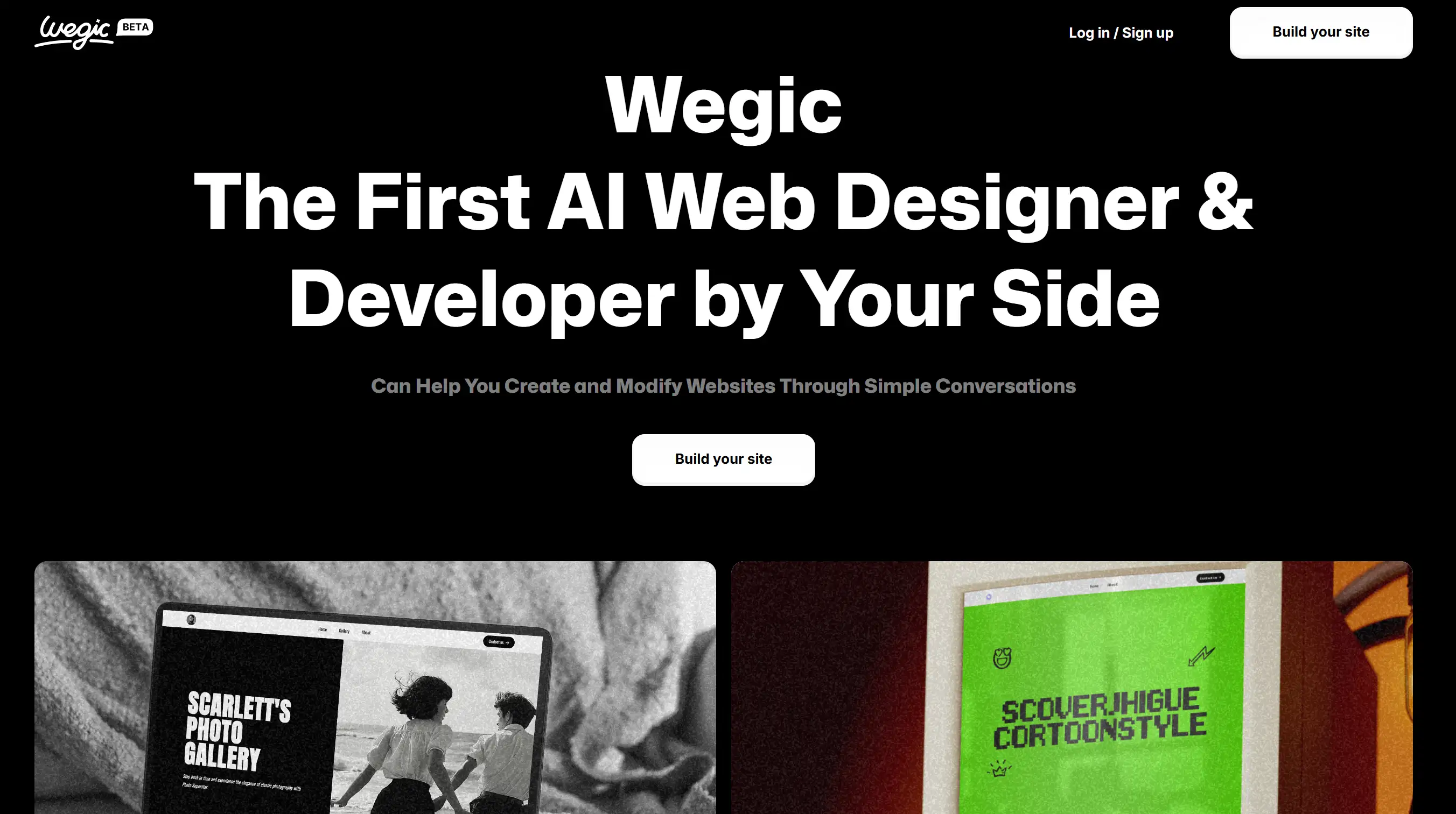
Let's take a look at Wegic's web design:
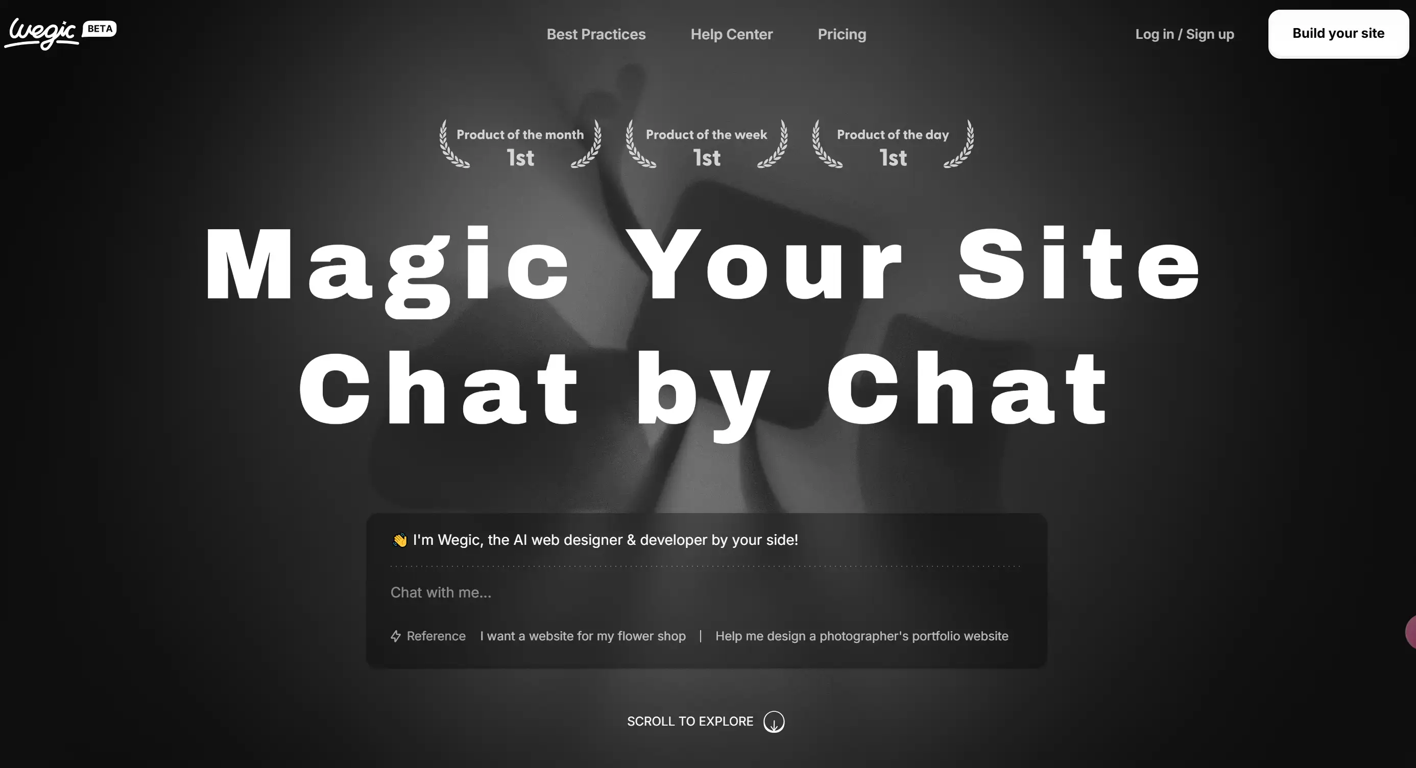
The homepage of Wegic aligns with its AI-driven web design tool's goals of simplicity and efficiency.
Visual Design:
- Dark Theme with Light Text: The use of a dark background creates a contrast that makes the text and call-to-action (CTA) buttons stand out. This dark mode design is not only visually appealing but also helps with focus on key content.
- High-Contrast Colors: The light text against the dark backdrop ensures readability and creates a sleek, professional look. The use of colour in typography and buttons is subtle yet effective in guiding the user's attention.
Typography:
- Bold, Sans-Serif Fonts: The headline "Magic Your Site Chat by Chat" uses large, bold sans-serif fonts, immediately drawing the user's focus to the core function of the tool – a conversational web design experience. This font for website choice reinforces a modern and digital-first identity.
- Text Hierarchy: The typography is structured, with the most prominent text being the headline, followed by supporting text in smaller fonts that provide additional context about the service. This hierarchy helps the user navigate the page and understand the product quickly.
- Use of White Space: The use of whitespace around text elements helps to avoid overwhelming the user and allows the content to breathe. It adds to the clean, minimalist aesthetic.
Call-to-Action (CTA) Buttons:
- Primary CTA - "Build your site": Positioned at the top right of the screen, this CTA is strategically placed to be immediately visible as users land on the page. It’s large, with a clear action verb that invites users to start using the service.
- Chatbox CTA - "Chat with me": The most unique element of Wegic’s homepage is the chatbot interface. Positioned at the bottom of the screen, this live-chat style CTA invites users to directly interact with the AI tool, highlighting the tool’s interactive and conversational nature.
- Secondary CTA - "Log in / Sign up": Also prominent in the top right corner, this CTA encourages returning users to sign in or new users to register, which is typical for SaaS platforms that require user accounts to access full features.
Hero Section:
- The hero section prominently features the slogan “Magic Your Site Chat by Chat” along with a brief introduction, directly communicating what the platform is all about.
- A subtle “scroll to explore” instruction prompts users to continue exploring the site beyond the initial screen, guiding them to the next steps in learning about the product.
Interactive Elements:
- Live Chat Interface: The presence of a live chat simulation at the centre of the homepage invites users to immediately start interacting with Wegic, showcasing its core feature: an AI web designer and developer.
- Feedback Icons and Awards: Displaying badges for "Product of the Month," "Product of the Week," and "Product of the Day" builds credibility and adds a sense of achievement for the platform, reinforcing trustworthiness.
Navigation and Usability:
- Top Navigation Bar: With links to important sections like "Best Practices," "Help Center," and "Pricing," the top navigation is simple and clear. It keeps the user experience smooth by offering easy access to support and more information about the tool.
- Sticky Navbar: The navbar remains visible as users scroll down, allowing them to access key pages at any point without having to return to the top.
Branding and Identity:
- Logo and Tagline: Placed at the top left, the Wegic logo helps with brand recognition. The “Beta” tag emphasizes that Wegic is an innovative, cutting-edge product still in development, appealing to early adopters and tech enthusiasts.
- Professional and Minimalist: The overall design reflects a professional but approachable feel. Using dark backgrounds and clean fonts creates an elegant look, while the interactive chat and playful badges bring a welcoming tone.
A Clear and Engaging Homepage
Your homepage is sort of like that first handshake digital. It’s got to be warm and firm and inviting. And this page should right away tell visitors who you are, what you do, and why visitors should pay attention. When it comes to writing content, it has to include a compelling headline, easy navigation and a call to action just begging for that click. Have important information at the front and centre instead of burying it. Think of website homepage content ideas like showcasing your latest offerings, featuring customer testimonials, or teasing a special promotion.
A Flawless Navigation System
Ever wandered into a store and couldn’t find anything you needed? Without a clear navigation bar, your audience feels that’s how they should feel. Create menus that are as intuitive and straightforward as possible, with easy passage on and off of each new page.
Everything should be a click away, with them whether your FAQ page, product categories or even hunting down your blog. Let your bounce rates rise no faster than a cat seeing a cucumber! Confusing navigation will send users packing.
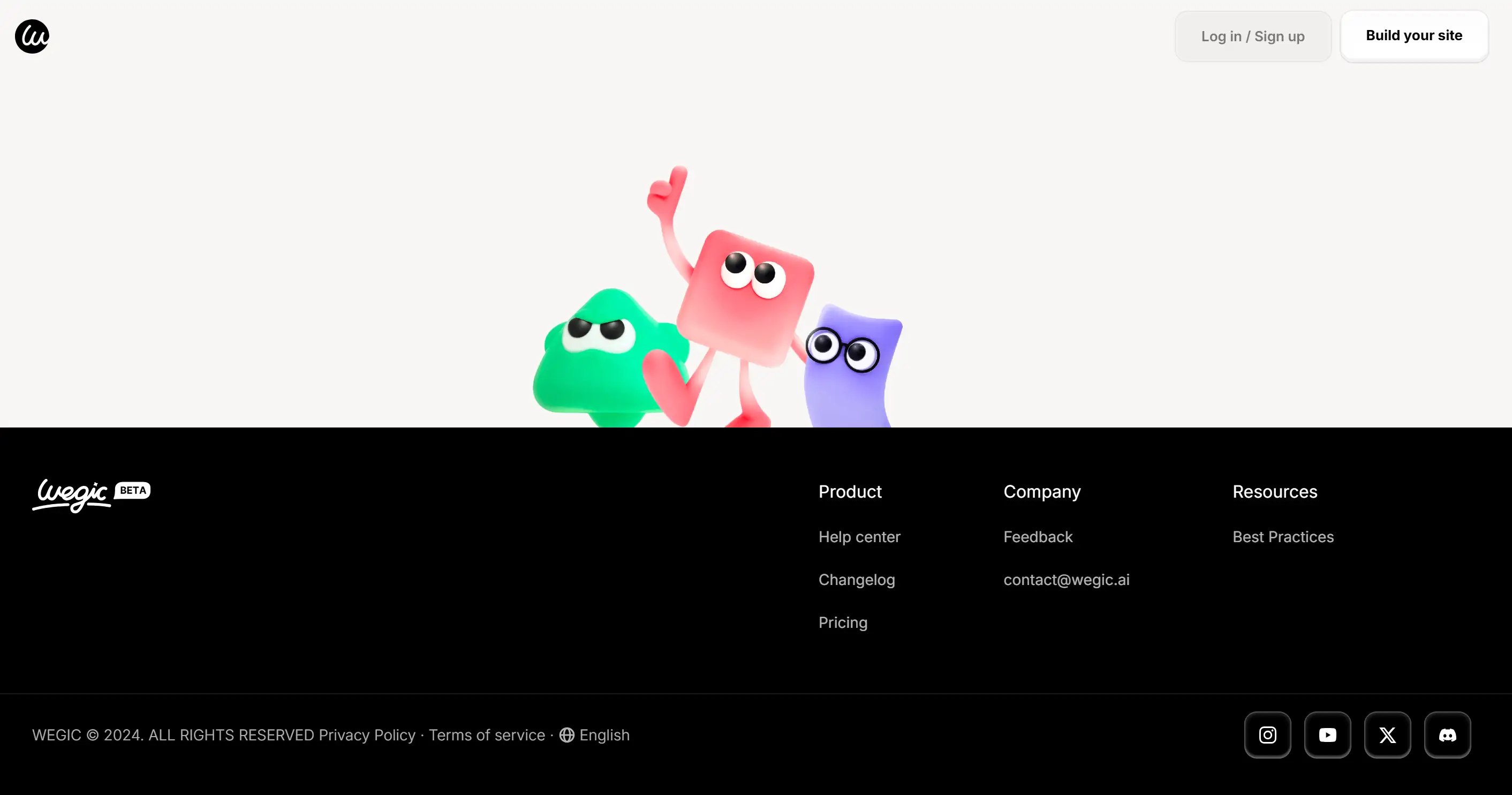
The following picture shows Wegic‘s clear navigation, including three main sections: "Product", "Company", and "Resources".
A Compelling About Page
Other people just want to do business with other people, not faceless entities. The purpose of your About page is to tell your story in a way that relates to your audience. Tell the world what you guys do and why you do it. Throw some humour or a little story in there—it keeps the visitor engaged and trust is built. Business website examples with personal touches like this always leave a lasting impression.
Strong Calls-to-Action
All that hard work if your visitors don’t know what to do afterwards. Once we know the value of the action you are trying to encourage, then we can decide how to make the path to taking action relevant to the context of the user. Don’t be subtle—this is not the time. Well-designed solid buttons with none of that ‘over the top’ thing happening here.
SEO-Friendly Metadata
Your site’s secret sauce to search engines' understanding and thereby ranking your website is a bit something called metadata. Use keywords strategically, including phrases like things needed to create a website or SEO strategy, in your title tags and meta descriptions. This will bring the right traffic to your site, but following good SEO practices.
Mobile Optimization
Let’s face it: They are stuck to their phones. If your website isn’t mobile friendly you are leaving money on the table. With a responsive design, your site will look and work great on all devices, no pinching, zooming or horizontal scrolling is needed.
A Blog or News Section
A blog is more than just for writers, it’s an engine to keep your audience in the loop and interested. Share insights, updates and solutions to their problems. Publishing quality content also helps your website structure for better SEO, as it is as important as it sounds. And, you’ll have new material to fill your newsletters.
Want to explore more about AI website building or web design? Click Wegic's blog to glimpse into the dynamic landscape of Wegic's recent insights and trends.
A Standout Landing Page
Your homepage is the face of the website, a landing page is about making a conversion. So these pages are designed with one purpose, to get your attention and capture leads, promote a product, or grow your email list. By ensuring they’re clean, persuasive, and catered to the audience you are targeting, they’ll make and close the sale for you.
An FAQ Page
That includes you, nobody likes answering the same questions over and over. When writing an FAQ page, it should be thought through and answer common questions so that you can save time for your time and your customers. Also, it’s a subtle way to showcase your expertise and professionalism.
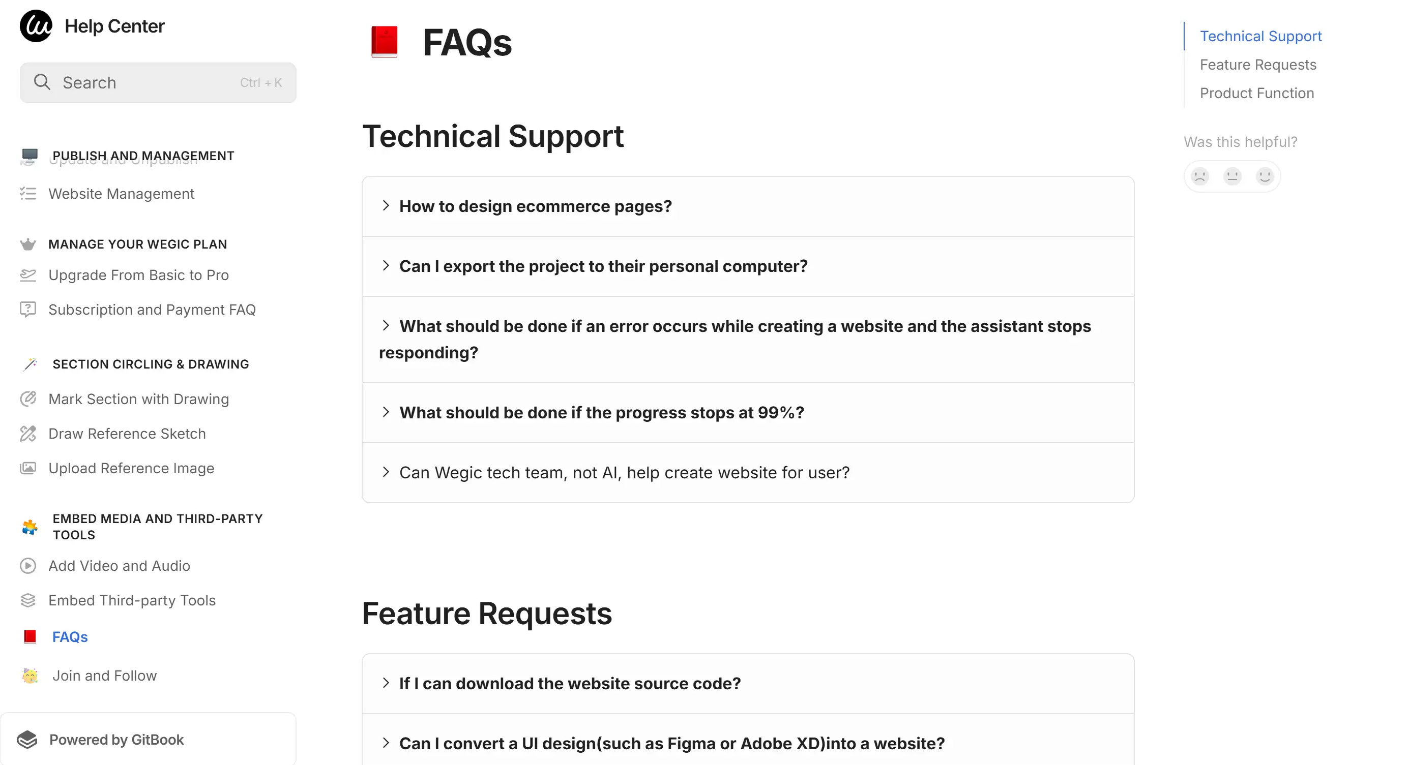
Providing users with a FAQ page is strikingly important. See how Wegic built its FAQ pool for its users to solve their questions about building their websites.
Contact Information
This one’s a no-brainer. Let visitors get hold of you by offering multiple contact options (phone number, email address, social media links, even live chat if possible). When you approach people, they are more likely to trust businesses too.
Putting all of these factors together will help you change your site from a place that simply exists online into an actual powerhouse.
What to Include in a Business Website?
Building a business website is like building a business’ digital headquarters. It’s not just a pretty space, it’s also a fully functional hub where customers get educated about your brand, learn more about your product offering and engage with you. Whether you’re launching your first site or revamping an old one, there are things needed in a business website that you simply can’t skip. Let’s explore the key components every website should have, along with some business website examples that do it right.
Eye-Catching Homepage
Your first impression is all the way over to your homepage; it’s the first thing your visitors see, which is why it’s important. It’s like an elevator pitch in digital format. You can showcase your brand’s personality while still keeping the design clean and easy to navigate, opening the door for a lot of possibilities. Imaginative visuals, a rate headline and CTAs that indicate users to continue to get to know the options. For inspiration, look at top-performing business websites that seamlessly blend branding with functionality.
A Professional About Page
Your About page isn’t just about you, it’s about telling them they can trust you. Tell us your story, your mission, and what makes your business different.
Show your values and expertise in a way that will help your audience identify with it. Don’t make it too formal; let your personality out. A story works because people connect with them, so this space should be used to build a real connection.
Detailed Product or Service Pages
Your website, if you can think about it as your store, is the wooden shelves where products and services sit, and are placed for sale. Provide all the details a customer might need to make a decision: featured with descriptions, features, benefits, and high-quality images or videos. Bringing testimonials or reviews will help you build that trust and confidence in your work. This includes clear pricing and easy-to-understand CTA’s such as “Buy Now” or “Get a Free Quote”.
Contact Information That’s Easy to Find
Customers should never have to look when searching for a way to contact you. Add a Contact page that has at least an email, phone number, social media links and if applicable a physical address. The embedded contact form makes contact even easier. If you're a business, check out the interactive map.
Blog Section for Insights and Updates
A blog is much more than just a place to show your updates, it’s an opportunity to build yourself a reputation in your area of expertise. It’s about sharing articles, tips, and news that your audience cares about. Publishing fresh engaging content more often will enhance SEO, as well as helping to drive traffic. Need ideas? Whatever business you are in, think about answering customer questions, discussing trends, or sharing behind-the-scenes insights.
FAQ Section
I must repeat: your website will be as good as it is; customers will always want to ask questions. If there are common queries related to shipping policy, product care instruction, etc., its FAQ section will be dedicated to this purpose. It not only saves time for both you and your customers but it also shows you’re ready to help, which builds trust.
Subscription Options
If you want to keep your audience engaged, what exactly is your offer? Create an email newsletter or email subscription offer. You can use it to send out offers, updates, or anything about your industry, for example. This aids in keeping your brand top-of-mind, and will even allow you to connect with your customers on a direct line of communication.
SEO-Optimized Content
You need it to be found. It’s not just about looking good. Incorporate an SEO strategy by using keywords like website homepage content ideas and things needed to create a website naturally throughout your site. Improves your image search engine rankings by optimizing metadata, headers as well as alt text on the image.
Social Proof and Reviews
People trust people, and that’s why your satisfied customers are the best way to get the word out. Often (but not always), you want to put testimonials, reviews, or case studies at the top of your site. It creates credibility because it helps build positive feedback and reassures potential customers.
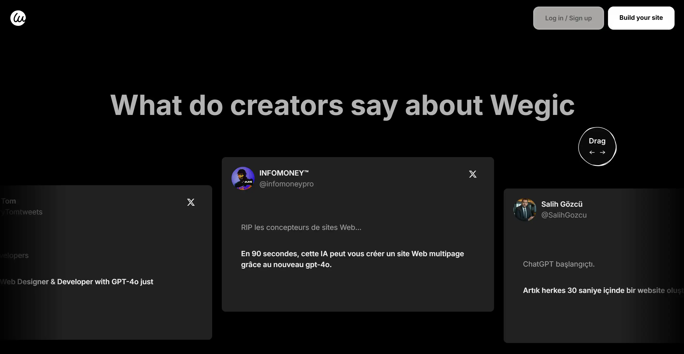
See how Wegic arranges its social proof and reviews:
Mobile-Friendly Design
Today, most of internet traffic comes from mobile devices and therefore, a responsive design is a given. The whole point is that the site should adjust in a snap to screens of any size yet still present a clean experience everywhere. Plus, a mobile-friendly design also helps you get rankings to boost SEO because search engines favour mobile sites.
Privacy Policy and Terms of Use
Don’t forget the legal stuff. A Privacy Policy and Terms of Use page aren't only a way of keeping your website compliant—they can help to build trust. Show the way you collect and use customer data, so your visitors know their data is secure with you.
Visual and Branding Consistency
A website plays the role of your brand. The use of consistent colours, typography and design elements enhances brand identity and your site becomes more memorable. Use those high-quality images and videos to make the experience of users better and follow the aesthetic website style.
Call-to-Action (CTA) Buttons
Conversion is driven by CTAs. From a “Shop Now” button on your homepage to a “Learn More” link in your blog, clear and enticing CTAs point users in the right direction to take that action. Make them impossible to miss, but use contrasting colours and concise text.
Security Features
Visitors care much about online security. You should at least make sure your site is HTTPS secured if you are taking sensitive information of the customer through your site like payment. Another way to demonstrate that your site is decent is to display trust badges and certifications so that users know their data is secure.
Adding these elements can help you create a website that not only attracts visitors but also is a place visitors want to come back to. Whether you're brainstorming business website examples or looking for fresh website homepage content ideas, this roadmap ensures your site is both engaging and effective.
15 Key Elements Your Business Website Should Have in 2025
A business website in 2025 doesn’t need to be handmade but rather the result of thoughtful application and careful effort that it takes to produce something users won’t soon forget. In simpler words, it's about setting up an online façade that looks clean and meets the expected quality and functionality of modern users and always being on top of changes in the industry. Here are the 15 must-have elements of a professional site that can help you in digital times.
1. Mobile Design
Since the mobile world creates a larger share of web traffic, the mobile-first approach is inescapable today. Make sure that every site screen size works, loads quickly, looks stunning and functions perfectly. A mobile-friendly site is not just about good looks — mobile-friendly sites can improve the user experience and also boost your SEO considerably.
2. Content-First Design
Try to focus on the content first in designing your message. Don’t cram your text into a pre-formulated layout, make your site around your words and visuals. Using this method keeps your content clean, compelling, and successful at generating sales.
3. E-Commerce Integration
Having an e-commerce section for products or services is a must for businesses. Have an end-to-end shop experience, with easy navigation, secure payments and a smooth checkout. Online stores are at the heart of digital commerce, whether you own a small boutique, or are a huge global retailer.
4. SEO Strategy Built In
A good website is not just pretty; it’s findable. Set up a solid SEO approach: seeking out keywords, meta descriptions, headers, and images. It makes it easier for potential customers to find your site, and search engines understand your site better.
5. Font for Websites That Enhances Readability
But typography is something that seems minor but impacts user experience. When choosing fonts for websites, go for something clean, professional and easy on the eyes no matter the device. Having a nice thoughtful typography style makes your site look polished and keeps visitors engaged with your content.
6. Visual Branding
Nobody wants to be lost online. You should provide intuitive menus and search functions that help users quickly get to what they need. Besides, you should organize similar pages by providing labels and making the site more usable.
7. Clear Navigation
No one enjoys getting lost online. Implement intuitive menus and search functions that help users quickly find what they need. Group similar pages together and use clear labels to enhance usability.
8. Engaging Call-to-Actions (CTAs)
The difference lies with effective CTAs, helping a casual visitor become a paying customer. Whatever your call to action might be, make it bold, action-oriented, and unmissable.
9. Interactive Features
An interactive website implies that your website can have live chat options, product configurators, and everything to make customers a user-friendly user experience. As well as increasing conversion rate by addressing customer’s needs in real-time.
10. FAQ Section
Let your readers save time and frustration by including a Frequently Asked Questions (FAQ) section. You can answer common queries about your products, policies and services simply. This is a simple way to increase user experience while reducing the amount of support requests.
11. Social Proof
People trust people. Put customer testimonials in front, case studies in front, and ratings in front. It also creates credibility and feeds the notion that they’re on the best path.
12. Secure and Reliable Hosting
The most important aspects of your website’s speed, uptime and security are dependent on your web page hosting provider. Secure reliable hosting services that guarantee the protection of your user's data, and your site’s smooth running through high traffic times.
13. Newsletter Signup
Have a newsletter signup option, to turn one-time visitors into a loyal following. So you can use this to share things like exclusive offers, updates, or behind-the-scenes stuff. I think it’s a great way to keep your audience engaged, so they come back for more.
14. Multi-Language Support
Imagine visiting a website that only offers information in a language you don’t understand. Frustrating, right? Now, think about your customers who might feel the same. Multi-language support ensures that your business can communicate clearly with visitors from different linguistic backgrounds, fostering trust and inclusivity.
15. Legal Pages
Essential legal pages like Privacy Policy and Terms of Service REALLY help you stay compliant as well as build trust with your visitors. In this digital era, transparency is one of the most important aspects and it is shown through these pages that the data of visitors is safe with us.
So, these 15 elements aren’t nice to have, they’re must-have elements for 2025. If you add these features to your website, you will not simply have a website, you will have a thriving website, bringing in visitors and building loyal customers. Whether you’re running online stores, brainstorming website homepage content ideas, or focusing on user experience, this checklist will help you stay ahead of the competition.
5 Important Things for a Website
While the 15 elements above paint the full picture, here are the top five things needed in a business website that you absolutely can’t ignore:
1.Easy-to-Use CMS: Your site should be straightforward.
2.Responsive Design: The users expect to have seamless browsing across devices.
3.Search Engine Visibility: Your site should rank well for relevant keywords like "How to create a website for business for free."
4.Contact Options – The simpler it is to reach you, the better.
5.SSL Certificate: Security, today, is not something you can negotiate.
Your Business Website. a Power Move!
Your business website isn’t just a digital point, your business website is the heart of your online presence. If you add the right features, you are able to create a tool that pulls in, keeps, and converts people into customers. It doesn’t have to be overwhelming to build such a website.
Creating a professional high-functioning website with Wegic’s AI-powered website builder is very easy. Whether you’re looking for no-code website building or wondering about the things needed to create a website, Wegic simplifies the process with intuitive AI assistants and expert guidance. Today is the day that you take your business website to the next level, check out Wegic and see what the future of web design looks like!
Written by
Kimmy
Published on
Mar 17, 2026
Share article
Read more
Our latest blog
Webpages in a minute, powered by Wegic!
With Wegic, transform your needs into stunning, functional websites with advanced AI
Free trial with Wegic, build your site in a click!