Giriş Yap
Sitenizi Oluşturun
Yanıt Veren Web Tasarımı Hakkında Tam Rehber: Ne ve Nasıl
2024'te yanıt veren web sitelerini inceleyerek yanıt veren web tasarımı temellerini keşfedin.

Tamamen tasarlanmış web sitelerinizin dizüstü bilgisayarda harika göründüğünü ama telefonlarda korkunç göründüğünü düşünmekten sıkılmışsanız sizin gibi birçok kişi var. Bugün web sitesi geliştirme sürecinde olan her müşteri, mobil sürüm istemektedir ve bu oldukça anlaşıldığı gibi. BlackBerry ve iPhone'dan iPad, netbook ve Kindle'a kadar farklı ekran tanımlamalarına sahip birden fazla cihazla, geliştirilecek web sitesinin görünümü aynı derecede iyi olmalıdır. Ancak pazarın sürekli artan cihaz listesine uyum sağlamak zorunludur. Bazen, tüm cihazlara uyumlu bir web sitesi oluşturmak konusunda ne yapacağını bilmenin zorluğundan sıkılırsınız.
İstediğiniz strateji, web tasarımı olarak bilinen şeydir. Her cihazda içerik ölçeklenebilir hale getirir, bu da kullanıcının ne tür bir cihaz kullandığından bağımsız olarak web sitenizi zevk alarak gezmesini sağlar. Ekran boyutu ve yönüne göre web sitenizin uyarlanmasını düşünün; düzen, resimler, gezinme ve özellikler, büyük monitör, tablet veya telefon olup olmadığını fark etmeden mevcut alana uyacak şekilde yeniden düzenlensin. Harika değil mi? Bu, uyumlu web sitesinin güzelliğidir ve kısa sürede öğreneceksiniz ki, hayal ettiğinizden daha karmaşık değildir.
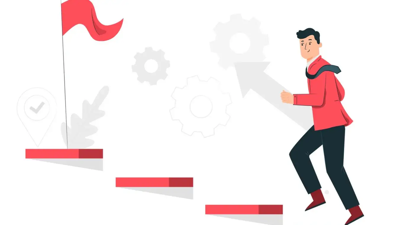
Pekala, geçmişe çok dalmadan, dikkat çekici ve dikkat çeken, ziyaretçilerin içeriği tekrar tekrar kontrol etmesini sağlayan uyumlu bir web sitesi oluşturma olasılıklarına bir göz atalım.
Site Oluşturmak İçin Tıklayın
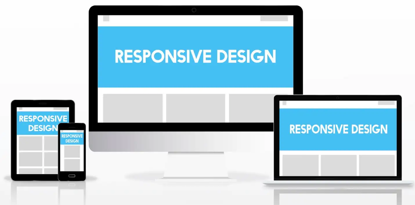
Uyumlu Web Tasarımı Nedir
Uyumlu web tasarımı, RWD olarak bilinir ve herhangi bir ekran boyutu veya tutulma yönüne rağmen herhangi bir web sitesinin optimizasyonunu sağlamak amacıyla web geliştirme yaklaşımıdır. Bu teknik, özellikle internetin küresel bir araç haline gelmesiyle birlikte daha fazla cihazın internete erişmesi nedeniyle kritik hale gelmektedir. Gereç türlerindeki gelişmeler nedeniyle, geleneksel bilgisayarlar, dizüstü bilgisayarlar, tabletler ve akıllı telefonlar gibi cihazlar için bir web sitesinin cihazların boyutlarına ve çözünürlüklerine göre uyumlu olması gerekir.
Diğer bir deyişle, uyumlu web tasarımı, hem web sitesinin içeriğinin hem de düzeninin esnekliğini vurgular.
Kullanılan düzenler, CSS medya sorguları ve esnek gridler ve düzenlerin kullanımı gibi resimler, farklı ekran boyutları için webin optimize edilmesini sağlayan diğer tekniklerdir. Özellikleri uygulamak için web sitesinin kullanıcıyı bir dizüstü bilgisayarda olduğunda tespit edip daha sonra tablet olmasına geçerek, resimleri ve tüm sitenin düzenini ekran boyutuna göre yeniden boyutlandırabilmelidir. Bu esneklik, bugün pazarda bulunan farklı cihazlar için yeni tasarım ve geliştirme yapmaktan kurtarır, bu da zaman tasarrufuna yardımcı olur.
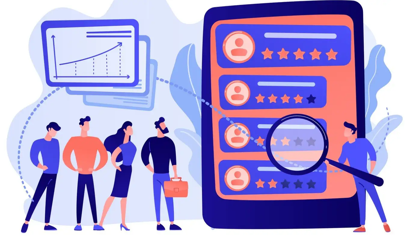
Ethan Marcotte, 2010 yılında "A List Apart" için yazdığı bir makalede, uyumlu web tasarımı kavramını ilk kez tanıttı. Bu kavramı uyumlu web tasarımı olarak adlandırdı: Binaların insanlara ve trafiğe nasıl uyum sağladıkları gibi, webin de aynı şeyi yapması gerektiğini önerdi. Bu fikri site tasarımı açısından yorumlamak, kullanıcı cihazının görünümünü taklit edecek özel bir web sitesi oluşturmaktır. Bu kavram, aynı sitenin cihazlarda çalışması için farklı web şablonları oluşturmaktan çok daha iyidir. Bu nedenle, uyumlu web tasarımı, bugünün web ve yüksek teknoloji dünyasında sadece bir eğilim değildir. Mobil cihazların artan kullanımına göre, sayfanızın tüm platformlarda iyi görünmesi ve kolay kullanılması hayati öneme sahiptir. Bu nedenle, kullanıcı deneyimini artırmanın yanı sıra SEO üzerinde derin etkileri vardır. Uyumlu tasarımın bu kadar önemli olmasının en büyük nedenlerinden biri, Google ve diğer arama motorlarının bugün mobil uyumlu sitelere öncelik vermesidir.
Özetle, uyumlu web tasarımı, mevcut tüm cihazlar için optimize edilmiş bir web sitesi tasarlamak ve geliştirmekle ilgilidir. Bu tür bir düzen, esnek resimler ve CSS medya sorguları ile birlikte, cihazın nasıl kullanıldığını fark etmeden harika bir tasarım ve web sitesinin optimal fonksiyonelliğini sağlar. Uyumlu tasarım artık tartışılmaz bir strateji haline gelmiştir çünkü mobil ortamda web sitesi için avantajları vardır.
Uyumlu Web Tasarımını Nasıl Kullanırım
Uyumlu web tasarımı kullanma rehberi, çeşitli cihazlar için web sayfasını uyarlamaya odaklanan size ait birkaç temel eylemi içerir. İşte uyumlu web tasarımı kullanma konusunda detaylı bir rehber.
Amacınızı ve Cihazlarınızı Anlamak
Yanıt veren web tasarımı için ilk adım, hedef kitlenizi ve kullandıkları cihazları anlamaktır. Web sitenizin analizlerini inceleyerek ziyaretçilerinizin en sık kullandığı ekran boyutlarını, cihazları ve tarayıcıları belirleyin. Bu veriler tasarım kararlarınızı rehberlik edecek ve hangi cihazlara odaklanmanız gerektiğini belirleyecektir. Hedef kitlenizin tercihlerini ve davranışlarını bilmek, farklı cihazlar için düzen ve içerik önceliklendirme konusunda bilgi sağlayabilir.
Öncelikle Mobil-Öncelikli Yaklaşım Alın
Mobil-Öncelikli yaklaşım, web sitenizi önce telefonlarda ve ardından tabletler ve dizüstü bilgisayarlarda geliştirmeyi hedefler, diğer yandan tersi değildir. Bu, en küçük ekranlarda temel içerik ve ana işlemleri görüntüleyebilir ve gerçekleştirebilir olduğundan emin olur. Bu, daha geniş ekranlara içerik ve seçenekler ekleyebilmesi için temel oluşturur. Daha dar bağlamlardan başlamak, çeşitli cihazlarda temel kullanıma uygunluk sağlayabilmek için önerilir.
Sıvı Ağlar Kullanın
Sıvı ağlar hakkında: bu, yanıt veren tasarımların önemli bir bileşenidir. Bu, belirli ölçü birimleri gibi piksel gibi sabit ağlarla değil, yüzde gibi göreli ölçü birimleri kullanır. Bu, sitenin her düzeninin tarayıcı penceresinin boyutuna göre orantılı boyuta sahip olmasına olanak tanır. Örneğin, monitörün genişliğinin %50'sini kaplayan bir gazete şeridi, tablet veya akıllı telefon üzerinde monitörün aynı oranda genişliğini kaplar. Sıvı ağların uygulanması, sitenizin görüntüleneceği ekran boyutuna göre yanıt vermesini sağlar.
Esnek Resimler Uygulayın
Belgeler, her web sitesinin vazgeçilmez bir unsuru olmakla birlikte, özellikle resimler yanıt veren tasarımlarda sorun olabilir. Yanıt veren resimler, yüzde gibi göreli ölçü birimleriyle içerik kutularına uyarak, her ekran boyutunda iyi görünür. Resim boyutu sorunlarını önlemek için, hiçbir resmin içerik kutusunun genişliğinden daha geniş olmaması gerektiğini belirten CSS kuralları uygulayın; daha iyi bir yöntemle, resimlerin kutunun tam genişliğine yayılması durumunda, genişlikleri %100'e sınırlı olmalıdır. Bu işlem, bağlı cihaz ve genel ayarlarla ilgili kullanıcılar için uygun resimleri koruyarak son kullanıcılar için dikkate alınmasını sağlar.
CSS Medya Sorgularını Uygulayın
Medya sorguları, yanıt veren tasarım için harika özelliklerdir. Bunlar, web sitesinin ekran boyutuna göre farklı teknikleri tanımlamalarına olanak tanır, örneğin genişlik, yükseklik, cihaz yönü ve çözünürlüğü. Örneğin, 768 pikselden daha küçük ekranlarda sayfanın düzenini değiştirmek ve uygun biçimde biçimlendirmek için medya sorgularını kullanabilirsiniz. Medya sorguları, farklı cihazlar için tasarım yapmanıza olanak tanır ve hem işlevsellik hem de görünümü geliştirir.
İçeriği ve Fonksiyonları Önceliklendirin
Bu, çeşitli cihazlardan erişilebilecek web siteleri geliştirirken, içerik ve bazı fonksiyonların her zaman öncelikli olması anlamına gelir. En önemli öğeleri filtreleyerek ve küçük ekranlarda görünür alana yerleştirmeye başlayın. İleriye dönük geliştirme tekniklerini uygulamak mümkündür; burada temel özellikleri geliştirir ve daha büyük ekranlar için geliştirme yaparsınız. Yanıt veren tasarım kullanmak, kullanıcıya bağlı cihazın türüne bakılmaksızın web sitesinin tüm gerekli içeriği ve fonksiyonlarını sağlar.
Tipografiyi Optimize Edin
Web sayfasının gezilmesi sırasında yapacağı düzenlemelerin serisinde, tipografi, web sayfasının daha yanıt veren hale gelmesinde kritik bir rol oynar. Mobil engelleri önlemek için, font boyutları için em veya rem gibi göreli uzunluk birimleri kullanarak tüm metni okunabilir tutun. Böylece, komfortlu bir satır yüksekliği tanımlamalı ve medya sorguları kullanarak ekran boyutuna göre font boyutlarını hesaplamalısınız. Ayrıca, kullanıcının görüş açısıyla orantılı olarak font boyutunu ayarlayan akıcı tipografi gibi yanıt veren tipografi stratejilerini uygulamak önerilir. İyi tipografi, tüm üretilen içeriğin her cihazda kolayca okunmasını sağlar.
Farklı Cihazlar ve Tarayıcılar Üzerinde Test Yapın
Yanıt veren tasarım testi, web için tasarım sürecindeki en önemli aşamalardan biridir. Web sitenizi farklı işletim sistemlerinde, ekran çözünürlüklerinde ve tarayıcı sürümlerinde test edin, sitenin nasıl göründüğünü ve çalıştığını görün. Farklı tarayıcılar ve onların pencerelerini, dar ya da geniş, dikey ya da yatay konumda test edin. Ayrıca, gerçek donanıma erişim sağlayan çevrimiçi araçlar ve hizmetleri kullanmayı düşünün. Test, fark edilmeden kalırsa, farklı işletim sistemlerinde kullanıcı arayüzünün sürekliliğini etkileyebilecek eksiklikleri ortadan kaldırır.
Yanıt Veren Çerçeveleri ve Araçları Kullanın
Bootstrap ve Foundation gibi araçlar, yanıt veren sitelerin tasarımı için temel oluşturur. Aşağıdaki çerçeveler, yanıt veren tasarımların uygulanmasını kolaylaştıran CSS ve JavaScript özelliklerini içerir. Bunlar arasında; yanıt veren bir ızgara sistemi, medya sorgusu kesme noktalarının kullanımı ve ekran boyutuna göre değişebilen kullanıcı arabirimi birimleri yer alır. Yanıt veren çerçeveleri kullanmak, üretim sürecini hızlandırır ve tasarımın görünümünün birbirine uygun olduğunu garanti eder.
Performansı Dikkate Alın
Bu, özellikle daha yavaş ağlarda deneyimleyen mobil kullanıcıların sayısı arttıkça performans açısından önemlidir. Resimleri bu amaçla ayarlamak ve WebP gibi daha yeni resim formatlarını kullanmak ve sadece gerek duyulduğunda resmi yükleyen erken yükleme tekniğini uygulamak gibi birkaç yol vardır. Sayfadaki betik sayısını sınırlayın ve stiller ve betikler için HTTP isteklerinin sayısını azaltmaya çalışın. Ayrıca, tarayıcı önbelleğini ve içerik teslim ağlarını kullanabilirsiniz, bu da yükleme süresini azaltmanıza yardımcı olur. Hızlı yükleme süreleri kullanıcıları mutlu eder ve sıralamada rol oynayabilir, bu yüzden bu konuya dikkat etmek akıllıca olur.
Erişilebilirliği Koruyun
Yanıt veren yaklaşımın ana stratejilerinden biri olarak fırsat ve erişilebilirliğin dikkate alınması gerektiği sonucuna varılabilir. WCAG gibi web erişilebilirliği yönergelerine uyarak, engelli bireylerin içeriklerine erişebilmesini sağlayın. Anlamlı HTML etiketlerini kullanın, resimleri etiketleyin ve bir site klavye ile geziliyorsa, kontrollerin klavye erişilebilir olduğundan emin olun. Tüm kullanıcıların sitenize erişip bazı ölçüde kullanabilmesi, iyi kullanıcı deneyimi tasarımı için kritiktir.
Sürekli İzleme ve İyileştirme Yapın
Yanıt veren web tasarımı, bir kez yapılan bir aktivite değildir, tekrar edilmelidir. Web sitenizin performansını ve kullanıcı davranışlarını başlatmadan sonra analiz edin. Kullanıcıların ilgisini temsil ederek, olası eksiklikleri belirleyebilecek görüşleri toplamalısınız. Web sitenizin içeriğinde yeni anlamlar düzenli olarak ortaya çıkar veya rakiplerinizle iletişime geçerek onların koruduğu web tasarımlarında hangi yeni web tasarım eğilimlerini veya teknolojilerini uyguladıklarını keşfedin. Sık sık web sitesi yeniden tasarımı ve güncellemeleri, sitenizin mevcut cihazlar ve teknolojilerle daha uyumlu hale gelmesine yardımcı olur.
Bu nedenle, yukarıda belirtilen adımları takip etmek, internete erişen insanların kullandığı çeşitli cihazlarda iyi optimize edilmiş iyi bir web sitesi geliştirmeye yardımcı olur. Yanıt veren web tasarımı, müşteri memnuniyetini artırmak ve mobil ortamda sitenizin daha iyi konumunu sağlamakla kalmaz, aynı zamanda daha fazla web geliştirme için tek yol gibi görünür. Açıkça, bir web tasarımı baştan geliştiriliyor olup olmadığı veya yeniden tasarlanıyor olup olmadığı önemli değildir, artık web tasarımı ve geliştirmede yanıt verme çok önemlidir.
Buraya tıklayarak sitenizi oluşturun
Yanıt Veren Web Siteleriyle Web Tasarımınızı Geliştirin
Yanıt veren web tasarımı, şu anda toplumda çok önemlidir. Bu, web sitenizin yanıt verdiğini ve tüm kullanıcılar için tüm cihazlarda işlem deneyimi iyi olacağını garanti eder. Esnek ızgara, esnek resimler ve medya sorguları kullanımından dolayı, her cihaz için görünür ve işlevsel bir web sitesi oluşturursunuz.

Wegic, ileri seviye yapay zeka yetenekleriyle web tasarımı ve geliştirme alanını dönüştürmektedir. Wegic, kullanıcıların kolay ve konuşmacı etkileşimlerle web siteleri oluşturmasına olanak tanıyan yapay zeka odaklı bir web oluşturucudur. Küçük bir iş için, kişisel portföy için veya profesyonel bir proje için bir siteye ihtiyacınız varsa, Wegic, fikrinizi hayata geçirir. Bu inovatif araç, spesifik fikirlere sahip olanlar ve yaratıcı ilham arayanlar için uygundur.
Ana Özellikler:
-
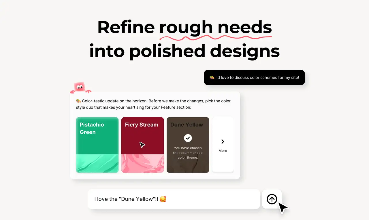
Yardımcı Artırılmış Destek için Yapay Zeka: Wegic, web sitesi oluşturma sürecini kolaylaştıran üç özel yapay zeka asistanına sahiptir. Bu asistanlar, tasarım değişikliklerinden fonksiyonel iyileştirmelere kadar kişiselleştirilmiş destek sunar ve akıllı ve verimli bir iş akışı sağlar. Bu çok yönlü yapay zeka desteği, no-code web siteleri oluşturmaya intuitif ve stresli olmayan bir yol sunar.
-
Otomatik Yanıt Veren Tasarım: Wegic ile web siteniz, çeşitli ekran boyutlarına otomatik olarak uyum sağlar ve her cihazda kullanıcı deneyimi için sorunsuz bir deneyim sağlar. Bu özellik, manuel ayarlamalara gerek kalmadan, sitenizin masaüstü, tablet ve akıllı telefonlarda harika görünmesini sağlar.

-
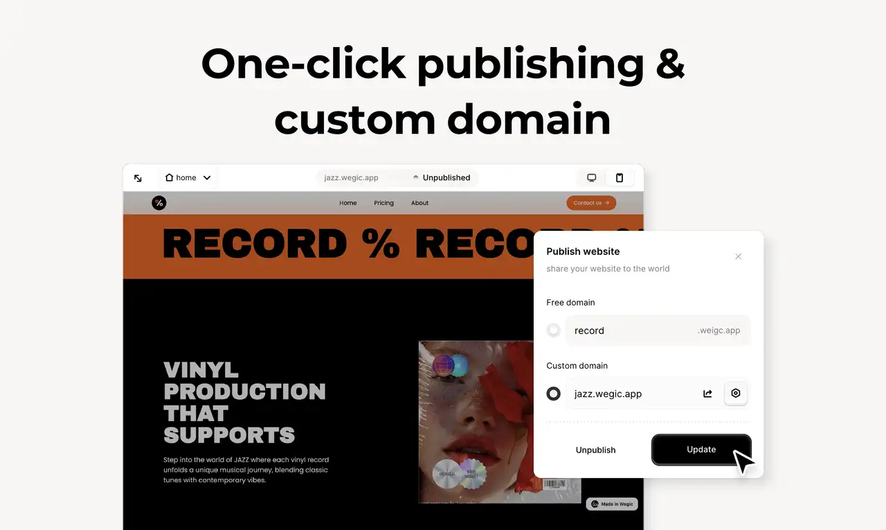
Kolay Yayınlama ve Özel Alan Adları: Wegic, web sitenizi çevrimiçi hale getirmenin sürecini kolaylaştırır. Tek tıkla sitenizi yayımlayabilir ve özel bir alan adı entegre edebilirsiniz, böylece hızlı ve kolay bir şekilde profesyonel bir çevrimiçi varlık oluşturabilirsiniz. Bu akıllı yaklaşım, herhangi bir zahmet olmadan canlı ortama geçmeyi kolaylaştırır.
Kullanıcı dostu bir web sitesine ihtiyacınız olduğunu çok iyi biliyoruz. en üst düzey yapay zeka eğilimleri ile ilgilenen kişiler için Wegic'in yapay zeka asistanları burada. Temiz, kullanıcı dostu ve etkili bir şekilde iş ihtiyaçlarını ve ziyaretçilerini karşılayabilen bir web sitesi inşa etmenize yardımcı olabilirler. Neden web sitemizi ziyaret etmeyip, bir yapay zeka asistanının dışarıda olan en iyi uyumlu web sitesini oluşturmakta size nasıl yardımcı olabileceğini görmekten kaçınmıyorsunuz? Zaman, sürecinize şimdi başlamak ve web sitenizin bir sonraki adıma hazır olduğundan emin olmak için.
Yazan
Kimmy
Yayınlandığı tarih
2 Nis 2026
Makaleyi paylaş
Devamını oku
En son blogumuz
Yapay Zeka Binası
25 May 2026
UX Tasarımcıları İçin En İyi 10 Portföy Oluşturucu: Çalışmalarınızı Sergileyin
Wegic ile Dakikalar İçinde Web Sayfaları!
Wegic ile ihtiyaçlarınızı ileri AI teknolojisiyle etkileyici ve işlevsel web sitelerine dönüştürün
Wegic ile ücretsiz deneme, tek tıkla sitenizi oluşturun!
Ne tür bir web sitesi oluşturmak istiyorsunuz?