Log in
Build Your Site
10 Best Experimental Web Designs to Inspire Your Own 2025
Explore the cutting-edge world of experimental web design! Discover innovative features, top examples, and creative techniques to inspire your website. Learn how experimental web design redefines navigation, content interaction, and analytics for unforgettable user experiences.
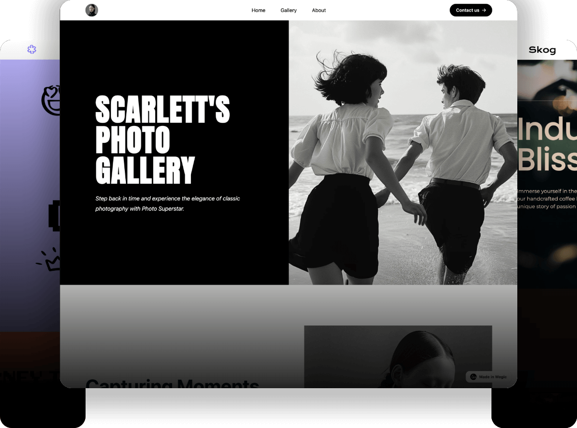
Have you scrolled through a site and thought you were exploring something brand new, something that’s out of the new web design mold? If not, you're in for a treat with experimental web design. Image of a digitally real world where layouts don’t observe typical construction, where navigation isn’t just structured but rather a challenge. Experimental web design isn’t your typical online experience—it's an art form where every element, from navigation to content, uniquely tells a story.
This isn’t a matter of conspicuously adding flair; it’s a matter of meaning. Experimental navigation web design introduces new ways to interact, while experimental design in web analytics allows for innovative tracking of how users engage with content. If you’re on the hunt to find and create your little frontier, then you may be interested in what the meaning and impact could be of this creative frontier, the web because the web is more than a space, it can be an experience.
What is Experimental Web Design?
At its core, experimental web design is about breaking the mould of traditional site layouts and user experiences. Experimenting with disruption of norms trumps standard structures and predictable navigational cues: each user interaction becomes a new journey. That could mean that users experience some unusual things—like horizontal scrolling or something interactive that is less linear, and more exploratory.
An experimental web designer leverages cutting-edge technology to merge art with functionality, surprisingly engaging the visitor. In contrast to orthodox sites, menus and familiar structures will guide you through these layouts. These designs defend fluidity and invite active exploration by the user. Using experimental design, every page and interaction is crafted to be memorable and present an experience instead of delivering information.
Key Features of Experimental Web Platforms
When it comes to experimental web design, think of it as the mad scientist of digital platforms. In other words, it’s about getting creative and coming up with unique, immersive experiences that bewilder and bewitch users (in the very best way possible). It’s not about the rules, it’s about breaking rules, about creating a different, better way to navigate, to experience, to interact with a website and how to reinvent the online experience of the user. Let’s take a look at some key features that make experimental websites such a fascinating and impactful choice.
Interactive and Unconventional Navigation
The experimental web platforms take great care to reinvent moving through a site. Rather than simply offering the classic top or sidebar menu, experimental large navigation web design transforms navigation into an experience of its own. It's things like menus that expand into interactive landscapes or guides that seem to take you on a particular visual journey that you should think about. Instead, navigation here is a part of storytelling: not a tool, but rather a necessary element of the story's delivery.
An experimental navigation web design might allow users to scroll horizontally instead of vertically, interact with a floating navigation bar that changes shape and colour as they explore, or even introduce unique UI elements like avatars that act as digital guides.
With these unconventional navigation ways, users continue to be intrigued and compel them to mind, to explore deeply, to often even rediscover pages they've already visited, but presented in a different light. Yet it can be refreshing and — if it’s good — a reminder to befriend your visitors after they’ve gone.
Dynamic and Interactive Content Displays
Another hallmark of experimental web design is its bold use of dynamic content. On the other hand, traditional websites tend to use very static, easy-to-navigate set layouts and elements that can sometimes feel stagnant and unexciting. Experimental websites, on the other hand, might include everything from animations and 3D effects to on-screen games and quizzes. What if on a website, the text of an element moves around as you hover it, or an image rotates or animates when you scroll? They provide an extra layer of interaction for each new movement, providing the user with the opportunity to get into the content of the site more in-depth.
This is not just fun; it’s also a way to attract visitors’ attention to certain parts of the content, making them want to investigate more. Content on an experimental control web design might be modular, allowing users to rearrange or unlock new elements as they go. Imagine: hovering over one area may reveal more information, or an image may expand to fill the screen as it takes on a sense of immersive visual experience, going from mere decoration to 'perceived' 3D. This is a playful way to experience as informative as it is entertaining.
Playful Layout and Structure
Put the grid layouts on hold. An experimental web designer often throws standard grid formats out the window, favouring unique, unpredictable structures. Layouts can be different from one page to another or even from one page to another. Ie, one section could be disordered and collaged, another with vast white space and the minimum of elements. However, this creative inconsistency continually spurs the user to think differently about how they interact with each section, leading to a feeling of adventure and discovery.
Such creativity, however, has its reason. The structure of an experimental web design usually supports the theme or goal of the site. Here’s an example; if you have a site for a modern art gallery then they are likely to choose an abstract, asymmetrical layout that resembles the unpredictability of the art. Conversely, a site experimental design for a nature reserve may use full-width images, overlapping text, and soft animation to create an immersive, natural feel. By defying predictability, experimental web design provides the freedom to express a site’s theme in ways conventional layouts simply can’t.
Data-Driven Design and Experimental Control
Another exciting aspect is how experimental design in web analytics comes into play. More and more, designers are thinking about analytics in creative ways — using the analytics to track interactions of users that traditional metrics miss. For example, if an experimental web platform is to track how users interact with other elements, other than basic page visits, it can look at how they interact with hover animations, behaviors while scrolling, and customizable page layouts.
By targeting one question that a designer could not answer and feeding it the data of a specific project, this data-driven approach helps designers learn what does and doesn’t work in a more nuanced way, giving designers the ability to use the feedback to drive future projects. Such experimental control web design gives insights into user engagement that go beyond simple clicks or bounce rates. It instead offers a holistic picture of how people are interacting with the site’s one-of-a-kind elements, allowing designers and stakeholders to make wise decisions regarding what to retain, why, to enhance, or change. If done right this leaves every interaction purposeful, providing for the design’s creativity and the business’s as well.
Minimalism Meets Maximalism
Finally, many experimental web designs play with the balance between minimalism and maximalism. Instead, designers flip back and forth between the two ends of that spectrum depending on the page, section or even element.
This might look sort of like an ultra-minimalist homepage with one bold headline, one high-resolution image, and perhaps a hovering call to action button. However, as you head further, the site can go maximalist, bombarding the user with animations, layered images, and clickable icons.
The mix of styles keeps users guessing and encourages them to keep looking. If done right, this approach is not overwhelming or underwhelming; instead, it can make for a very engaging rhythm, keeping your users eager for what’s coming next. Visitors move from one extreme to the other and experience a series of emotions and impressions that can mean the overall design becomes much more memorable.
10 Best Experimental Web Designs to Inspire You in 2025
Here are some of the most appealing experimental websites, each embracing different features and designs to set themselves apart:
Golden Hum

Golden Hum’s experimental web design perfectly balances visual intrigue with an understated elegance that lets sound take centre stage. Each project on the landing page appears blurred, creating an abstract tapestry of colour and movement. However, a clever interactive element—a pulsing dot—awaits your cursor’s approach. As you hover, the video becomes clearer, revealing the beauty of Daniel Lea’s soundscapes. With contextual cursors like "LISTEN" and "PAUSE," even the sound transitions feel like a carefully crafted composition. This design elevates experimental web design, immersing users in an auditory experience where simplicity and sophistication blend harmoniously.
Noisegen
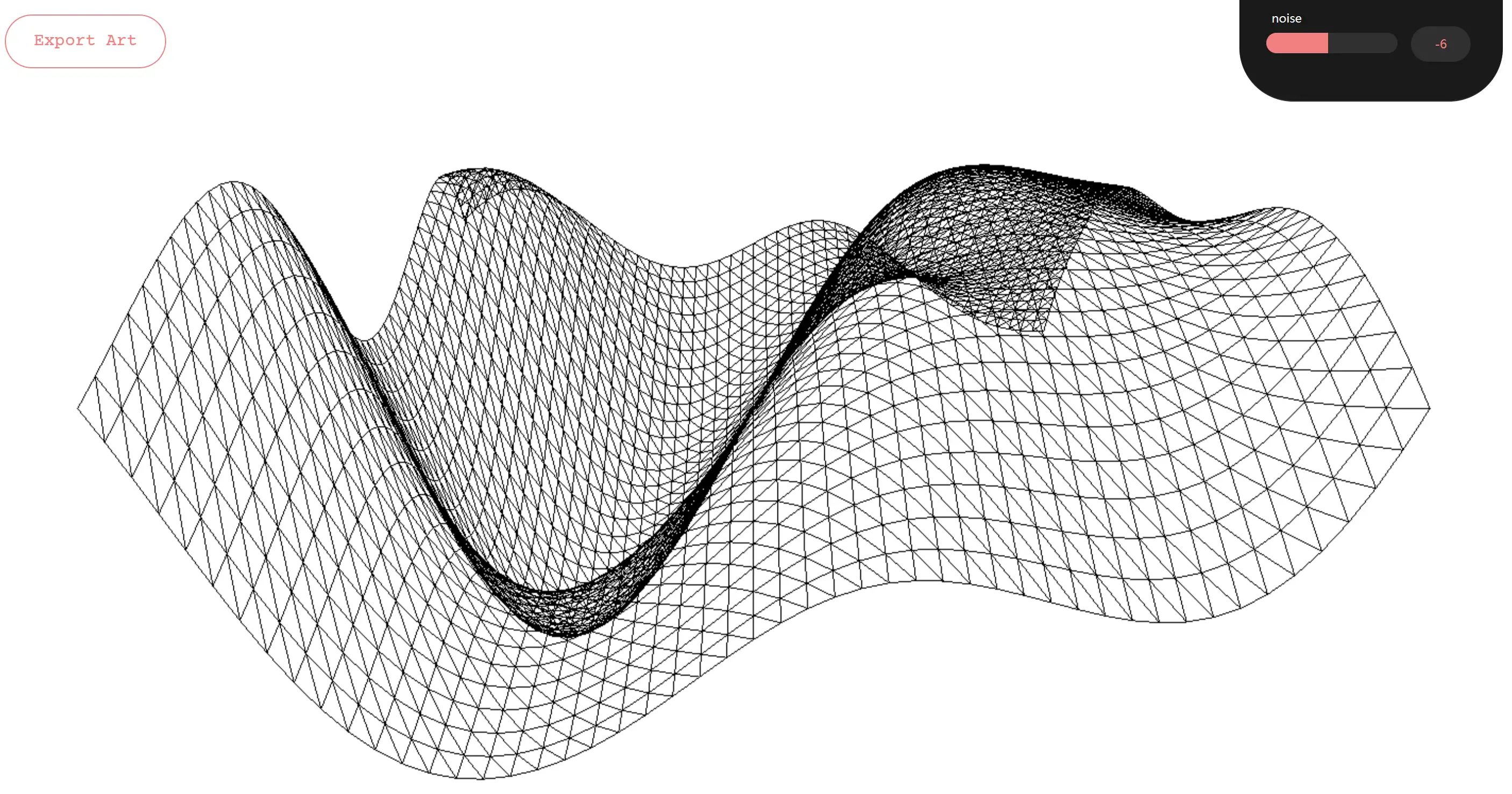
This high-tech experimental web design is not just a website; it’s a creative playground. Users are invited to dive into generative 3D art creation using advanced tools like WebGL, GSAP, and Three.js. With Perlin Noise guiding the shape distortions, this site lets visitors unleash their inner artists and export their creations in JPG format. Built with cross-platform functionality in mind, this experimental web design exemplifies innovation, providing a visually captivating experience on both desktop and mobile. It’s a digital playground that lets you design in style—no sandbox required!
SpaceCloud
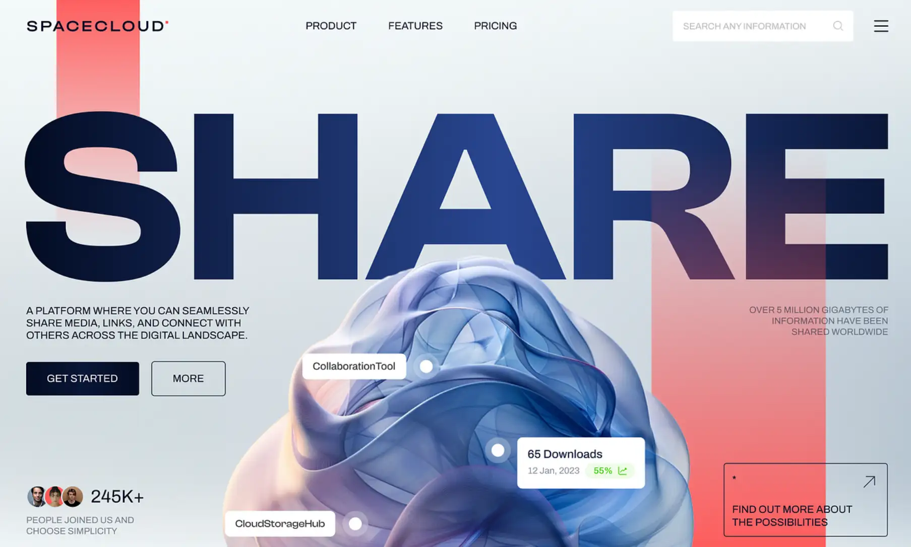
SPACECLOUD’s experimental web design feels like a digital universe crafted from bold typography, harmonious gradients, and intricate, abstract illustrations. This is a tech-savvy haven where data like downloads and user counts sync seamlessly into the interface, offering a blend of style and interactivity. Each visual element is a nod to the brand’s tech-forward identity, while the dynamic real-time data adds a layer of connectivity. This design nails the balance between modern aesthetics and functional tech, making it a stellar example of experimental web design that pulls users into an ever-evolving tech cosmos.
Berg und Luft
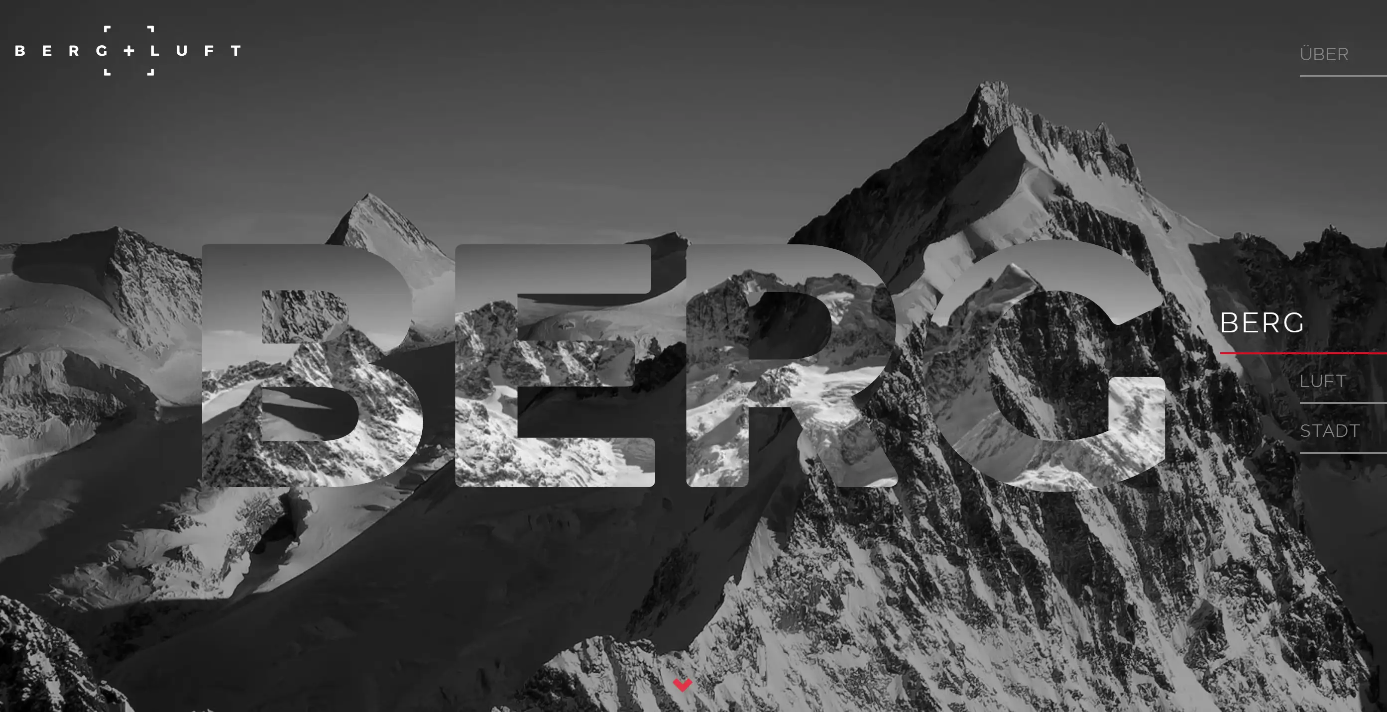
Berg und Luft’s experimental web design presents Marcel Dubacher’s photography with a refined touch. From a custom loader to masked full-screen backgrounds and dynamic GSAP animations, the experience is as visually pleasing as a Swiss mountain view. This design doesn’t overwhelm; it invites users into an elegant journey. Scrolling triggers subtle yet beautiful effects that guide the eye with effortless sophistication. It’s an experimental web design with a heartbeat—slow, deliberate, and fully in sync with the artistic spirit it aims to represent.
Crypto Meme Token Website Design
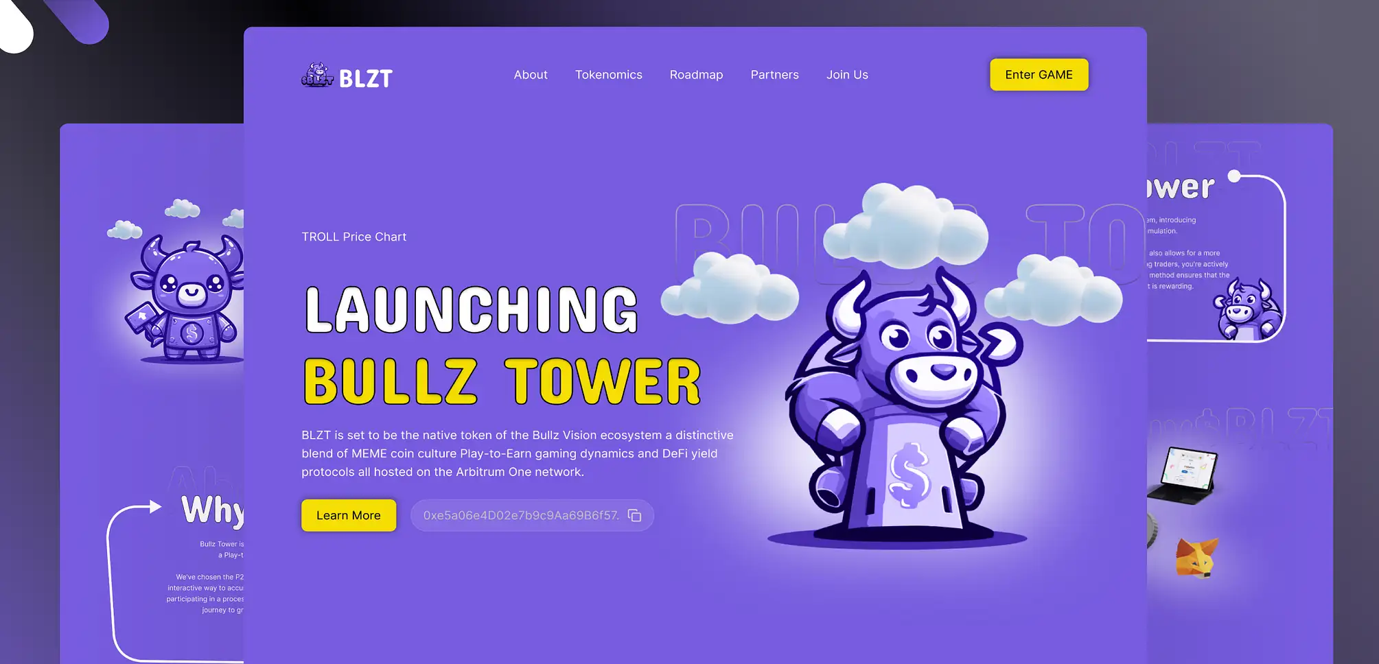
Diving into the world of digital currency can be intimidating, but this experimental web design approaches it with a playful twist. Bathed in a vibrant purple palette and populated with whimsical illustrations, this site feels like an adventure through the crypto cosmos. With interactive animations and a tech-savvy feel, the design manages to have fun without losing professionalism. This is experimental web design at its best: welcoming, immersive, and clever in a way that makes even cryptocurrency feel approachable.
Double Click
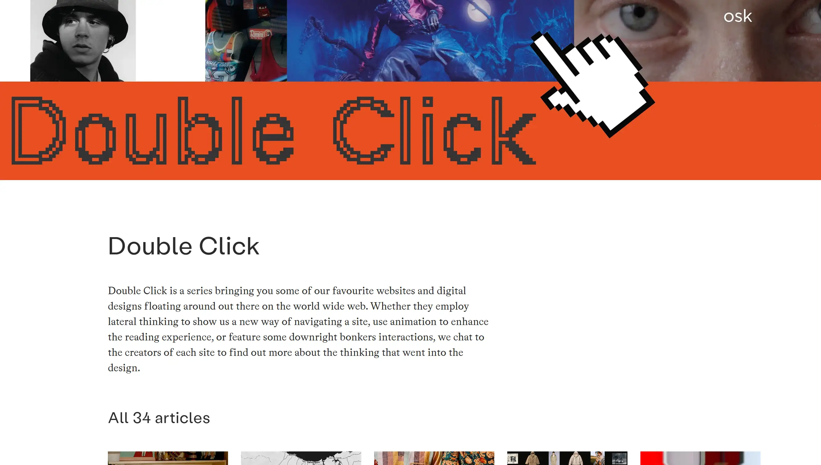
Double Click isn’t just another collection of websites; it’s an experiment in curation and thematic exploration. This experimental web design features a monthly roundup that explores digital design themes, from culinary websites to vintage aesthetics, with insights from top designers. Each page within the series feels like a mini art exhibit. The design captures the spirit of discovery and creativity, showcasing the endless potential of experimental web design to inform and inspire.
Website cover animation
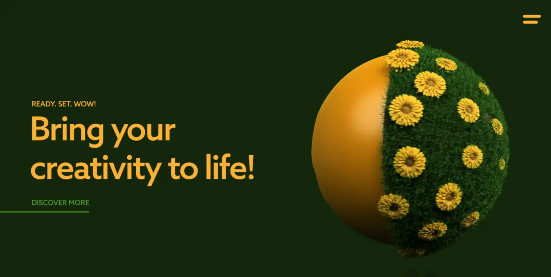
With a monochromatic background and a three-dimensional emoticon, this website is a masterclass in bold minimalism. Typography takes centre stage, with sleek, commanding fonts paired with subtle shadowing around the “DISCOVER MORE” button. This experimental web design strikes a balance between simplicity and depth, creating a sophisticated interface. While its visual allure is undeniable, a touch more interactivity would take the “bring your creativity to life” slogan to new heights, adding an extra layer to this already impressive design.
Iara Grinspun
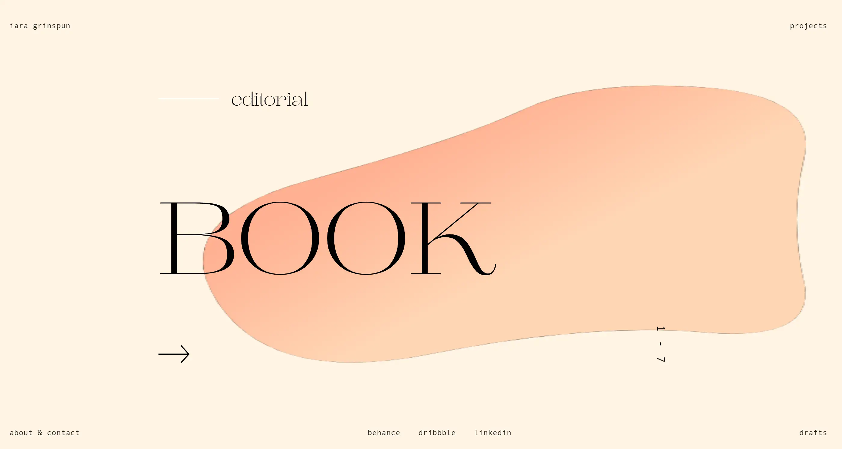
In Iara Grinspun’s portfolio, experimental web design reaches new artistic heights. Instead of relying on images, it draws you in with an abstract moving bubble—an eye-catching centrepiece that dances across the screen. With dynamic GSAP animations and parallax effects, every scroll reveals another layer of Iara’s creativity. It’s an interface brimming with personality, reflecting a unique blend of professionalism and artistic flair. This design doesn’t just showcase Iara’s talent; it immerses visitors in her world, proving that experimental web design can be both personal and polished.
DesignRush
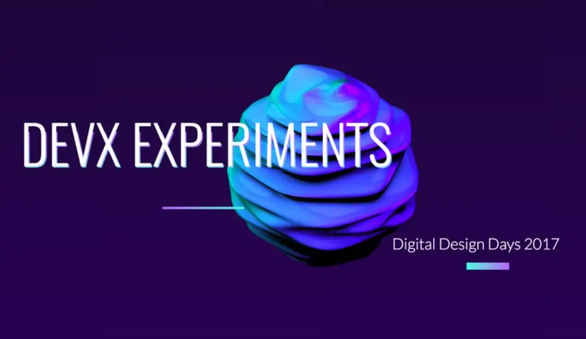
DEVX Experiments is a tribute to the daring and dynamic. Serving as the virtual gateway to the Digital Design Days conference, this site is where rugged innovation meets digital sophistication. Each feature on the homepage introduces the festival’s ethos of unapologetic experimentation. It’s a design that wears its experimental web design badge proudly, drawing digital designers into an inspiring realm where every pixel pulses with potential. The result is a site that doesn’t just communicate a message—it embodies it.
Ozan Akoglu
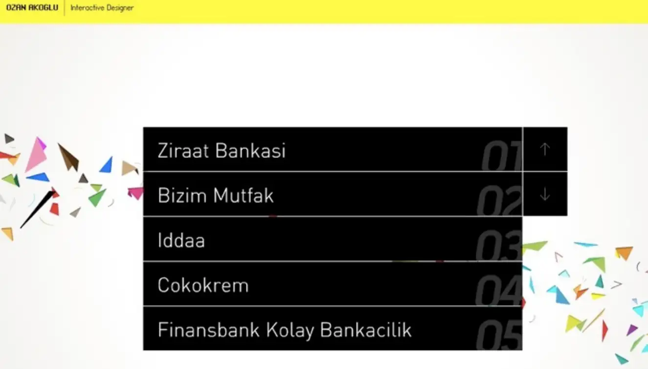
Ozan Akoglu’s portfolio takes simplicity and spins it into something playfully funky. The experimental web design features a collage-like background and a striking yellow header, giving it a fresh aesthetic. But it’s the unique navigation that truly sets this site apart. Through a blend of mouse movements and keyboard inputs, users can seamlessly explore projects and information. Instructions are built right into the interface, making every interaction feel effortless. It’s a quirky yet sophisticated example of experimental web design that proves simple layouts can pack a punch.
Challenges in Experimental Web Design Development
Creating experimental websites brings its own set of challenges. First, it’s the possible tradeoff between creativity and usability. While unconventional layouts are interesting, they can be confusing to visitors used to the standard layout. For eCommerce and services-based websites, this is especially critical, as ease of navigation affects your conversion rates. The key to this is to balance creativity with user-friendliness.
Accessibility is another challenge. However, in many experiments, the unconventional navigation and visual elements they employ may not always be user-friendly for those with assistive technology dependency. A thoughtful experimental web designer will ensure that while the design is novel, it’s also usable for a diverse audience by providing guidance and alternate paths for site navigation.
And then there is performance. It’s common for high-resolution media, 3D graphics, and interactive elements to slow down a site, meaning that SEO and user experience suffer. This can be countered by designers optimizing their content and balancing visual elements with what is required of it performance-wise so that load time on devices and platforms is kept reasonable.
Ready to Experiment with Your Bold Web Design?
The trend of trying new things allows for a world of possibilities when it comes to web design, which is only just beginning to change.
Experimental web design represents the fusion of art and technology, bringing dynamic, interactive, and imaginative elements to life. If you’re inspired to introduce something different to your website, a good rule of thumb is to ensure you don’t forget about the functionality, and that you’re not going too far with innovation. Getting users to stay and getting them to love your content while keeping your site navigable and easy to use is a tricky mix.
If you’re thinking of crafting a memorable digital experience that captivates and converts, this post will answer your questions. Wegic bears witness to a locally developed AI-powered assistant that comes through and helps you with every step of your site creation process, as per your vision. Try out designs that are eye-catching, captivating and alluring.
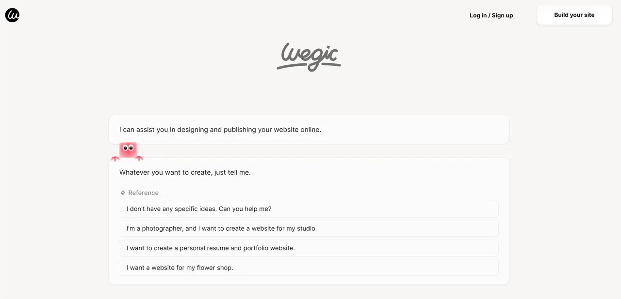
- User-Friendly Brilliance: Wegic is like having a web designer in your pocket. Imagine building a website by simply chatting about your ideas. No tech jargon, no stress. Wegic makes web design so accessible, that even your grandma could create a stunning site for her knitting club.
- Versatile Magic: Whether you're setting up a chic site for your flower shop, a sleek portfolio for your budding photography career, or just a personal portfolio to rant about the latest TV shows, Wegic’s got your back. Its customization options are like a magic wand, turning your wildest web dreams into reality.
- Efficient Sidekick: With three fabulous assistants at its disposal, Wegic ensures every pixel on your site is perfect. It’s like having a superhero team dedicated to making your website shine, minus the capes (but feel free to wear one while you work).
Let’s dive in and kick off the work to make your website a search engine magnet. Remember, the best SEO practices are all about consistency and creativity. Let's make your no-code website shine!
Written by
Kimmy
Published on
Mar 17, 2026
Share article
Read more
Our latest blog
Webpages in a minute, powered by Wegic!
With Wegic, transform your needs into stunning, functional websites with advanced AI
Free trial with Wegic, build your site in a click!