Log in
Build Your Site
Cool Website Design Examples: A Curated List for Designers
Discover a curated list of cool web design websites with stunning visuals. Get inspired by good website design and explore the best website design practices.

Good website design is crucial during the construction of websites. Studies indicate that individuals have made up their minds about whether they love a website after viewing it for 0.05 seconds. A first impression is a factor that determines whether they remain or move on. This article will assist the reader in knowing what constitutes cool web design websites. Basic design rules and rules are going to be discussed, real examples will be viewed, and tools that may help you are going to be proposed.
Click on the image to build a cool website without code! ⬇️

Why Good Website Design is Important?
An attractive website design influences the way users feel, the way they perceive your brand, and the success of your business. People will not abandon a site that is well-designed too soon. It leaves them with the urge to remain and explore. Recent studies reveal that one more second in the time that a page takes to load can result in 7 percent fewer customers purchasing or registering. Also, convenient menus, understandable structure, and non-complicated functions will enable people to be able to get what they want within a short period of time. This will make them happier and trust your site.
In your brand, cool web design websites enhance the memory of your business. Users can be retained to spend 30 percent more time on a site because of cool web design ideas, which are pleasing to the eye and straightforward to use. This implies that they will be more active and make purchases.
Briefly speaking, a site does not serve as a source of information only. It determines whether people will have an opportunity to know more about you, rely on you, or even purchase your products.
10 Cool Web Design Websites Examples to Inspire You
The following 10 cool web design ideas are all different in style and creativity. Their distinguishing features are unique in visual style, typography design, choice of colors, interactive experience, and so on. These cases are worth close consideration, both by those who are novices in web design and by professionals who need inspiration.
Pitch

- Industry: Presentation & SaaS
- Visual style: Bold, modern
- Typography design: Geometric sans-serif, high contrast
- Color matching: Dark base with vibrant accents
- Interactive design: Smooth transitions, modular scrolling
The best website design of Pitch's official website pays great attention to rhythm and visual impact. The foundation of the page consists of the dark colors to induce a calm mood, and the bright purple and green are used next to improve the visual level of the page. In fonts, a strong illustration has been given to the feeling of the sense of technology and clarity by selecting a sans-serif font. Pitch utilizes a lot of modular scrolling, in interactive design. Every block is a slide, convenient to read and helpful to concentrate on the information. Hover effects are used along with scroll-triggered animation to make browsing a fun activity. An official website is, by itself thus a nice kind of demonstration, and therefore, in visiting the official site, a user has a feel of what the product has to offer.
Mubasic

- Industry: Music for kids
- Visual style: Playful, bright
- Typography design: Round sans-serif, soft curves
- Color matching: Pastel tones, cheerful palette
- Interactive design: Micro-interactions, playful cursor
The word that comes to mind in looking at the official website of Mubasic is that it is quite interesting, cute, with childlike. The page is not visually polluted like a bunch of colors instead of leaving a dirty impression, a substantial number of soft colors are used, like pink blue, and cream yellow, rounded fonts, and cartoon illustrations, all of which are quite appropriate to its positioning as a platform of children's music content. The site also takes pains with finer points, like when the mouse is in motion, then it will change to a small cartoon image, which is quite good. A small animation appears when one clicks a button, and that is also delightful. The design is not selfishly aimed towards the so-called high-end feeling, but rather oriented to the emotional needs of consumers, which impresses the parents and children in a more easy-going manner.
Check website design process, click the article: ⬇️
Locomotive

- Industry: Creative Agency
- Visual style: Experimental, immersive
- Typography design: Contrasting weights, editorial feel
- Color matching: Monochrome with occasional bold colors
- Interactive design: Scroll hijack, parallax, kinetic text
The official website of Locomotive is the textbook example of web animation. The page is designed in fa full-screen immersive experience and actively exploits scroll hijacking, parallax animation, and dynamic typography to provide an immersive experience. The scrolling of the page is not an ordinary switching up-down effect, but as it is viewing a video, the powerful rhythm and the clear sense of the dynamics can be approached. In terms of typography, the official website incorporates the style of magazine typography. The main visual uses a bold font with great tension, while the subtitle uses a more refined thin font to adjust the rhythm. This strong style recognition is unforgettable, and it is a high degree of unity between visual communication and technical implementation.
Monday
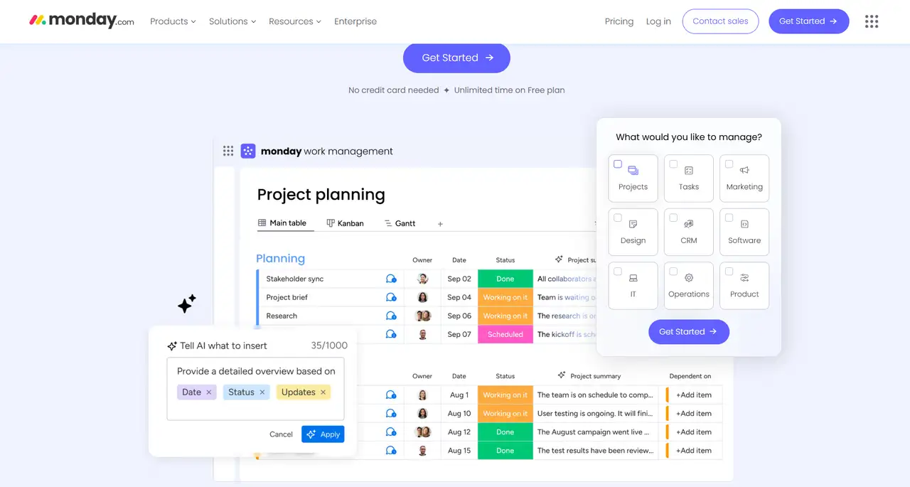
website design has indeed accomplished the goal of watching and actual use - Industry: Productivity SaaS
- Visual style: Clean, business-oriented
- Typography design: Legible sans-serif, consistent sizing
- Color matching: Bright primaries, lots of white space
- Interactive design: Embedded UI demos, scroll guides
Monday's official website focuses on "efficiency and clarity". The color of the page is predominantly white with high saturation of red, yellow, and blue as the primary colors, and this is very recognizable. And the whole page layout is well understandable, and practically each paragraph is composed of a short title and a practical demonstration. The font is neutral and enduring in order to have a good presentation on all devices. On interaction, the thing on Monday to remember is that there will be an abundance of embedded product demonstrations. The page enables the users to view the instructions on how to use the tool without the need to click on the page to jump, and it has indeed accomplished the goal of watching and actual use, and highly enhances the efficiency of the user in acquiring the knowledge .instructions
Moo

- Industry: Printing & Branding
- Visual style: Sophisticated, brand-centric
- Typography design: Modern serif + sans-serif
- Color matching: Soft tones, lots of white
- Interactive design: Hover effects, product animation
Moo is a firm that offers personalized printed materials to brands. This good website design is very elegant, modest, and of paramount importance is the textural detail. The trademarks rest more or less on off-white and light grey, denoting the gentleness and professional demeanor of the brand. The format combines serif and sans serif texts to create a delicate and flowing reading perception. An example is micro-animation that portrays the product display, which, when scrolling to the case, will automatically enlarge and expand, offering a wish-fulfilling experience, or a method called the tactile experience. Regarding the general visual, the site of Moo does not make any attempts to impress its visitors with beautiful animations, instead conveying brand importance with the help of structure and style.
Humaan

- Industry: Digital Agency
- Visual style: Clean, confident
- Typography design: Strong sans-serif, modular scale
- Color matching: Muted tones, bold highlights
- Interactive design: Hover states, animated transitions
Humaan is a digital product agency, and the best website design pays much attention to the so-called professional aura. The main color range is a quiet series of gray-blue with a bit of bright color as the emphasis, and the general rhythm is strong and steady. The style of layout is modular, and the information is demonstrated in a logical and well-organized way. Regarding interaction, when hovering the button, a slight animation will appear, and the change of the pages, in turn, is provided by the appearance of the fade-in and fade-out effects, and the process will be natural and comfortable. Especially in the "Project Display" section, each case uses a minimum of text with animated pictures or demonstrations to quickly convey the project's strength, which is very suitable for brands that emphasize ability.
Aesop

- Industry: Skincare & Cosmetics
- Visual style: Minimalist, editorial
- Typography design: Serif-focused, poetic rhythm
- Color matching: Earth tones, monochrome
- Interactive design: Fluid motion, elegant scrolling
The official site of Aesop can be even called a rather quiet experience. It does not follow the high contrast and button-based design of the majority of commercial websites and instead, we try to express the philosophical attitude of the brand using the minimalist structure, natural colors, and beautiful fonts. The page scrolls slowly and the content fills the page like reading a paper book. It is not too loud and tremulous and that is exactly the kind of frame its skin care products deserve. Aesop does not rush one into buying, but rather narrates the stories with the use of design, and forms a strong bond with the users with the help of rhythm, blank spaces, and temperament.
Burberry

- Industry: Luxury Fashion
- Visual style: Bold, cinematic
- Typography design: Strong serif, headline-driven
- Color matching: Monochrome with high contrast
- Interactive design: Fullscreen video, scroll animation
The official site of Burberry is a graphic sensation. Large-scale videos and photographic images prevail on the page, and the website font type is a large serif font, which is highly dramatic. The choice of colors is extremely modest, with black, white, and gray as the background color, which contributes to getting the impression of high-end. The best thing about it is the interaction, the video, the text, and the animation will fade one by one like a catwalk, and with a lot of rhythm during the scrolling process. Even when you are not acquainted with the brand, you will be strictly impressed by its good website design. This is a quite applicable brand-story building style with the use of pictures and format, which other high-end brands could consider and adopt.
Active Theory

- Industry: Creative Agency / Digital Experience
- Visual style: Futuristic, immersive 3D visuals
- Typography design: Bold sans-serif fonts, high contrast
- Color matching: Dark backgrounds with neon highlights
- Interactive design: WebGL animations, cursor-responsive effects, smooth transitions
Active Theory is a creative agency that was masterful in the creation of immersive digital experiences. They borrow some futuristic 3D graphics, a dark background, and neon, which immediately attracts the attention of their visitors to the site. The font is strong and with the latest trends and fashion, so that the information in it is well-defined and readable. Regarding interaction, WebGL technology is applied to realize the complicated animation effect, and pages interact in real time when the user moves his or her mouse, and this is very smooth and very interesting. The overall interactive website design not only demonstrates their technical strength, but also provides users with a dual enjoyment of vision and touch, perfectly interpreting the possibilities of modern cutting-edge digital creativity.
Superlist

- Industry: Productivity / Task Management Software
- Visual style: Clean, organized, modern minimalism
- Typography design: Simple sans-serif fonts, balanced hierarchy
- Color matching: Soft pastel palette with occasional bold accents
- Interactive design: Intuitive drag-and-drop, smooth animations, subtle hover effects
Superlist's best website design is based on a minimalist style, emphasizing clear and orderly content arrangement and user experience. The overall color adopts soft pastels, with a small amount of eye-catching colors, making the visual effect warm and professional. The font selection is simple and well-structured, helping users to quickly grasp the key points. In terms of interactive design, it supports intuitive drag and drop functions and delicate animation effects to enhance users' sense of control over task management. The website makes people feel relaxed and efficient, which fits the concept of "making work simple" of its product, and is a model of productivity tool website design.
Essential Tips for Cool Web Design Websites
When designing cool web design websites, inspiration alone is far from enough. A truly "useful and good-looking" website is often the result of careful polishing in details, structure, and user paths. The following are some cool web design ideas from actual projects:
Click on the image to design a cool website with AI! ⬇️

Image by Istock
- Focus on the content of the website. Cool web design ideas are not "beautification" but "structured presentation". First, clarify the content goals, and then consider how to design and arrange them.
- Pay attention to the rhythm of the page. Don't pile up information all at once. Make the user's browsing experience smoother through white space, module segmentation, and motion control.
- Be strategic with fonts and colors. There should not be too many fonts (it is recommended to control within 2 types), and it is recommended to set a "primary color + secondary color" system for colors to maintain a unified style.
- Don't make the interaction too complicated. Motion effects and interactions should serve the function. Keeping it natural and predictable is the basis, and cool does not mean obscure.
- Test the experience on multiple devices. Make sure it can be displayed well on mobile phones, tablets, and PCs. Responsive design is not only a technical issue, but also part of the design decision.
- Cool web design websites should be equipped with very clear guidance. Whether it is a button, jump path, or product CTA setting, it should be concise and clear.
Wegic: Best Website Design Tool
As a top website design tool, Wegic accurately solves the various pain points encountered by designers and creators in the process of cool web design websites building. It not only breaks the limitations of traditional design tools, allowing users to achieve highly personalized and visually impactful designs, but also makes creation more efficient and free.
Accurate and flexible visual customization
Traditional website design tools often use fixed layouts. Designers can only make small changes within these set frames. This makes the final work look similar and not very creative. Wegic changes this. It lets users freely adjust every part of the design. They can change colors, layouts, animations, and small details. This ensures the website matches the brand’s style or personal taste perfectly. The result is a unique design that avoids looking like everything else.

Smooth design process
Wegic puts users first and makes every step easy to understand. Even beginners can use it without trouble. The layout is clean and makes sense, so designers can focus on being creative instead of dealing with hard steps. The platform has three smart AI helpers. They help with building websites, designing, and managing. Users can change designs fast by moving parts around or talking to the AI helper. This makes designing quicker and more flexible. Users can fine-tune small details like text, spacing, colors, shadows, and moving effects. This helps them make pro-level, top-quality websites. When people visit these sites, they immediately notice the special style and strong brand feel.

Adapt to responsive design
Nowadays, websites are accessed on a variety of devices. Designers need to think about more than just computers. They must also plan for phones and tablets. Wegic has responsive designs, that change layouts and sizes to fit each device. This meansthe site will look good everywhere. Designers don't have to keep fixing it for each device.

Efficient collaborative management
In teamwork, giving feedback and changing designs often takes too much time. Wegic provides multi-site management capabilities. Designers, developers, and clients can share designs right away. They can quickly get opinions and make changes. This makes talking to each other easier.
Conclusion
In today's digital age, a well-designed and distinctive website is the key to stand out for businesses and personal brands. By observing these cool web design websites, we can clearly see that website design is a bridge to communicate with users. Traditional website design tools have many bottlenecks in personalization, efficiency, and collaboration. If you want to create a recognizable website, you might as well try Wegic, a design tool that does not require code. From capturing inspiration to interactive implementation, from sketching to official release, everything can be quickly advanced.
Written by
Kimmy
Published on
Mar 17, 2026
Share article
Read more
Our latest blog
Webpages in a minute, powered by Wegic!
With Wegic, transform your needs into stunning, functional websites with advanced AI
Free trial with Wegic, build your site in a click!
What kind of website do you want to build?