Log in
Build Your Site
17 Top Interactive Websites You Must See in 2025
Discover 17 top interactive websites in 2025 that push the boundaries of design and user experience. Get inspired to create your own immersive web experiences.
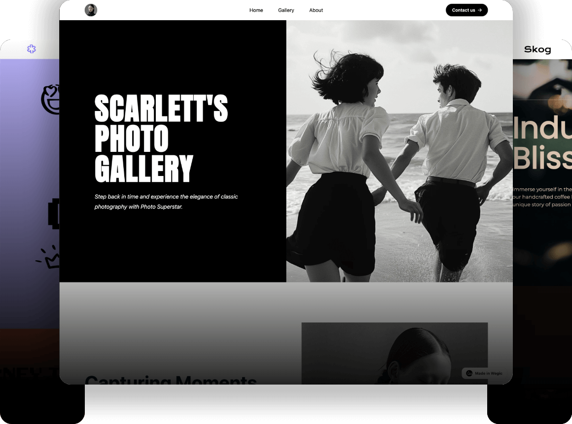
In 2025, interactive websites have become essential for captivating user attention and enhancing the overall experience.
As web design evolves, interactivity is no longer just a feature but a crucial element that drives user engagement and satisfaction. Interactive elements like immersive animations, VR/AR integrations, and dynamic content create more engaging and memorable experiences, keeping users connected and invested in what they encounter online.
As Steve Jobs once said, "Innovation distinguishes between a leader and a follower." This article will showcase 17 inspiring examples of interactive websites across various audiences, including innovative designs for kids, to illustrate how embracing these trends can elevate your web presence and captivate diverse users.

What Makes a Website Interactive?
Definition of Interactive Websites
Instead of only showing static material, an interactive website actively engages viewers with dynamic components that react to their activities. By allowing users to interact in two ways—clicking, scrolling, and other means—these websites foster a more dynamic and engaging user experience.
Key Features of Interactive Websites
Animations
-
Eye-catching animations that respond to user interaction, such as hover effects or animated transitions, keep visitors engaged and add a sense of fluidity to navigation.
Scrolling Effects
-
Parallax scrolling, infinite scroll, and other visual effects triggered by user scroll movements create a dynamic and visually appealing experience.
User Inputs
-
Forms, quizzes, and clickable elements that let users contribute or control what they see enhance engagement by giving visitors an active role.
Interactive Media
-
Videos, slideshows, and interactive infographics enable users to explore content at their own pace, making the experience more personalized.
Benefits of Interactive Design
User Retention
-
Interactive websites are more engaging, encouraging visitors to stay longer, explore more content, and return for future visits.
-
By allowing users to interact with content in meaningful ways, interactive design provides a more enjoyable and intuitive user experience.
Better Conversion Rates
-
The immersive experience of interactive sites can guide users through specific journeys, leading to higher conversion rates by making navigation and calls to action more impactful.
Top 17 Interactive Website Examples
1. AngelList
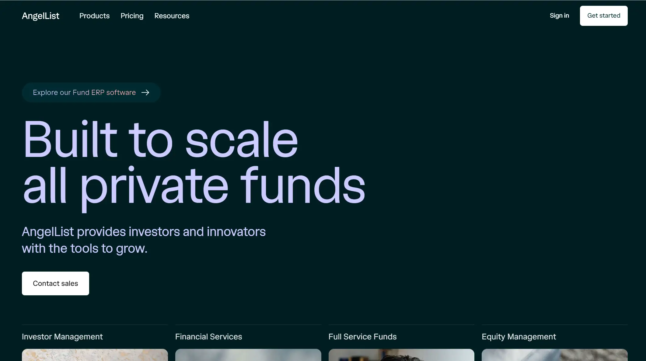
Say goodbye to dull, static tables! This interactive website flips the traditional investor platform on its head with a sleek, modern design that invites easy exploration. AngelList's 2023 Year in Review is more than just a recap—it’s an engaging digital space crafted for both investors and entrepreneurs.
What sets AngelList apart is its focus on user experience, not just in how it looks but in how it functions. The website is built to encourage meaningful interactions between investors and entrepreneurs, providing a dynamic platform where innovative ideas can connect with the necessary resources.
Feature Highlight: One standout feature of this site is its interactive layout, which transforms financial data into an engaging experience, making it easier for users to dive into key insights.
2. Cyclemon
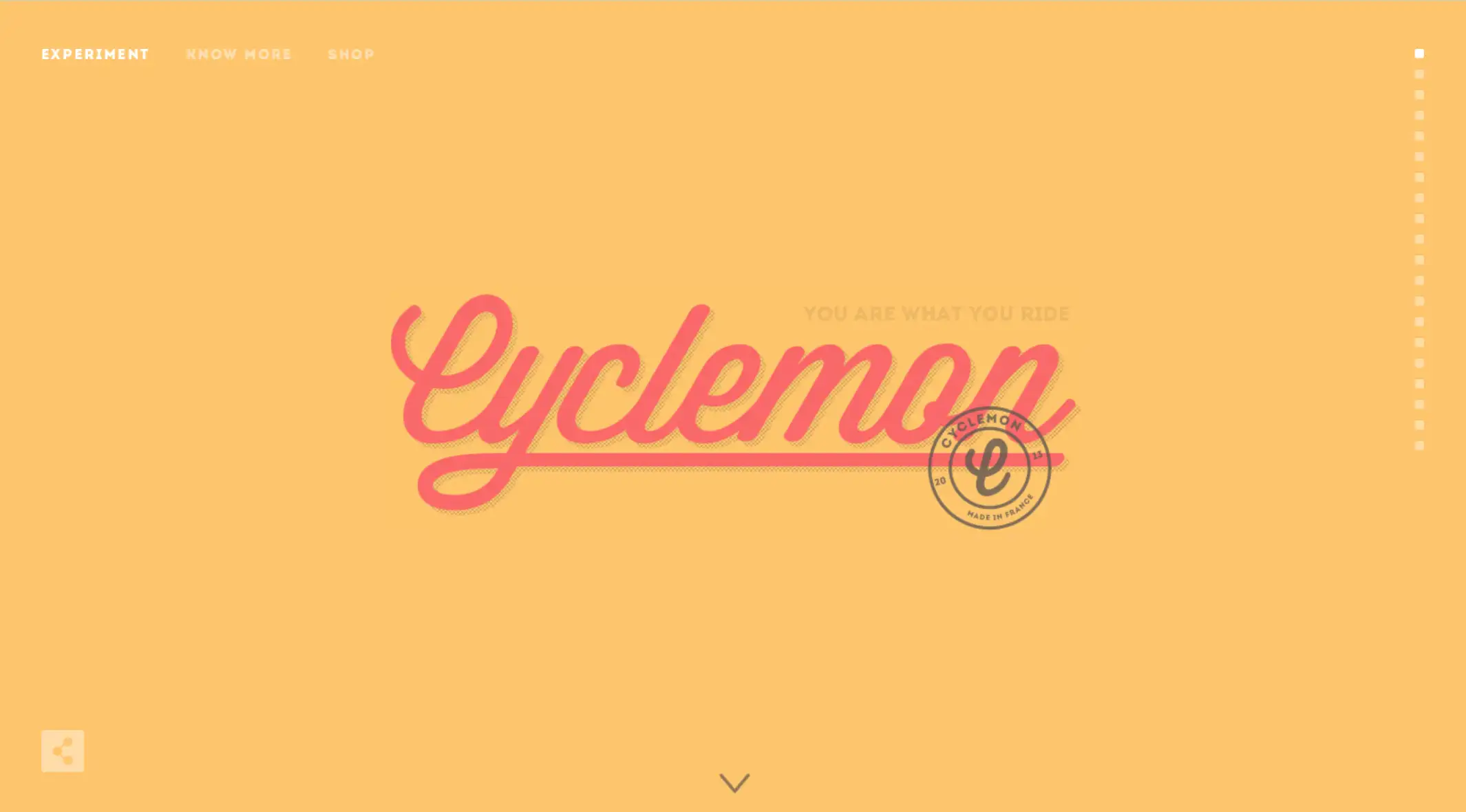
Cyclemon is a top-tier example of interactive web design. This French masterpiece takes users on a visual journey, using parallax scrolling to showcase various bicycles, each representing a unique rider persona. As you scroll, you’ll discover a traveler bike framed by a stunning mountain landscape or a hipster fixie cruising past a vibrant café scene.
What makes Cyclemon truly engaging is how it turns simple bike browsing into an immersive experience, with each style tied to a narrative that feels alive through its smooth transitions and visual storytelling.
Feature Highlight: The use of parallax scrolling creates a dynamic experience, blending movement with storytelling, making every scroll feel like part of a journey.
3. Victoire Douy

Victoire Douy, a leading French figure in illustration and interactive design, revolutionizes the conventional portfolio with a fresh approach. Her website, also one of the best interactive website, transforms into a vibrant artistic display, where every scroll reveals a ballet of subtle animations—text leaps playfully, and a closer examination uncovers a realm of gentle undulations and whimsical movements.
The site features a charming detail: each project is linked to the page by a string that animates on hover. This delicate touch reflects Douy’s meticulous craftsmanship, emphasizing that even the smallest elements are thoughtfully integrated. The result is not just a showcase of her work but an immersive experience that offers a deep glimpse into Douy’s creative spirit.
Feature Highlight: The interactive string element that animates on hover adds a unique and personal touch, enhancing the user’s connection to each project.
4. Eamonn Day
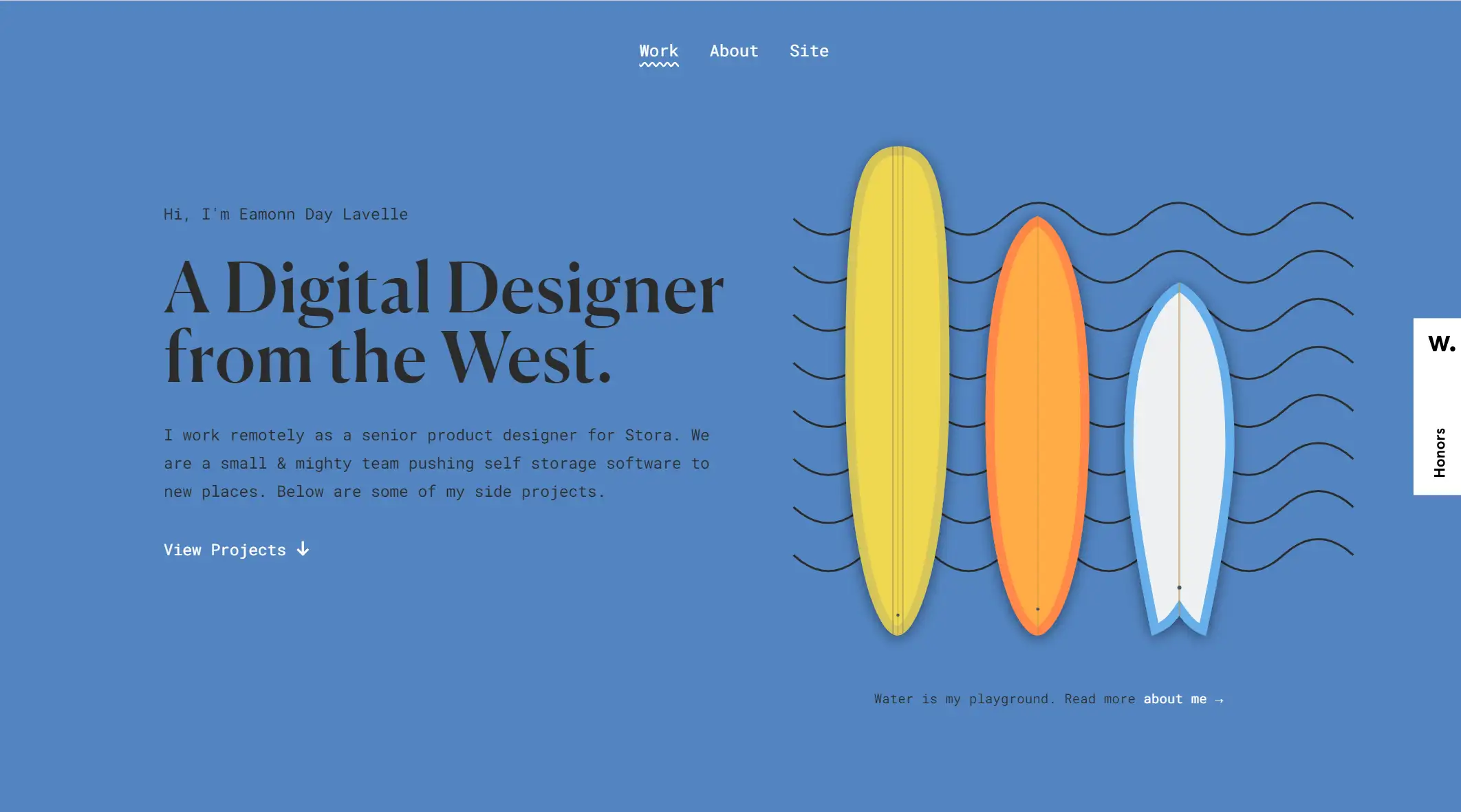
Eamonn Day Lavelle’s portfolio, inspired by surf culture, stands out as one of our top picks. The site exudes a relaxed, surf-inspired vibe that captures attention from the moment you click on "View Projects." The transition is so seamless, it feels like catching a perfect wave in Waikiki.
Navigating through the site takes you to detailed project pages that follow with equal smoothness, providing a clear and organized flow of information.
Feature Highlight: The fluid scrolling effect from the main page to individual projects mirrors the effortless glide of a wave, enhancing the overall surfing experience of the portfolio.
5. Violet
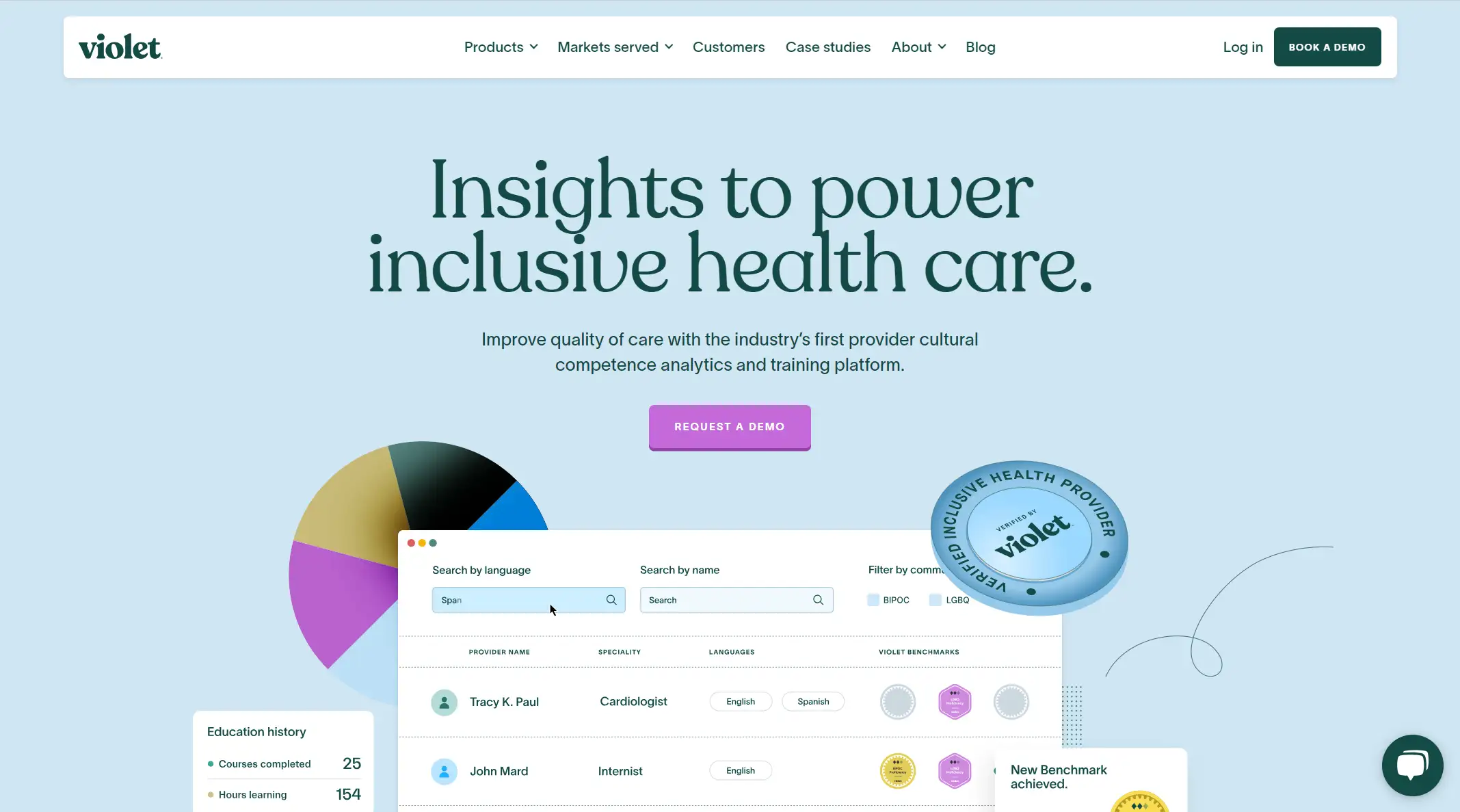
Say goodbye to bland white backdrops and impersonal fonts! Violet’s website brings inclusive healthcare design to life with a burst of vibrant colors and playful visuals. This UX masterpiece captivates users with bold typography and lively illustrations, making each scroll an engaging experience.
Dynamic animations and interactive features, such as rotating graphics, shifting backgrounds, and icons that expand on hover, turn the website into a captivating narrative.
Feature Highlight: The interactive icons that grow on hover add an engaging touch, making the user experience as dynamic and personalized as the inclusive care Violet aims to provide.
6. Tarot-o-bot
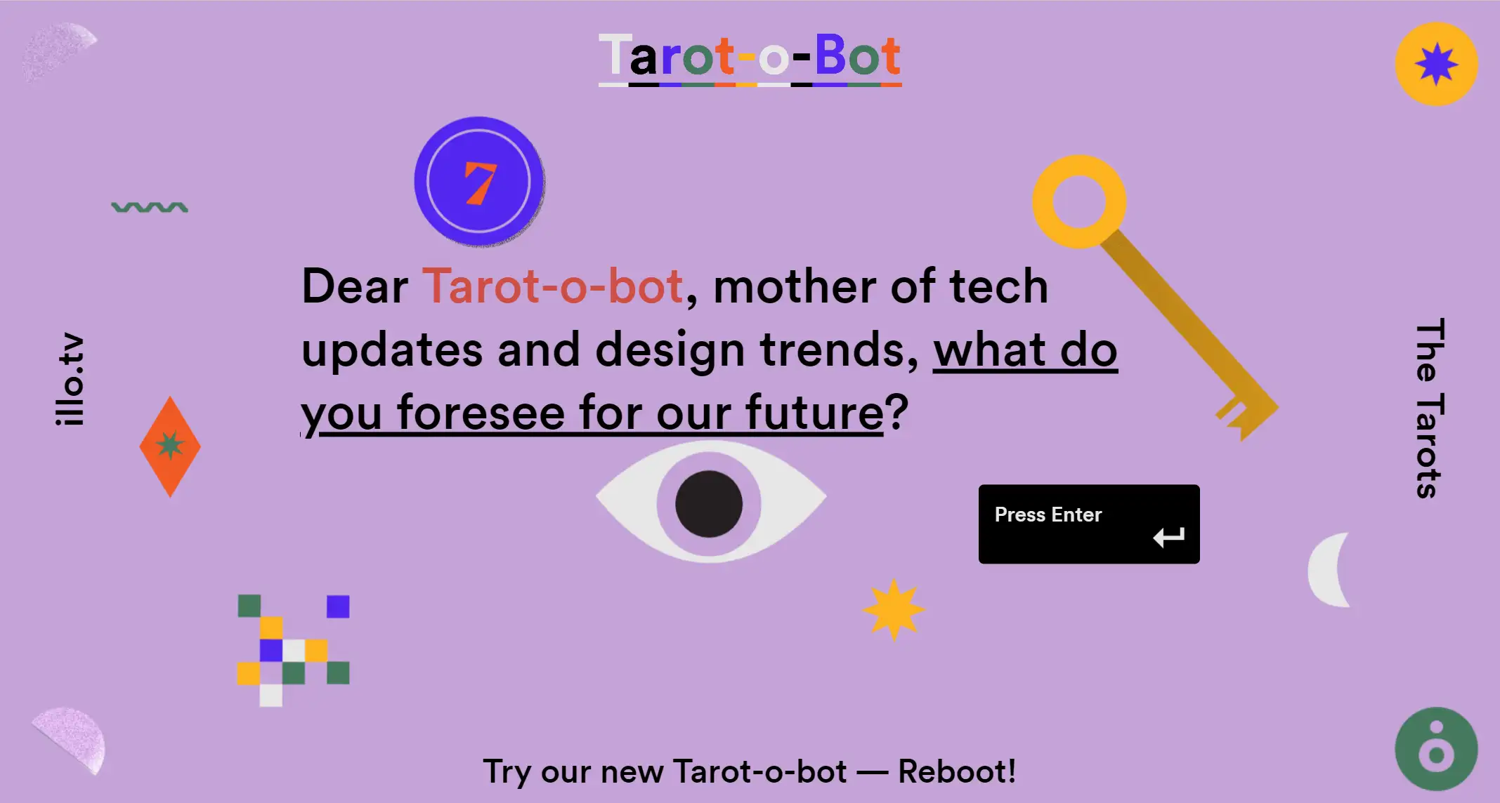
Say goodbye to traditional fortune-telling tools—Illo’s Tarot-o-Bot offers a fun, modern twist on predicting the future of creativity! Designed to celebrate the studio's 7th anniversary, this interactive website is a lively blend of color, animation, and symbolism, featuring eyeballs, keys, and lucky number sevens in honor of the occasion.
Once you press enter (or click the button), the Tarot-o-Bot opens its doors, presenting three mysterious cards. But before revealing your future, the site invites you to pause, reflect, and consider your aspirations.
Each card flip reveals a playful prediction related to design, art, technology, or the creative world at large.
Feature Highlight: The interactive card-flipping feature adds a layer of anticipation, making the experience both engaging and a showcase of Illo’s creative ingenuity.
7. Delve Architects
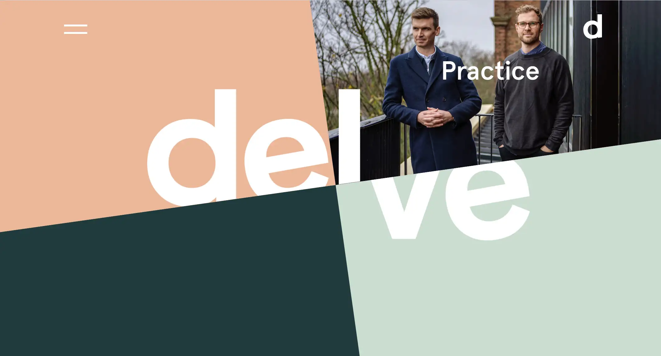
Delve Architects, a London firm, brings a fun and approachable vibe to their work, and their website perfectly reflects this ethos. With gentle pastel tones and an engaging, interactive homepage, the site offers a warm and inviting experience. Rather than using a conventional menu, users can click on vibrant blocks that reveal images and sections, guiding them through the firm’s projects, design philosophy, and contact information.
Feature Highlight: The colorful block navigation offers a unique and visually engaging way for visitors to explore the site, making it both intuitive and playful.
8. Oggy
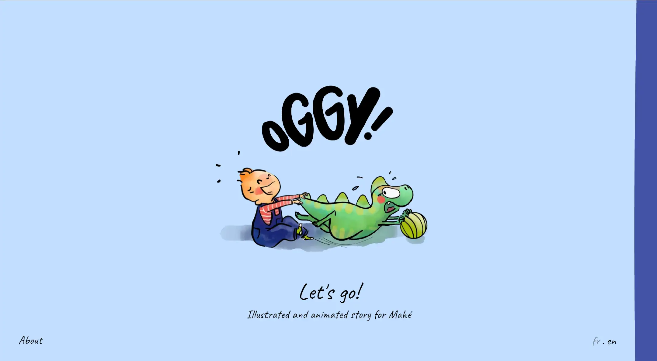
"Oggy," an animated and illustrated tale by Donatelle Liens and Willy Brauner, invites users to experience the world through the eyes of a baby as his dinosaur companion, Oggy, gradually drifts from the center of his life.
With each turn of the page, a new piece of the story is revealed, gently exploring the themes of change and personal growth. As the child grows, his relationship with Oggy subtly evolves. This interactive format goes beyond static visuals, making the story of Oggy come to life with every click or scroll.
Feature Highlight: The evolving interaction between the baby and Oggy provides an emotional journey, enriching the storytelling with dynamic engagement at every step.
9. An Interesting Day
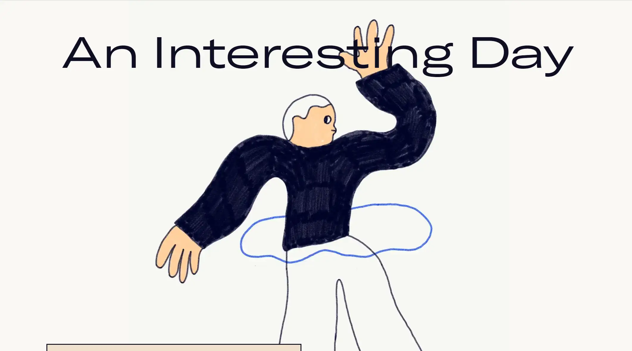
The page offers a playful, interactive color slider and provides quick access to essential details, such as links to the host's site, past events, and contact information. Everything is conveniently available on one screen, eliminating the need for any scrolling.
Feature Highlight: The interactive color slider adds a fun, engaging element, enhancing user interaction while keeping all information easily accessible.
10. Zwift
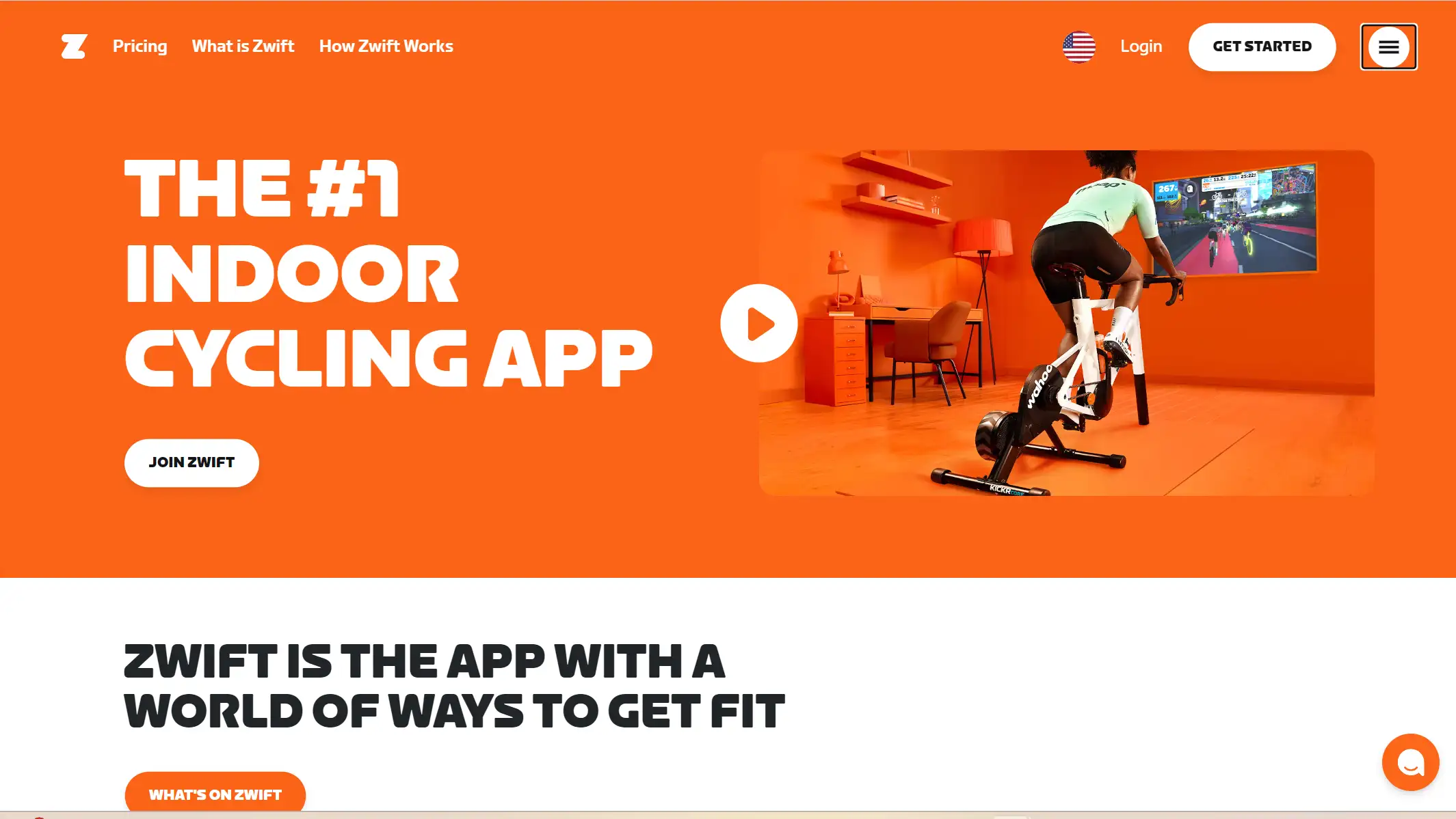
Zwift is a cycling training app designed for users to train from home while connecting with cyclists worldwide.
On the site where users can download the app, interactive previews showcase the in-app simulation, allowing potential users to experience the variety of workouts Zwift offers. Check out our article to dive deeper into game UI design.
Feature Highlight: The interactive previews provide a glimpse of the app's workout experience, making it easier for users to envision their training sessions with Zwift.
11. i-Spy
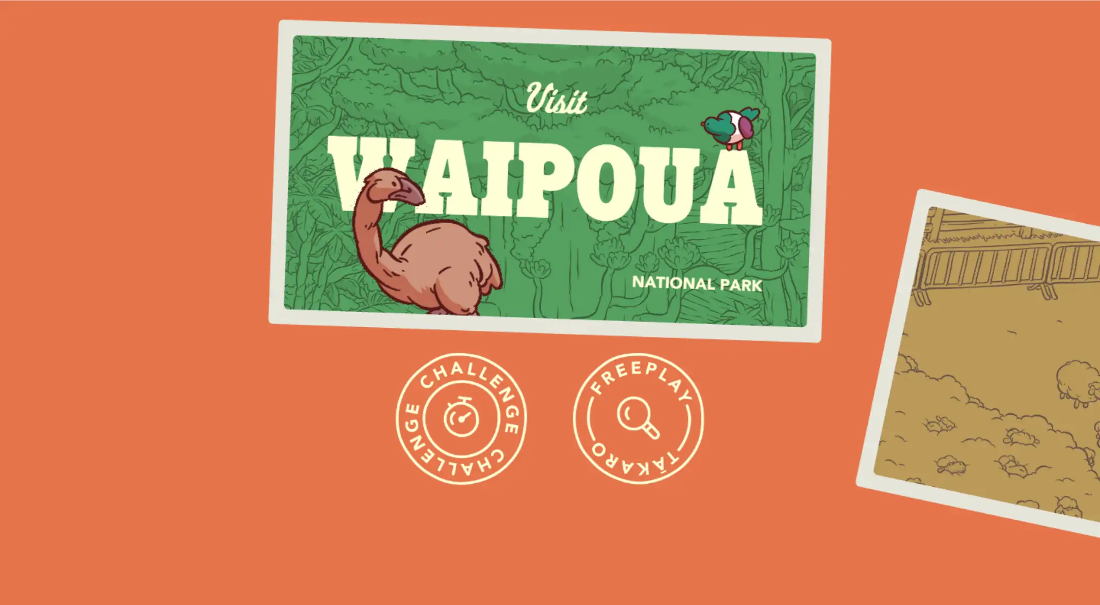
Attention UX designers interested in gamifying education! Heihei, a children’s app from Television New Zealand, is a fantastic model with its engaging i-Spy game. This interactive adventure takes kids through five unique New Zealand destinations, from the vast Waipoua Forest to the vibrant streets of Wellington’s Cuba Street. Smooth gameplay is ensured with easy-to-use mouse controls and a helpful target list.
But the excitement doesn’t end there. After each session, players receive interesting facts about the location, reinforcing the educational value.
Feature Highlight: The reward of location-specific fun facts ensures that children leave with both enjoyment and newfound knowledge.
12. Dreamfactory
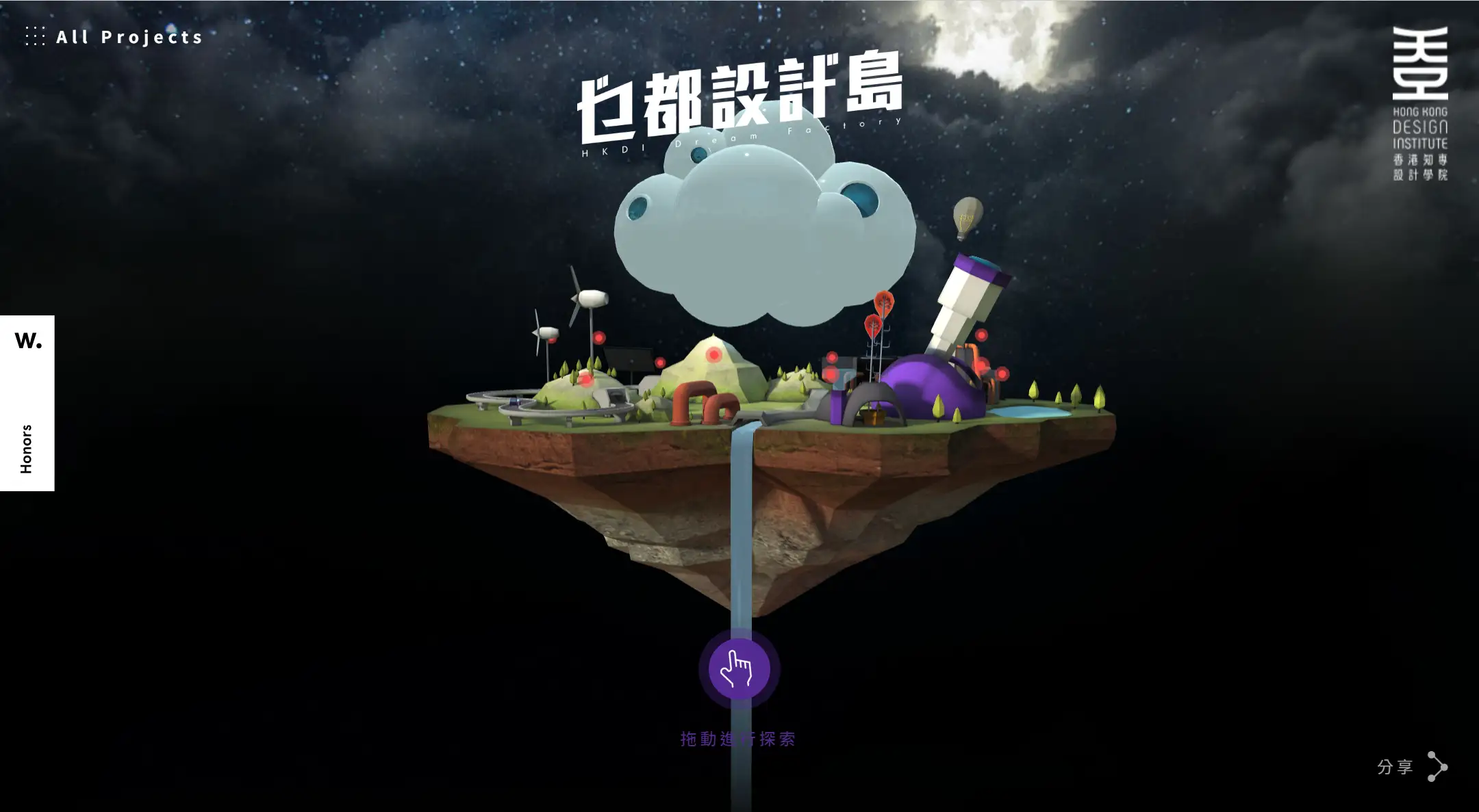
HKDI’s Dream Factory offers an incredible platform that draws inspiration from everyday items to ignite your creative spark. Created by HKDI students, alumni, and faculty, this virtual environment invites users to explore DIY design kits and interactive games right on the site. By zooming in on images, much like using a telescope, users can click on highlighted sections (typically marked with a red circle) and be transported to detailed project pages, complete with clear instructions and downloadable materials.
Feature Highlight: The zoom-in feature adds a fun, immersive element, making it easy for users to dive into projects with accessible resources.
13. Salt & Pepper
Salt & Pepper specializes in providing consulting, development, and technical assistance for Ruby on Rails programming.
The homepage showcases a clean, responsive design, using a consistent black-and-white color palette. Paired with bold, blocky fonts, this minimalist aesthetic enhances readability, allowing visitors to quickly navigate the site's features and find the support they need without hassle.
Feature Highlight: The monochromatic design paired with large fonts makes navigating the site straightforward, ensuring users can easily access relevant information.
14. Artificialia
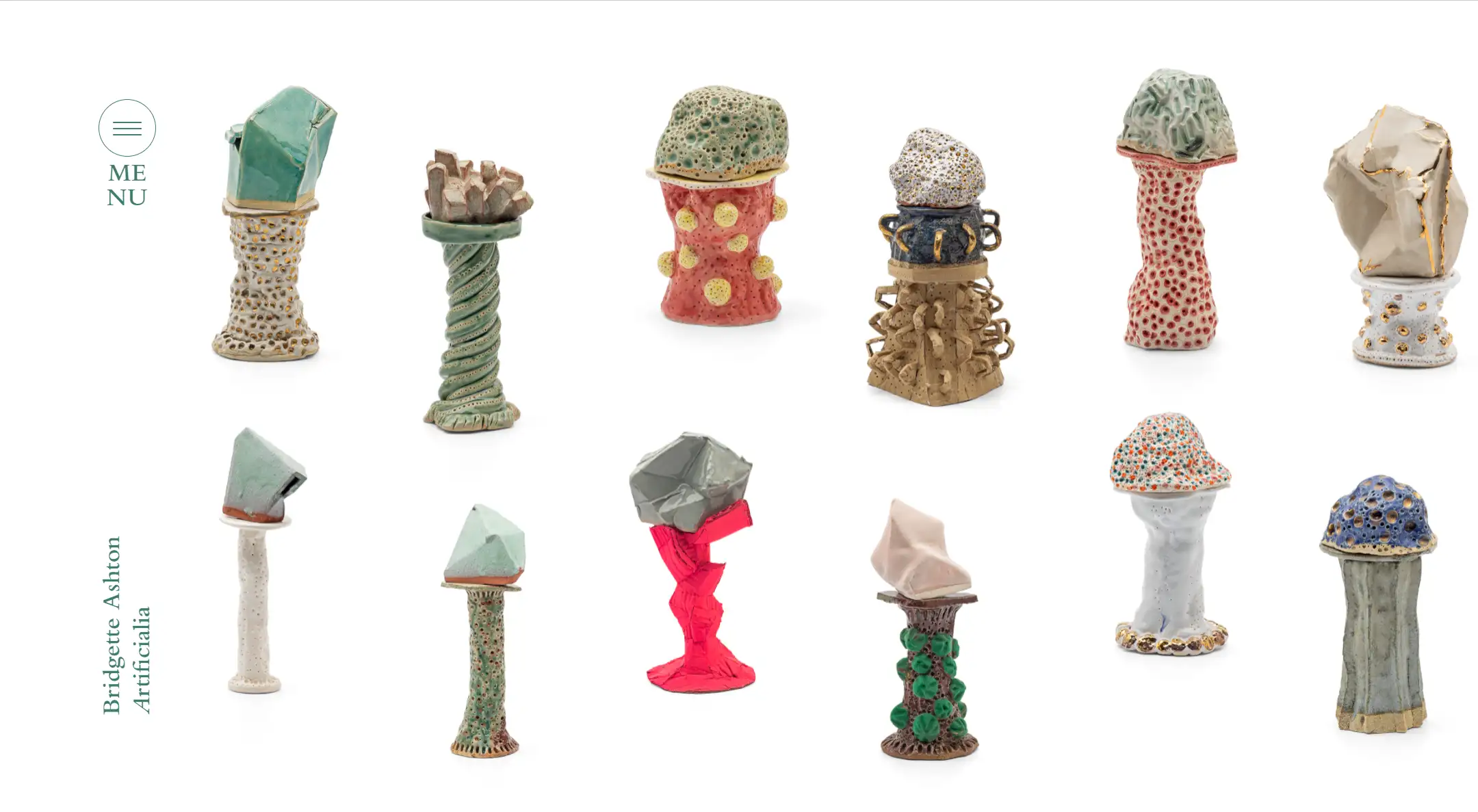
Bridgette Ashton’s Artificialia features an online gallery that invites users to dive into the unique and fascinating world of her ceramics. This interactive format lets visitors uncover the fine details of each piece at their leisure. The gallery’s unconventional design aligns perfectly with Ashton’s distinctive artistic style, blending eccentricity with elegance.
Feature Highlight: The user-driven exploration offers a personal experience, allowing visitors to appreciate the intricacies of Ashton’s ceramics in a setting that enhances the art's unconventional charm.
15. Telefónica
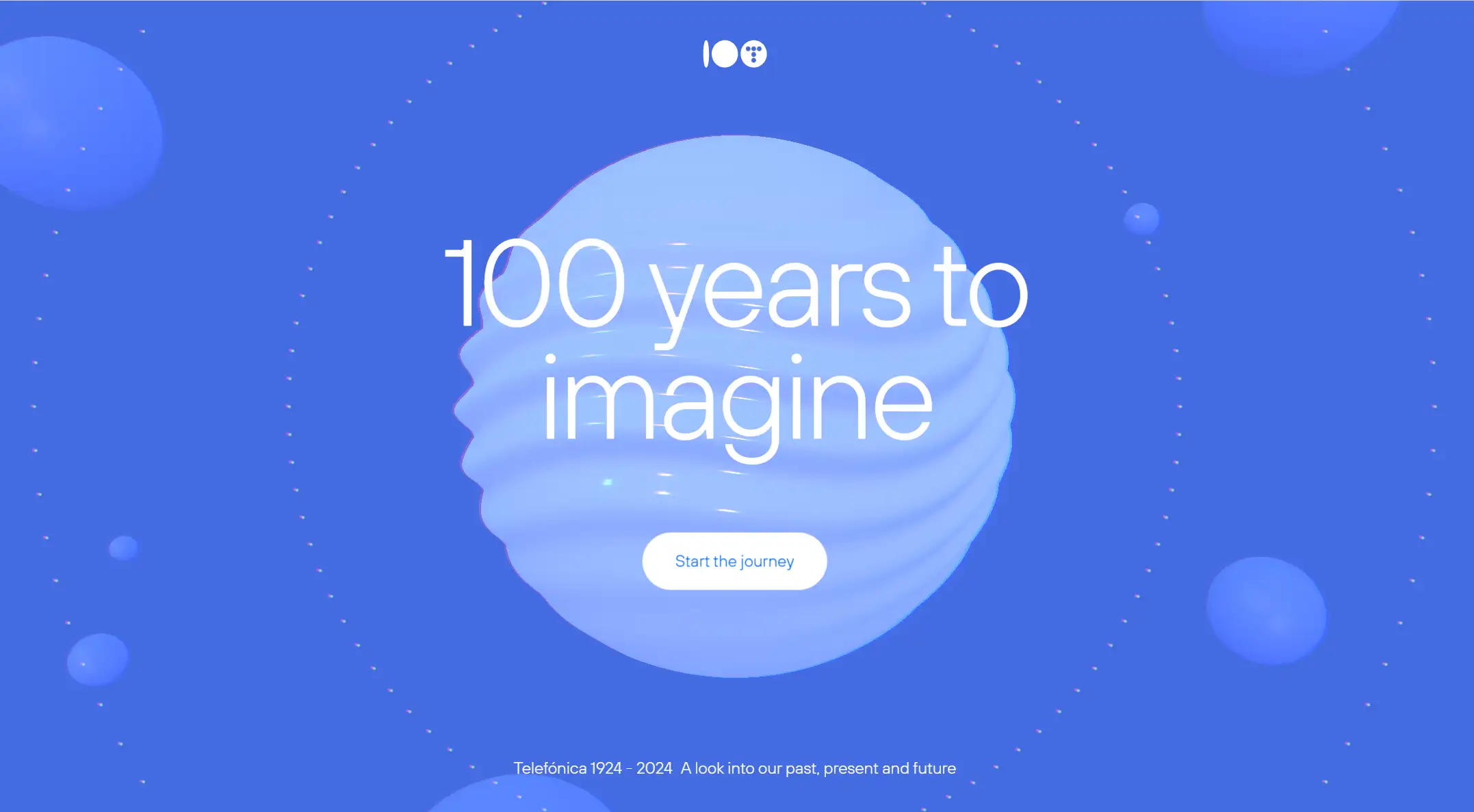
Telefónica’s centennial interactive timeline stands out as a top example of engaging web design. This immersive site celebrates the essence of human connection, central to Telefónica’s mission. The modern, minimalist design invites exploration, and the subtle background music enhances the overall experience, encouraging visitors to continue their journey through the timeline.
Feature Highlight: The background music adds an atmospheric touch, enriching the interactive experience and inviting users to stay engaged with the content.
16. Kanak Naturals
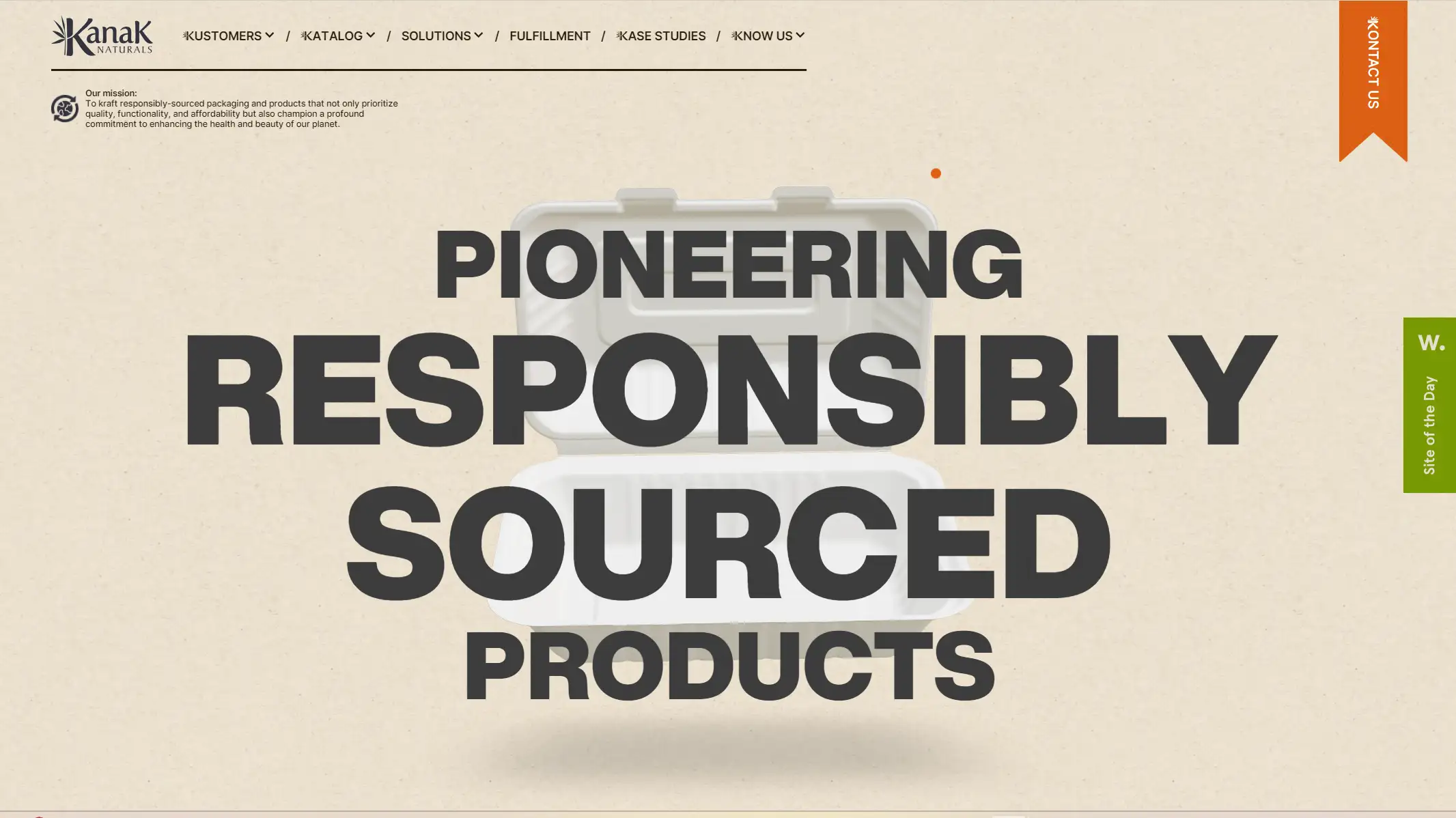
Kanak Naturals’ website goes beyond mere words to deliver a truly engaging experience. As you navigate through the site, a whimsical paper bowl—reflective of their eco-friendly dinnerware—leads you through the narrative and mission of Kanak Naturals. This award-winning interactive design masterfully combines playful engagement with informative content, making it an essential visit for UX designers and prospective partners. It’s a standout example for those who value inventive and sustainable design.
Feature Highlight: The interactive paper bowl that guides users adds a creative touch, enhancing both the engagement and storytelling aspects of the website.
17. (Un) trafficked
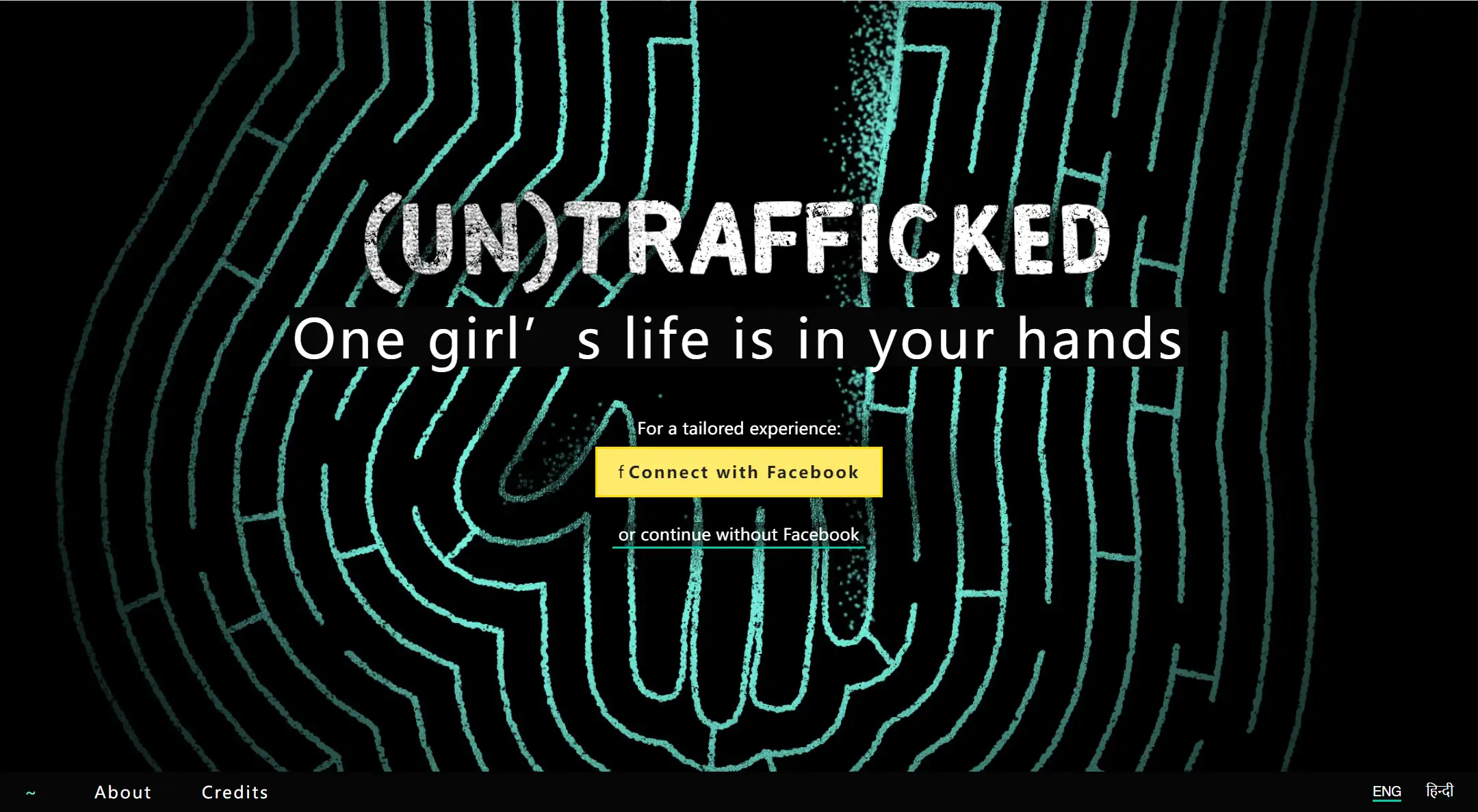
Forget passive browsing—(UN)TRAFFICKED immerses you directly into the heart of a pressing social issue through an impactful interactive narrative. This website addresses child trafficking in India by allowing users to experience the harrowing decisions of a 13-year-old girl.
The interactive, choose-your-own-adventure format enables you to influence her fate, with the emotional depth heightened by a poignant soundtrack and real-time statistics that anchor the story in reality. Beyond storytelling, (UN)TRAFFICKED motivates users to make a difference by signing a pledge and sharing their experience, harnessing the power of the web for meaningful change.
Feature Highlight: The real-time statistics enhance the narrative’s impact, providing a grounding effect that deepens user engagement and understanding of the issue.
Key Design Trends for Interactive Websites in 2025
Interactive websites in 2025 are evolving with new design trends that prioritize immersive user experiences:
VR/AR Integration
-
Websites are using Virtual and Augmented Reality to create immersive experiences. For example, IKEA’s AR feature lets users visualize furniture in their homes, enhancing the shopping experience.
3D Elements
-
3D visuals are becoming standard on websites, adding depth and interactivity. Nike’s product pages showcase rotating 3D models of their shoes, allowing users to engage with products more dynamically.
AI-Powered Personalization
-
AI is tailoring websites in real-time based on user behavior. Spotify’s homepage, for instance, adjusts recommendations based on listening habits, providing a personalized experience for each visitor.
Interactive Storytelling
-
Websites like (UN)TRAFFICKED we've talked about use choose-your-own-adventure formats to engage users, putting them in control of the narrative while raising awareness about important social issues.
Embracing Interactive Website Design Trends on Wegic
Click below to try your top-notch conversational AI-assisted website-building tool👇
Wegic, the AI-powered website builder, is revolutionizing how we embrace the latest interactive design trends. With its chat-and-build features and built-in support for immersive elements like 3D visuals, motion effects, and personalized user journeys, Wegic allows designers to easily integrate cutting-edge trends into their website design.
Whether you're looking to create an interactive product demo or add dynamic content that reacts to user inputs, Wegic provides the features needed to craft modern, engaging websites that stand out in 2025.
Follow up and take a look at how Wegic works! For a more detailed guide, check here.
How to Use Wegic?
Getting along well with Wegic is a breeze—just head to the website and sign up using Google for a quick and easy registration. Once you're logged in, you'll be greeted by a friendly mascot whose eyes follow your cursor, adding a touch of fun to the experience.
To kick things off, simply click on "Create new website" and explore the various sample site options available. Input your site’s title, theme, and language, then confirm your choices to get the ball rolling.
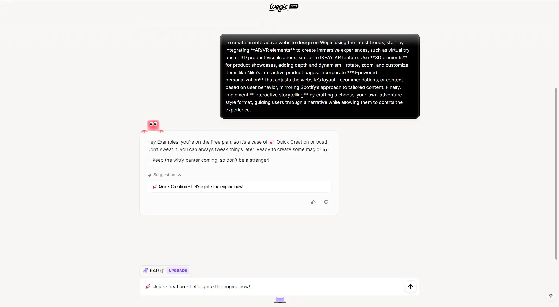
As Wegic works its magic to build your site, you can keep an eye on the progress and make any text changes as needed. When everything looks perfect, adjust your site’s status and hit "Publish" to make it live.
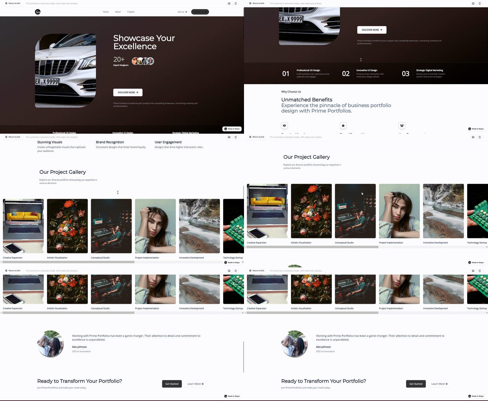
Wegic offers three pricing plans: a Free plan with 70 monthly credits for up to three new sites, a Starter plan at $39.90 per month, and a Premium plan at $69.90 per month, with a 20% discount if you pay annually. Enjoy creating your site with Wegic—it’s that simple!
Kick off Your Interactive Website Design Ideas Now!
Having explored the latest trends and inspiring examples in interactive website design, you're now ready to transform your ideas into reality. Interactive design is more than just a trend; it's an opportunity to create engaging and memorable user experiences that truly resonate.
Check More Articles:
Written by
Kimmy
Published on
Mar 17, 2026
Share article
Read more
Our latest blog
Webpages in a minute, powered by Wegic!
With Wegic, transform your needs into stunning, functional websites with advanced AI
Free trial with Wegic, build your site in a click!
