Log in
Build Your Site
12 Inspiring Parallax Scrolling Website Examples (Updated 2025)
Discover 12 inspiring parallax web examples that showcase the power of parallax scrolling in web design. Learn why this dynamic effect enhances user experience and how to create your stunning parallax website.

Have you ever navigated to a particular site’s homepage, then all of a sudden, you get fixated on the design? It is ‘soft’, ‘absorbing’, and most of all it is ‘addictive’. Well said my friend, that is the beauty of parallax scrolling. Even if you do not know what it is, it is not surprising, seeing that we are still unfamiliar with it to this very day. Many people are familiar with parallax web design, but few know its specifics or what makes one glued to the screen. The good news? Parallax scrolling is about demonstrating to you the precise reason why it can make your simple site stunning.

Now, getting into this guide, you will find out some of the best parallax web examples which will present you with the edge of web design. Whether you’re an inquisitive designer, an everyday businessman or woman, or one of those individuals out there wondering how you can make your site special, these examples will enlighten you. What you are seeing here is not code, since you can see that most of these parallax web examples came from simple website builders, and anybody can create something so amazing with it.
By the end of this article, you will not only understand what parallax scrolling is, but you will also be able to observe the impact of these parallax web examples on the ability to attract visitors’ attention and enhance the site design. Ready to get inspired? Now, let’s go over some of the best examples of parallax web designs that are sure to inspire the next project.
What is Parallax Scrolling?
Picture this: Let me explain; you are just browsing through a website, and then unexpectedly, the background of the website moves slower than the foreground – a cool effect which makes the site seem to come to life. This seems like something you could pull out of a magician’s hat, does it not? Well, that is what parallax scrolling does in actuality; it is kind of adding a pinch of magic to the web design.
Parallax scrolling is a well-liked web design effect, but what does this term even mean? In layman’s terms, it is an animation technique where various levels of content travel with varying speeds on a single web page as the user scrolls down. Think of it like this: The elements nearer to the viewer (foreground) move toward and away faster and the elements away from the viewer (background) move only more slowly. It gives your two-dimensional site the impression that it pops out and brings so much depth to it. As much as I would like this to be the end of my article, let me present to you some Parallax Web examples so that you can see for yourself the utilization of this effect. Such examples can transform a usual website into a site full of eye-poppers that are associated with various mega CW4 reactions at every scroll. Considering you are playing a video game and the background scrolls and moves in a different manner to give the impression that you are in an actual 3D world. That’s the same idea but instead of doing it for the entire country, you’re doing it for your website.
This design technique was developed based on the concept of animation and games, which came into use as early as the 1980s. This technology was first employed to create depth in 2D video games to enhance the overall features of gaming. Moving forward several years, you can find parallax scrolling as an element of modern web design and bringing the same magical feeling to your cyberspace.
To sum it up, parallax scrolling is one aspect that makes your site unique and interesting. Even though it is presented as a way to draw people’s attention to the fact that you look cool, it makes practical sense if you want to bring in the audience and make your content more dynamic. Thus, when you are twiddling your fingers and scrolling through parallax web example, the following tip comes across, do not forget that the technique you are observing is as cute as it is efficient.
Why Parallax Scrolling Works Effectively in Website Design
Alright, let’s get real. What makes most of the parallax scrolling designs effective on websites? Suppose you are at a social gathering and there is a person, who is a Disc Jockey and he knows how to manipulate the lighting. The lights go out, the music starts, and in a moment, all the attention is focused. This is where parallax scrolling comes in, to elaborate, whereas a physical party and DJ provide the music to a specific physical location, parallax scrolling draws the internet-based party or event to the website implemented by the web design.
- Enhanced User Experience
Parallax web examples prove exactly how this technique gets eyeballs. Due to the creation of multiple layers of content, parallax scrolling provides your website visitors with the feeling that they are interacting with something rather than just having a bunch of pages. It is a comparison between a two-dimensional photo that does not protrude and a three-dimensional movie that has very good movements. Having gone through the sample, the users can experience the feeling of depth and movement, which entices them to discover more.
- Taps into Kinesthetic Perception
There is one primary reason why parallax scrolling is effective: it interferes with people’s kinesthetic perception. Parallax scrolling is when the graphics on a computer screen move faster than the object closer to the user when compared to the objects far away from the user just like objects in the real world. It is a bit of an optical illusion that I feel makes sense and brings the feel of cutting to the surface. It is also worthwhile to consider their qualitative comparison; One may think about it as a kind of interaction when you walk through a beautiful park; Everything in the foreground goes past the observer rapidly, and the reverse is true for the objects in the distance.
- Effective Storytelling and Content Presentation
These are examples of parallax web applied to storytelling to show how this technique can be effective. Scrolling as a feature enables you to take users through sequential and hierarchical content at varying rates. This makes matters that are complicated in their nature easier to comprehend and so much fun. Here, it is easy to envision a product page where descriptions regarding features and utilities are embedded, such that as the user scrolls, they come across these details. It is the process of watching a movie but with no social facilitator and a touch of cool graphics.
- Highlighting Key Information and Hierarchy
In addition to the advantages characteristic of scrolling techniques, parallax scrolling can contribute to the generation of hierarchical layouts and the attraction of the viewers’ attention to certain details. Here, the authors also described that by using speeds for grasping and moving background and foreground elements, it becomes possible to make respective crucial sections of the screen stand out. It is like giving your best stories, or calls-to-action, the kind of light that highlights them to the best.
Also, the existence of parallax web examples demonstrates that this phenomenon is not just a simple and exciting show-off but a useful and efficient tool to improve users’ experience. When done correctly, it helps users to remember your site and engage down to a deeper level. It’s the design equivalent of adding a touch of magic that makes everything seem a bit more engaging and fun.
Therefore, parallax scrolling is not only about seeming cool, which it is. It is about improving the overall user experience strategy and making the content more accessible, as well as giving the visitor an engaging tour of your website. So, when you’re exploring parallax web examples, remember that what you see is true interactive web design, where depth and motion are but the first signs of what is yet to come.
12 Inspiring Parallax Web Examples (Updated 2025)
1. Custo.io
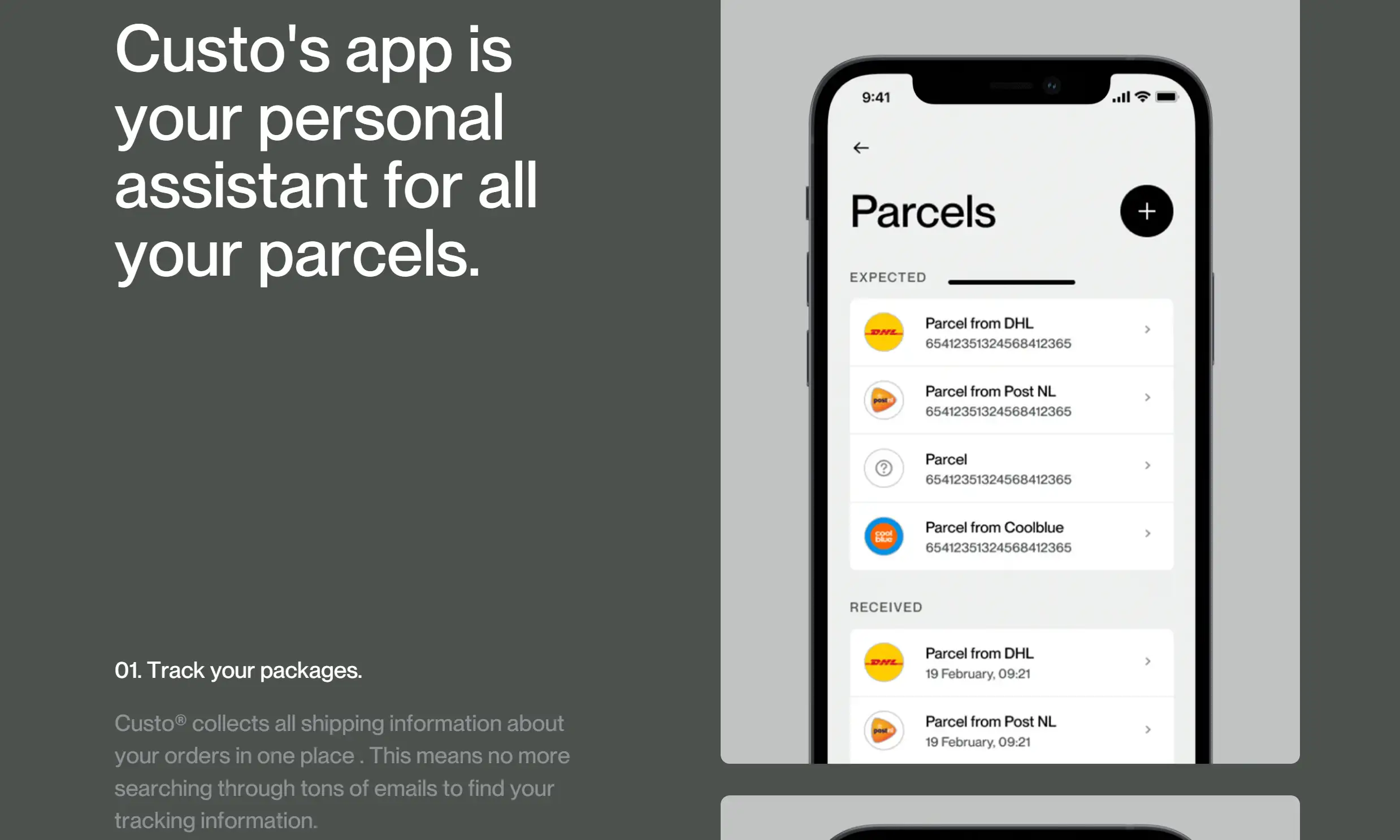
Custo offers a masterclass in parallax web examples by elegantly displaying a smart mailbox product. The movement on this website may be subtle, but it’s oh-so-effective. The gentle scrolling gives an air of sophistication and technological prowess. On the left-hand side, you get visual insights into the product’s app, while the right side treats you to a breakdown of its features. It’s a perfect setup—like a digital dance between form and function, ensuring users absorb exactly what the site’s creators intended.
2. Tatort Ruhrpott
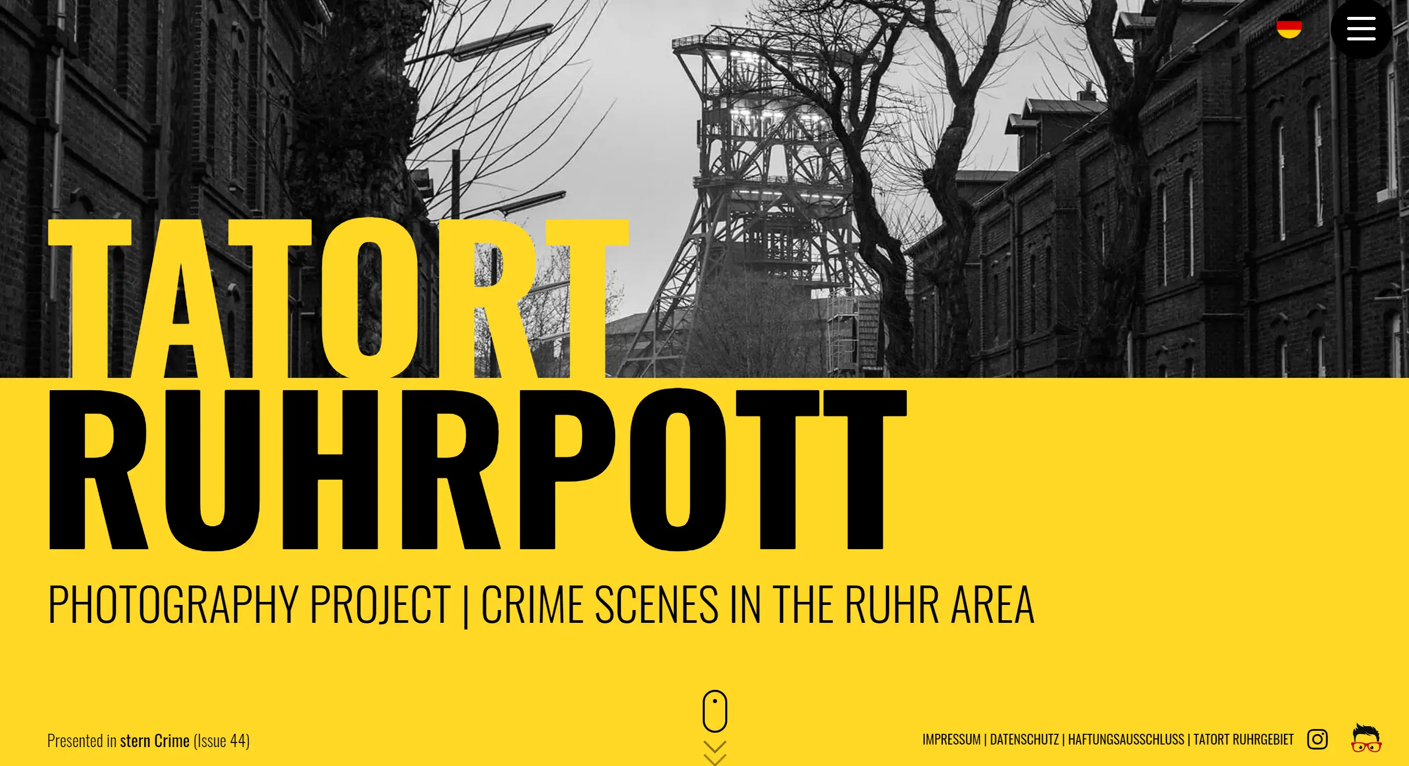
Imagine diving into the depths of a shadowy metropolis, where crime, disasters, and untold stories live. This parallax web example plunges visitors into the raw intensity of urban life in Germany. The minimal scrolling gives a noir-like depth to the visuals, creating a haunting and immersive experience. It's a dark, but striking display of how parallax effects can bring storytelling to life, one grim frame at a time.
3. Unfold
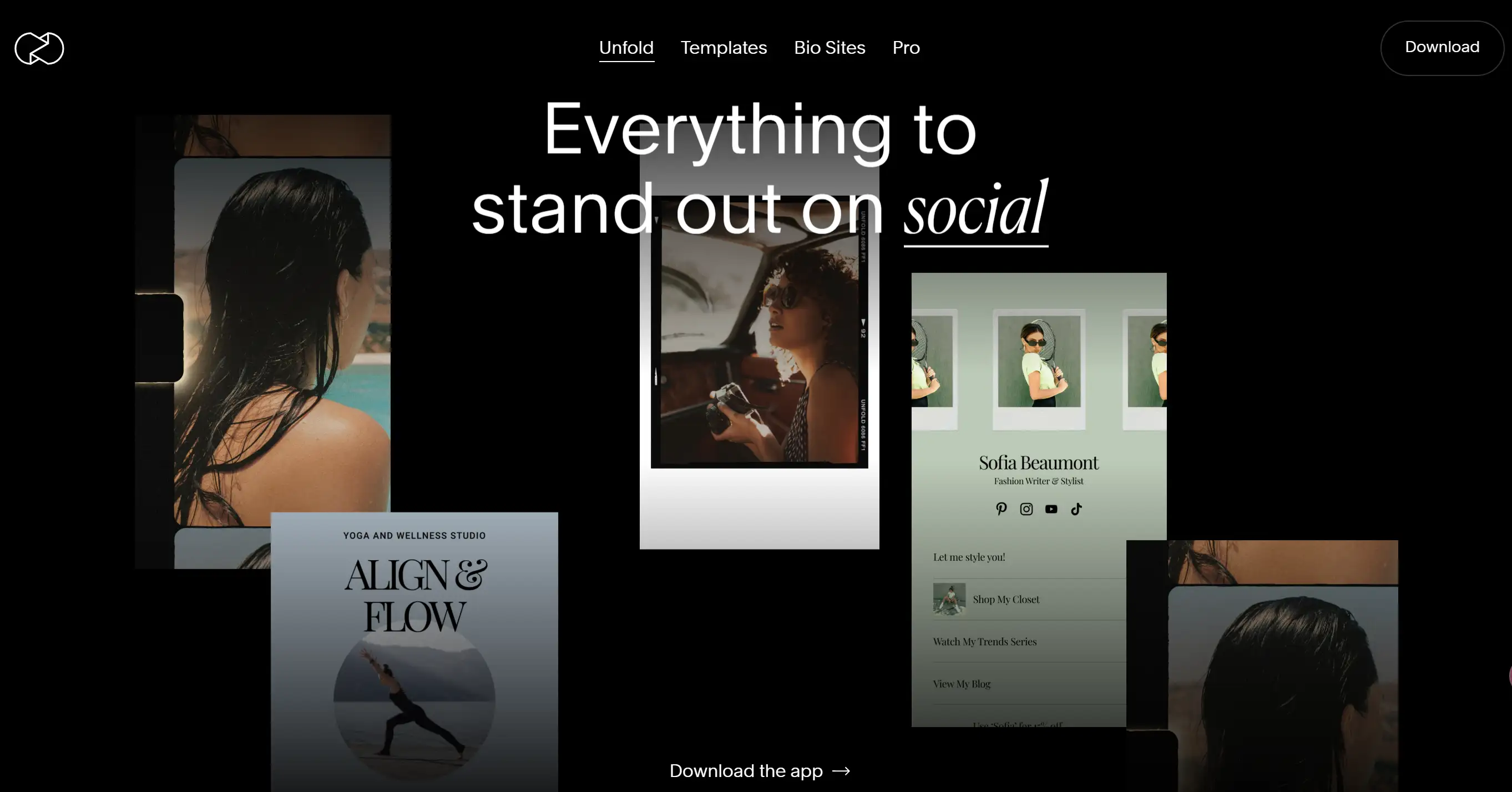
Unfold's parallax web example is pure nostalgia back to 90s with a modern twist. Picture a Polaroid photo doing a stretch-and-shrink routine as you scroll through the site. Yup, that’s exactly what you get. And the fun doesn’t stop there—head over to the “Digital Collectibles” section, and your cursor takes control of the action. Images expand and contract, like they’re dancing to your beat. With flickering animations leading to full-screen visuals, this site keeps your eyes glued and your finger scrolling. It’s as dynamic as it is delightful.
4. Visual Track
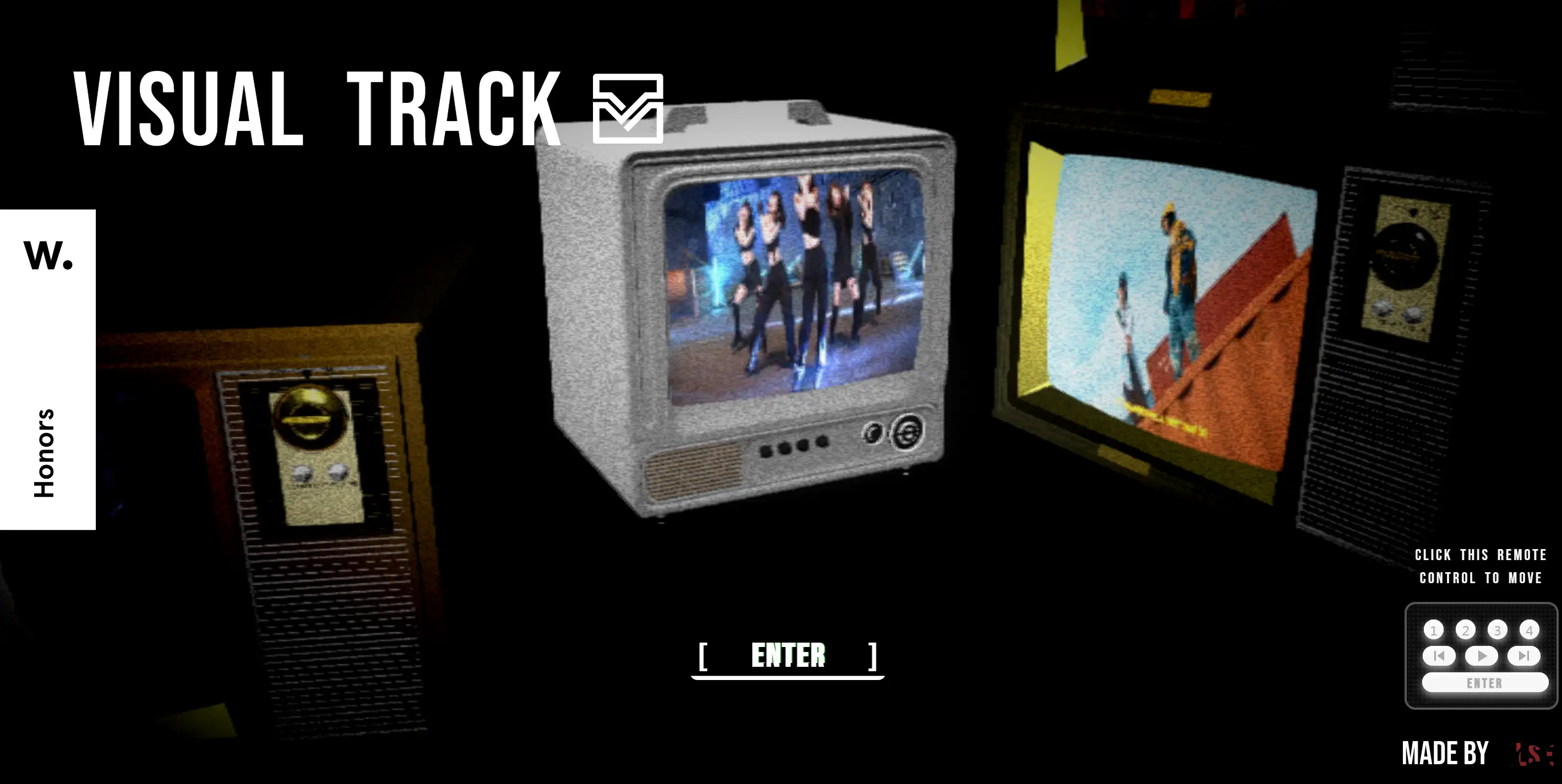
If you’re in the mood to dance, Visual Track’s parallax web example is the website for you. The energy is infectious, from the punchy colours to the snappy transitions. As you scroll, there’s a burst of creativity that feels like it could pop off the screen. There’s no doubt: this site is a visual dance party, and your scroll finger is the DJ. It’s the kind of design that just makes you happy—try not to bust a move while you explore!
5. LetZKola
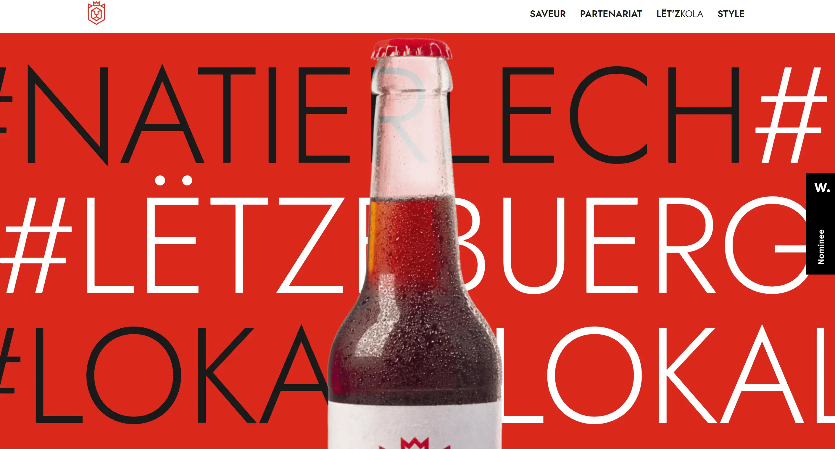
Ever wanted to see parallax in its purest, most elegant form? The LetZKola's website is a feast of cycling visuals, text, and layers, all coming together in a harmonious display of parallax motion. No gimmicks, just the smooth, seamless transition of images and text. Each section moves just enough to grab your attention but never overwhelms you. In short, this parallax web example is what happens when design and function blend perfectly.
6. Toyfight
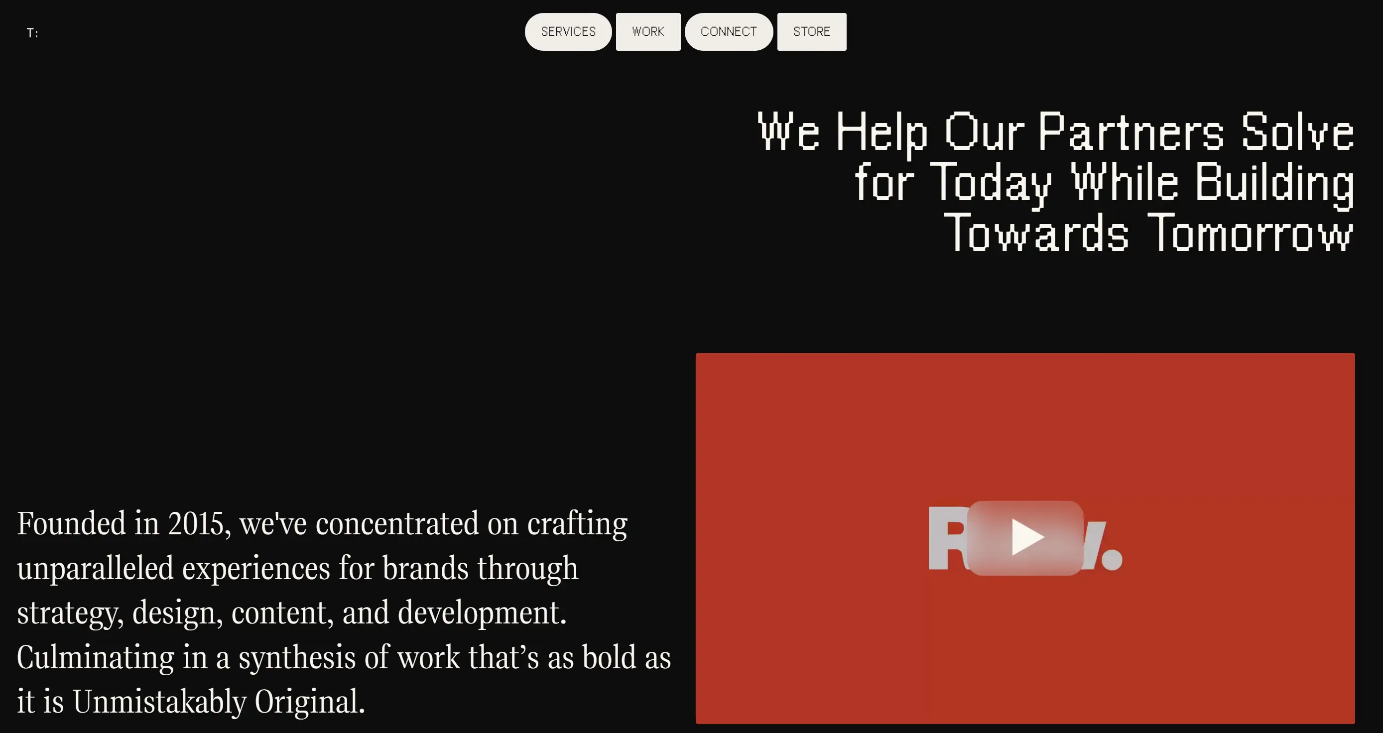
ToyFight’s parallax web example feels like an interactive toybox. Each scroll introduces you to action-packed toy imagery with text layered perfectly over them. The fun doesn’t stop at the visuals, though. Even the menu bar joins the party—it bounces and jitters with delight, refusing to be just another boring navigation tool. ToyFight's site shows that innovation and creativity go hand-in-hand, making it a playful yet powerful display of parallax perfection.
7. Jomor Design
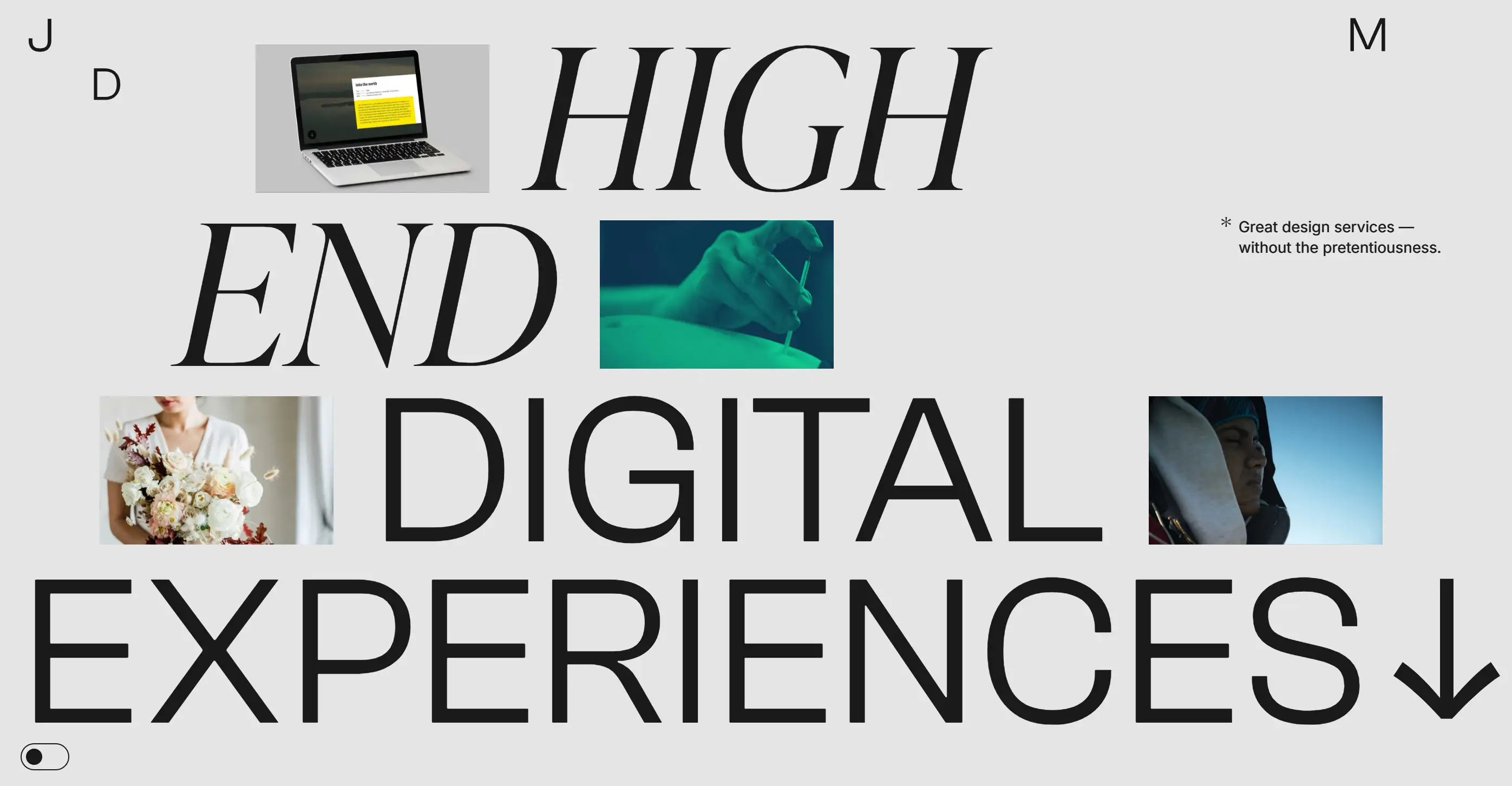
If websites could fly, Jomor would be soaring. This parallax web example is a treasure trove of vibrant visuals, dancing videos, and bold typography—all tied together with just the right touch of parallax magic. Every scroll feels like an adventure, with new layers of dynamic content appearing as you progress. It’s a visual treat, showcasing just how powerful parallax can be when done with flair.
8. Delassus Group
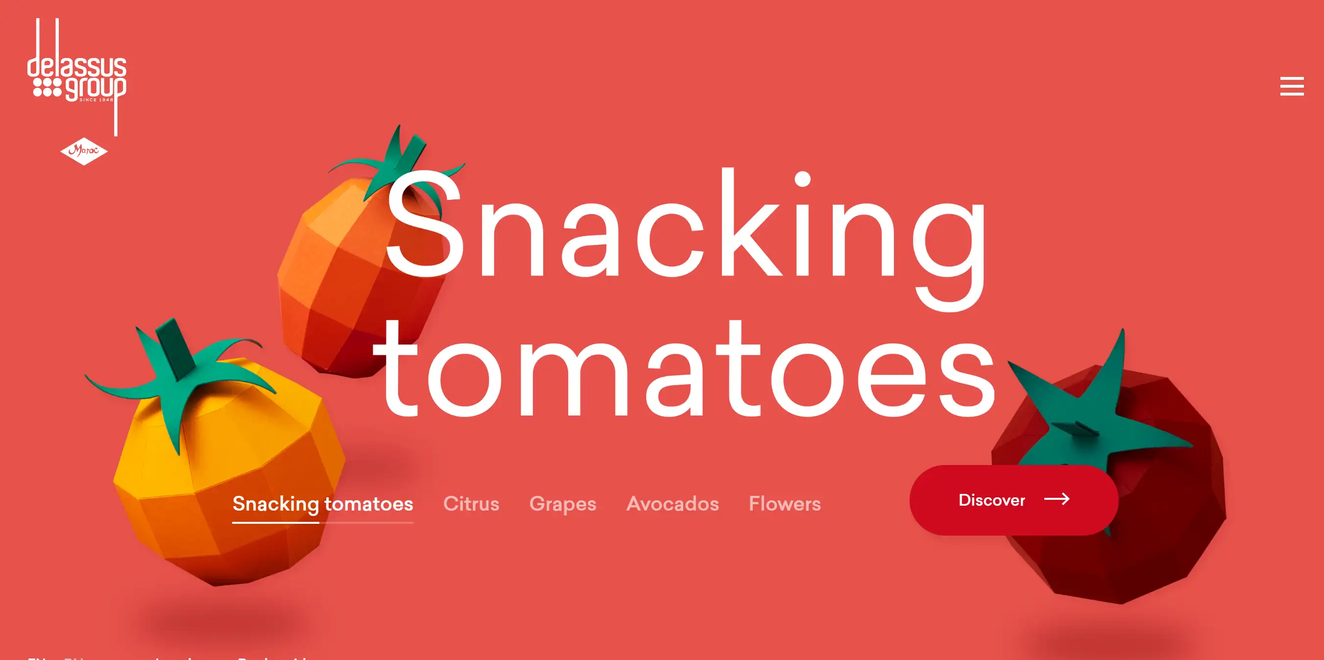
Who knew scrolling through a fruit selection could be this much fun? Delassus Group’s parallax web example takes you on a fruity journey—literally. As you scroll, the background colours change to match each product: from tomato-red to grape-purple to avocado-green. It’s a parallax parade of fresh produce, and with each horizontal scrolling swipe, you’re treated to another colourful section. This website is as mouth-watering as it is visually stunning.
9. Cyclemon
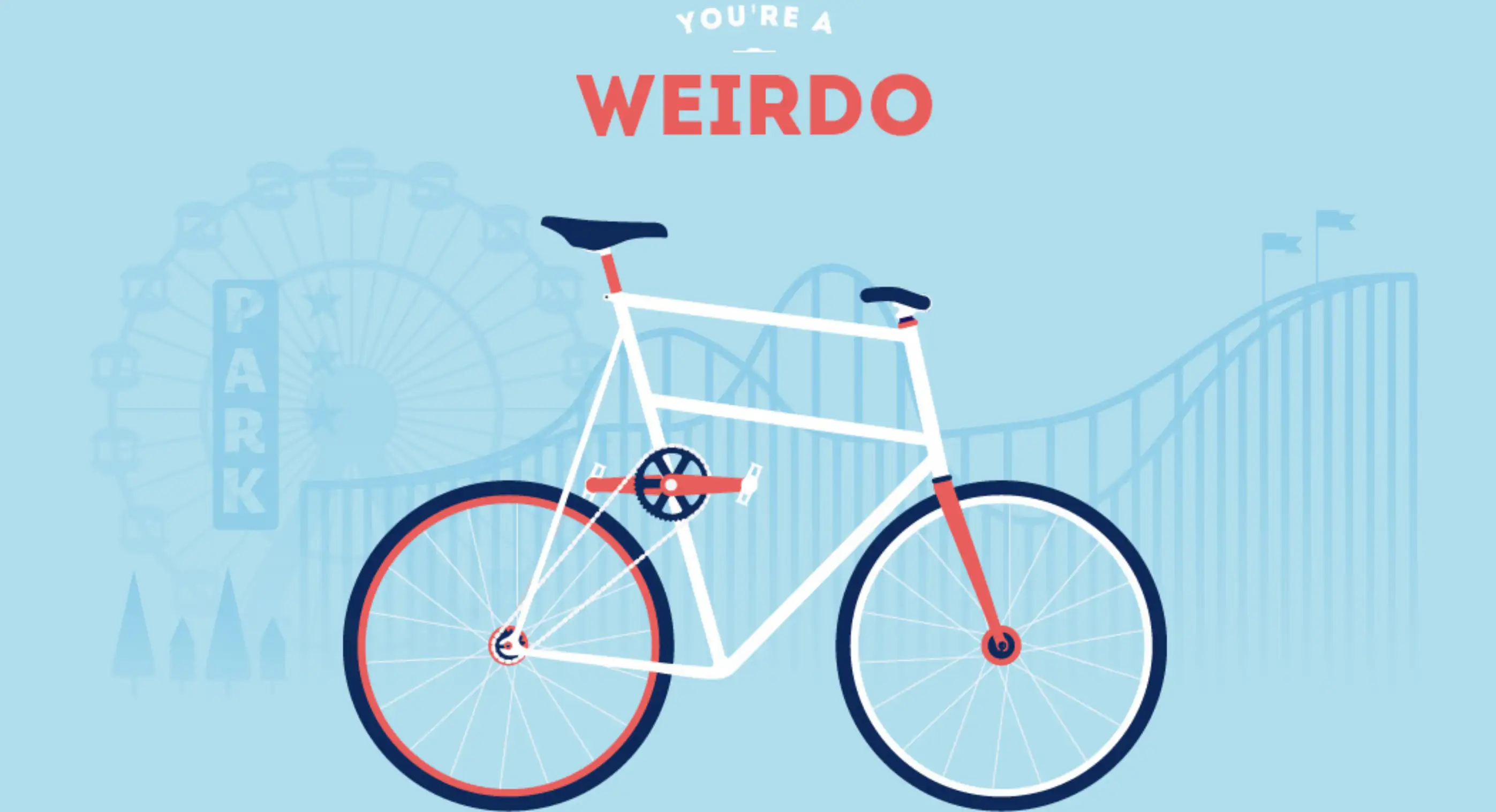
Cyclemon’s parallax web example proves that bikes can have style—and so can websites. This project by two freelance digital artists is bursting with personality, from the quirky illustrations to the vibrant colour palette. Parallax scrolling brings these unique bicycles to life, making each one feel like its own little character. The simple, detailed design paired with smooth transitions ensures that this small project packs a big punch.
10. Leon Dupuis
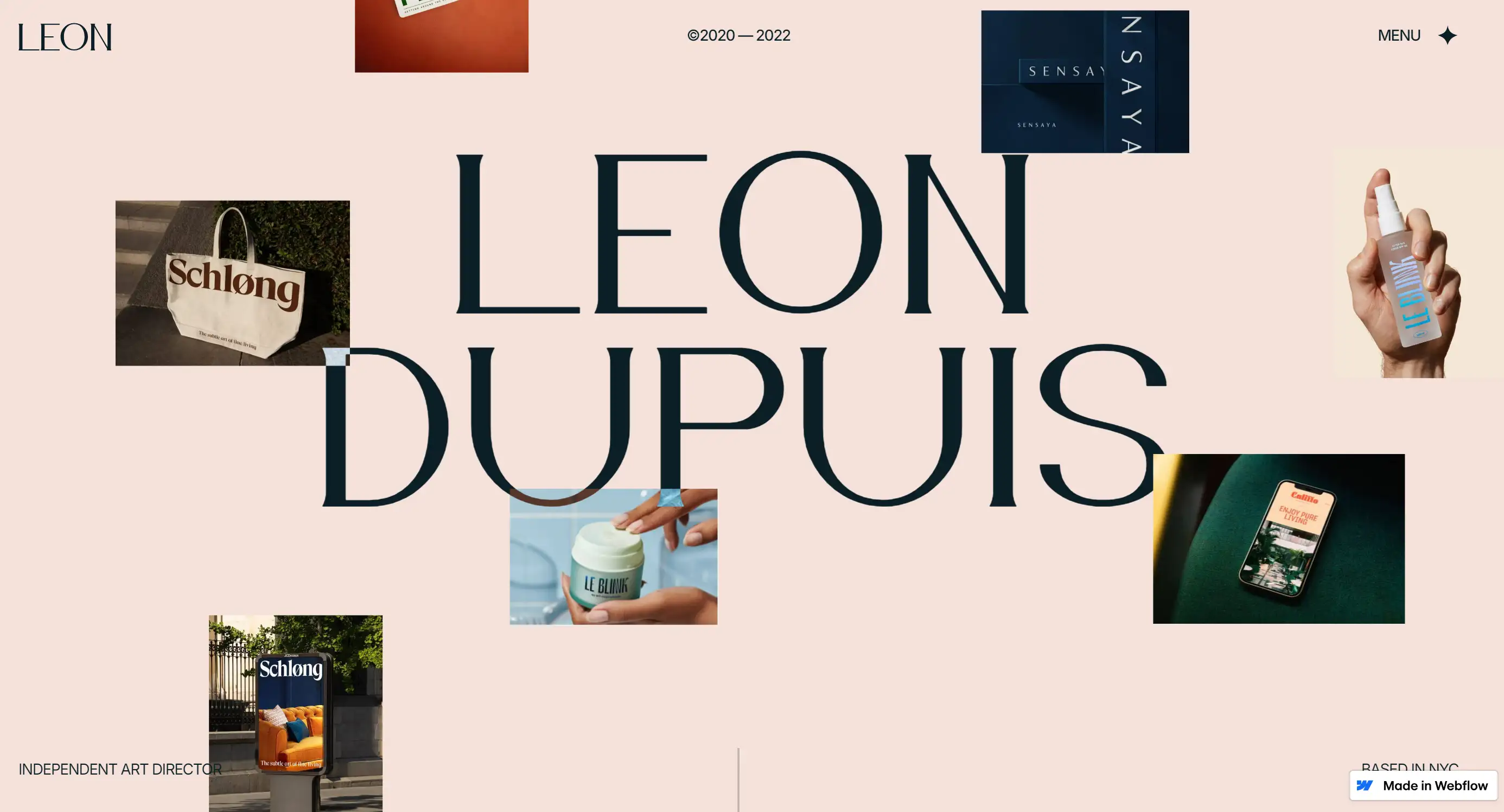
Leòn is more than just a Webflow template—it's a masterclass in parallax web examples for creative minds. Whether you're capturing moments with your camera or painting your next masterpiece, Leòn’s sleek design elevates your work to a whole new level. Its use of parallax scrolling seamlessly draws users into an immersive visual experience, making them feel like they’re flipping through a designer’s portfolio with a hint of flair. It’s clean, it’s stylish, and it’s the perfect blend of form and function for anyone looking for parallax web examples that do their art justice.
11. The Goonies

"The Goonies" takes you back to the 80s in more ways than one, with a parallax web example that’s as rich and layered as the beloved film itself. The personal website uses parallax scrolling to create an emotional journey for fans, mirroring the film’s depth and charm. It’s not just a tribute to the past but a visually stunning design that combines modern web trends with a retro feel. From the top to the image gallery at the bottom, the site is a vibrant parallax web example that resonates with viewers, much like the timeless movie it honours.
12. Bagiga
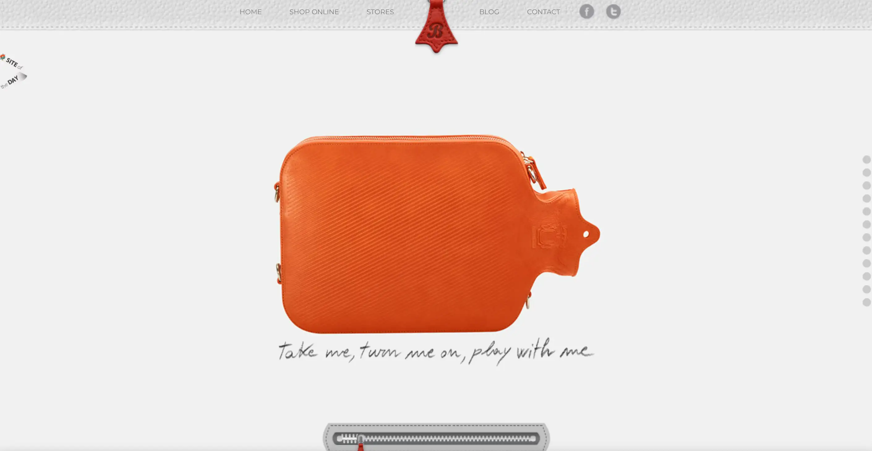
Bagigia’s parallax web example takes creativity to a new level, turning an online shopping experience into an interactive playground. As you scroll, the product rotates and comes to life with scrapbook-like notes, inviting you to "take it, turn it on, and play with it." To top it off, there’s a zipper animation that cleverly doubles as a progress bar, guiding users through the site with ease. This parallax web example not only presented Bagigia’s products but also included the component of sophisticated fun, which makes the entire view of the site look like everyone is controlling and even enjoying the process.
Let’s Parallax Like It’s 1980s (But Better!)
Well, now you are fully aware of what parallax web examples are and how these can bring interactivity to your site, which as we know, is far from being flat. Of course, I understand that it may well be perplexing for individuals like myself, in this case, to decide on where to begin when it comes to designing websites during the immeasurable number of choices and quick trends with tremendous popularity.
However, looking at these parallax web examples, I am confident that you can comprehend how minor changes can bring depth and interactivity that will keep visitors on the site. If you have not yet decided how to use these awesome techniques or you do not know which parallax web examples are best for your aesthetic website, do not worry. It is advisable to note that there are many readily available tools out there for web content analysis (In fact, you do not even have to know the basics of coding!).
Wegic is an AI-driven web design and website builder that's changing the game. Think of it as your personal digital architect, working through simple, chat-based interactions to bring your website vision to life—no coding, no headaches. Whether you’re building a sleek portfolio, an online store, or a fully customized parallax website, Wegic is designed to make the process smooth, efficient, and creative.
Key Features that Make Wegic Shine:
-
AI-Powered Design and Development: Wegic uses advanced AI tools for business to transform your ideas into a beautifully crafted, fully functional website. It’s like having a professional web designer on call 24/7.
-
Conversational Interface: Forget complicated tools and endless menus—Wegic lets you design a website by simply chatting. Tell it what you need, and the AI handles the rest.
-
Parallax Design Made Easy: Want to create that eye-catching parallax scrolling effect that captivates users? Wegic makes it easy to design dynamic, layered websites where images and content move at different speeds, adding depth and engagement to your site.
-
Versatile Project Capabilities: Whether it’s a parallax-driven homepage, an e-commerce platform, or a personal blog, Wegic handles a broad range of web projects. You dream it, Wegic builds it.
-
Pricing: Wegic offers a free trial for everyone, including 70 free credits for website building—meaning anyone can create a website at no cost!
Written by
Kimmy
Published on
Mar 17, 2026
Share article
Read more
Our latest blog
Webpages in a minute, powered by Wegic!
With Wegic, transform your needs into stunning, functional websites with advanced AI
Free trial with Wegic, build your site in a click!
What kind of website do you want to build?