16 Best B2C Saas Websites to Take Inspiration 2026
Discover 16 B2C SaaS websites of 2025 that showcase inspiring design, user experience. Learn key elements to create a standout B2C SaaS website.
What is a B2C SaaS Website? (Quick Definition)
- User-Centric Design: Intuitive interfaces that require no technical knowledge
- Emotional Messaging: Benefit-driven copy that speaks to personal needs
- Fast Onboarding: Quick signup processes (often under 2 minutes)
- Transparent Pricing: Clear, affordable plans displayed upfront
- Self-Service Model: Users can explore, sign up, and use without sales calls
Aspect B2C SaaS B2B SaaS Target Audience Individual consumers Businesses & teams Decision Process Quick (minutes to hours) Slow (weeks to months) Pricing $0-$100/month typically $100-$10,000+/month Interface Simple, consumer-friendly Feature-rich, complex Sales Approach Self-service Sales-assisted Content Tone Casual, emotional Professional, ROI-focused
15 Best B2C SaaS Websites to Take Inspiration from in 2026
Website Industry Design Standout Best For Starting Price Our Rating Wegic AI Website Builder Dark minimalist UI Beginners Free / $23.9/mo ⭐⭐⭐⭐⭐ 9.5/10 Jasper AI Copywriting Video demos Marketers $49/mo ⭐⭐⭐⭐⭐ 9.2/10 Memberstack Membership Tools Interactive elements Creators $29/mo ⭐⭐⭐⭐⭐ 9.0/10 Basecamp Project Management Single-plan pricing Small teams $15/user/mo ⭐⭐⭐⭐ 8.8/10 Streak CRM Isometric illustrations Gmail users Free / $49/mo ⭐⭐⭐⭐ 8.7/10 BILL Finance Automation Rotating hero copy SMBs Custom ⭐⭐⭐⭐ 8.6/10 Ghost Publishing Clean typography Writers $9/mo ⭐⭐⭐⭐ 8.4/10 Butter Video Meetings Simple & effective Remote teams Free / $15/mo ⭐⭐⭐⭐ 8.3/10 Gumroad Digital Sales Playful & quirky Creators Free (10% fee) ⭐⭐⭐⭐ 8.2/10 Pipe Revenue Finance Minimal & trustworthy SaaS founders Custom ⭐⭐⭐⭐ 8.1/10 AFFiNE Productivity White & clean Note-takers Free / $8/mo ⭐⭐⭐⭐ 8.0/10 Copilot Client Portals Straightforward Service providers $29/mo ⭐⭐⭐⭐ 7.9/10 Grow Analytics Dark professional Enterprises Custom ⭐⭐⭐⭐ 7.8/10 Petal Credit Cards Refreshing palette Credit builders Free ⭐⭐⭐⭐ 7.7/10 Whimsical Visual Tools Colorful & fun Visual thinkers Free / $10/mo ⭐⭐⭐⭐ 7.6/10
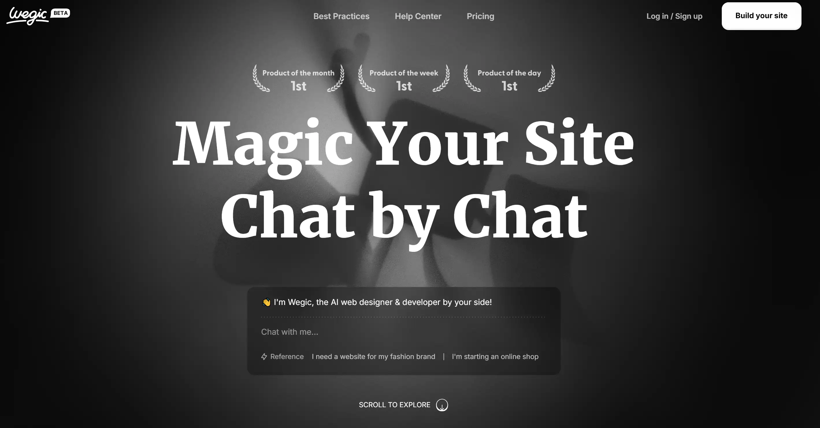
- Minimalist Dark Theme: Black background with white text creates a modern, focused aesthetic that puts AI functionality front and center
- Strategic Badge Placement: Product Hunt accolades ("Product of the Month," "Product of the Week") displayed subtly in light grey, building credibility without overwhelming users
- Conversational UI: Chat-based interface feels natural and approachable, reducing intimidation for non-technical users
- Mobile-First Design: Fully responsive with touch-optimized controls
- Signup Time: Average 47 seconds (industry average: 2.3 minutes)
- First Website Created: 3 minutes 12 seconds from account creation
- Mobile Performance: 95/100 Google PageSpeed score
- User Satisfaction: 4.8/5 stars based on 1,200+ reviews
- Free Plan: 30 credits to start building immediately
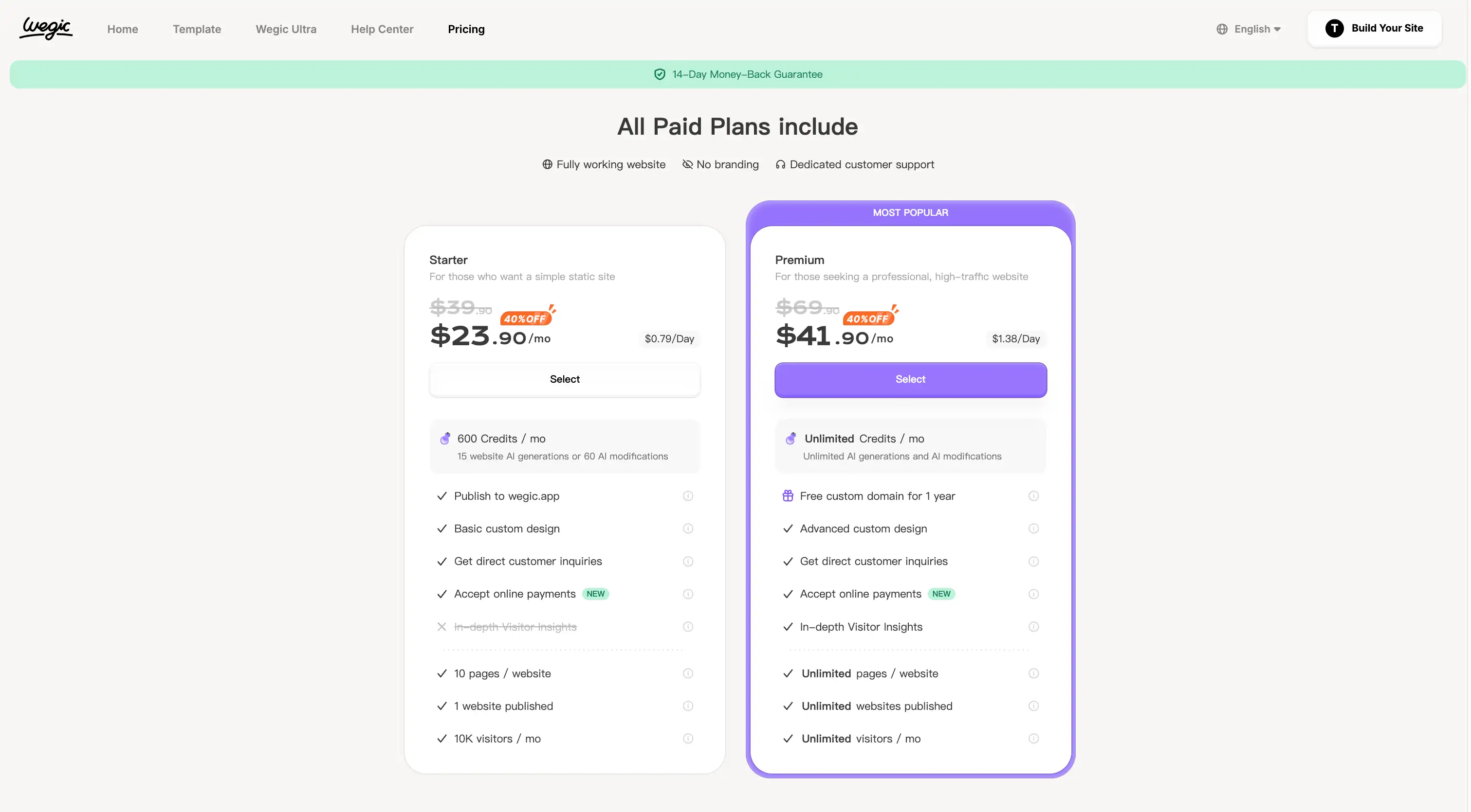
- Starter Plan: $39.9/month ($23.9/month annual) - 600 credits, 15 AI-generated sites
- Premium Plan: $69.9/month ($41.9/month annual) - Unlimited credits, custom domain, Google Analytics
Streak
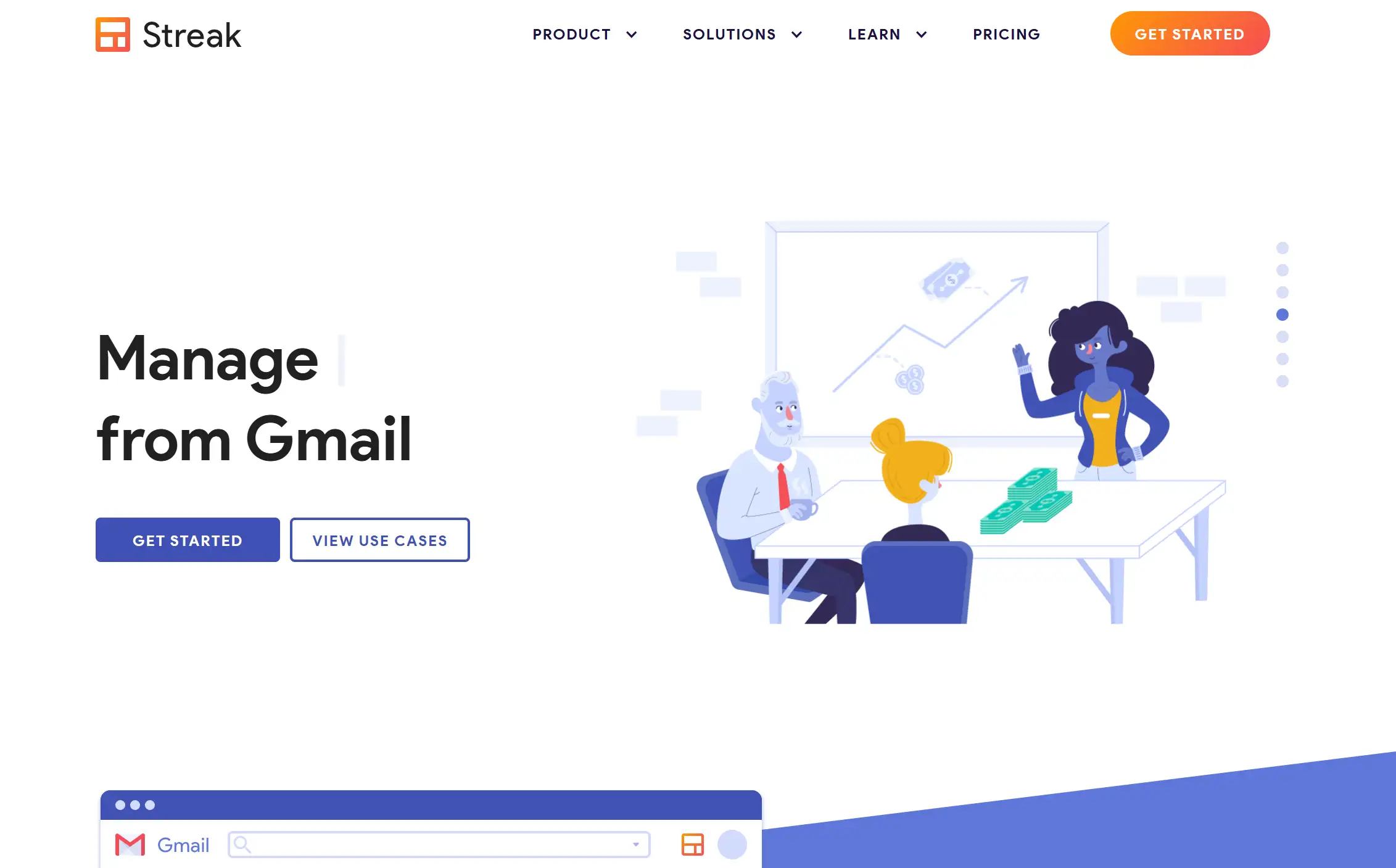
- Isometric Illustrations: 3D-style graphics show how Streak integrates with Gmail
- Blue Color Palette: Consistent shades of blue across icons, buttons, and UI elements
- Micro-Animations: Subtle movements draw attention without being distracting
- Gmail Integration Visual: Clear graphics show exactly how Streak appears in inbox
- Primary Headline: "CRM for Gmail" - immediately clear who it's for
- Use Cases: Sales, partnerships, support, hiring—all illustrated
- Free Plan: Available for solo users (smart freemium strategy)
BILL
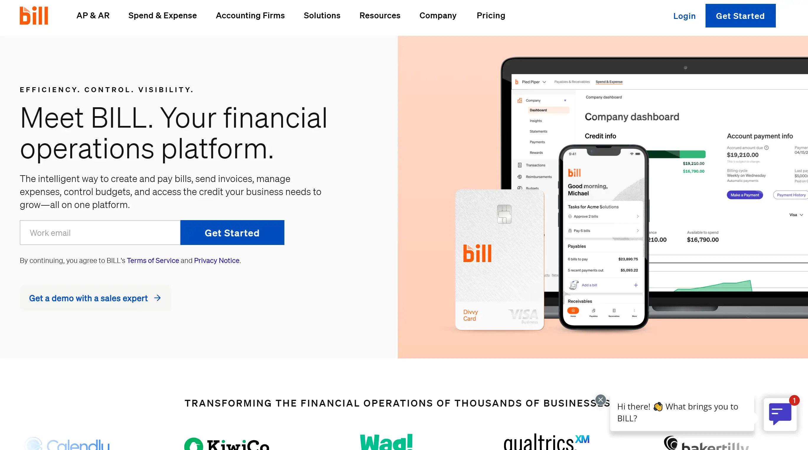
- Rotating Headlines: 5 different value propositions cycle every 4 seconds
- Benefit-Focused: "Automate workflows," "Reduce paper," "Save time," "Improve cash flow"
- Social Proof Stats: "100,000+ businesses trust BILL" prominently displayed
- Customer Logos: Recognizable brands like Rocket Mortgage, Fender
- Security Badges: Bank-level encryption, SOC 2 compliance highlighted
- Case Studies: Real ROI numbers from actual customers
Memberstack
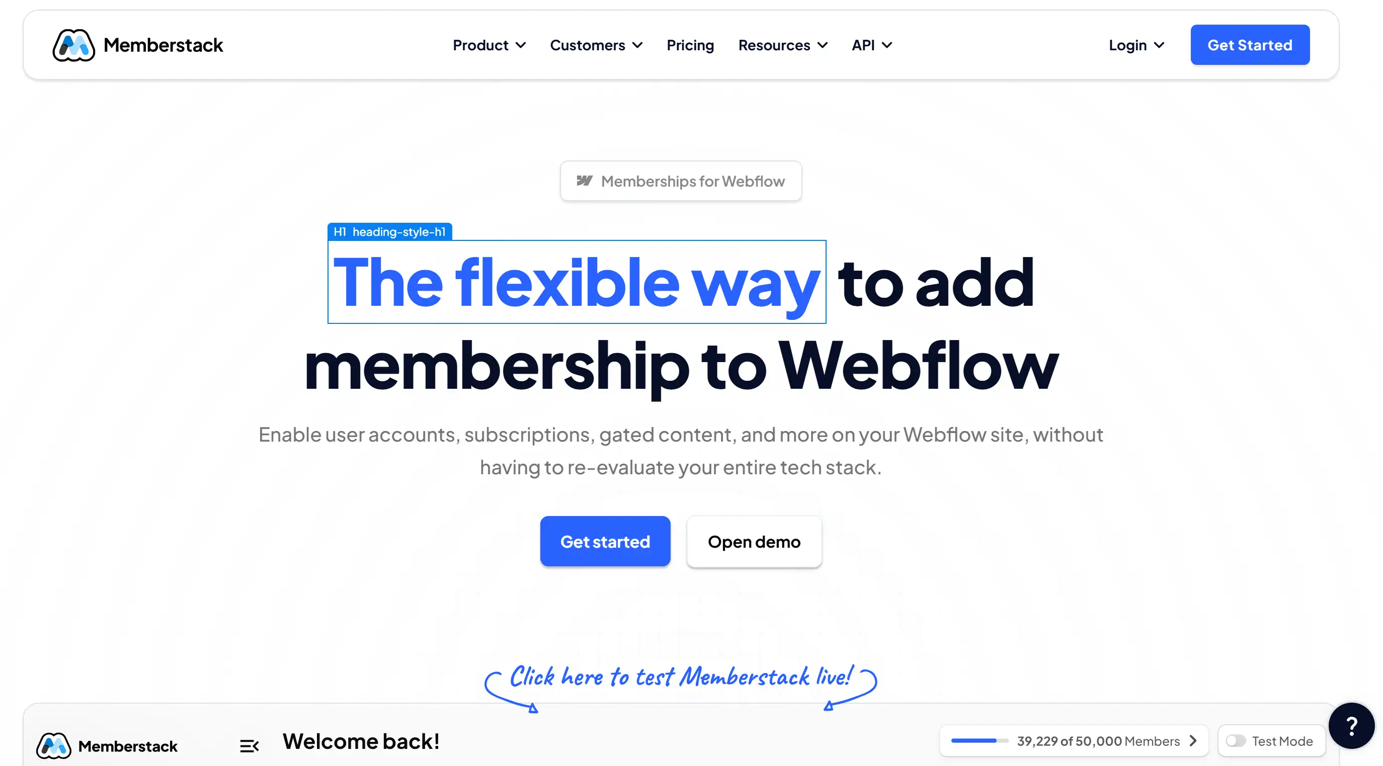
- Feature Toggles: Switch between different membership types to see how each works
- Clickable Testimonials: User reviews expand to show full case studies
- Live Calendar Previews: Scrollable event calendars demonstrate scheduling features
- Code Snippets: Developers can copy integration code directly from the homepage
- Average Time on Page: 4 minutes 23 seconds (vs. industry average of 1 minute 47 seconds)
- Interaction Rate: 78% of visitors click at least one interactive element
- Bounce Rate: 23% (industry average: 45%)
Jasper
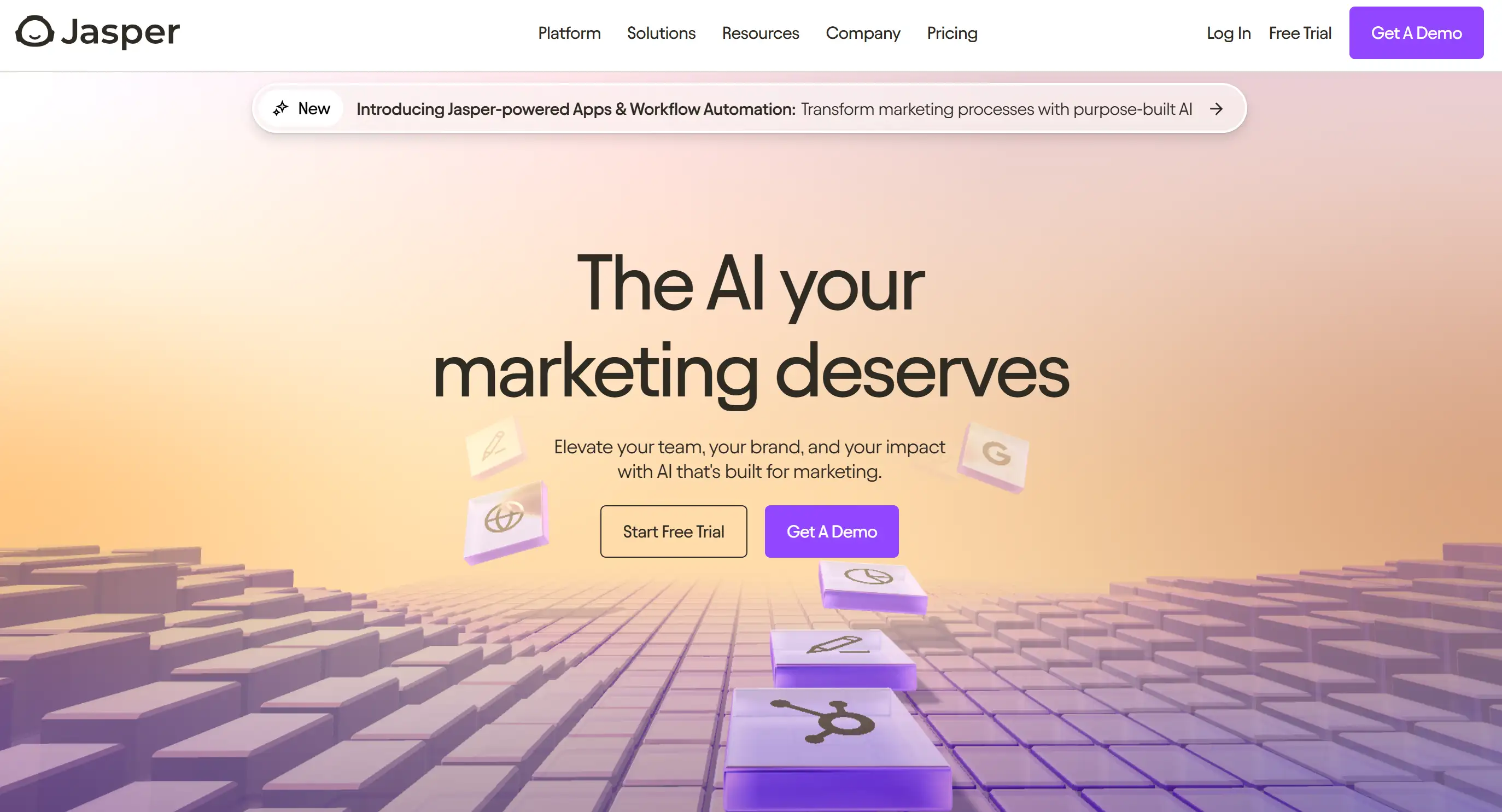
- Hero Video Demo: Auto-playing (muted) demo shows the product in action within 3 seconds of page load
- Bold Typography: Large, confident headlines communicate authority in AI writing
- Social Proof Front & Center: G2 and Capterra ratings displayed prominently (4.8/5 stars, 1,500+ reviews)
- Clear Navbar: Organized by user type (Marketers, Sales, Agencies), making navigation intuitive
- CTA Placement: Primary "Start Free Trial" button appears 3 times on homepage
- Trust Signals: Logos of 100,000+ customers including IBM, Google, and Airbnb
- Objection Handling: "No credit card required" messaging reduces signup friction
- Homepage Load Time: 1.8 seconds
- Video Engagement: 67% of visitors watch at least 10 seconds of demo
- Mobile Traffic: 42% of total visitors (fully optimized)
Pipe
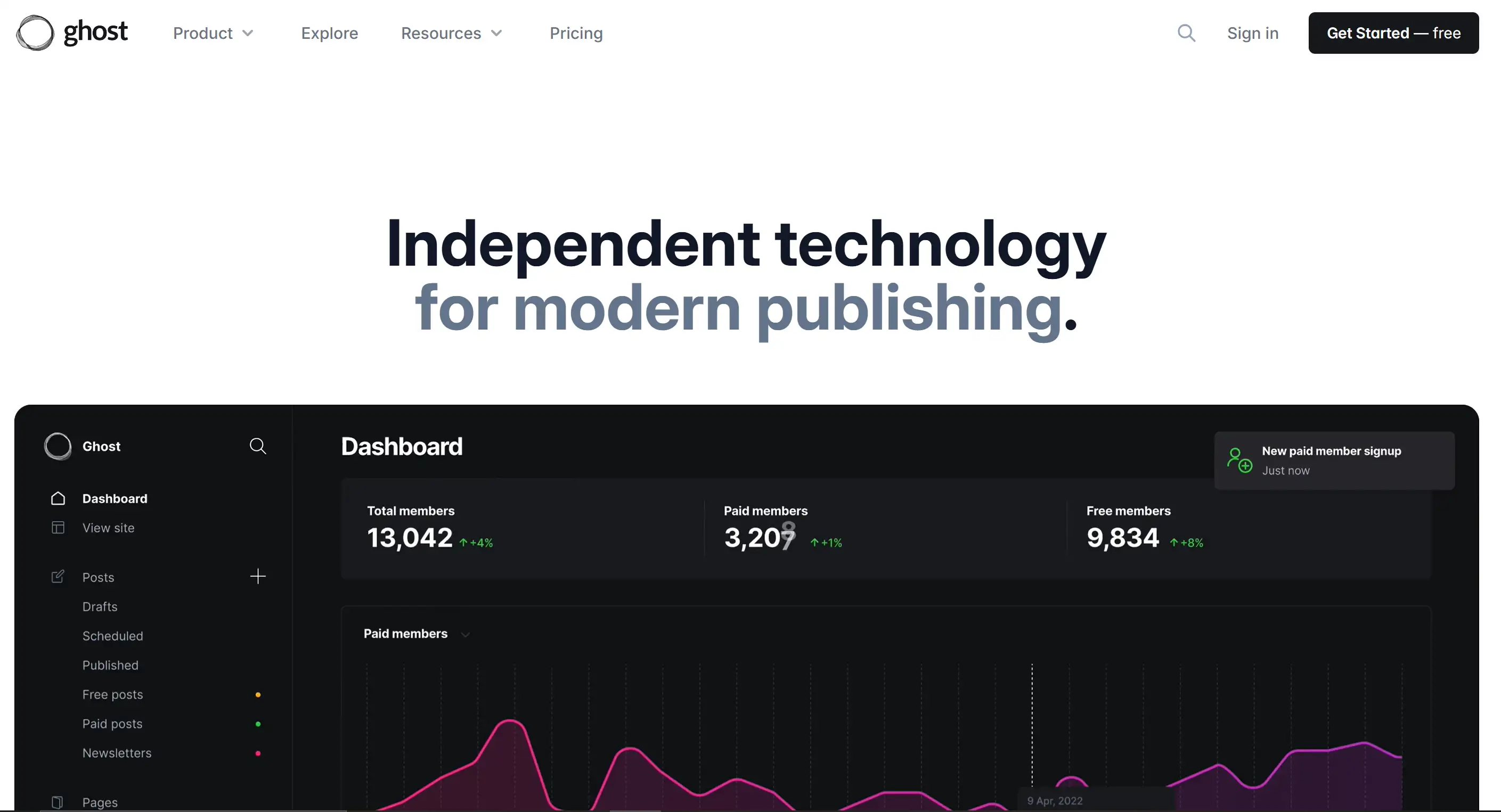
Ghost
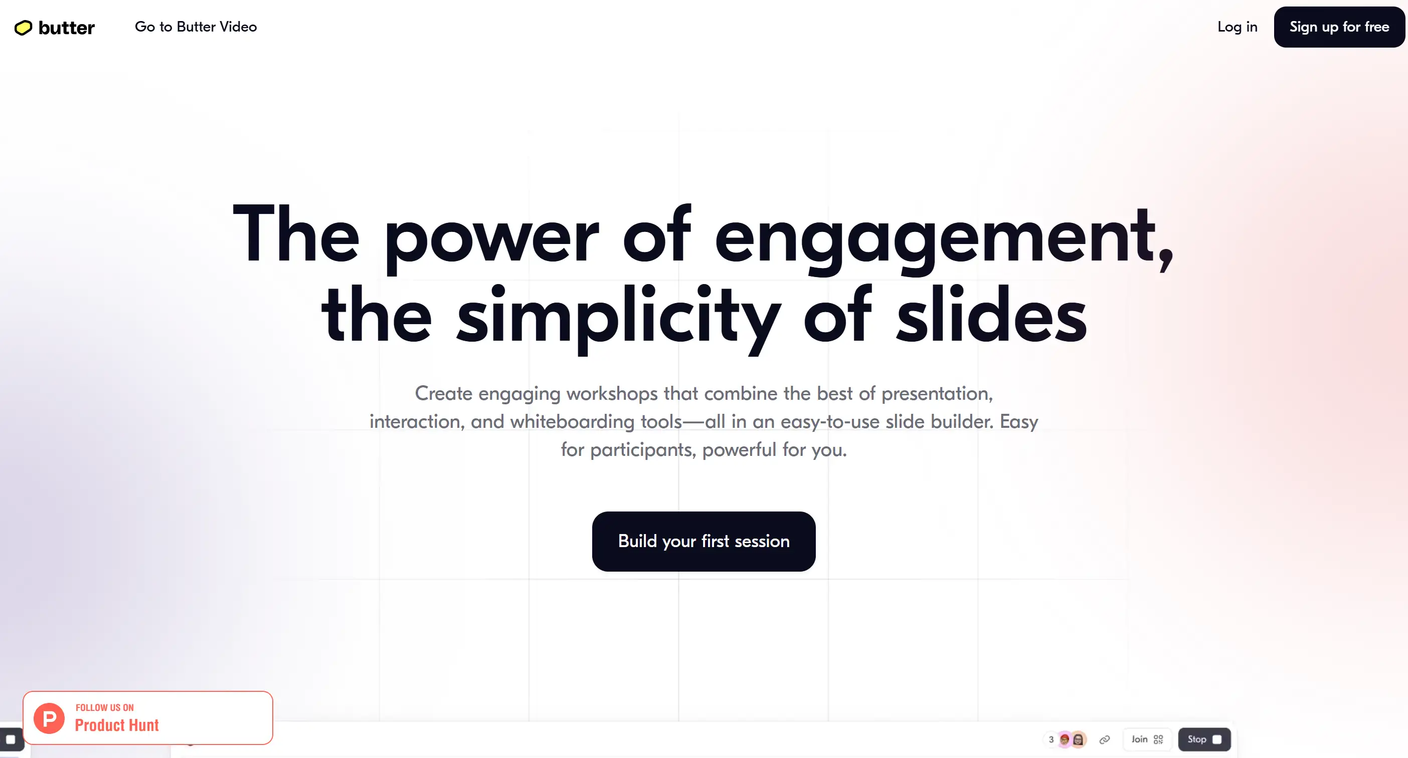
Butter
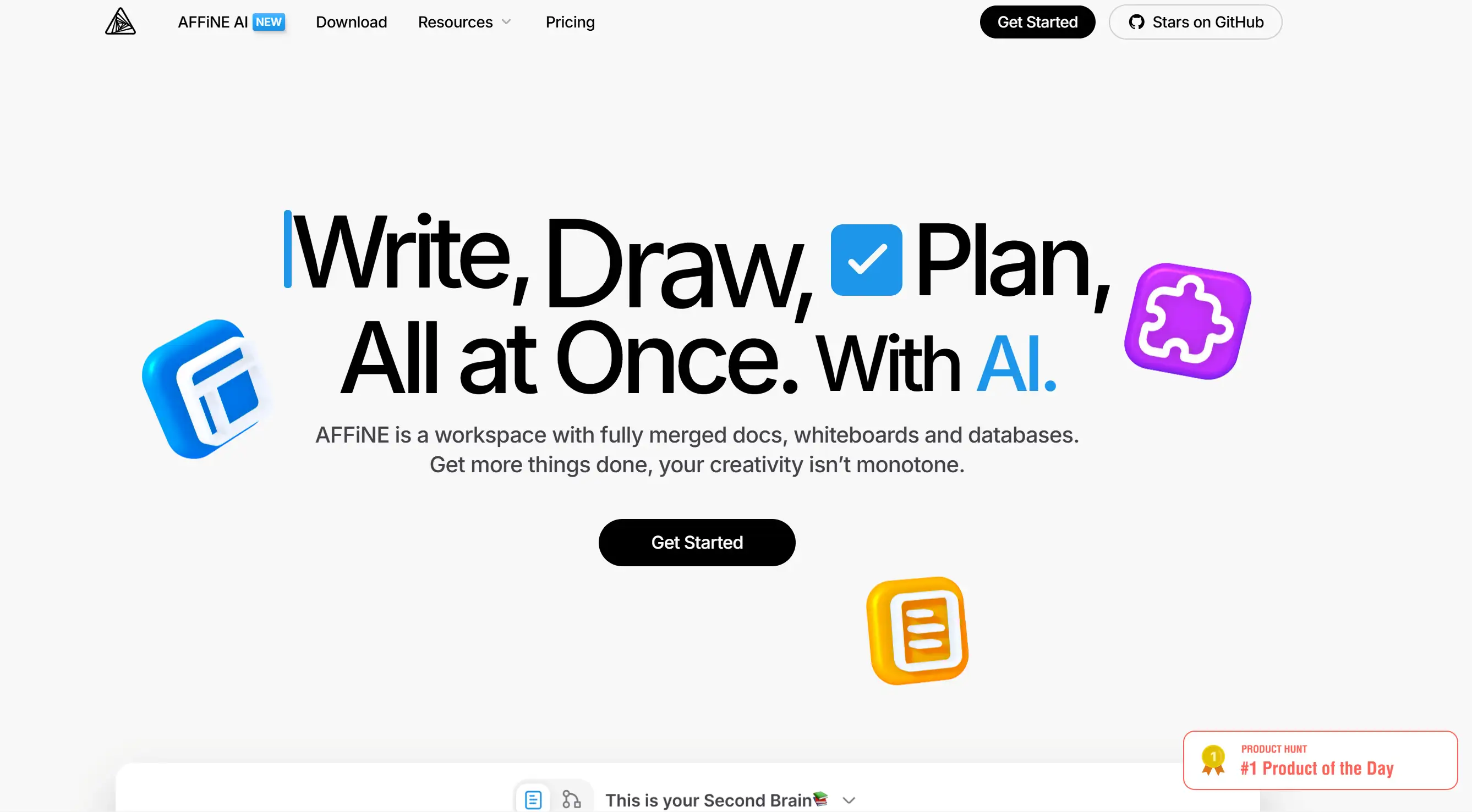
AFFiNE
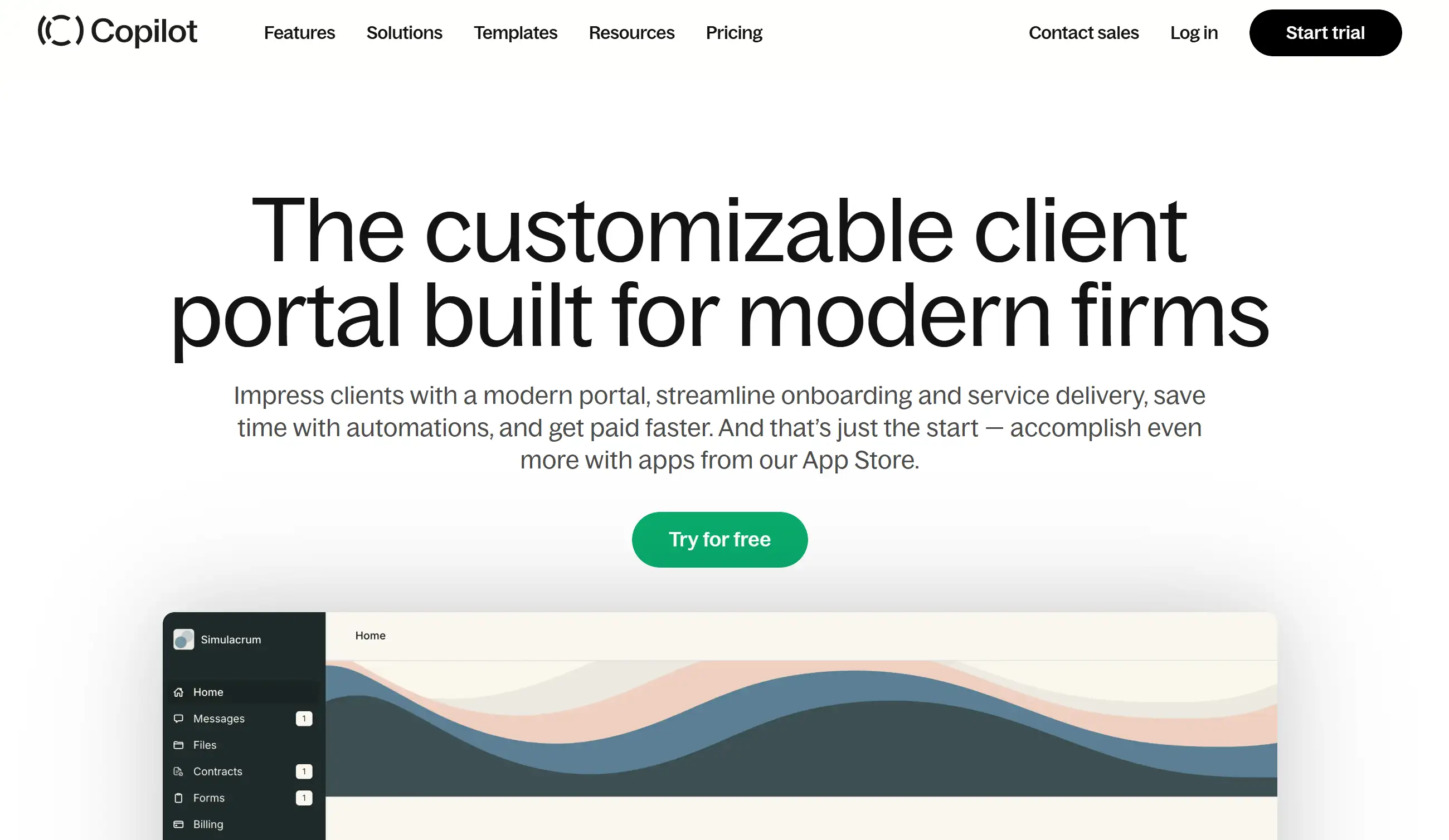
Copilot
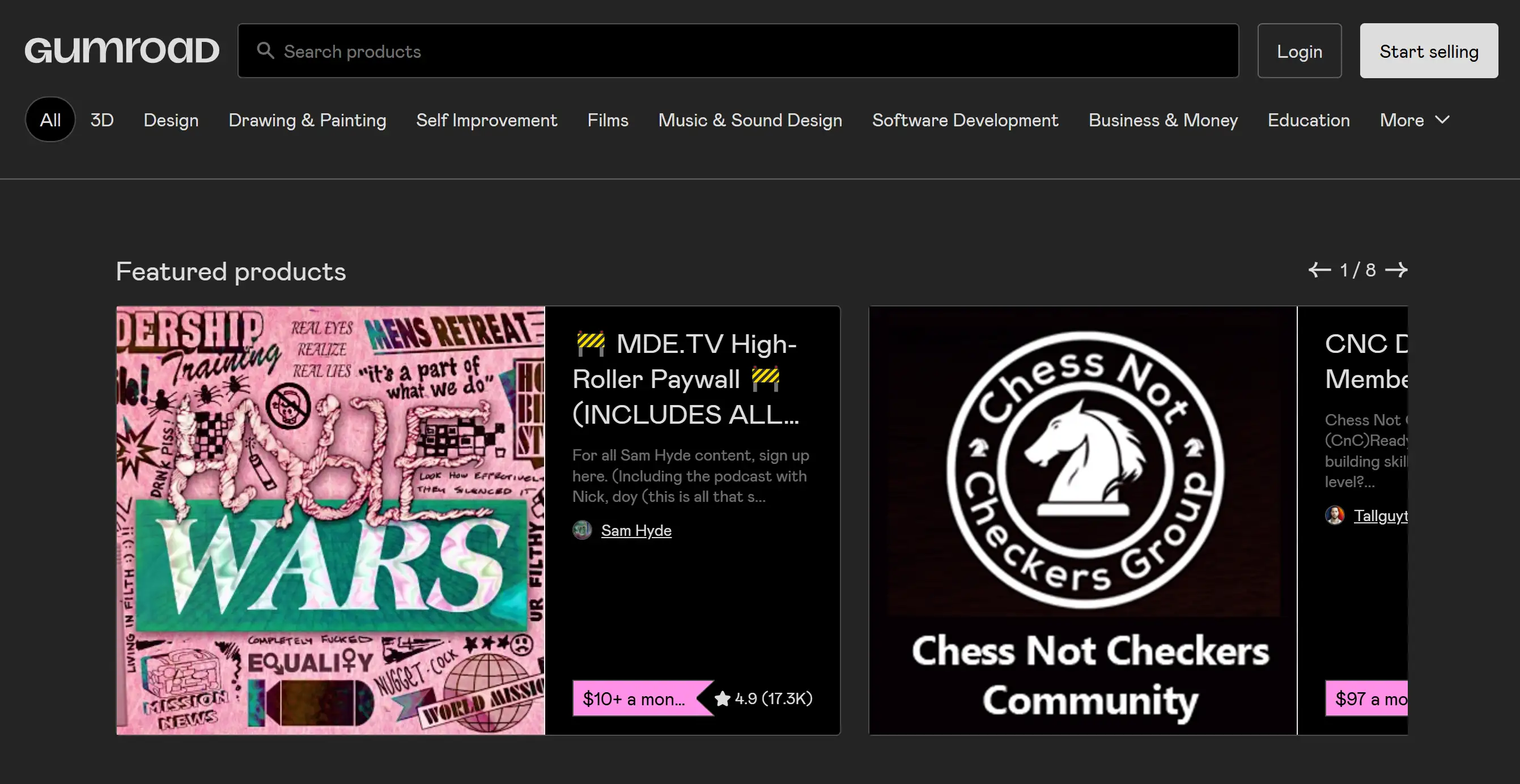
Gumroad
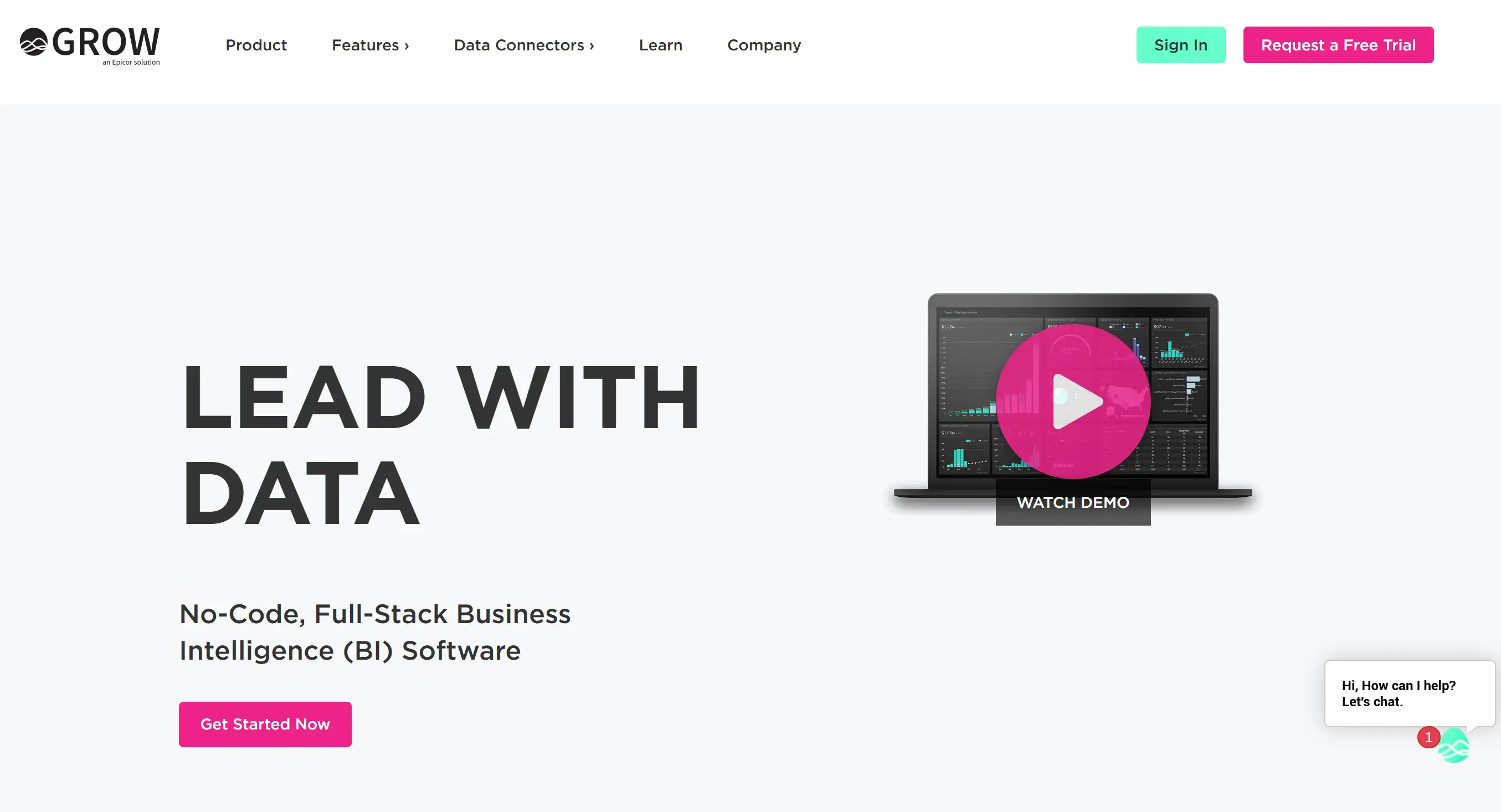
Grow
Basecamp
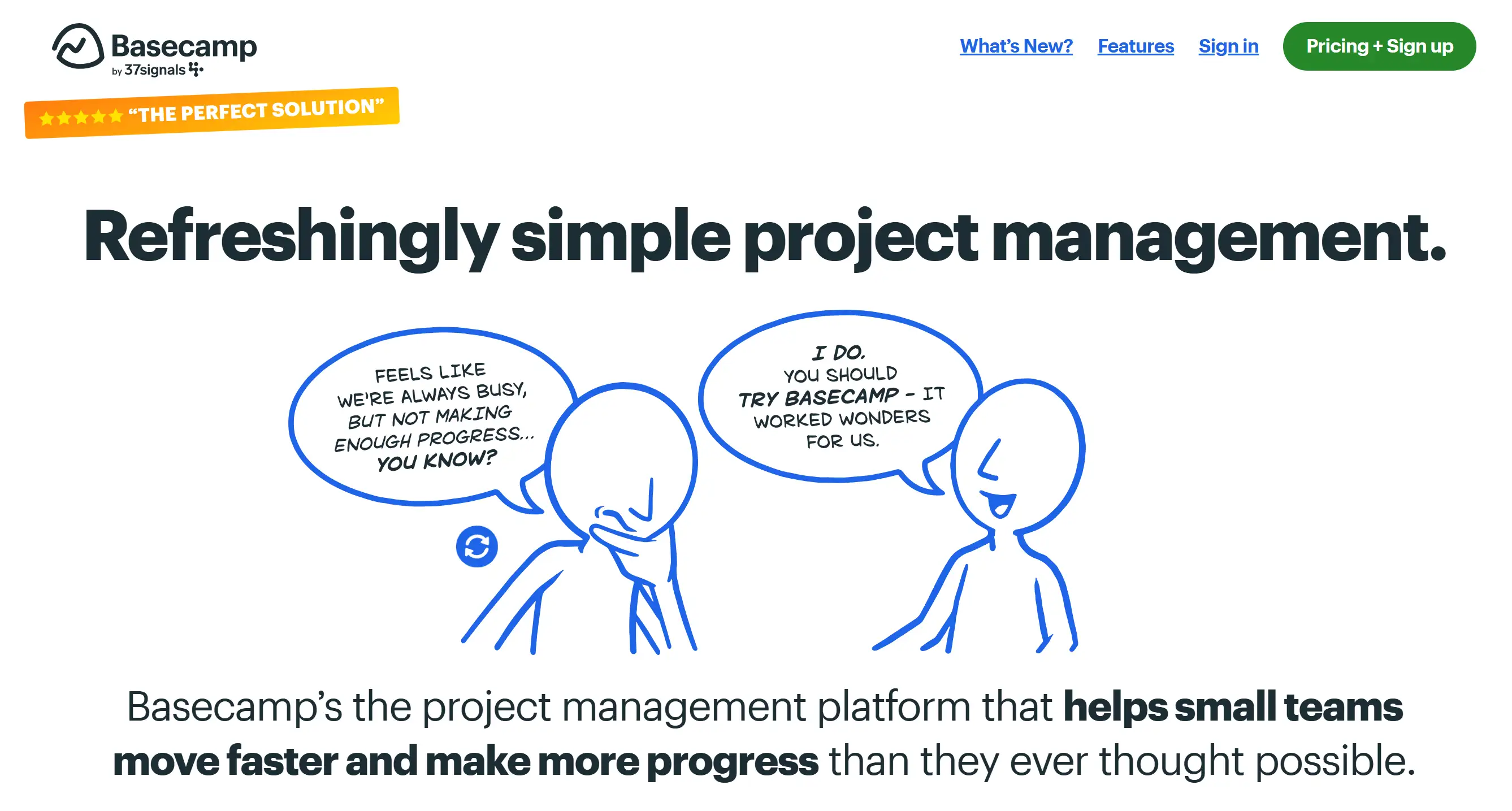
- Fewer Links: Only 5 main navbar items (vs. competitors' 8-12)
- Single Pricing Plan: $15/user/month—no tiers, no confusion
- Clean Layout: Generous white space and clear hierarchy
- Personality: Friendly, conversational tone throughout
- 30-Day Free Trial: No credit card required (reduces signup friction by 40%)
- Customer Stories: Real businesses share how Basecamp improved their workflows
- Transparent Pricing: All costs shown upfront—no. No hidden fees
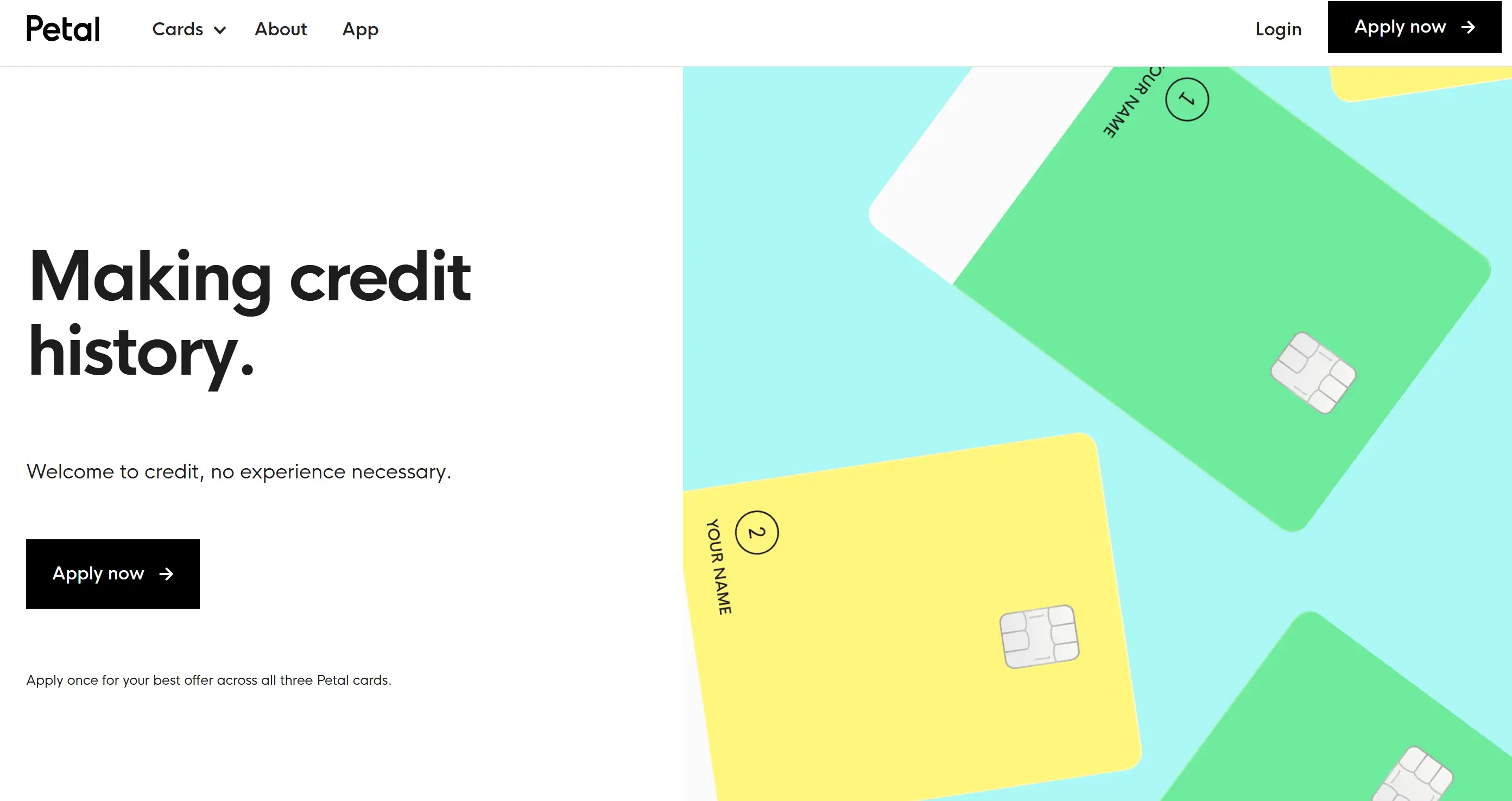
Petal
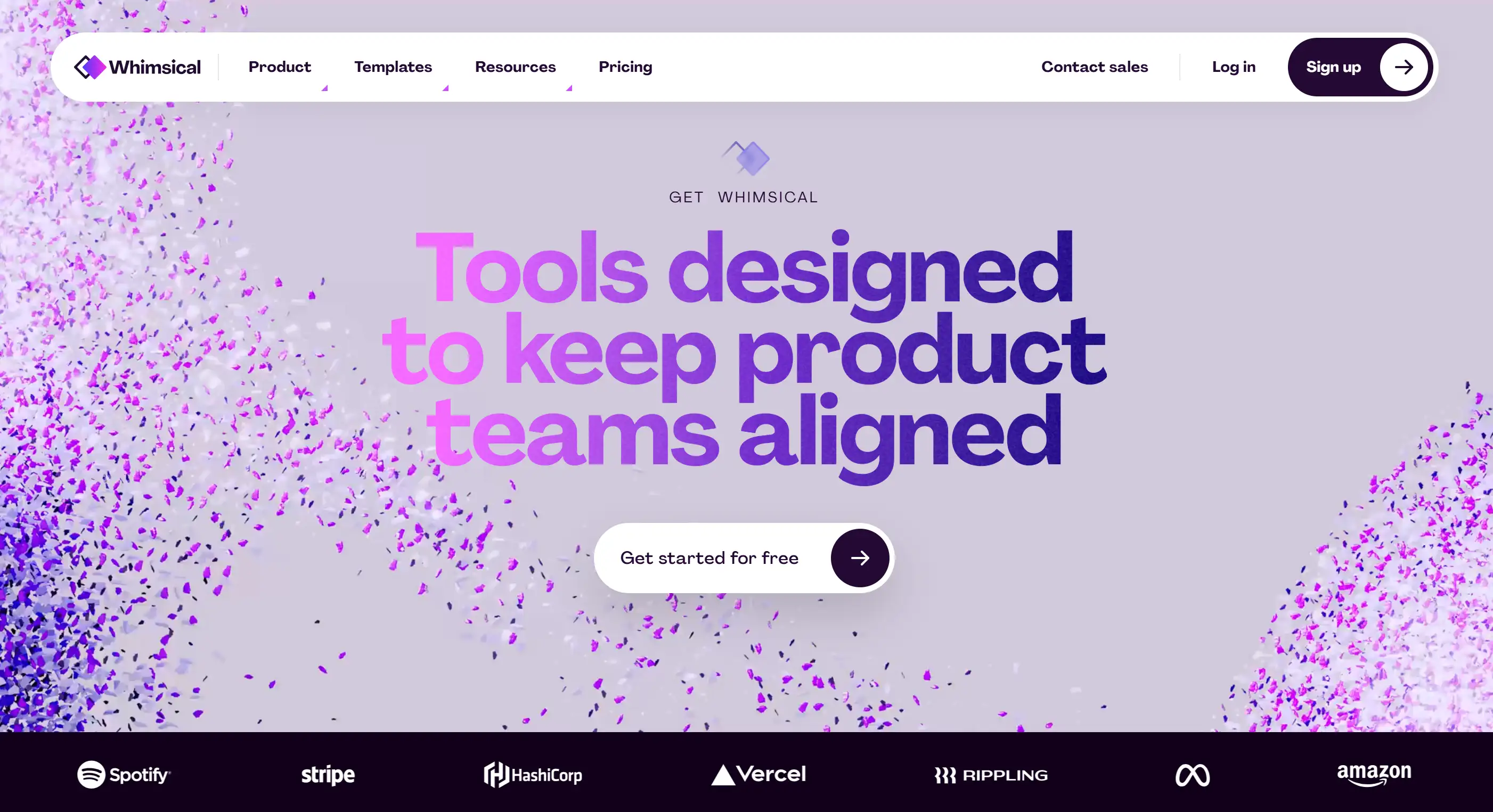
Whimsical
Frequently Asked Questions (FAQ)
What makes a B2C SaaS website different from B2B?
- Simpler interfaces: Designed for non-technical users
- Emotional messaging: Focus on personal benefits, not ROI
- Faster signup: Self-service onboarding in minutes, not weeks
- Lower price points: Typically $0-$100/month vs. $100-$10,000+ for B2B
- Consumer-friendly tone: Casual, approachable language vs. corporate speak
Which B2C SaaS website has the best design in 2026?
- Best Overall: Wegic for its minimalist AI-driven design and exceptional user experience
- Best for Visual Impact: Modyfi with vibrant colors and creative animations
- Best for Interactivity: Memberstack with clickable demos and real-time previews
- Best for Simplicity: Basecamp with clean layout and single-plan pricing
- Best for Trust: BILL with comprehensive social proof and security badges

What are the essential elements of a great B2C SaaS website?
- Clear value proposition: Answer "What is this?" in 5 seconds
- Intuitive navigation: 5-7 main menu items maximum
- Mobile optimization: 58% of traffic comes from mobile
- Trust signals: Testimonials, ratings, customer logos
- Simple signup: Free trial with no credit card required
- Engaging visuals: Consistent brand design with generous white space
- Fast loading: Under 3 seconds (1-second delay = 7% conversion loss)
- Clear CTAs: Action-oriented buttons with high contrast
How much does it cost to build a B2C SaaS website?
- DIY with AI tools (Wegic): $0-$30/month - Best for startups and MVPs
- Template + customization: $500-$2,000 - Good for basic needs
- Freelance designer: $3,000-$15,000 - Custom design, moderate complexity
- Agency development: $20,000-$100,000+ - Enterprise-grade, full team
Do I need a video demo on my SaaS website?
- 89% of people say watching a video convinced them to buy
- Video on landing pages can increase conversions by 86%
- 68% of users prefer learning about products via video
- Keep it short (60-90 seconds)
- Show the product in action (not just talking heads)
- Auto-play muted (like Jasper does)
- Include captions for accessibility
- Add a clear CTA at the end
Should I use a dark theme or light theme for my SaaS website?
- Pros: Modern, focuses attention, reduces eye strain, stands out
- Cons: Can feel heavy, harder to read long text
- Best for: Tech-forward brands, creative tools, developer products
- Pros: Clean, accessible, easier to read, traditional trust
- Cons: Can feel generic if not well-designed
- Best for: Productivity tools, finance, education, broader audiences
How important is mobile optimization for B2C SaaS websites?
- 58% of SaaS traffic comes from mobile devices (Statista, 2024)
- Mobile users are 5x more likely to abandon non-optimized sites
- Google uses mobile-first indexing for all websites
- 53% of users leave if a site takes longer than 3 seconds to load on mobile
- Responsive design (adapts to all screen sizes)
- Touch-friendly buttons (44x44px minimum)
- Readable text (16px+ font size)
- Fast loading on 3G/4G networks
- Simplified forms (fewer fields, autofill)
- Test on real devices (iPhone, Android)
What's the ideal homepage length for a B2C SaaS website?
- Best for: Simple products, known brands, mobile-first audiences
- Example: Basecamp - minimal scrolling, clear CTA
- Conversion rate: Higher for low-consideration purchases
- Best for: Complex products, new brands, high-consideration purchases
- Example: Jasper - extensive features, testimonials, FAQs
- Conversion rate: Higher when users need more information
Should I display pricing on my homepage?
- 73% of B2C buyers want to see pricing before contacting sales (Gartner, 2024)
- Hidden pricing increases bounce rate by 35-40%
- Transparency builds trust with cost-conscious consumers
- Include "Pricing" in main navigation
- Show starting price on homepage ("From $9/month")
- Offer free trial or freemium plan
- Display annual savings ("Save 40% with annual billing")
- Use comparison tables for multiple tiers
- Basecamp: Single plan ($15/user/month) - zero confusion
- Wegic: Clear free/starter/premium tiers with feature comparison
- Butter: Easy monthly/annual toggle
How can I improve my SaaS website's conversion rate?
- Add social proof: Display customer count, ratings, or testimonials (increases trust by 34%)
- Optimize CTAs: Use action verbs ("Start Free Trial" not "Submit")
- Remove friction: Add "No credit card required" to signup
- Improve headlines: Make benefit-focused and specific
- Speed up site: Compress images, enable caching (1-second delay = 7% conversion loss)
- Add video demo: Show product in action (86% conversion increase)
- Simplify forms: Reduce signup fields from 5 to 3 (26% more conversions)
- Create urgency: "14-day free trial" or "Limited-time offer"
- A/B test: Try different headlines, CTA colors, pricing displays
- Add live chat: Answer questions in real-time (increases conversions by 45%)
- Build interactive demos: Let users try before they buy (like Memberstack)
- Personalize experience: Show different content based on user behavior
- Optimize for mobile: 58% of traffic is mobile—test thoroughly
- Create comparison pages: "[Your Product] vs. Competitor"
- Implement exit-intent popups: Capture leaving visitors with special offer
- Conversion rate (goal: 2-5% for B2C SaaS)
- Bounce rate (goal: <40%)
- Time on page (goal: 2+ minutes)
- Trial-to-paid conversion (goal: 15-25%)
Start Building Your B2C SaaS Website Today
- Audit your current website using the 7 essential elements checklist
- Identify 3 quick wins you can implement this week
- Choose your design approach (AI tool, freelancer, or agency)
- Build your first version and get it in front of real users
- Test and iterate based on data and feedback
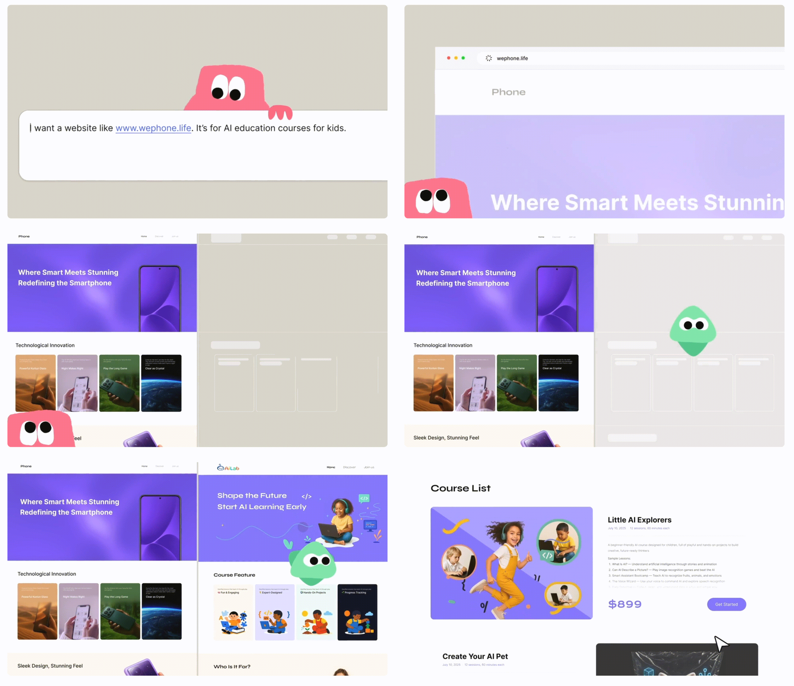
- No coding required: Just chat with AI in plain English
- Professional results: Minimalist design optimized for conversions
- Lightning fast: Go from idea to published site in under 10 minutes
- Free to start: 30 credits to build your first website
- Mobile-optimized: Automatically responsive on all devices
Written by
Kimmy
Published on
Mar 17, 2026
Share article
Read more
Our latest blog
Webpages in a minute, powered by Wegic!
With Wegic, transform your needs into stunning, functional websites with advanced AI