Log in
Build Your Site
Homepage Design Inspirations: 17 Examples in 2024
Discover how to design a homepage that drives engagement, enhances user experience, and boosts conversions with practical advice and creative ideas.

Do you have trouble designing a homepage capable of delivering the brand image that your company needs? You're not alone. Designing a beautiful homepage is never enough; it has to also appeal to your audience’s calls and get the audience to take action. If you are sitting in front of a blank computer/notebook wondering how to proceed then you are at the right place. I’ve been there as well, and this is why I’ve compiled for you an extensive list of home pages to inspire your new design project.
In this article, I will also discuss further the specifics of homepage inspiration, some of the best examples of homepages along with the design elements and layout ideas and some valuable tips that will not only grab the attention of your visitors but also make them come back. For those who need to lay down a new site or those who just decided to update the old one – these examples and tips will come in handy. Therefore, if you are finally up for making changes to your online ‘face’ and give it that perfect once-in-a-lifetime chance, let’s get started with the topic of homepage inspiration.
Understanding the Importance of Homepage Inspiration
On your page, when you say ‘homepage inspiration’, you are referring to the ideas and strategies that are behind the successful development of a homepage. Your homepage is not just a face that reflects positivity; instead, it acts as a guide to your website and reminds your visitors of the need to take action. Depending on what kind of site you are designing for business purposes, a personal site, or an online shop, the first page has to embody all that defines your business. Homepage design is one way of enhancing the design UX process, increasing engagement and, in the long run, enhancing sales. This is a basic principle that states that by modeling your homepage from another successful homepage, you can be sure to come up with a homepage that will appeal to your audience, is in harmony with your brand and can meet business needs as desired.
Key Elements of an Inspiring Homepage
Web design elements of homepage inspiration
Designing an appealing homepage is just half the battle; it is about asking how we can make the users feel, think and, subsequently, act in the way we want them to. So, to assist you in getting to that point, here is what should be included on every homepage to encourage that kind of engagement:
Clear and Compelling Headline
Always remember the saying ‘The first things they see must be the last things they hear,’ this implies on your headline. It should also instantly show visitors what the brand is all about and why they should be interested. The best headline is brief, concise and must get straight to the point – this is often referred to as the tagline for the overall website. It’s your opportunity to lure attention and make people interested in further exploration of that particular area. To get a feel of homepage design, try to focus on well-chosen brands such as Apple to enable them to come up with relevant wordings most appropriate to their target market.
Engaging Visuals
Let’s face it: People can see things and this is the reason they are called visuals. Sometimes, just getting in can be easy, for with a click you are drawn by beautiful images, great graphics or even even a perfect video. However, visuals are not just for showing; they should also convey your brand’s message. For example, if the products you are offering are environmentally friendly then using bright pictures of the environment can add to your passion for environmental concerns. It should always be remembered that the visuals you include should complement the content, not the other way around. Airbnb home page is good for this for inspiration They use imagery to tell a story that is emotional for one to identify with.
Intuitive Navigation
You’ve probably come across a website that seems as if you are lost in a labyrinth right? Not fun, right? Your homepage’s goal should be the opposite and it should be the digital equivalent of a GPS for your visitors. Easy to navigate means that the users can freely go to the area of interest without being distracted by unending pop-ups or adverts. An uncluttered menu bar is also important and all the buttons featured should have obvious names. It is rather unwise to force visitors to search for the content; the more intuitive the site structure is, the longer people will be willing to stay on the site. In this respect, Dropbox, for instance, is wholly impressive, designing the application to have a slick and polished design to go along with its great function. This aspect is especially important when looking for homepage inspiration.
Concise and Persuasive Copy
No one is keen on reading a fiction book when they find his or herself on a home page. The copy must, however, be short, convincing, and to the point. Each say is valued therefore one should strive to make them mean something. Your copy will direct the users through the site helping them understand what you offer without having to overwhelm them. This is where you can bring out your brand personality – if your brand is funny, blunt sarcastic or whatever the personality is, the copy has to reflect that. As for the homepage, one can turn to Slack for the perfect example: the copy there is as practical and unobtrusive as the app.
Strong Call to Action (CTA)
It can be said that a homepage without a good call to action is like a car without fuel – it’s going nowhere. This is a key call to action which should be larger or different in colour than the rest of the text to capture the attention of the visitors and direct them to the next action that you want them to take, for instance, filling a subscription form or purchasing a product or hiring a consultant. Still, when designing the CTA, make sure to pay attention to the colour contrast and placement and even use strong verbs in the text. So please don’t be shy here, your CTA is a place to be creative on your homepage is a great place for it. Learn from Netflix, their CTA is simple and their use and appeal are persuasive, using ‘Watch Now’ that creates an almost irresistible sense of urgency.
Social Proof and Trust Signals
The 21st century is all about trust. It also doubled when social proof such as clients’ feedback, rating, and even fame by adding recognizable clientele seals can also enhance credibility. Users tend to trust companies that other users also trust; there are always cases of loyal buyers recommending the same company to others. Social proof can be compared to yourCustomersTrust fellow customers would be most beneficial and it is simply a nudge to turn new visitors into customers. For example, gaining inspiration from homepages such as that of Basecamp customer testimonials and case studies are emphasized as this guarantees their reliability and effectiveness.
Mobile Responsiveness
This is especially important with the increased use of mobile devices such as smartphones in accessing the internet through browsers. A responsive website follows each of the above aspects, in a way that the layout of the web page will fit in different devices ranging from phone to tablet, to a personal computer. Such as Shopify, more websites are now built with Mobile first design where they provide homepage ideas that are responsive across devices. Mobile friendly isn’t just about the action that shrinks the pages downsized; it is the need to ensure that every textual content, image, and menu is as effective when viewed on the small screen as the large one.
Drawing Inspiration from 17 Successful Homepage Examples
Since we now have the basic principles let’s take a look at some real-life homepage inspiration that have successfully applied the tips above. These websites demonstrate inventive, easy-to-navigate designs, and the capacity to relate to users.
Airbnb
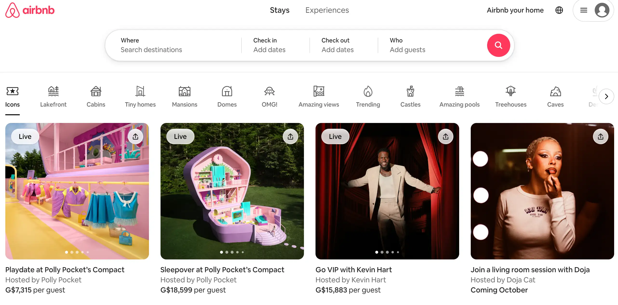
Airbnb's homepage is a prime example of how simplicity can be strikingly effective. The headline, “Book unique places to stay and things to do,” doesn't beat around the bush—it's as clear as a summer's day. The design is minimalist yet captivating, with high-quality images that make you want to pack your bags immediately. The navigation is as smooth as a well-oiled machine, and the CTA, “Explore Airbnb,” is practically an invitation to wanderlust. This homepage inspiration proves that sometimes less really is more.
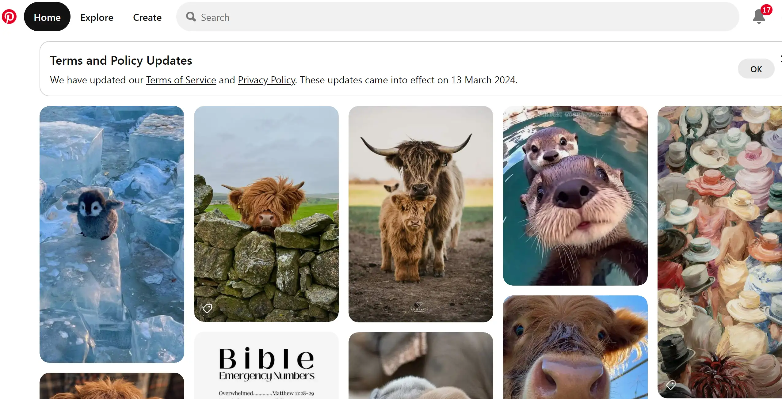
If you ever needed a rabbit hole of homepage inspiration, Pinterest is the place to dive in. Whether you're hunting for the perfect cookie recipe or a dose of web design creativity, Pinterest is your treasure map. It’s not just a platform for pretty pictures; it's where your design dreams come to life. The beauty of Pinterest is that it’s like a buffet—you get a bit of everything, from web design showcases to juicy blog posts. With this homepage inspiration, you’re bound to find that creative spark, whether you’re a novice or a seasoned pro.
Healthline
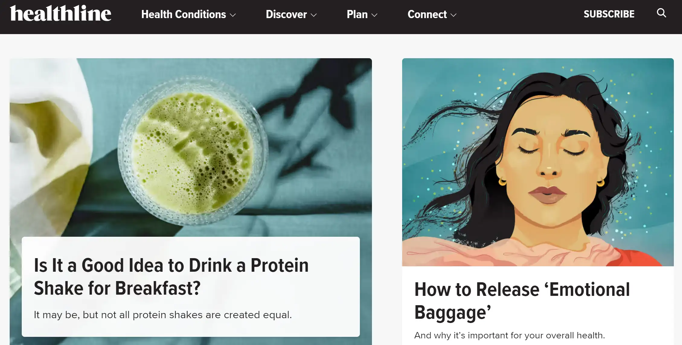
Healthline's homepage is like a health guru who prefers to show rather than tell. No need for loud declarations like "We publish health articles!"—the homepage does the talking with an array of informative article titles right above the fold. The design is educational without being overbearing, and the hamburger menu is your ticket to easy navigation. This homepage inspiration is perfect for those looking to educate and engage without a lot of fluff—just the facts, ma’am!
Apple
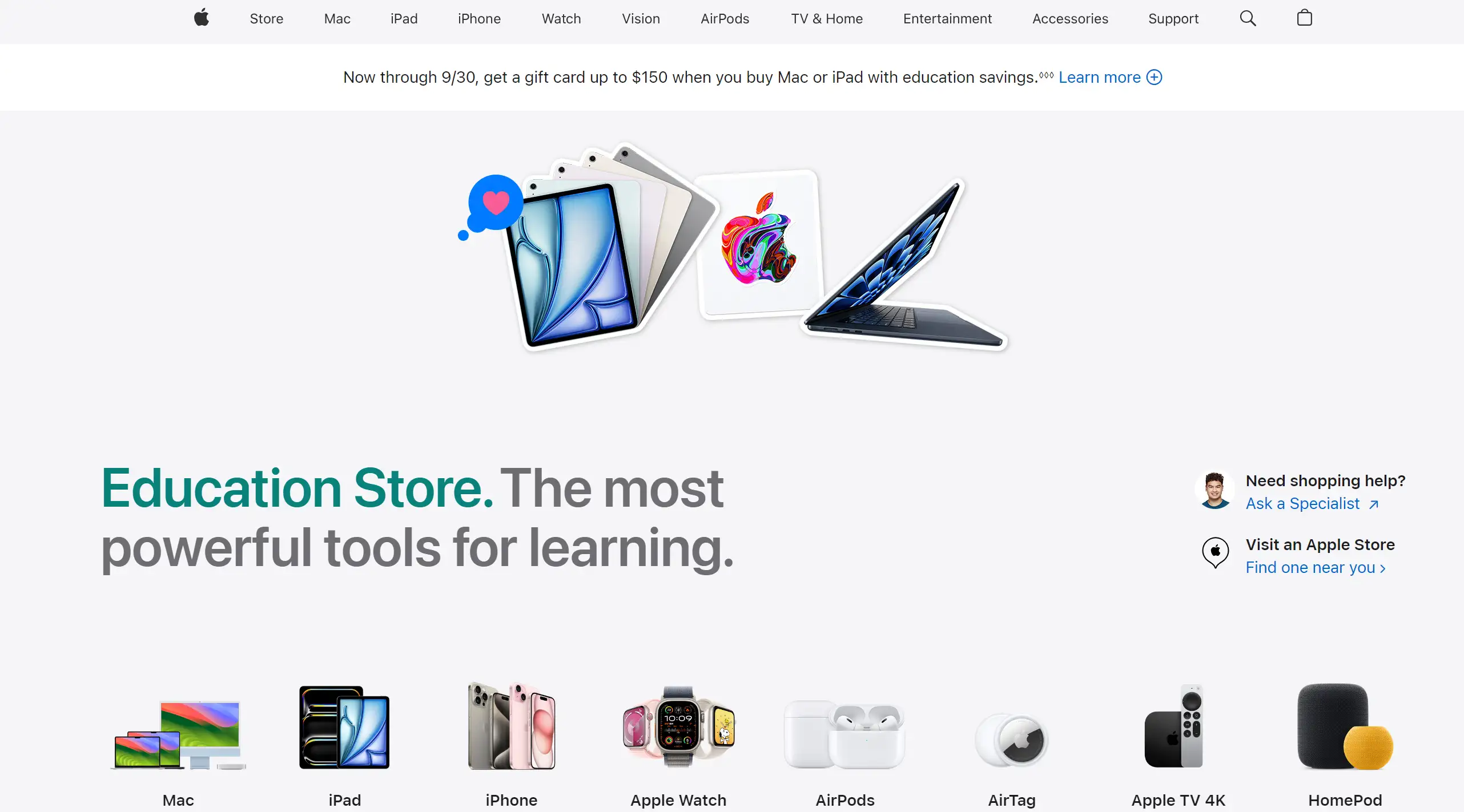
Apple's homepage is the epitome of elegance and innovation, delivered with a side of minimalism. High-quality visuals do the heavy lifting, while succinct text whispers sophistication. Navigation is as straightforward as a one-way street, leading you directly to their sleek product pages. With CTAs that are clear and to the point, this homepage inspiration is all about making a lasting impression with less—because who needs clutter when you’ve got style?
StudioPress
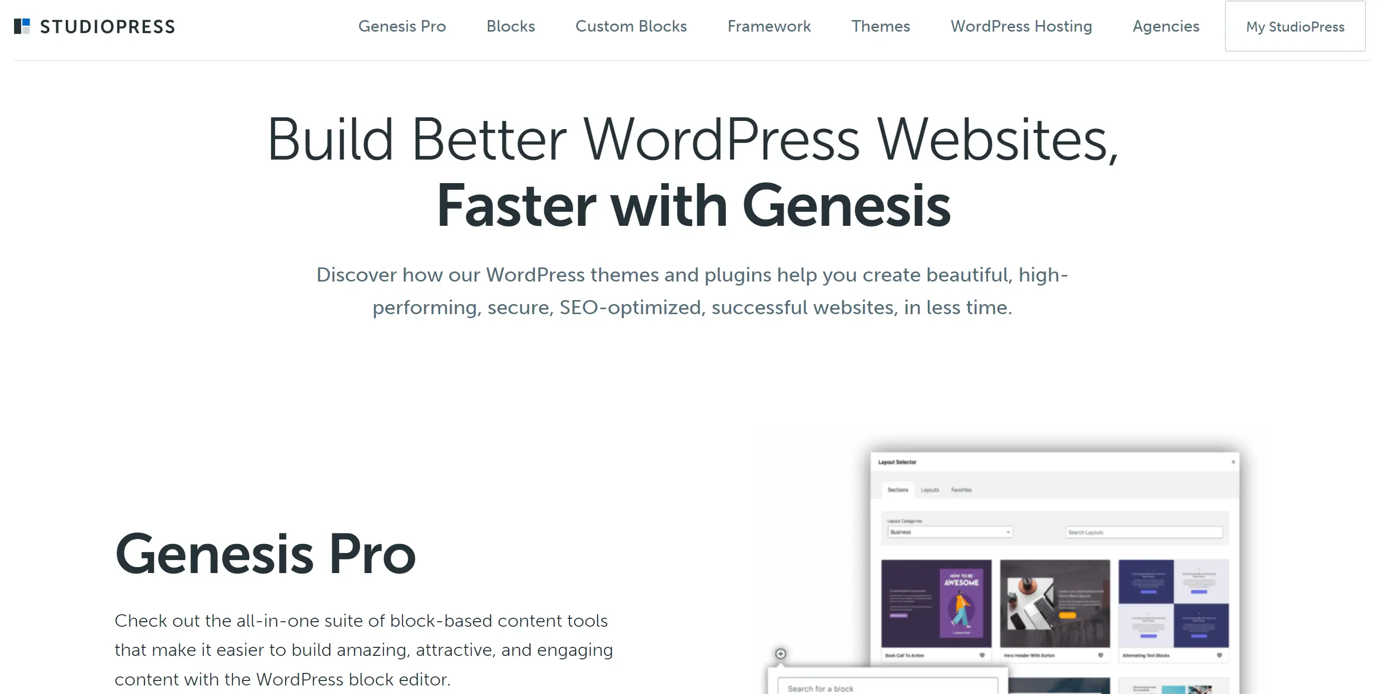
StudioPress has mastered the art of making a statement with minimal elements. Their homepage is a symphony of flat design illustrations and muted colors, making the message, “Build Amazing WordPress Sites,” stand out like a lighthouse in a storm. With three CTAs catering to different user journeys, this homepage inspiration is all about guiding users to their next step with confidence and clarity.
Grammarly
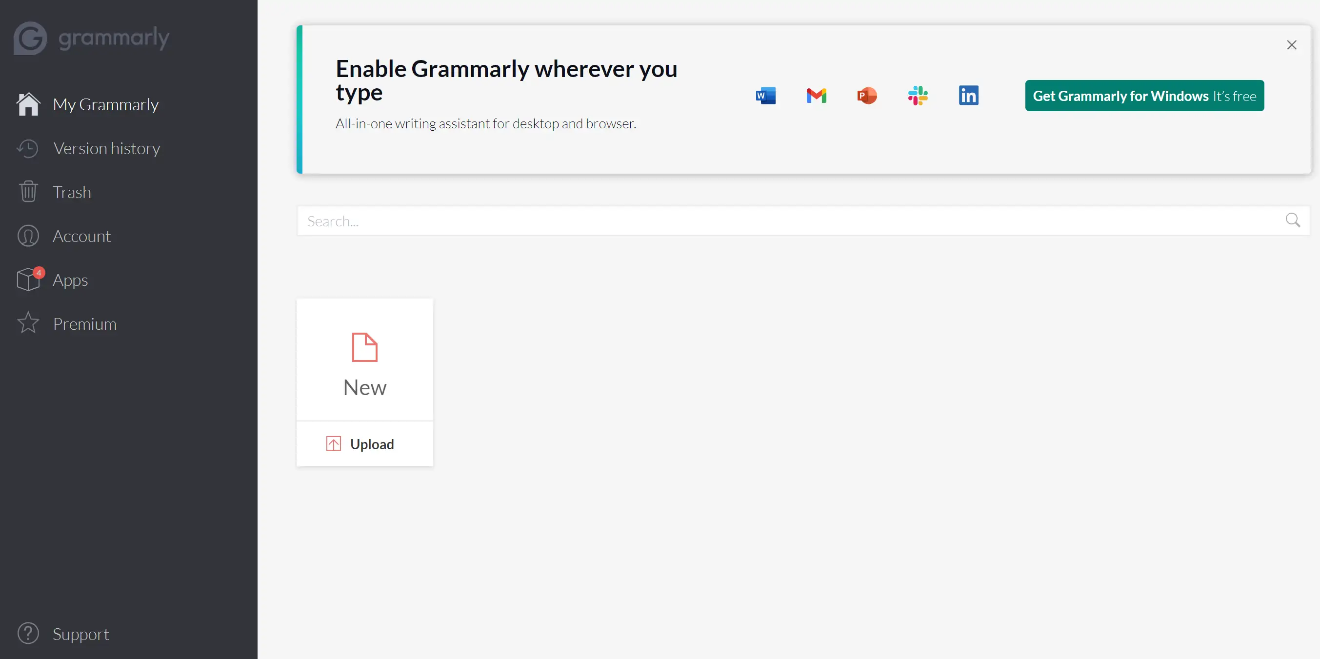
Grammarly's homepage is like a grammar superhero in action. With lively animations showing the app's versatility—from emails to Word docs—this homepage inspiration is not just informative but also entertaining. The bold headline grabs your attention, and the subsequent copy addresses common writing woes, offering Grammarly the ultimate solution. The user ratings and numbers flaunt Grammarly's popularity, making it a homepage that convinces and converts with flair.
Spotify
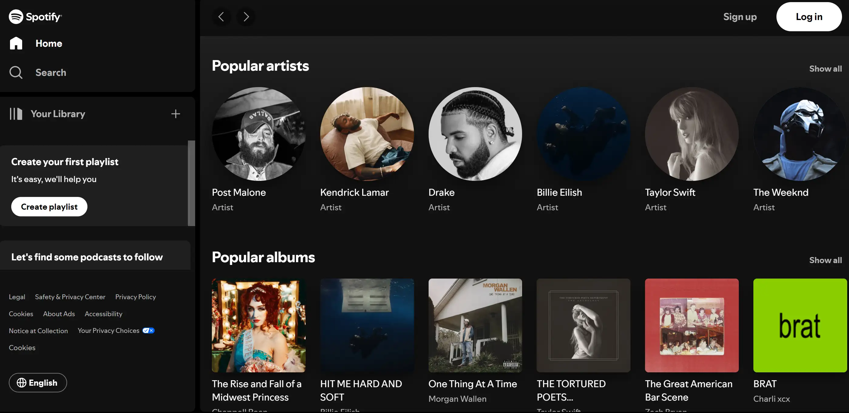
Spotify’s homepage is a masterclass in engagement, with the catchy headline, “Listening is everything,” setting the stage for a personalized music journey. Vibrant visuals and a prominent CTA—“Get Spotify Free”—make it hard to resist diving in. The bright colors, shadow effects, and animations reflect Spotify’s creative spirit, making this homepage inspiration a melody of great design and brand consistency.
Dribbble
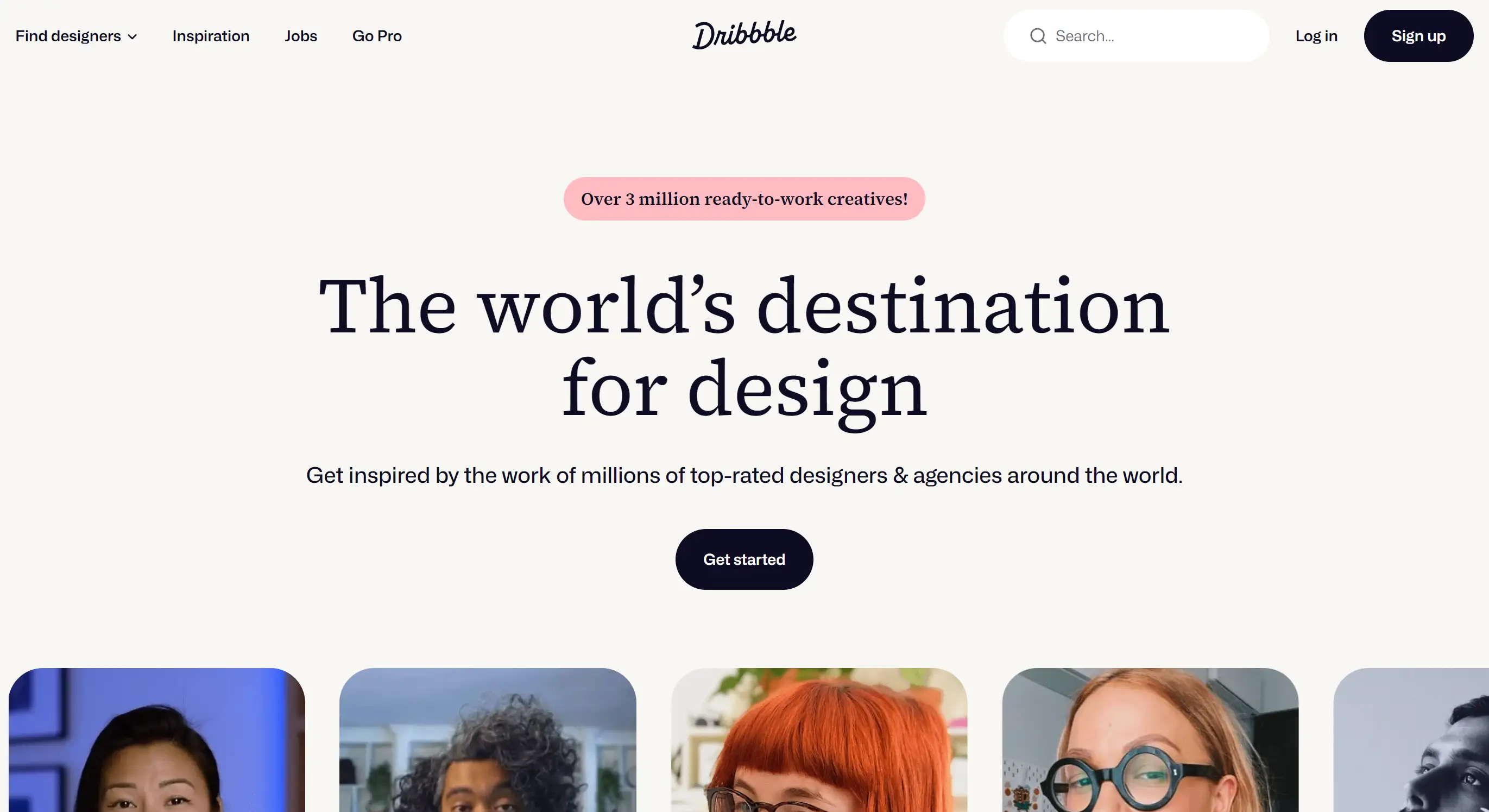
For a designer, Dribbble is like a candy store of homepage inspiration. This platform is a community hub where designers can showcase, share, and grow their skills. From web design to print, Dribbble’s vast collection is a goldmine for those seeking creative ideas. The design showcases are so diverse, that you might find yourself inspired by something completely outside your usual scope—like a UX pattern or a graphic animation. If you’re stuck in a creative rut, Dribbble’s homepage will surely be your escape route.
Slack
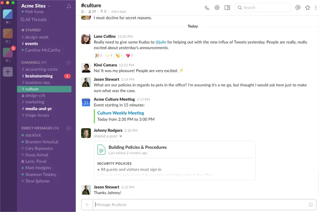
Slack’s homepage is a colorful parade of custom illustrations and a tagline that nails it: “Where Work Happens.” This isn’t just any old homepage—it’s a roadmap to productivity, clearly guiding you to sign in or create an account. With more navigation options than a Swiss army knife, Slack’s homepage inspiration ensures you find exactly what you need, all while enjoying the journey.
Pttrns
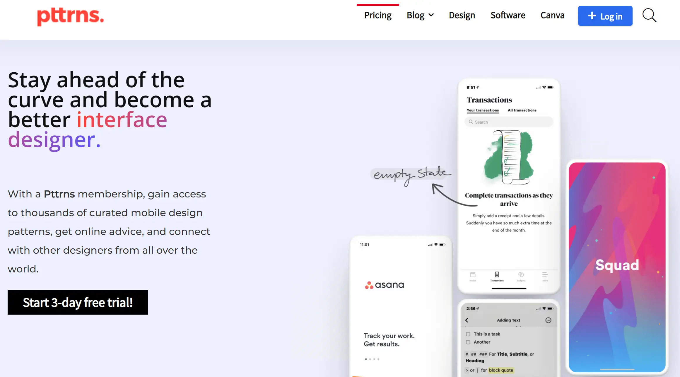
If mobile app designs are your jam, Pttrns is the homepage inspiration you’ve been waiting for. This site is dedicated to showcasing responsive designs that look fabulous on both desktop and mobile devices. The categorized design patterns make it easy to find just what you’re looking for—whether it’s a slick confirmation screen or a creative activity feed. Pttrns is all about finding that perfect design gem, no matter how specific your needs are.
Zendesk
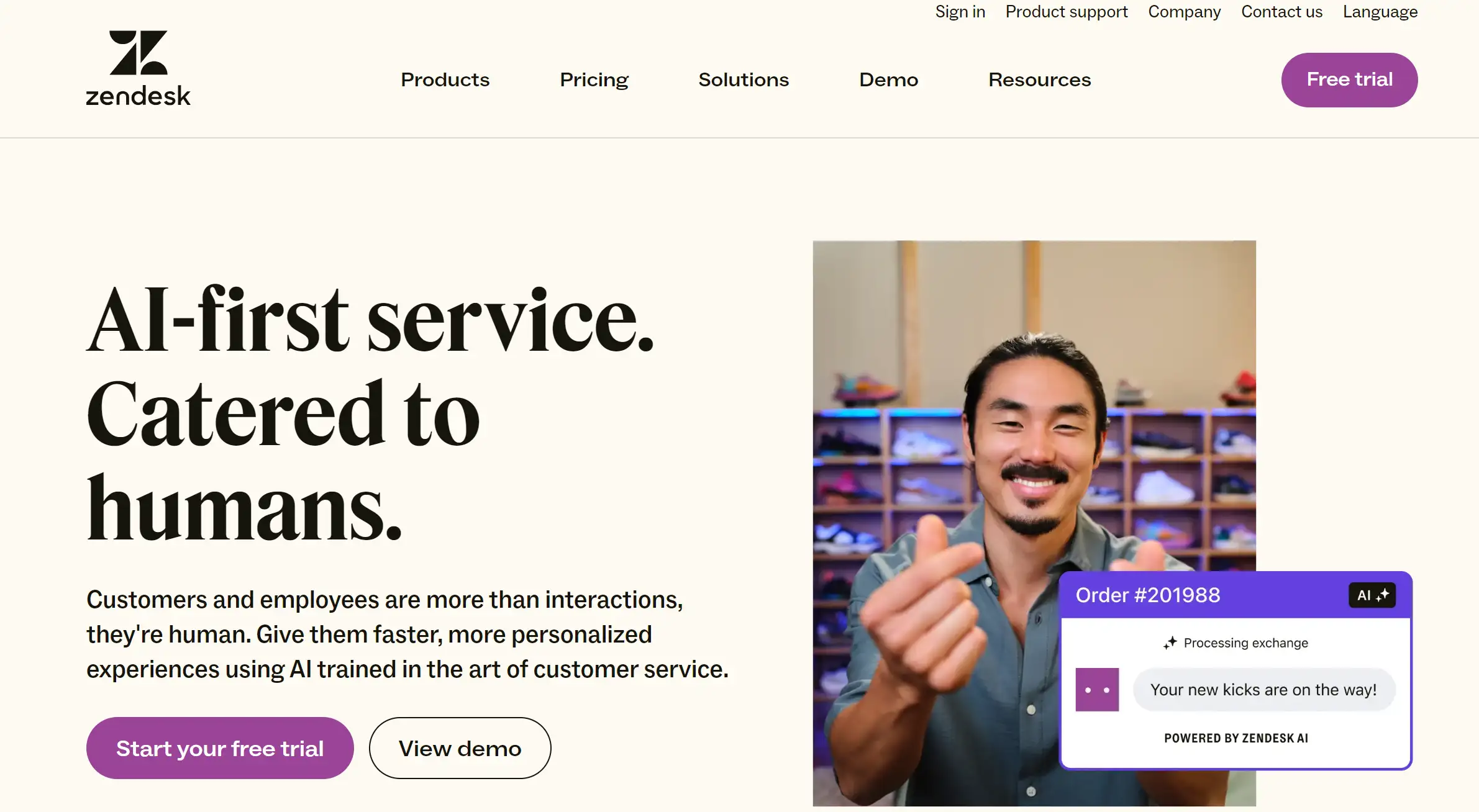
Zendesk’s homepage is like a breath of fresh air—simple, straightforward, and to the point. The menu bar is clean, the white spaces are generous, and the CTAs are crystal clear: “Start your free trial” or “View the demo.” The moment you land on the homepage, you know exactly what to do. This homepage inspiration is all about making the user’s journey as smooth as possible, proving that sometimes simplicity is the ultimate sophistication.
CarMax
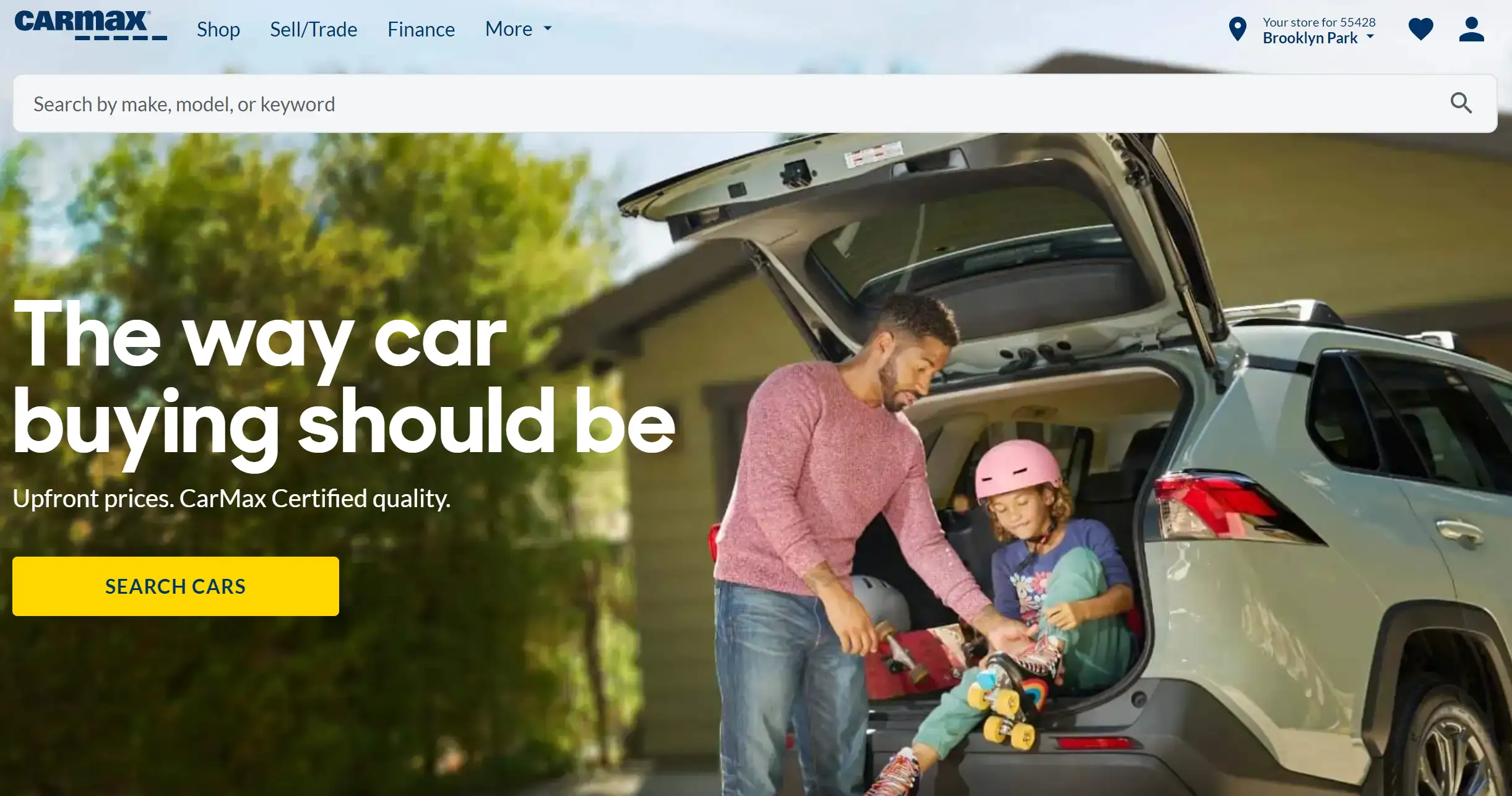
CarMax’s homepage had to cater to two very different audiences—buyers and sellers—and it does so with flying colors. Multiple CTAs guide visitors to either find a car or sell their old one, with a custom-made hero image adding a personal touch. This homepage inspiration is a prime example of how to balance dual functions without compromising on clarity or user experience.
Starbucks
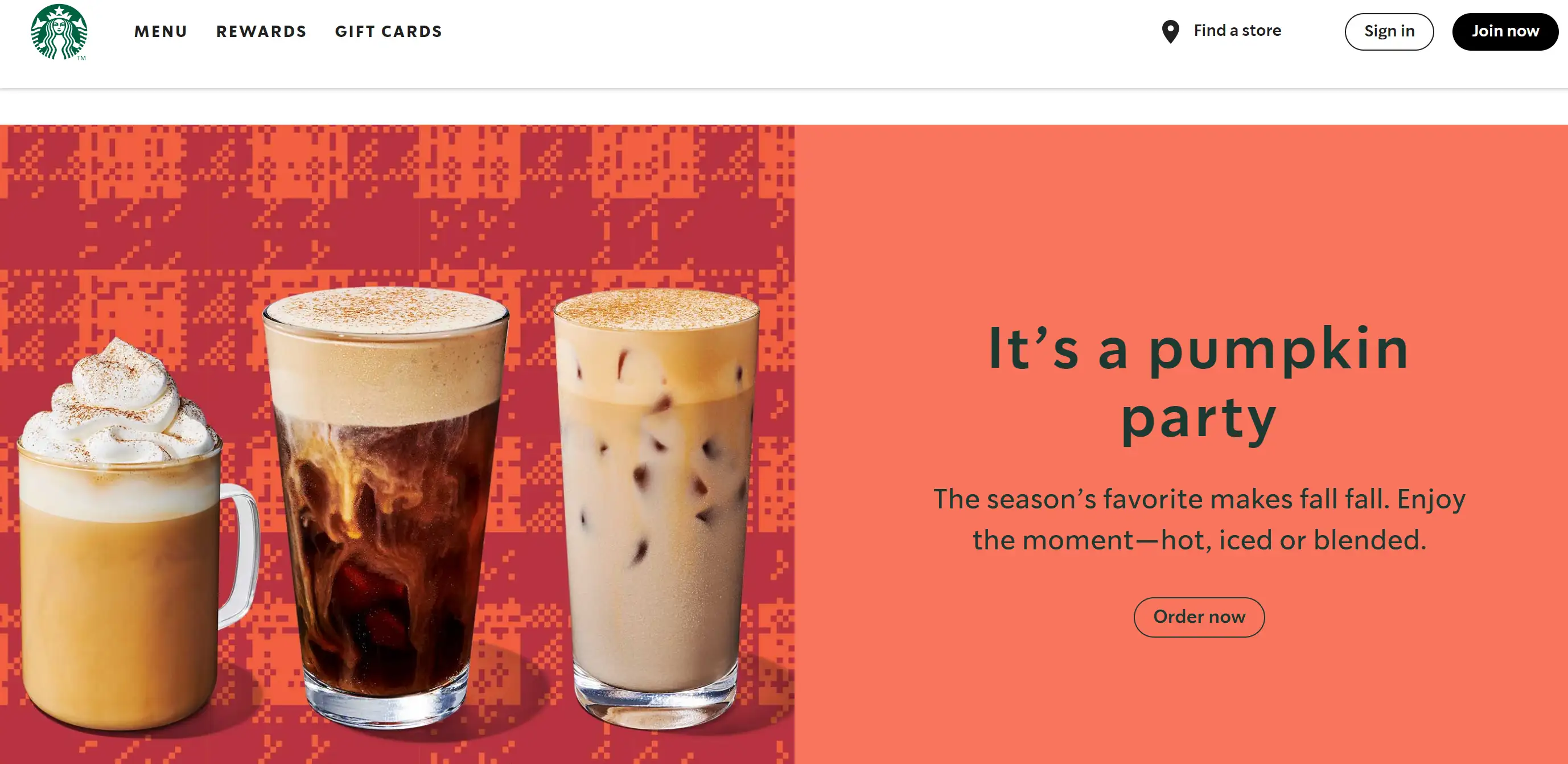
Starbucks knows how to keep things fresh, and its homepage is no exception. Whether it's promoting a new drink or a seasonal offer, the design changes regularly, keeping the content lively and engaging. The “New” icons and compelling headlines are like an irresistible nudge, guiding users to take action—whether it's getting free coffee or exploring new products. This homepage inspiration is a perfect blend of marketing savvy and user engagement.
Evernote
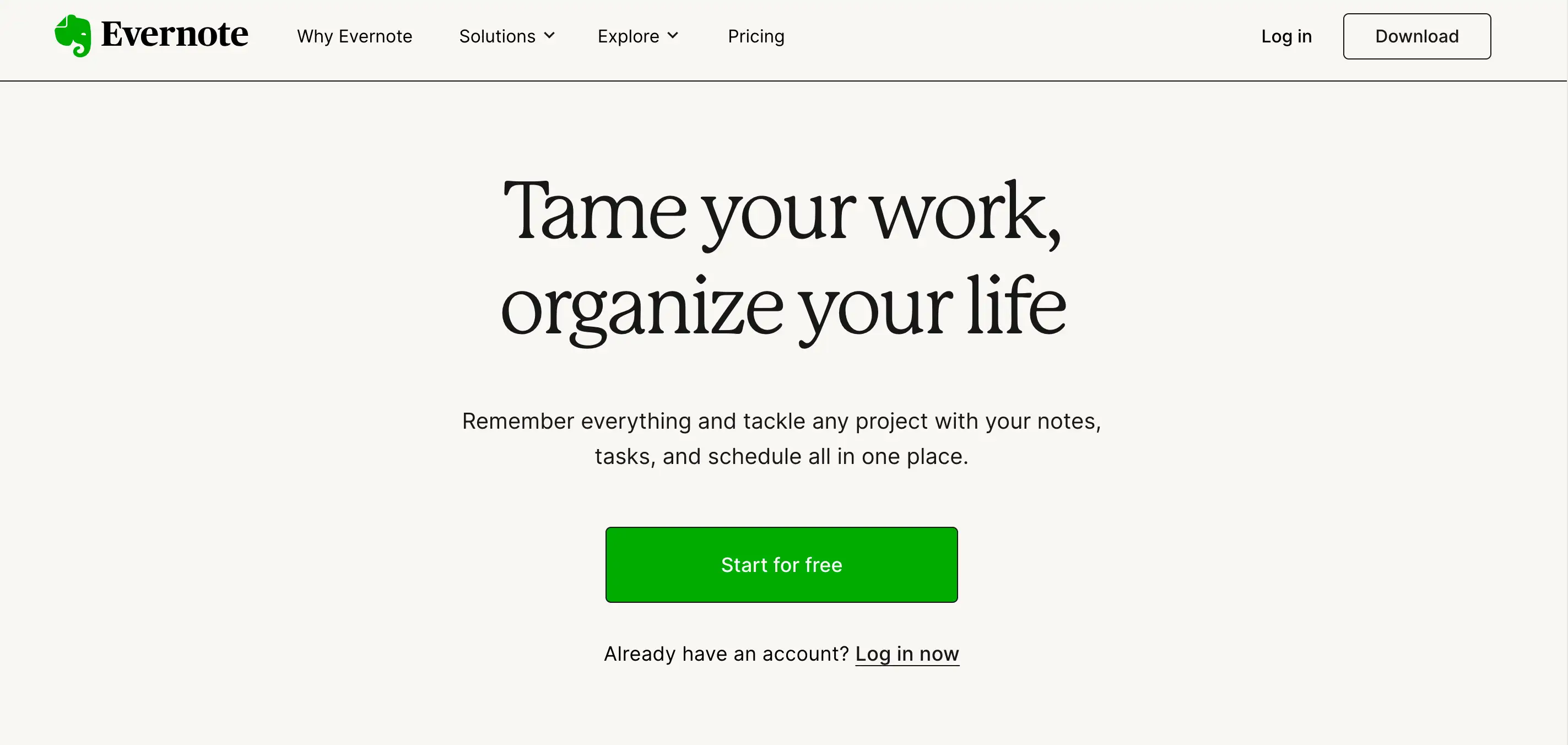
Evernote’s homepage is like a well-organized workspace—everything is where you need it, right at your fingertips. Screenshots give you a peek inside the app, making it easy to understand what Evernote offers. The green-highlighted CTA—“Sign up for free”—is impossible to miss, and with pricing details upfront, there’s no need to go on a scavenger hunt for information. This homepage inspiration is all about efficiency and transparency, making life easier for its users.
Behance
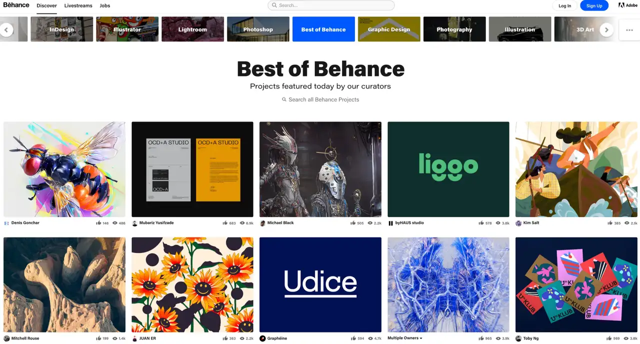
Behance’s homepage is a treasure trove of web design inspiration, thanks to its vast and diverse creative community. The detailed filtering options let you narrow down your search to exactly what you’re looking for—whether it’s the latest typography trend from Japan or the most popular UI design from Mexico. With categories like web design, UI/UX, and motion graphics, this homepage inspiration is like a world tour of creative brilliance, right from your browser.
Siteinspire
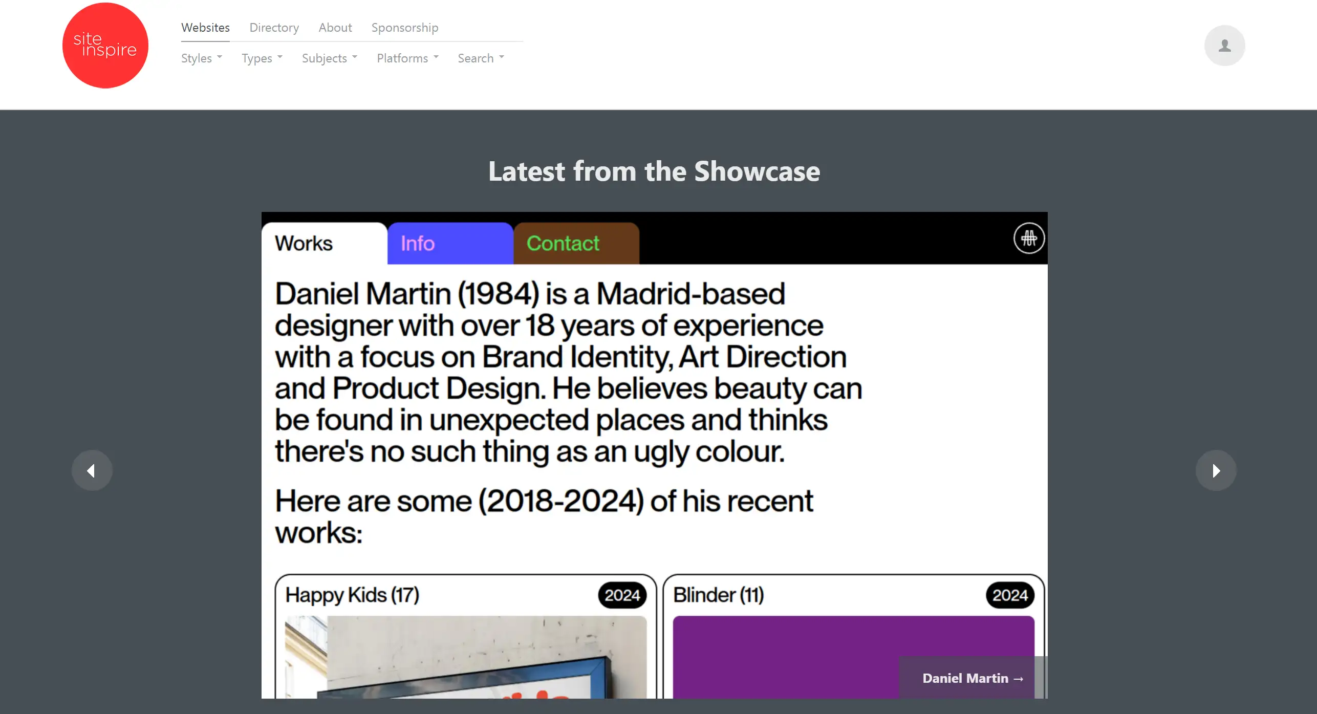
Siteinspire is the homepage inspiration you turn to when you need something specific, whether it’s a particular industry, layout, or design pattern. With an extensive tagging system, you can filter through a massive library of inspirational websites to find just the right fit. Whether you’re looking for user experience design or photography websites, Siteinspire’s refined search capabilities ensure you find that perfect piece of inspiration.
Dropbox
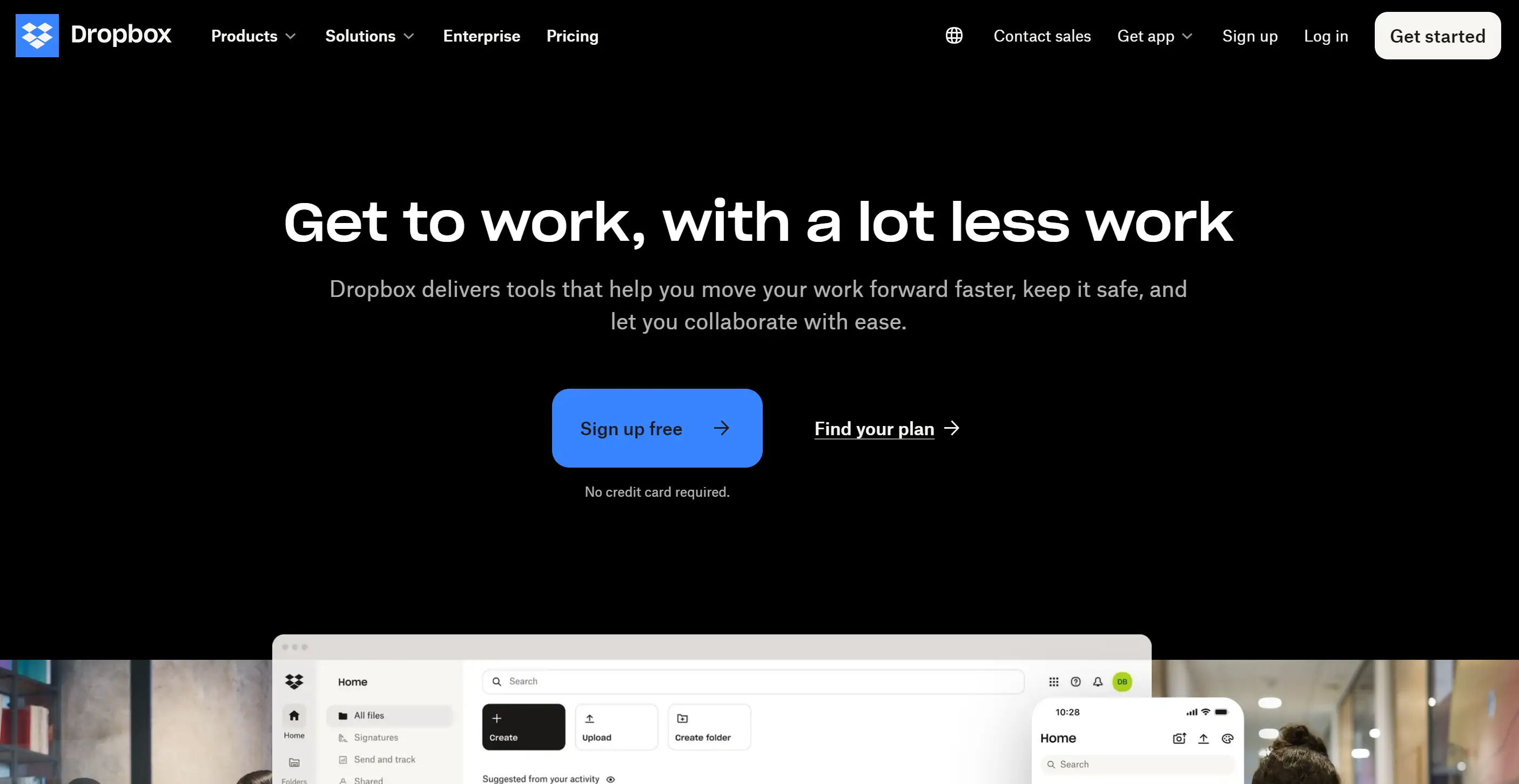
Dropbox’s homepage is a masterclass in organization, living up to its tagline with a design that’s as neat as a pin. Visible menu buttons and a well-arranged footer make navigation a breeze, while the primary CTA—a signup form gets straight to the point. This homepage inspiration shows how simplicity and function can go hand in hand, making it easy for visitors to find exactly what they need.
Tips for Finding Your Own Homepage Inspiration

Flat helpful tips for finding homepage inspiration
To help my clients establish a homepage that makes an impression, I try not to think about what has already been done. Here are some tips for finding your homepage inspiration:
-
Understand Your Audience: The most effective homepages are those that are oriented toward the target consumers. Always make sure you know who your visitors are, what they want and how your website can cater to them before you begin designing. Make sure that your design meets what he expects to see because everyone has their taste when it comes to designing.
-
Analyze Competitors: Learning from your competitors can also be necessary in a way that it gives you an insight into what is good/bad in the particular market niche. Study the workings of their homepages, with a special focus on the most successful aspects, and consider how these may be employed in the creation of your basic layout with a few twists.
-
Stay Updated with Trends: It is good to go with the flow more especially when it comes to web design because the trends change frequently. But do not run after every trend out there in the market. In this case, think of how the given trend will improve your homepage and ensure that the change is following the branding of your website.
-
Experiment and Test: Do not adhere strictly to organizational behavior theories when designing and planning for your motivation and organization. By the use of A/B testing, one can be in a position to identify what is effective in the market. After a few days, you may choose to experiment with the headlines or the images you use to capture the attention of your target audience as well as the call to action you use on your landing page.
Common Mistakes to Avoid When Designing Your Homepage
Creating a homepage that will enthrall visitors might sound very easy, but even the best designers out there are likely to make some mistakes. Here are the following areas that you should avoid making your homepage inspire you and not the other way around.
Overloading with Information
Perhaps, one of the most common mistakes involves attempts to put as much information about the brand, products and services as possible into the homepage. Although at first glance the concept of giving as much information as possible is rational, this often results in overly gaudy pages. People are not willing to read through blocks of text; they want something brief that will give them a glimpse of what you have to offer. Light and minimalist design can be used as a good example of how readability and unambiguity of the interface should be achieved. When considering home page designs, it might be useful to consider Google as an example: minimalist is the best way to go.
Ignoring Mobile Optimization
Designers are adjusted to the fact that the world has gone mobile, but they fail to consider mobility in their designs. If your homepage is designed in a way that is visually unappealing or doesn’t perform well on a mobile device, then it’s pretty much guaranteed that you will be losing a chunk of traffic. Make your design responsive this is a technique that enables your design to shift from one screen size to another. A homepage that takes time to load one that may not be easy to use on the phone or one that is just uncomfortable on the phone drives users away. A little homepage inspiration can be gotten from sites like Spotify, where the homepage can seamlessly be developed to be compatible with mobile phones without in any way having to compromise on looks or usability.
Vague or Weak Calls to Action (CTAs)
Essentially, a CTA’s role is to lead the visitors toward action and potential customers toward your services or products by offering them information through newsletters, or other means. Nevertheless, a large number of homepages do not have a CTA at all, or, conversely, contain vague and unemotional phrases. This is particularly important because your CTA must be assertive and immediate so that the target audience does not doubt the next action to take. Utilize such words that give an impression of, forcefulness, or enthusiasm. If you are looking for homepage design ideas, have a look at Dropbox – they use strong CTAs that encourage the user to do “Get Started” right away; there is no confusion as to what they intend the user to do.
Neglecting Visual Hierarchy
What visual hierarchy means is the fact that arranging items on your homepage will be naturally sequenced, in the preferences of a visitor. Without it, your homepage can come across as cluttered and there won’t be a clear indication of where the user should be paying attention. Headlines, CTAs, and key visuals should also stand out because these are some of the most critical items a web designer should always focus on. If the desired identity is not conveyed and a plan of visual hierarchy is not set then users tend to leave the site to avoid further confusion. For a dash of homepage inspiration, it’s always helpful to take a look at how the multibillion-dollar corporation Apple runs its homepage with a highly structured layout that guides the user’s eye exactly where it should go.
Using Too Many Fonts and Colors
Often when designing a homepage, people can get so enthralled with the notions of choosing a font, choosing a colour, and so on that they can easily lose track of what is important. That is why complex combinations of different fonts for websites and clashing colours create an untidy and unprofessional look on a homepage. Everyone wants an attractive design, so stick to a scheme of your colours and choose not more than two fonts. This prevents the establishment of the haphazard aesthetics that come with content clutter, thus designing a more professional and harmonized interface. As for homepage design, Medium is a good example, while clean design and consistent typography make the page look pretty and easy on the eyes.
Ready to Transform Your Homepage? Let’s Get Inspired!
Designing a brilliant homepage of the website might look like a herculean task to many people since they have no clue what is required of them. But hey we’ve all been there with the blinking cursor in front of the blank screen wondering how those ideas are going to materialize let alone be workable. If you are now reading this article sitting on your laptop, discouraged and wondering how you got here, it is okay; everyone gets lost sometimes. That’s it here the key elements and the common mistakes one must not make while working on getting the perfect homepage and the trip does not have to be done alone.
I know the pressure of trying to craft the perfect homepage, where every pixel and word needs to scream “This is us!” But here’s the thing: searching for the proper homepage inspiration is not as much about inventing something new when it comes to the wheel it is about making a smooth ride in your direction. This is the goal when it comes to the homepage design – be it as simple as a single page with a logo, and name of your site, or bright, loud, and memorable – the main idea should be the freedom of your personality. The best ideas for developing your homepage are to soak up the best practices and principles for improving UX, and combine them with what is best for your business.
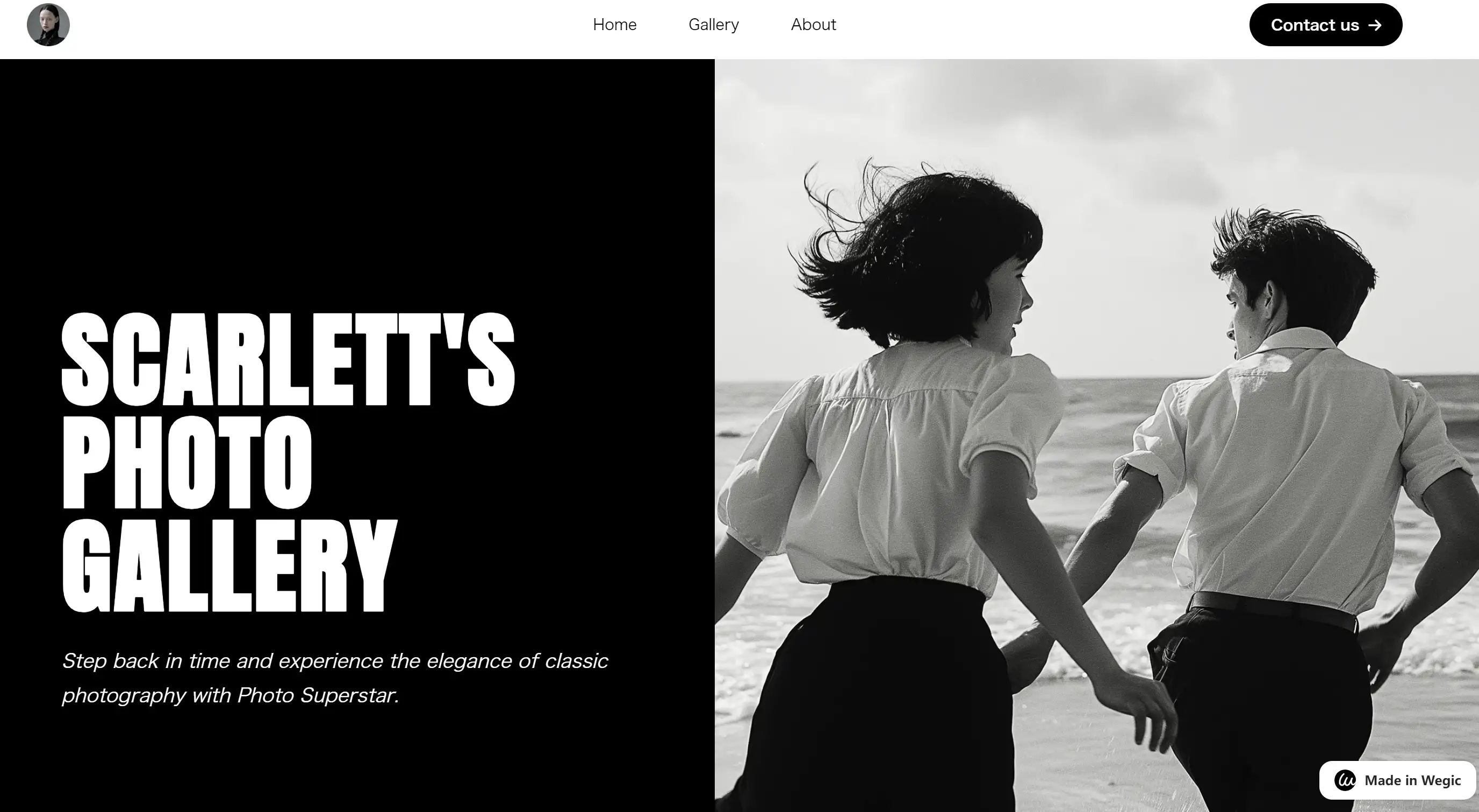
Wegic isn’t just another web design tool; it’s the one that makes everyone else look like they’re trying too hard. With a chat-based interface that anyone can use, it’s perfect for anyone who wants a pro-looking site without breaking a sweat. Whether you're setting up shop online, creating a killer resume, or launching a photo gallery, Wegic is here to make it happen with a wink and a smile.
Why Wegic is Awesome:
-
AI-Powered Design & Development: Wegic uses advanced algorithms that turn your vague ideas into a polished website. Think of it as your brain but with HTML skills.
-
Browser Compatibility: Wegic plays well with all the major web browsers. No need to worry about your site looking wonky on your friend’s ancient laptop.
-
CMS Integration: While full integration is coming soon, Wegic’s output can be adapted for popular CMS platforms. It’s ready to roll with the big boys.
-
API Access: For the tech-savvy, API access is in the works. Think of it as giving Wegic even more superpowers.
-
Social Media Integration: Coming soon—direct integration with your favorite social media platforms. Sharing your new site will be easier than ever.
So, what’s stopping you? It only takes a few clicks and maybe a massive opportunity awaits your organisation. Welcome to the world of homepage inspiration Let’s get started and design something you would be proud to show to the world.
Written by
Kimmy
Published on
Mar 17, 2026
Share article
Read more
Our latest blog
Webpages in a minute, powered by Wegic!
With Wegic, transform your needs into stunning, functional websites with advanced AI
Free trial with Wegic, build your site in a click!
What kind of website do you want to build?