Log in
Build Your Site
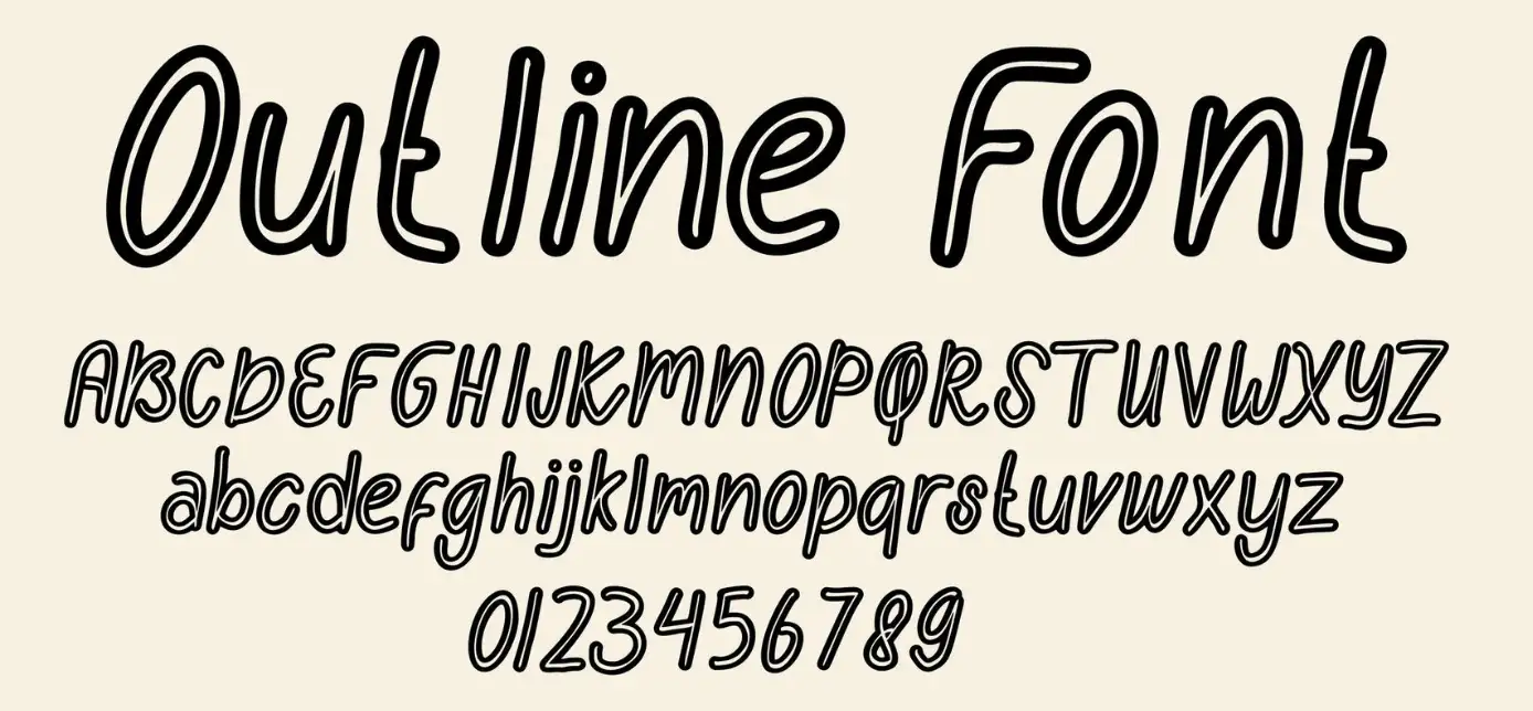
Top 10 Fonts for Websites to Enhance Your Design in 2024
Unevil the top 10 fonts for websites and elevate your design with our comprehensive guide. Learn essential tips for choosing suitable fonts to enhance readability, accessibility, and brand identity.

The obtained visualization of needs is the perfect balance of both aesthetic and functionality which may be difficult to achieve in the constantly evolving sphere of web design. Similarly to structural design, visual design involves the careful consideration of several aspects that eventually impact the perceived usability of the application. Indeed, choosing the right fonts for websites is one of the most important things that you will ever do. Choosing the correct fonts can give or take away your design, and determine the public image of your company or the feel and look of the content.
I’m sure that all of you, at least once in life, were struggling with the choice of fonts and their quantity. Deciding on the suitable typefaces for websites is not simply selecting types that are aesthetically appealing but selecting the most appropriate brand identity for the site’s communication strategy and target audiences. The theme of an engine that provides successful performance for a launching tech startup is not effective for a boutique clothing store. Such relativity makes the selection process as an interesting one as it is also a challenging one.
Several things affect customers’ attraction and stick around on your site, and the font you choose is one of them. Choosing a web font that is likely to be preferred by the targeted visitors makes the texts easier to read, more pleasant to the eyes and attracts more traffic. On the other hand, the worst font choice may hamper site usability and its exterior looks, thereby forcing people to leave.
But how to move in this quite tangled world to choose the right fonts for the website? That is what we are here to discover. Now it’s high time to explore the world of Web typography and determine what fonts for websites can enrich the design and attract the audience in 2024. Regardless of whether you are in the mood for more contemporary and sleek styles, or for more traditional and timeless shapes or if you desire to be entirely more individual and artistic, you are at the right place.
Click here to Build your site
Why Fonts Matter
Among the important factors, which people fail to pay much attention to when trying to design or redesign their website, is a selection of fonts. Selecting the right fonts for websites is vital for multiple reasons, each contributing to the overall effectiveness and appeal of your site. Let's delve into why fonts are more than just decorative elements and how they can significantly impact your website's performance and user experience.
-
Effective Communication: To begin with, the fonts you use are one of the main determiners of how high the readability and legibility are going to be. Even though the terms ‘typeface’ and ‘font’ are used almost synonymously, they hold specific meanings in the domain of typography. The concept of readability relates to the ease with which the users of your website can comprehend the content on your site. This catalogue includes elements like the use of coherent sentences, the words’ length, and even the paragraphs’ construction. On the other hand, the term legibility depicts the ease of individual letters as well as characters regarding how easily one can recognize the respective figures with a passing glance or recognize readily distinguishable forms of elements. Choosing a spectacular font improves the two aspects of readability and makes your content not only easy to comprehend but also attractive to the readers. It can also be described as a situation in which one gets to a website that looks good and interesting with great pictures and appropriate info, but the text is too close and the letters cannot be understood. More often than not, you would probably leave the site in disgust. Thus, fonts focus and help to keep the visitors not only interested but also engaged, which prompts them to browse through the information more or otherwise lose interest with lowered readability and poor legibility of fonts.
-
Visual Design and Brand Identity: Fonts are indeed effective means through which your website and business can convey its visual layout and message to the audience. Unlike other designs that are only cosmetic, they narrate your brand. For instance, a slim and clean font will reflect business and elegance, which is ideal for a business or technology firm’s website. On the other hand, a decorative and playful font can be appropriate for a portfolio or a child-related website as the intent is to be creative and fun. The fonts that you should use in your samples should correspond to your brand’s character and the tag you want to set. The mere fact that all the signs and graphics are created from this ideology forms a harmonious aesthetic that is acceptable to the targeted public. In essence, when users want to find feeds that harmonize with the whole tone or style of your website, they are inclined to have faith in your brand and utilize your products or services. This ensures that when a typeface has been chosen it is representative of the brand’s nature and ethos, therefore resulting in a coherent and easily recognizable user experience.
Characteristics of the Best Fonts for Websites
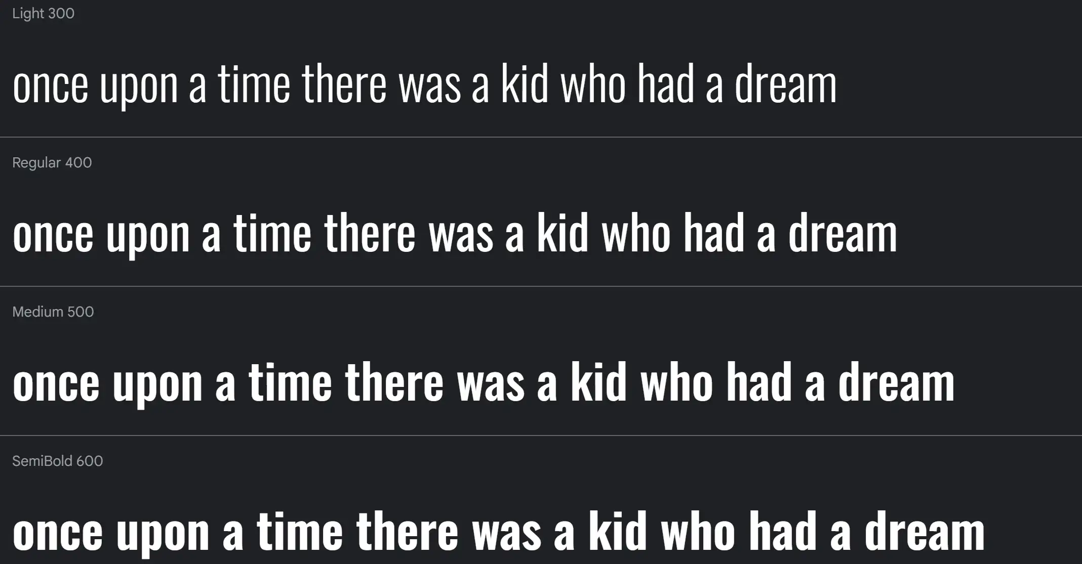
First of all, when it comes to font selection it is better to use regular fonts, that are rather universal, and still look good. New Readability makes the content easy to read and New Versatility allows you to use the font for different parts of the site. The first type of compatibility relates to the general looks and ensures that the font fosters the right brand image and design of the website.
-
Readability: The major criterion that you should look at is the readability of the fonts. Thus, when applied to Web 2.0, fonts that can be easily read help improve the overall UX by rendering content more legible. Font size and the space between letters (kerning) and lines (leading) are some of the characteristics that could act as hindrances to reading ability.
-
Versatility: Good fonts for websites should be able to fit the many circumstances and purposes that may be required of them throughout your website. Regardless of whether the font is placed in the header or the body text or even in the captions, the font should remain pleasant to the eye and should be readable.
-
Compatibility: Another property to which much attention should be paid is the fact that it should match the overall theme of the site and its vision. It should harmonize with other styles, including colours and overall [layout/design] to give consistent appeal to the eye.
-
Accessibility: To attend to the disabled especially the visually impaired make sure that the fonts are legible for them. Do not use cursive styles, or very stylised typefaces, as these are difficult to read. However, writing should use clean typefaces that have good contrast and striking passable type sizes.
-
Performance: Figure fonts can indeed impact the speed of your website. That is, depending on the type of font you choose, it may require a longer time to load the font on your site and this drags the overall performance. Thus, the appropriate option is to select the web-safe fonts that provide the highest speed of work. This helps to make your site fast and, of course, users will always appreciate that.
Top 10 Fonts for Websites: Enhance Your Design
Poppins
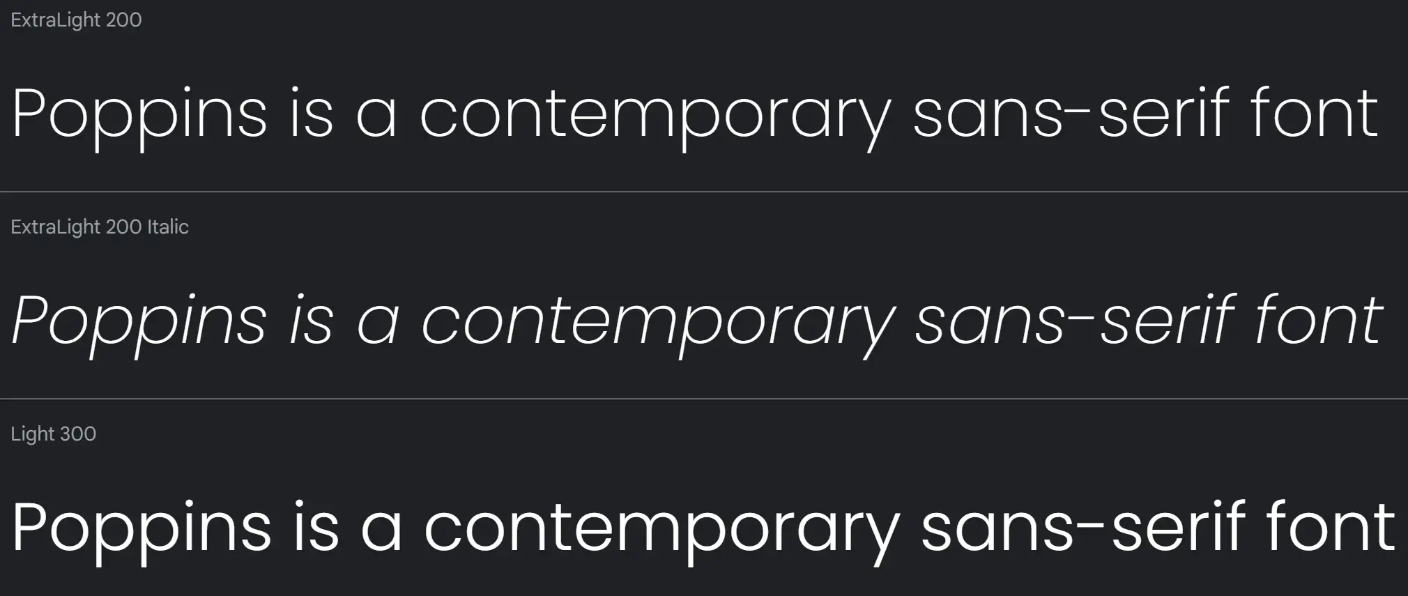
Poppins is a contemporary sans-serif font from the Indian Type Foundry, known for its legibility and versatility. It offers a harmonious balance between geometric shapes and humanist influences, making it suitable for both headlines and body text. With its wide range of weights and widths, Poppins is one of the most adaptable fonts for websites, providing a clean and modern aesthetic that fits various design styles.
Lora Font
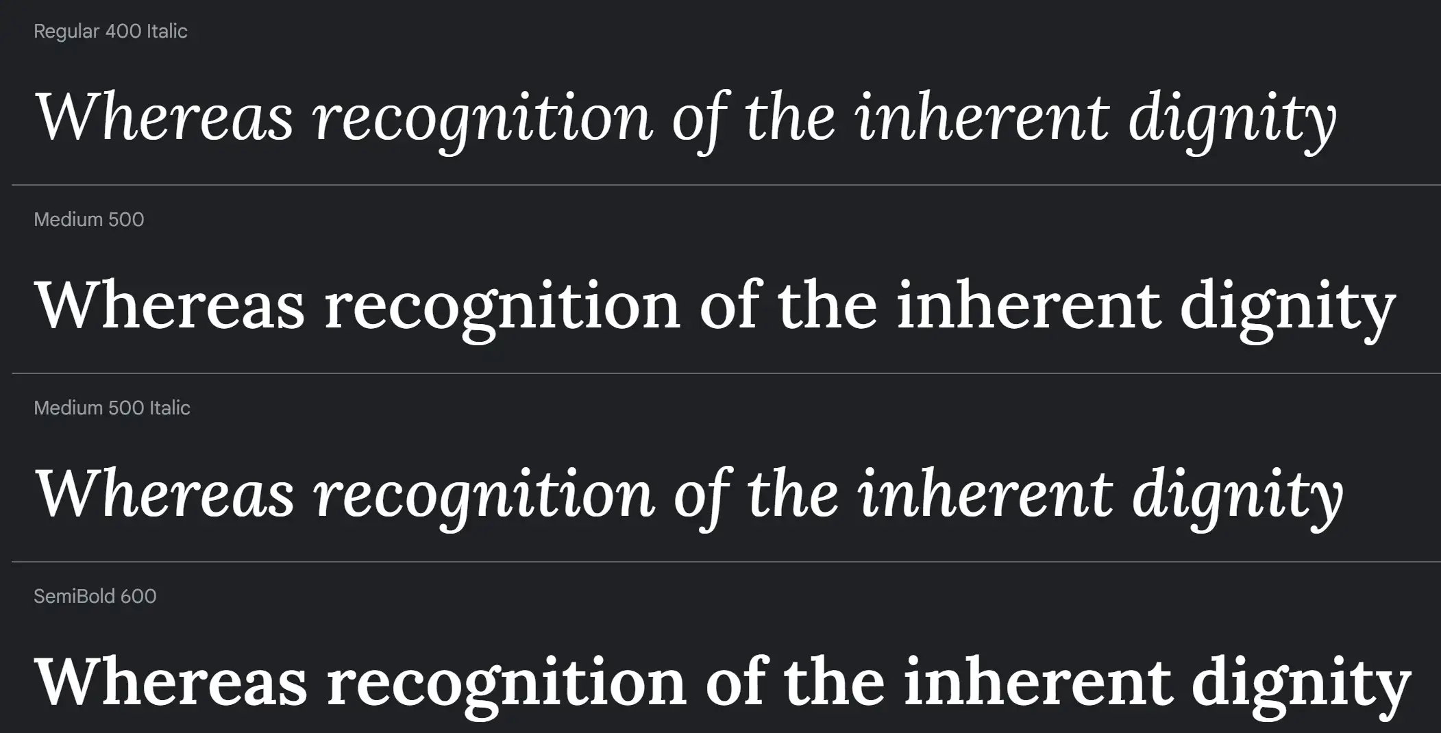
Lora is an excellent choice if you're looking for fonts for websites that combine readability with artistic flair. This serif font is highly legible, making it ideal for body text, while its hand-brushed curves add a touch of elegance reminiscent of calligraphy. Lora's four-weight options provide versatility for various design needs. When considering fonts for websites, Lora stands out for its ability to balance performance and personality, especially for creative brands seeking a more distinguished look. Its inclusion in Google Fonts ensures easy integration into your web projects.
Oswald Font
Oswald is a sans serif typeface meticulously designed to fit the pixel grid of digital screens, making it one of the best fonts for websites. Its narrow structure saves space, which is particularly beneficial for large headers with extensive text. Oswald's adaptability makes it a superb choice for web designs that require a modern and clean look without compromising on legibility. If you're seeking fonts for websites that offer both functionality and aesthetic appeal, Oswald is a top contender.
Migha Font
Migha, a free variable font by Seniors Studio, blends modern and vintage styles, making it a versatile option among fonts for websites. This display font family includes six weights, four widths, and numerous stylistic variations, totalling 96 font files. Migha is perfect for branding, magazines, posters, logos, and more, offering a full set of uppercase letters, numbers, punctuation, and multilingual support. Its extensive variety makes it one of the most adaptable fonts for websites, suitable for any design project requiring a distinctive touch.
Maragsâ Font

Maragsâ is a serif font inspired by the pakupyâ accent mark used in Filipino pronunciation guides. This modern bold typeface features sharp edges and abrupt cuts, echoing the stressed pronunciation of words. Free for personal and commercial use, Maragsâ is a unique option among fonts for websites, bringing cultural richness and contemporary style to web design. Its distinctive character and boldness make it an excellent choice for projects that want to stand out with a culturally inspired aesthetic.
Newake Font
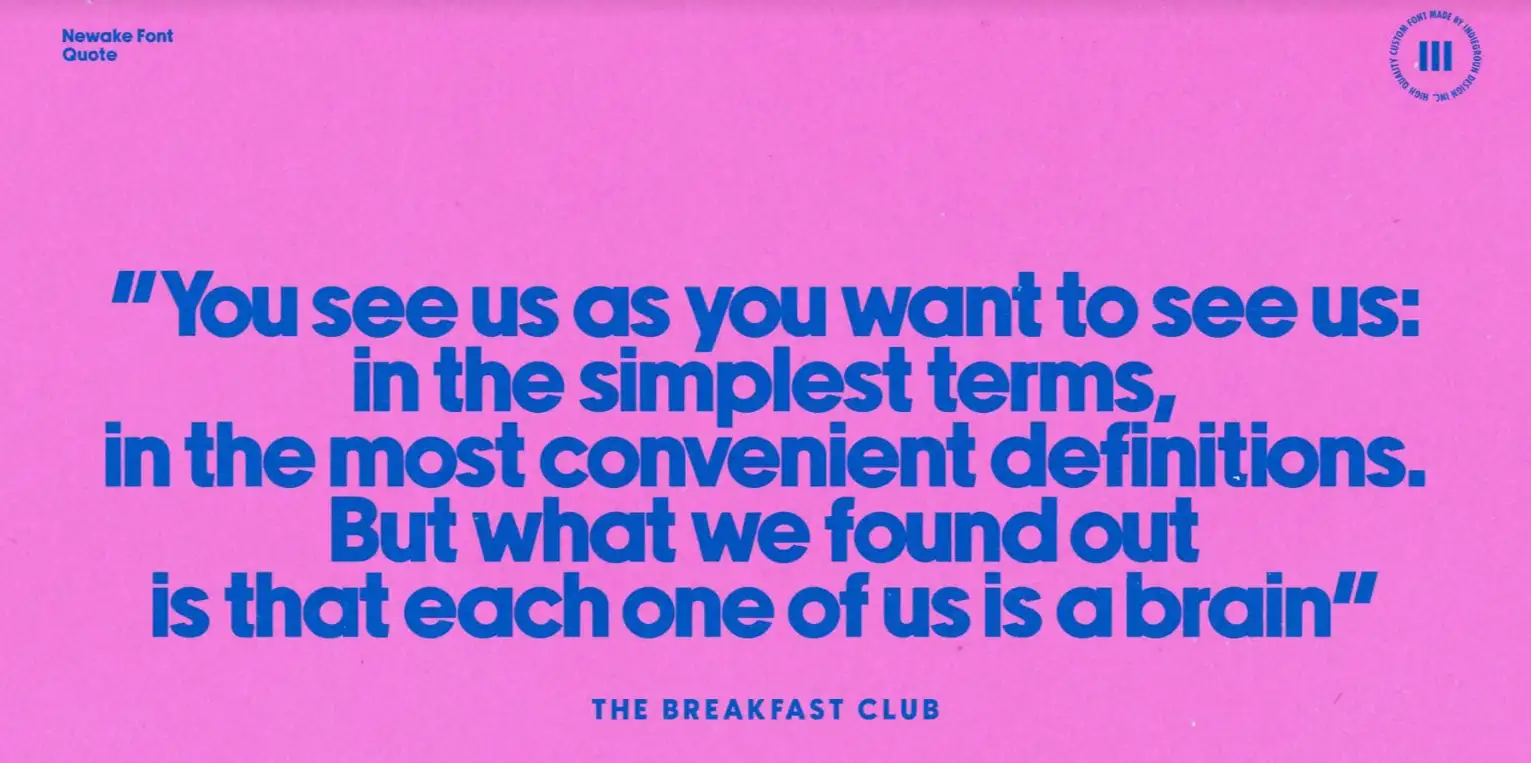
Newake Font by the Indieground Team is a sans-serif typeface with elegant lines and slightly rounded corners, making it perfect for titles, logos, editorial designs, and web design. This font's minimalistic atmosphere lends a cool, stylish weight to any project. With a full-character set available in the commercial version, Newake is one of the most refined fonts for websites, offering a blend of simplicity and sophistication that enhances any artistic composition.
Neutral Face Font
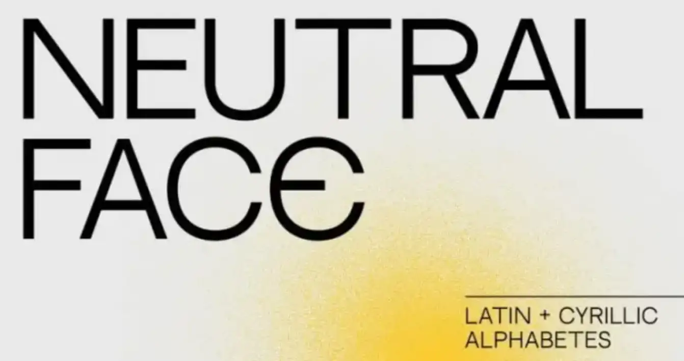
Neutral Face is an elegant sans serif font designed by Vadym Axieiev, inspired by the Swiss style. Available in regular and bold weights, it supports both Latin and Cyrillic alphabets. Neutral Face is ideal for layouts, apparel, magazines, posters, and more, making it a versatile addition to fonts for websites. Its clean and contemporary look is perfect for modern web design, offering a balance of elegance and readability that suits various design needs.
Neue Metana Font
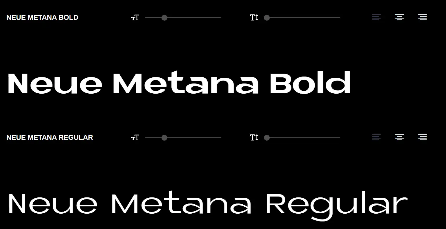
Neue Metana is a modern minimalist typeface with a geometric design and additional alternative characters and ligatures. Inspired by urban and lifestyle trends, this font blends seamlessly into any design, from light to bold weights. Created in collaboration with Aulia Rahman and designed by Jeje Yuhardi and Wildya Balqis, Neue Metana is a versatile choice among fonts for websites, adding personality and modernity to any project.
Magilio Font

Magilio is a serif display font featuring classic glyphs in a modern and classy style. With many alternative characters, it simplifies various design projects, making it one of the most flexible fonts for websites. Ideal for social media posts, logos, merchandise, book covers, and more, Magilio brings elegance and modernity to web design. However, it is only available for personal use. Its sophisticated look makes it a great choice for projects aiming for a luxurious feel.
Elanor Font
Elanor is a fresh and modern serif font with a retro style and experimental touches. Its elegant style and sharp shapes make it perfect for invitations, branding materials, business cards, quotes, posters, and web design. Elanor's extended Latin character set covers over 94 languages, making it one of the most comprehensive fonts for websites. Its classic yet contemporary design adds a refined and assertive look to any project, ideal for those seeking a luxurious and polished appearance.
Things to Consider in Choosing the Most Suitable Fonts for Your Website
The choice of the proper fonts for websites is the most vital aspect of the formation of website images and visitors’ behaviour. Fonts play a major role in the concept of user comprehension, also known as readability and, equally importantly, legibility, of a website. Also, fonts reflect the particular layout of your brand and can be an essential aspect concerning the visual design and appearance of the website.
Readability
Among all the features that may be granted to a font, the factor that must not be overlooked is the font’s readability. These are some of the aspects that have a direct impact on the usage of content by the users. For example, a font that is too small or has poor space between letters and words can cause hardship when reading thus a poor experience. A font, which is spaced and sized well, would be more amiable to the eyes as well as more easily scannable.
Text properties may slightly be tricky; however, they are easy to comprehend and include the font size, the space in between two letters called kerning, and the distance in between each line of text called leading. It is critical to ensure that these parameters are optimized which will enhance the general feel that customers develop towards your content. That is why it is also essential how the font responds to different gadgets and screens. Most fonts that may be good to read on a desktop computer may not look good when viewed on a phone screen. Thus, you should check how the fonts that you have selected work on different devices and do not break the text readability.
Font Licensing and Legal Considerations
Getting a licensed font is important in the act to avoid falling prey to any legal repercussions. Most of the font retailers go in for Web licensing and there are many Web fonts freely available on the Web. For instance, there is Google Fonts, which contains a large and easily downloadable collection of web-safe fonts that any web designer can use without being legally charged for it. Another advantage of using licensed fonts is to avoid confrontation with copyright copes as it is related to legal matters.
Font Pairing
The other area under typography is font selection. Applying different fonts in the design is effective because it brings out the contrast and the aspect of the hierarchy. For instance, setting huge and thick fonts for the titles and small and thin fonts for the texts can give a coherent structure that will direct people through the site. However, the fonts used should be compatible to avoid a mismatched look on the material or the project that they are working on.
Accessibility in Web Typography
In the context of the subject of web typography, accessibility forms one of the most significant concerns. Specifically, the fonts used must be clear to all the users including those with sight impairment complications. This implies the use of readable fonts and those which could stand out from the background in question. Avoid overly decorative or complex fonts that can be challenging to read, especially for users with visual impairments. Instead, opt for clean, simple fonts that enhance readability and provide a positive user experience.
Performance Considerations
The performance of your website can be affected by the fonts you choose. Some fonts can take longer to load, which can slow down your site and negatively impact user experience. To avoid this, choose web-safe fonts that are optimized for performance. These fonts are designed to load quickly and efficiently, ensuring that your site remains fast and responsive.
Click here to Build your site
Find the Best fonts that Match Your Website
Deciding on the best font for your webpage is critical in establishing the first and subsequent impressions on the audience’s psyche. By comparing the features with cues like readability, access, functionality, and licensing, you can choose different options to contribute to the improvement of the website.
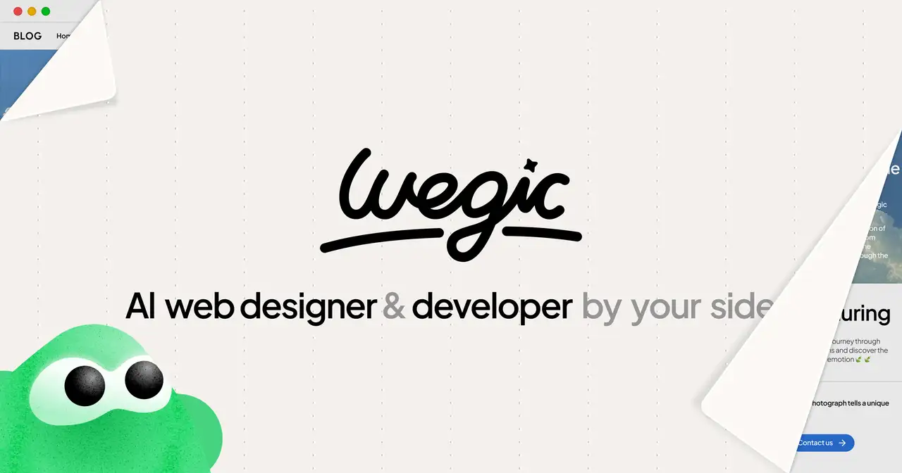
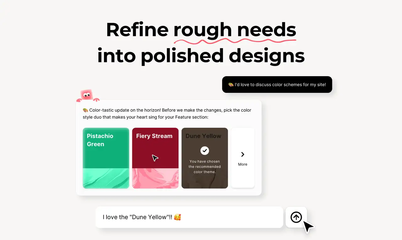
Wegic is a revolutionary AI web design and development tool that democratizes website creation through its user-friendly, chat-based interface. It's an excellent choice for individuals and small businesses looking to establish an online presence without diving deep into coding or web development. The blend of AI efficiency, ease of use, and customizable design options makes Wegic a standout tool in its category, offering unique advantages to a wide range of users. Whether you're building a personal portfolio, a business site, or anything in between, Wegic provides a streamlined, accessible path to a professional online presence.
-
Multimodal Interaction: Powered by GPT-4, Wegic enables users to guide the website building and hosting process through natural conversations and images, ensuring a seamless and intuitive experience.
-
Zero Barrier, Full Process Support: Wegic manages all technical details from website conception to deployment and hosting, requiring no programming or design background from the user.
-
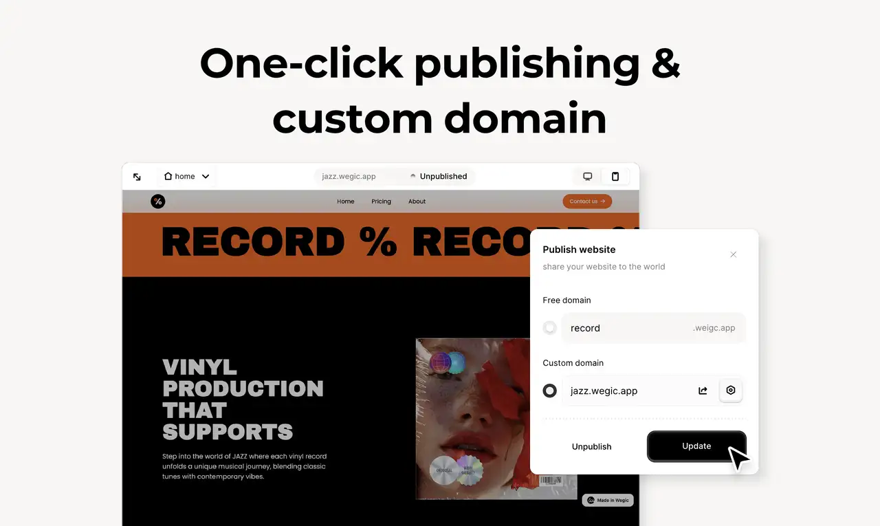
One-Click Launch & Custom Domain: From concept to completion in minutes, Wegic supports custom domains and hosting, making the process efficient and hassle-free.
We do believe that with the assistance of this guide, you will be quite free and easy in choosing suitable fonts for your website. Let us know about your practices of different fonts in the comments below and be sure to visit our website below to get more insights on the web design. If you need help with your website design, do not hesitate to chat with us!
Written by
Kimmy
Published on
Mar 17, 2026
Share article
Read more
Our latest blog
Webpages in a minute, powered by Wegic!
With Wegic, transform your needs into stunning, functional websites with advanced AI
Free trial with Wegic, build your site in a click!
What kind of website do you want to build?