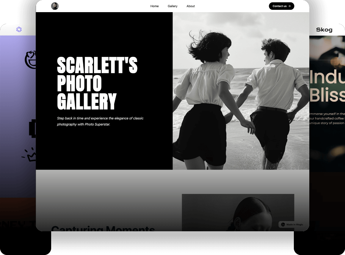
How to Create an Aesthetic Website: Tips and Examples
Discover how to create an aesthetic website with our guide! Learn essential design tips, explore inspiring examples, and enhance your online presence.

Today, a good-looking website can help a business succeed. An aesthetic website not only brings in visitors but also keeps them interested, making them loyal customers. For your existing or possible clients, making a nice website can greatly improve how people see your brand and make customers happy. This article will give important advice and show three representative examples to help you create a nice and special website. Let's start now!
Main Elements of an Aesthetic Website
Sight Design Rules for a Great Website
- Colour: Colors are key for a site's look. Red gets eyes, while blue and green are calm. Pick colours that fit your brand and audience. Try out different combos to find the best look.

- Content: The words on your site are key for looks and use. Use words that are clear and match your brand. Sort the content with big and small headings to make it easy to read. You can mark key points with bold words. And hey, don't forget to make sure that the style of your words is all in sync.
- Images: Good images make your site look nice. Pick pictures that fit your audience and add worth to your words. Don't use low-quality out-of-date pictures. Use good pics that fit your message, giving a fresh touch to your website.
User Use in a Nice Website
- Navigation: Make sure your site is easy to use. Give lots of ways for people to find what they want. A good route helps visitors move around your site.
- Minimum Load Time: Your site needs to load fast. Use good pics, write clean code, and use caching to load your site quickly. Do not expect netizens to have the patience to wait a long time loading your website. A fast website makes people stay.

- Mobile Responsiveness: Ensure your site looks good on all screens. A responsive design is a good solution to provide a great user experience on both desktops and mobile devices.
Website Design Tips for a Beautiful Site
- Arrangement: Connect and balance your site's parts. Use a few layouts for small sites, and more for bigger ones. A clear message and tidy visuals lead to more action.
- Order and Flow: Keep things the same so visitors know where they are and how to move on. This is key for action. A new page must match expectations and keep the same message.

- Blank Areas: Blank space is crucial in content creation as it allows your text and visual elements to stand out and breathe. Ample blank space helps highlight key points and prevent clutter, which can otherwise obscure the main message you want to convey.
Designing a Beautiful Website: Tips and Methods
Making Plans for Your Aesthetic Website
- Set Clear Goals: Know what you want to achieve with your website, whether it's promoting your products or displaying your talents. This could be to increase brand awareness, generate leads, or drive sales. Your goals will guide your design decisions.
- Understand Your Audience: Find out what your audience likes and how they act. This will help you make a website they will click on. Do research and look at data to know what they need and want.

- Make Plans and Models: Make sketches and models to plan your website’s look and how it will work. Task management tools can help you see your schedule visually and change it on time before you launch it.
Put Fun Stuff on Your Aesthetic Website

- Use Great Photos and Videos: Spend on good photos or stock images. Videos must be sharp and match your topic. Bad or out-of-place images will hurt your website's look. Custom graphics can make your website special. You can use some graphic generators to make cool graphics or create them by yourself.
- Add Something Interesting: To enhance user engagement and make your website more appealing, consider incorporating features such as sliders, galleries, and forms. These interactive elements can captivate visitors and provide them with a more enjoyable and interactive experience while navigating your website.
- Have a Call to Action: Put CTAs to guide users on what to do. Make sure they stand out but don’t mess up the look. Good CTAs can make more people do stuff on your site.
7 Amazing Examples of Aesthetic Websites You Must Know
Wingmen

Let's start with Wingmen, which employs minimalist design principles to achieve a clean and attractive aesthetic. Its use of whitespace, straightforward navigation, and subtle animations provide visitors with a clear view of their area of expertise, allowing site users to effortlessly absorb content. Businessmen may find this design attractive and straightforward to understand. The navigation bar comprises journals that visitors may wish to browse without cluttering the space.
Zelt

Zelt has a gorgeous, completely responsive website design that takes an animated and creative approach to the current user experience. A truly original and creative website, with sleek motion effects to keep you interested in text and visual imagery. The website's animation demonstrates the power that the Zelt app can provide to its customers by allowing them to operate all of their people operations in one system and eliminate the need for scattered point solutions.
Studio Brave

The Studio Brave website has a bold and asymmetrical design that complements a colourful colour palette. This visually appealing website also incorporates fascinating CSS Fullscreen background video content and several 3D UI elements that are sure to captivate the viewers' interest right away. The site also has varying-sized, strong typeface, brief textual content, and huge buttons, which adds a significant amount of debt to the page. This website is completely responsive. When you visit the web from your mobile device, the top menu transforms into a hamburger menu.
Delassus

Delassus made a vibrant and entertaining website with tremendous control over its palettes, creating superb harmony. It uses vibrant colours and dynamic imagery to produce a lively and engaging user experience. It uses bright hues like pink, orange, and green to draw visitors' attention and stimulate user involvement; as we often say, a colourful home page is the finest welcome message for a likely new client.
Waka-Waka

The Los Angeles-based wood furniture business Waka-Waka chose a layout dominated by a logo in the custom-made Waka Sans typeface, which is evocative of the International Typographic Style, sometimes known as Swiss design. The website begins with a loading animation with a poster-like style, similar to the opening page of a newspaper or catalogue, which subsequently zooms in to fill up the full page. The designer used a drastically limited grayscale palette to add to the style, with the colours of the highlighted furniture serving as the lone exception.
Totto Ramen

This noodle restaurant's website has a simple and appealing design that ensures they get directly to the point: the menu items for sale. I appreciate how, rather than giving a convoluted homepage with too much information, this professional website sticks to a basic navigation bar and polished photography. I like how they set up their food! It's a cool start for new visitors.
C-Roots

The C-Roots agency is headquartered in Amsterdam. It specializes in identity, strategy, and innovation. We feel that the roots are an endless supply of inspiration. Whatever the size of your organization. Its distinct navigation menu layout distinguishes it from the competition and finally makes it a jaw-dropping website. It has a fascinating spiderweb-like navigation menu. The website is very simple to use and has a number of interesting pages. Every time you hover over an element on the page, a subtle motion effect appears.
Build an Aesthetic Website with Wegic
Making an aesthetic website is key for your talent to be known online. If you use the tips and methods in this article, you can make a website that looks nice and works well. For immediate help and a powerful website designer to make your beautiful website, go to Wegic and see how we can help you.
Wegic acts as an AI web designer and developer, partnering with users to streamline the website creation process by simplifying it to a casual conversation. Despite its simplicity, Wegic offers extensive customization options, allowing users to realize their unique visions. The chat-based interface demystifies website development, making it user-friendly for those without a technical background. With AI seamlessly handling the heavy lifting, users can anticipate their websites to be operational in a fraction of the time compared to manual development.
Here are some standout features that make Wegic unique:
- AI-Powered Design and Development: Unlike many AI web designers who just generate code, Wegic offers a one-of-a-kind conversational experience powered by the latest GPT-40 model. Our approach is all about making web design and development more intuitive and accessible, breaking down barriers in a way that we think is pretty unique.

- Conversational Interface: Wegic behaves like a friendly companion, effortlessly managing web design and launch while engaging in casual conversations. You can chat in your preferred language and build websites in multiple languages.

- Browser Compatibility: Wegic is designed to seamlessly work across all major web browsers, ensuring compatibility with a wide range of devices.

- Multilingual Support: Wegic offers seamless support for multiple languages including English, Chinese, and Japanese, making it easy for your website to reach a global audience.
- We sincerely invite you to experience Wegic, embrace innovation, and provide feedback. We believe that Wegic will not only eliminate technical barriers but also inspire everyone's creativity and freedom of expression. Thank you for your attention and support as we explore and shape the future of the digital world together.
Related reading:AI Graphic Design Tools
Written by
Kimmy
Published on
Mar 17, 2026
Share article
Read more
Our latest blog
Webpages in a minute, powered by Wegic!
With Wegic, transform your needs into stunning, functional websites with advanced AI