Log in
Build Your Site
16 Essential Tips to Improve Your Web Design in 2024
Discover 16 expert tips to improve website design and boost user experience. Learn how to enhance navigation, speed, mobile responsiveness, and more for a successful website.

Is there a moment when your website does not look as good as it should or as good as your expectations? If you are trying to figure out why your site is boring, uninteresting or isn’t monetizing properly don’t worry you are not the only one. Creating an appealing and efficient website to attract as well as retain its consumers is often not an easy task. But don’t worry! Well, I am here this evening to educate you on some principles and techniques that will assist you get over all these barriers when designing a website.
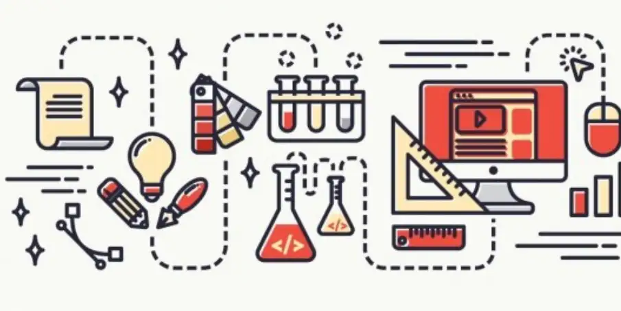
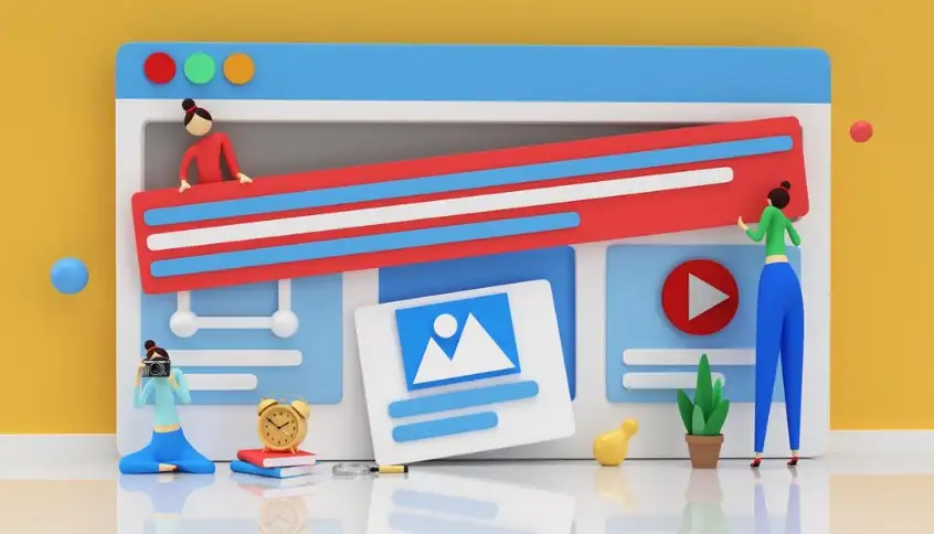
Image by raftel on Freepik
If you have ever thought about why your site is not to be effective or how you could improve your layout, then you will find the answers that you are seeking here. Here you will find tips that can help elevate your website design will cover all from the site speed, mobile responsiveness, neatness, and completeness of the information. Now let’s get down to the practical recommendations on website design that will help turn your website into an effective one.
But practice the lesson in your head first, before making the change you have in mind: Remember, every little bit helps! Whether you are new to the whole website development scene or very experienced, utilizing these tips to enhance web page design will ensure you’re one step closer to the ideal website you have in mind.
16 Essential Tips to Improve Your Web Design in 2024
If you find yourself incredibly keen on getting your particular website noticed and engaging with users, this is the best time to look into some practical approaches. Web design isn’t just about making your site look pretty for the visitor, but ensuring that they never have a bad experience. These tips to improve website design will be useful for any web owner regardless of whether he/she is just entering the market in 2024.
Tip 1: Simplicity Always Triumphs
As much as it can be appealing to incorporate every possible cool bits and pieces, simplicity is the best policy. In this case, it is easy to observe that a rather simple organisational structure is more effective than a chaotic one. Users prefer simple design and will not spend a lot of time on your site if it is complicated. White space or negative space is used in minimalistic designs and plays an indispensable role in them. It prevents information overload in websites and gives users a vision of what part to attend on the website. Properly apply white space to emphasise details and show users in which direction they should look at your site.
Tip: Avoid overcrowding your pages with too much text or too many visuals. Keep it simple, clean, and focused on what matters most.
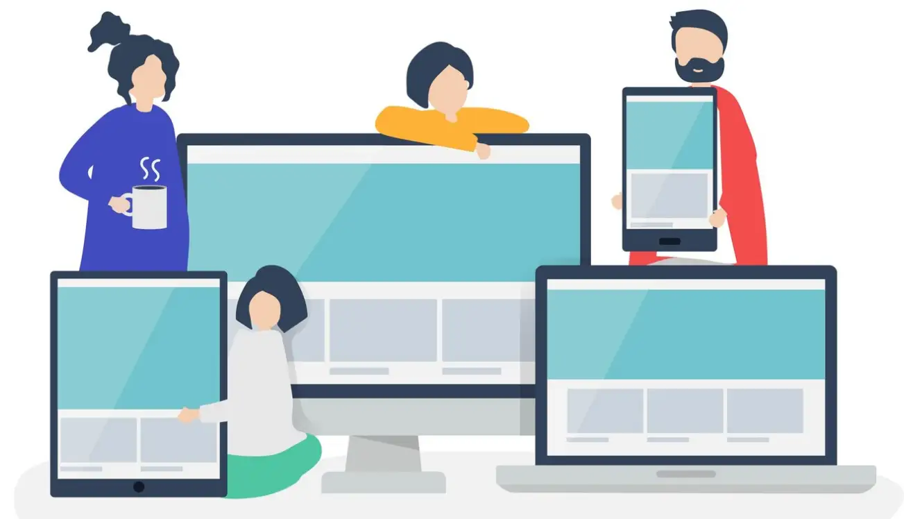
Tip 2: Mobile Responsiveness Is Non-Negotiable
This statement is true as most internet users are accessing the internet through their mobile devices making websites that are compatible with small screens compulsory. This is especially true if your website is not compatible with small screens because this will mean that the majority of the population will not be able to access it. Responsive web design implies that whenever users visit your website via their mobile devices, the design automatically fits into the device screen size and users get a pleasant experience of using your website.
A responsive website is the best approach that can be considered for designing a particular website which can be efficiently viewed on both the desktop as well as mobile systems. Additionally, viewing adapts the content, images as well as menus to fit the current screen, which results in a perfect look no matter the device.
Tip: To check the behaviour of your website on smartphones and tablet devices, try to minimize the window of your browser and optimize the browser window or use the Google Mobile-Friendly Test. Minimize where necessary so that the site appears good and offers the best experience on any device.
Tip 3: Speed Is Everything
Hasn’t anyone wanted to leave a site after waiting more than a few seconds for a page to load? Exactly. No visitor waits for a site to load for ages, and Google doesn’t wait either. This is because fast websites have better search engine rankings means that to keep your visitors engaged and help boost SEO, focus on speed. Slow loading of a website is an annoyance to the visitors more so in today’s technologically advanced world. Experience also reveals that if a site takes more than three seconds to be loaded, chances are high that people will leave and go to a different site. This not only your user experience but also your search engine ranking. To optimize the loading of your site, you should reduce the file size of images you use in your website, set up browser caching and use CDN to host your website’s contents across the server. Also, reduce HTTP requests by including the CSS and JavaScript files into one so that the browser will only have to download one large file. This is perhaps why faster websites tend to retain users and at the same time boost the ranking in SEO results.
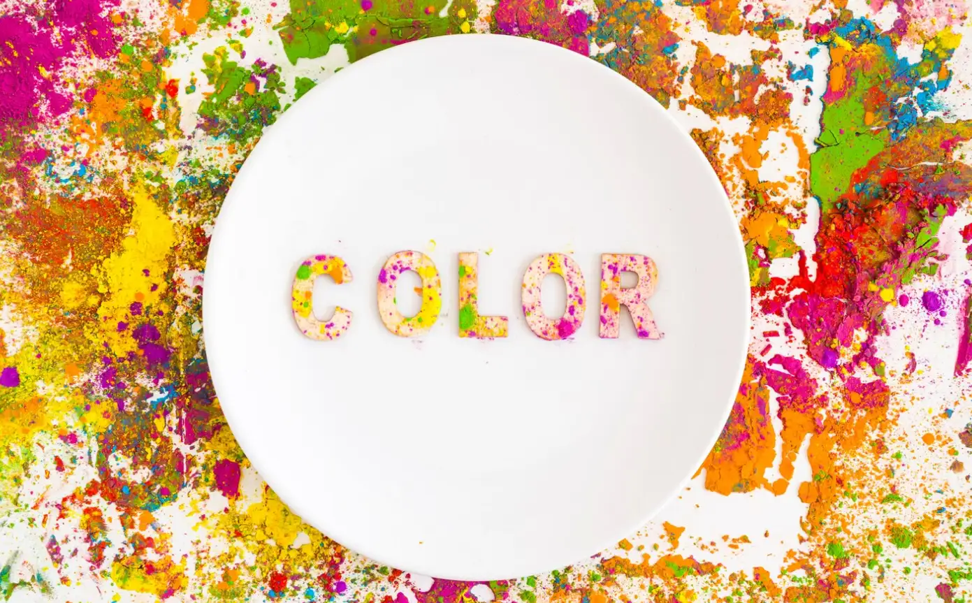
Tip 4: Be Mindful of Color Schemes
By maintaining a consistent layout and colour choice, a website design not only draws the visitor’s eye but helps to establish a branding image as well. This way the chosen colours would reflect the proper image of the company and convey the intended message. For example, blue colour is used to denote the trust and professional nature of a site, whereas orange denotes energy and excitement. The next important rule is not to use more than three main colours at a time. To avoid giving the visitors an impression of an overdose, it is recommended to use not more than 2-3 primary colours all through the site. It’s also good to use colour to direct users towards a call for action such as buying a product or subscribing to a newsletter.
Tip: Use online tools like Adobe Color to generate colour schemes that complement each other and enhance your site’s visual harmony.
Tip 5: Use Clear Call-to-Actions (CTAs)
Every website you design is meant to drive some level of engagement response in the users, be it subscribing to a newsletter, buying something, or contacting your team. To encourage this, you require conspicuous and persuasive call-to-actions (CTAs) – the notices that instruct people about the following step. Names should prominently be printed and those of CTAs should use persuasive language. Such a tagline as “Get Started Now,” “Subscribe Today,” or “Shop the Collection” works because they convey a sense of immediacy and tell the audience what to do. The placement of CTAs is also important—buttons should be easy to spot and ideally located above the fold.
Tip: Experiment with different CTA colours and placements to see what resonates best with your audience. A/B testing can provide insights into what drives the most conversions.
Tip 6: Easy Navigation Is Key
If users cannot navigate your site, they will exit it and this will not take them more than five minutes. , the last tip is as simple as it sounds, however it is one of the most overlooked in website design- simplified navigation. The usability of a website or an application and more specifically practical user interface is identified to be an important determinant of satisfaction. Just think of a situation where going to the store to look for a product of your choice, the shelves are arranged in a very haphazard manner or effectively disorganized, it is quite annoying, or may be inconvenient. The same relates to websites We can also give examples of websites, to which the above principles also apply in the same manner. It is necessary to make a person able to find the necessary information without having to click through numerous links. If your users have to spend time searching the site instead of being presented with a list of categories that will lead them to the right pages, they are less likely to bounce and will be more satisfied with the site. Use headings and subheadings that are easily understood and organize the web pages that are related in some way to have a logical flow. Also, incorporate a ‘search’ feature to efficiently access the website’s content especially where the website consists of numerous pages.
Tip: Getting rid of too many links; do not have more than six options on your navigation bar. It minimizes the difficulty of getting overwhelmed by the type of information provided and enables users to concentrate on specific areas of interest, in this case, the sections of your site.
Tip 7: Content Remains Supreme
and You can be extremely proud of the design, but if the content is low, people will leave your site. Be sure to use good writing, and an appropriate writing style for your target demographic. Every visitor who comes to a website wants to be given content that not only educates but also persuades him to buy a particular product. Besides, remember to input relevant keywords so that your site is ranked higher by search engine optimisation services. Do not use more than four sentences in a paragraph, add headers where possible, and whenever possible, use lists in place of large, long paragraphs.
Tip 8: Images Speak Louder Than Words
Website design is enriched with visual elements, which are very important in the process of website building. There is no better way of presenting quality imagery and videos as these are not just the icing on the cake but also assist in presenting the information in the best way possible. It has been found that individuals comprehend visuals, up to 60,000 times faster than text content hence the need to incorporate good-looking and engaging images that give life to your brand’s narrative.
When choosing the images, it is advisable to pick the images that relate to the kind of brand you have or the images that the targeted population group will find relevant. You can use existing photos from other sources or take photos yourself because it gives your site’s individuality. In the same manner, videos should be short and useful to your visitors, whether you are demonstrating an item or revealing what goes on in your business.
Tip: Compress images and videos that are to be used on aesthetic websites do not make the website slow. When it comes to file size there are ways like using TinyPNG or JPEG-Optimizer which will decrease the file size while not affecting the quality.
Tip 9: WhiteSpace Is Your Friend
Negative space refers to the gaps, or the blank area, in printed media or web pages. It may not seem like a lot, but white space enhances legibility and directs the users’ attention to the relevant parts of your web page. This is an important consideration for embracing white space, since it brings relief to the design, thus enabling the users to digest the information easily. Therefore, there is a need to avoid overstuffing the website with as much content as possible.
Tip 10: Typography Matters
Any connoisseur of typography wouldn’t disagree that selecting fonts for websites is no innocent matter either. Typography is one of the subtlety most effective weapons in the designer’s arsenal. Ensure that they are easily readable on different devices, computers, mobiles and in different sizes as well. Only use one, sometimes two fonts throughout the site, nothing fancy, and it should be professional and the viewer should be able to read it easily. Typography is a valuable tool when it comes to the experience of the user and therefore there should be improvements made to it to increase its readability.
Tip 11: Don't Forget About Accessibility
Web accessibility therefore refers to a situation whereby anyone with a disability or handicap can access your website. Not only it is good for them but also increases your viewers or listeners depending on the media you are using. Easy changes such as including descriptions in Images, ensuring that the stigma between the text and the background is very different, and making it possible to scroll with a keyboard can greatly improve how a disabled person can use the site or program. It will become even more critical in 2024 when even more regulations will be implemented to further enhance the financial market.
Tip 12: Use Visual Hierarchy
Visual hierarchy is the implication of the organization of the subjects in order of priority. When implemented effectively it leads the user around your website naturally. Give headings and calls-to-action proper font size, boldness and colour to ensure the users can easily identify areas of interest. This is among the most important tips to enhance website design since it guides web visitors in their exploration of your content.
Tip 13: Include Social Proof
Including such elements as testimonials, reviews or case studies can increase credibility to a great degree. There is truth in the saying that word-of-mouth publication is very essential when it comes to trusting a business. Lastly, word of mouth is social proof for your website, therefore ensure it is well visible, whether it is icons of firms that you have worked with or a ‘Customer Review’ segment.
Tip 14: Consistent Branding Is Essential
Your project or overall brand image shouldn't stick around and be echoed throughout your company’s website. Consistency applies to the logo and colours you choose, all we way to how you write your copy. Now, if your website looks and feels drastically different from your social media or the marketing aspect of your brand, you tend to confuse the visitors. Another aspect of using images is continuity to ensure that the consumers associate certain images with the brand in question and therefore be loyal to it.
Tip 15: Optimize Search Engines
It is quite pointless having a well-designed website that nobody knows about and few people visit, if any. This is where search engine optimization commonly known as SEO comes into play. Search engine optimization makes your web page design more recognizable by search engines and therefore more visits by internet users.
The first step that one should take involves researching keywords that people are using in their search. Please use the following keywords naturally within the text, meta descriptions, image alt and URL. Also, when designing your website, pay special attention to its organization within the context of the search engine, including headings and subheadings.
Tip: Concentrate on the keywords that are related to your particular topic, since such keywords are usually less popular because traffic is more relevant.
Tip 16: Test, Analyze, and Improve
No matter how great your website looks, users won’t stick around, if your content is outdated. Regularly updating your content keeps your site fresh, relevant, and engaging. Whether it’s a blog post, product update, or company announcement, frequent updates show visitors that your brand is active and up-to-date. Additionally, search engines favour websites that regularly publish new content, which can improve your rankings. Focus on creating high-quality, valuable content that addresses the needs and interests of your audience.
Tip: Set up a content calendar to consistently publish fresh material. This will keep your audience engaged and coming back for more.
Great Websites Don’t Build Themselves
Shh! Don’t tell anyone, but sometimes it can be downright intimidating to create a unique website. The world is full of pieces of advice, and it happens that at some point you can not even understand which one to choose. But hey, that’s why I’m here to help and to explain and to discuss with all of you the positions that are being taken for or against Love Drunk, and why. If you’ve ever sat before a blank screen and pondered how to enhance your site, you are still not alone. The good news is, that all the tips to enhance website design listed here don’t necessarily need one to be a designer or web developer.
Here’s this week’s tip: With attention to such details as usability, graphics, and writing, any bare-bones site can be made to communicate with the audience. Overall, these tips to improve UX web design strategy are realistic and easy to follow, which enables you to make a website that would not only be effective, but unique as well.
Wegic isn’t just another AI tool; it’s like having a web designer on speed dial, minus the awkward small talk. It takes the process of creating a no-code website and turns it into a casual conversation—because who doesn’t love talking about fonts and colour schemes over coffee? Wegic’s main gig? AI web design. Whether you’re a local coffee shop or an aspiring influencer, As a website builder, Wegic makes your website dreams come true with the grace of an AI-powered genie.
Wegic's Web Design Superpowers:
-
AI-Powered Website Wizardry: Wegic’s algorithms are like the Sherlock Holmes of web design. You give it a few hints, and it deduces exactly what your website should look like—no detective work is required on your part.
-
Chat-Based Creation: Imagine designing a website by simply having a chat. No complex code, no dragging-and-dropping weird widgets. Just type in what you want, and watch Wegic turn your words into a living, breathing personal website.
-
Designs for Everyone: Need a personal blog? Check. Running a quirky cat café? Got you covered. Wegic’s versatile enough to handle everything from online stores to portfolios, all while looking effortlessly stylish.
-
The Assist Squad: Not one, not two, but three extra AI assistants are there to help you polish your personal portfolio website to perfection. It's like having a personal tech support team, minus on-hold music.
And remember, no one expects that from you at the beginning. This is the first step. Think about how you get there step by step; try it and last but not least, enjoy the process.
Written by
Kimmy
Published on
Mar 17, 2026
Share article
Read more
Our latest blog
Webpages in a minute, powered by Wegic!
With Wegic, transform your needs into stunning, functional websites with advanced AI
Free trial with Wegic, build your site in a click!
What kind of website do you want to build?