Log in
Build Your Site
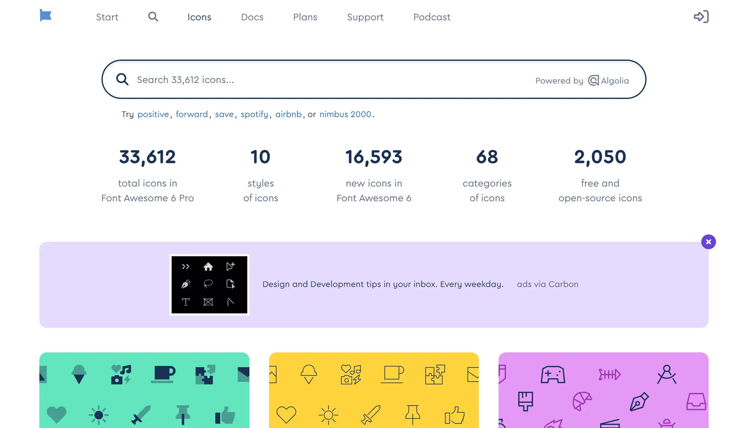
16 Inspiring Navigation Bar Ideas You Can Directly Copy
Discover 16 inspiring examples you can easily customize. Learn what to include in your navigation bar and how to keep visitors engaged.

Have you ever gone to a website and felt utterly disoriented? I know I have! A website's navigation bar can either make your online experience easier or give you a hard time. If you find it difficult to develop an intuitive and visually attractive navigation bar for your site, you’re in good company.
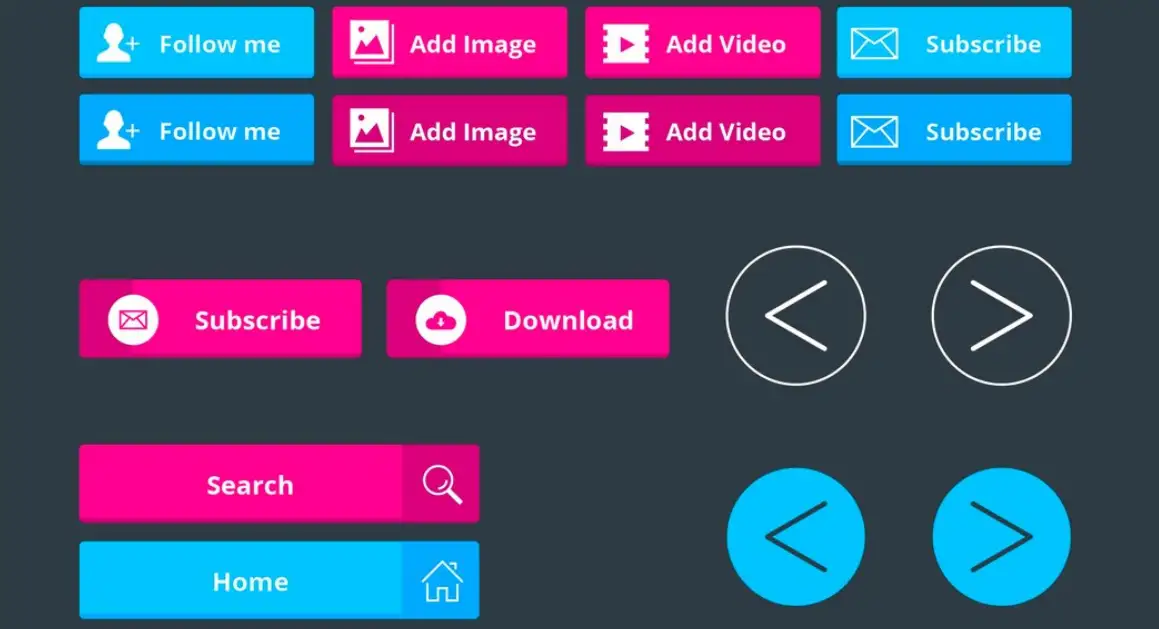
Image by freepik on Freepik
Finding the right navigation bar ideas can feel overwhelming, especially with so many options out there. But no need to stress—I’m here to lend a hand! In this article, we’ll dive into essential navigation bar ideas that can transform your website from confusing to captivating. Irrespective of whether you’re planning a personal blog, an online shopping platform, or a portfolio, a thoughtfully designed navigation bar is critical to engaging and satisfying your visitors.
So, let’s explore some creative navigation bar ideas together that will not only enhance user experience but also reflect your unique style!
What Should You Include in a Navigation Bar?
The navigation bar, when designed well, can serve as the roadmap for the journey your visitors take on your aesthetic website. An effective navigation bar is beneficial not just in directing users through your site, but it also enriches their user experience. So, let’s get into the key components that should be considered for your navigation bar.
Beginning, home is your initial place. It's similar to a welcome mat for your website, inviting people to come back to a familiar area. Additionally, make sure you don’t underestimate the importance of your About page or who you are. This section pokes around behind the scenes, offering your audience the chance to empathize with your brand’s narrative. Who doesn’t enjoy a great tale, huh?
Next, the services or products tab occurs. This is the place to exhibit what you provide. It’s your moment to excel! Use summaries to interest your visitors in learning more. If you are in charge of a blog or news site, it is necessary to include a blog or news section, ensuring your content remains fresh and promotes recurring visits.
Contact is another must-have. No one wants to engage in hide-and-seek when they are trying to connect. This option should be emphasized. To save yourself from wasting time and effort, it's beneficial to include FAQs, which address common questions in advance.
Now, let’s sprinkle in some creative navigation bar ideas! Think about a search feature built to allow users to find what they require without squandering their time scrolling infinitely. Should you want to be more daring, you can include social media links. Incorporating these elements enables you to give visitors an entertaining avenue to engage with you beyond your site.
Additionally, a call-to-action button can have a stunning effect! No matter what–“Get Started” or “Subscribe Now”–this pushes visitors to join in and stay engaged with your content. By implementing these navigation bar ideas, you’ll not only create a user-friendly experience but also keep visitors coming back for more!
16 Inspiring Navigation Bar Ideas You Can Directly Copy
When it comes to creating a website for free, the navigation bar is akin to the GPS of your digital space—necessary for helping visitors move around your web pages with ease. With countless navigation bar ideas out there, it can be tricky to know which one will be your best ally. Don’t worry! I've got you covered with 16 awesome navigation bar ideas that you can take away to get your website equipped!
Classic Dropdowns
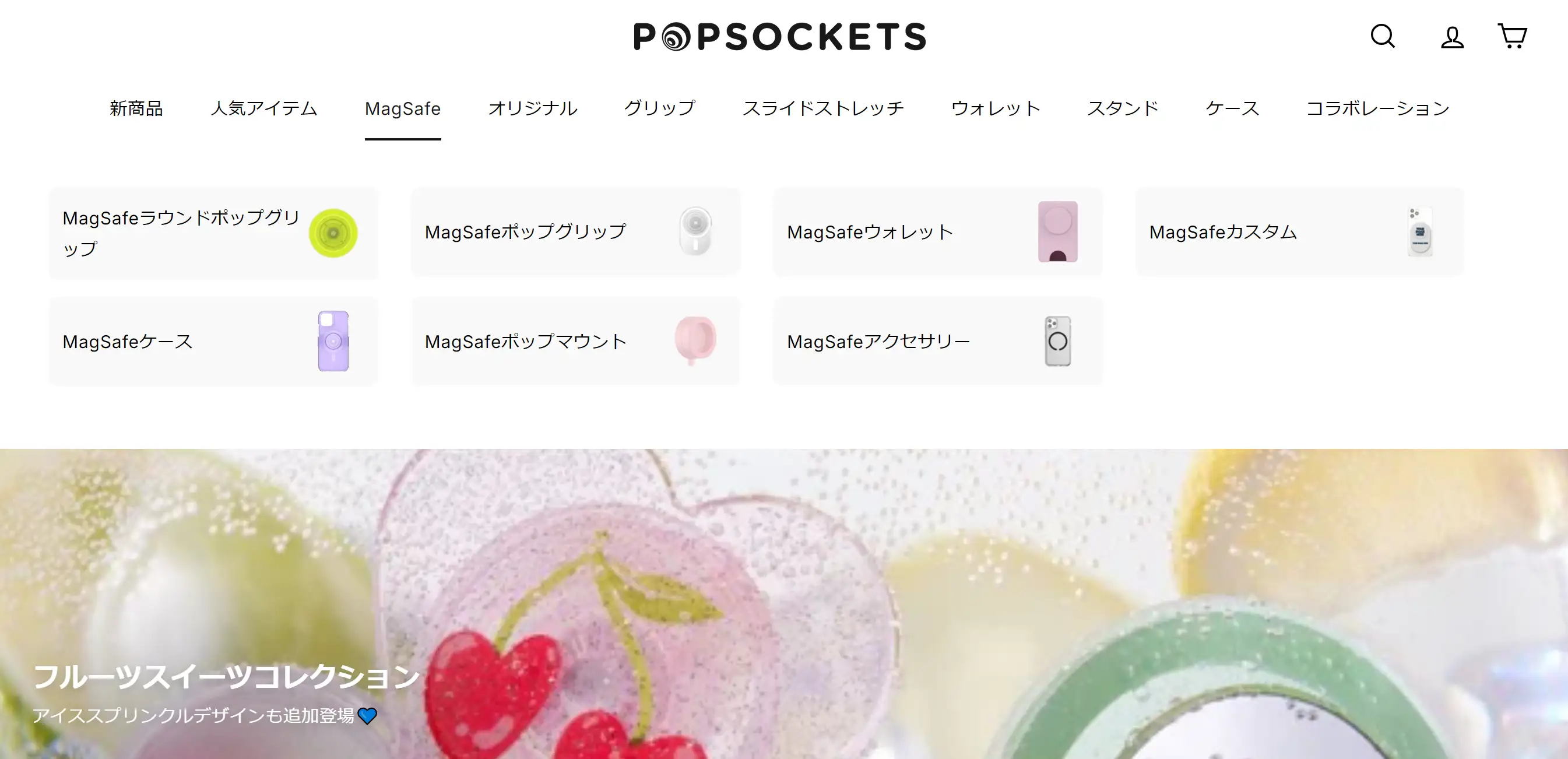
Who doesn’t appreciate a reliable friend? Dropdown menus are the steadfast pals of navigation bar ideas. These menus invite users to hover over categories, revealing delightful subcategories like a treasure map unfurling its secrets. Take PopSockets, for instance—this online phone accessory haven employs a dropdown menu adorned with colourful illustrations, creating a visual feast that makes shopping a breeze. It’s like having your cake and eating it too, all while navigating smoothly!
Sticky Navigation
Picture this: you're deep into the abyss of a website, and suddenly, you lose your way. Fear not! Sticky navigation is here to save the day! This clever design keeps your navigation bar anchored at the top of the screen, making it perpetually accessible. Enter AWD Agency, which offers sleek vertical navigation that sticks to the side like a loyal sidekick. With a hidden toggle menu, users can easily expand or collapse the options without clutter. Whether you’re on a giant desktop or squinting at a smartphone, this navigation style ensures you never lose your bearings again!
Hamburger Menu
Don’t let the simplicity of the hamburger menu fool you; this design is like a ninja—stealthy yet powerful! Perfect for mobile users and those who adore minimalism, the hamburger menu conceals your navigation options until called upon. Overport, an Australian branding agency, demonstrates this beautifully. Their homepage showcases a stunning slideshow while their full-page hamburger menu opens to reveal a clean, distraction-free space. It’s all about finding important information without the clutter—talk about a meal fit for a design connoisseur!
Icons and Text
Why settle for plain text when you can jazz it up with icons? Combining visuals and text in your navigation bar ideas creates an inviting atmosphere. Imagine spotting an envelope icon next to "Contact"—it’s like giving your website a fashionable makeover! Bars Icon offers a treasure trove of examples showcasing how icon fonts for websites can elevate your navigation. After all, a stylish navigation bar is a happy navigation bar, and we all want to dress up our websites to impress!
Full-Width Navigation
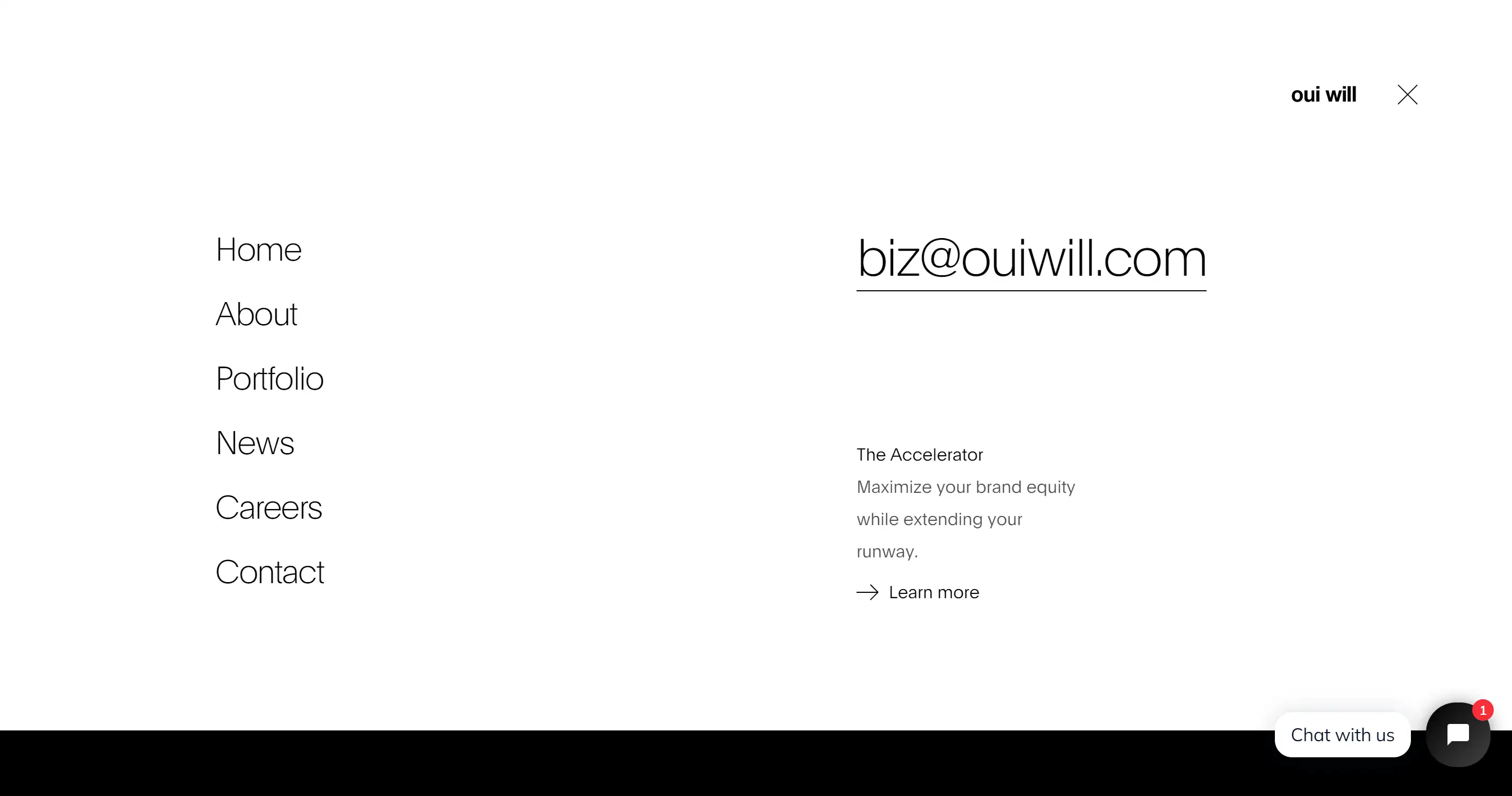
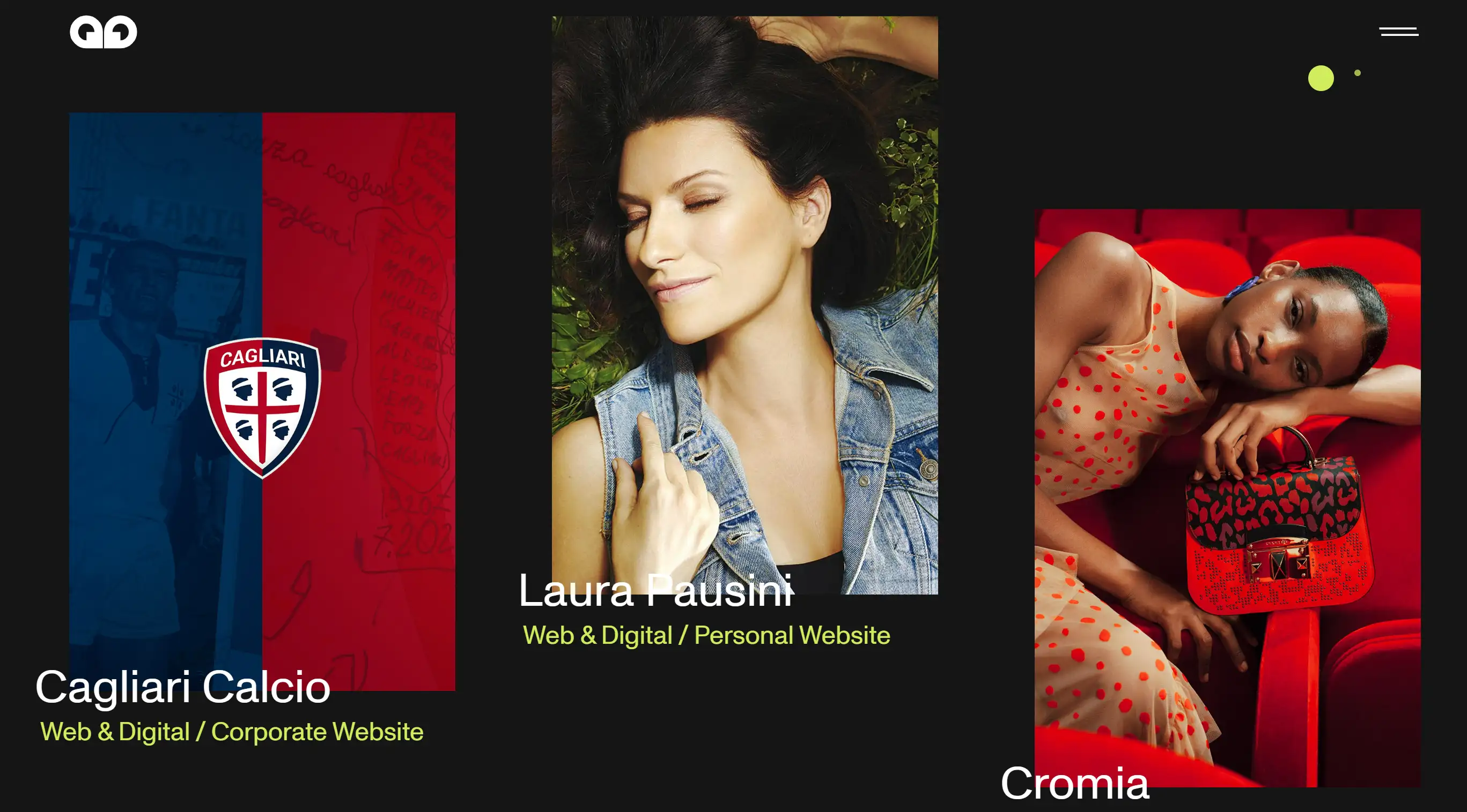
Think big and bold! A full-width navigation bar spans the entire screen, demanding attention. This striking layout not only grabs the spotlight but also provides ample space for categories and subcategories. Check out Oui Will’s creative “Disrupt” project, where menu items elegantly hover into view with dynamic 3D objects. The blend of simple text, animations, and a cohesive colour palette ensures users are not just navigating but experiencing the brand in style!
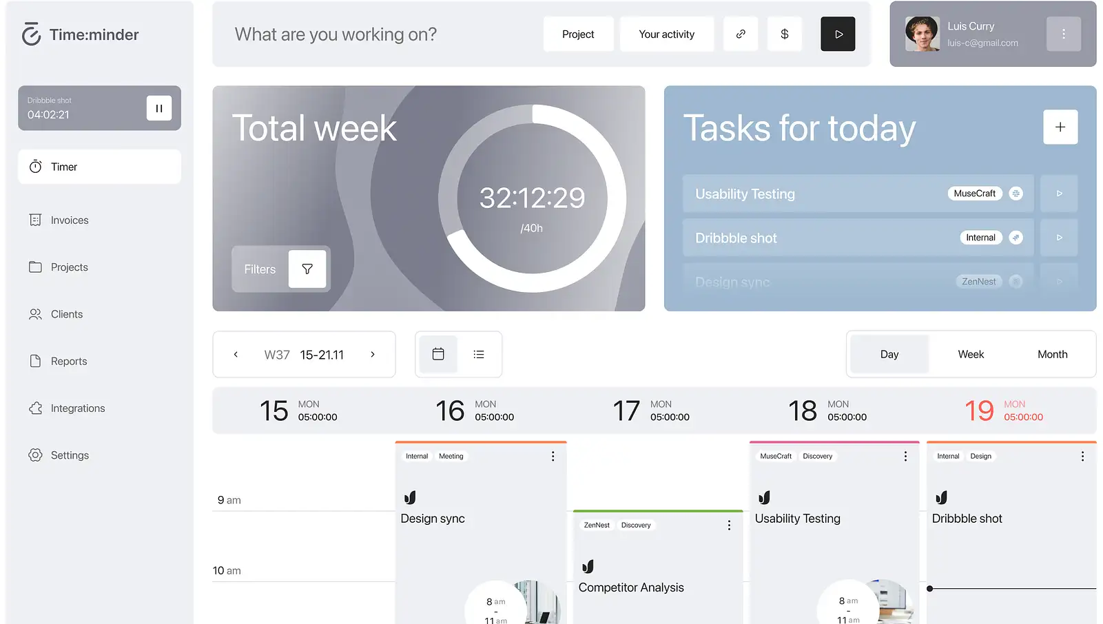
Horizontal Tabs
Horizontal tabs are like a well-organized filing cabinet—simple, sleek, and incredibly effective! They allow users to glide through different sections without feeling overwhelmed. Hanna Krauchenia’s design on Dribble showcases elegant horizontal navigation with neatly arranged icons that scream efficiency. With this setup, information is just a click away, making it easy for users to find exactly what they need—no digging required!
Single-Page Navigation
If your website is straightforward, consider a single-page navigation setup. This design allows users to scroll seamlessly through content, creating a cosy little neighbourhood where everything is just a stone’s throw away. It’s like a stroll down a charming street—everything is within reach, and there’s no reason to stray!
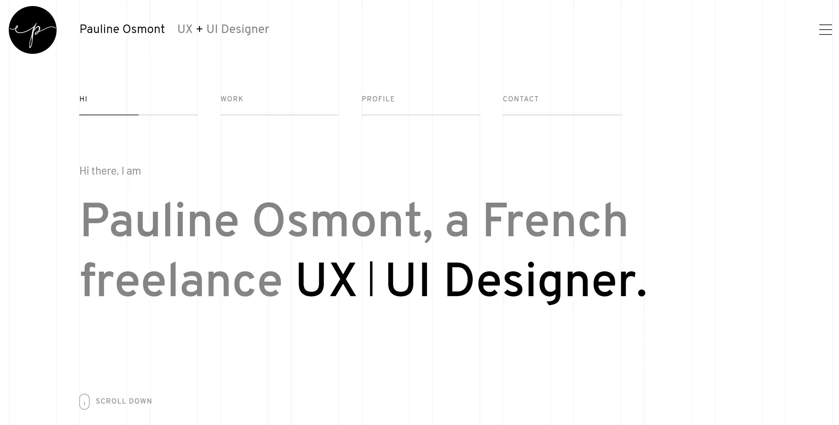
Vertical Navigation
For the adventurous souls, vertical navigation bars present a unique flair. Placed on the side of the page, these bars offer a modern edge and stand out in a crowd. Pauline Osmont’s website is a stunning example, featuring elegant transitions between horizontal and vertical scrolling. This design not only showcases her artistic skills but also provides a delightful user experience—like having a trustworthy sidekick who always knows the way!
Search Bar Integration
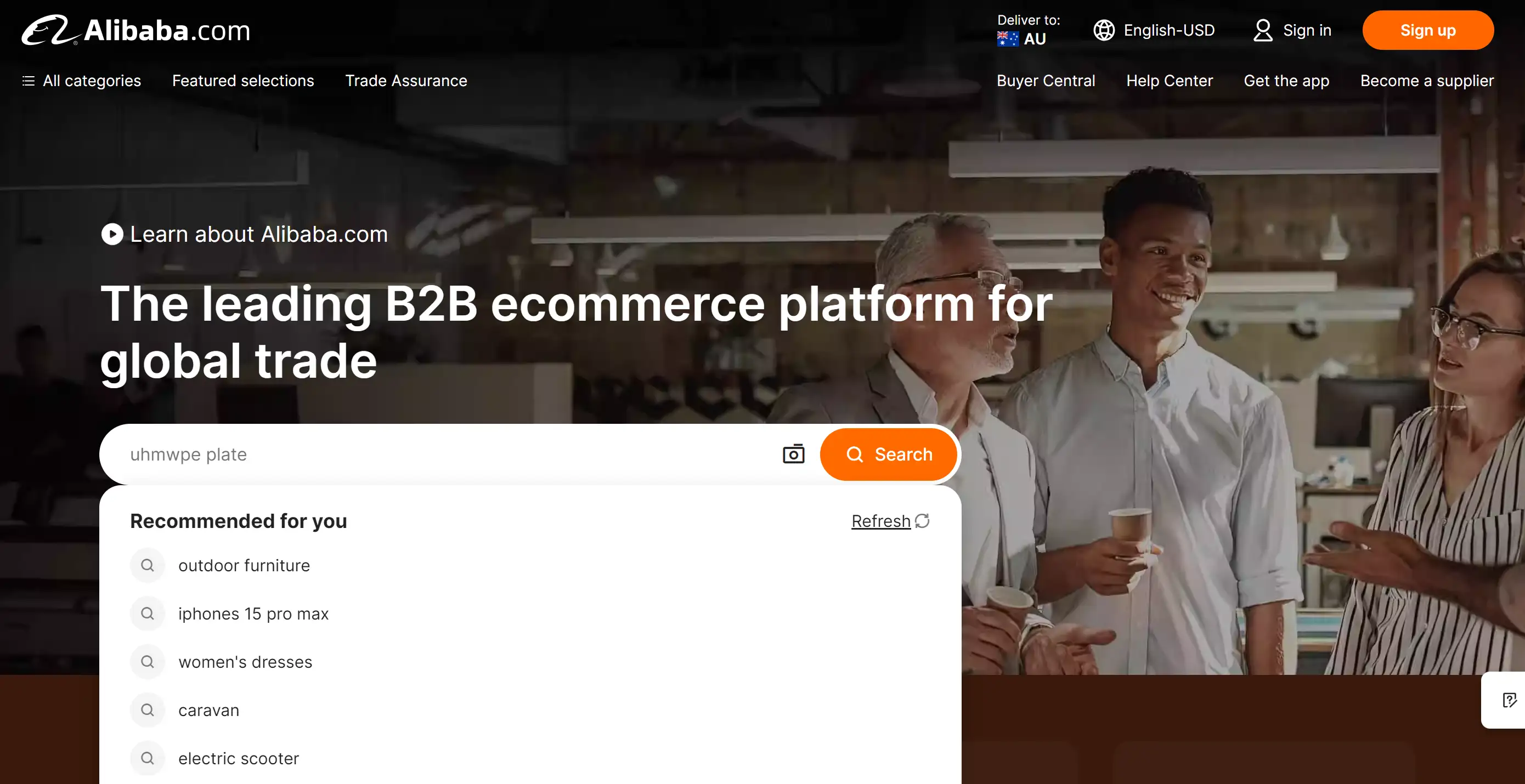
If your visitors are on a mission, let them wield the power of the search bar right in your navigation! It’s like giving them a magic wand to conjure up exactly what they need—no more wandering in the digital wilderness. Alibaba has mastered this art with a charming search bar and a snazzy auto-suggestion feature that practically reads minds. Plus, they’ve added an image search option—because sometimes, a picture really is worth a thousand clicks!
Customizable Navigation Bars
Who doesn’t enjoy a little customization? By letting users curate their navigation bars, you’re putting the power in their hands—after all, no one knows their preferences better than them! It’s like letting them decorate their own digital space; every click feels like home. So why not offer a menu that suits their unique taste?
Mega Menus
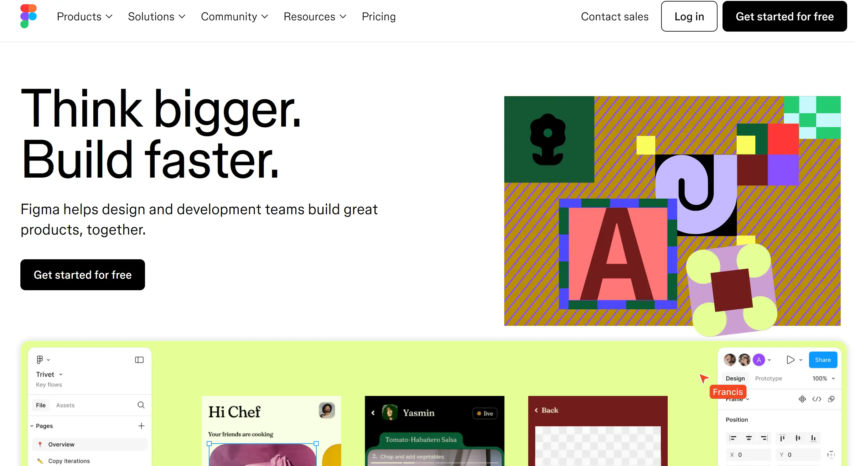
For those sites overflowing with content, mega menus are the buffet tables of navigation bar ideas! Figma shows us how to do it right, providing a spacious dropdown that showcases everything without feeling cramped. They even jazz things up with infographics and sleek borders, making sure visitors find exactly what they’re craving without the clutter. Who needs a map when you’ve got a mega menu?
Floating Navigation
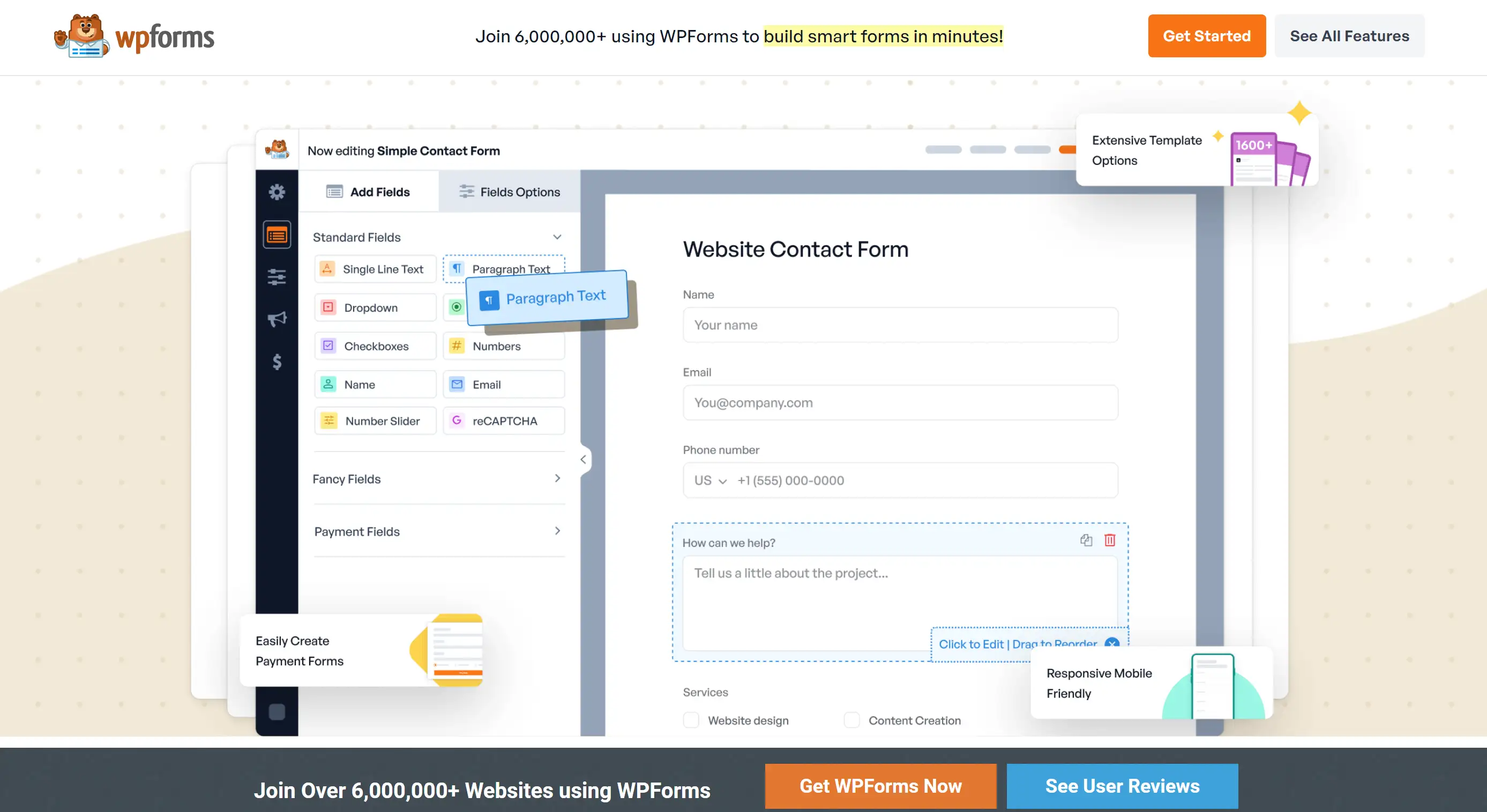
Ever wish your navigation would follow you around like a loyal pet? Enter the floating navigation bar! This clever design stays anchored to the page, ensuring users never lose sight of the menu. Just like a trusty sidekick, it’s there through every scroll. WPForms takes this to the next level with a countdown sticky bar that not only guides visitors but also nudges them toward specific pages—talk about multitasking!
Animated Navigation
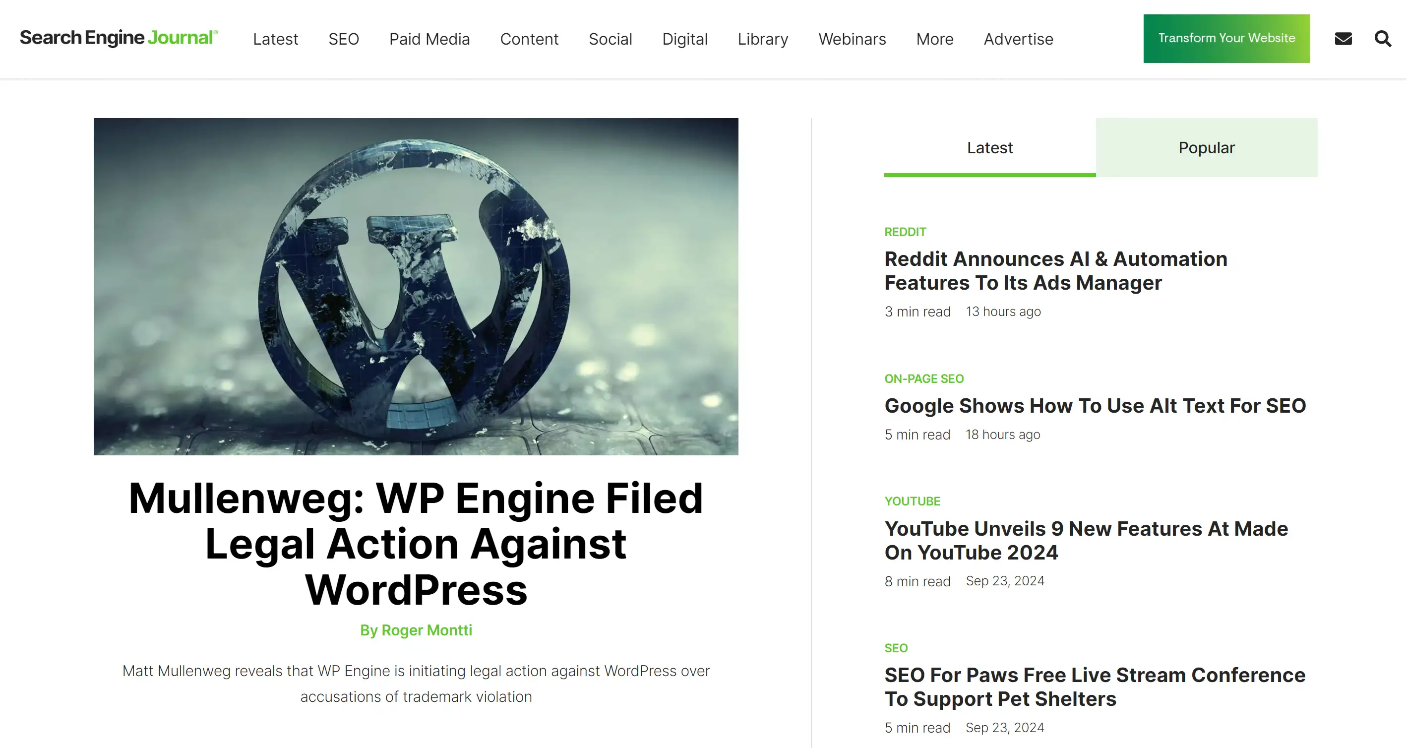
Inject some personality into your site with animated navigation bars! These playful elements can slide, fade, or pop, transforming mundane browsing into a delightful experience. Search Engine Journal knows how to keep things lively with a floating bar that not only sticks around but also animates into view as you scroll. It’s like your website is throwing a party, and everyone’s invited!
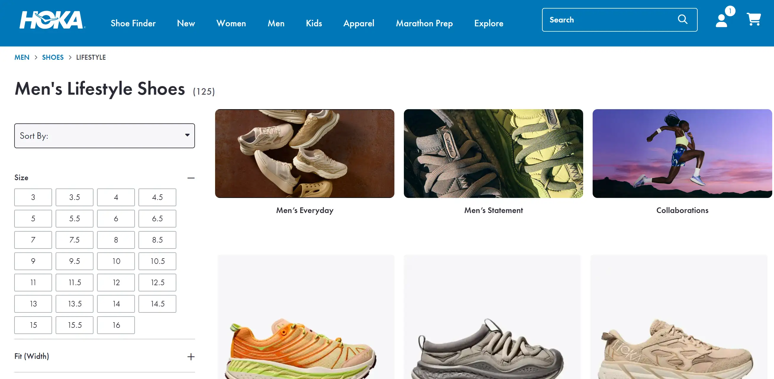
Breadcrumbs
Breadcrumbs may evoke fairy tale imagery, but they’re a practical way to keep users grounded in your site’s structure. Think of them as your digital guide, helping users retrace their steps without the risk of attracting birds. Hoka takes a modern twist by using slashes instead of the classic greater-than sign, proving that breadcrumbs can be both functional and stylish.
Social Media Integration
Within today’s digital ecosystem, what is stopping you from inspiring visitors to join in on your social media party from your navigation bar? It’s as if you’re doling out exclusive invitations to the party scene of your website! Incorporating social links enables you to maintain connections with others across various platforms, ensuring that the enjoyment continues after they leave your site.
Colourful Navigation
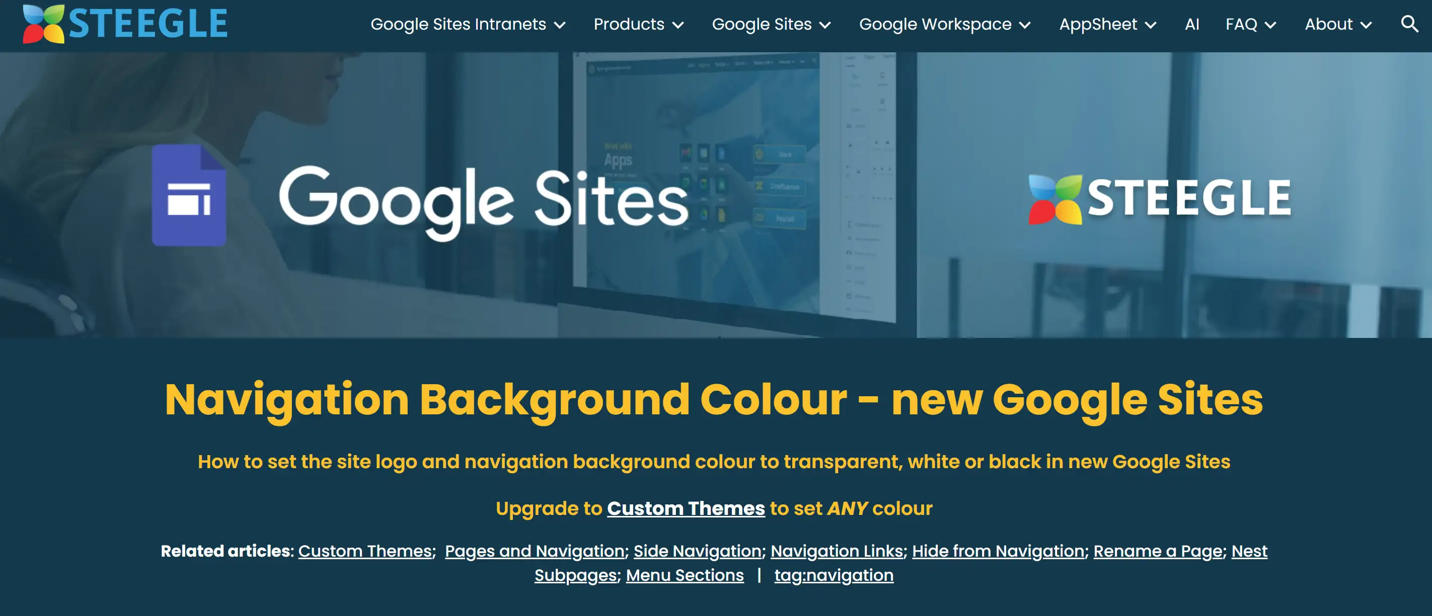
Increase the vibrancy of your navigation bar for an energetic boost to your site! A visually appealing design helps your menu distinguish itself from the crowd and seems to grab more attention as visitors scroll. Remember, moderation is the answer. You can use tools like Steegle to get your navigation’s background transparent or in sleek black and white, hitting that sweet spot of boldness and attractiveness!
With these 16 navigation bar ideas, you’re armed and ready to create a website that is not only functional but also enjoyable to use. Using these artistic approaches will support you in ensuring that your visitors feel relaxed and can easily explore your content. So take action, give these ideas a shot and make your navigation bar the focal point of your website!
Let’s Get This Navigation Party Started!
As we wrap up our exploration of navigation bar ideas, I want to share something important with you. Feeling stifled in your efforts to develop a user-friendly and intuitive website? That struggle is a familiar feeling. The navigation bar acts as a reliable compass, leading users through the large breadth of your content. Remember that an expertly designed navigation bar can shift users from feeling frustrated to having fun, enabling them to locate the important information you offer. With the navigation bar ideas we've discussed, you now have a toolkit to elevate your website’s user experience.
So why not take the plunge? Dive into your website design today and experiment with these navigation bar ideas. If you feel stuck or overwhelmed, don’t worry! I suggest you investigate what Wegic has to offer. It’s like having a pal who knows all the secrets of the website design field, helping you to build your personal website that is both visually pleasing and user-friendly, and facilitates you to enhance your website to its finest state!
Wegic is a cutting-edge AI website builder redefining website design and development. At its heart, Wegic is a collaborative AI designer and developer, turning the often daunting process of website creation into a seamless experience. Imagine building your website through friendly chats, where even crafting the navigation bar feels intuitive and straightforward.
Key Features of Wegic:
-
AI-Driven Design and Development: Wegic utilizes advanced AI algorithms to translate your ideas into a visually stunning and functional website. It’s like having a design expert at your fingertips.
-
Effortless Navigation Bar Creation: One of Wegic's standout features is its ability to simplify the creation of navigation bars. With clear prompts and user-friendly guidance, you can design an intuitive navigation system that enhances user experience and ensures easy access to your site’s content.
-
Conversational Interface: With Wegic’s chat-based interface, creating a website becomes a dialogue, not a chore. You simply express your needs, and Wegic responds with tailored suggestions and solutions.
-
Versatile Project Handling: From personal portfolios to comprehensive business sites, Wegic can accommodate a wide range of web projects, making it the go-to tool for various users.
-
Supportive Assistant Tools: Wegic includes three helpful assistant features designed to enhance your website-building journey, providing tips and adjustments along the way for a smooth workflow.
Written by
Kimmy
Published on
Mar 17, 2026
Share article
Read more
Our latest blog
Webpages in a minute, powered by Wegic!
With Wegic, transform your needs into stunning, functional websites with advanced AI
Free trial with Wegic, build your site in a click!
What kind of website do you want to build?