Log in
Build Your Site
Typography in Effective Web Design: Best Practices and Tips
Discover how typography in web design enhances user experience, improves readability. Learn best practices, and tips, and get answers to common typography FAQs.

I mean, all things considered, when else in the design process do you bother thinking about typography? Of all these elements, the typography of web design may be one of the most important to your entire site. That might sound slightly dramatic. However, if you're struggling with understanding how fonts for websites, spacing and alignment affect readability and user experience, you are not alone. Most people undervalue this and it can hurt them as far as engagement, conversions, and even a few SEO penalties.

It is the real truth that in typography of web design, it is not only choosing a typeface, which will look nice on your website — this is developing a visual language which can be understandable by everybody who comes to visit you.
I got you if you still don't know where to start, or are too anxious about the fear of choosing a crappy-looking Typography. This guide offers clear insights on how web typography can often make or break your static website to present a neatly designed and accessible space, let's dive in and address some common questions concerning Typography.
What is Website Typography?

Improving website typography is the fine art of arranging the text on your web page. I mean more than using lovely fonts. Typography represents how text can be displayed — for example font, size, rhythm, and how these factors operate to create a uniform user experience.
The typography on your website should be clear. Whether it be a prominent headline to catch the eye, or a well-styled paragraph to make it more digestible and readable, typography plays an important role in ensuring your message is read by the visitor. In short, web design typography is what determines how people will experience and process the content on your sites. Typography done well makes a site feel more polished, professional and trustworthy. Poor typography, however, can leave your homepage design feeling cluttered, confusing, or even amateurish.
Typography in Effective Web Design: Best Practices

There was a time when it was considered a disgrace to ignore typography even in a simple web design. Like other elements of the design, with proper implementation, the typography makes a difference from a website being a digital slumber room, to one that is interesting and welcoming. Some people may think it’s all about choosing a fancy typeface and that’s it, while it is not as easy. It’s about aesthetics, structure, harmony, legibility, hierarchy and to some degree, psychology as well. Let us turn to some resourcing of practical tips and recommendations to prepare an error-free typography in the design of your website.
Keep Readability as Your Top Priority
The basic requirements are that the audience must be able to understand and read the text on the site. Crazy, I know. Typefaces may look very attractive with the present designs and graphics, but their joy is deprived taken them off. No one will continue to try reading very small letters or elaborate letters that offer no real benefit only to frustrate the reader. They will just walk away and quite frankly, how many can be found at the scene to criticize such behaviour? Therefore, in loading all the other web design aspects that will concern you, bring to the forefront the need for the typeface used to be legible. Get fonts that will be readable to all the targeted viewers regardless of the device they may be using and the screen size. Simply, the idea is to ensure that users of your site will not have any difficult time trying to take in the information you have provided on it.
Users should not face any extra effort in absorbing your content amid all of it. Font size should be min 16 pixels and contrast between text and background needs to be maintained. Mikalai Tabalou — Medium Light grey on white is minimal but a visual nightmare.
Choose Fonts That Reflect Your Brand’s Personality

The choice of fonts should not only convey information but also reflect the nuance and personality of your brand. Do you have a casual, fun blog that can push updates through without much concern, or do you run some super high-tech cutting-edge startup site? No matter what the brand is what you have, there is a font that speaks your vibe. For instance, a serif font such as Times New Roman appears formal and businesslike, whilst a sans-serif typeface like Helvetica seems clean and modern. Handwritten fonts can be a touch more personal, and a little playful or just inviting but shouldn't go to such extremities. You know, a personality is great, but too much generates an ugly design. Under no circumstance should you ever use Comic Sans. That’s not a joke. Just don’t do that.
Establish Visual Hierarchy
Web design that works should always consider the order in which information appears. You need your readers to order Look inside First, Second and so on. Here, web design typography transcends from being a decoration to more like a tool. With various styles and weights of font available, you can easily separate content for users and guide them through the text.
Your website is a map, typography is the signposts. Headlines should be like a neon sign for your visitors: large, bold and attention-grabbing screaming, “Start here!” Sub-heads also should be smaller but prominent, ushering users towards the next passage of text.
And, lastly, the body text should be consistently comfortable to read, with harmonious and silent background noise that helps maintain focus on the most important things. The easiest way to add that hierarchy and not have your website turn into an unreadable disaster is by varying font sizes and weights.
Limit Your Font Choices
We all like options, but when it comes to web design Typography, less is never more. I mean, yeah, you could load up your site with 10 different fonts and call it a “design statement,” but the odds are that it will just confuse and overwhelm your users. And visual clutter is never good!
Keep your number of fonts to a minimum, ideally no more than two or three. This is the famous three-font rule, preached like scripture in web design sectors. Some websites may use one typeface for headings another typeface for the body text, and yet another typeface that’s used sparingly, like, let’s say for buttons. Having several fonts is helpful for repeatability and makes all the pieces blend well with the rest of the rest of the design. Plus, it just looks cleaner.
Pay Attention to Line Spacing and Letter Spacing
When considering typography on the Internet, the issue is not only about choosing a font. It is also about how the font in space: when he writes what size to receive when asked paragraphing etc. And if there is not even enough space between the lines (line-height) and/or the letters (letter spacing), it also turns into a problem when reading becomes difficult and your texts feel very compressed. On the other hand, having less space used on a site can clutter the site, or make it look incomplete.
The correct line height and letter spacing vary depending on your chosen typeface, the direction of the design and, of course, many other aspects, one of which is to increase the interval to 1.5 times the size of your font for better legibility. Small letters, just enough more than letter spacing to keep the words apart without the text looking like it is on either side of a split.
Test, Tweak, and Test Again

Web design is by no means a matter of ‘set and forget’, especially where typography is concerned. Knowing that something that scales anything wonderful on your computer screen looks great could look like crap on the tablet or phone. This is, in part, why testing across platforms is so important for typography.
To keep your typography in web design the same and readable on all devices, systems and browsers check repeatedly how your site will look. Cooper told Wired, feel free to change it if it feels wrong. It must change over time because web design is not a single activity that will be done once and then never change; it is a process where even the tiniest alteration can be revolutionary at improving users’ experience.
Use Web-Safe Fonts

You could be enticed to use that pretty, certain font that you came across from some unknown blog, a lot of fonts, however, are not recognized by browsers or other devices. That is where the concept of web-safe fonts comes into play Web-safe fonts are a type of font that may be safely implemented without any concern about their availability on the client-side’s computing system. There is a host of web-safe fonts, and a website will look good in each of them no matter the device used to access it. Web-safe fonts are familiar to many individuals and include Arial, Helvetica, and Georgia fonts among others. If you do want to use custom fonts, ensure you optimally reference the correct web fonts from map services like Google Fonts or Adobe Fonts. That way, you can get the best of both worlds—unique typography in web design that’s still functional and accessible.
Typography in web design is not just an art; it's a science. By applying these best practices, users will be able to develop an aesthetically pleasing responsive website that is also usable. In other words, these guidelines will make your typography secure and leave no chance for destructive interference with other elements of design. And if in doubt? Just remember to ‘KISS’ it and make it readable clearly. Happy testing! After all, the right typography in web design is what separates the pros from the amateurs.
Website Typography Tips to Answer FAQs

What’s the purpose of typography in design?
Typography is not about making words pretty to look at (although that is a plus). In web design, the goal of typography is to convey content so that people can read and navigate through information inside your site. You can imagine it as the map of your website: it shows the headlines, subheadings, or the body text where people are guided to go next. Good typography in web design also strengthens your brand’s identity and leaves a lasting impression on visitors.
Why is font choice important in web design?
Selecting the font is one of the most important aspects of design, just like selecting the right shoes for the outfit. In web design, your font is one of the most important facets in the design process that defines the personality of your brand. The silly, informal font might look great on the Children’s website, but how do you think it will go on the website of a law firm? Probably not. The right typography in web design needs to be easy to read and fit the brand’s vibe. Moreover, nobody wants his visitor to leave quickly, and for this to not happen, optimizing your website to address the primary issues that make people leave fast, new UX solutions should be implemented.
What typography should I use for my personal website?
When it comes to selecting typography in web design, there’s no one-size-fits-all answer. As stated before, selecting the right fonts for your web page will be dictated by the nature of your market demographic, your intended theme, and the mood that you want to be associated with your website. It is well known that fonts like Arial and Helvetica are sans serif – the new fonts for a new generation, while fonts like Times New Roman are serif – as classical as it can be. Potential contrast and interest can be achieved by combining liberal doses of both types in equal proportions. Remember the rule: it’s better to have readable text and a limited number of fonts on the page.
What is the 3-font rule?
The “3-font rule” you have most likely already come across in web design best practices, states that a website should use no more than three fonts. This rule is all about appearances and tidiness, and about making sure that everything on your website looks like it belongs.
Just like adding too much garnishing to a dish is unhealthy for our taste buds so is it for our eyes by adding too many fonts. In the same way, the use of too many fonts on the page can make the design uncontrollable and scatter visitors. When you choose many fonts, maintaining balance is challenging, so it can make the site look messy or like it was created by a beginner.
So, what does the 3-font rule look like in practice? It typically breaks down like this:
-
Primary Font (Headlines): This is the font that you should use for your titles, headings or headers as some may call it. It should be big should grab the attention immediately and should give a feel of what your brand is all about. This represents your style if you’re going for modern, elegant or playful, to name but a few, your primary font is your soap box.
-
Secondary Font (Body Text): The secondary font is the one, which is applied to the paragraphs, the articles, the posts, and all the other content pieces where the reader has to focus for an extended amount of time. Minimalist; it should be presentable and clear when viewed by users, they should not feel like they have to squint or their eyes get weary when reading from it. Some options for the text font are Arial or Georgia.
-
Accent Font (Optional Use): This is where you can inject a bit of personality or flair. The accent font is typically used sparingly — for callouts, quotes, or special elements like buttons or menus. It adds a unique touch without overwhelming the rest of the design.
In such a way, reading your text becomes comfortable as there is no excess amount of fonts; every font is used and limited to three, for the layout to look well designed. It also helps maintain coherence throughout your aesthetic website, which makes site usage with less interference and information easy to receive. Finally, the 3-font rule helps to make your design orderly, look like business as usual, and avoid distractions.
Don’t Let Bad Fonts Ruin Your Website: Master Typography in Web Design Now!
Alright, let’s face it—typography in web design can feel a little overwhelming at first. Selecting the appropriate fonts, determining where to place the line separations, and ensuring that ideally, everything looks alright in every device? Yes, it is enough to give anyone’s head a spin to even attempt to try and understand that. But here’s the good news: you don’t have to be a design guru to master typography in web design.
The catch is being able to comprehend that typography isn’t just limited to the type of fonts but the kind of experience given to the eye of your visitors. If you’re still confused or at least, have that feeling that you don’t know what to do to get the best results, don’t panic, you’re not. Typography in web design doesn’t have to be a headache.
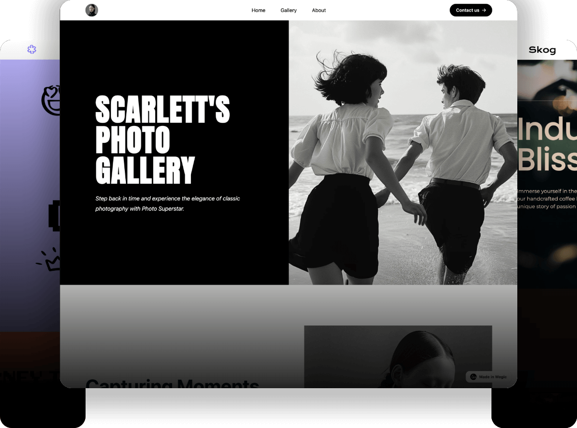
The right typography in web design can turn your site from "meh" to "wow" in no time. And if you’re still unclear or just do not have time to waste on fonts and their combinations, let the DIY website builder - Wegic choose the fonts for you. For instance, Wegic helps remove the guesswork of decisions like typography and web design, so your site not only gets the attention it deserves but also has the ‘get up and go’ factor to deliver that attention.
Wegic is a revolutionary AI web design and development tool that democratizes website creation through its user-friendly, chat-based interface. It's an excellent choice for individuals and small businesses looking to establish an online presence without diving deep into coding or web development. The blend of AI efficiency, ease of use, and customizable design options makes Wegic a standout tool in its category, offering unique advantages to a wide range of users. Whether you're building a personal portfolio, a business site, or anything in between, Wegic provides a streamlined, accessible path to a professional online presence.
-
Multimodal Interaction: Powered by GPT-4, Wegic enables users to guide the website building and hosting process through natural conversations and images, ensuring a seamless and intuitive experience.
-
Zero Barrier, Full Process Support: Wegic manages all technical details from website conception to deployment and hosting, requiring no programming or design background from the user.
-
One-Click Launch & Custom Domain: From concept to completion in minutes, Wegic supports custom domains and hosting, making the process efficient and hassle-free.
So why wait? Seize the day, get a grip on your chosen typography and let your website stand out.
Written by
Kimmy
Published on
Mar 17, 2026
Share article
Read more
Our latest blog
Webpages in a minute, powered by Wegic!
With Wegic, transform your needs into stunning, functional websites with advanced AI
Free trial with Wegic, build your site in a click!
What kind of website do you want to build?
