Log in
Build Your Site
Cute Color Palettes for Your Brand or Personal Website
Discover the perfect cute color palette for your brand or personal website. Elevate your aesthetic with charming hues that boost engagement and express your unique style.

When you make a brand or personal website, color is a very important part. It will change how people feel when they see your website for the first time. A good color plan can make the page look nicer and also make your brand look more stylish.
These days, many people start to like "cute style" color mixes. These soft and sweet colors make people feel good when they look at them. On Instagram, Pinterest, and other platforms, more and more brands are using this style. It looks friendly and can touch people's hearts more easily. If you're aiming for a site that feels professional yet emotionally appealing, studying some of the best-designed websites for small businesses can also inspire how to combine cuteness with brand clarity.
So, if you are making your brand or personal website, you can try this color palette cute style. It is good for beauty, handmade, drawing, and other creative brands. It is also good for personal blogs or portfolios that want to feel warm.
Next, we will show you some popular cute color types, like macaron colors, candy bright colors, soft natural colors, and more. We will also tell you how to pick the best color group for you. No matter if you are a beginner or you are upgrading your brand, you can find ideas from this article!
Click on the image to get more inspiration 👇
Why “Cute” Color Palettes Work for Brands & Personal Sites
Why do so many brands and websites like to use cute color palettes? There is actually a reason from psychology.
People are naturally attracted to soft, bright, and clean colors. Colors like pink, light blue, and cream yellow make people think of happiness, safety, and childhood. So when users open your website for the first time and see these “cute” colors, they will feel happy and like your brand more easily.
These pretty color palettes are not just beautiful; they also help you make the user experience better. They can make the page look more relaxed and feel more comfortable to look at. Also, cute colors are easier to remember, and they help people know your brand by its look.
Especially Gen Z and Millennials, they like more personal and emotional design styles. They want to support brands that “feel warm”.
Glossier is a good example. Its brand color is soft pink, and it looks both modern and friendly. Also, Hello Kitty, Notion, even if their styles are different, they all use soft colors to touch people’s hearts.
So, if you want your brand to be more attractive and easier to remember, you can start with a color palette cute.
Types of Color Palettes Cute
There are many kinds of cute color palettes on the market. Each one has its own feeling and fits different brand styles. Now, let’s look at some of the most popular cute color palettes with hex codes. They can help you find the best color group for yourself.
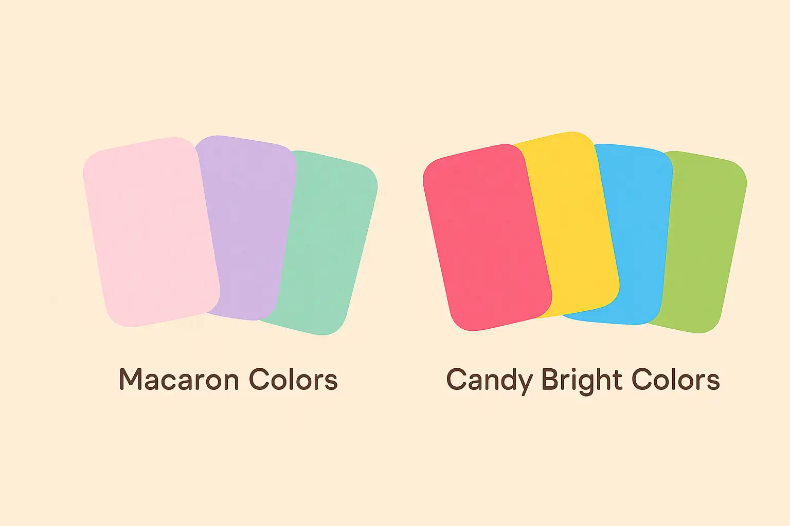
Macaron Colors
This color palette is very soft. Common colors are light pink, light purple, mint green, and baby blue. The feeling is dreamy and gentle. It is good for skincare, cultural products, illustration brands, or lifestyle websites.
Recommended colors:
- Pink: #FADADD
- Light purple: #DCC6E0
- Mint green: #C1F0DC
- Baby blue: #AEE2FF
Candy Bright Colors
These colors are stronger. They are very bright, with high contrast. They look like candy packages. This style is good for young, fun, and active brands, like snack shops, toys, fashion stores, or creative studios.
Recommended colors:
- Hot pink: #FF5DA2
- Lemon yellow: #FFF685
- Bright blue: #63C5DA
- Candy green: #B8F47B

Natural Colors + Cute Touch
This is a very popular mix now. It uses beige, milk coffee, brown, and adds one or two sweet colors like nude pink or soft green. It feels natural but is still cute. It is good for simple style, handmade brands, or photographer websites.
Recommended colors:
- Milk tea: #D7BBA8
- Off-white: #F6F1EB
- Nude pink: #FADCD9
- Soft green: #C7E8CA
Japanese Kawaii Style
This style comes from the Japanese cute culture. The colors are rich but not too much. It looks sweet, dreamy, and full of a cute feeling. It is good for illustration, games, blogs, or small fashion brands.
- Recommended colors:
- Cherry pink: #FFC1CC
- Sky blue: #B2E3FF
- Mint milk green: #D3FFE6
- Cream yellow: #FFF1AE
When you choose colors, you can pick by your brand’s personality.
- Soft colors are good for a gentle style.
- Bright colors are good for a lively feeling.
- Natural colors are good for a simple and clean look.
- Kawaii style is more personal and fun.
Of course, not only must the colors look nice, but the color mix must also be good. The colors should have some contrast, but not too much. You can use these colors as main colors, and match them with some dark or neutral colors for background or text.
Remember, when your visual style is united, your brand is easier to remember!
How to Choose a Color Palette Cute That Matches Your Brand
Choosing the right colors is like giving your brand the right clothes. Every brand has its own personality, like gentle, lively, professional, or free... So the colors you choose should match that feeling.
For example, if your brand is for young girls, you can use colors like pink, lavender, purple, and cream yellow. These colors are cute and not too strong. If you make stationery or lifestyle products, maybe you can use milk tea color with soft green. It looks warm and natural.
You can also use the “color wheel” to match colors. Colors next to each other on the color wheel look nice together. Colors that are opposite on the wheel have a strong contrast, but they can show something important. For example, light blue and coral orange are a classic pair.
It’s OK if you don’t know how to match colors. Now there are many good online tools. Tools like Coolors, Adobe Color, and Canva Palette Generator can help you make color palettes, and they also give you color codes. It’s very easy to use. You can save the cute color palettes with codes you like, and use them in your website design.
If the same brand uses different color palettes, it will feel very different. Sometimes, just changing colors can make the whole style change. So, finding the best color group for you is really important. If you want to see how others do it well, take a look at some creative website design examples to learn how colors can shape mood and message clearly.
Use Wegic to Bring Your Color Palette to Life
After choosing your colors, the next step is to really use them on your website. But many people feel nervous when they hear “build a website.” They think it means writing code or learning design. Actually, now it’s much easier.
There are some very helpful tools that let you choose colors and build pages at the same time. The whole process is as easy as chatting. Some platforms can even make the page layout, text style, and color mix for you, based on your style. You can get a first version of your website in just a few minutes. If you already picked a group of colors you like, like the cute color palettes with pink we talked about before, you can just put them in and see the result right away. It’s super easy.
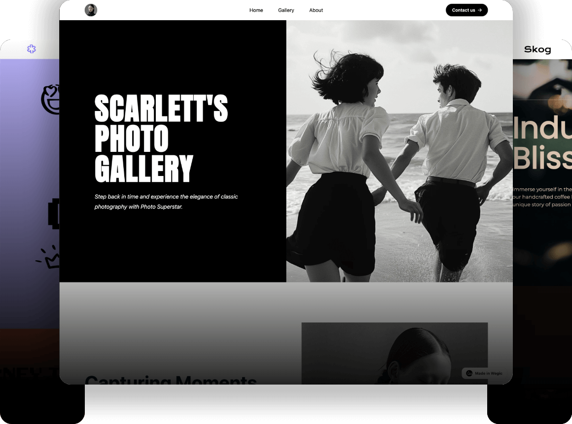
Platforms like Wegic are worth trying. You don’t need design skills or coding. Just talk to the system and tell it what feeling or color style you want. It will help you step by step to make a full website. For beginners who want to build a brand or personal page, it really saves time and energy.

Of course, tools are just for help. The most important part is still your own style and ideas. As long as your style is clear and the colors look nice, no matter what method you use, the page will be your own special creation. Here is a comprehensive beginner's guide and Wegic web examples for your reference.
Tips for Using Color Palettes Cute on Your Website
Cute color palettes look nice, but when you use them on a website, you need to use them in the right way. If not, the page can feel “too sweet” or too messy.
First, the title, button, and background colors are very important. You can use the main color for the title, like soft pink or light purple, so people can see the key part quickly. The button color should have some contrast. For example, you can put a bright button on a light background, so users can find the action more easily. The background color should be simple and clean, not too busy.
One more important thing is: don’t “use too much.” If you use pink, bright blue, and soft green all over the page, it will feel too heavy. You can choose one or two main colors, and match them with some neutral colors, like white, beige, or light gray. This will make the page look more comfortable.
Don’t forget, many people visit your website on phones or tablets. So in responsive design, you should also keep the color style the same. No matter big screen or small screen, the whole feeling should stay the same. Then users will think your brand is professional and careful.
If you like pink, you can start with a group of cute color palettes with pink. Match it with some natural or cream colors, and the page will be both cute and nice to look at.

Conclusion
Now, after reading this, you should see that a good color palette cute can really make your brand better. It doesn’t only make your website look nicer, but also shows the feeling you want to share, like gentle, lively, healing, or happy.
No matter if you are making a personal website, portfolio, brand homepage, or small shop, a good color plan will help your style look clearer and special. The cute color types we talked about today—from pastel to candy brights, and to natural soft colors—are all great for making a friendly and attractive page.
Now it’s your turn to try! You can pick a group of colors you like, or try the color codes we shared in this article, to create your own style. You will see that choosing colors is not that hard.
So don’t wait—open your website editor and start changing your colors! Just a small change can already make a big difference.
To build a cute and eye-catching brand page, start by choosing your own special colors! For more ideas on how color works with layout and visuals, check out some of the best graphic design websites for real-life inspiration.
FAQs
Q1: What kind of colors are called “cute”?
Cute colors are usually soft, bright, and not too strong. For example, pink, light blue, creamy yellow, and mint green. These colors make people feel relaxed, warm, and happy. That’s why so many people like to use the cutest color palettes to build their websites and brand look.
Q2: Are cute colors good for professional brands?
Yes, of course! The key is how you use them. If your brand is about creativity, design, beauty, or a healthy lifestyle, cute colors can help you look more friendly. You can also mix cute colors with a simple style. Then your brand will look both professional and special.
Q3: How many colors should be in one palette?
Usually, 3 to 5 colors are best. You can include: one main color, one accent color, and one or two neutral colors (like gray, beige, or white). This way, the palette won’t be too messy, but still has good layers. It works well for different page layouts.
Written by
Kimmy
Published on
Mar 17, 2026
Share article
Read more
Our latest blog
Webpages in a minute, powered by Wegic!
With Wegic, transform your needs into stunning, functional websites with advanced AI
Free trial with Wegic, build your site in a click!
What kind of website do you want to build?
