Log in
Build Your Site
10 Most Creative Website Design Examples: Show Your Passion
Discover 10 creative website design examples that effectively showcase passion and innovation online. Learn about the best website design elements and create one with Wegic.

These days, the internet is really crowded. The reason is there are just so many different innovative website designs out there. So many websites are fighting for just a little bit of attention from visitors. Because of this, having a creative website design isn't just a nice little extra—it's essential. You can actually get noticed and increase your website click rate by just having the best website design. Plus, having a good website design can help connect with real audiences.
The most important thing is that most people who visit a website decide very quickly. Often, in just a few seconds, they know if they want to stay or leave. That first impression counts for a lot. A creative and thoughtful website design sends a clear message to your visitors. It tells them you care about their experience. It says, “Hey, we invested time and energy into making this great because what we do really matters to us, and you matter too.” This approach builds trust in your visitors and makes them feel welcome and valued.
The more exciting part is there isn't just one way to be creative. A thought website design doesn't automatically mean you need tons of flashy animations or complicated graphics that take forever to load. Sometimes, the most creative approach is bold simplicity. The main goal is to show your brand's passion for your best website design. It should feel natural and true to who you are and what you offer. Your website should feel like a representation of you.
Today, we'll discover 10 creative website design examples that effectively showcase innovation online. Get started with us and get inspired!
Why Having a Creative Website Design Matters
It is so hard to focus on one platform for a long time. Everybody scrolls fast and clicks faster; if your website doesn’t catch their eye right away, they’re off to the next thing. That’s why if you want to build a personal or business brand, you need a creative and unique website design.
A great design can stop someone mid-scroll. But it’s more than just grabbing attention from your visitors. A creative design shows personality and care. If your site looks like every other generic template out there, people might assume your brand is just as forgettable. On the flip side, a unique website design tells visitors you take what you do seriously. That builds trust. And trust is what turns casual visitors into loyal customers.
Creative website design also gives you a way to tell your story without saying a word. The colors, fonts, layout, and the way things move or react. They all work together to create a vibe. More importantly, that’s what makes a site stick—and why investing in unique website design is totally worth it.
10 Creative Website Design Examples
We collected the most creative website design examples for you to watch. After learning from these 10 examples, you might spark your own innovative website design idea. Let's highlight your creativity and turn your website into something eye-catching and interesting.
1.Wegic-AI-Powered Creative & Unique Website Design
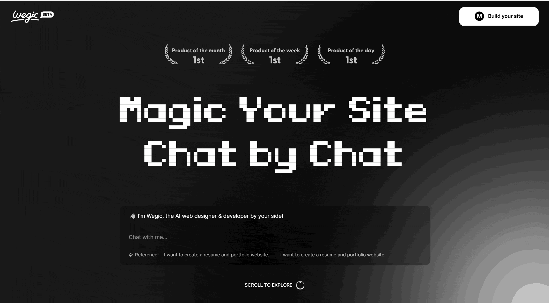
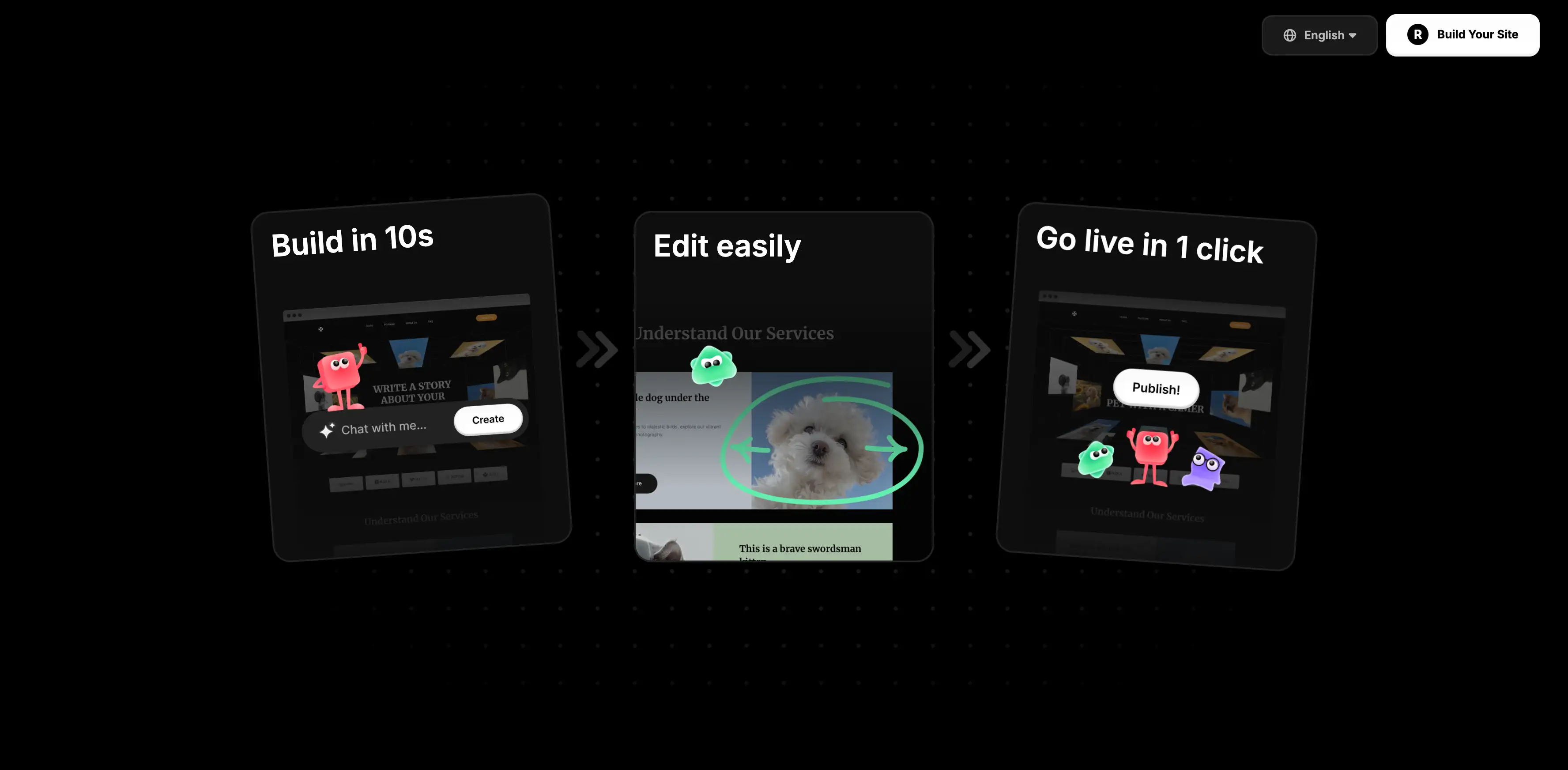
First up is Wegic. This isn't just another drag-and-drop website builder.Wegic positions itself as the "First AI Web Designer & Developer&Manager by Your Side." This means you can have a fully professional website development team by your side. What makes it stand out is its approach. It aims to make building a unique website feel as simple as having a conversation. You describe what kind of site you need, what features you want, and the overall vibe. The chat response time is fast; it only takes seconds. Then, the AI assistant Kimmy gets to work, generating your website in minutes.
The really cool part is how Wegic learns and adapts to your specific style preferences. Whether your vision is something bold and artistic or clean and minimalist, the AI tailors the output. The AI website developer Timmy will serve all your needs.
No code? No problem. Wegic makes AI-powered web creation easy!

It's designed to create responsive sites automatically. This means they look great and function perfectly on desktops, tablets, and smartphones. And perhaps the biggest draw for many? You don't need to touch a single line of code. You can DIY your own website based on anything you can think about and chat through Wegic's AI assistant, Timmy. After the chat, you can immediately see the transformation of your website. Most of the design templates are modern and unique. You won't just end up stuck with some basic website design that looks no different from others.
Publishing your finished site is straightforward, often just a click. Wegic also includes a built-in AI manager, Turi. This tool can help keep your site updated over time, which is a huge plus.
Wegic is fundamentally about making professional-level, creative website design accessible and effortless. It empowers users to bring their vision to life easily.
Why Wegic is Popular?
-
Global Reach: Users from over 220 countries and regions
-
Multilingual: Accept for chat-by-chat language English, Chinese, and Japanese
-
Beginner-Friendly: 80% of users are first-time users
-
Extensive Usages: Over 500,000 Websites Built and Managed
-
Affordable: All new users enjoy free trials, allowing them to create websites at no cost
2.Dopple Press-Modern Website Design
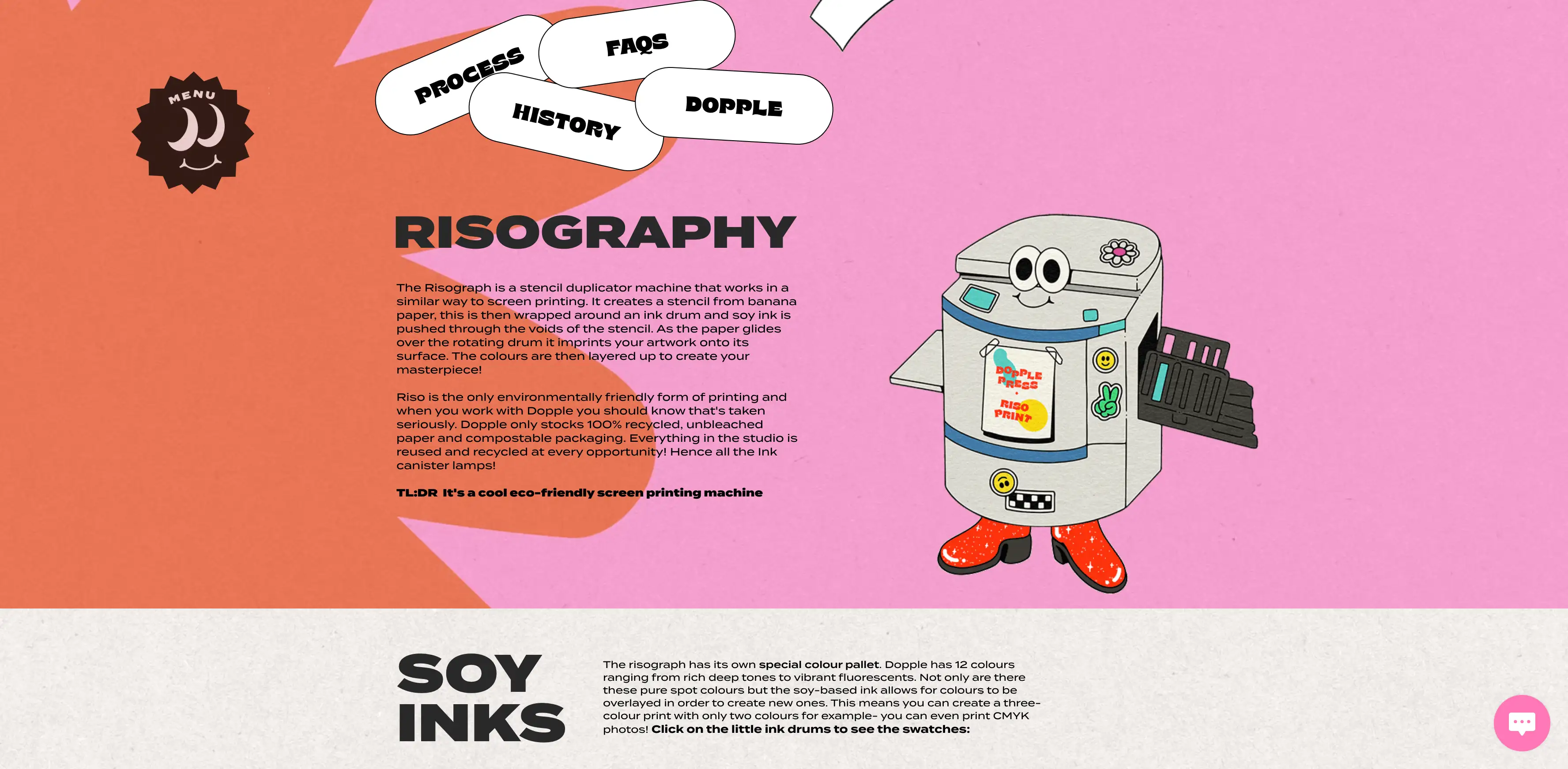
Due to its innovative design, the Dopple Press website feels calming and interesting for visitors. There’s no clutter, no overwhelming pop-ups, and the best part is that Dopple Press's website design fits its brand theme perfectly.
Their website's artistic design mainly focuses on classical-inspired fonts, bold splashes of color, and subtle little animations. That print style has this cool, handmade, slightly retro feel. It's a check spot for people who like simpler, modern designs with calming feelings. It doesn’t feel like just another crowded website. Dapples Press delivered a more crafted feeling that almost felt like someone cared about every detail.
What’s nice is that everything on the site ties back to what it stands for. Its commitment to sustainability includes using recycled paper and soy-based inks. But you can feel it in the design. It’s subtle, but it’s there, baked into the whole vibe of the site. The website design doesn’t just look good; it handles right. The reason is the design is aligned with what the brand actually stands for. That kind of authenticity is what makes it one of the best site designs out there.
3.Studio Mast-Innovative Website Layout
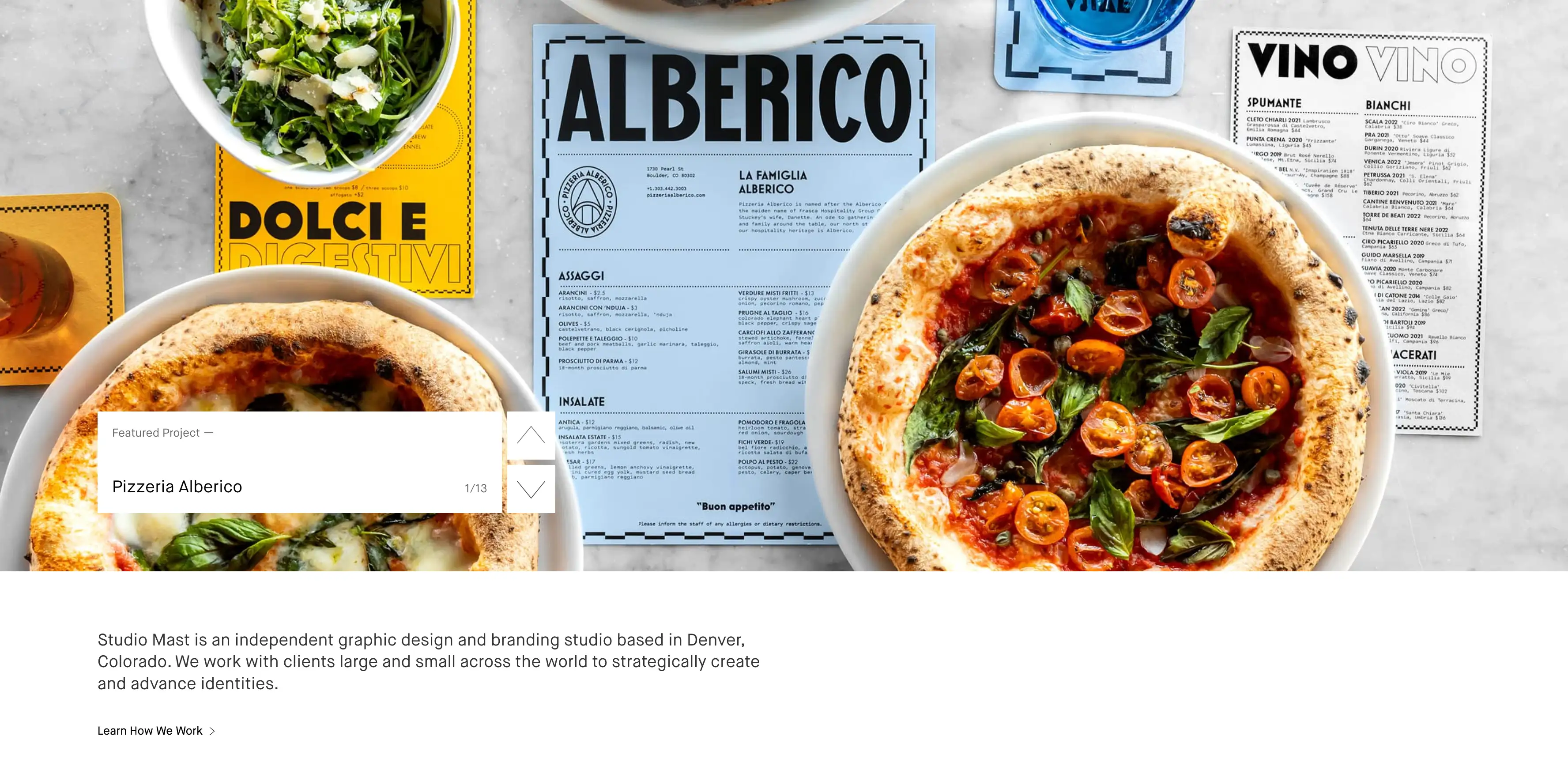
Studio Mast is a great example of how you can totally break the rules of traditional web design. Plus, the website design makes it work. Their website doesn’t stick to the usual grid layout. Instead, it feels more like a collage in motion. You’ve got overlapping pieces, text playing with images in unexpected ways, and an off-center balance that somehow clicks. Right away, you get the sense that this brand is creative, bold, and not afraid to do things differently.
The clever use of white space keeps it from feeling messy. It gives each element plenty of room to breathe, which helps your eyes move naturally through the page. Even with all the asymmetry, it still feels organized—like there’s a method to the madness. That’s what makes the design feel fresh without being overwhelming.
This kind of layout says a lot without spelling it out. It gives off strong creative energy and shows confidence. You can tell the studio isn’t here to blend in—they’re here to lead. For brands that want to come across as edgy, artistic, or a little rebellious, going off the beaten path like this can really leave a mark. Studio Mast proves that even the layout can be part of the branded voice.
4.Isshī-UniqueWebsite Design
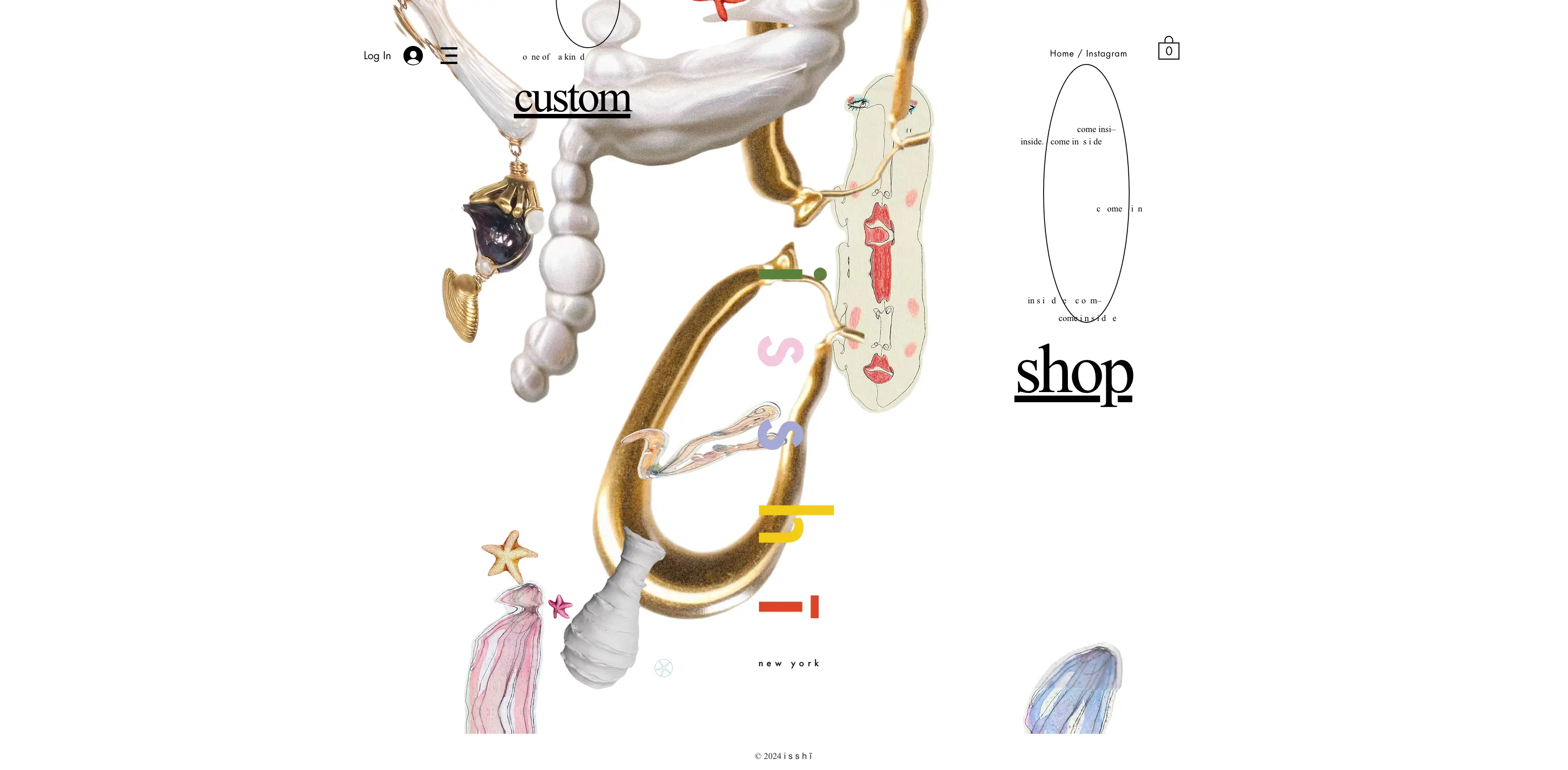
Checking out Isshī’s Creative website feels less like browsing something unique. The innovative website design uses parallax scrolling to create this soft sense of depth. You’ll see graphics float by, little surprises pop up as you scroll, and the whole thing just invites you to explore. It doesn’t feel like typical navigation—it feels like you’re discovering something.
Elements gently fade in; some things spin slowly, and others just drift. What’s cool is that the desktop version leans more artistic. It is a delivered floating experience; the mobile version keeps things a bit simpler. It trims down the effects, so it’s easier to use and quicker to load on a phone—which is super smart. They’ve clearly thought about how people actually use the site. Even their product packaging matches the look and feel of the website, which ties the whole brand experience together.
5.Cami Ferreol-Clear Website Design
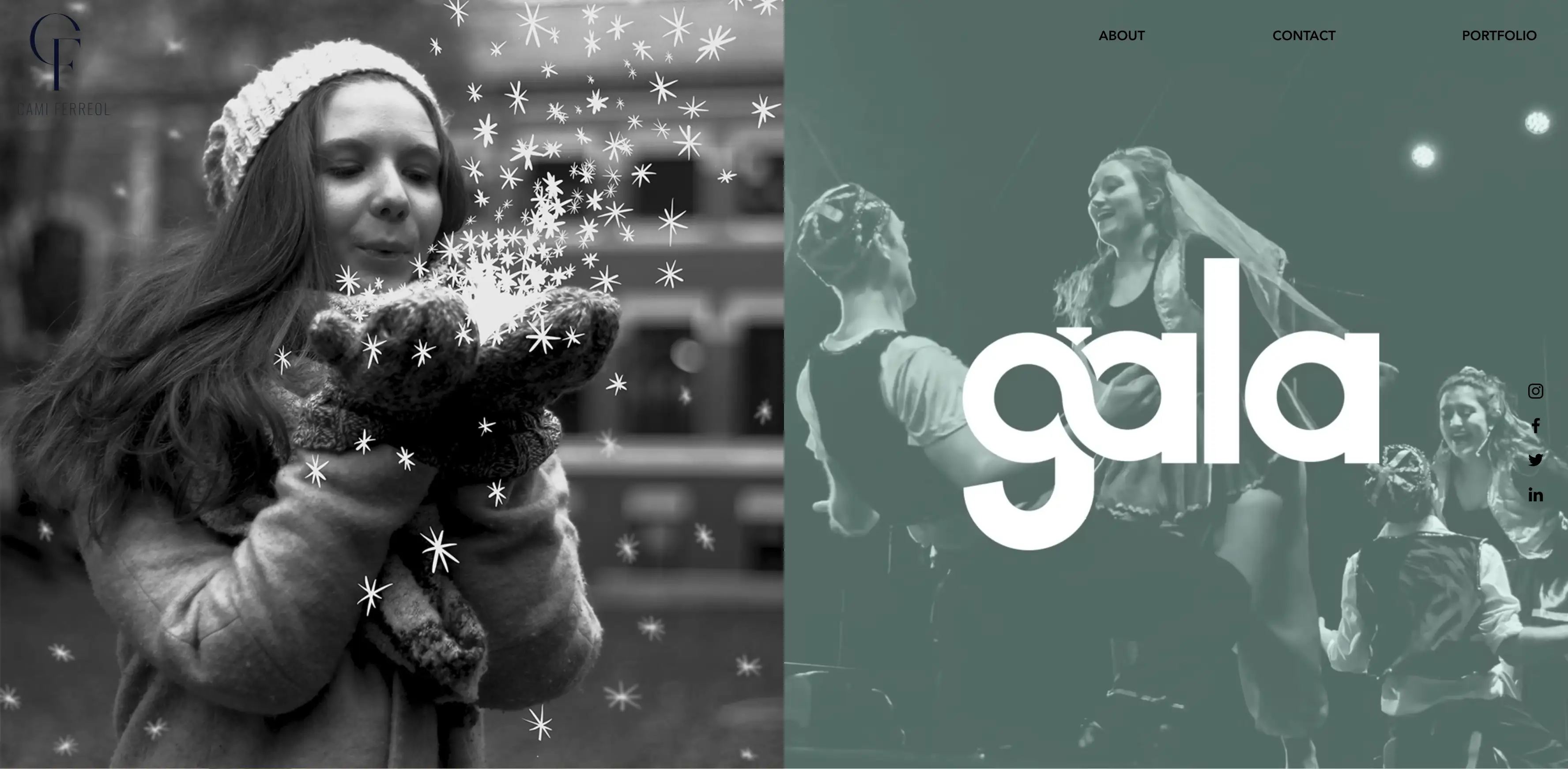
Cami Ferreol’s portfolio site is clean and minimal and does a great job highlighting the work. But what really stands out? The footer. Most websites treat the footer like an afterthought, and it's just a spot for copyright info or some generic links.
But Cami gives a more innovative website design; You’ll find the headshot, a unique logo mark, and even a hand-picked Spotify playlist. This one small detail makes the whole website feel more personal. It’s proof that even the most overlooked parts of a layout can be turned into a creative website design feature. While the rest of the site keeps things polished and professional with solid visuals and client testimonials, that footer adds a human touch. It’s a simple but smart design move—and honestly, that’s what makes it stick in your head. It’s a strong website design example of how details matter.
6.Chico Santos-Rethinking Navigation With the Best Website Design
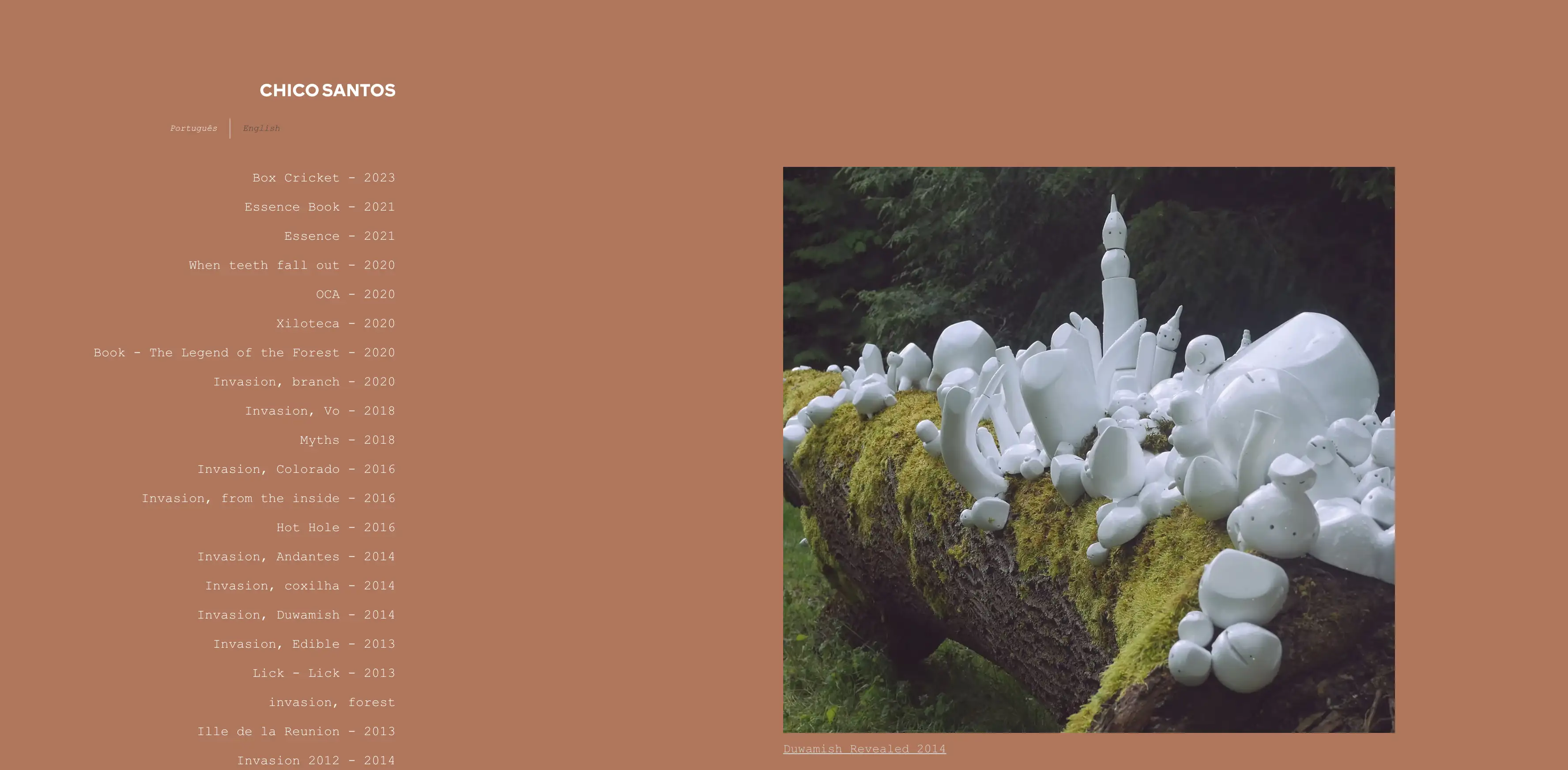
Chico Santos takes a fresh angle on portfolio navigation. Instead of the usual top or side menu, he puts a project list front and center—and that list is the navigation. It’s a small shift, but it changes how you move through the site. To keep things easy to follow, the website uses sticky elements and smooth scrolling. You never feel lost. Everything flows naturally, and you always know where you are. It’s clean, user-friendly, and just makes sense. This kind of layout shows how rethinking something as basic as navigation can lead to the best website design that’s both functional and fresh. It’s a great creative website design move that prioritizes user experience without overcomplicating anything.
7.Ellen Von Wiegand-Innovative Website Feature
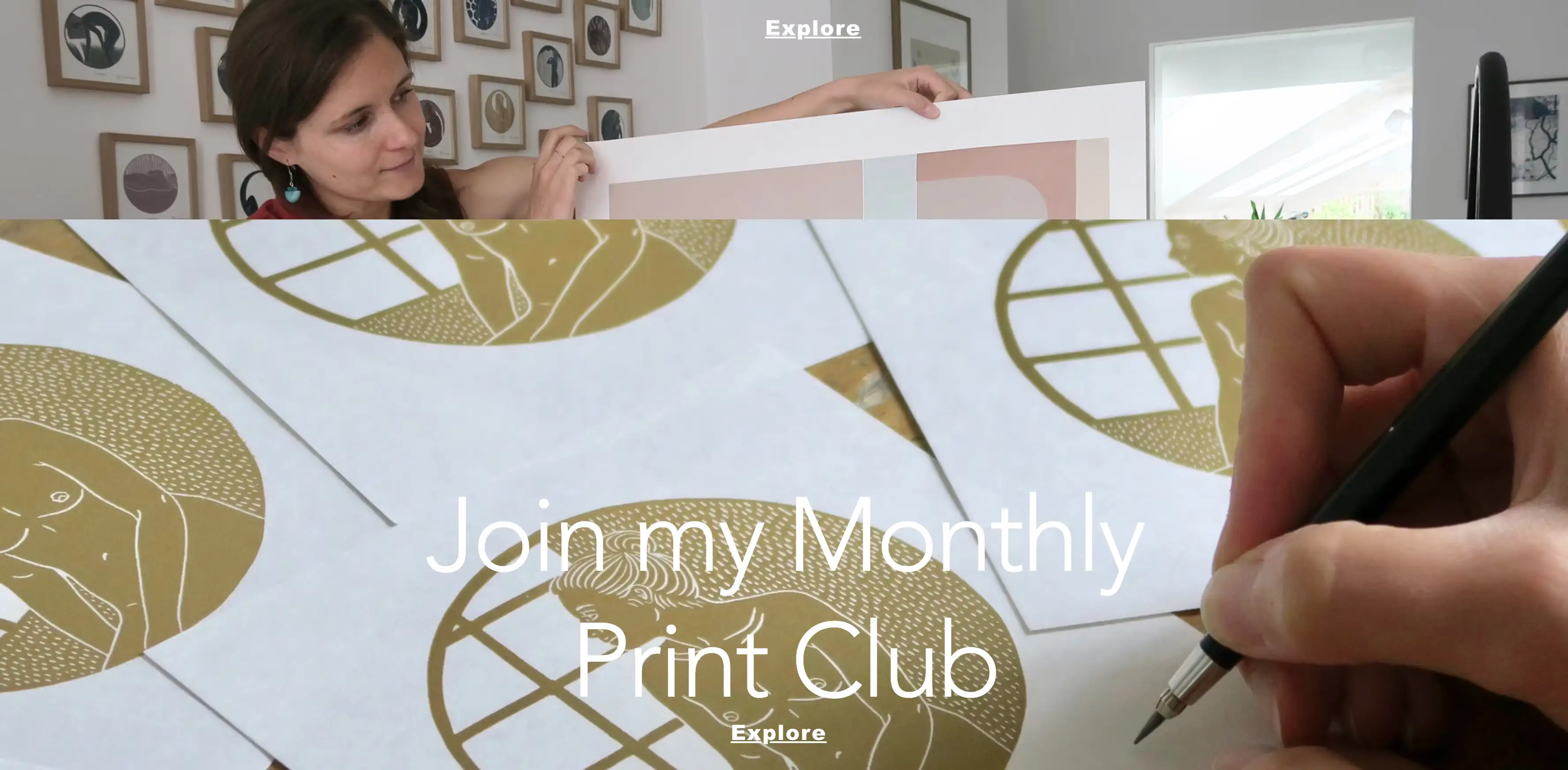
Ellen Von Wiegand’s site is exactly what you’d want from an artist—clean, calm, and totally focused on her artwork. But there’s one little feature that really stands out: a lightbox promoting her "Print of the Month" club. It pops up gently without feeling annoyed or in your face, which is a rare win for pop-ups.
What’s smart is how well it fits into the overall flow of the site. It adds value without being a disruption. It’s a great innovative website feature that supports her goals—getting people to subscribe, building a community, and creating a steady stream of support. It’s subtle and smart and shows how just one thoughtful touch can elevate a creative website design and actually help drive business.
What really works here is the balance. It doesn’t feel like a sales pitch. It feels like an invitation. That kind of approach resonates with visitors, especially in a space as personal as art. It keeps the vibe consistent with the rest of the website while still pushing a clear call to action. This is a strong website design example of how to use small interactions to build deeper engagement without compromising the aesthetic or overwhelming the user.
8.Nathalie Lete-A Storybook Website Design Example
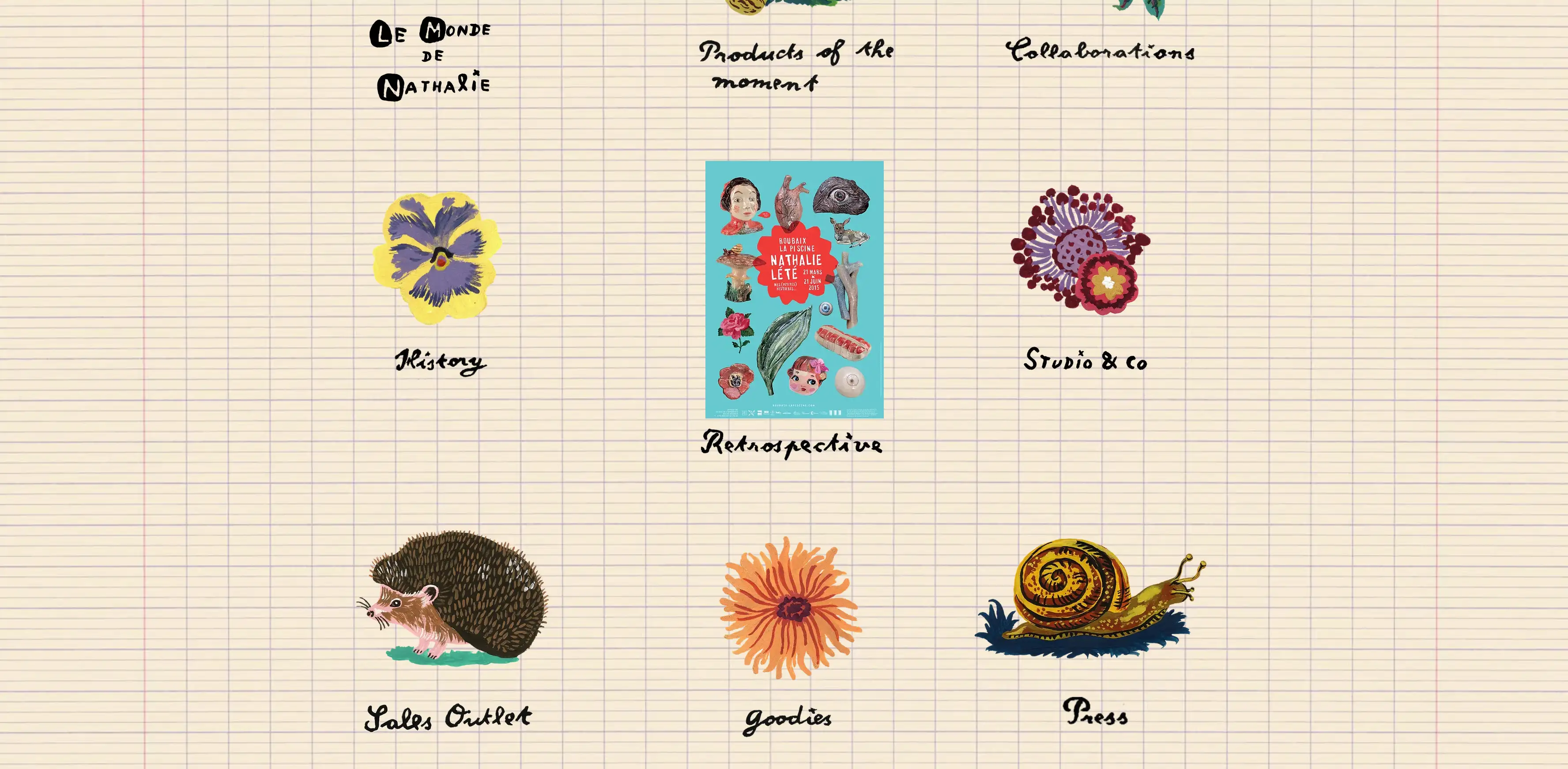
Nathalie Lete’s website doesn’t feel like a typical site—it feels like you’re flipping through a magical old storybook or one of her personal sketchpads. Right from the jump, you land on a whimsical splash page with her signature hand-painted style, and instead of a menu or a bunch of buttons, you’re just met with a big, warm “Enter” button.
It’s simple, but it totally breaks the usual website mold—and that’s what makes it so fun. That small detail changes the whole vibe. You’re not just visiting a site. You're stepping into this new website-designed world. It’s playful and artistic. This is the kind of unique website design that really sticks with you. It’s a perfect website design example of how the atmosphere and brand voice can be built right into the layout, even with the first click. You feel like you’re being gently invited on a little visual adventure. And honestly, it’s way more memorable than just dumping someone into a homepage.
9.Scarf Aid-Thoughtful Blog Website Design
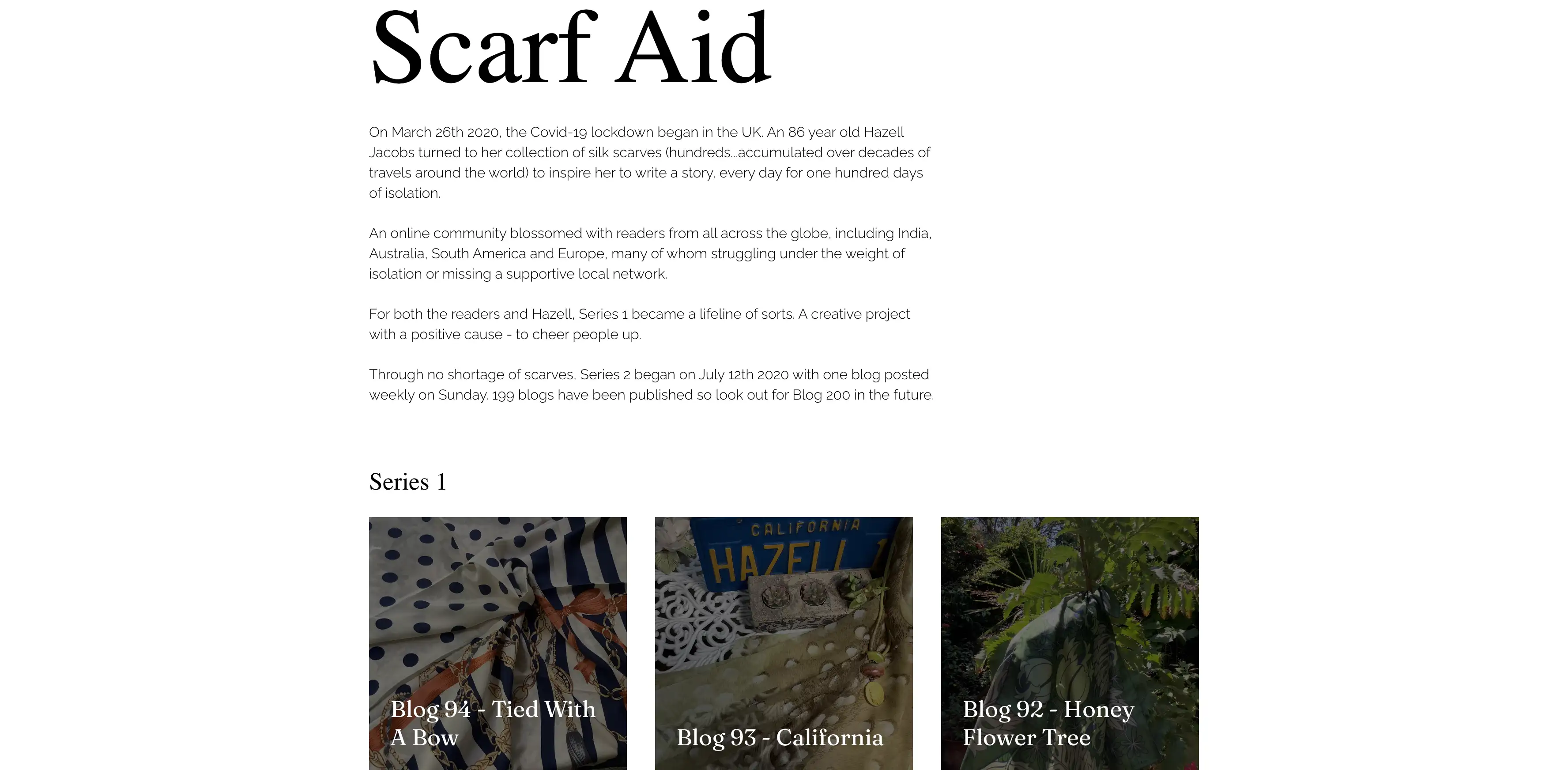
Scarf Aid demonstrates how even a blog, often a content-heavy format, can be presented with thoughtful creativity. The site blends blog entries with simple, evocative visuals to create an online space that feels soothing, personal, and expressive. It reads almost like a beautifully curated digital diary. The design supports the intimate nature of the content.
The unique website designchoices—nice typography, a gentle color palette, and a really smooth flow—all work to support the content. It’s a reminder that even content-heavy sites can have a strong aesthetic. Honestly, if your blog is about storytelling, reflection, or personal growth, this is one of the best website design approaches out there. It’s soft, personal, and totally engaging without trying too hard.
10.Meppity-AddingLife with Innovative Website Animations
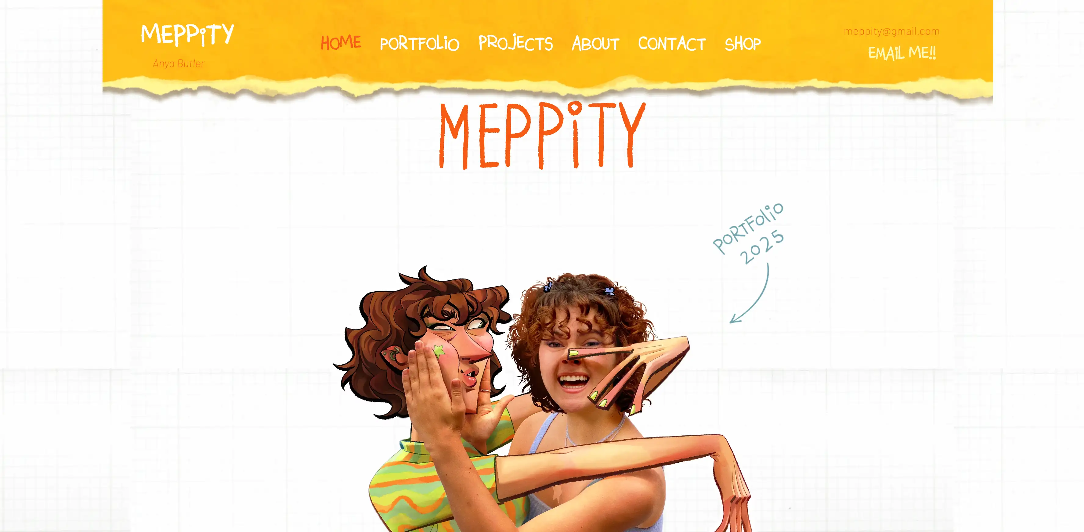
Meppity’s site is a solid example of how a little motion goes a long way. It’s not overloaded with animations, but the ones it has? They’re done just right. You’ll see little GIFs pop to life when you hover over project names or social icons, giving you a slight wiggle—tiny stuff, but it makes the site feel super alive.
What’s great is that none of it feels like fluff. Everything’s there to help guide you—whether it’s drawing your attention to something clickable or giving you subtle feedback that you’re interacting with the site. It’s polished but still has personality. This is a great, innovative website move that shows you don’t need wild effects to make something stand out. Just being intentional with small details can make a site feel dynamic and engaging. It’s a low-key, creative website design that gets it right by keeping things fun, helpful, and human.
Conclusion: Creative Website Design That Connects
These ten creative website design examples are just a tiny peek at how wide open the world of website design really is. As you’ve seen, there’s no one-size-fits-all. Creativity can show up in so many different ways—whether it’s using AI tools like Wegic to simplify the process, adding cool textures that give off a certain vibe, going with a bold layout that breaks the rules, or including subtle little UI animations that make a site feel alive. That’s the beauty of it—there’s no “correct” way to do it. The variety is what makes it so fun and full of possibilities.
At the end of the day, what really matters is building a site thatfeels like you—something honest, something that clicks with the people you actually want to reach. The best website design isn’t about chasing trends or trying to copy what everyone else is doing. It’s about showing your personality, your style, and what your brand’s all about.
When your site feels real, people pick up on that. They connect with it. Hopefully, some of these examples gave you a few ideas to play with. Think about what sets you apart—and how your website can show that off in a way that feels natural. A great creative website design doesn’t just look good; it makes people feel something. That’s what sticks. So go ahead, make something that feels true to you.
Written by
Kimmy
Published on
Mar 17, 2026
Share article
Read more
Our latest blog
Webpages in a minute, powered by Wegic!
With Wegic, transform your needs into stunning, functional websites with advanced AI
Free trial with Wegic, build your site in a click!
What kind of website do you want to build?