Log in
Build Your Site
20+ Tips to Make Your Website Outstanding in 2024
Discover 20+ expert tips. Learn how to enhance mobile responsiveness, optimize design, improve speed, and more to create an outstanding user experience.
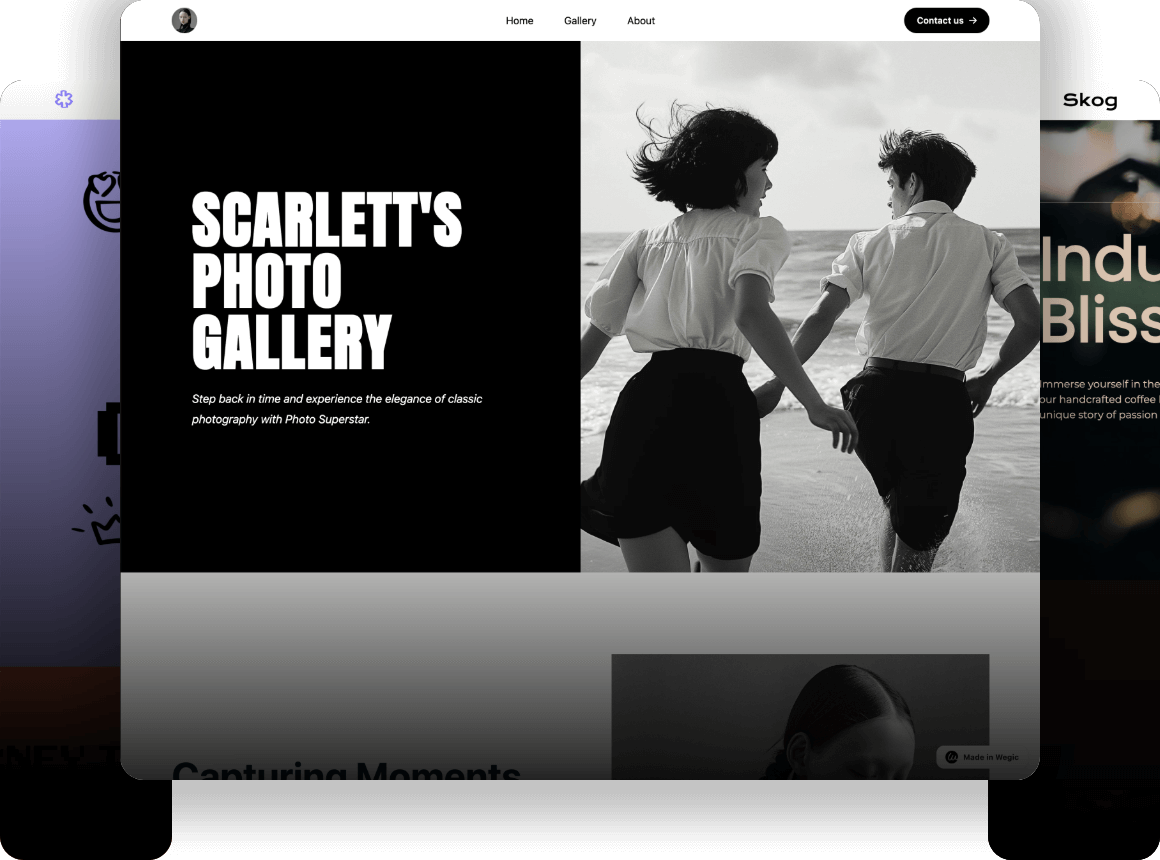
So, you've built your website—congratulations! But remember, this is only the beginning of your journey. In today's vast online landscape, standing out among countless competitors isn't easy. To help you succeed, I’m going to share 20+ tips that will elevate your website and make it truly outstanding.
20+ tips to make your website outstanding
01.Mobile Responsiveness
02.Easy Navigation
03.Simple Design
04.Fast loading speed
05.CTA Best Practices
06.White Space
07.Clean, Easy-to-Read fonts
08.URL Structure
09.Internal Linking
10.Page titles, meta descriptions, and tags optimization
11.Strategic Color Choices
12.Social Media Integration
13.Visual Elements
14.Layout Variety
15.Audience Research
16.User Personas
17.Regular Content Updates
18.User's Journey Mapping
19.Micro-Interactions
20.Data Analytics
21.A/B Testing
01.Mobile Responsiveness
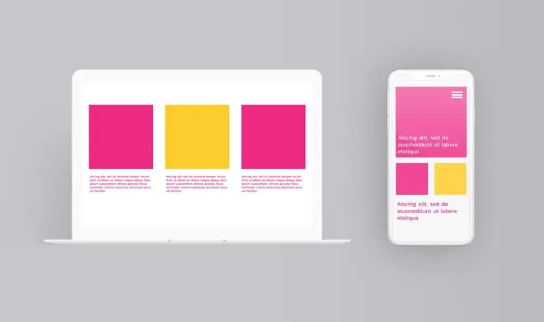
The reason why I put mobile responsiveness first is because it is so important. Mobile responsiveness is to ensure that users can see the content of your website normally on different devices, including layout, pictures, etc. According to data provided by Google, nearly 80% of the world's searches come from mobile users, which shows that mobile-friendliness plays an increasingly important role in website construction and optimization. Google will even punish websites that are not mobile-friendly and lower their rankings.
So, make sure your website is friendly to mobile users.
02.Easy Navigation
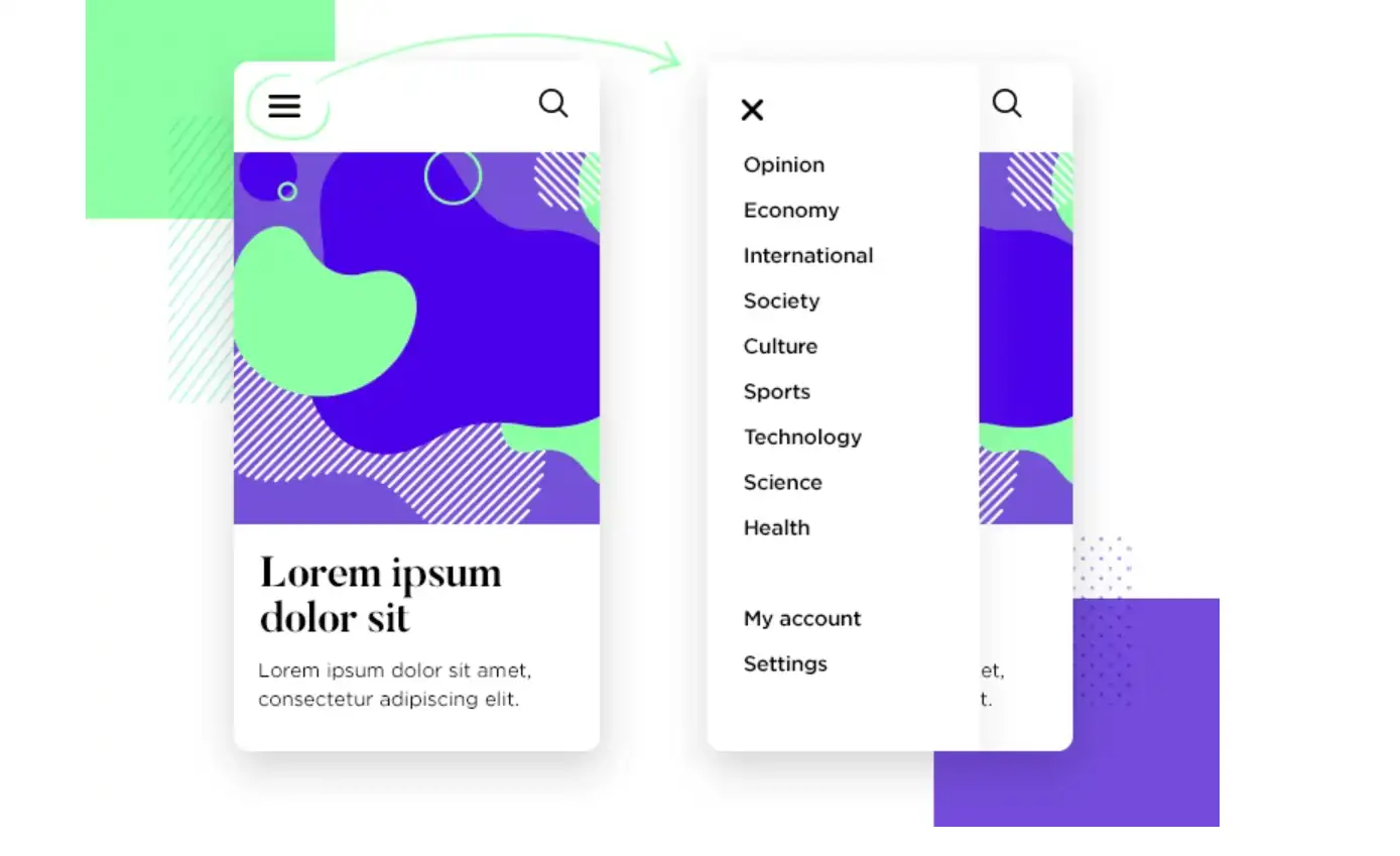
Make sure your navigation is simple and intuitive so that your users can quickly find the information they need. You need to simplify the button structure and follow the principle of minimalism, keeping only the most important buttons, so that you can guide users and not cause too much confusion for the audience.
If possible, you can also add a search box. This can help users find the information they want faster. Moreover, every search is a very important source of information, and you can also intuitively understand what each audience wants to see. This data can help you further optimize your website and navigation.
For mobile users, due to the smaller screen size, hamburger buttons are a good choice, but ensure they are easy to use.
03.Simple Design
Less is more. When a website is simple, users can quickly find what they’re looking for without getting overwhelmed or confused. Meanwhile, simple design drives your audience to focus on the most important content.
To make your design simple, you can limit the use of colors, make your content conscious, and choose simple fonts. These designs will increase readability and make your audience more enjoyable when they go through your website.
04.Fast loading speed
Fast loading speed can improve user experience and reduce the possibility of user loss. According to statistics, if users cannot open a website within four seconds, they will close the webpage and go to other websites. So at least increase your webpage loading speed to less than three seconds, the faster the better.
Analyze the reasons for the slow loading speed of the website and optimize it. Generally speaking, it is mainly because there are too many pictures or video resources on your webpage, which affects the loading speed. You can compress the size of the images or files or add a progress bar animation, which helps you increase network speed, relieve users' anxiety during the waiting process, and improve user experience.

05.CTA Best Practices
CTAs guide users to take specific actions on your website, such as signing up for a newsletter, making a purchase, or downloading a resource. Meanwhile, compelling CTAs can help increase the conversion rate. By telling users what to do next, you can reduce confusion, thus taking action.
Make sure your CTAs use action-oriented language, such as “Learn More” or “Download Now”. This language is concise and powerful, and it creates a sense of urgency. This is a great way to drive your audience to take the next step and encourage them to click the button.
The placement and color of your CTAs should also be carefully considered. Using large CTA buttons with contrasting colors will make them stand out from the rest of the content. You can put these CTA buttons at the end of blog posts, on landing pages, or in the hero section of your homepage. Ensure they are easily accessible without scrolling too much.

06.White Space
Using some white space not only makes your entire page more tidy but also guides the audience to focus on the key content. At the same time, the use of white space can also make your page less crowded and create a sense of breathing.
07.Clean, Easy-to-Read fonts
Clean, easy-to-read fonts can enhance the readability of content and help your users absorb your content more easily and easily, which can improve the user experience. If users have to squint or decipher your text, they’re likely to leave, resulting in higher bounce rates.
You can choose sans-serif fonts like Arial or Roboto, which are easier to read on screens. A font size of 16px or larger with sufficient line spacing ensures clarity and comfort for readers. Also, don't choose multiple fonts, which will make your content cluttered and confuse your audience.

08.URL Structure
A concise and memorable URL structure makes it easier for search engines to read your website content, which is conducive to crawling and indexing your website and improving the website's ranking.
09.Internal Linking
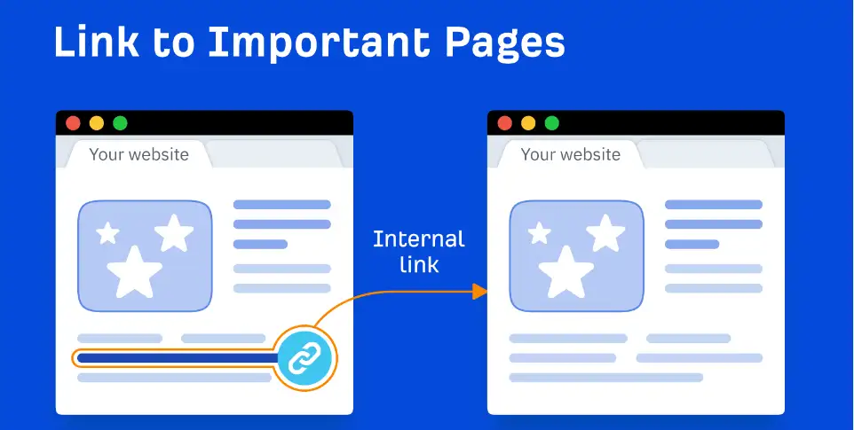
Internal linking is important because search engines like Google use internal links to crawl and index your site’s content. A well-structured internal linking can improve your site’s ranking. Not only that, it can also guide users and help them find the information they need faster.
So, please make sure your anchor text is descriptive and relevant to the linked page. If you add some irrelevant or random links, the audience might feel confused, which might weaken the overall user experience. Another thing to note is to avoid using “click here” as your anchor text. Instead, specific keywords will be better.
10.Page titles, meta descriptions, and tags optimization
Clean and clear titles, meta descriptions, and tags will give your audience a quick review of the content of your page. If they are interested in your content, they are more likely to click on the link. This will also increase click-through rates.
11.Strategic Color Choices
Choosing the right color for your website is very important because it is a very intuitive element that can leave a deep first impression on your audience. How to choose the right color depends on many factors.
If you already have your brand logo, the website color and logo color need to be consistent in style, which can highlight professionalism and enhance brand awareness.
Colors also have psychology. Different colors can convey different feelings. Blue can evoke a sense of calmness and trust and is often loved by some financial institutions or technology companies. Green represents nature, vitality, and health, and is often used by many food industries.
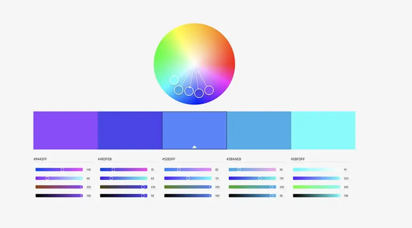
Knowing some color combinations can help you better choose the colors of your website, such as analogous colors, complementary colors, etc. Make sure the color combination you choose has enough contrast. High contrast helps improve user experience, especially between text and background. For example, a yellow background with black text, or a black background with white text, can improve the readability of the content.
You can also use some color-matching software to see how to match colors to achieve better effects. For example, Adobe Color and Coolors.
12.Social Media Integration
Social media helps expand your reach. When your users share the content on your website, it will attract a wider audience and bring more traffic. Social media integration encourages visitors to interact with your content by liking, sharing, or commenting. This will help increase engagement and build a stronger connection with your audience.
You can add a share button on your website to integrate social. Such a design will make it easy for visitors to share your content. Also, consider embedding your social feeds to keep your site dynamic and connected.

13.Visual Elements
In this rapidly developing era of fragmented information, people have become less and less patient to read long texts. Therefore, appropriately adding some high-quality visuals such as images and videos to your content can attract more audiences to your website. More importantly, images and videos can convey your brand’s personality and values without words.
Use high-resolution images, videos, and infographics to convey your message. Remember, visuals should support your content, not overshadow it.
14.Layout Variety
Many sites on the web have the same layout for every single page. Consistency isn’t bad, but if you want to give a fresh and engaging feeling to your site, consider updating the layouts for each of your navigation folders.
15.Audience Research
User research mainly includes analyzing your user demographics, behaviors, preferences, challenges, and needs. This can help you form a comprehensive understanding of who your target customer group is, as well as their needs and expectations. After understanding this information, you can meet their needs, solve their problems, and improve user satisfaction with your design, content production, etc.
You can conduct questionnaires to collect user needs and feedback. You can also analyze competitor websites, identify what works well and what doesn’t, and then adjust your strategy accordingly.
16.User Personas
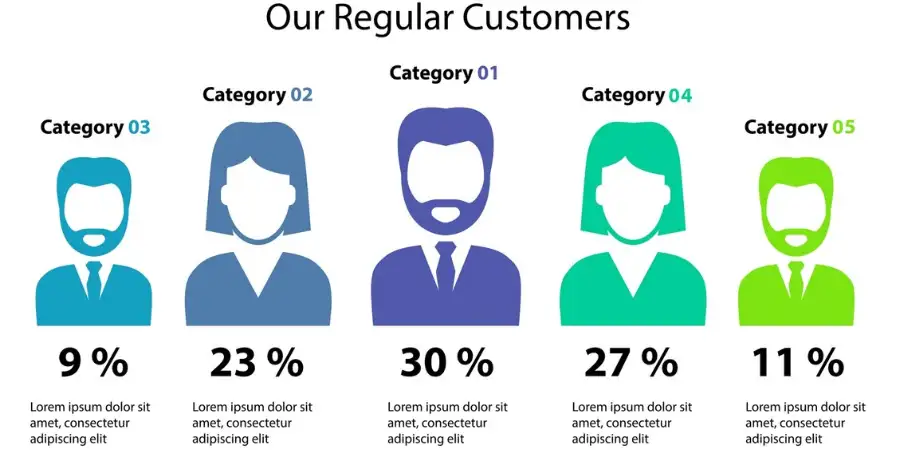
If conducting user research can help you have a comprehensive understanding of the entire audience, then user personas are focused and specific, and their purpose is to segment your audience. After conducting audience research, you synthesize the data into user personas. Then you can analyze the similarities and differences between different groups, crafting detailed profiles that represent each major segment. User personas can help you develop further detailed strategies, generate tailored content for different segments, and meet their specific needs.
You should update your personas periodically to reflect changes in your audience or market trends.
17.Regular Content Updates
Updating your website's content in real-time can help you attract more customers and keep them engaged and active. Especially if you can update hot topics frequently, this can improve your search engine rankings and keep your audience interested. Otherwise, outdated content, on the other hand, can lead to a decline in traffic and user trust.
You can create a content calendar, which can keep your website content consistent and relevant. You can also monitor industry trends at all times, analyze what people are paying attention to, and produce relevant content based on these hot topics.
18.User's Journey Mapping
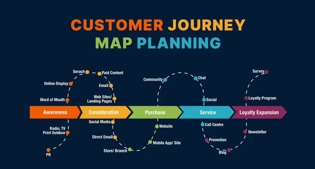
Mapping out the user’s journey is to show how your audience interacts with your website from start to finish. It makes you understand what steps they take, what they are looking for, and what they experience when they browse your website. If you know their every step, you can guide them to complete the steps and actions you want them to complete, such as guiding registration or purchase.
In this process, you can analyze which steps users may get stuck or confused, which affects the completion of the next key action, and you can optimize accordingly. Make sure your design is focused on experience.
19.Micro-Interactions
Micro-interactions are small subtle animations or design elements, such as hover effects. When your cursor moves to a button, the color might change or the button will become larger. These designs can improve user engagement and user experience, guiding users to complete expected actions。
Make sure your micro-interaction is simple and subtle. They should enhance the experience without being distracting。 Meanwhile, make sure they are meaningful and functional. They should be a confirmation if the audience makes a successful action.

20.Data Analytics
Do you think that after you build a website, you are done and can leave it alone? If you want your website to run for a long time and make money, this is far from enough. You need to monitor and analyze the performance of the website at all times, analyze your audience profile, how long they stay on your website, and which channel attracts the most traffic for you. What are the keyword trends? This is a long-term task. You can use tools like Google Analytics to track user behavior on your site. Analyzing this data helps you understand what’s working and what needs improvement.
21.A/B Testing
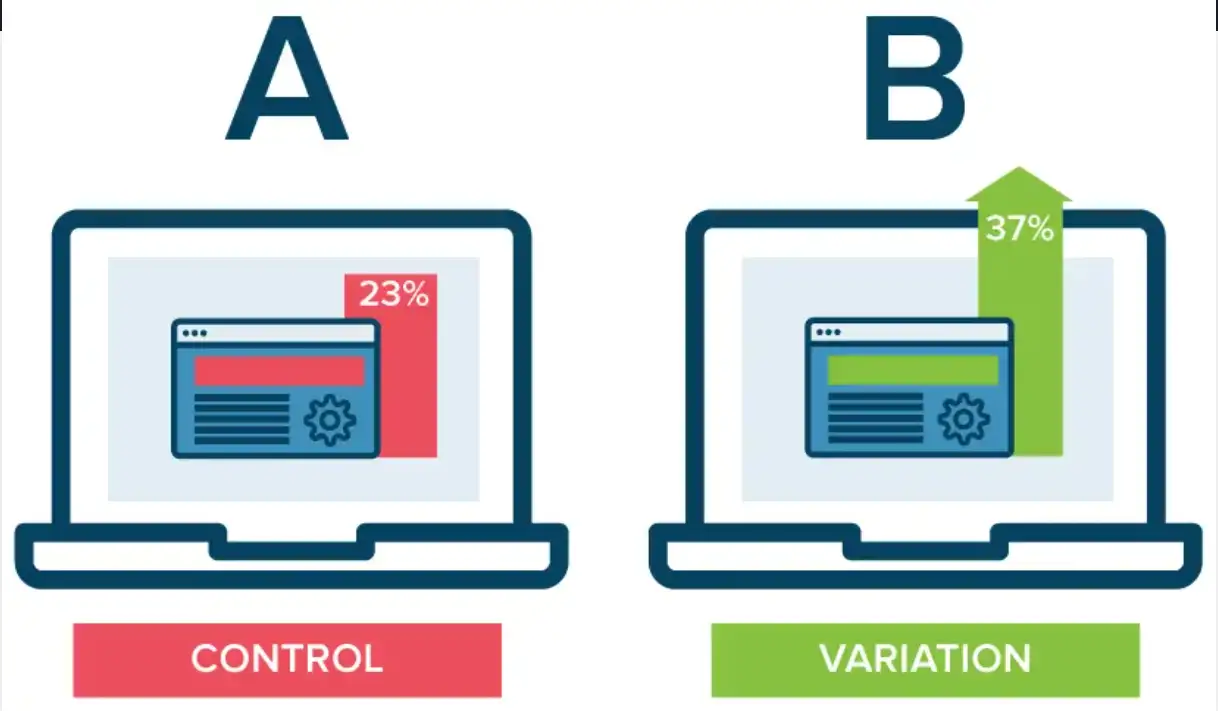
A/B testing is important because it helps you figure out what works best on your website by comparing two versions of the same page. For example, you might want to see if a red button gets more clicks than a blue button. A/B testing lets you test this and see which version your visitors like more. This way, you can make changes to improve your website.
One thing you need to keep in mind when doing A/B testing is that you can only change one thing between the two versions, like the color of a button. This way, you know exactly what caused any differences.
Conclusion
As you implement these tips, remember that making your website outstanding is an ongoing process. It's about continuous improvement, staying ahead of trends, and always thinking about your users' needs.
By focusing on mobile responsiveness, simplicity, speed, and the other strategies we've discussed, you'll be well on your way to creating a stunning website. It will not only stand out from the competition but also deliver a seamless, engaging experience for your visitors. Keep refining, testing, and updating your site, and you'll see the results in no time.
Written by
Kimmy
Published on
Mar 12, 2026
Share article
Read more
Our latest blog
Webpages in a minute, powered by Wegic!
With Wegic, transform your needs into stunning, functional websites with advanced AI
Free trial with Wegic, build your site in a click!
What kind of website do you want to build?