Log in
Build Your Site
How to Improve Your Website Layout in Wegic?
Discover the latest powerful functions in Wegic beneficial to your website layout design. Explore the using steps now.

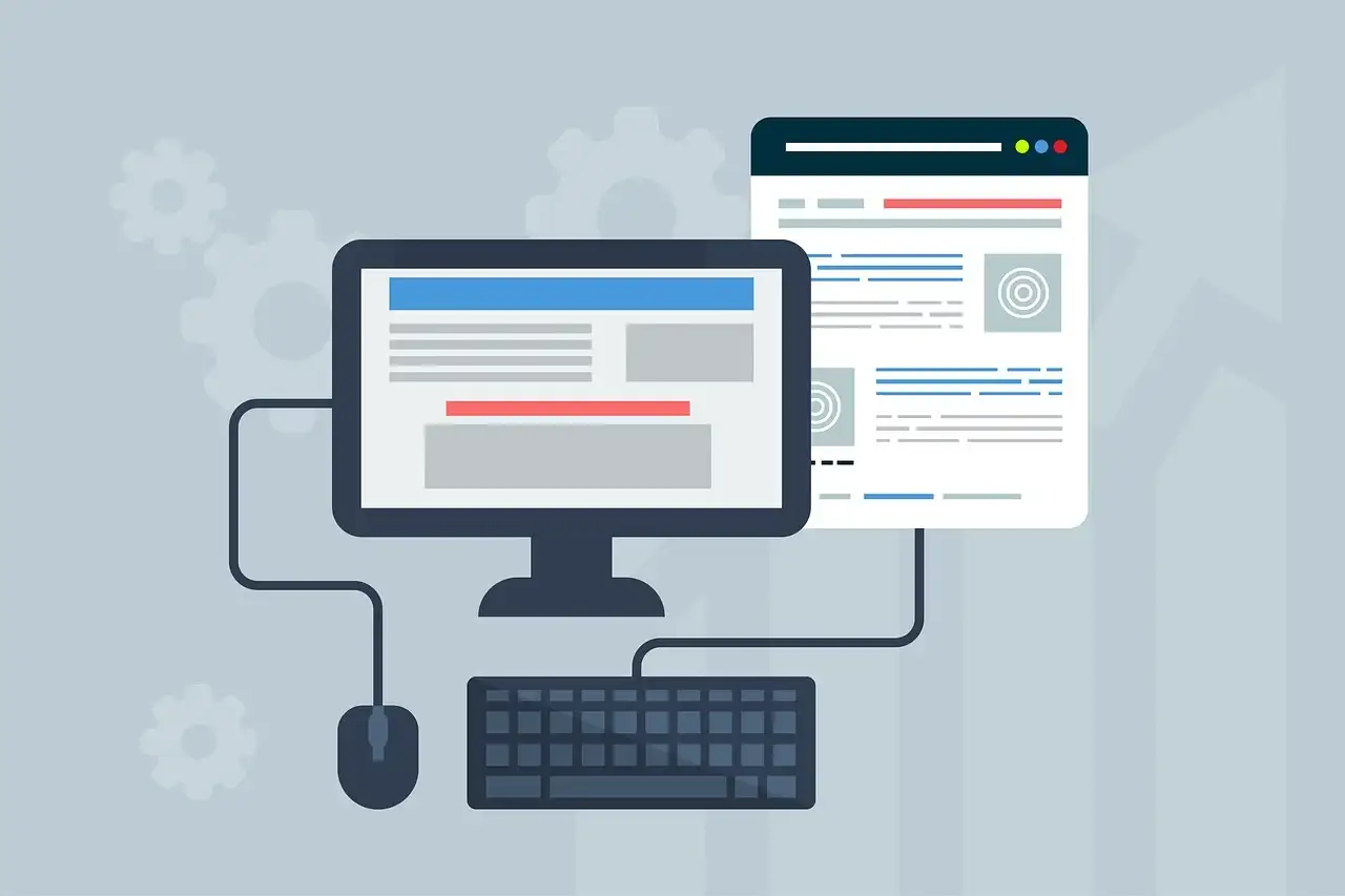
In today's modern digital world, many websites have gorgeous colors, fancy animations, and complex content. But once you take away color, animation, and content, what will be left of a website? When you really dig into the underlying logic of web design, you will realize that the website layout is the true foundation of websites.
It is not an exaggeration to say that if your website has a well-organized layout, then your website design is half the battle. The layout of a website can be various: functional, simple, or creative, but it must fit the ultimate need of the website: showcase your personality or brand identity. Therefore, in this article, we will illustrate everything you need to know about website layout and how to change or improve your website layout with the powerful tools built into Wegic.
What are the common website layouts? Top 8 Types Introduction
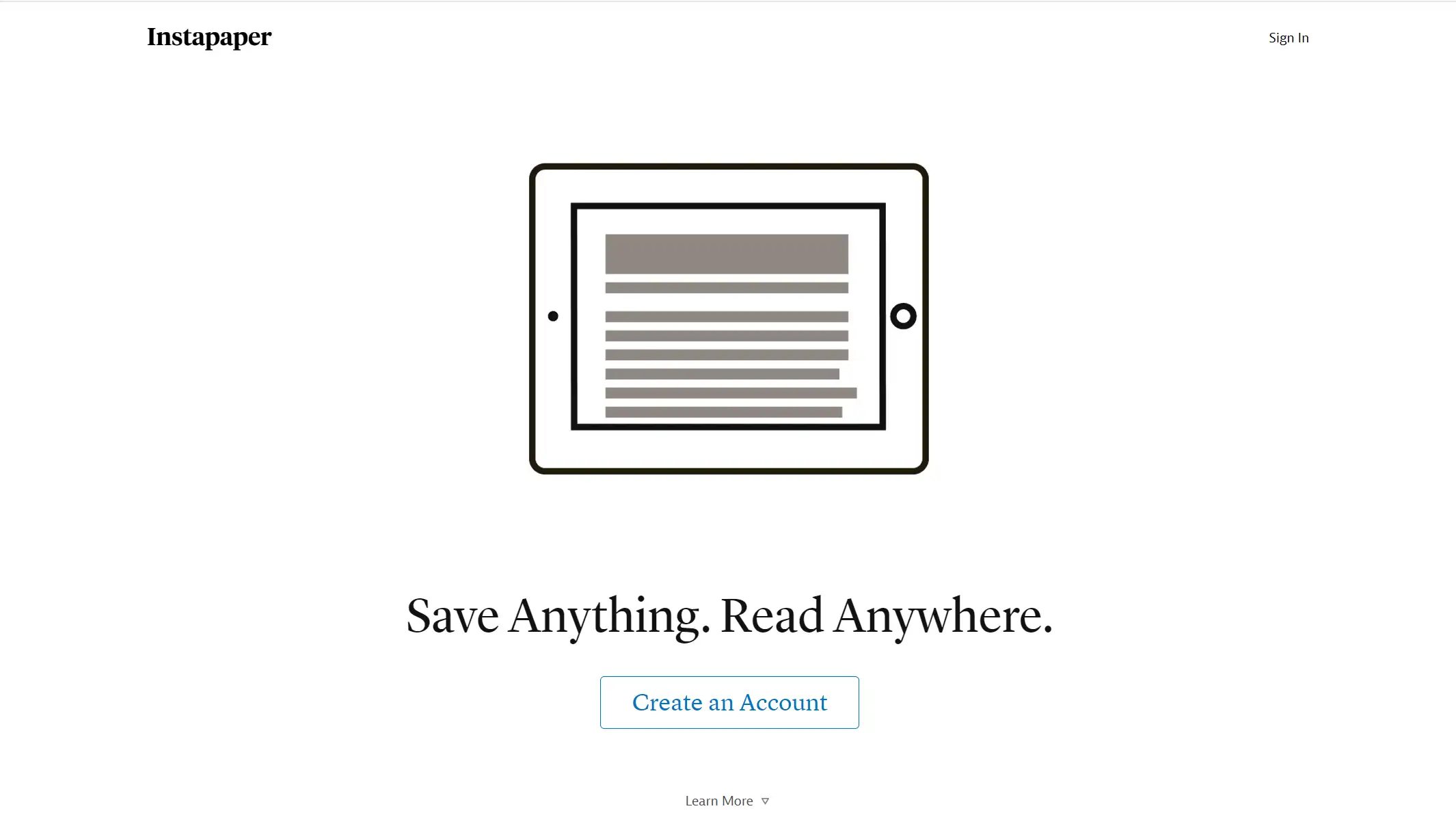
Single Column Layout
Single column layout is to center the content of the web page in a column, which is one of the most common ways of website layout. Its main advantage is that the design is simple and the layout is clear. Therefore, the core content can be directly presented to the user.
F-pattern layout
The F-layout is based on the fact that when users scan the content, they achieve a trajectory similar to the letter F. The layout matching this way of reading allows users to get information faster, hence the name F-layout.
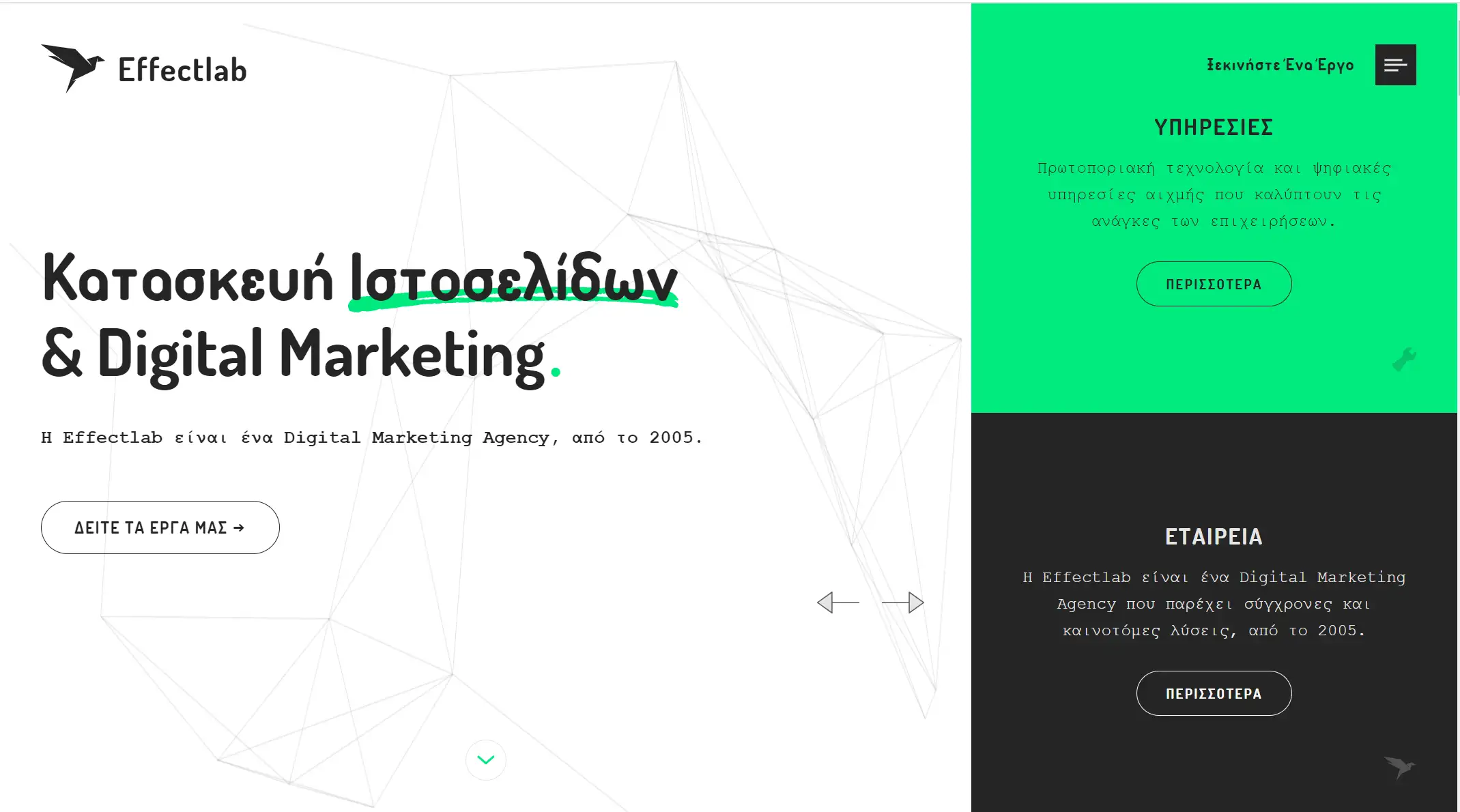
Split screen layout
Split screen layout refers to the layout of a website's home page or landing page into two or more vertical sections. This layout allows designers to present different content or information on the same page at the same time. Users can easily make their own choices to follow different user streams in a very natural "left or right" style.
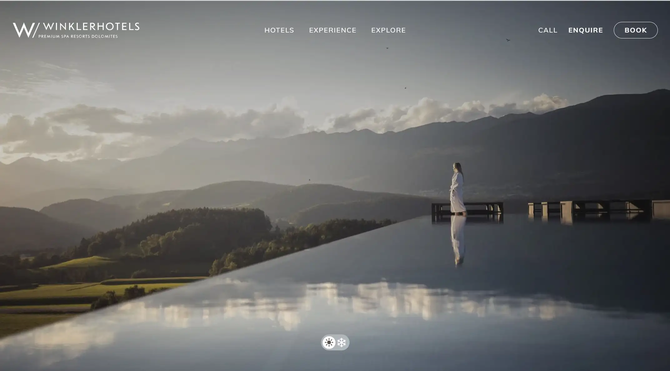
Fullscreen image layout
Full-screen image layout is to place a large background image on the entire screen. Compared with the traditional flat background image, this way has a strong visual impact, especially suitable for websites that want to showcase visual influence, such as photography, tourism, art exhibitions, etc.
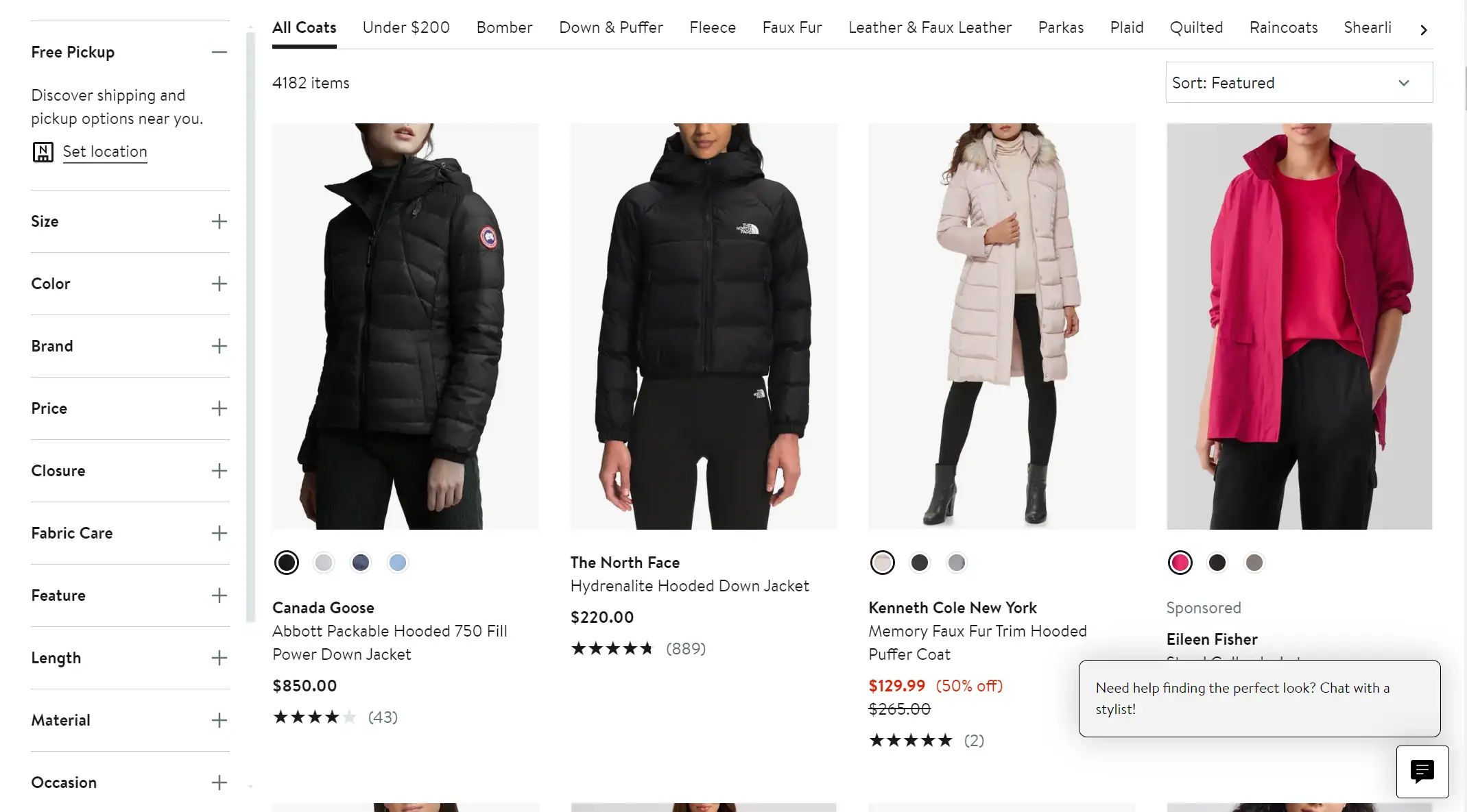
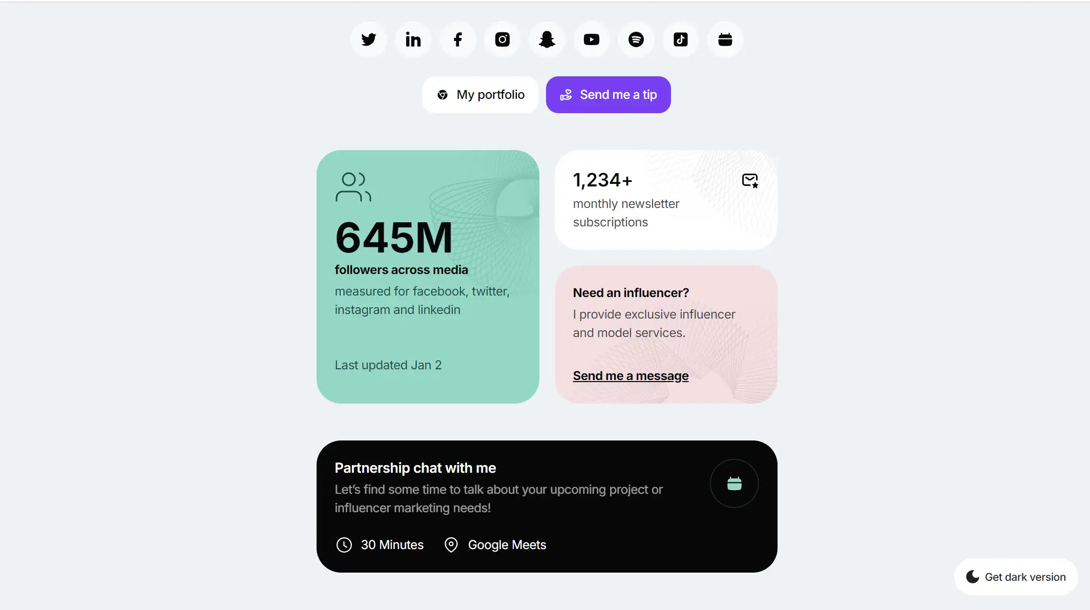
Card Layout
Website layout on cards usually means the design way of presenting information in the form of cards on the page. Each card contains a separate content unit, which can contain text, images, buttons, and other elements. This style is effective for putting a lot of content on the page while keeping each piece of content clear.
There are two main forms of card layout: equal-sized cards arranged on a grid, or cards of different sizes grouped together to form a functional page or group.
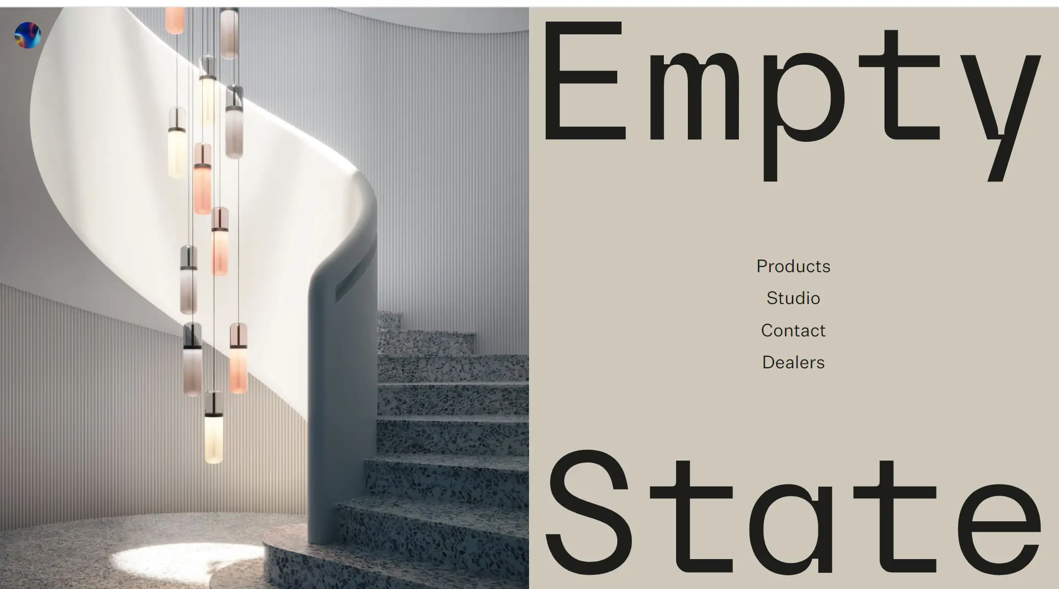
Asymmetrical layout
The asymmetrical page layout is similar to the split screen type in that it also splits the components of the web page, but the two parts are not equal in size and weight. This asymmetrically balanced movement from side to side creates visual motion and makes the whole design feel more dynamic.
Magazine layout
The magazine layout is based on a multi-column grid to create complex visual hierarchies, inspired by print such as paper newspapers. Customize different elements of the page to highlight the title or content that needs to be emphasized.

Z-pattern layout
The z-pattern layout uses people's common reading habits to distribute important information along a Z-shaped path. Websites with this layout typically have the logo in the top-left corner and the navigation menu and action buttons in the top-right corner. The diagonal part of the Z-shape is the best place to place information to attract the attention of visitors.
How to Improve Your Website Layout in Wegic?
As an AI web designer and developer, Wegic is dedicated to upgrading its service and constantly releasing new functions with the latest techniques. To help designers better improve their website's layout, Wegic published a brand new functionality recently: the circle drawing mode. With this mode, designers can easily change the layout in only a few minutes. The mode itself also contains diverse capabilities.
Below we'll combine Wegic's new function with some common website layout types to introduce you how to effectively adjust your website layout on this platform. Let's delve into them now.
Mark Section with Drawing
First, let's see the mark section with drawing function. This method can effectively reduce the communication cost and time cost between the user and the AI assistant so that the process of changing the page layout only through the text description can be quickly achieved by intuitive drawing, which is more convenient and fast.
Meanwhile, for those who have just stepped into the field of web design, but also can not clearly express their own design needs for language users, this model is undoubtedly more user-friendly.
For example, if you want to change your website layout from its original look to F-pattern, then you can use this choice to help.
Step 1: Enter the mark section with drawing mode.
As you can see, there are two toolbars at the top and bottom of the page. The upper toolbar has many options, including brush, rectangle draw, arrow draw, text input, and eraser. The toolbar below allows you to adjust the colors used and brush weight.
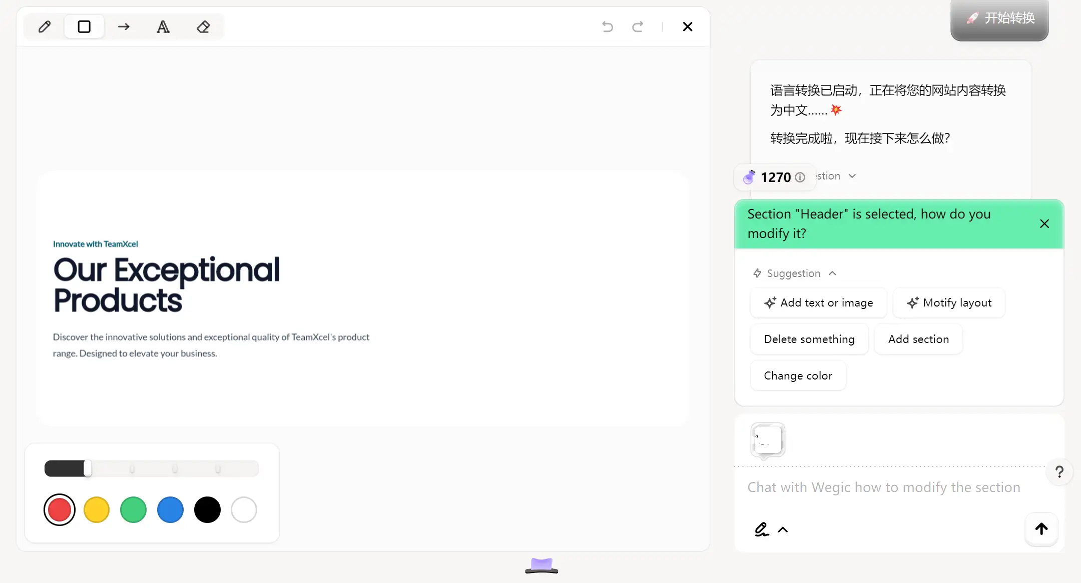
Then you can mark the part that you want to change its layout. Don't forget to use these multiple tools to help you express your purpose more accurately.
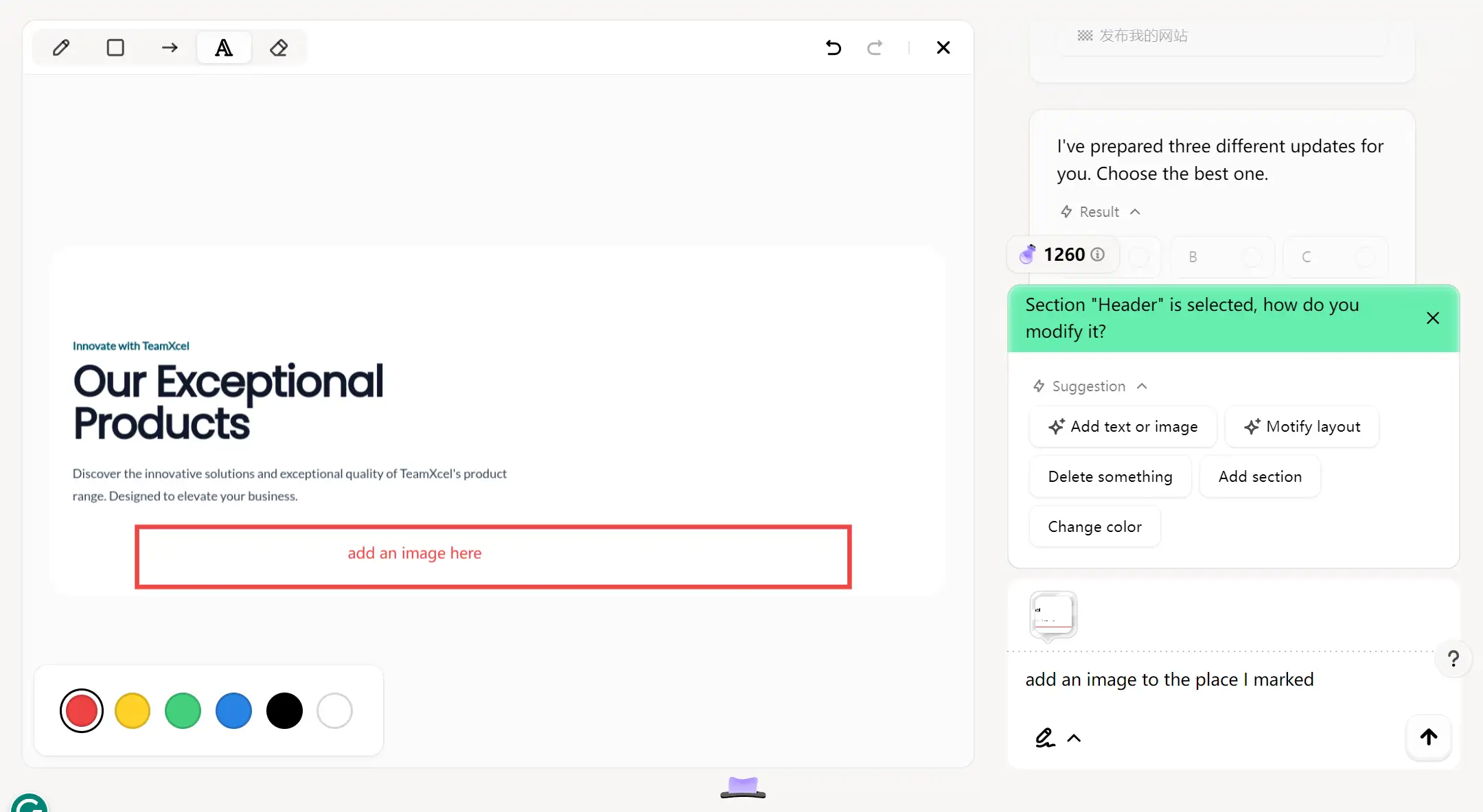
Step 2: Draw and type what layout detail you want to change
If you want to add an image below the heading and subheading, then you can draw a rectangle below them and type "add an image here" in it. Also, you need to tell Wegic's AI assistant what you want to do in the dialogue box, then just click the arrow, and Wegic will directly improve your website layout as you wish rapidly.
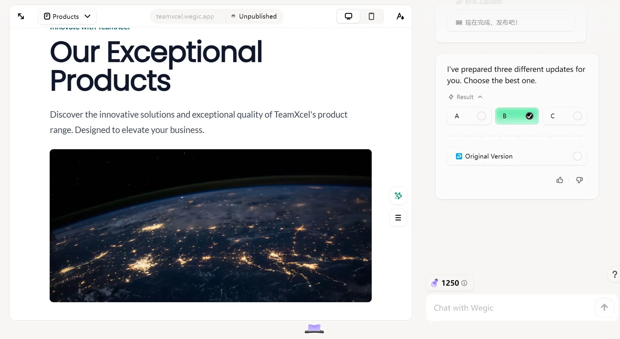
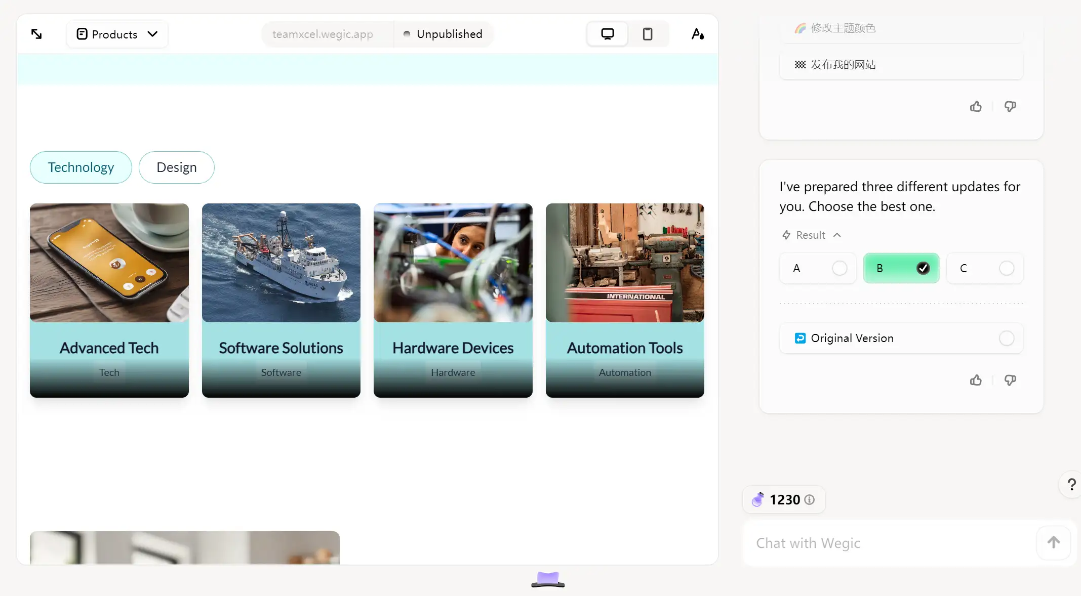
After Wegic changes the layout successfully, you will go back to the edit page again and view the result.
It is remarkable that Wegic will give you three different updates and you can choose the best one. If none of them make you satisfied, you can also choose the original version and change it again.
There you go, now you get an F-pattern website layout design smoothly.
Draw Reference Sketch
The draw reference sketch mode provides users with more freedom and design space than the first mode we mentioned above. This process is often accompanied by creative stimulation. While sketching, users may come up with new ideas and ideas, which they can quickly write down or draw out and directly reflect in the final design of the site structure.
Let's take the card layout as an example. If you are not satisfied with the first layout Wegic gave you, then just draw your ideal website.
Step 1: Click the mark section with drawing mode.
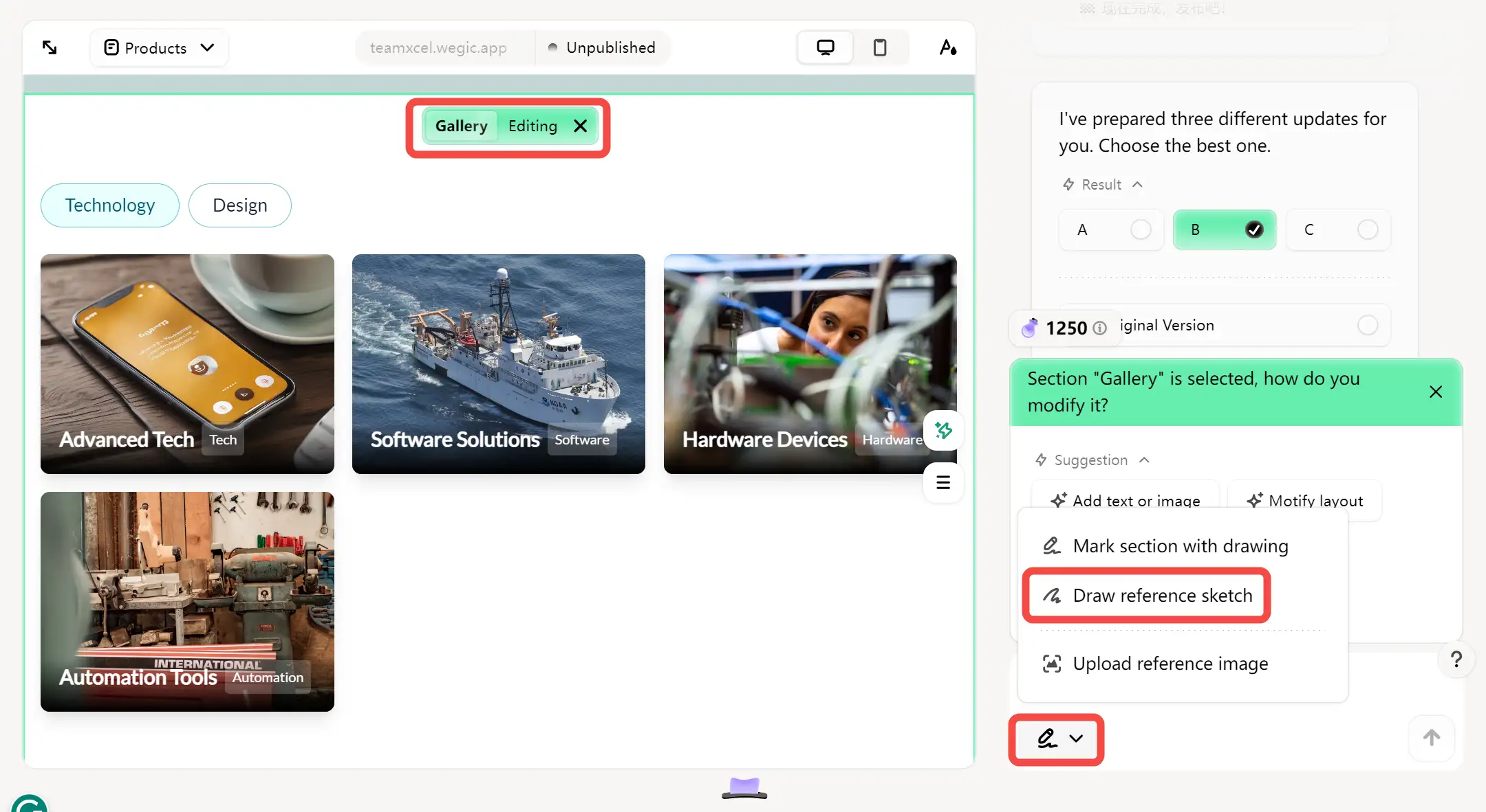
As you can see, currently the layout is imbalanced and asymmetry.
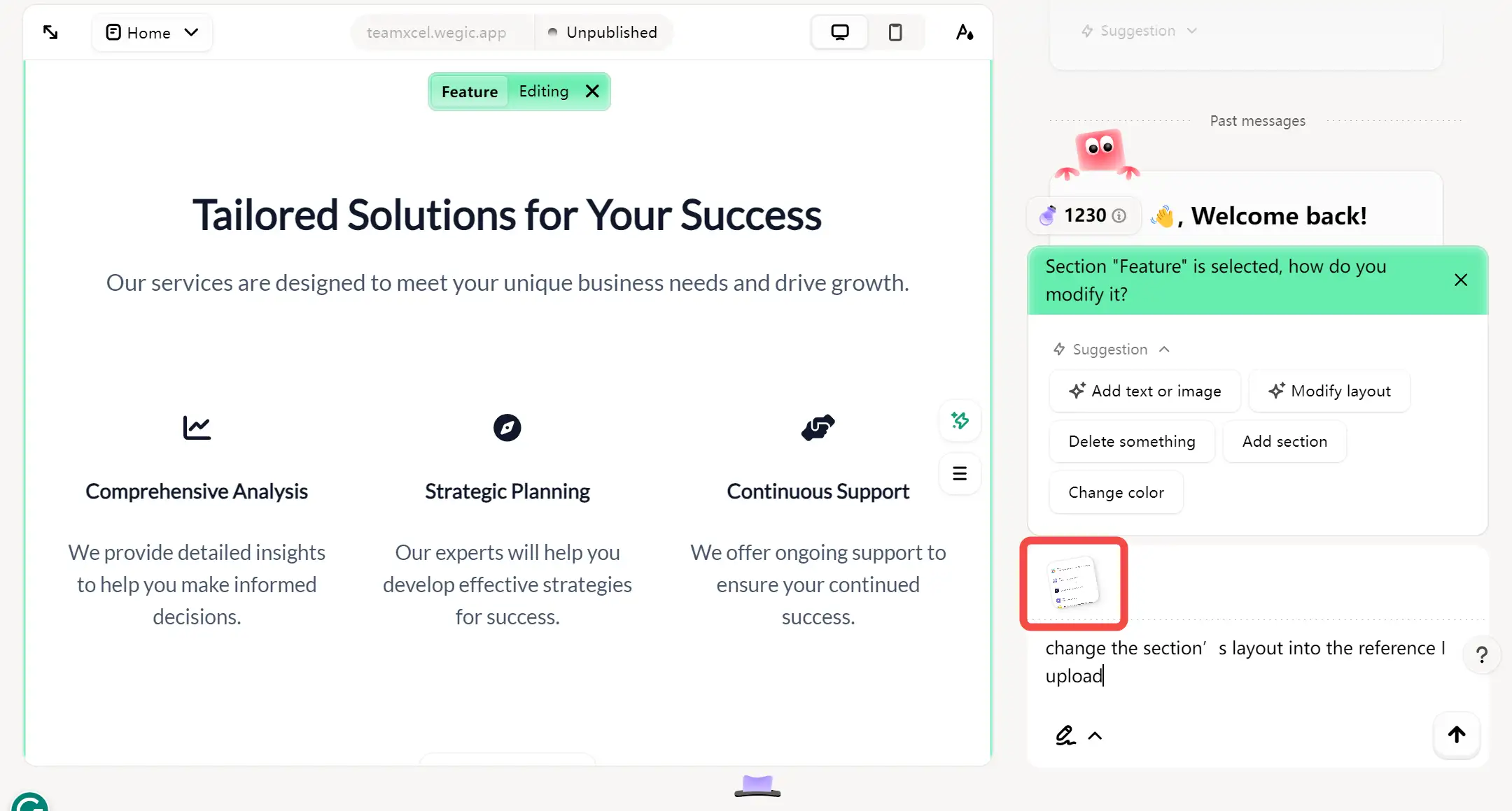
Step 2: Draw your ideal website on the whiteboard
You can draw your ideal website layout as a sketch now. For example, if you want to change it into a card layout averagely, you can draw it as shown in the following image and give the AI assistant a command.

We're done! As if by magic, Wegic optimizes the layout of your website to look exactly like the sketches you draw. And it only takes a few minutes of your time.
Whenever you come up with a new idea or concept, you can quickly put it into practice by sketching it out and continuing to make adjustments later.
Upload reference Image
Apart from the drawing section or reference sketch, Wegic also developed the upload reference image function. You can upload your own reference images straightforwardly to the platform, such as existing screenshots from other websites, design sketches, or visual reference materials.
Wegic's AI assistant is able to analyze and collect key information such as layout structure and design elements of the reference image, and then directly improve the website layout into the layout structure within the reference image for users.
Let's see how to make your website clearer than the existing one.-
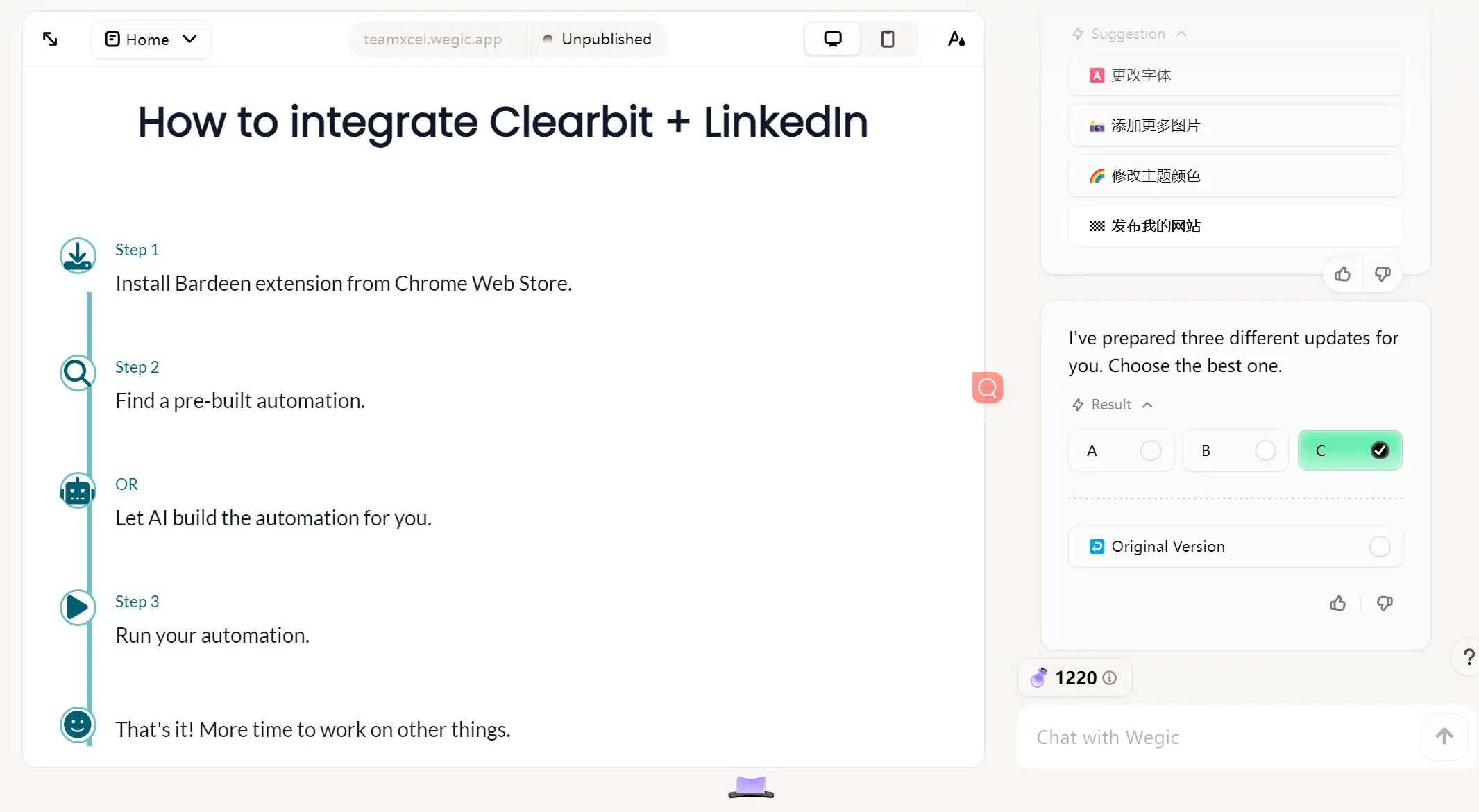
Step 1: Upload your selected reference image.
Upload is undoubtedly the first thing you need to do. You can check whether the image has been successfully uploaded in the lower right corner above the dialog box. Remember to type in the command to Kimmy (Your Design AI assistant).
Step 2: Check Wegic's adjusted result
After the first step, all you have to do is click the arrow, get up, and grab a cup of coffee or tea. When you go back to your computer, you'll find that Wegic has changed the layout exactly like the reference image you uploaded. How powerful it is!
Besides, if you want to keep the original site content, remember to send instructions with the instructions. Otherwise, Wegic will default to your site content also adjusted to the content in the reference image.
Let Wegic be Your Creative Accelerator
An excellent layout design can effectively convey the brand image and values, enhancing the website's professionalism and credibility. It also plays a positive role in improving the ranking of the website in the search engine. Carefully planning the layout is an essential step in any successful website.
With these functionalities we detailed above, Wegic can accurately capture your design vision and quickly transform it into a professional website layout. In Wegic, you don't need any tedious text descriptions anymore, just embrace an efficient and intuitive visual editing experience and make every click inspire unlimited possibilities. Start a new chapter in your website layout design with Wegic now!
FAQs
What are the basic parts of website layout?
-
Title: The top section that usually contains the website logo, navigation menu, and contact information.
-
Content body: The main body of a website that displays the most important content.
-
Sidebar: The vertical or horizontal portion of the side of a website, usually used to hold gadgets, navigation, or other information.
-
Footer: The bottom section that typically displays copyright information, links to other pages, and social media ICONS.
What makes a well-designed website layout?
-
Adopt negative space on your web page
Negative space or white space refers to the space between web page elements. Too much white space can make a page look too minimalist, and viewers may not be able to find what they're looking for. Too little negative space can make the page feel cluttered and crowded, which can overwhelm them and make it difficult to find the information they are searching for.
As a result, the negative space on the page should be balanced. Page elements should be evenly spaced.
-
Follow the rule of odds
Typically, most designers choose three elements because the two elements on the outside complement the focal point in the middle. But you can also use three, five, seven, or other numbers, as long as the page is still evenly spaced and turns people's attention to the central element.
-
Build the hierarchy for content
Different pages have different layouts. Your website's homepage should be different from your individual pages, and they should also be different from each other. This is because you need to design your layout around the most important content on the page. It can create a hierarchy for other elements, directing the viewer's attention back to the main content of your website.
The reason is that you should try to build your layout around the most important content on the page. This creates a hierarchy for the other elements, directing the viewer's attention back to the main content.
Written by
Kimmy
Published on
Mar 12, 2026
Share article
Read more
Our latest blog
Webpages in a minute, powered by Wegic!
With Wegic, transform your needs into stunning, functional websites with advanced AI
Free trial with Wegic, build your site in a click!
What kind of website do you want to build?