Log in
Build Your Site
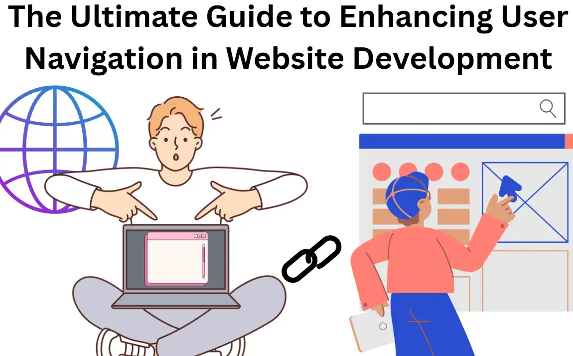
The Ultimate Guide to Enhancing User Navigation in Website Development
Improve your website's usability with our comprehensive guide to enhance user navigation. Learn techniques that make your site more intuitive and user-friendly!

Statistically, visitors forget about websites which have inadequate navigation mechanisms at a rate of 45%.
Every website click from your B2B business audience holds potential value as either a business partnership or revenue opportunity. A confusing website navigation system will result in the loss of targeted prospects.
The following guide provides practical methods for developing better user navigation systems in website creation. By focusing on intuitive website navigation design, you can ensure your site not only retains visitors but also drives conversions.
Consistent mastery of navigation design is necessary for websites that wish to excel within digital market competition, especially while building new sites or optimizing old ones.
To enhance user navigation website development, follow the post and access inspiring website navigation examples.
What is Navigation in Website Development?
Organizing website movement involves more than page transition, yet it creates a path that delivers users toward purposeful actions and clear understanding. At its core, website navigation design is the strategic architecture that directs visitors through your content and offers clear pathways to the most important parts of your site, like product pages, contact forms, or key resources. A B2B website demands more than a menu display since navigation functions as an organized tool which supports business targets and user needs. Website development requires more than standard usability to enhance user navigation since this stage should build visitor confidence alongside informational content.
Showing mastery in navigation design allows CTAs to unite with search bars, dropdown menus and breadcrumb trails into an interface that functions without friction for users. These tools help reduce user uncertainty when they discourage hesitancy to perform desired actions, such as scheduling demos and whitepaper downloads or newsletter subscriptions. Navigating the website should feel intuitive and natural, like following a well-marked path in an unfamiliar city. Visitors tend to extend their duration and convert into customers while returning more frequently when their experience remains unperturbed.
An inadequate website navigation implementation results in negative user experiences for visitors. A confusing or cluttered navigation site leaves visitors lost, frustrated, and more likely to bounce. Faulty website navigation creates higher bounce rates, which jeopardizes conversion potential because users stop their searches immediately.
In summary, optimizing website navigation design isn’t just about aesthetics; it’s a critical factor in retaining visitors, striving to enhance user navigation website development and driving conversions. To enhance user navigation experience, you ensure users easily follow your site’s flow while staying aligned with your business goals.
Navigating the Website
When it comes to navigating the website, different sites use various strategies to organize content efficiently, ensuring users can find exactly what they're looking for without confusion. Let’s break down some popular navigation site structures employed by industry leaders to provide insight into what works and why.
Horizontal Top Menu
The horizontal top menu serves as the most common navigation method which Amazon uses effectively. Users navigate the items on Amazon through a well-organized menu structure which places information into logical categories, making it effortless to locate electronics. books and groceries. It’s quick, simple, and directly accessible from anywhere on the page, helping to enhance user navigation website development by streamlining the browsing experience. The website navigation design is intuitive, promoting ease of use across various devices.
Footer Navigation
The footer navigation serves two aims which make it easily underrated by website users. Web users can access essential pages through secondary pathways that appear in footers while the navigation elements boost SEO performance. Additional internal links in footer menus play a role in improving site structure which enhances search engine rankings. Secondary pages which might get less traffic find easy access through the footer navigation system commonly used by SaaS websites. This strategic placement means to enhance user navigation experience, guiding users toward critical areas without disrupting their primary browsing flow.
Vertical Sidebar
The New York Times utilizes vertical sidebars next to its top menu to let users access advanced content options. Websites benefit from this method because it provides multiple pathways to content areas which eases navigation through extensive information-based websites. Sidebars are useful for navigating the website in a way that’s both practical and aesthetically pleasing.
Hamburger Menu
Hamburger menus are specifically used for mobile website navigation design. The hamburger menu is compact yet powerful. A collapsing navigation system maintains complete menu functionality while freeing up space from screens, which works best when screen space is limited. This minimalist approach to website navigation design helps keep mobile sites clean and easy to navigate, especially when space is at a premium.
By using these proven navigation structures, you can significantly enhance user navigation website development, ensuring that users can move through your site effortlessly while meeting your business objectives.
Core Principles of Effective Website Navigation Design
When aiming to enhance user navigation website development, applying a few key principles can transform your site from frustrating to frictionless. The adherence to fundamental guidelines enables visitors to ease website discovery of essential content while reducing pointless interruptions or confusing routes.
-
Clarity Over Creativity: The purpose of website navigation design is not to impress users with creative flair but to guide them clearly and efficiently. Users obtain an immediate understanding of their destination from menu labels which include “Contact” as well as “Services.” Users should avoid confusing menu item labels with complex language because it creates confusion, which results in abandonment of the search process. The more visible a link's destination proves to viewers, that they will navigate beyond it. This is especially important when navigating the website, should feel intuitive and accessible at every step.
-
Mobile-first design becomes vital: Google now focuses exclusively on mobile indexes but will consider sites that are not mobile-friendly. A responsive website layout that automatically adjusts to any display size creates essential conditions for giving users a positive experience. The mobile menu design adopts thumb-friendly standards and clickable elements must remain reachable without stretching or needing zoom functions. A responsive navigation site allows users to find what they need quickly and comfortably, regardless of whether they’re browsing on a smartphone, tablet, or desktop. Prioritizing mobile usability when enhancing user navigation website development ensures your site is optimized for the growing number of mobile users.
-
Visual Hierarchy: The goal of navigating the website is to guide visitors toward important content logically and predictably. Visual elements that should be used for achieving this task include sticky navigation bars and contrasting colours alongside strategically placed "Back to Top" buttons. The implemented features spotlight essential website locations and minimize resistance to keep users moving forward toward their goals.
-
Consistency: One of the most important principles in website navigation design is consistency. All web pages should have consistent logos in the same position with identical menus while following the same layout design.
By adhering to these principles, you'll be well on your way to enhance user navigation website development, creating a site that not only looks great but works smoothly for every visitor, every time.
7 Actionable Tips to Enhance User Navigation Website Development
Effective website navigation design is a crucial factor for converting casual browsers into engaged visitors. If you want to enhance user navigation experience, here are seven actionable tips that will help your site stand out by making it intuitive, efficient, and user-friendly.
Tip 1: Simplify Menus
All websites succeed with simple approaches. Navigating the website shouldn’t feel like a treasure hunt. Include only seven to eight main categories in your primary menu. Exceeding eight primary menu items will swamp your visitors. Your menu should display the actions which users need most because these are at the forefront of your thinking. A clutter-free navigation site not only helps guide users but also aligns with your business goals, making it easier for visitors to find the information they need.
Tip 2: Use Sticky Navigation
Users become extremely annoyed when they cannot find their current location because the page extends too long. B2B websites presenting complex service portfolios should maintain their main menu accessible while users slide down the page. Easy user navigation includes sticky feature implementation which enables users to reach essential menu choices directly without requiring full page up-scrolling. This feature is especially helpful in website navigation design, improving the flow of content and enhancing user experience by reducing the need for constant scrolling.
Tip 3: Integrate Smart Search Bars
Users dislike the process of searching through numerous pages to obtain the desired information. Navigating the website should be fast and efficient. The website needs a tolerant search bar to find the requested page when users enter incorrect spellings.
Tip 4: Optimize CTAs for Conversions
Put action-based language which matches user needs into all buttons to prompt users such as “Request a Quote” and “Get Started Today.” Each phrase reveals the exact outcomes users obtain after button activation. Optimizing CTAs plays a crucial role in trying to enhance user navigation website development, steering users toward key actions that drive conversions.
Tip 5: Maximize Footer SEO Value
Footer menus are often an afterthought, but they can serve a double purpose: improving website navigation design and boosting SEO. Essential links pointing to legal pages, blog categories, contact forms and other important sections located at the bottom assist users in finding these pages from any page. Internal linking elements can boost search engine performance because search engines value these valuable connectors aimed at your key pages.
Tip 6: Link Logos to Homepages
One of the most basic but essential features of a well-designed navigation site is the clickable logo. Online users automatically assume that clicking on the logo directs them back to the homepage of the website. Verify that your website logo connects users to the homepage from every page on your site. This simple gesture makes navigating the website feel intuitive and helps users return to their "home base" quickly, reducing the likelihood of them getting lost or frustrated.
Tip 7: Audit Navigation Regularly
You cannot create a website by merely installing a one-time setup and walking away. The examination for broken links combined with the elimination of redundant paths and testing of mobile responsiveness takes place across quarters. To enhance user navigation website development, ensuring your site is always running smoothly is key to preventing any friction that might cause users to leave your site prematurely.
Expert Picked: Navigation Bar Design Examples
A well-designed navigation bar plays a pivotal role in trying to enhance user navigation website development. This guide includes professional selections of remarkable navigation bars implemented by popular websites that combine fashionable design with optimized usability.
Apple
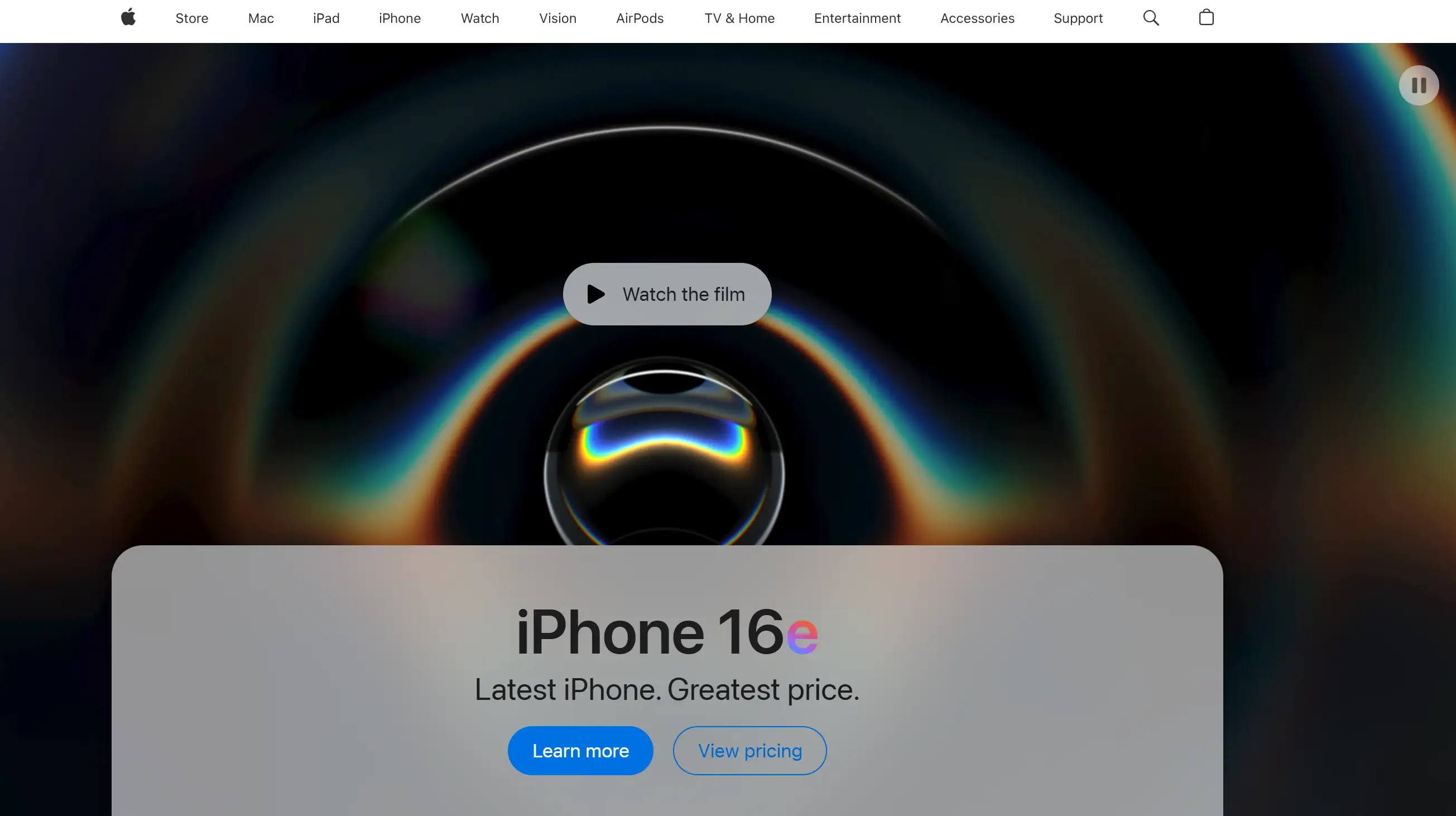
Apple’s website offers one of the clearest examples of navigating the website with ease. The navigation bar offers both sleek minimalism and outstanding effectiveness at the same site. Apple provides restricted main menu options which help visitors locate their needed content without experiencing confusion. This clean design enhances user navigation by providing clarity, making it a perfect example of website navigation design.
Airbnb
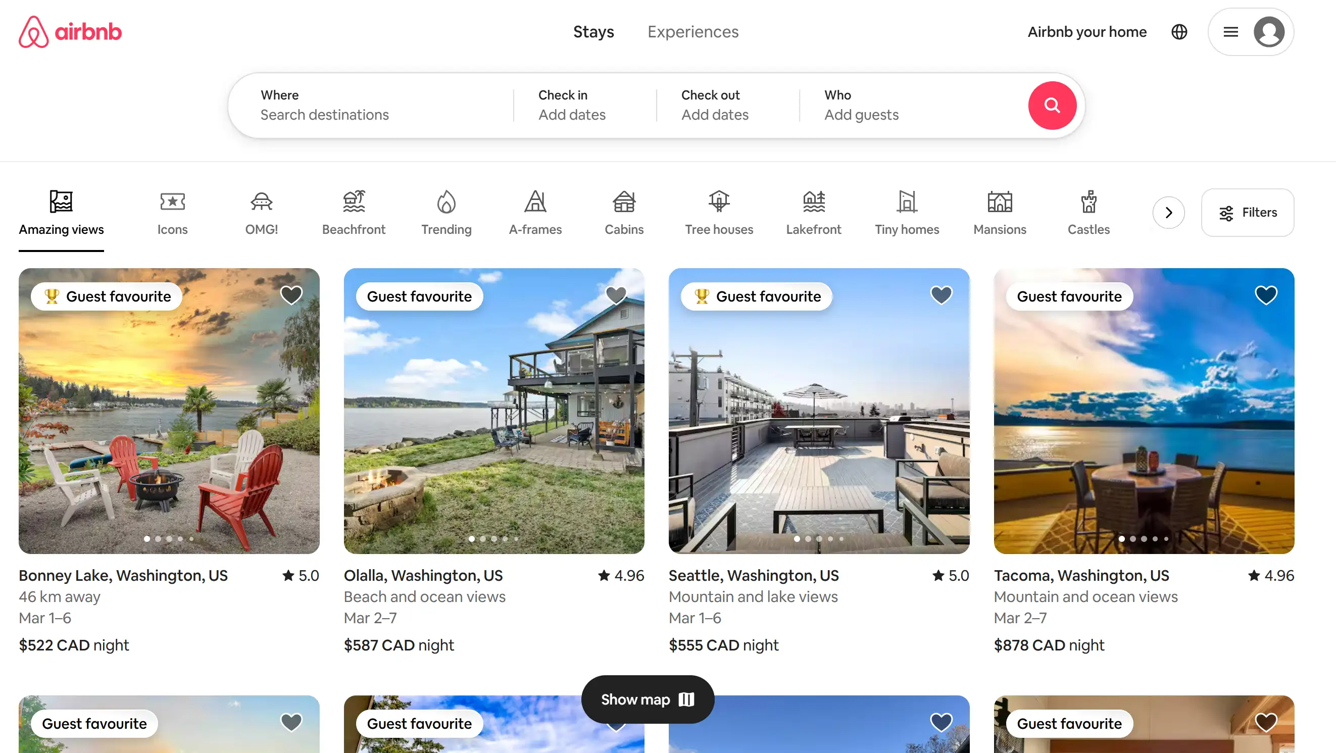
Airbnb built its navigation bar to serve the functional needs of site visitors. Important menu actions "Become a Host" and "Log In" appear first in a prominent position at the top section of the interface yet other basic options "Help" and "Browse" are still simple to reach without cluttering the screen. Airbnb’s intuitive navigation encourages exploration. It also encourages users to move seamlessly between pages. To enhance user navigation website development, Airbnb focuses on smart categorization and prioritization.
Amazon
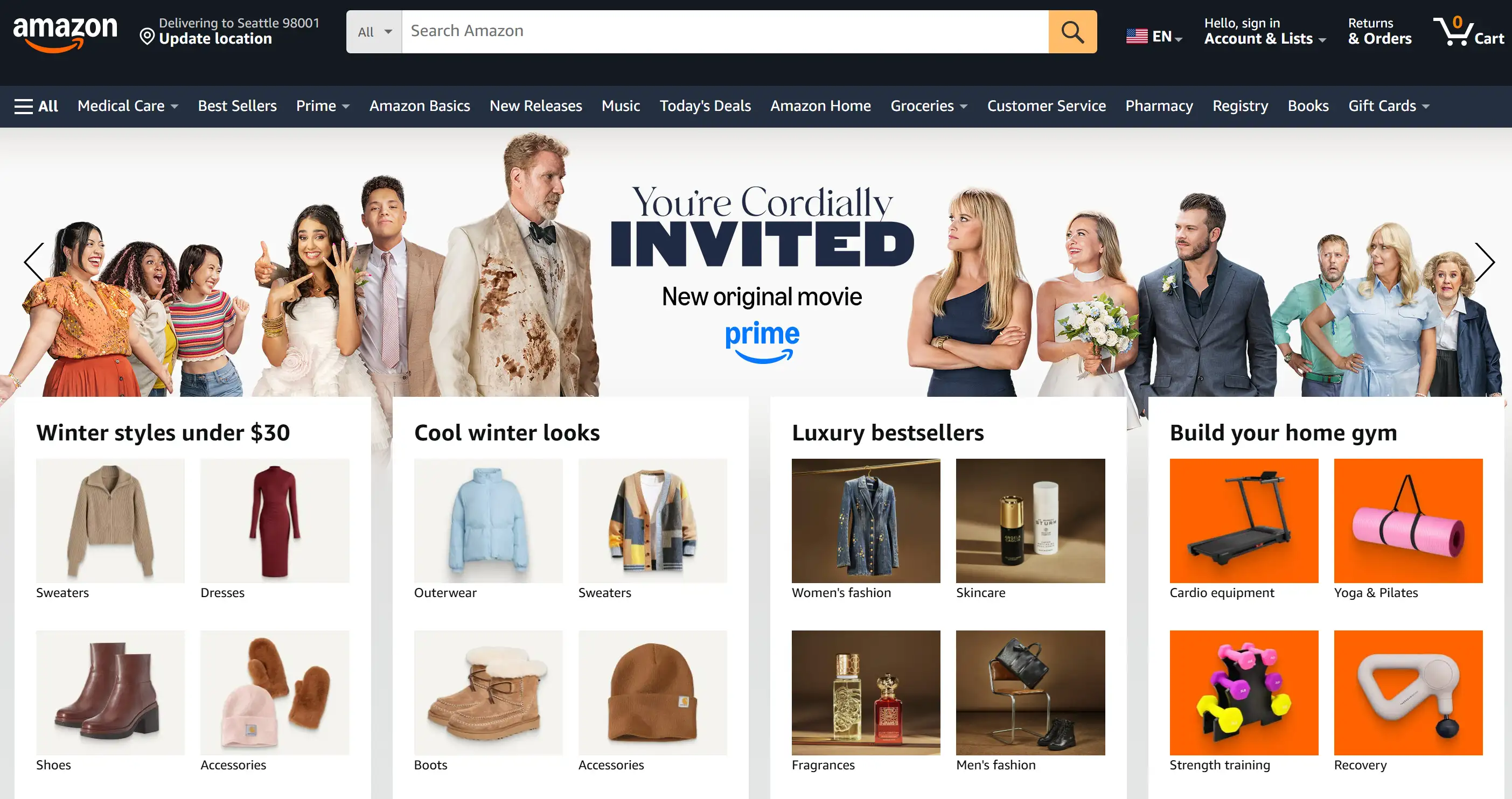
Amazon delivers an extensive collection of products in addition to various service options through their platform. The site provides numerous options through its navigation bar which becomes easier to navigate because of its well-organized dropdown menus. Icons along with images deployed in the menu system produce a simple browser interaction that advances accessibility. A sophisticated website development process with enhanced user navigation is presented through Amazon’s design. A perfect approach exists for websites containing extensive product inventories to enable users to locate their needed items without difficulty.
Dropbox
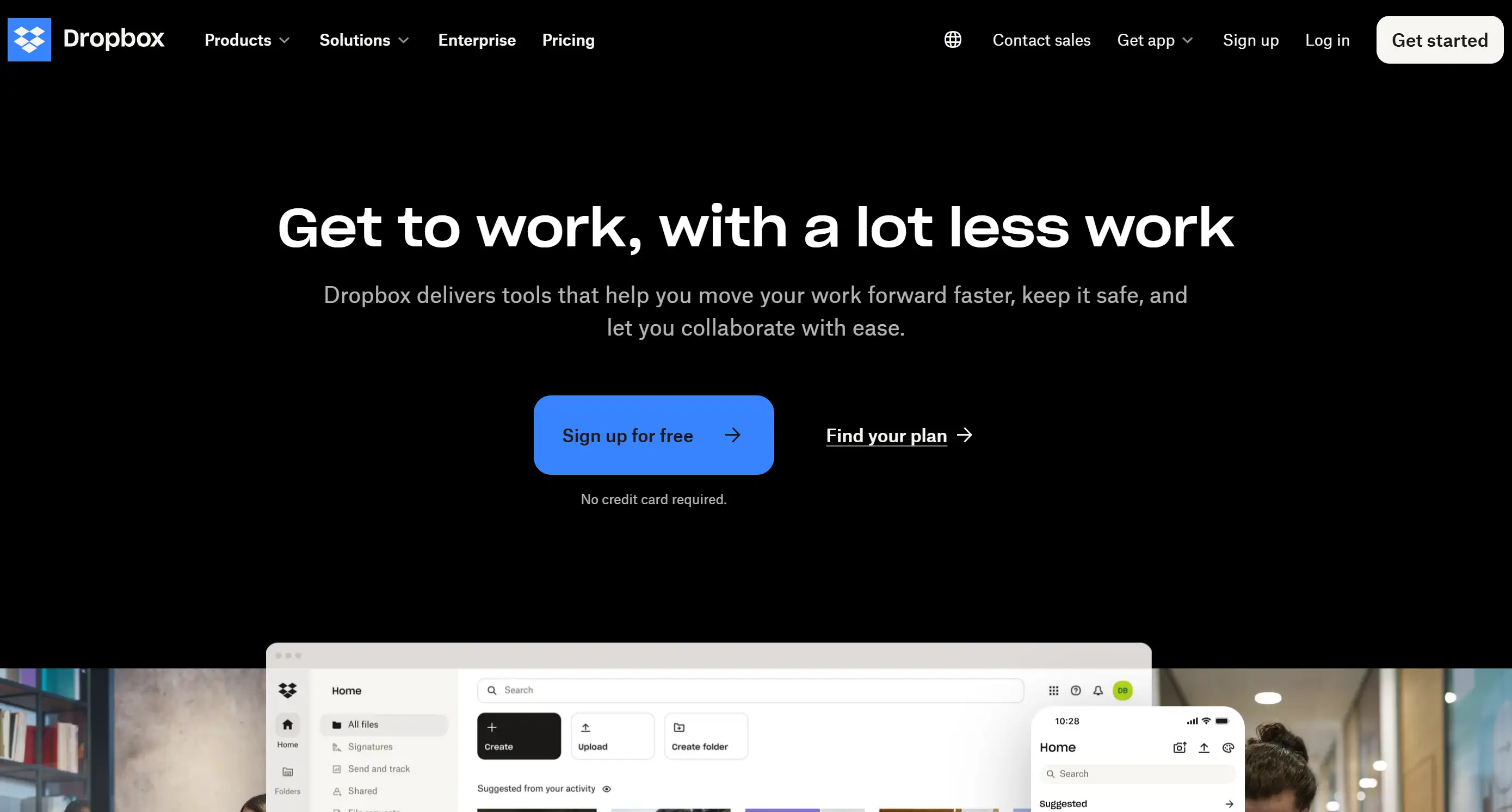
Dropbox’s navigation bar is a prime example of website navigation design. Users can access the navigation bar across the webpage since it sticks when scrolling continues. Users can benefit from this feature while browsing lengthy web pages because it keeps them oriented between different sections of content. Users always stay focused on the basic layout which prevents overwhelming complexity. Sticky navigation bars like Dropbox’s are an excellent way to enhance user navigation website development, especially for business websites with long service pages or content-heavy sections.
Shopify
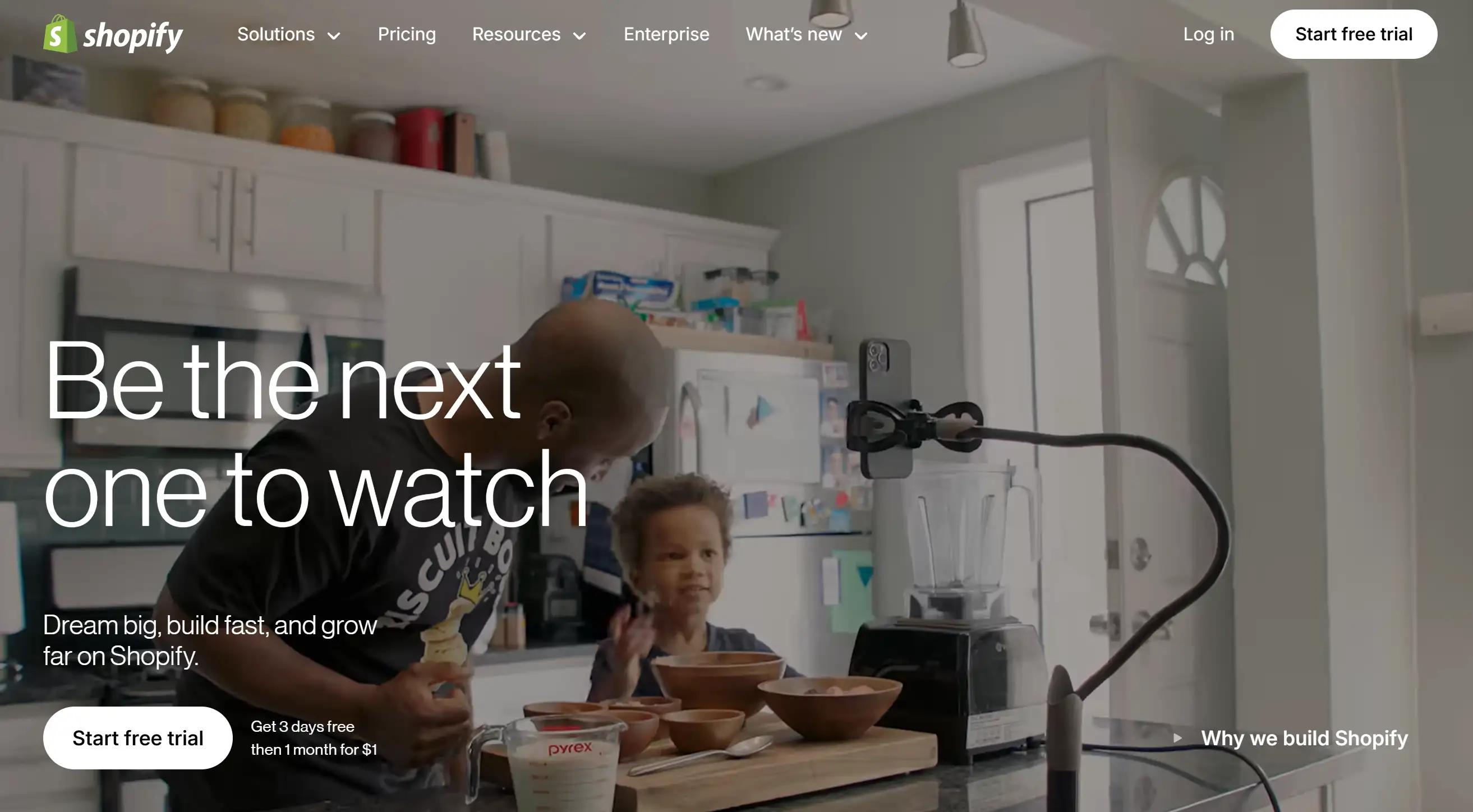
Shopify demonstrates top-class expertise in placing conversion-driven CTAs where customers can easily spot them through their navigation bar. Shopify manages to display action items which guide users to free trials and customer support while keeping the overall page clean and uncluttered. The website navigation design is straightforward, with clearly defined sections, making it simple for users to quickly navigate the site. Shopify proves that placing CTAs thoughtfully within the navigation bar results in significant improvement in user conversion and engagement levels.
The New York Times
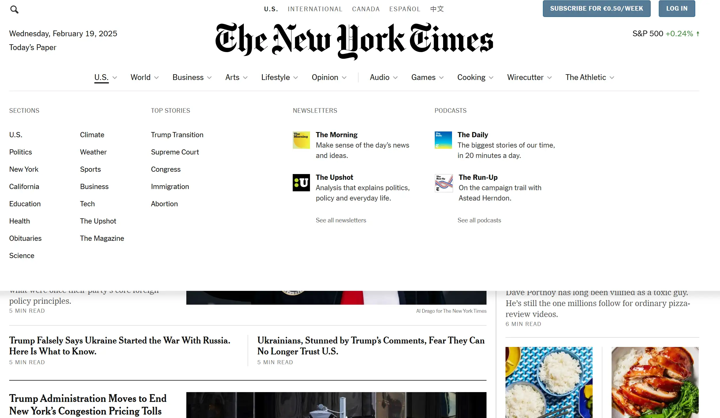
The New York Times delivers a typical navigation structure that blends a bar menu at the top and a vertical sidebar for users. The website displays numerous content items by utilizing this structure which simultaneously provides users with effortless access to browse different topics. This site is a great example. It aims to enhance user navigation website development with a dual-navigation approach, catering to visitors looking for both broad and in-depth content.
HubSpot
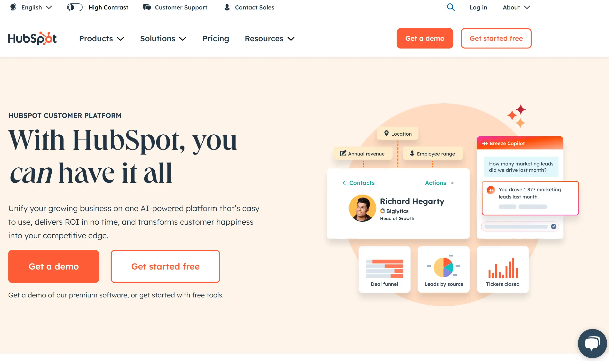
The top navigation bar of HubSpot maintains a neat and simplified design to present consistent page navigation and experience throughout all parts of the website. Users find important resources through the navigation bar since it presents direct pathways to customer support along with product demos and blog content across all pages. The standard presentation allows website users to comfortably navigate the site without facing confusion. By maintaining a steady navigation site design, HubSpot enhances user experience and minimizes cognitive load, showcasing how consistency can significantly improve website navigation design.
Each of these examples demonstrates unique ways to enhance user navigation website development. No matter you're running a blog, an eCommerce site, or a corporate service platform, a carefully crafted navigation bar is essential to ensuring users enjoy a seamless journey across your site.
The Best Practice to Enhance User Navigation Website Development
Online navigation requires more effort than creating an aesthetically pleasing setup. Intuitive website navigation systems require more than complex methods for their design. Wegic provides an AI-powered website builder alongside designer functionality through which you can achieve the following:

-
Al-powered design: Users can ask Wegic to produce sites by providing verbal instructions. Wegic builds websites from verbal descriptions of requirements that you provide.
-
Conversational Interface: Function like a human designer with Wegic through text messaging because this interface functions like a human web designer interface.
-
Easy Customization: You can personalize the design that Wegic creates. The website development tool lets you change colours while also modifying fonts and layouts to produce pages that match your design goals.
-
No-code interface: No coding required! Users of all technological abilities can effectively use Wegic. All web design experience levels can benefit from Wegic because it grants beginners the ability to build professional-quality websites.
-
Fast Deployment: When your design reaches completion, Wegic provides mechanics to deploy your website which rapidly activates your online presence.
Ready to enhance user navigation website development effortlessly?
👉 Start your exploration of Wegic right now to create sites with both modern designs and conversion-enhancing power which tempt customers to buy. This allows business growth to remain your top priority.
Written by
Kimmy
Published on
Mar 17, 2026
Share article
Read more
Our latest blog
Webpages in a minute, powered by Wegic!
With Wegic, transform your needs into stunning, functional websites with advanced AI
Free trial with Wegic, build your site in a click!
What kind of website do you want to build?