Log in
Build Your Site
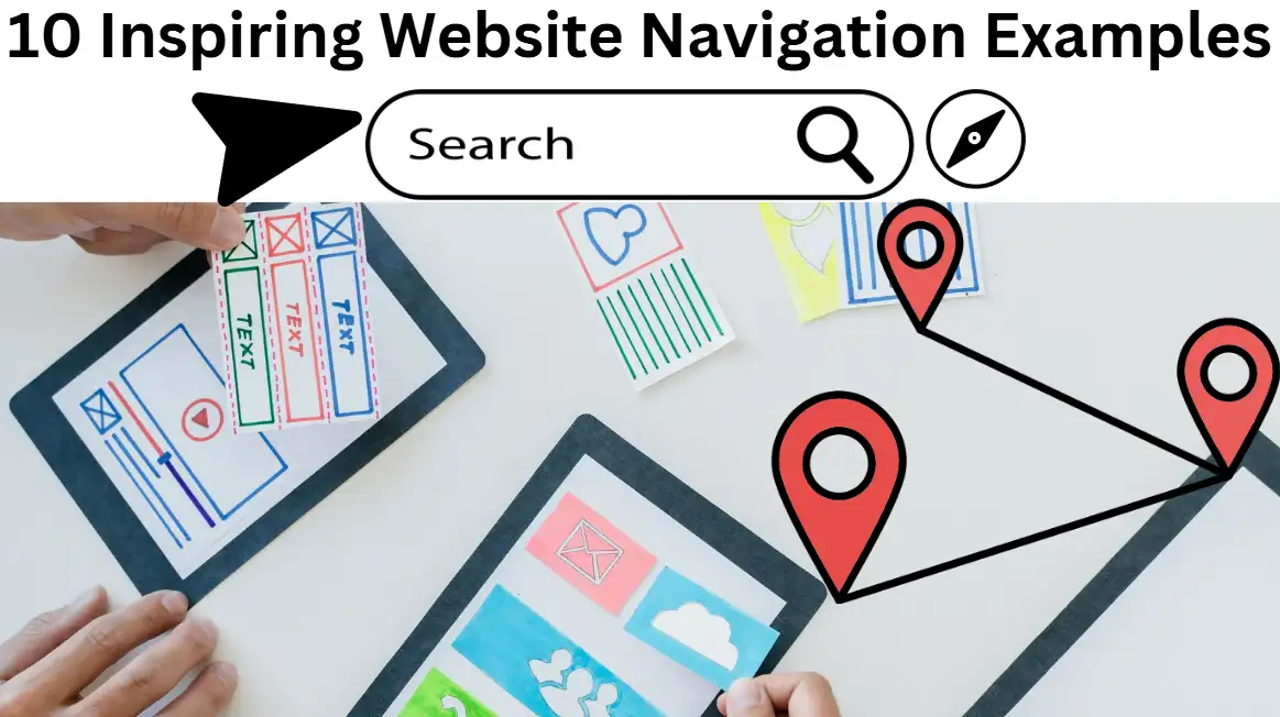
10 Inspiring Website Navigation Examples to Enhance User Experience
Boost your site's user experience with our collection of 10 outstanding website navigation examples. Explore innovative designs that guide users seamlessly.

If you navigate to a website, will you manage to find your way, or are you completely disoriented? When you stumble upon such sites you end up feeling trapped within a digital labyrinth seeking directions to your next move. The struggle to find proper navigation systems among web users remains one of their main online problems. The quality of a website's navigation determines whether anyone genuinely enjoys their time spent on that website.
That’s where website navigation design comes in. Website navigation extends beyond visual decorations because it guides users through seamless transitions between pages. When people use websites to search for inspiration or to purchase specific products, solid navigation effortlessly guides them through each step.
In this guide, I will present a selection of exemplary website navigation designs to spark ideas for your upcoming project. You will discover strategies to elevate website navigation from a potential hurdle to a smooth and delightful journey for users.
What Is Website Navigation?
Walking into such a huge library with missing signs provides no library catalogue and makes finding needed books challenging. Users will experience a frustrating online journey when they face bad web navigation systems. A website's navigating system serves as a clear path structure, enabling people to switch seamlessly between pages. Additionally, the digital map functions as a user guidance system that prevents visitors from getting lost on the website.
Good website navigation bar design isn’t just about aesthetics—it’s about functionality. When navigation is designed strategically it delivers enhanced user experience while efficiently guiding visitors toward necessary information without unnecessary effort. A user browsing an e-commerce site should instantly access categories "New Arrivals" or "Best Sellers" without unnecessary clicking. This is where website navigation examples can come in handy to illustrate how to strike the perfect balance between creativity and usability.
The ability to set up a proper navigation structure is necessary for enhancing SEO success. Crawler systems use site navigation structures as their basis for proper content exploration and indexing tasks. A navigation system that lacks proper design will confuse users and impair search engine visibility. Users stay longer when the structure is intuitive, which leads to better rankings and reduced bounce rates.
From drop-down menus to sticky headers and sidebars, there are numerous ways to create intuitive website navigation examples that cater to user preferences. Clear label search functionality and structured organization elements create crucial elements for successful user interactions.
Whether you're looking for the best website navigation ideas or trying to improve navigating the website for your audience, one thing is clear: good navigation is non-negotiable. Simply put, it functions as a connection between your visitors and your content by providing exactly what they need to take away.
What Are the Three Main Types of Website Navigation?
Web navigation serves as a guide to Internet exploration because it helps visitors move between different pages. To build a seamless browsing experience, it’s essential to understand the three primary types of website navigation: hierarchical navigation, sequential navigation, and search-based navigation. Each plays a unique role in creating an intuitive structure, offering valuable lessons from various website navigation examples. Let’s explore these three categories and how they enhance website navigation design.
Hierarchical Navigation
Website content follows a structured hierarchy that displays data in the manner of an extended family tree. At the highest level primary categories ("Products" or "Services") appear with subcategory pages underneath containing detailed information. Within e-commerce websites, this menu organization leads visitors through sections that progress from "Clothing" to "Men's" and then "Women's" and "Kids."
A hierarchical navigation system proves optimal for digital platforms that present many kinds of content and products.
Users stay clear of confusion through a straightforward guidance system. The best website navigation examples using this method often include breadcrumbs, which show users where they are and how they arrived there.
Sequential Navigation
An orderly series of user steps defines the operation of sequential navigation systems. Importantly this approach proves beneficial for websites featuring educational materials and extended sign-up steps including multiple form pages. Think of an e-learning platform: Online resources guide users from the introductory material to lesson one before finishing the entire lesson set.
Sequential navigation provides users with step-by-step content direction, preventing them from overlooking vital information. Organizations that use sequential systems for creating new accounts or finishing Checkout stages keep users engaged during complex activities. These systems simplify navigating the website, making it feel like a guided experience rather than a frustrating maze.
Search-Based Navigation
Through search functionality, users can locate exactly what they desire without exploring multiple layers of the system. A visitor's primary interaction tool with the site is a search bar that enables instant retrieval of relevant content after they enter search terms. This navigation method works perfectly for websites containing large quantities of content, including extensive online blogs and product catalogue stores.
Not only does a robust search function improve the user experience, but it also highlights key elements of website navigation design by making the process efficient and personalized. Pairing this with filters and sorting options can turn a search feature into an exceptional tool, as seen in many website navigation examples of top-tier e-commerce platforms.
Bringing It All Together
Whether you’re using hierarchical menus to structure categories, sequential steps for guided journeys, or search-based tools for instant results, the goal is always the same: improving the user experience. The best website navigation ideas blend these types creatively to meet user needs while maintaining simplicity.
Any site owner must learn to master different navigation styles to keep visitors satisfied and engaged.
10 Inspiring Website Navigation Examples
Manual exploration of web content depends entirely on on-site navigation, which provides the connection between visitors and the information they wish to see. The correct implementation creates a lasting impact which enhances usability along with visitor engagement. To inspire you, here are ten carefully curated website navigation examples that showcase creativity, usability, and intelligent website navigation design. These sites represent the best exemplary website navigation from various industries and highlight how different approaches can elevate the user experience.
Apple
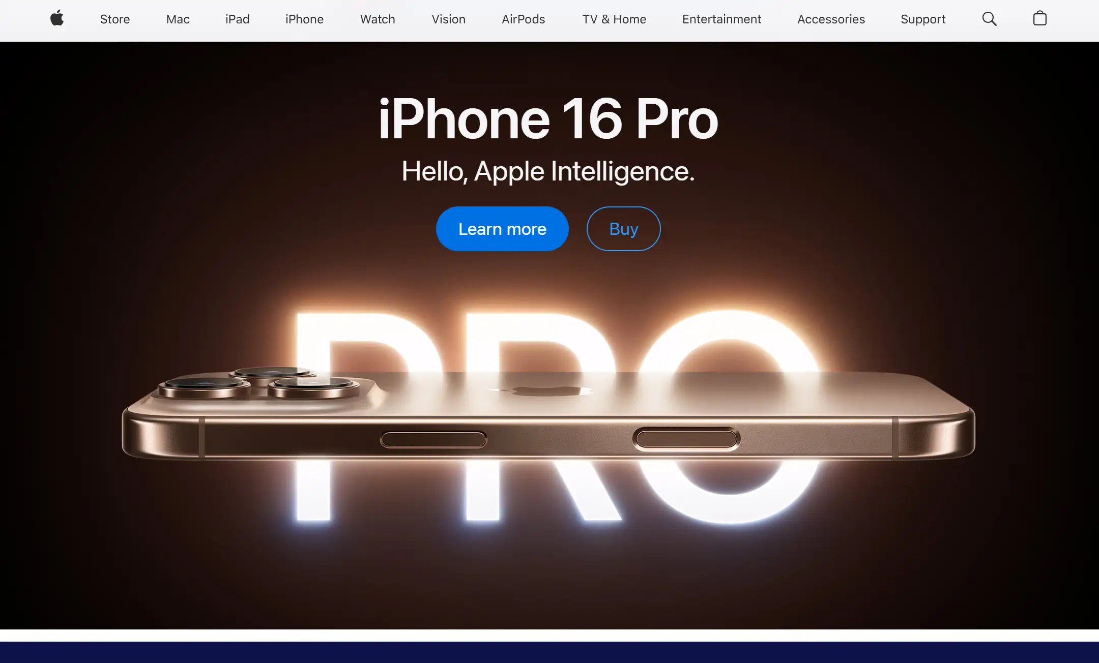
Apple is renowned for its clean and intuitive website navigation design. Their main navigation contains essential elements that create a sophisticated interface which maintains identity consistency in their design. By categorizing their products clearly—like “Mac,” “iPhone,” and “Accessories”—they make navigating the website effortless for visitors. The drop-down menus activate with hover actions to present supplementary information which does not overwhelm users while enabling an effortless browsing experience.
Airbnb
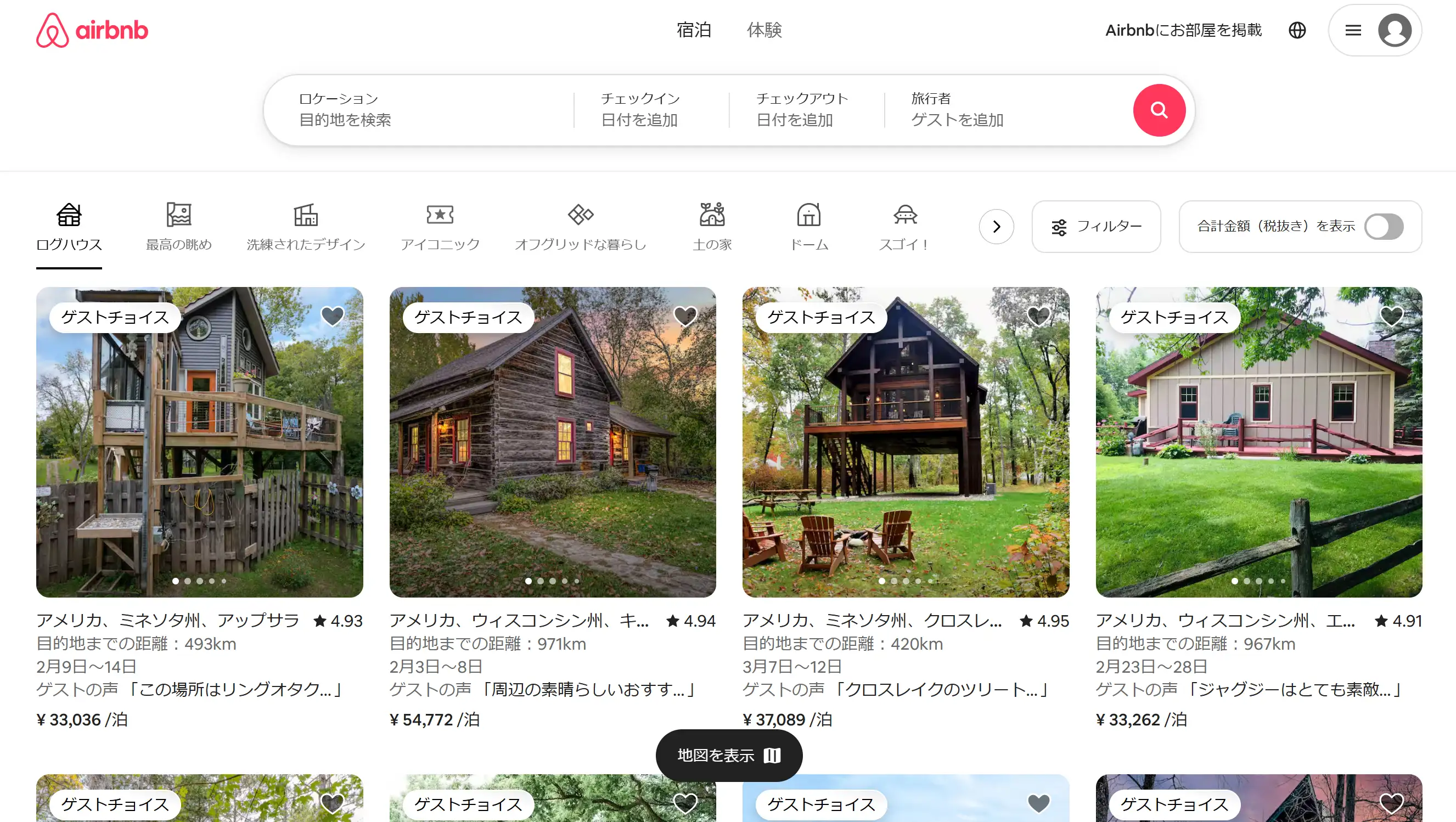
Airbnb achieves advanced personalization through its customized navigation structures. Users encounter a search bar on top of the page during their homepage visit because it serves to accelerate personal exploration. The platform allows users to find their ideal stay through its helpful filters which sort results by area room type and price range. This is a prime example of how website navigation examples can blend simplicity with functionality.
Amazon
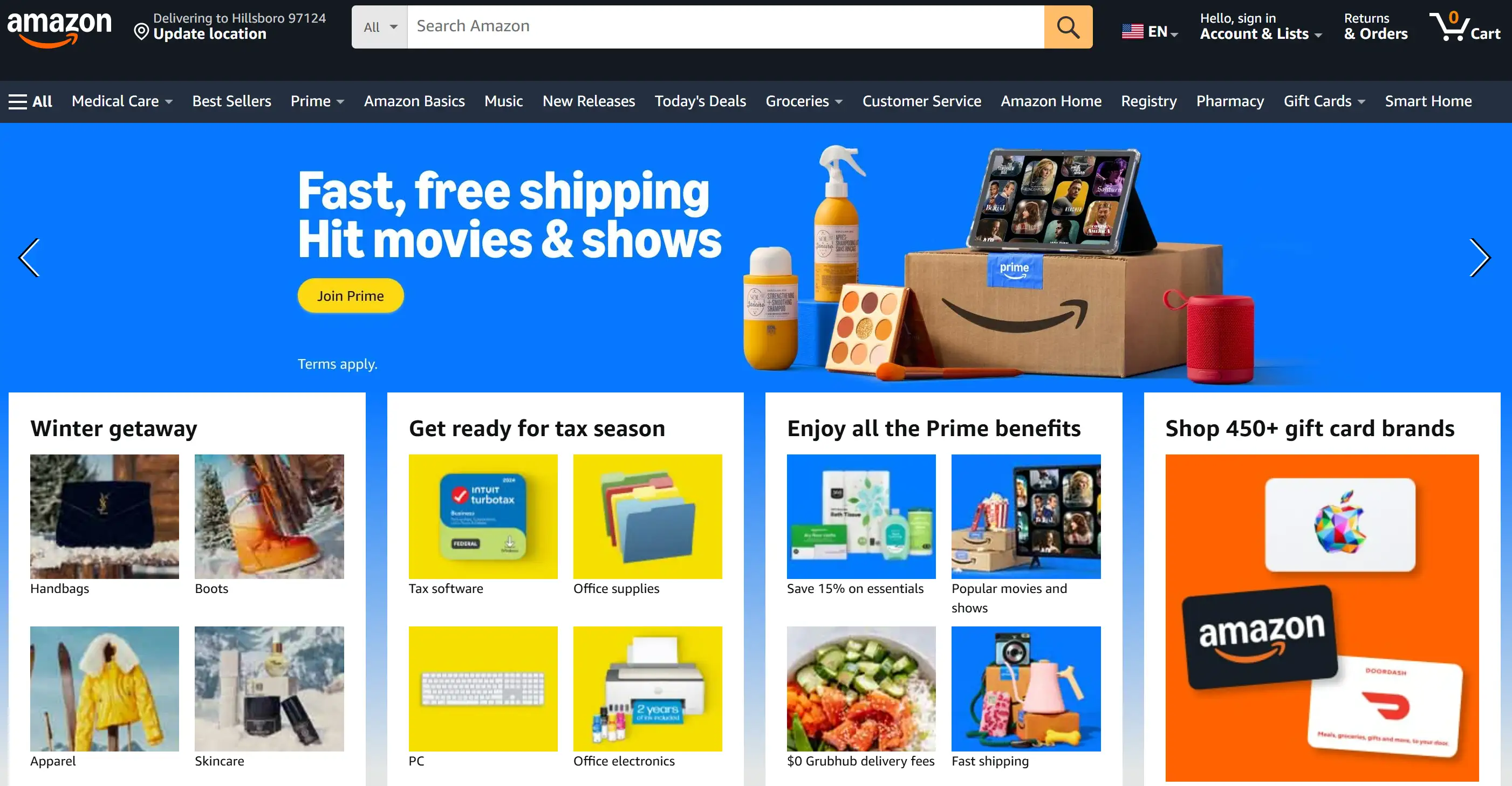
The worldwide giant Amazon presents its market system through an organized network that stands as an online organization masterpiece. The website's complex organization system transforms even broad category collections into organized browsing experiences. From its top navigation bar to the side menu’s in-depth categories, the site exemplifies how the best website navigation examples can balance vast content and user convenience.
Spotify
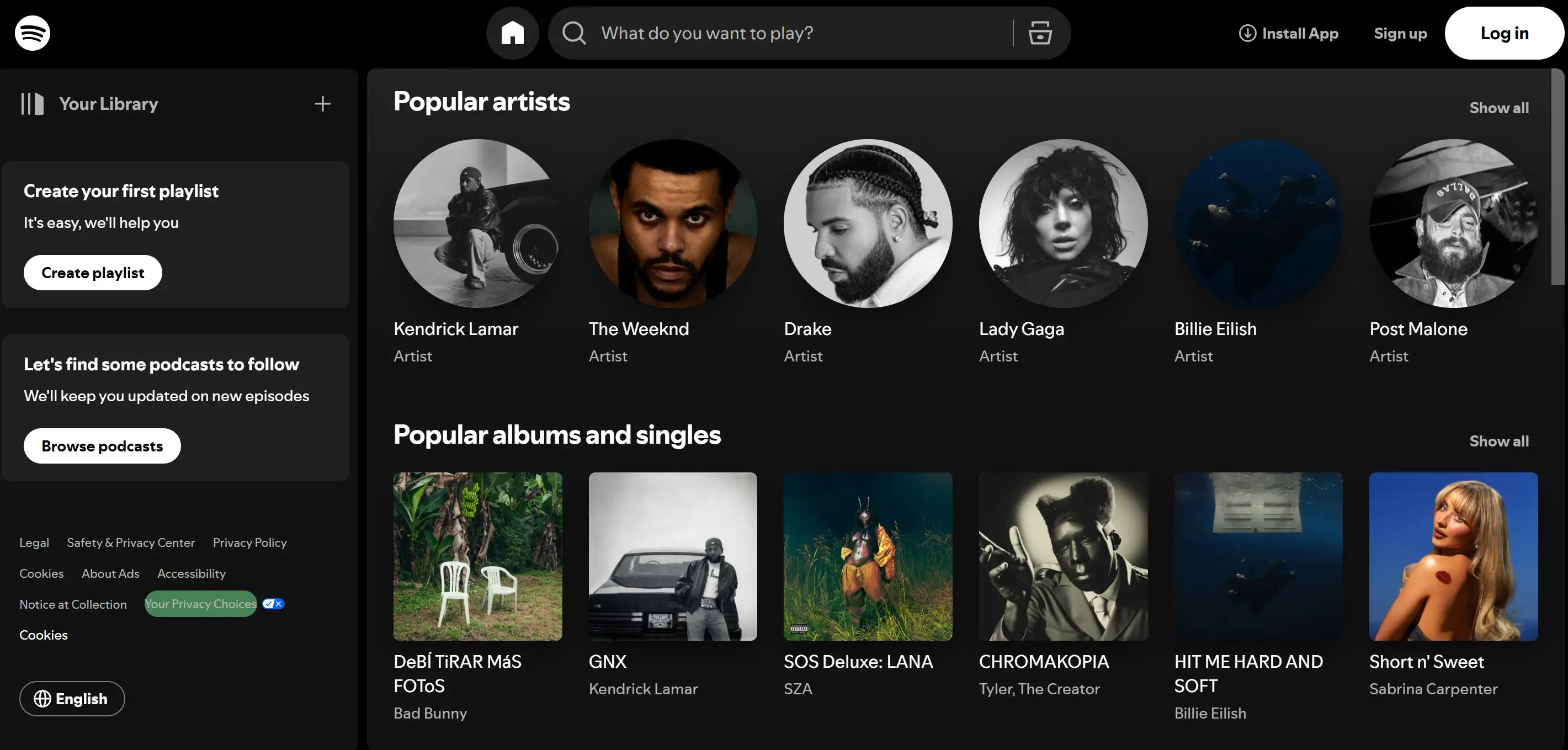
The simple user interface at Spotify serves both casual visitors and frequent users. VIS Users encounter primary features like "Your Library" and "Search" along the sidebar where they remain easily accessible through one click. A streamlined navigation approach allows users to minimize their research activities and maximize their experience with content. Spotify is an excellent example of an intuitive website navigation design that prioritizes user habits.
Dropbox
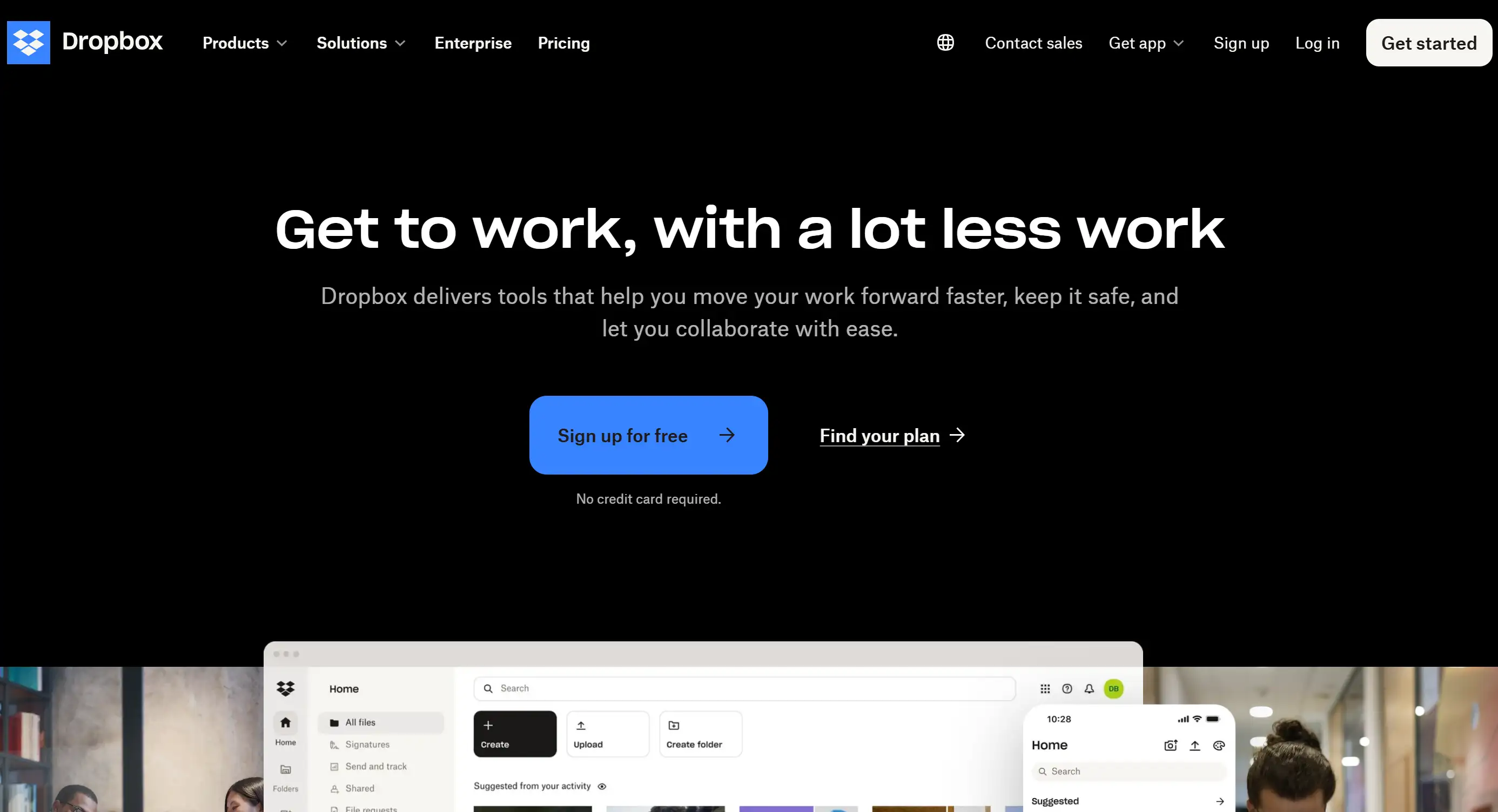
Dropbox applies a clear and uncluttered layout approach to direct website visitors. The essential information found under their navigation bar includes "Features," "Pricing," and "Support" so users can find important details without delay. Their design demonstrates how navigating the website can feel effortless with clear labelling and an uncluttered interface.
Vogue

The way Vogue has designed its homepage navigation underscores its elegant fashion statement. Visitors find captivating beauty in its drop-down menus which include bold typography combined with premium imagery. Users benefit from an easy experience within the fashion and lifestyle categories as well as beauty products through this design method. Vogue proves that functionality doesn’t have to come at the expense of aesthetics when crafting website navigation examples.
Tesla
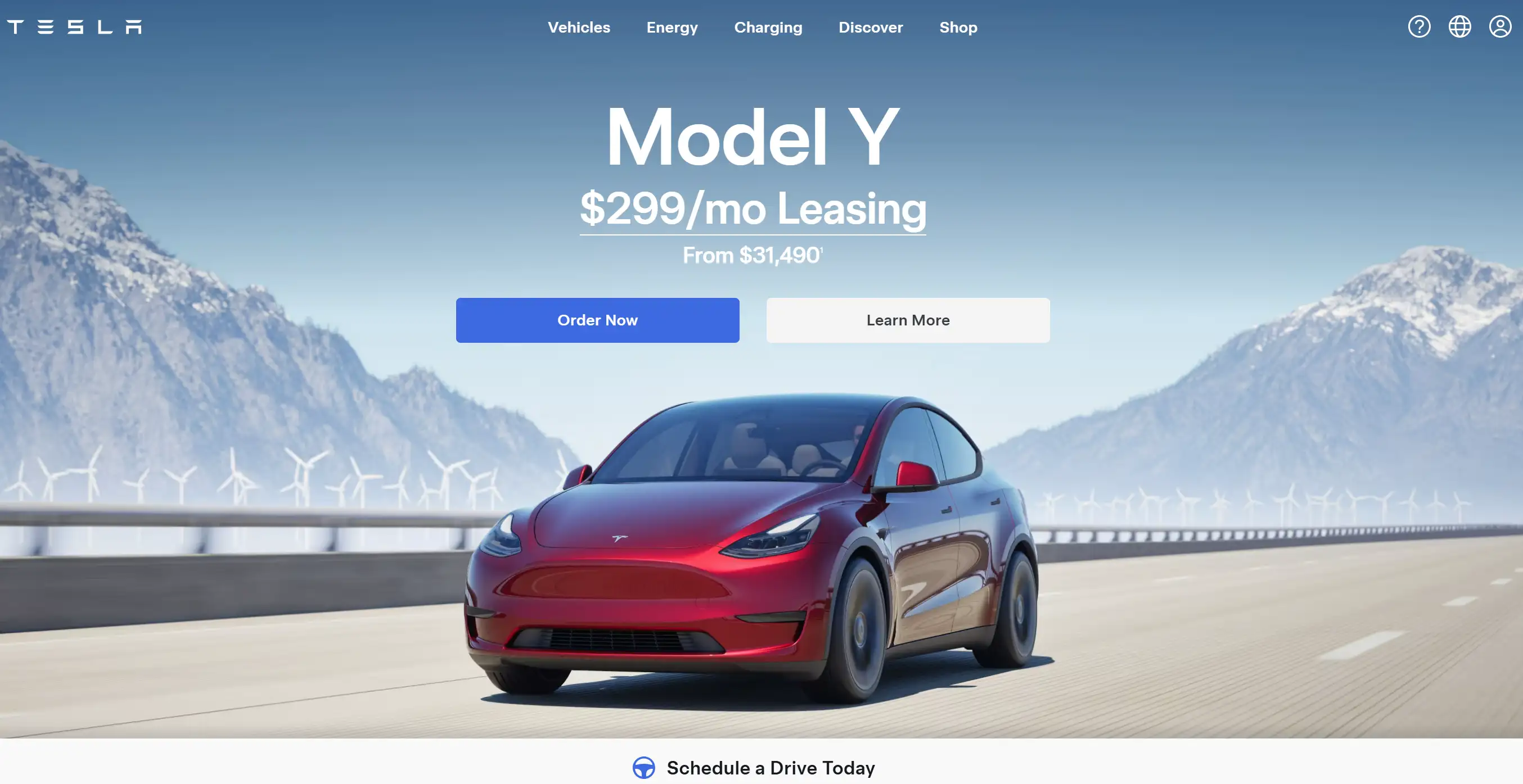
The website of Tesla maintains its futuristic brand identity through a navigation bar that features a simple layout. All menu items maintain a specific focus on products between “Model S” and “Solar Roof” allowing users to explore detail pages free of extraneous distractions. Tesla shows how a minimalistic approach to website navigation design can make a lasting impact.
The New York Times
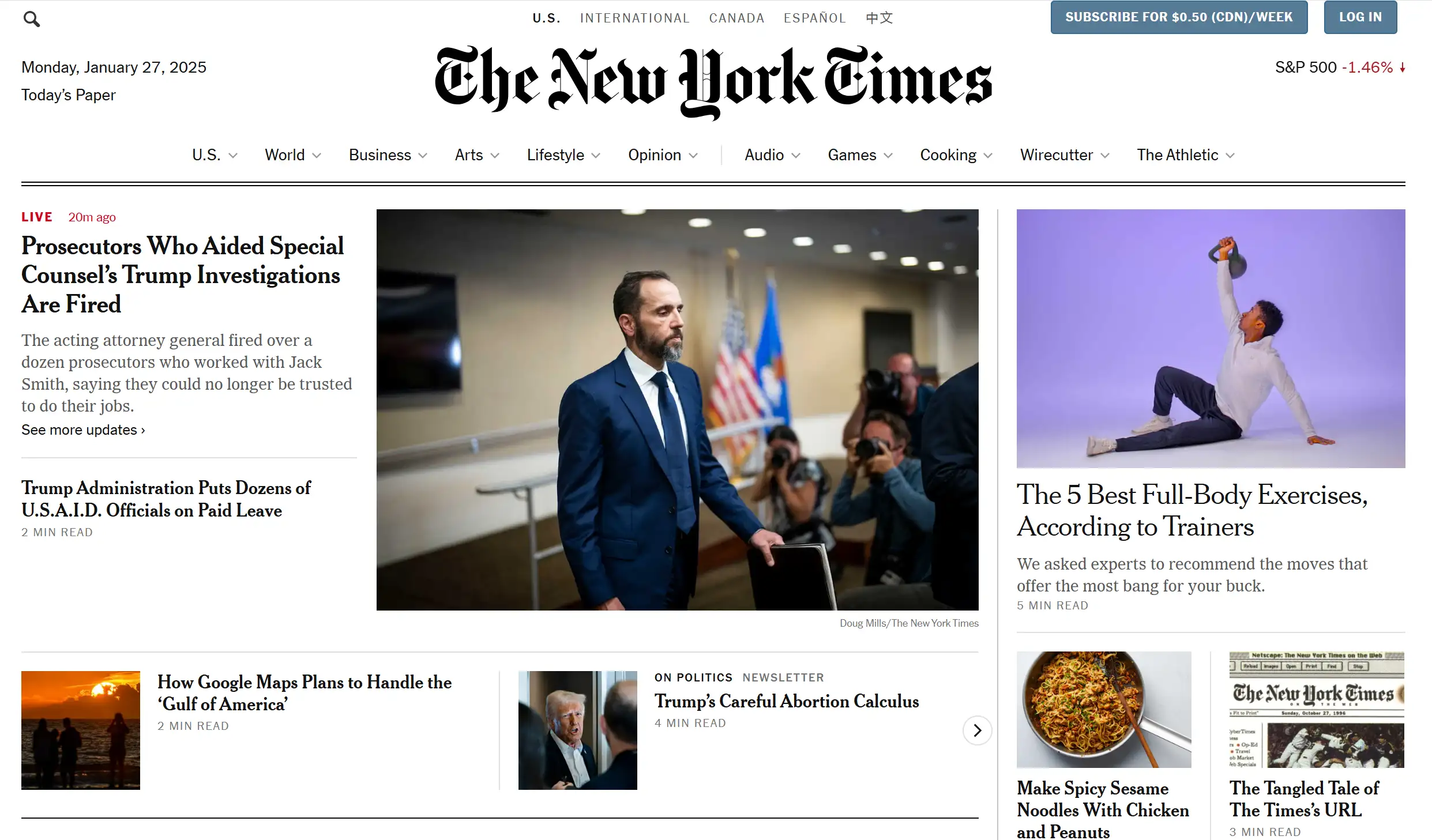
A well-organized website navigation is one of The New York Times main advantages that keeps their news site approachable despite its extensive information. Their website architecture combines structural hierarchy with personalized preferences which goes under "For You" sections to serve readers with diverse preferences. This seamless organization demonstrates one of the best website navigation examples in the digital publishing world.
Etsy
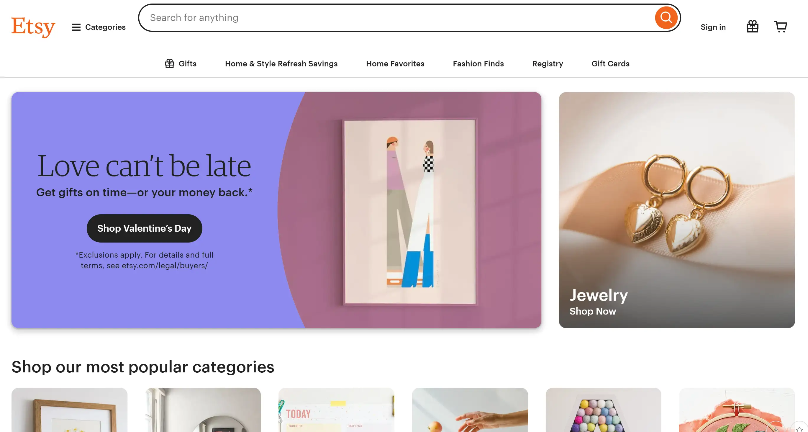
Users access unique products by navigating through Etsy through categories and practical filters that simplify their discovery. Personalized recommendations from their “Recommended for You” segment alongside the “Trending” content. It enhances the user browsing experience. By prioritizing personalization and accessibility, Etsy showcases how navigating the website can feel like a curated shopping journey.
Slack
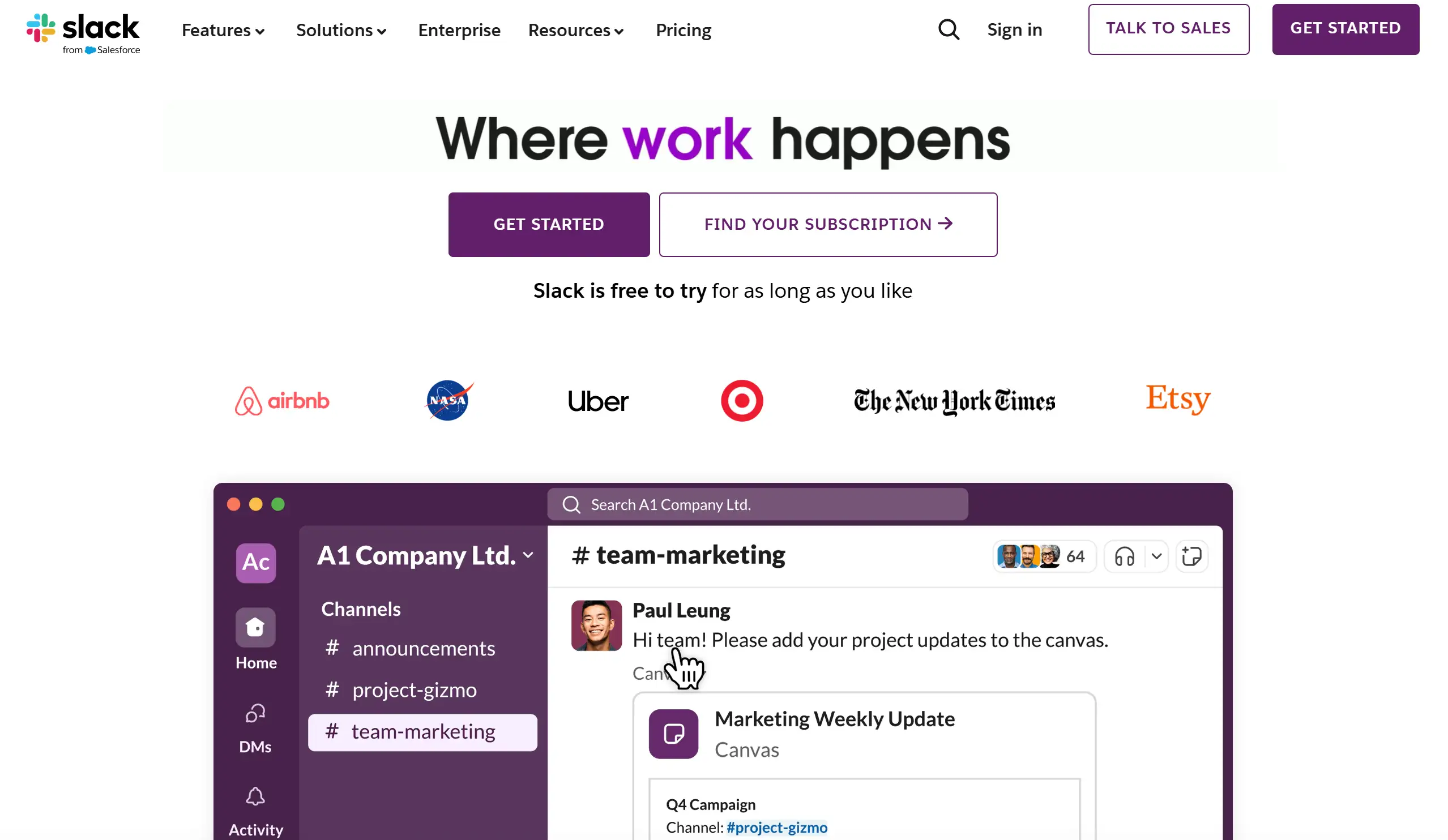
Slack delivers a combination of contemporary layout design with useful navigation features that users can readily utilize. The homepage presents clear solutions alongside product offerings creating an easy path for businesses to see the company's value. Additionally, their resource-rich support section highlights how thoughtful website navigation design can cater to diverse user needs while remaining visually appealing.
From e-commerce giants like Amazon to design-focused brands like Tesla, these website navigation examples prove that good navigation is a combination of creativity, functionality, and user-centric design. Whether the goal is to organize complex content, highlight visuals, or enhance searchability, the best website navigation examples succeed in making every visitor feel at home. By studying these inspirations, you can elevate your website navigation design and ensure your site delivers an exceptional user experience.
Website Navigation FAQ
How can I improve the user experience with my website’s navigation?
User experience improvement requires designs that are simple to use. The first step is to build a logical structure of your content, followed by labeling menu options with clear descriptions. Users should be provided with show breadcrumbs and dropdown menus as navigation tools to monitor their site position. Users who want to find particular information will benefit from a powerful search interface with many applicable filters. Remember, the best website navigation examples prioritize intuitive design, ensuring users can find what they need without frustration. After frequent navigation evaluation, users should provide feedback to detect website pain points which must be addressed.
What common mistakes should I avoid when creating website navigation?
Most businesses make the error of placing too many choices on their menus. Extensive menu choices overwhelm site visitors until they abandon your platform. Food issues occur when product navigation controls consistently appear in strengths users find at the page alignment's top and sides.
A common mistake lies in turning away from mobile compatibility. Digitally fragmented users will leave your target demographic when they find your website navigation unreadable on mobile screens. Learn from website navigation design best practices to dodge these errors.
What tools can help analyze the effectiveness of my website navigation?
Site navigation improvement tools exist for measurement and enhancement purposes. By implementing Hotjar heatmaps users can observe which website areas generate the most clicks. Google Analytics surveys how users engage with pages and measure user bounce rates to show how navigation affects interaction. Reviewing website navigation examples through usability testing platforms like UserTesting can also uncover areas for improvement. These tools ensure that your navigating the website strategy aligns with user expectations.
From Clicking Menus to Building Masterpieces
So, you've explored the best website navigation examples and learned the secrets behind user-friendly designs. You can now use your acquired knowledge to produce something extraordinary. Wegic functions as your chat assistant for hassle-free website creation. Through Wegic users can create exceptional multi-page sites without writerly struggles over coding or complex software as they simply narrate their concepts to produce end-results. Through Wegic, you can build websites effortlessly with a solution designed to develop portfolios, businesses and storytelling platforms. Building an entire website beyond exceptional navigation becomes possible due to our platform. Try Wegic today!
Written by
Kimmy
Published on
Mar 17, 2026
Share article
Read more
Our latest blog
Webpages in a minute, powered by Wegic!
With Wegic, transform your needs into stunning, functional websites with advanced AI
Free trial with Wegic, build your site in a click!
What kind of website do you want to build?