Log in
Build Your Site
Call to Action in Writing: 20 Effective Examples of 2025
Get more customers with 20 powerful call-to-action examples for 2025! Learn proven strategies to boost engagement and conversions. Click for the best CTA tips!

If you want to make a product outstanding, the efforts of every link are essential. Whether it's the product itself or the process of making it. In today's article, we will talk about the call to action (CTA). CTA can be said to be the key to achieving sales goals. So what is a call to action? A CTA is simply text with links, sometimes as buttons or arrows. For example, I can add a paragraph to this post asking you to click on the CTA I created to access our product.👇
"Try Wegic to create your own AI website!"
In other words, use a CTA when you want your readers to do something. A strong call to action can help you get people to take action. Whether it's to buy, subscribe, book, or take any other action that helps you achieve your business goals. In other words, it is a marketing tool that allows your potential customers to click on the link and view your product through the call of the CTA. However, almost everyone who understands marketing uses CTAs. This makes it difficult to make CTAs new and compelling. In this article, I will go through 20 call-to-action examples in writing to show you how to make the CTA an indispensable part of marketing that stands out in the competitive business world.

20 Effective call-to-action examples in writing
CTAs can be anywhere in the digital world. There are several categories. Each type usually has a different purpose. In general, CTAs can be broken down into:
Direct Action CTAs: a great way to get users excited and take action! They ask users to take a specific action right away, like "Buy Now" or "Subscribe Now.”
Informational CTAs: This type of CTA directs users to learn more about a product, service, idea, or activity. It probably consists of "Learn more" and "Read the guide.
Let's dive into the world of social media call-to-action examples! This type of CTA is a great way to get users excited about sharing content on social media!
Feedback CTAs: This type of CTA encourages users to provide comments and feedback or take surveys. For example, "Complete the free trial," "Leave a comment," "Tell us what you think," and so on.
It's time to get creative with personalized CTAs! The great thing about personalized CTAs is that they're dynamically adjusted based on user behavior and preferences. Examples consist of "Your exclusive offer is waiting for you," "Recommended for you," and "Tailored for you.
Let me give you 20 examples of effective calls to action in writing.
1. Wegic
On the home page of Wegic's website, "build your site" is one of 20 effective call-to-action examples in writing. It contains the elements of a good CTA. First, it is targeted and relevant. Wegic's target group is those who want to build their own website, but have too much time and money to learn how to build a traditional website. Wegic is the first to use AI to build their own website. Second, Wegic's CTA is simple. It says directly what it wants the user to do. It is also an essential part of creating a CTA. Second, it's very simple. It can be said that Wegic's CTA achieves audience research, uses action verbs, sets clear goals, focuses on user interests, and is very concise. It can be said that such a CTA is very attractive.
Click the picture to find out how Wegic created a website!⬇️

2. Cloudflare
Cloudflare's page has a lot of CTAs. However, the one that caught my eye the most was the "under attack? It is one of the best call-to-action examples in writing. Cloudflare is positioning itself as the cybersecurity version of calling the police when there's an intruder in your house. This CTA takes a lot of CTA fundamentals and tweaks them. First, Cloudflare's CTA identifies its audience and goals. Second, this CTA button uses the action verb "under attack?" This piques the curiosity of the user and makes them want to click to see if they are "under attack".Third, it uses a bright color scheme. The bold text contrasts with the bright colors. Finally, it creates a sense of urgency. Without a doubt, "Under Attack? Will urge readers to click.
3. Slack
Slack's CTA is one of the most common examples of to call to action in writing. "Try for free" is the CTA used by many companies on their websites or social media. The reason why "Try for free" has been popular and used by many companies for a long time is precisely because it is very classic and useful. If you find the right tool but don't know if it can help you, "Try for free" will help you. After a period of customer use, this CTA will bring you sales. It is one of the most common call-to-action examples in writing.
4. Sales Force
If you go to the Sales Force page, you will notice that it has several CTAs. This is very common on any website. On the page, you will see the "Try Free" button twice. This CTA is probably the most common example of a written call to action. Overall, the design of the website and the CTAs are very simple, and there is an "ask agent force" CTA on the website that encourages people to learn more about the company.
5. African Wildlife Foundation
The African Wildlife Foundation is a nonprofit organization with a powerful call to action. There are only two CTA buttons on their website interface. One is "see our vision" and the other is "donate". These two buttons are targeted to their audience, and bright colors are used to highlight the CTA button. The two buttons are also consistent, which is important for the CTA. It reinforces the organizational vision of the African Wildlife Foundation. You want to motivate supporters to learn more about the organization or donate now. The African Wildlife Foundation is a non-profit organization, but it's one of the best examples of call-to-action examples in writing.

6. Domino's
Delivery or Pickup. This is the Domino's website CTA. Domino's CTA is very obvious and simple. As a large pizza company, all they want to do with the website is to get customers to buy their pizza. And the people who clicked on the company's website just wanted to buy pizza. So a simple CTA design is enough for a restaurant website.
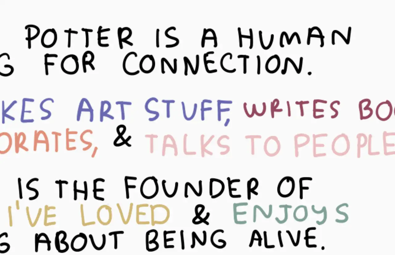
7. Carissa Potter
Let's take a look at this unique CTA. Carissa Potter's website breaks the conventions of CTA design. Carissa Potter is an artist, so the design of the site is very much in keeping with the tone of the artist. The CTA matches the tonality of the brand. Yes, a brief introduction. For example; she "makes art stuff", "writes books", "collaborates" and "talks to people". Change the key information in the introduction to the CTA and use different colors and nice fonts. This approach will undoubtedly make the site even more impressive. What's more, the design of this CTA is so impressive that it's probably one of the best call to action examples in writing.

8. Greek Sandals
The CTA is not prominently displayed on the company's website. However, as a shopping website, its overall design style is similar to the brand style. When you click on the website, you are first attracted by their images, and then you notice the "shop the collection" CTA. It's relegated to the bottom of the page, and it doesn't seem to be easy for people to notice. But I think it was carefully designed by the site. After seeing the image, people browsing the site will naturally look for new information.
9. Netflix
This is a brand that is familiar to all of us. Its CTA call is straightforward and clear. Using a bold color scheme, it simply says "Get started". This is simple enough and has a definite call to action. Can't say it's the best call-to-action example in writing. But bold enough and simple enough. Of course, if your brand is as well known as Netflix, you can get away with not focusing too much on CTA creativity.
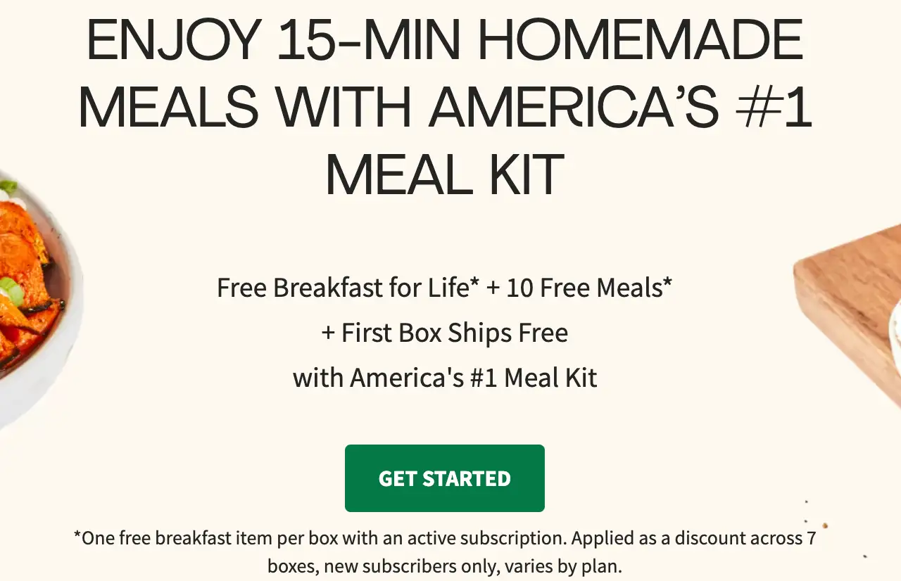
10. Hello Fresh
This site also uses a common CTA called "get started." The site focuses on quality farm-fresh ingredients, refrigerator-ready meal kits, and easy-to-follow recipes. After stating these benefits, it uses "get started" to make potential users more aware of the brand. What makes "get started" so effective is that it uses action verbs to grab users' attention and motivate them to convert. It is a common apporach to encourage audiences to know your company in call-to-action examples in writing.

11. Spark Toro
One of the CTAs on this site is very interesting. "see a sample report". This is a direct way for the target audience to see what their company is doing, which is one of the most interesting call to action examples in writing.
12. Chipotle
What is the best CTA demonstration for a catering company? "order now" is a common CTA for food and beverage companies. It is because it is concise and uses action verbs. It is also strategically placed in a prominent place to make people notice the CTA in the first place. It is one of the common ways of call-to-action examples in writing in food industry.
13. Headspace
The company's intention to add a CTA is straightforward. It wants the company's products that people buy. So their CTA is "get 50% off" and "get this deal." This way the CTA button creates a sense of urgency for the customer. It makes readers respond immediately for fear of missing out on offers. It is one of the efficient methods of call-to-action examples in writing.

14. Lyft
Lyft's CTA is very appealing and in keeping with the tone of the brand: "apply to drive", and "sign up to ride". These two CTA buttons are different from the others. Maintain the characteristics of the brand, but also mobilize the enthusiasm of the audience. It is one of the best call-to-action examples in writing.
15. The Syntopia Hotel
"Book now" is a common type of CTA for hotel-type websites. It keeps things simple but also uses action verbs.It is one of the good methods of call to action examples in persuasive writing.
16. Outreach
Outreach used "Get a demo" and "Chat now with Cleo AI" to get customers to learn more about the product.
17. Kati Curtis Design
For websites that help people Design, Kati Curtis Design's CTA design is undoubtedly a success. Colored buttons say "book a consultation" to prompt customers to learn, and there are also AI bots to answer basic questions. It is one of the common call-to-action examples in writing in the industry.
18. Patagonia
Patagonia is an outdoor clothing store that calls for environmental protection. In the most prominent place on the website, it placed the CTA button "take action".
19. The Budgetnista
A one-stop shop for personal finance, The Budgetnista. Unlike other CTAs, this one takes a unique approach. "TAKE THE 60 SEC QUIZ". Let users take the financial test first to understand their own situation, and then let them wonder how this website can help them. This is one of the most characteristic call-to-action examples in writing.
20. Heyday
Heyday also combined its brand characteristics to write a "book a laser facial" to promote users' clicks.
Conclusion
This article introduces you to what a CTA is and shows you how to use it most effectively through 20 call-to-action examples in writing. Not only do you need to know your target customers, your product goals, and the CTA, but you also need to be concise and direct. Setting up a CTA requires the same color effort, but that is not enough to make your CTA stand out from the competition. You need to think carefully about how to make your CTA more creative while maintaining the basic features. Also, your CTA needs to vary across social platforms according to your goals to help you reach your conversion and sales goals. According to Unbounce, 90% of website visitors read headlines and call-outs. This is why CTAs have become even more important in this networked age.
Written by
Kimmy
Published on
Mar 12, 2026
Share article
Read more
Our latest blog
Webpages in a minute, powered by Wegic!
With Wegic, transform your needs into stunning, functional websites with advanced AI
Free trial with Wegic, build your site in a click!
What kind of website do you want to build?