Log in
Build Your Site
16 Inspiring Business Homepage Design Ideas 2025
Discover the top business homepage design ideas for 2025! Learn what makes a great homepage, and why small business websites matter, and explore 16 inspiring design examples to elevate your online presence.

It’s overwhelming when you’re creating a website that stands out, isn’t it? Especially when you’re unsure about what a business homepage design should look like or how to make it compelling enough to keep visitors around. You’re not alone. The problem is that many business owners desire small businesses that run themselves and struggle to create homepages that represent their brand well and convert visitors into customers.
But here’s the good news: designing great small business websites doesn’t have to be complicated. By focusing on business homepage design ideas that are simple, clean, and engaging, you can create a homepage that works for you 24/7. Your homepage is the digital front door to your business. That's the first impression visitors get and usually the thing that makes or breaks whether they stick around or bounce.

In this guide, we’ll explore everything you need to know—from small business website examples that inspire to must-have elements for a killer business homepage. We’ll even share some creative website homepage ideas to help you connect with your audience and drive results. Prepared to spice up your small business with a homepage?
What Makes a Great Business Homepage Design?
When it comes to crafting a standout business homepage, it’s not just about looking good; it’s about making an impact. Most of them don’t even reach your homepage is the first impression for most of them. It’s like the cover of a book. It has to be interesting to your audience, it has to communicate what your brand is about, and most importantly, it has to entice them to keep reading. But what exactly makes a great business homepage design? Well, let’s break it down.
First Impressions Matter
The old saying, “You never get a second chance to make a first impression,” couldn’t be more relevant when it comes to business homepage design ideas. If home pages are the first interaction a potential customer will have with your brand, then they better make an impression. Visitors will bounce if your site looks outdated or is cluttered. On the flip side, if you don’t, presenting a clean, professional layout is a sign of trustworthiness and that you are taking your business seriously.
Clear Branding and Messaging
A small business website design should instantly convey what your business is about. Do not make visitors look for basic information; make it apparent. That homepage needs to inform your visitor who you are, what you bring to the table, and why she should be interested. In doing so, you can get a good headline, easy-to-locate navigation, and relevant content to a brand’s tone. Think of that as your virtual handshake, which should be firm, confident and welcoming.

Look at some great small business websites for inspiration. They get it right by placing priority on clarity, ease of use, and a clear CTA (call to action). Great! Your path to success is starting off early, as your visitors immediately know what your business does and how they can benefit from it.
Mobile-First Design
A lot of web traffic is coming today from mobile devices. What this means is, that if your homepage isn’t optimized for phones and tablets, you’re essentially cutting out and not even realizing a large portion of potential customers. Make sure your business web design is responsive, meaning it automatically adjusts to fit any screen size. Yes, this improves user experience, but Google too has been thrilled about responsive design and has grown fond of rewarding such designs.
If you want to see what works, check out some small business website examples. Most of the best designs are mobile-first designs with layouts suitable for small screens that are easy to navigate. The more easy they can scroll through, click and interact with your content, users are more likely to stay on your site longer regardless of where they are.
Intuitive Navigation and User Experience
We don’t like to search for information to find endlessly. A business homepage should have clear and intuitive navigation, allowing users to find exactly what they need without frustration. Imagine your homepage as a map: it should lead people to where they need to go (whether that’s learning more about your products or signing up for your services) while not feeling lost in the process.
Consider incorporating simple yet effective website homepage ideas. Maybe the entire navigation will be sticky or you might have a search bar or some strategically placed links that lead to your most important pages like your product page or about page. This is because navigating your new business needs to be easy, and easy-to-use, to keep visitors engaged, and not clicking away in frustration.
Compelling Visuals and Branding
The visuals on the top are uber important to attracting your potential customers, so use beautiful photos, videos or graphics to showcase your products or services for that perfect branding. That being said, don’t let visuals that are important take over your visitors. The best business website examples strike a balance between eye-catching design and a clean, minimal layout that lets content breathe. When there are too many elements competing for attention, your message can get lost.

These also need to match your brand identity in colour schemes, typography and imagery. It should be cohesive whether you go bold and bright or sleek and understated, whatever your page looks like, is alright. Your website is, after all, an extension of your business, and consistent posting is building trust.
A Clear Call to Action (CTA)
At the end of the day, a business homepage isn’t just about looking pretty—it’s about guiding visitors toward taking the next step. Whether you want them to subscribe to your newsletter, schedule a consultation, or buy your product, your business homepage should have a prominent and persuasive call to action. When writing use action-oriented, like ‘get started’ or ‘join our community,’ and place the CTA in easy-to-see places. Don’t push it down to the bottom of the page or make your visitors search for it for eternity. Interestingly enough, if your CTA is not compelling enough, or not something that attracts the user’s attention, it will not gain the user’s attention. That clear, strong CTA turns passive visitors into active customers.
Designing a great business homepage isn’t about choosing the flashiest colours or the most complicated layouts. That means ensuring an unbroken user experience, clear messaging and smart design decisions. Whether you’re looking for business homepage design ideas or seeking inspiration from the best small business website examples, remember: You need to represent who you are and what you think on your homepage. If you get these, your homepage will be a good tool for attracting and converting potential to your customers.
16 Inspiring Business Homepage Design Ideas for 2025

When it comes to creating a business homepage that stands out in 2025, it’s essential to embrace fresh design ideas that engage your audience and meet their expectations. Not only is your homepage just a bunch of pretty visuals, but it’s an integral part where you lay out your brand's tone and show users what to do next. Let’s dive into 16 innovative business homepage design ideas that will take your website to the next level.
Key Takeaways:
-
Bold typography combined with minimalistic designs make a statement, without clutter and staying updated.
-
Hero and scroll animations, as with interactive sections, make the experience more engaging.
-
AI or geo-targeting enhances personalized user experience.
-
Navigation is made sticky to make it more interactive and usable, content blocks are dynamic.
-
Split screen layouts and dark mode offer aesthetic and functional benefits.
-
Social proof through testimonials and partnerships builds trust.
-
Creative use of colour and video backgrounds keeps the design fresh and exciting.
-
Prioritizing mobile-first design ensures a smooth experience across all devices.
1. Minimalistic Design with Bold Typography
Timeless clean and minimal design is always in style, but for 2025 typography is making a comeback in bold. Put large, authoritative-looking fonts, but make sure the overall design is still uncluttered. If you are looking at building your brand, think simple, effective and impactful.
2. Interactive Hero Section
Hero section is prime real estate on your homepage and it’s time to make it interactive. But what about using a scroll-triggered animation or a background video to introduce your brand or product powerfully? This allows users to do something right from the beginning, and get them exploring.
3. Personalized User Experience
One of the top business homepage design ideas for 2025 is to make your visitors feel like the site was built just for them. Adding AI or geo-targeting allows you to personalize the homepage as people get to specific locations or based on their preferences. A big impact on user experience can be made with personal greetings, relevant product recommendations and dynamic websites.
4. Sticky Navigation Bar
It should also help to make navigation easier for visitors by having a sticky navigation bar that stays with the user as they scroll down the page. That way they wouldn’t have to scroll back to the top if they wanted to jump to another section—in other words, this is ideal if you have large sites full of content.
5. Visual Storytelling with Scroll Animations
It works not just with static images, but with scroll animations to tell you a visual story. This time, the user views content and images as they horizontally scroll down the page, fading in or moving. Especially for businesses that want to show how their product or service is, this approach is very very effective.

6. Split Screen Layout
For small company websites, the split-screen layout is a game-changer. This layout breaks the screen into two halves of different focus. Whether that is a call to action or a product showcase, this layout delivers visual interest while organizing.
7. Dark Mode Option
Dark mode is nothing new, but it's a very popular approach to web design. This enables users to customize their experience by toggling web design between white and dark fashion and can bring a more modern and sophisticated feel to the design.
8. 3D Elements and Parallax Scrolling
As we move into 2025, incorporating 3D elements and parallax scrolling will continue to elevate business homepage designs. This depth is where your users engage with the design in a fun and visually exciting way, and these interactive features are what make it happen.
9. Social Proof Section
For small business website design, adding a section dedicated to social proof—like testimonials, user reviews, or brand partnerships, can make a huge difference. The mere presence of these elements helps visitors to your business know that they are dealing with a legitimate business.
10. Dynamic Content Blocks
Instead of creating an all-talk no-walk homepage full of text, use dynamic content blocks that give a little bit of information at a time as users interact with them. There could be hover-over effects or expandable text boxes that let the visitor know exactly what they need to read without any confusion on the page.
11. Creative Use of Color
Unexpected bold colours can attract attention and make your business seen. Put on some bright hues or gradients all over your homepage to make it work. As long as you keep good contrast and legibility, there is nothing wrong with it.
12. Video Backgrounds
The lack of static images can be overcome with video backgrounds highlighting exactly what your products or services do. With this dynamic form of visual storytelling, visitors can be engaged and given more context on what you offer.
13. Unique Grid Layouts
Unleash your creative mind and break away from the standard column format putting your products, services or team on display in a different, unique grid layout. This way will make your place look so fresh, smart and even organized.
14. One-Page Design
If you have less offering or content, a one-page design could be ideal. Provides seamless access to all important data in one scroll. In essence, it’s a quick and effective way of marketing your business to potential customers.
15. Integrated Chatbots
That’s why having an interactive chatbot embedded in your homepage helps users instantly. The use of chatbots on your website is perfect for helping you increase engagement, as well as conversion rates by answering common questions and making personalized recommendations.
16. Mobile-First Design
In the days of mobile browsing, a small business website homepage design should be geared towards mobile users. Everything should load rapidly, there should be easy-to-click buttons and the same quality experience across all devices.
Each of these business homepage design ideas can help you create a more functional, engaging, and visually appealing homepage that stands out from the competition. When you look towards 2025 remember the goal is to create an experience as unforgettable as your company.
The Importance of a Small Business Homepage Design
When it comes to your small business website design, the homepage serves as the first touchpoint for visitors, so its importance cannot be overstated. A good homepage isn’t merely about how attractive and cool it looks, it is largely about how functional, credible, and how good its experiences are. In this section, I’m breaking down why your homepage design should be one of your top priorities, especially for small businesses that want to create a major impact.
First Impressions Matter
When was the last time you went to a website that let you down? It could have been the design was old, or the text was too small to read or, heaven forbid, it took forever to load. We’ve all been there, right? Studies show that your visitor’s attention has between 7 seconds to go. If your business homepage doesn’t look inviting or feel user-friendly, that visitor will likely bounce. Great small business websites don’t just draw people in; they keep them engaged and make it easy for them to explore what your business has to offer.
If you don’t believe your homepage is important you need to think again. Your digital storefront shows potential customers who you are, what you do, and why you stand out. The first impression you make with a professional homepage, with the correct design elements, will immediately signal trust and competence. It’s important for smaller businesses who want to compete in the market against larger players.
Mobile Optimization is a Must
Almost all of the internet traffic on the internet today is from mobile devices. If your small business website design isn’t mobile-friendly, you’re leaving money on the table. As your visitors use phones and tablets to visit your site, your homepage must be easy to travel through, speedy to load and look good on all screen sizes. Let’s say a website homepage does not scale down well for smaller devices; users may get frustrated as they have to pinch and zoom in just to read your content, which definitely will affect a high bounce rate and a poor user experience.
Test your website if you don’t know how it is supposed to look on the mobile! The good news is there are tools to make sure your design is responsive and optimized for all devices. This small thing might end up converting some of those visitors into customers.
Building Trust and Credibility
When it comes to small business website design, trust is key. Visitors expect to see that your business is legitimate, reliable and professional. That’s where a polished homepage can instantly give you that, and prevent the user from questioning whether your product is worth buying. Your homepage must sell the fact that your business is worth their time, hard work, and money.
For example, business website design ideas like including an “About Us” section, showcasing your team, or adding a few positive reviews can help build credibility. If people trust your company, they are more likely to do business with you and your homepage is where you should create that trust.
Converting Visitors into Customers
With your homepage, it’s not only about how you impress people; it’s really about how far you can get them down this path. Whether that’s purchasing a product, signing up for a newsletter, or getting in touch with your team, the small business homepage design needs to facilitate conversion. After all, the goal of your business website is to turn curious visitors into paying customers.
The best business homepage design ideas encourage interaction. Visitors know where to go next and what to do based on clear CTAs, well-organized information and a simple layout. The more you can work to make it easier for someone to follow through with their intentions, the more likely they are to stick around and take action.
It Sets the Tone for the Rest of the Site
Finally, your homepage is a road map for the rest of your site. A good Homepage design sets the right expectations of what the rest of the website will be like. The more user-friendly and informative your homepage is; the more likely it is that visitors will explore other pages on your site once they have been there. A disorganized home page or one littered with too many features can scare users away from checking out your products and services as well as your blog posts and thus you may be missing out on the rest of what your business has to offer. Take some inspiration from business website examples you admire. Look and see what works and what doesn’t and start thinking about how you can make those work for your business. For instance, many great small business websites have a hero section right at the top that highlights their main selling point or special offer, followed by a section detailing their services or products.
A great homepage design is the foundation of a successful small business website. It will determine the sound make your brand trustworthy and help the potential customers to become the customers. By investing in a smart and professional small business website design, you’re not just creating an attractive homepage—you’re setting yourself up for business success. Every detail matters from improving user experience to making mobile compatibility.
Make Your Homepage Shine with Wegic’s Magic Touch
Your homepage ideas layout shouldn’t just sit there—it should work like a magnet, pulling in visitors and turning them into loyal customers. With Wegic, you don’t have to stress over complex business website design ideas. With tools like the AI assistant in Wegic, you won't be alone in the process. Just three steps using this AI-powered design tool can help you generate your website.
Step 1: Open Wegic
Step 2: Chat with Wegic as if you were discussing your website. You can also send a screenshot of the desired website.
Step 3: Based on the design outcome, you can also have a conversation with Wegic to rework the result.

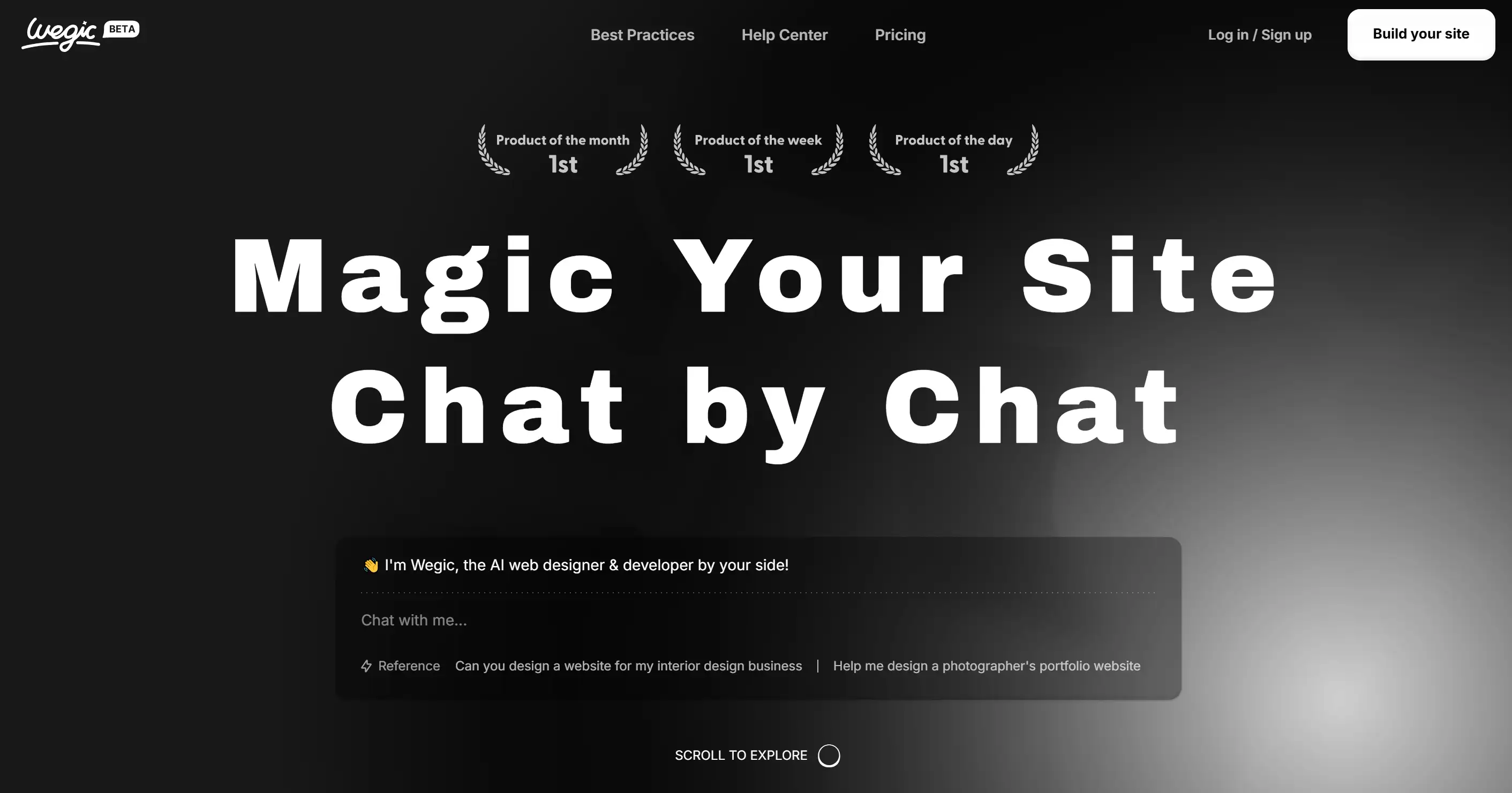
On the Wegic homepage, Wegic.ai friends see a sleek, minimal design with a dark theme that puts their keys front and centre. Here's a breakdown of the design elements:
-
Header and Navigation: A "Beta" tag is placed at the top left of the Wegic logo to indicate it’s in a development phase. These navigation options ("Best Practices", "Help Center" and "Pricing") are all centrally aligned in light grey in their respective divs for simplicity and easy access. There are two prominent action buttons on the right: “Log in / sign up” and “Build your site”, the latter with white text on top drawing attention to it.
-
Hero Section: Large, bold white text at the top of the page with the main heading has the clear and attention-grabbing “Magic Your Site Chat by Chat. Using this dark background paired with a subtle shadow effect gives the text some depth and contrast to it. The message down below the main text reads like a chatbot: "Hey, I’m Wegic, the AI web designer and developer by your side!" This creates the impression that the user has direct interactions with the AI which helps him to create its website. This placeholder stands as "Chat with me…" It suggests we can talk to the AI in real-time.
-
Awards and Achievements: There are some small and subtle icons above the main text, showing how Wegic has been named "Product of the month," "Product of the week" or "Product of the day," all marked as "1st." They are put in a light grey hue and well balanced with the existing colour palette without swamping the user.
-
Call-to-Action: At the bottom, there is a call-to-action section that asks the users to scroll more and see more using the page.
Ready to transform your no-code website into something truly extraordinary? Wegiecs AI assistant can drive for you and bring your vision to life effortlessly. Why wait? Get started building your dream homepage now!\
Written by
Kimmy
Published on
Mar 17, 2026
Share article
Read more
Our latest blog
Webpages in a minute, powered by Wegic!
With Wegic, transform your needs into stunning, functional websites with advanced AI
Free trial with Wegic, build your site in a click!
What kind of website do you want to build?