Log in
Build Your Site
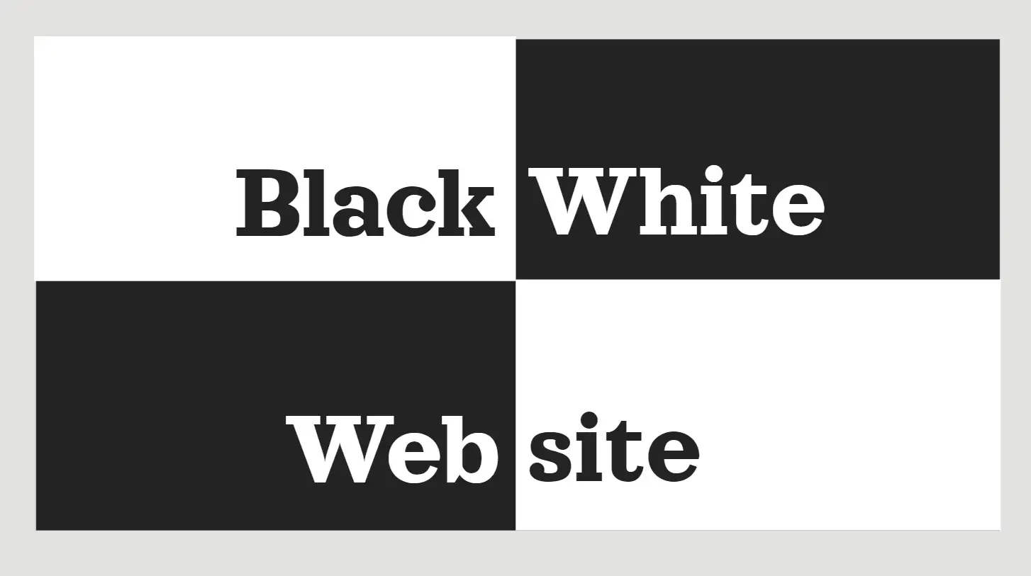
10 Beautiful Modern Black and White Website Examples
Discover the timeless elegance and modern appeal of black-and-white websites with our guide. Explore 10 stunning examples, learn how to make your site stand out, and find answers to your top FAQs.

Have you looked at a website and been deeply attracted by its clarity and grace? That’s the power of black and white websites. Finding the right path to design a beautiful aesthetic website without using bright colours can be challenging for many people. Often simplicity works well and an artfully designed black-and-white website illustrates the point.
I get it. You aim for your site to be unique and stylish but without any unneeded clutter. A simple black and white website has real significance. This traditional design allows you to highlight crucial aspects of content. This message makes a powerful impression through grace and timeless quality while embracing a new style. Plus, with the right balance, black-and-white websites can elevate the user experience and highlight the best parts of your brand. Stay tuned to grasp how this significant design decision can serve your interests!
What Can Black and White Websites Bring to You?
Let’s talk about what black-and-white websites bring to the table. First and foremost they can provide significant contrast. Think about it: Black and white differ in colour more than any other pair. This clear difference amplifies the readability of images and text on the page by making them stand out and appealing visually. A simple black-and-white website allows you to display your offerings powerfully and stylishly.
At times websites can appear as if they are striving to be perfect. When there are numerous colours and disruptions present, your message may get lost. But black-and-white websites strip away all that clutter, leaving behind only what matters. With this straightforward colour palette, you can express your intent more clearly and without clutter. It gives your content a straightforward, simple background that allows it to truly excel.
Another perk? They’re timeless. While flashy colour trends come and go (remember when neon was all the rage?), black-and-white websites remain a classic. They radiate sophistication and attractiveness suitable for businesses that desire modern but emphatic professionalism. Constructing your site without colour does not compromise creativity; on the contrary, it encourages you to become more imaginative in your use of layout and design elements.
Simplicity should not be mistaken for bland. Using two colours in your design does not guarantee a boring website. Conversely with correct typefaces and arrangement black and white designs provide a vibrant showcase. With a classy business appearance or a modern trendier look, black and white can achieve the needed variation. If you aim for a bit more pizzazz, you might choose to introduce a vibrant accent colour.
For a moment imagine that black and white could converse; they might simply state, "We've endured for generations and remain relevant due to our durability. And they’d be right! Whether you’re designing a portfolio, an e-commerce site, or a blog, black-and-white websites can make your content look bold, sophisticated, and timeless—all without trying too hard.
If you are getting weary of puzzling over which shades of blue match your brand's tone selecting simplicity with black and white may make sense. It offers a unique appearance that is popular.
10 Beautiful Modern Black and White Website Examples
Let’s dive into some real-world examples of how companies and designers have mastered the art of black-and-white websites. This colour scheme became so versatile and powerful when done for every website.
1. Wegic-AI website builder
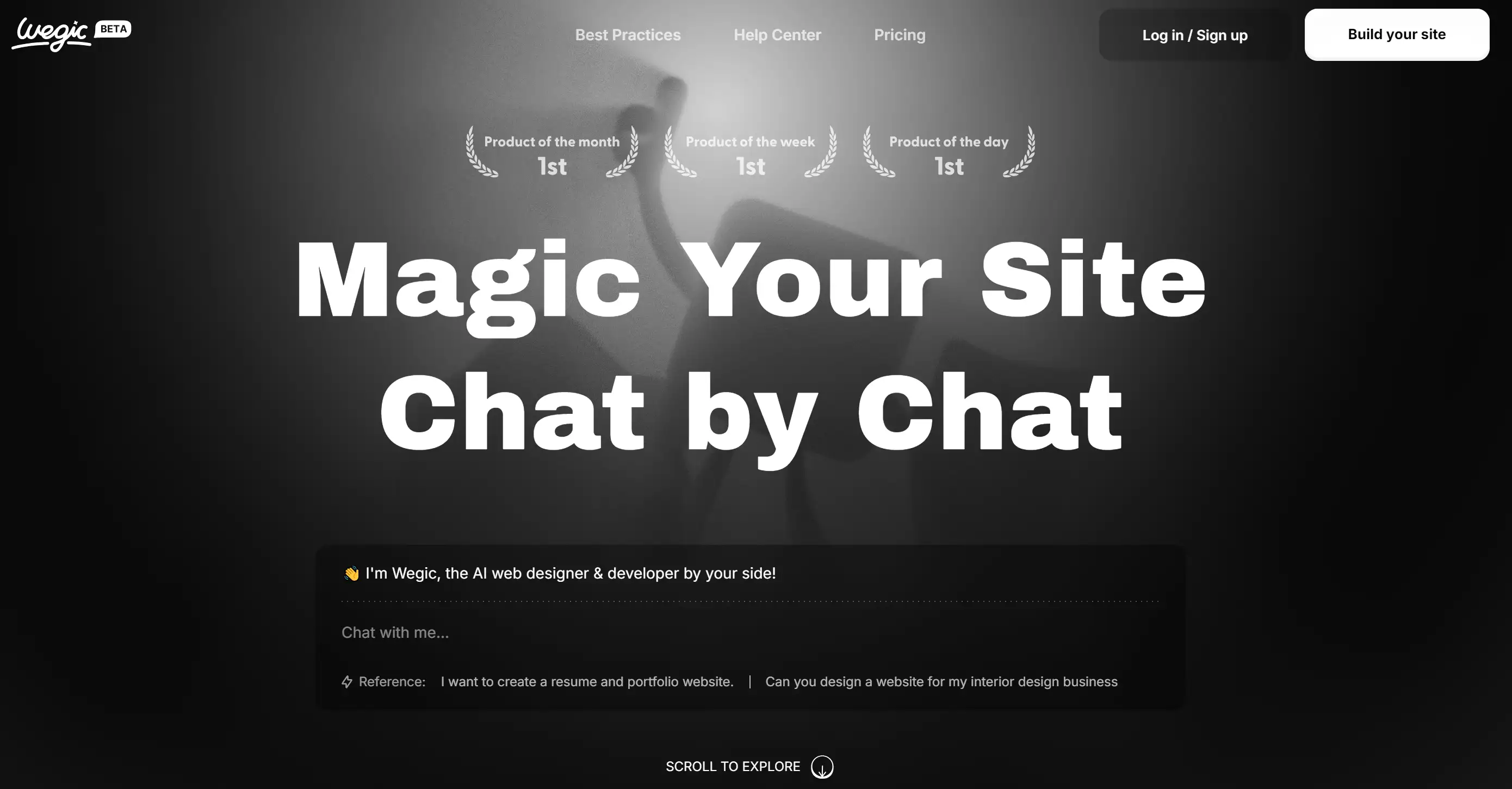
Step into the world of Wegic, where black-and-white websites take on an elegant charm. This chat-based AI DIY website builder showcases a sophisticated monochromatic palette, featuring crisp white text on a deep black background. It’s like the designer of the website knew just how to whisper professionalism while shouting modernity!
The sleek dark mode enhances content focus, ensuring the AI functionality steals the spotlight without any distractions. Navigating Wegic’s site feels as effortless as a walk in the park, thanks to centrally aligned light grey navigation options, including "Best Practices," "Help Center," and "Pricing." Above the main content, a row of understated icons celebrates Wegic’s accolades, including “Product of the Month” and “Product of the Week.” These light grey gems add a touch of sophistication.
And let’s not forget the prominent action buttons on the right: “Log in / Sign up” and “Build your site.” The latter stands out in bold white, inviting users to dive in and get started on their website journey. The main heading, “Magic Your Site Chat by Chat,” commands attention with its large, bold white text, delivering a clear message that’s impossible to ignore—like that siren call of your favourite food truck at lunchtime!
Key Features:
-
Elegant monochromatic design for a modern aesthetic
-
Centralized navigation for effortless user experience
-
Eye-catching action buttons to encourage immediate engagement
Takeaway: The call-to-action section at the bottom encourages users to scroll and explore further, directing users to interact more with the page. Black and white design works especially well in fashion, providing a high-contrast setting for showcasing products.
Pro Tips: For stunning website building, consider Wegic—our AI-powered website builder. With Wegic, you can chat with our AI assistant to create a secure site in seconds.
2. Airnauts

When it comes to crafting black-and-white websites, Airnauts is a powerhouse that merges sleek design with cutting-edge technology. Draped in a commanding black background, their website hits you with professionalism. Diagonal elements are cleverly used to lure users down the page, all the while they don’t even know what’s going on. It’s like a roller coaster ride only for your eyes!
Key Features
-
Striking black background for maximum impact
-
Dynamic diagonal elements for engaging navigation
-
Responsive design ensures a seamless experience
Takeaway: Use black backgrounds to make images pop, but balance them with minimal text to avoid overwhelming the visitor.
3. Yara Farm
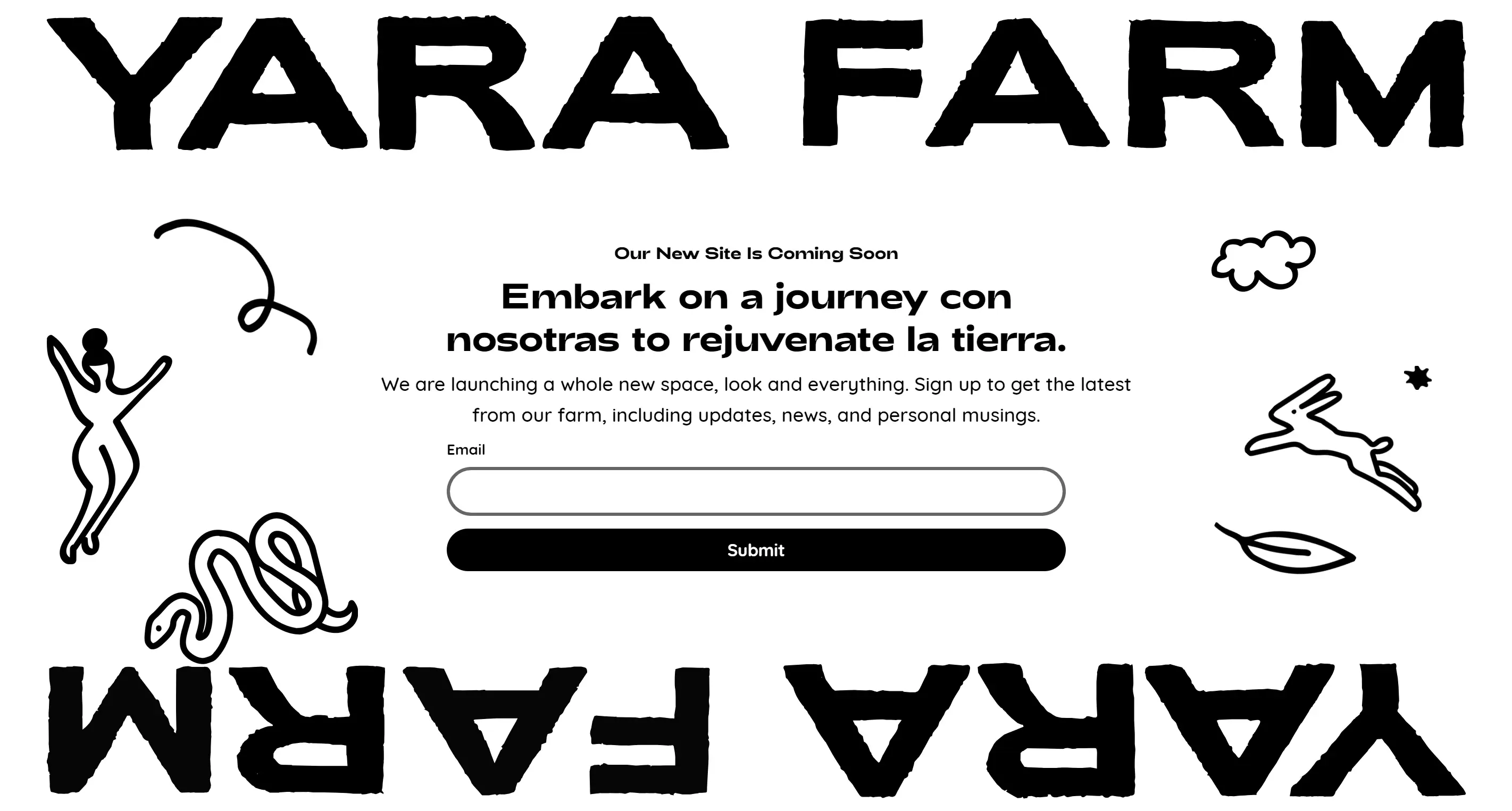
If you’re still in prep for your big launch, a coming soon page can go a long way; take Yara Farm’s black-and-white website for instance. Their minimal design is simple enough to create anticipation while also enticing emails easily via a simple newsletter CTA. Speaking of that neon green accent, this is a surprise party for your eyes, and let’s not forget this. Who knew black-and-white websites could have such a playful twist?
Key Features:
-
Clean black and white design for a sleek look
-
Effective newsletter CTA for growing contacts
-
Eye-catching neon accent for a fun surprise
Takeaway: White backgrounds in black and white websites offer a crisp, clean look, especially effective for online brands.
4. 10X Hub
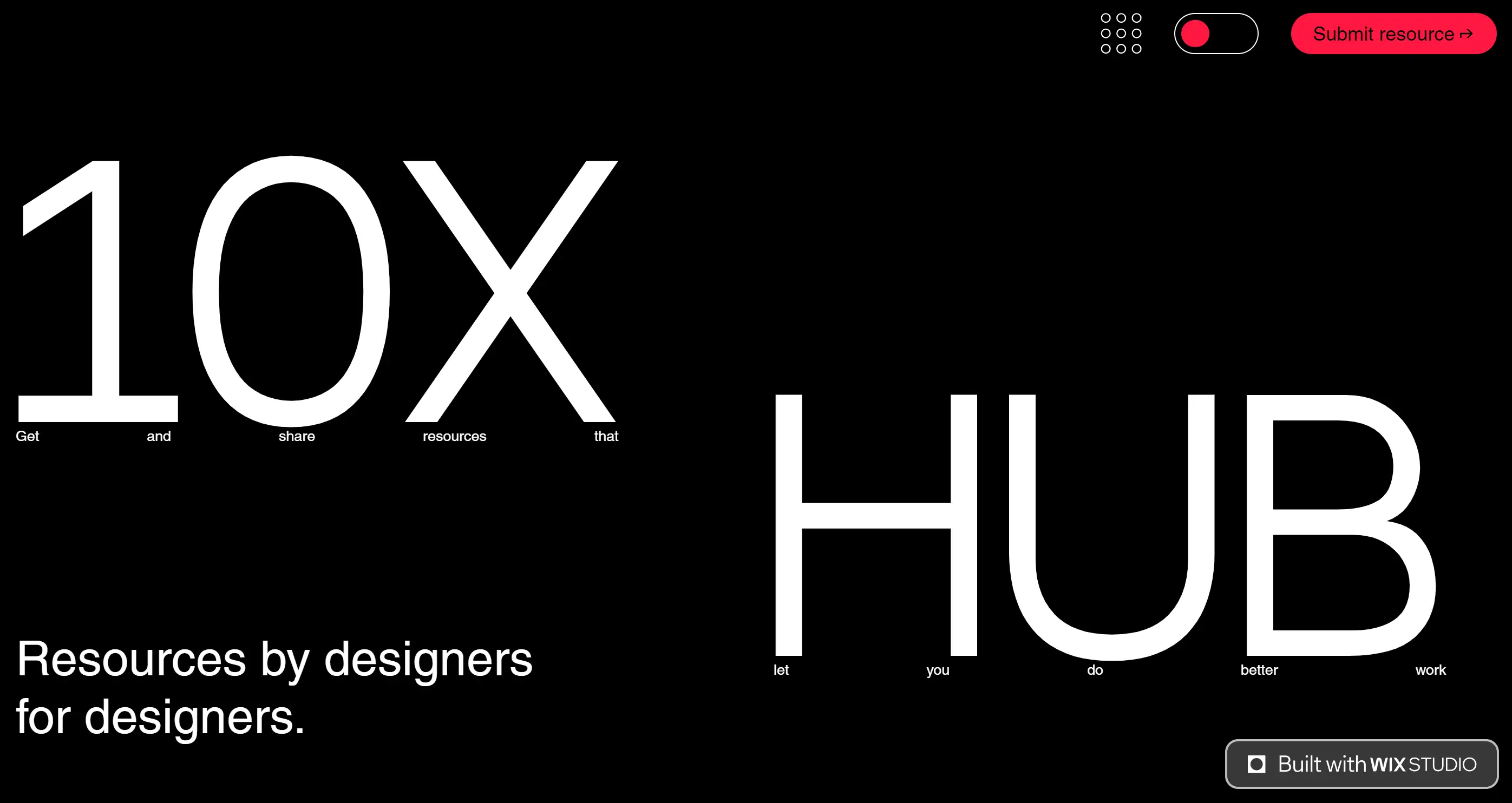
Its black-and-white website is a masterclass in simplicity for those who just want to drive one action on their site; say, event registration with 10X Hub. A jack in the box doesn’t get any more electric crimson than these guys when we see their call-to-action jumping off the page looking like it’s made of jumping. This site has shown us that a splash of colour in the right place will brighten up a minimalist theme into a bustling experience, and doing so with black and white as the canvas!
Key Features
-
Bold accent colour for standout CTAs
-
Focused design for driving user action
-
Simple layout enhancing user engagement
Takeaway: Black backgrounds with white text work well for companies that want to appear authoritative, but keep the text minimal for better readability.
5. The Ordinary
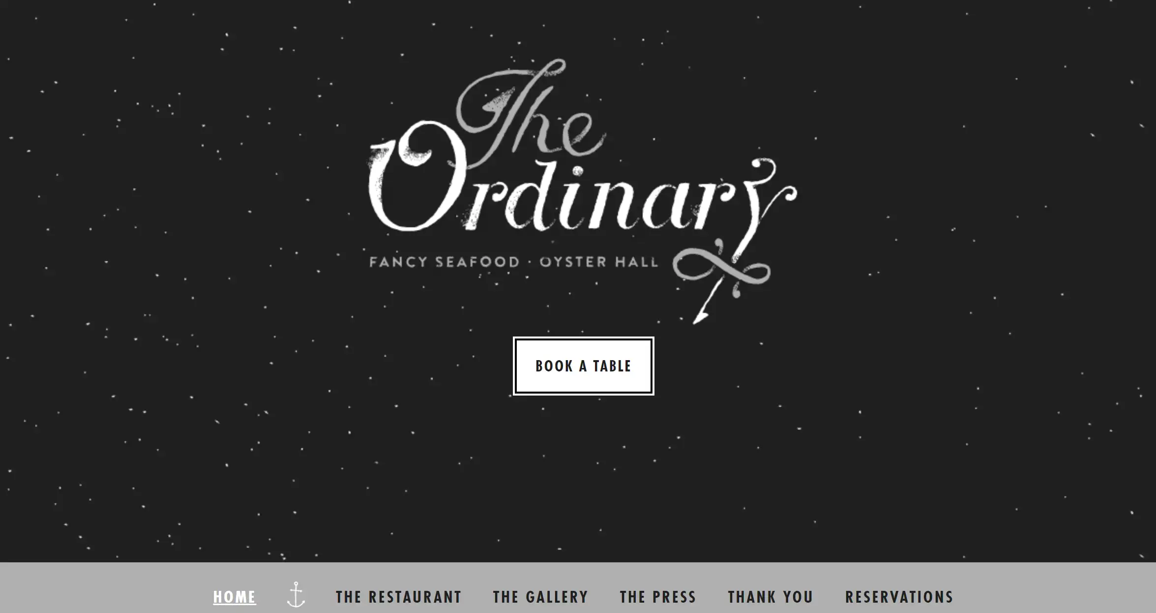
Who said black-and-white websites can’t be romantic? The address of The Ordinary’s site is a dreamy crossbreed of class and nautical joie de vivre, enchanting like a starlit evenin’ aboard (sans seagulls). The backdrop is black, setting the mood, and the grey adds echoes to its seafood theme. Poop is the perfect bait to get hungry diners thinking they’ll be getting something for their meal.
Key Features:
-
Elegant black background for a romantic feel
-
Nautical-themed icons enhance the seafood experience
-
Minimalist design that highlights the menu
Takeaway: Alternating between black and white backgrounds can add depth and inquisitiveness to your design.
6. Golden Suisse

In brilliant black and white, Golden Suisse uses an elegant theme for a site that’s all about protecting your wealth and privacy. In a way their website gives me an exclusive feeling, as soon as I visit it, I feel like a VIP already. The homepage has only under 100 words and there’s plenty of negative space, making it easy on the eyes and easy to scan. It’s like a luxury boutique for your digital needs; no clutter and all class!
Key Features:
-
Luxurious black background for a premium feel
-
Concise content ensuring clarity and focus
-
Plenty of negative space for a clean look
Takeaway: Less is more. Minimalism in black-and-white websites draws attention to key points without overloading the user. AI functionality is now the most important part of user experience (UX), and the dark mode theme helps focus on the content.
7. Eylon Malkevich
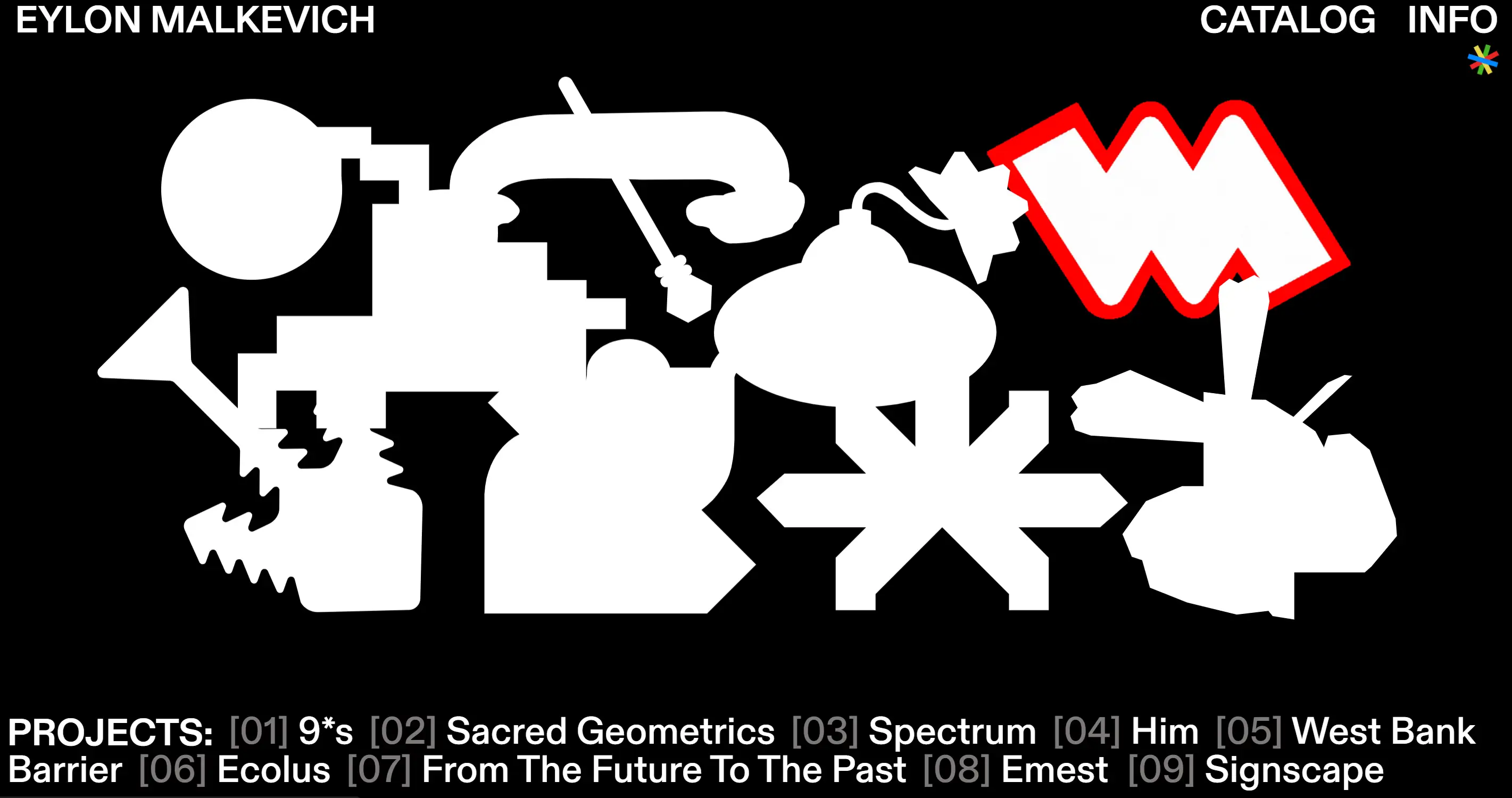
Eylon Malkevich breaks the mould with a playful spin on black-and-white websites. The simplicity of black and white combined with the colorful interactions of your most remembered childhood cartoon, melded together is used in this creative portfolio. The white text used on an all-black background like it's somewhere in the ’90s gives you this feeling of creativity that you are somehow out of place.
Key Features:
-
Fun, colourful interactions add character
-
Nostalgic design elements for a unique touch
-
Ample negative space enhancing curiosity
Takeaway: In your black-and-white website, don’t be afraid to try out bold typography and animations to help create an impressive experience.
8. Salt & Pepper

Salt & Pepper is a responsive website development company with a name like Salt & Pepper so its design is very bold black and white. At a fine dining restaurant, they ride their technical support and custom website functionality like a master chef, mixing each element perfectly just for client success. A no-thrills approach that proves that simplicity can taste good!
Key Features:
-
Clean black and white design reflecting professionalism
-
Responsive layout for a seamless user experience
-
Focus on technical support and custom functionality
Takeaway: For industries like furniture, a black-and-white website can echo the clean, precise nature of the work, enhancing the portfolio’s visual impact.
9. Replica
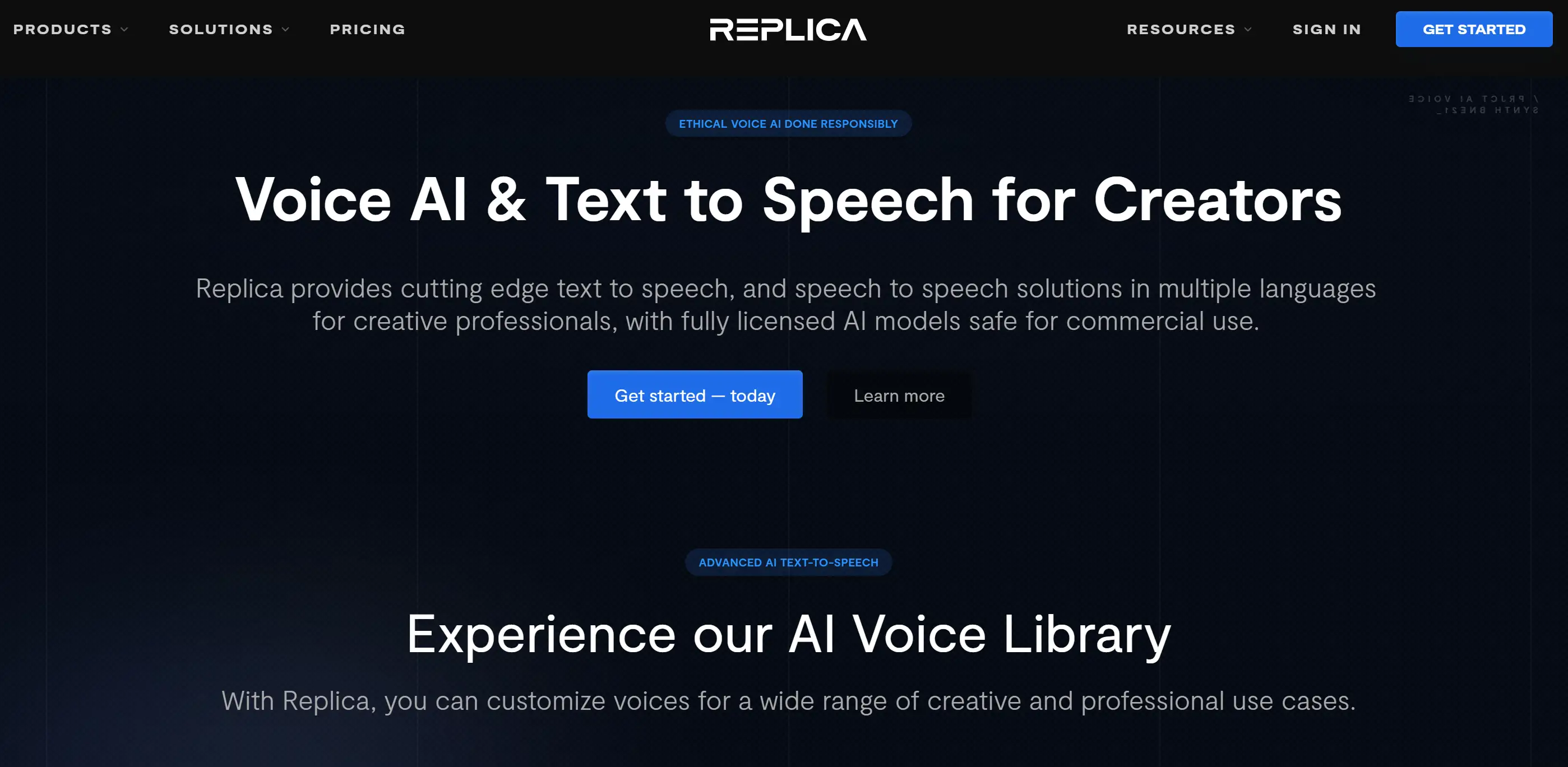
AI voice actors could seem daunting, but Replica Studios brings it down a notch with their black-and-white website. It provides mere information so that visitors are not overwhelmed with the complexities it presents. Kind of the 'less is more' philosophy where a little guidance in the form of a concise explanation and some gratifying video demo help make for a packaging that's informative and inviting. Often you will leave wondering why AI can’t cook your dinner too!
Key Features:
-
Straightforward design for easy navigation
-
Video tutorials simplifying complex topics
-
The black-and-white colour scheme ensures clarity
Takeaway: A black-and-white website can help complex subjects, such as tech and innovation, to seem accessible and transparent. The text on the dark background is given depth and contrast with a subtle shadow effect.
10. Oto Nove Swiss
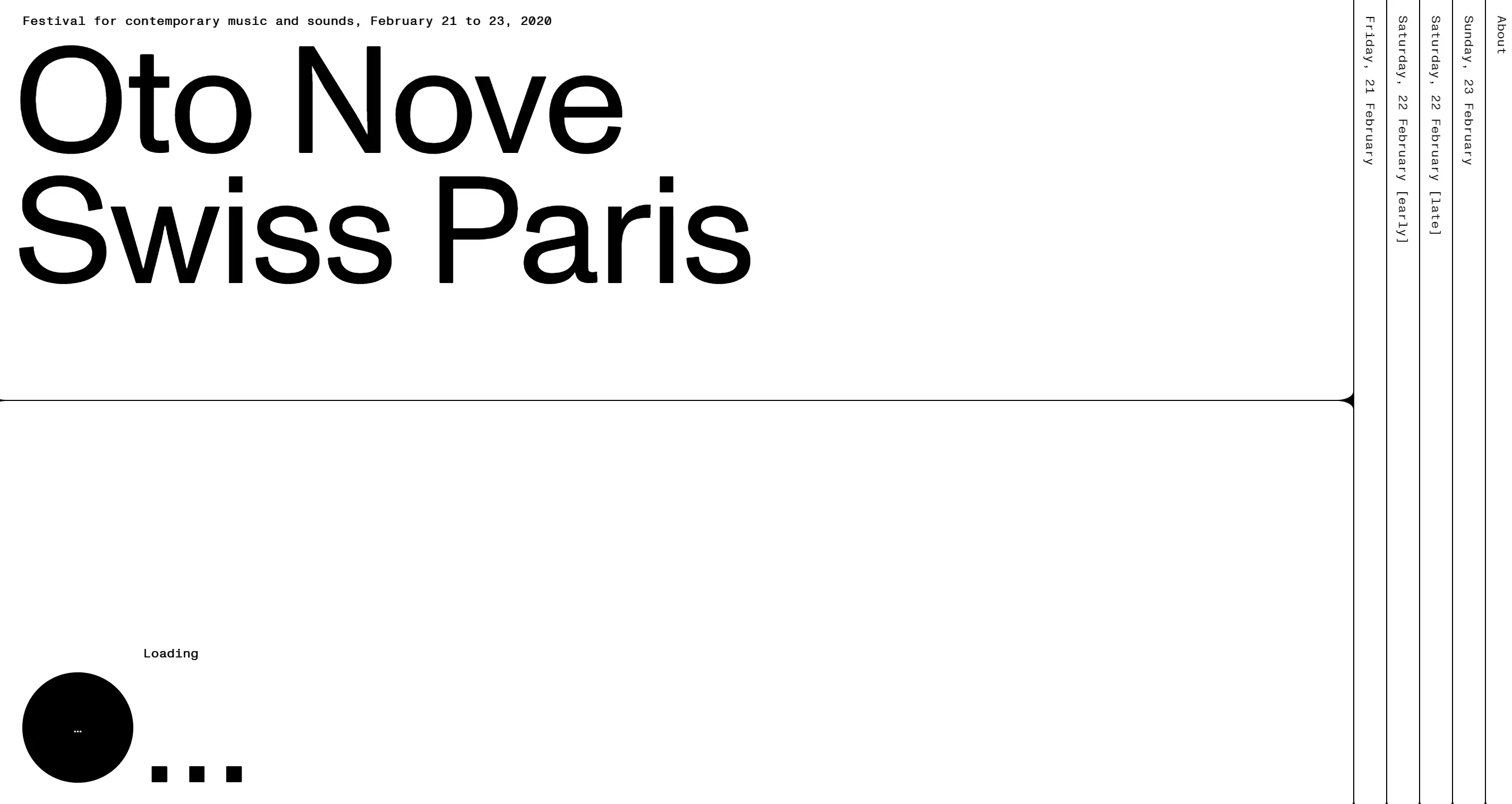
Oto Nove Swiss proves that black-and-white websites can be anything but dull. Check out their minimalist site that dazzles with cleverly chosen typographic choices which move as if they are a well-practised ballet. The engaging navigation menu and immersive song snippets make browsing so exciting, that you almost forget you’re just sitting there. You might even just grove your seat!
Key Features:
-
Memorable minimalist design for a lasting impression
-
Dynamic typography enhancing user engagement
-
Immersive audio snippets add an interactive element
Takeaway: For entertainment brands, black and white create a strikingly bold, cinematic feel that commands attention.
FAQ: All About Black and White Websites
Is black-on-white webpage design a good UI?
A strong UI of black and white of black and white for website design is what many use. That’s the very heart of web design. Black type in a bright white isn’t just more legible, it’s also more relaxing for the eyes, allowing users to enjoy your content naturally. The colour scheme we’re using is perfect for websites that deal mostly with content – such as blogs and news platforms. Black text on white stays easy to navigate on every device. It works and it has been implemented for a good reason. Some would call it simple, but it does the job well. Users can sense their arrival and tend to hang around your site if it is comfortable.
You might consider playing around with different font types and font arrangements to make your site more identifiable while still keeping the use of this colour combination intact. A trick to originality in typography, turning a usual black-and-white site into an interesting, stylish showpiece.
Should a Website be White or Black?
The answer to this question is highly valuable! One strategy fits all is not the case as the feeling you aim for significantly influences the solution. To achieve a smooth and classy aesthetic strongly favours a black-based online design. A strong sense of authority emerges from black; it enhances a website’s image when combined with vibrant graphics and little text.
In contrast, a pure white site displays minimalism and simplicity. This suits you if you desire a clear and inviting layout. A clean white look grants your website clarity and openness ideal for fresh-looking e-commerce sites or personal portfolios.
Combining black and white creates an excellent combination. Many designers choose to combine these shades to create dynamic, engaging black-and-white websites that appeal to a wide range of audiences. Want to add some punch? Use a contrasting shade to draw attention to crucial sections like buttons or promo links. Perfect proportions are vital; experiment with preferred designs for your brand.
How to Make a Black and White Website Look Good?
Many people believe that creating a black-and-white website requires making designs dull and uninspired. This idea is false. Boosting visual components is what it's really about. With just two hues available for you to use in design every decision becomes more vital. You have to rise through the noise of vibrant designs; hence your creativity must reflect in unique ways.
Highlight powerful fonts to differentiate your black-and-white site. Sans serif fonts for websites will provide support for a design with one tone. Explore bold stylish fonts for section titles and clean fonts for text body. Merging typefaces can enrich and fascinate a basic scheme.
Be mindful of how much space you incorporate. Allow your details to have their own identities. This increases elegance and assists users in focusing on vital elements of your site. Remember: Even though it is monochromatic, your website can look less cluttered.
Finally, try a bit of visual engagement. By adding modest animations or hover effects, you can transform your black-and-white website into a lively and engaging space. These additions should not rise to extremes; instead, they can invigorate a straightforward design.
What Color Goes Well with Black and White Websites?
While black-and-white websites are stunning on their own, adding a splash of colour can elevate the entire design. By using bold colours like gold and vibrant blue, you can emphasize critical features on your no-code website.
Consider it like polishing off an already perfect dish. Using a few colours carefully can direct your visitors and highlight specific elements. Using a bright yellow "Contact Us" button on a polished black-and-white webpage instantly attracts attention and shepherds users straight to it.
Selecting an accent colour hinges greatly on the mood and sadness you want to project. A noticeable element of urgency or intensity may come from red; however blue often symbolizes trustworthiness. Remember to stay within reason. For your website to stand out subtly, allow the black and white scheme to dominate with the accent shade illuminating it.
When you combine black and white beyond their basic form with a bit of color palette choices; your site transforms into an appealing and efficient website. With black and white web design choices exist for personalization without sacrificing style.
Ready to Ditch the Rainbow? Let’s Go Bold with Black and White!
So, after seeing these stunning examples and learning about the benefits, are you ready to say goodbye to the overwhelming chaos of colour and embrace the bold, timeless charm of black-and-white websites? It may seem overwhelming for many—but I worry about the potential for your site to look flat or uninspired. Incorporate the appropriate elements for your design and your website won’t feel lackluster. Crafting a black-and-white website effectively enhances your brand and gives your visitors a refined sense.
If you're not certain about your beginning or finding that right balance feel free to take action. It’s unnecessary to work everything out alone. To achieve the ideal black-and-white site effortlessly and free from uncertainty, Wegic brings our AI-powered web builder along. Visualize a website that resembles a professional design effort without needing endless back-and-forth. Why not let Wegic assist you and step up to an original and bold design like your vision?
Written by
Kimmy
Published on
Mar 17, 2026
Share article
Read more
Our latest blog
Webpages in a minute, powered by Wegic!
With Wegic, transform your needs into stunning, functional websites with advanced AI
Free trial with Wegic, build your site in a click!
What kind of website do you want to build?