Log in
Build Your Site
10 Web UI Design Tips for Your Next Website (updated 2024)
Discover the difference between UI and UX, and get actionable tips for creating a seamless, mobile-friendly, and visually appealing design.
Do you remember the last time you went to read articles somewhere on the internet only to get lost and confused about how to get to a certain link or icon? Don’t worry, you are not the only one to face this issue due to poor and defective User Interface design. If, for example, you have ever found yourself trying to build a website that not only would have a pleasing design but would also function as intended, then this article should help.
This is especially so for any web designer who is charged with the responsibility of establishing a site that meets aesthetic, navigational and user experience thresholds. That is why I am here to give you some tips on web UI designs that will make your site more friendly and more attractive to most of the users out there as well as to increase usability and make the site more suitable for use on mobile devices.
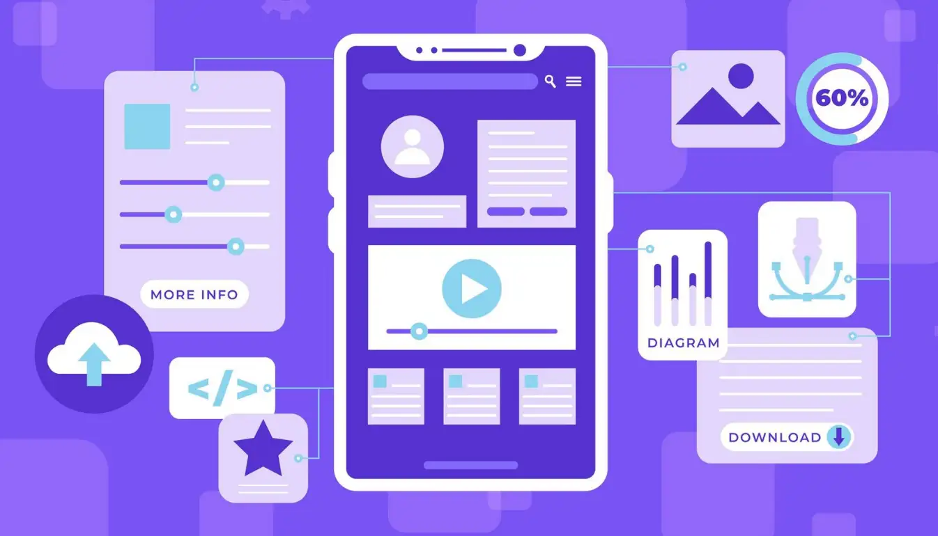
If you have no idea where to begin, you don’t have to worry. I will show you elegant principles of web UI design that will help you update your site’s appearance and make it easy to use. So let these web UI design tips be helpful As you know these are the key things to keep in mind when designing your website no matter if you are a beginner or have some experience. Thus, let me share these web UI design tips and bring your site to the top-performing one.
What is UI?
To kick it off, we must establish that the terms UI and UX are not interchangeable. Although the two tools are closely related, they are effectively applied for distinct purposes in connection with web design. But before analysing the differences between UI and User Interface, or UI for short, let’s take a closer look at what it means.

Essentially, UI means the graphic interfaces of Web sites or, in other words, buttons, input fields, sliders, pictures, etc., and numerous other aspects that should be pointed out. It is the form of objects, which can be seen and felt on the screen, for example, the color of a “Submit” button or the animation of a dropdown list. Let’s remember here that UI is the visual aspect of a website, whereas UX is the tangible, touchy-feely kind of sense. If your website were a car then UI would be the car’s dashboard, steering wheel, and gears whereas UX would be about how the car drives.
Therefore, with all these features, how does the UI affect your website? Picture this: a user arrives at your site and for instance, feels a need to purchase a particular product. Just imagine that some user finds your navigation menu hard to understand; the “Buy Now” button is placed somewhere in the middle of the text—this user will likely leave without purchasing anything. That is when great web UI design tips do come in handy. Therefore, maintaining the users engaged and happy is always the key, which can be achieved with the help of such minor aspects as layout simplicity, font readability or great visuals.
The Difference Between UI Design and UX Design

Now it’s time for UX or User Experience. While UI may be confined to style and ways through which a user can interact with your site, UX looks at the overall impression a user gets when they are using your site. It is the part that creates not the mere aesthetic of what a website is, but the actualities that make it enjoyable to navigate. Indeed, UX is concerned with navigation from one page to another, with how quickly the site loads and with how efficient its users are in achieving what they want (which can be to buy something or to find out some information). While UI might be akin to getting a shiny wrapper on anything, UX is the simple design that guarantees that everything on the outside functions perfectly inside.
The biggest difference? UI stands for User Interface and UX stands for User Experience; UI is focused on the aesthetics of the object while design UX process is concerned with the functionality of the object. You can design a site, and make it very beautiful and innovative, but if the users do not understand how to navigate it, then the appearance of the site becomes useless. However, there will be web UI design tips that are necessary for the design as well as a great emphasis on the usability part, which is UX.
Namely, UI is the brush that the web designer skill presents, while UX is the map for the guest to find his/her way around the painting. In combination, they ensure that your site not only boasts a great layout but is also usable and as intuitive as possible. And it is worth recalling that, using appropriate web UI design tips, even the best-tuned user experience can fail. To a greater extent, both are the fundamental aspects that need to be well implemented for your website to be considered a masterpiece.
10 Web UI Design Tips to Upgrade Your Website
If you find that your website is slowly becoming more and more similar to a classic phonebook rather than an iOS application, fear not! We’ve all had our sites reach a point when they seem to be crying out for a design overhaul, and the good news is that there are web UI design tips for that. Below, we’ll cover 10 practical and creative ways to make your website not just look better, but work smarter for your users.
Make Navigation Simple and Obvious

Navigation can be regarded as the map of your website with directions on how the operations should be performed. If users cannot find the way through the site, they will leave faster than you can say “404 error. ” An intuitive menu navigation is crucial here. Whether you use the hamburger icon for mobile navigation or a standard top horizontal bar for desktop, people have to be able to navigate easily. Another usability principle of web UI design is simplicity of navigation: they don’t want to be driving in circles looking for the contacts page!
Prioritize Visual Hierarchy
Have you ever actually seen how our attention is immediately attracted to the largest and the largest text on a page? That is exactly what is referred to as the arrangement known as visual hierarchy. Through the manipulation of font sizes, colours and positioning of various sections, one is able to lead users’ attention to where one would wish them to focus most – for instance, a call to action button or an announcement. Each of the web UI design tips to follow can be summed up in one word: prioritize; ensuring that your most important content is the focal point and everything else is secondary.
Use Consistent Branding
Picture this: it means you open a website with a symbol in blue color, but scroll down, and it is half-way pink in neon. Confusing, right? Consistency in branding is also helpful in developing the credibility and some form of recognition in relation to your target clients. Use consistent colour scheme, font for websites, style and the way of communication throughout all the companies’ pages. It will not only help to enhance the overall professional appearance of your no-code website, but it will help the users to know that they are still on the same site and not some bizarre parallel universe.
Design for Mobile First
Here’s a fun fact: you’re designing your website like it is the masterpiece of the century to discover that the majority of your visitors are using their smartphones to access it. Designing for mobile first is similar to inviting your friends over for dinner with all the dishes on the table, but thinking of how your friends are still going to be comfortable eating while running.
Paying especial attention to mobile friendliness is important as, frankly, if your site does not stand out on the smartphone experience, it is sort of like competing on roller skates. Web UI design tips should be followed in order to design a mobile interface that performs very fast. With a stronger mobile experience, more users visiting your site as they use phones and navigating through the starting web pages proves to be transformative. Therefore, mobile first design adoption can dramatically increase your users satisfaction rate.
Utilize White Space
White space can be described as the break or space that a website needs to ‘breathe’. In a way, it’s like letting your content go for a walk, get some fresh air, exercise and come back with more energy and vitality to your content. White space can have a positive impact and improve the overall appearance of a site and add a more professional appearance. This is not about making any space empty; it’s about the mediation between text, image and any space that is in between. This tip under web UI design ensures that your site is not congested with too many items hence making it look very jampacked. How about if all these had to fit into one page; that would actually be the icing on the cake! White space helps users’ gaze and simplifies navigation; therefore, your site will be both aesthetically pleasing and easy to navigate. Therefore, do not avoid blank space as it is something that makes your sensational and aesthetic website!
Use High-Quality Images and Graphics
Who wants to get pixels, or blurred images anymore? It is as though they have a book smearing a foggy window and they are desperately trying to read what is written inside. Beautiful aesthetics make your website shine, so ensure you spend a bit on images and graphics. Clean and sharp graphics not only make your website look professional but they also get your point across much better. This means if it’s a hero image that appeals to the emotion of the audience or icons that are used in the site make sure everything looks spectacular. Once again, it is worthwhile to recall that the web UI design tips mean to make every pixel matter! Remember to also make these visuals properly optimized so that it does not take ages to load them like how we hate waiting for a slow slideshow. High-quality images and equally clear graphics provide your website, and therefore your business, a look that is worth millions but doesn’t need to cost a million!
Create Engaging Call-to-Actions
Well, ‘submit’ and ‘click here’ no longer hold the charm due to the increased competition and more sophisticated users. Revitalize your call to action – or CTA buttons are they are known – with dynamic action words. An example like, “Join the Fun” or “Start Your Adventure” is going to be much more inviting than the previous ones. Another web UI design tip that starts at the most basic level is the understanding that call-to-action buttons have to look different and give a rather clear concept of what is to come.
Make Forms User-Friendly
We all have probably dealt with forms that it takes a sharp mind to fill in properly- Do not make your website that difficult to deal with. It is recommended to set the forms to contain as few questions as possible and those which are necessary. When your form is more than a grocery list, it is advisable to divide it into segments so that the users are not overwhelmed by the number of inputs you are asking for. Instead, they should provide the borrowers with clear and friendly labels and intelligent error messages to navigate them. Remember, the purpose is not to communicate to the user a feeling that makes them want to abandon what they’re doing; the process has to be seamless. Perhaps one of the most helpful pieces of web UI design tips is how to turn those things that one despises most, forms, into something that is enjoyable to use!
Optimize Your Website for Speed
No one would like to wait for a website to load and this is even worst when the attention span is so short. A slow loading site can result to higher bounce rates and consequently lower conversion rates of a business. Optimise your images, reduce your code where possible and use cache to improve your site performance. To the point, one of the most vital web UI design tips is that the site that loads quickly keeps users energized.
Test, Test, Test

Oh yes, designing a website is not just as simple as developing it and that is why testing is very important. Carry out A/B tests on layout, colour and the buttons to see which is preferred most by the target market. This is usually done in determining which of the two versions receives more click throughs or which of the versions has users linger longer. As if you are a detective of your no-code website! There are resources such as Google Analytics, which help in the determination of the behavior of the users as well as identifying what may be growing or declining in terms of the strategies applied in the business. One of the smartest web UI design tips is to never stop tweaking and refining based on real data because even the best designs can always improve.
Ready to Wow the Web with Your New UI Superpowers?
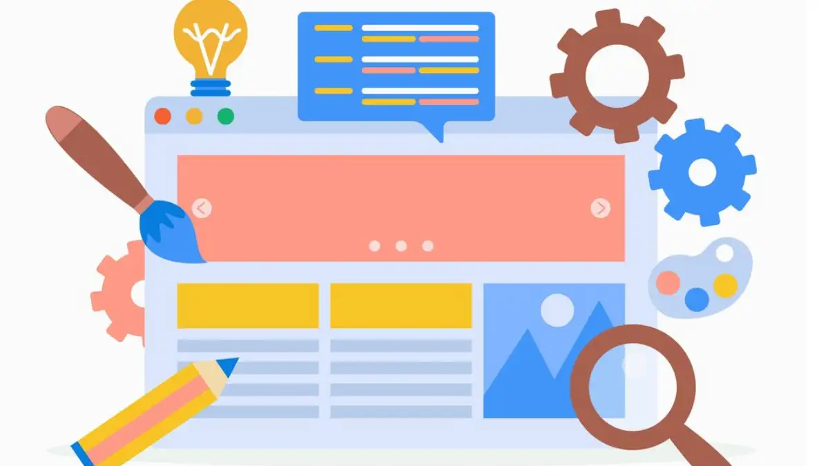
Now, you have quite several web UI design tips in your belt to enhance your site to the next level. But if by any chance you are still finding yourself a little bit stressed—don’t worry, I understand completely. Being able to manage so many factors, all of which play a crucial role in the determination of an optimal user experience is not easy. Between choosing the featuring colours, the placement of the items, and the possibility of all the options to be viewed on the device or a tablet, a person can easily get lost in the number of options.
But here’s the good news: this is particularly encouraging when you do not have to do it alone. armed with these tips in web UI design, you should be at a good starting point. And if you ever think that you are getting trapped or that there is no way out, then worry not. Kindergarten is a perfect description of the world of design and, more so, the design process that we operate under in this field.
The best part? It is good news as Wegic's AI assistant is here to make everything much easier. It can assist you in implementing these web UI design tips without having to bother with coding or sitting in front of an empty page for several hours. It is like having an assistant who understands every trick to make your website as user-friendly, beautiful and fast as possible, meet Wegic.
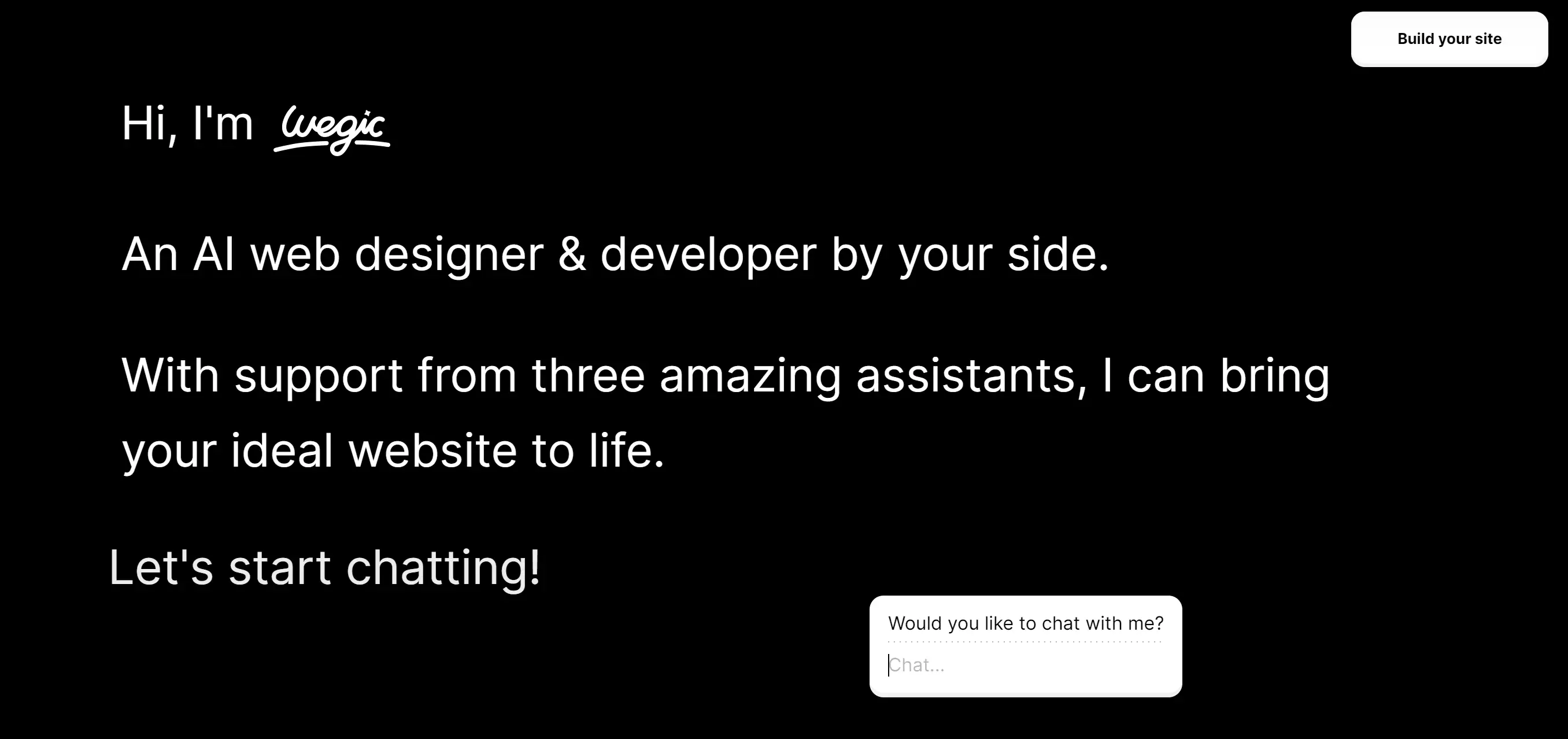
Wondering how to start a web page without pulling your hair out? Meet Wegic, the AI-powered wizard that turns website building into a breezy conversation. Imagine talking through your ideas, and voilà—your dream website is crafted in real-time. Wegic’s chat-based design is so user-friendly that even your tech-averse grandma could whip up a snazzy site for her knitting club. With versatile customization, Wegic is perfect whether you’re launching a stylish portfolio or a cozy blog. Plus, its AI-powered magic ensures every pixel is picture-perfect, making Wegic the ultimate sidekick in your web creation adventure.
Key features:
-
Chat-Based Interface: Wegic turns the web design process into a conversational experience, allowing users to build their website simply by chatting about their ideas, making it incredibly user-friendly and intuitive.
-
AI-Powered Design: With the help of AI, Wegic effortlessly transforms your concepts into professional designs, blending creative freedom with precision to ensure a polished final product.
-
Versatile Customization: Whether you’re creating a personal blog, an online portfolio, or a business site, Wegic offers extensive customization options, enabling you to tailor every aspect of your website to fit your unique needs.
Therefore, why wait? After you learn these web UI design tips, today let Wegic be the tool that would enable you to transform your visions into reality by creating stunning and responsive websites that both you and your users would appreciate.
Written by
Kimmy
Published on
Mar 17, 2026
Share article
Read more
Our latest blog
Webpages in a minute, powered by Wegic!
With Wegic, transform your needs into stunning, functional websites with advanced AI
Free trial with Wegic, build your site in a click!
What kind of website do you want to build?