Log in
Build Your Site
How to Build a Donation Website: Your Complete Step-by-Step Guide
In this article, we will give you details on how to create a good donation website to attract more donors to your organization.
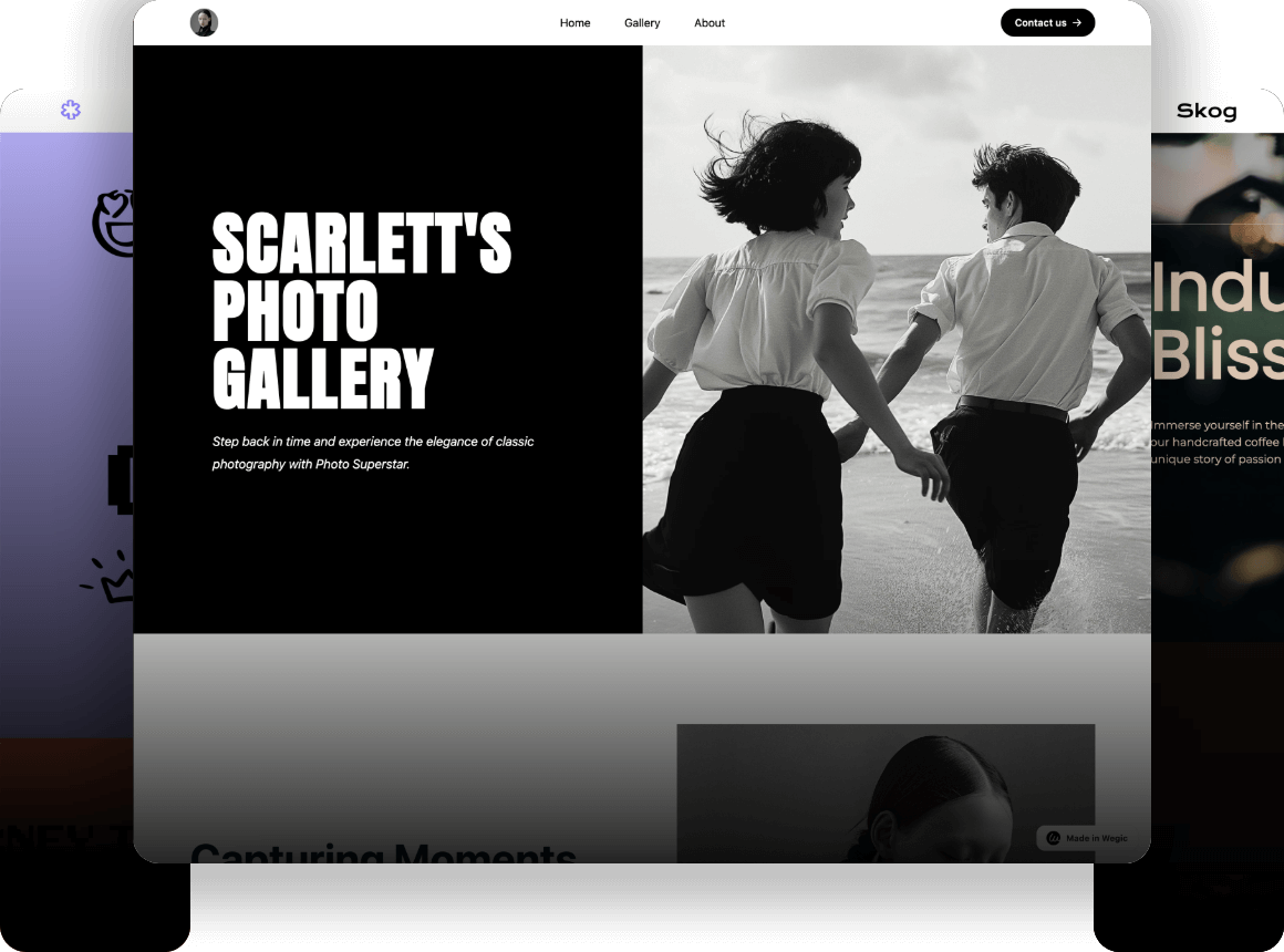
Take a second look at your donation website: do you think it gives you the urge to donate? If you don't feel that way, chances are the potential donors browsing your website do too. So, if you want to raise more donations, then knowing how to create a donation website that encourages people to take action is crucial.
As we all know, placing a PayPal link directly on your website is the easiest way. But in practice, it doesn't have the effect you'd hope for. On the contrary, your donation page should provide detailed information about your organization and its activities, rather than asking for it.
In this article, we will give you details on how to create a good donation website to attract more donors to your organization.
Click here to Build your site
How to Create a Donation Website: A Step-by-step Guide
Step 1: Choose an effective website-building tool.
Whether you want to create a donation site or any website in other areas, the most important and first step is to choose a suitable site-building tool. Nothing can be done overnight, which is why we need to ensure that the donation website is built on a sound foundation. Fortunately, there are many website building tools on the market for us to choose carefully.
Site-building tools can be divided into many kinds, including free plans, paid plans and customizable support for enterprise customization and so on. We believe you can find the platform that best suits your budget and needs. Like Wegic, the world's first AI website designer and developer.
At the same time, you should also consider the optimization needs that may arise in the future. Your web outcomes may change as your organization matures, campaign effectiveness, and project expansion. Wegic just happens to support continuous content improvement and SEO optimization after you build your site.
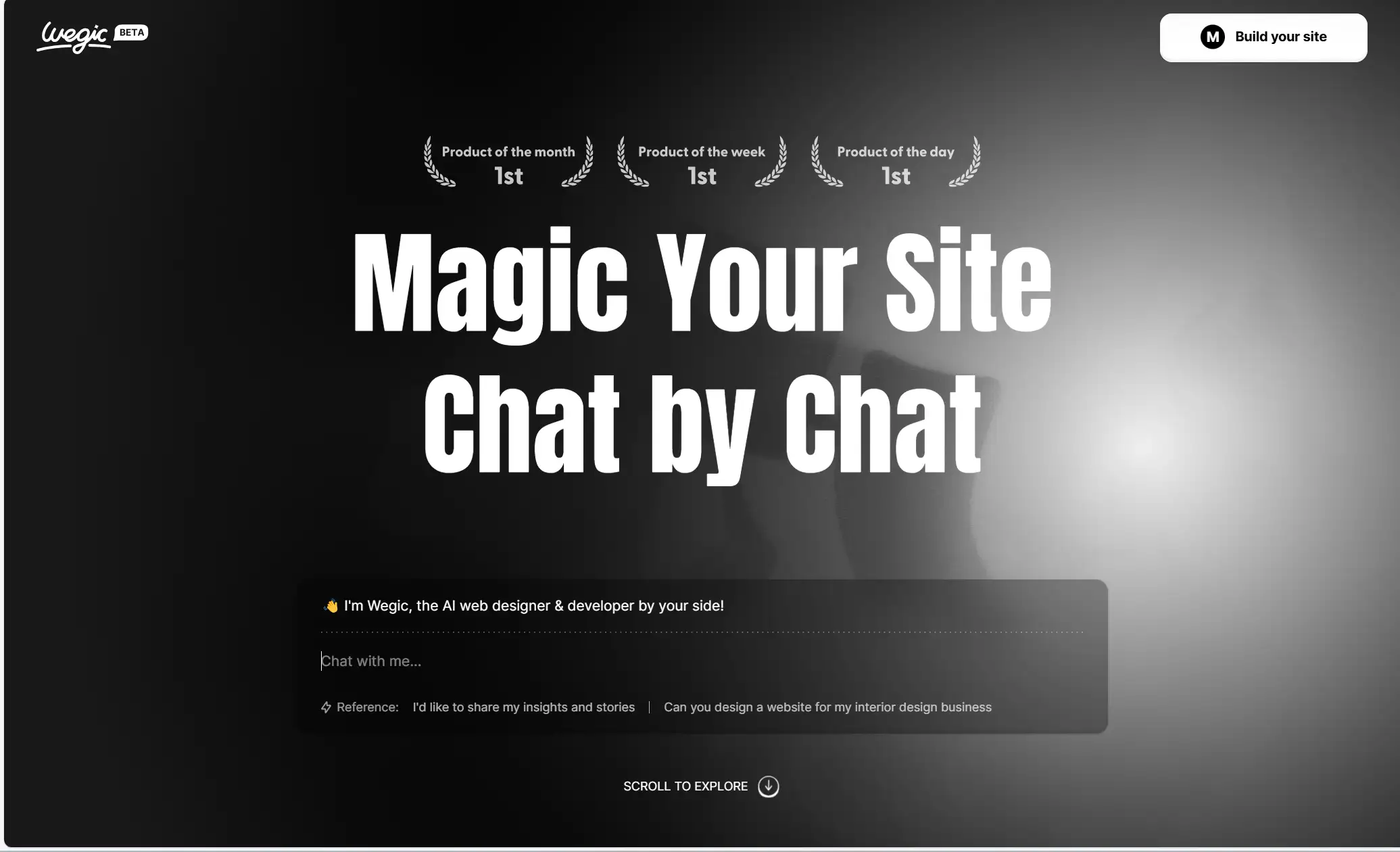
Step 2: Create a story that people can relate to
When you have the help of site building tools, creating a fully functional website becomes very simple indeed. But we still want you to take the time to write a more detailed story for your site. It's important for people to learn about your project and donate to support it, and only if they know that what you're doing is worthwhile and worthwhile will they donate their valuable money to you.
Just like writing an English essay, your fundraising website should be careful about its length and include some basic questions, such as who is doing it, what is it doing, why, and how. Here are a few core questions you should answer on your website:
-
Who could benefit from your project? Be as truthful and complete as possible. Explain why they deserve to donate.
-
Why do they need donations? Tell potential donors what problems the recipient is facing.
-
When do you need these funds? It's important to tell your supporters when you need money and let them understand the urgency of the matter.
-
What are some ways donors can help? List specific expenses or supplies that you or the recipient need help paying for.
These questions can help people understand exactly what impact their donations will have.
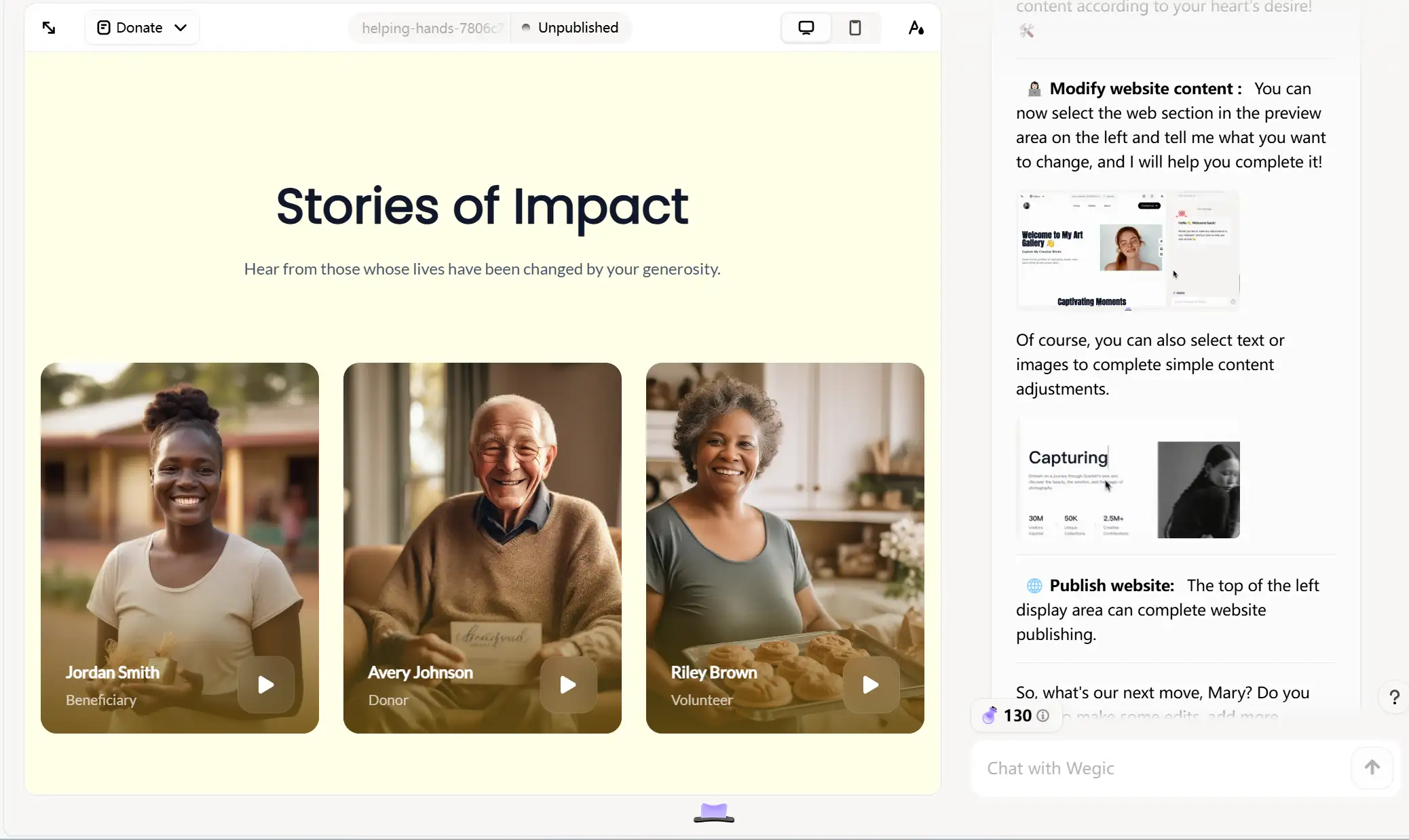
Step 3: Decorate your page with multimedia elements
Adding some images and videos can further optimize your donation page, as visualizing content can tell people about your project and show the results of your cause in a more intuitive way.
But remember to use high-quality, clear images, and don't use pixelated images or images that have nothing to do with the topic, which will reduce the credibility of your website. We recommend that you choose personalized photos, videos, or audio that accurately convey the character of your project.
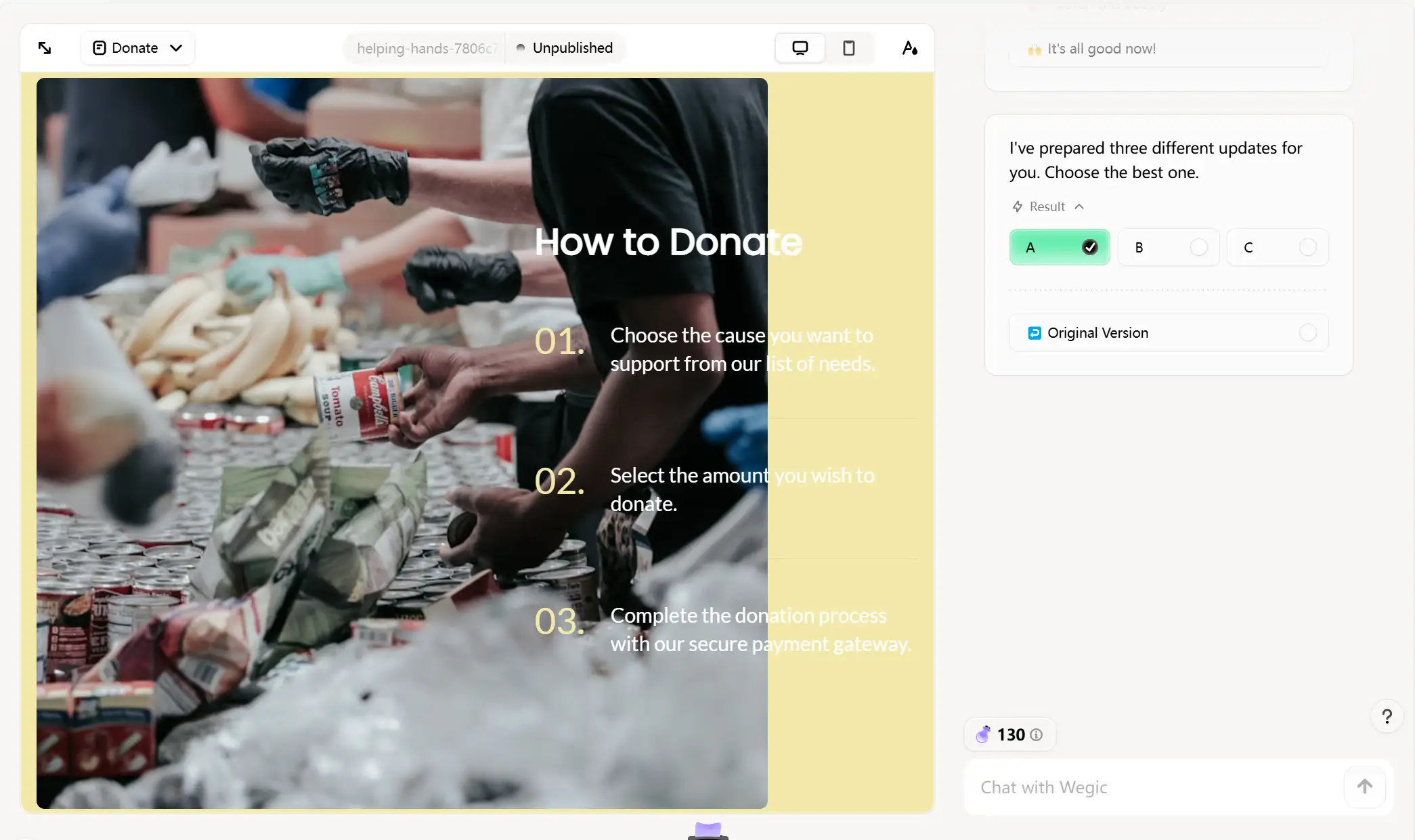
Step 4: Showcase your goal on the website
In fact, designing a website for donation is all about creating a space that inspires trust among potential donors and making the process as easy and fluid as possible. To achieve this goal, we suggest you design the homepage in a way that makes it relevant to the mission and values of your charity and try to resonate with your viewers as much as possible.
Be careful not to overstate the need for the donation, but you can state the positive change and benefits that will result if the donor gives.
For example, if you want to design a website that helps women learn professional skills and provides them with professional guidance, state your mission and goals on the homepage of the website. Comments from women and past donors who have benefited can be included below and posted as a way to donate to the cause. It just happens, it doesn't happen on purpose.
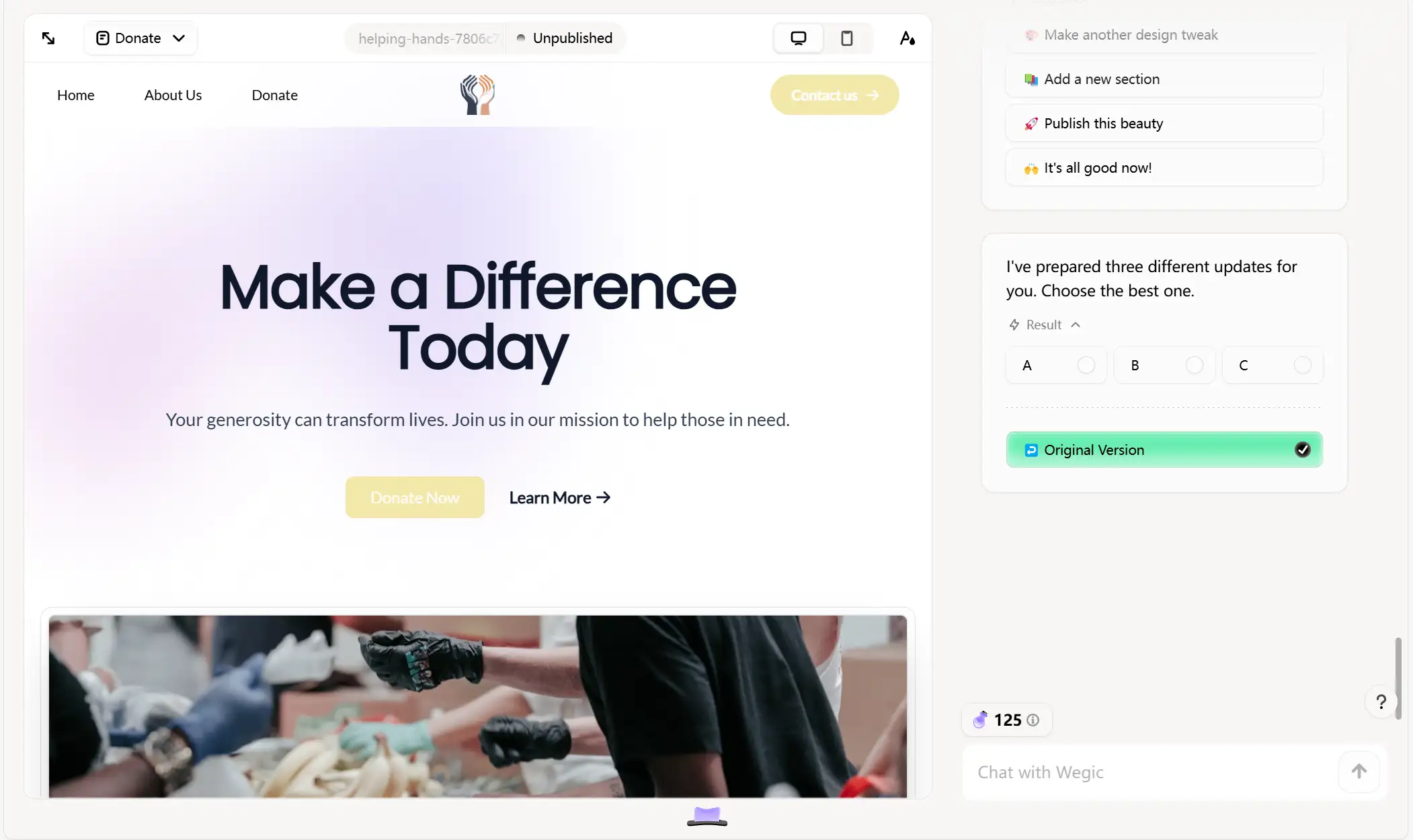
Step 5: Personalize your page with an interactive section
In this step, you need to design the structure and layout of the entire site, and include buttons or logos in prominent places that will direct visitors to donate to you. Here are a few things you can do to create a great donation page:
Simple donation process
It's not easy to get donors to click through. Therefore, the fewer manual clicks required between the donor's intention and the completion of the payment, the better. Donors can be guided through integrated donations.
Provide a variety of fundraising methods
In addition to fixed amount donations, you can also provide your donors with long-term continuous donation channels such as monthly or quarterly payments and in-kind donation channels, so that people with different preferences can donate to your project. And can provide a variety of payment methods, such as debit cards, credit cards, etc.
Consider how your site looks on different devices
When designing your site's look, keep an eye on how it looks on different devices, especially mobile. Statistics show that more than 50% of the traffic and exposure to non-profit websites today comes from mobile devices, namely mobile phones. So it's important to make sure your website looks nice and easy to read, even on a small screen. Good mobile design is mostly simple, do not add too much unnecessary animation, drop-down effects, etc., to prevent the site from looking cluttered.

Pay attention to donor information collection
Basic information such as the donor's name, contact information, and payment details are expected during the donation process. Avoid the temptation to gather more information, as 65% of website visitors will refuse to fill out forms that ask for too much personal information.
In addition, your entire website should follow the website accessibility guidelines, but there are some additional factors to consider when it comes to tables. For example, in each input field, add a literal indicator such as an asterisk to required fields instead of relying solely on color. Try browsing the donation form entirely from the keyboard, running the page through a color-blind filter, and making sure that screen readers can read all the text.
Step 6: Preview and get feedback
This is the moment you've been waiting for. Before you celebrate and click to publish your fundraising page, though, do a final holistic review to make sure it's ready for its grand debut.
Page Inspection
Double inspection in desktop and mobile mode helps you better confirm how your page looks on different devices before publishing.
Copy check
You can use some of the grammar tools on the market to check that there are no typos or grammatical problems on the page. The perfect first impression is very important.
Search Engine Optimization check
Decide if you want your page to be seen by search engines, and optimize your page by making keyword-focused page titles and meta descriptions.
Step 7: Publish and optimize the page
After completing all the steps above, your fundraising page is ready to be published. Congratulations, you have your own website.
We know that achieving conversion can be addictive. You can further increase conversion rates by tailoring the perfect landing page for each visitor. Avoid the "set it and forget it" mentality - reevaluate and optimize your pages regularly to keep them performing at their best.
After the initial page is rolled out, efficiency is improved by copying and creating new variants. This approach simplifies the production process and enables you to optimize each release for its best performance. With the basics of creating your first donation page complete, you are now ready to scale up.
How Wegic Can Help to Build a Donation Website
After walking you through the steps involved in designing a donating site, the next step is, of course, to take action. Even if you have absolutely no previous experience in website design, with the help of modern tools, creating a website is as easy as drinking water.
For example, the platform we mentioned above, Wegic, is an AI-powered web design and development tool. It runs on the latest GPT-4o model and comes with an AI assistant to guide you through the design process. As a conversational website design tool, you just need to enter your basic requirements for the type and content of the website in the dialog box, and Wegic will generate an attractive and fully functional fundraising website for you in minutes. What are you waiting for? Let's start here!
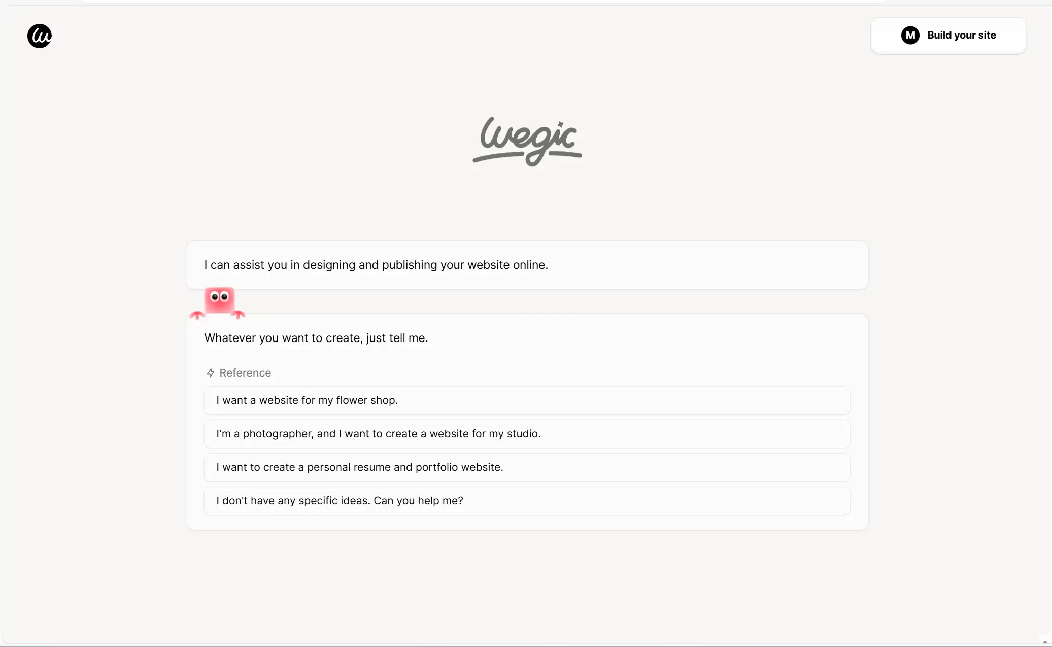
Key features of Wegic
Wegic's design page has three dedicated AI assistants that handle user conversations, understand requirements, create and modify website designs, and manage web page files. This setup greatly simplifies the website creation process and is especially friendly to beginners.
Efficient design, flexible adjustment
Wegic supports global adjustment, as well as re-generation of the layout for a specific part of the page. In addition, you can also manually select part or all of the page to adjust the font or color, which makes the whole website design process become very fast and efficient.
Cost-efficient solution
Wegic leverages AI to handle the most complex and time-consuming tasks, thus reducing the need for manual coding. This allows users to launch an entire website much faster than traditional methods.
Comprehensive Help Center
Recognizing the challenges faced by new users, Wegic's help center addresses common questions about website building. In addition, the platform provides detailed contact details for the support team, ensuring that users can seek help if they need further help, making the onboarding process smoother for newcomers.
FAQs
What is the difference between a donation form and a donation page?
The donation page is the landing page people see when they click the "Donate" button on your website, and it's the page you link to in your appeal email or social post. The donation form is the tool you use to collect information about donors and their donations. The donation page contains the donation form.
Why is having a full-fledged donation website essential for your organization?
-
Ask people to donate anywhere, anytime. The internal donation process should be smooth no matter where and when visitors click on your site. Having a beautiful and functional mobile website is essential for a growing fundraising organization.
-
Convenient for supporters to donate quickly. Donations are often emotionally driven. If you can create a donation page that resonates on an emotional level, viewers are more likely to "jump on the head" and donate to you.
-
Organize information centrally. You should proactively provide visitors with all the project information and cost details they may need, rather than leaving them to figure it out on their own. When you make a donation page, all your key points should be clearly visible and have a good brand image.
-
Meet donor expectations in an increasingly digital fundraising landscape. Your donation page is most likely not the donor's first exposure to online giving. Be sure to use typical best practices so that you appear more authoritative and trustworthy.
Click here to Build your site
Conclusion
It's no exaggeration to say that a good donation website can make a huge difference in achieving your fundraising goals. We hope that by adopting the right strategy and using tools like Wegic, you can create a unique and exceptional donation website that inspires your visitors to give generously.
Remember, the key to success is clear delivery, effective storytelling, and continuous optimization to meet the changing needs of your audience. Now that you have a comprehensive guide to setting up a donation page by reading this article, it's time to start creating a website that truly makes a difference.
Written by
Kimmy
Published on
Mar 12, 2026
Share article
Read more
Our latest blog
Webpages in a minute, powered by Wegic!
With Wegic, transform your needs into stunning, functional websites with advanced AI
Free trial with Wegic, build your site in a click!
What kind of website do you want to build?