Log in
Build Your Site
Why Content-First Design Makes a Better Website?
Discover the power of content-first design! Learn how starting with content improves user experience, streamlines website development, and strengthens brand messaging. Find out why content-first web design is the key to creating meaningful, user-centered websites.

Have you ever asked yourself why some websites are intuitive, and it’s a snap to locate what you’re searching for; versus others so wordy and with a visual mish-mash you could never decipher what they’re talking about? That’s where content-first design steps in. If this set-up is new to you, don’t worry you’re not lost! Content-first design focuses on making the content, like text, images, and key messages, the main driver of your website’s design. By prioritizing what you want to say over how it looks, a content-first web design approach ensures every element serves the purpose of delivering your message clearly and effectively.

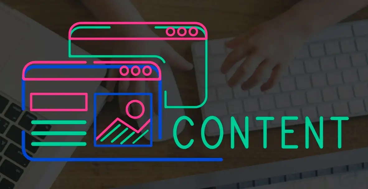
Image by rawpixel.com on Freepik
Imagine you’re building a house: Wouldn’t you begin with the layout before the decor, right? The same logic applies here. Starting with a content-first design approach helps you build a strong foundation for your site, allowing the visuals and layouts to support your story, not compete with it. We’ll explore why it’s a game-changer, how head-first design patterns content can offer insight, and how this method could be your secret to a user-friendly website that makes an impact right from the start.
What is Content-First Design?
Content-first design means letting the content determine the website's structure, style, and layout. Rather than designing pages and then adding words, images, or videos afterwards, a content-first design approach begins by establishing the core message and purpose of each page. Picture it like a story you want to tell your visitors with colours, shapes, fonts, etc. only after you’ve outlined that story. Once you ‘find the story,’ you can now tell the design ‘what it should be standing for,’ and then shape and flex each and everything so that it supports and amplifies that message.

Image by vector4stock on Freepik
In the simplest terms, content-first design is a strategy where you build a responsive website around the content rather than squeezing content into a pre-set design. The message is that different pieces of the content—text, an image, a video or interactive elements. By starting with content, it pushes the message naturally, with users easily being able to find and understand the content on your site.Advantages of the Content-First Approach for Website Building
When you dive into content-first design, you’re essentially putting your website’s mission first, ensuring each design choice enhances and complements your message. But beyond helping things look pretty, a content-first design approach packs some serious perks for building a website that truly delivers. With a few of those benefits you may not have thought about, read through here to learn how embracing this approach can take your site from good to great.
Clear Direction Right from the Start

Image by dooder on Freepik
This allows you to start with content which acts as a blueprint for the site. Rather than setting down a layout and filling it with good words and pictures, you are making a map so to speak to get you to the destination of a good design. What if you’re trying to decide on a paint scheme to put on your walls before knowing how your room will be laid out or what furniture will be there? When there is no content to keep the line of your design being steered it can be awkward, spaces creep in or there are things that don’t quite fit. With content-first design, you’re leading with purpose, which results in a cohesive, structured site that feels natural and seamless for visitors.Better User Experience (UX)
In the digital age, visitors want to find what they need fast, without going through distracting visuals or animations that don’t serve a purpose. When you adopt a content-first web design approach, you’re already prioritizing the user experience by ensuring that the most important elements—like headings, information, and calls to action—are central to the layout. Thus, users are satisfied once they navigate and interact with your site and are more likely to return.
Streamlined Design Process
Let’s face it: Like trying to nail jelly to a wall, juggling design tweaks can be. A content-first design approach significantly streamlines the process. If web designers know what the content is going to be well in advance, they don’t need to keep redesigning the layout for unexpected app features. This saves tons of time, cuts back-and-forth revisions, and keeps everyone on the same page, getting you to the launch quicker and reducing the total headache for you and your team.
SEO Benefits Galore

Image by sentavio on Freepik
The content-first design has major SEO perks. We can optimize headings, subheadings, and body text for search engines when content dictates the structure. Keywords are allowed to flow naturally, increasing your ranking potential, without the need to squeeze content into a preset layout. This allows a content-first UX web design to balance readability for users and friendliness for search engines: two birds, one stone.Design that Actually Serves Content (and Not the Other Way Around)
The content-first design approach puts content at the wheel, so the design isn’t just there to look nice but to enhance and highlight the message. Picture a billboard with some wonderful artwork on it and no clear message, and you’re going to be driving right by without knowing what it’s about. Content first helps you have more than eye candy. If you put in content, the content will drive decisions, not only will it look good, but it will do what your website has to do, which is an engaging and intuitive place for your visitor to be.
In short, content-first design isn’t just a trendy term; it’s a method that brings clarity, efficiency, and purpose to your website-building process. Instead, before you dive into colours and layouts, your content can be your best guide — and it might be the smartest design decision you make.
What Comes First, Content or Design?

Image by vector4stock on Freepik
Think of creating a house with no idea of the rooms each should occupy—a mess unknown. Similarly, with websites, content-first web design starts with what’s “inside” the pages. The structure should be dictated by the content from marketing pages, full of cute graphics, to dashboards full of complex charts and tables. Knowing what you have now gives you a design that will keep all the elements comfortable and close together. The other risk you run into if you start designing before content is, that you may run out of room for key content. You may have problems positioning text, videos or images into the layout since the layout becomes disjointed. In contrast, content-first design encourages you to begin with the essentials: users want to read, learn or experience.How to Implement Content-First Design to Improve Your UX Design
Implementing content-first design in your website process might seem like flipping traditional design approaches on their heads, but don’t worry—it’s simpler than you think, and it can have a huge impact on user experience. You can mold a site that’s intuitive and puts visitors at ease, with the right strategy and sprinkle of wit. Here’s how to embrace a content-first design approach to make your site’s UX stand out.
Start by Gathering and Organizing Key Content
Before investing all your design ideas or cultivating all your visual concepts, you’ll certainly want to outline the content project at the centre of your site’s reason for being. Ask yourself what’s truly necessary: Is it product information? A brand story? Interactive guides? When you know exactly what needs to go on each page, you don’t have to add some last-minute “oh, we forgot this part” adjustment. Group the content in terms of priority and relatedness, so the things you write look and are digestible with headings, subheadings and bullet points. This method will provide you with a roadmap and a way for your design not to overpower the message you intend to deliver.
Create Content That Speaks Directly to Your Audience’s Needs
Your content-first design approach can only enhance UX if the content itself connects with your audience. Do not take time to create engaging, clear, and purposeful content. Don’t use jargon or confusing language that will put them off. Instead, write conversationally (just like this!) to start building a relationship with your visitors. Good UX is not just about easy navigation, it’s also about delivering content that users feel understood. It helps visitors to feel on the correct path and to take the actions you want them to, such as signing up for your newsletter or purchasing.
Prioritize Content Flow to Guide User Journey
In a content-first web design, the layout should amplify content, creating a smooth flow that takes users seamlessly from one section to the next. Your website is nothing but a story, with each heading, each paragraph, and each button helping a visitor reach a goal. Choose an order for your content hierarchy so you know what’s most important and what logically follows on each page. Imagine you're designing a homepage where the content begins with a big impact headline, followed by a short intro, some points of trust, and something obvious to ask a call to action. If content drives the design, then people naturally draw the path you meant them to follow.
Collaborate Early with Your Design Team

Image by storyset on Freepik
One huge perk of a content-first design approach is that it fosters early collaboration between content creators and designers. This traditional approach usually means designers have to retrofit elements into the finalized design, but with writers, designers will have the chance to work with the content writer from the start. By working together, you can work together to make sure every piece of content is visual support, whether it’s getting the right complementary colours, adding icons, or where to place interactive elements. As a result, all the design elements are coordinated, and no content hangs out awkwardly.Prototype and Test for UX Optimization
Prototyping early and testing with real users can reveal any hiccups in your content-first web design approach. You can then put wireframes or mockups based on content, and check how the flow works and how users react to the layout. Testing can tell you if your content hierarchy makes sense, or if any sections should be moved so your users stay engaged. That’s why it’s good to make adjustments now rather than after the site goes live.
Fine-Tune Visuals to Support Content, Not Steal the Show
After the structure of the content has been done, you can start to design those fun flourishes. But be careful! In a content-first design, visuals are there to elevate the content—not distract from it. Go for the simple, clean design elements that are meant to drive attention towards the right place. Space is something you can use to call attention to something important, including an engaging call to action button that shines through, or even icons to make hard things easy to understand.
When you let content tell a part of the design through, you end up with a site where visitors are natively led, and not in a muddle of information. In the end, implementing a content-first design approach doesn’t just improve UX—it can transform it, helping you build a website that’s as functional as it is visually appealing.
Should I Design My Homepage First or Write Content?

Image by vector4stock on Freepik
The classic dilemma: So when should you approach one first – your snazzy homepage design or sit down and write out your content? Here’s a hint: content-first design suggests that crafting content first often leads to a more seamless and effective content-first web design.If you tried layout first — selecting fonts, colour combinations, and images — but not yet the messaging that drives the homepage, you can imagine that. This can leave your audience wanting, establishing the base for a beautiful design (you’ll be proud) but it will feel hollow because they are lacking the spice (substance) that 66% of your audience wants. By using a content-first design approach, you begin by building the message, and guiding the structure of your homepage based on what you’re communicating, not on pre-existing design constraints.
With content as your foundation, you can strategically organize sections, add engaging calls-to-action, and ensure your content-first web design feels intuitive for users. The obvious thing is that content helps to establish the tone and the general direction of the site, so if you’re designing around that, there’s no need to make the text go into an awkward space. If the content leads and takes the lead, we can better elucidate what visuals will linger naturally with the content, saving us the headache of revisions and fine tunings later on.
In short, a content-first design approach ensures your homepage looks polished and serves its purpose beautifully, blending design and content in a way that feels natural and purposeful. So, if you’re torn between the two, just remember: We’re letting content be the guide and design will follow in line smoothly!
Wrap It Up with Content-First Design: Your Key to a Better Website!
Embracing a content-first design approach isn’t just a trend—it’s a smart, user-centred way to build a website that truly connects with your audience. When you have good content, design has a way of just naturally inserting itself so that you get a site that is thoughtful engaging, and simply easy to navigate. Whether you’re starting fresh or revamping an existing site, content-first web design brings clarity and focus, making each page work harder for you.
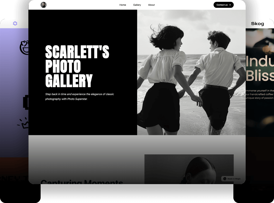
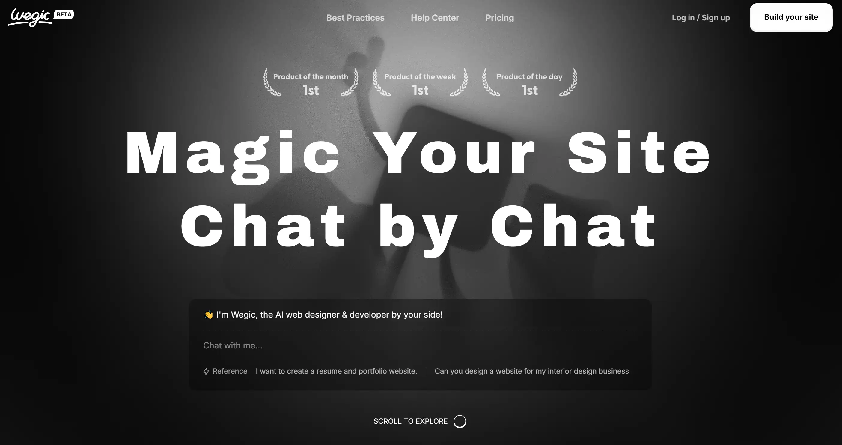
Are you ready to pull the trigger to a smarter, more strategic design journey? Now we have AI as our web design assistant (which means your website builder Wegic is here to make your content magic a reality!) Wegic will give you great layout ideas, beautiful finishing touches and a site that will impact people.

This revolutionary AI website builder can be considered as the web designer and developer tool of a new generation – at least it can be called like this because it works for free. The chat-based design of the Wegic platform gives the experience of building an aesthetic website with chatty friendliness. And guess what? What Wegic does not do is to only be user-friendly. This comes with the AI design and development capabilities that transform your ideas into a swift and efficient website within a moment of uttering the magic word; a top website builder. Simplifies the website creation process through a chat-based interface, making it accessible to users without technical skills. From concept to completion in just minutes, with support for custom domains and hosting.
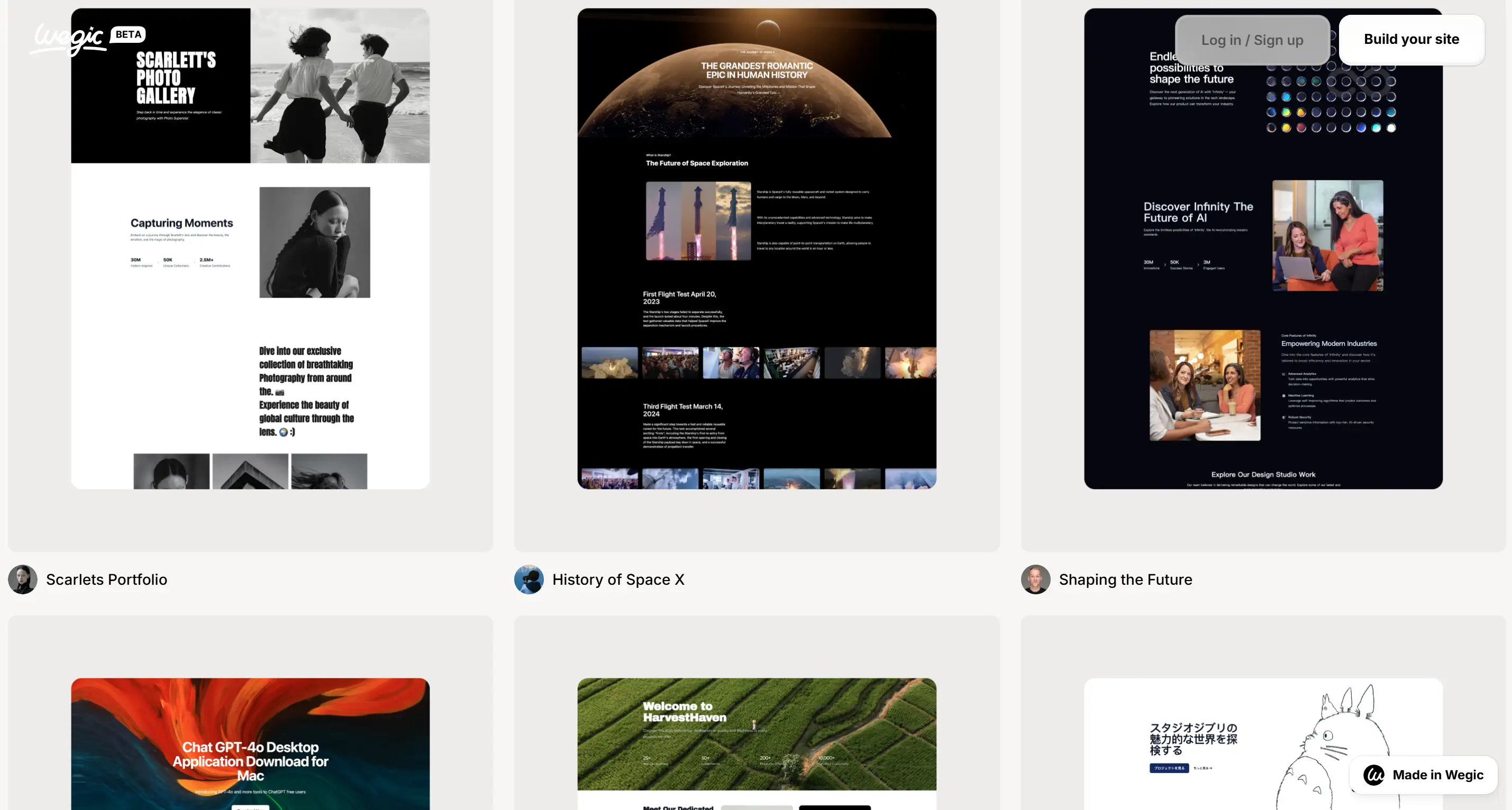
Want to see the best practices of websites created by Wegic?

So sit back, give Wegic a try and let your content make its way to your best website yet!
Written by
Kimmy
Published on
Mar 17, 2026
Share article
Read more
Our latest blog
Webpages in a minute, powered by Wegic!
With Wegic, transform your needs into stunning, functional websites with advanced AI
Free trial with Wegic, build your site in a click!
What kind of website do you want to build?