Log in
Build Your Site
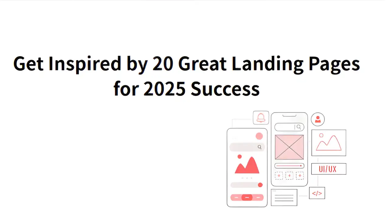
Get Inspired by 20 Great Landing Pages for 2025 Success
Discover 20 great landing page examples that convert. Learn the benefits of effective landing page design and how to optimize landing pages for 2025 success.

Digital marketing keeps changing, and it's getting harder to gain traffic online. People are less likely to read every detail on a page nowadays. Marketers are constantly searching for techniques that help them achieve better outcomes while spending less. Landing pages with strong conversion rates can give companies a leg up against their rivals. It’s important for businesses in diverse fields such as e-commerce, software, education, and personal blogs.
This article first defines what a landing page is. It'll explain all the design principles that make successful landing pages. You’ll also get to see 20 great landing pages from various industries. You will find inspiration from these examples to optimize landing pages.
What is a Landing Page?
A landing page aims to get users to take a specific action. It does this by getting things done quickly rather than providing lots of details. People often think of landing pages as the same as the site’s main page, but they are different and play different roles within the website.
The homepage of a website is responsible for a variety of tasks. It displays the brand, points people to products and provides information about the business. It acts as the main entrance to the website. A landing page focuses on getting users to do one thing. Its purpose is to get users to achieve a single goal, such as signing up, downloading an app or making a purchase. People get to it after seeing an ad or clicking on a link. All elements of the great landing pages are designed to encourage users to perform the desired action.
A typical landing page usually has simple navigation and only a single call to action. All the information on the page is organized neatly, and the main message is easy to grasp. If you click on an ad for a fitness app, the page you're taken to is called a landing page.
Learn about the differences between landing pages and websites, click the article: ⬇️
What Makes Great Landing Pages?
More than just a pretty website, a high-performing landing page uses psychology to direct users toward specific actions. It applies behavioral insights to help visitors easily take the desired steps. Applying principles from the science of decision-making, you can improve conversions by using targeted visuals, emotions, and clear messaging. As a result, many effective landing pages feature a red button to encourage users to take important actions. This encourages users to act quickly because they don’t want to miss out. At the same time, the button should match the visual identity of the brand. Using colors radically different from the rest of the landing page can disrupt the design and damage credibility.
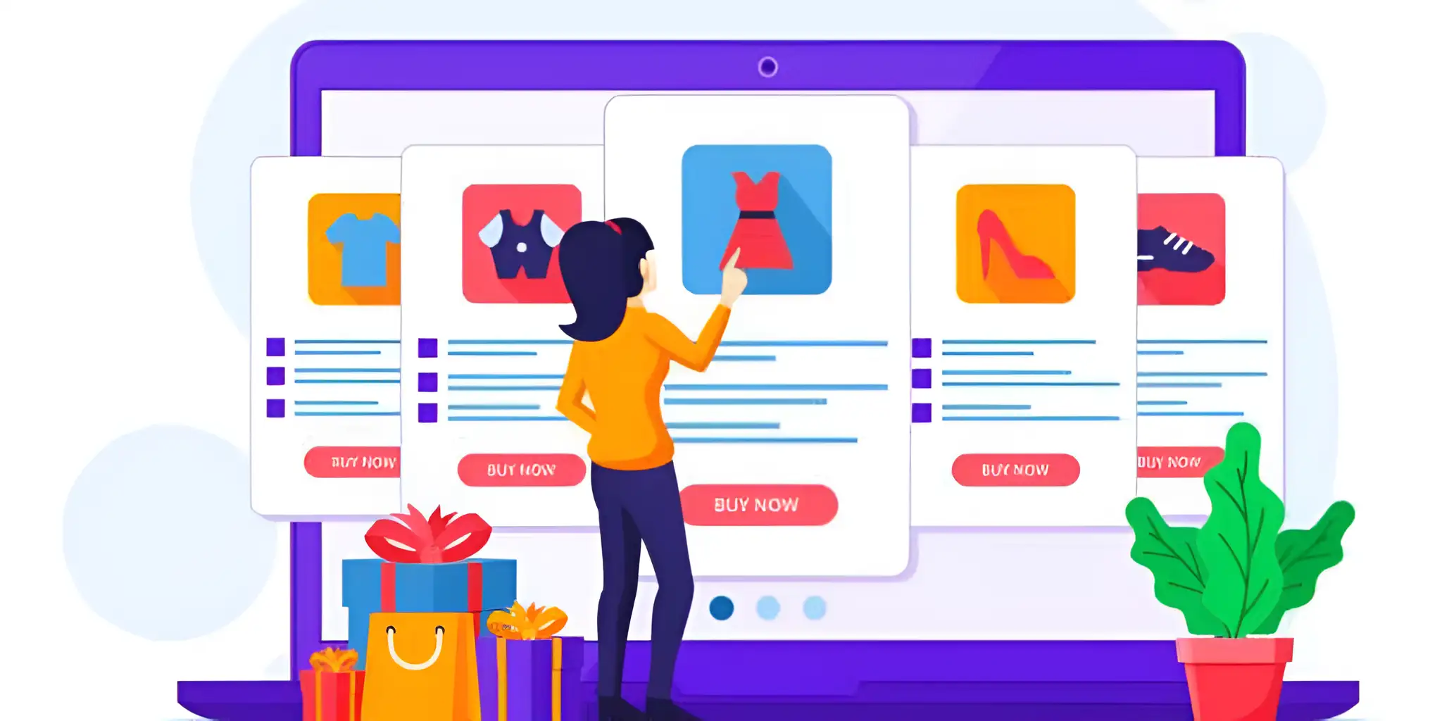
Image by Istock
20 Great Landing Page Examples in 2025
We’ve put together 20 landing page designs covering a variety of niches and objectives. These landing pages grab attention with their design and clear messaging. By examining these examples, you can optimize landing pages that people will find helpful and interesting.
Creatorwizard
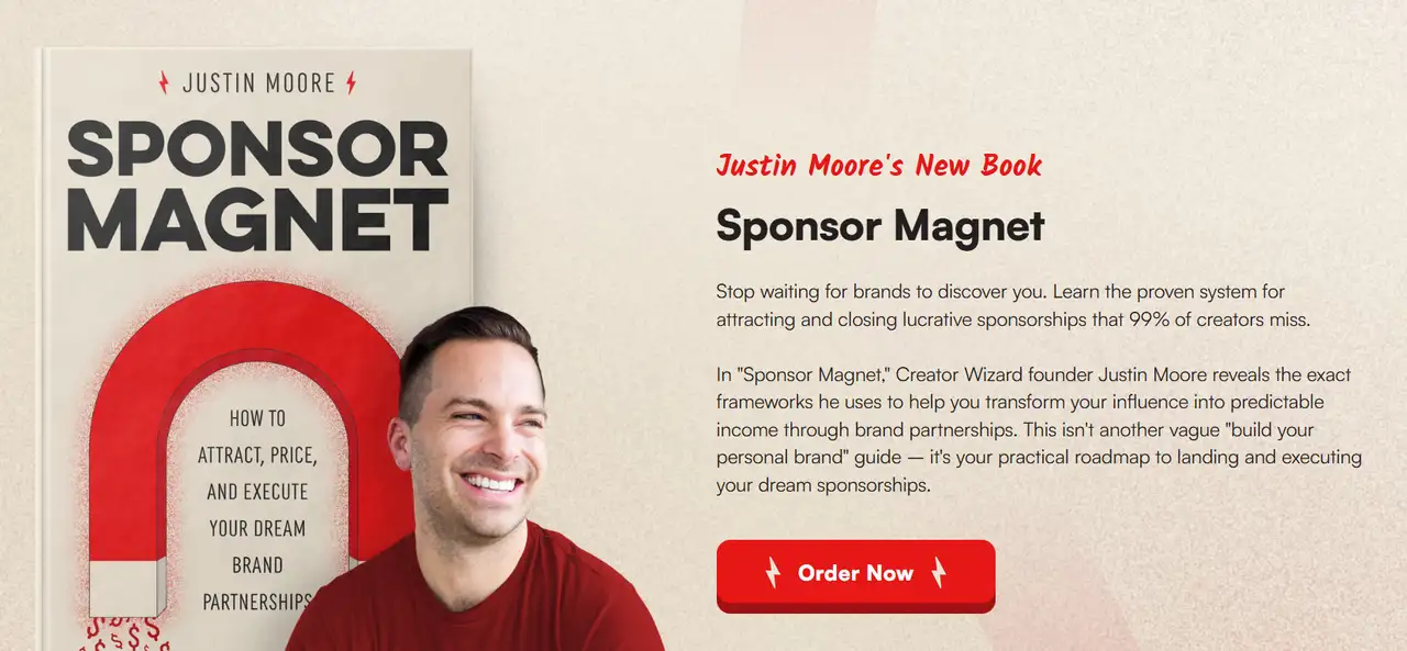
Creator Wizard’s landing page introduces creators to the opportunity of partnering with brands. It emphasizes converting influence into stable income through sponsoring education and coaching. The page tells the tale of its creator, Justin Moore. He provides resources to help creators understand how to connect with, negotiate, and manage collaborations with ideal companies. He also discusses his latest work, the book Sponsor Magnet. The book gives creators a simple, actionable guide to making a reliable income from brand partnerships.
Grind
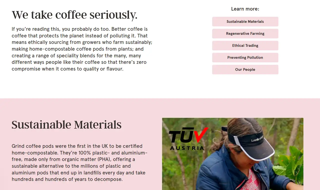
Grind’s sustainability page has a bright and polished design. Large white space and simple language clearly show the brand’s commitment to sustainability. Large images and brief labels clearly show features such as compostable coffee pods and completely plastic-free packaging. The design reflects Grind’s values and love of sustainable practices as well as delicious coffee. Check the AI Sentence Generator to create appealing content.
Small
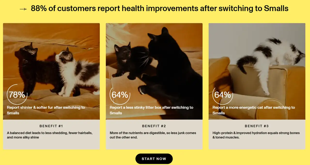
Small’s landing page is easy to use and inviting. Soft hues and open space give the design a light and genuine feel. A large picture of an animal catches the eye and shows that the brand cares deeply about pets. Short words and vibrant images capture the attention of pet lovers with the brand’s focus on personalized cat food. An obvious “Get Started” button invites new users to explore the site. The design appeals to what pet owners look for.
Amazon Prime Student
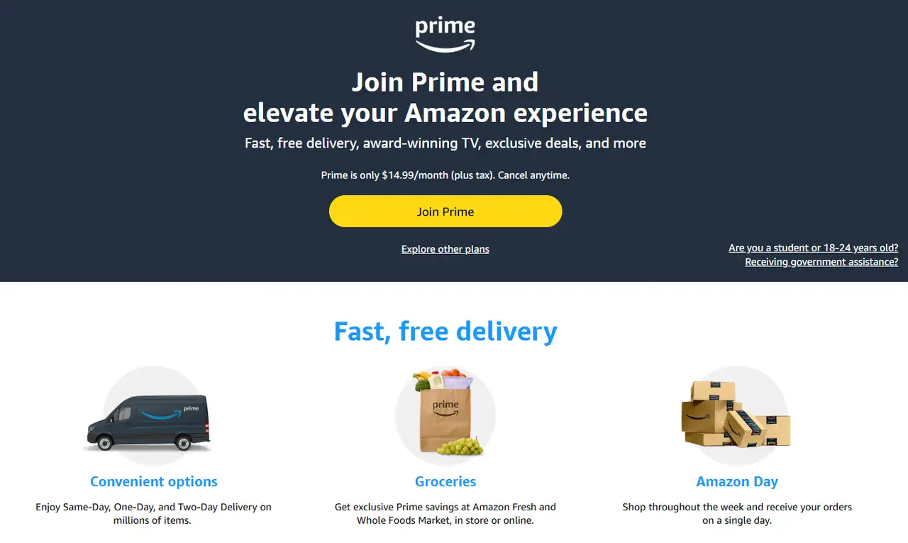
The great landing pages are clean and uncluttered with a fresh combination of blue and white. A big "Sign Up" button and information about student discounts are immediately visible at the top of the page. Various student benefits, such as free trials, faster shipping, and movie access, are highlighted with images and brief descriptions. Below you'll find answers to common questions and an additional way to sign up, so you can become a Prime Student member right away.
If you want to know how much it costs to sell on Amazon, click the article: ⬇️
Kit
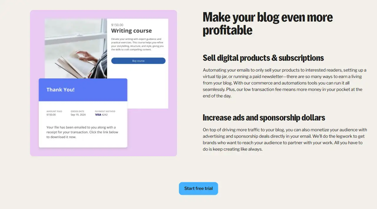
This great landing page example is simple and bright, with a lot of white space to highlight the content. The interface layout is clear, which allows users to quickly access different sections. The title and introduction at the top are clear and eye-catching. Icons and examples allow users to understand the benefits of the service right away. A blue button is included to encourage users to take action. The page has a modern and professional design to appeal to bloggers.
Paypal
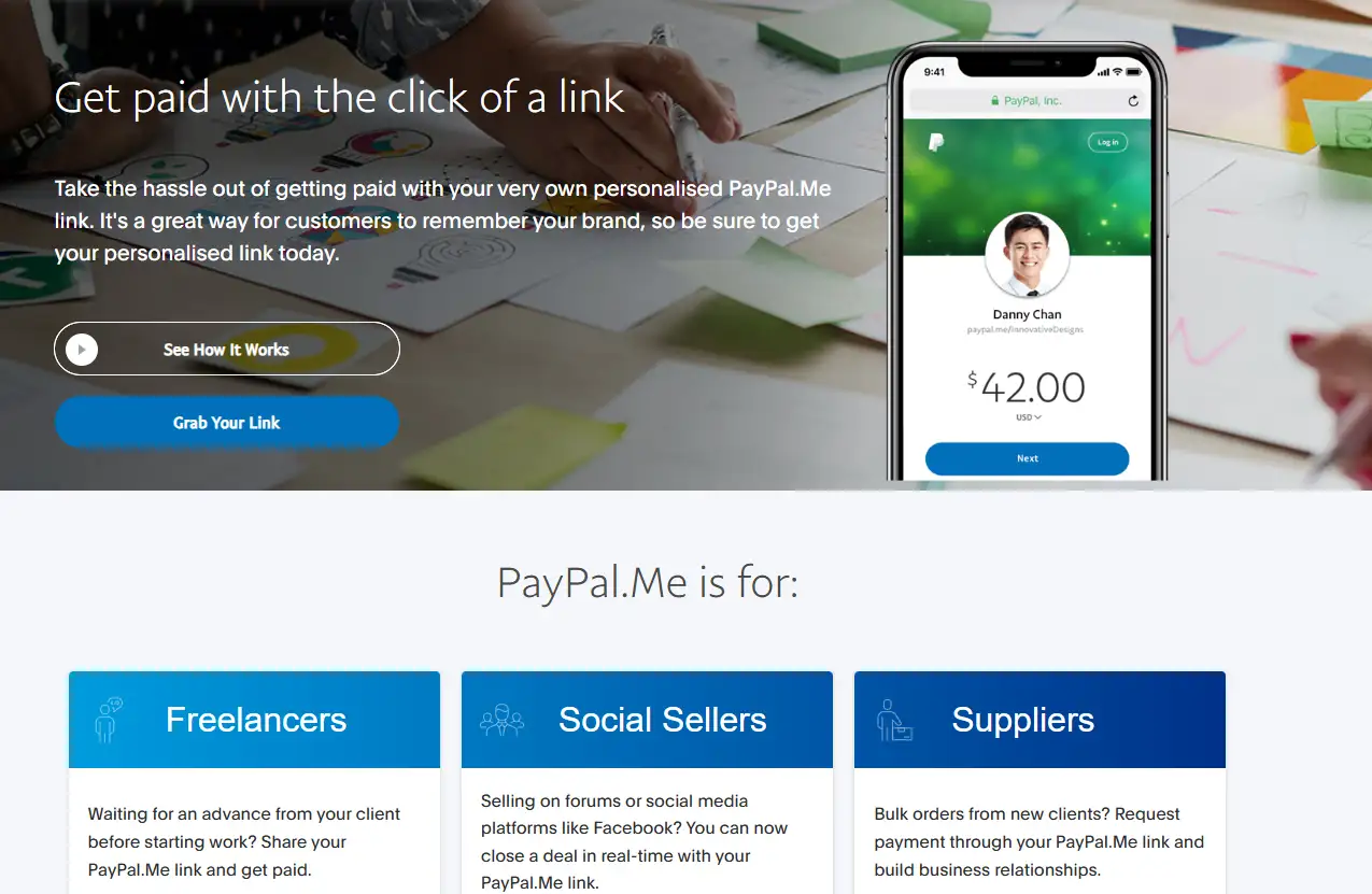
The page uses a predominant shade of PayPal’s logo blue to show reliability. The layout is centered. Call to action elements are prominently placed for users to begin right away. The final part contains helpful information in a clear format. Everything is arranged for easy understanding by the user. Users can easily build their links on the platform.
Adobe
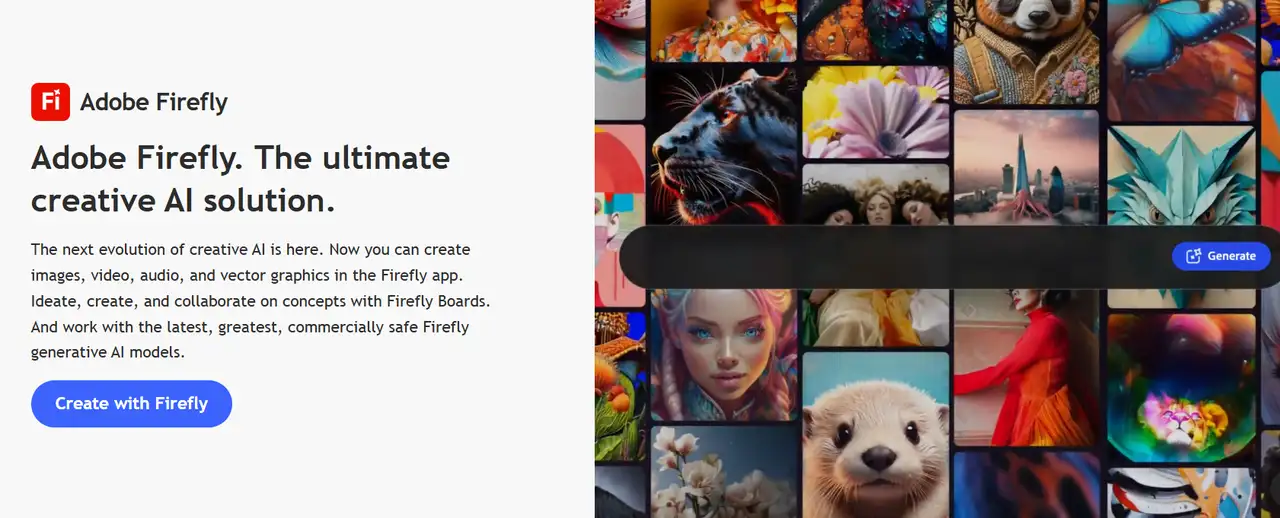
Adobe Firefly’s page is clean and contemporary. The background is dark, and images are created by AI. The tools are prominently displayed. The page features some real examples of how the tool can help you generate ideas. Major tools are described in the central section, such as Firefly Boards and Scene to Image. They let users come up with concepts and create visuals in no time.
UpCounsel
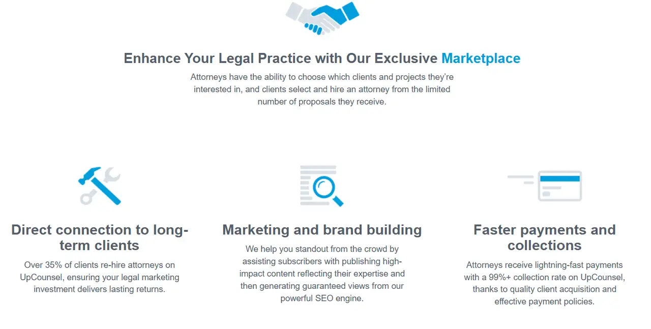
It's a modern design using classic colors. The page details how lawyers choose clients and become involved with projects. It explains how the platform assists clients in marketing, establishing a brand, and making transactions swiftly. The page demonstrates how various clients rely on UpCounsel to meet their specific legal needs.
Rocket Lawyer
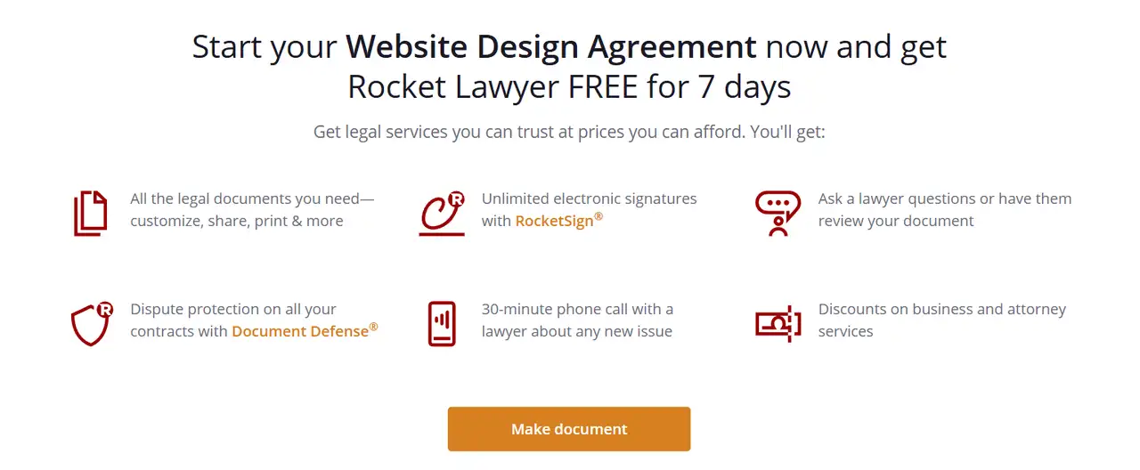
The page starts with the title “Website Design Agreement.” The template can be downloaded by clicking the button right below the description. The design is open and convenient, so users can quickly understand the information. It makes it easy for users to understand and take quick action.
Descript
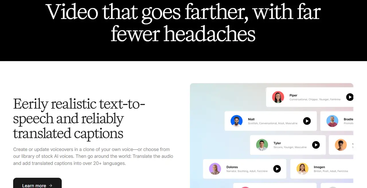
Descript's landing page design has a dark background with bright text to show off its AI video editing. The page is split into sections to explain key tools like multi-track recording, team editing, and ready-made templates. It blends video demonstrations and authentic case studies to present its services. Check landing page testing to test the landing page's effects.
Glossier
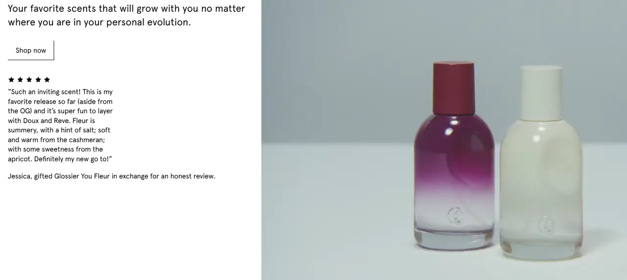
Giant photos and just a few words explain the brand's message. "Skin First, Makeup Second." There is a lot of room on the page and the sections are easy to follow. Users can easily access the site from their phones, demonstrating the brand values a positive experience for everyone. Its design is authentic, genuine, and inviting.
Dropbox Business
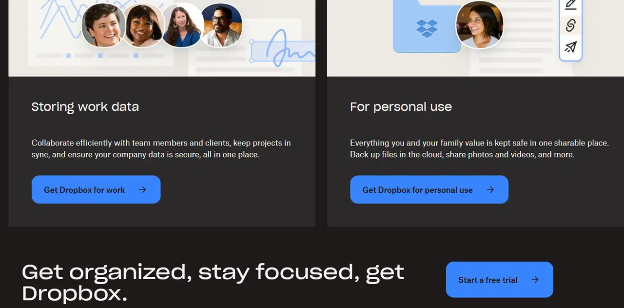
Dropbox Business’s page offers a straightforward and contemporary design. The page shows the most important features in an easy-to-follow way. Labels help users easily locate the information they’re looking for. The features and costs of the various plans are illustrated through images and text. Buttons let you start for free or get the full product right away.
LinkedIn Recruiter
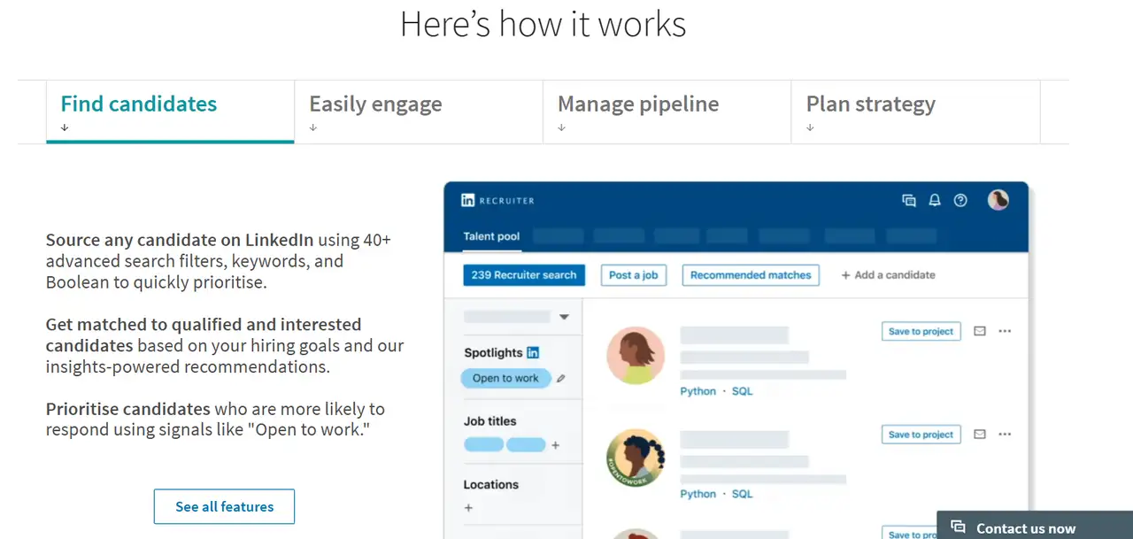
You'll find clear explanations of how Recruiter helps you search, message, and work together with your team using pictures and text. There are also reviews from other users and instructions for easy use to build confidence in the product. The design aims to provide a great user experience, highlight Recruiter’s benefits, and motivate users to discover or experience it firsthand.
Quickbooks
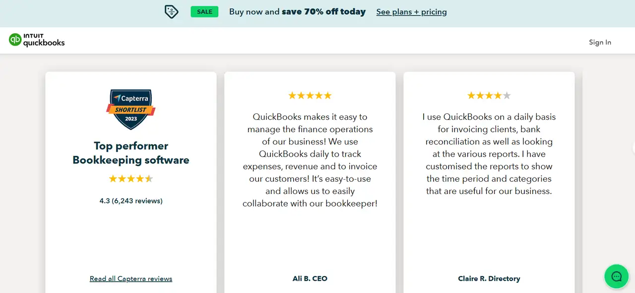
The page highlights the most important features with an attractive design and showcases customer opinions. Information about user experiences and service capabilities is provided below to make a stronger case. The overall layout is reasonable, with sufficient white space, which improves the reading experience and combines information communication and conversion efficiency.
Warby Parker
Warby Parker showcases its new collections with clean and contemporary design, featuring bright images that present the current eyewear lineup in an exciting manner. The layout is simple, with light colors and plenty of negative space to emphasize the products. Each collection has a short description and a prominent button to allow users to view and buy the entire collection.
Blinkist
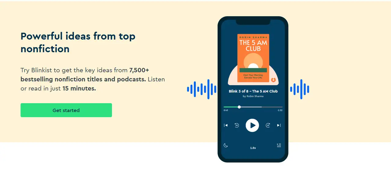
A soft gradient is used on Blinkist’s Daily landing page to evoke a sense of morning cheerfulness. The main heading and statement in the middle of the page explain what makes Blinkist unique. The phone screen picture captures the app’s main capabilities. Soft fonts and inviting buttons encourage visitors to download or try the app.
Hims

There’s clear text and accessible buttons (such as “Begin Evaluation”). They make it easy for visitors to get started with the online form or set up a doctor consultation. The products are displayed in neat card format. This lets users easily see what the drug can do for them. Privacy and ease are important features of the design. The design stresses that no doctor visit is required and delivery is free.
Webull
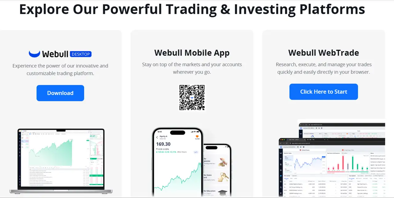
Page demonstrates that the platform can be used on a wide range of devices. It shows clearly how the platform can be used across different devices. A list of every kind of investment available on Webull is provided, including stocks, ETFs, and futures. It provides an overview of the tools and services available so people can learn how the platform works.
H&R
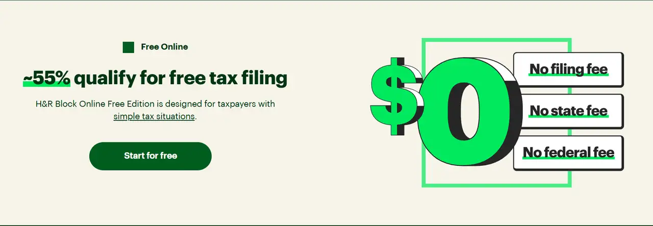
A prominent button toward the center of the screen guides users in starting their tax filing process. Quick explanations keep things easy to understand. The design clearly presents all the important information. Icons on the page highlight what you get with the service. The design focuses on user experience, with clear visuals for quick use.
23andMe
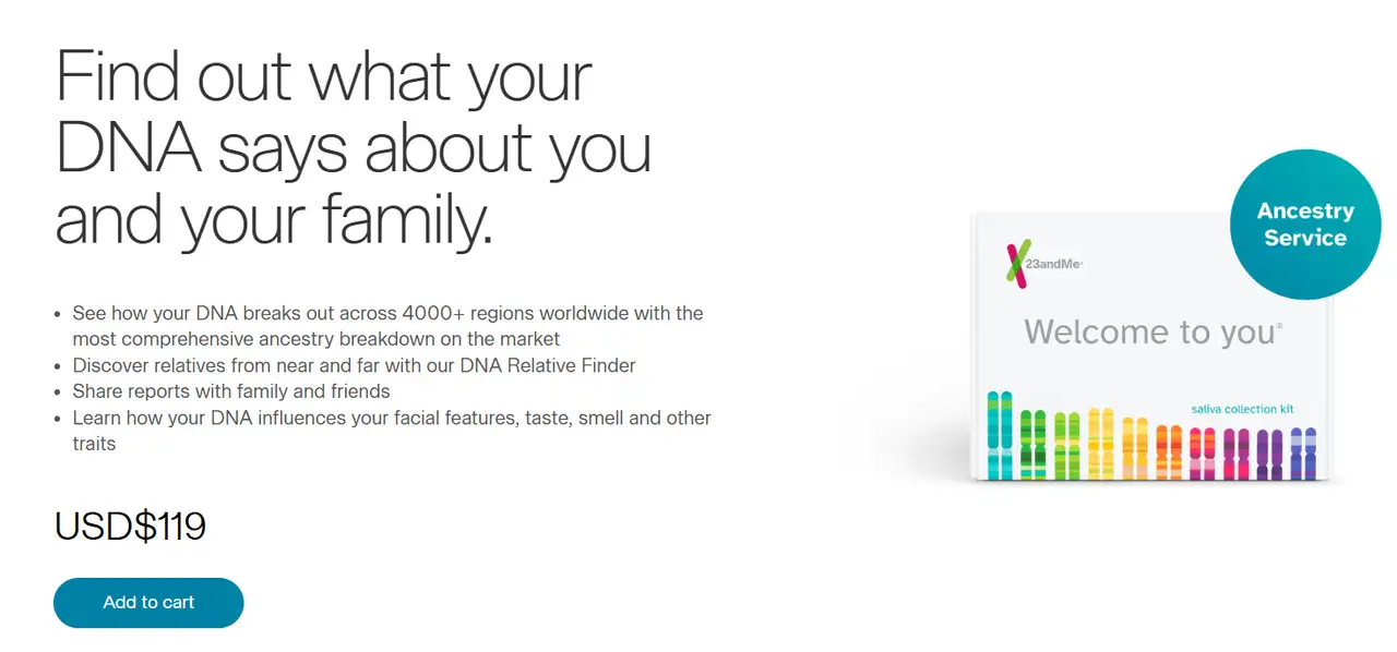
The 23andMe page has a modern, simple look. The main color is white, with blue-green gradient lines for a tech-friendly feel. The layout is neat. The top heading shows the main benefit of DNA testing. Sections below display different products and services. Icons and short text help users understand quickly.
To find more great landing pages, click the article: ⬇️
Tips to Optimize Landing Pages
When creating a landing page it's helpful to address the user’s needs early on and then present the main advantage clearly in the headline. "Find out how you can master the spoken language in just one month." "Wondering how much you could reduce your annual electricity expense?" Such an opening can effectively stimulate user interest and drive subsequent browsing.
The page structure should be as simple as possible, and all content should revolve around a clear conversion goal. Remove the navigation bar and irrelevant links, and make the "Register", "Download" or "Buy" button the visual focus. At the same time, the reasonable placement of "social proof" such as user reviews, ratings, or cooperative brands can enhance the credibility of the page.
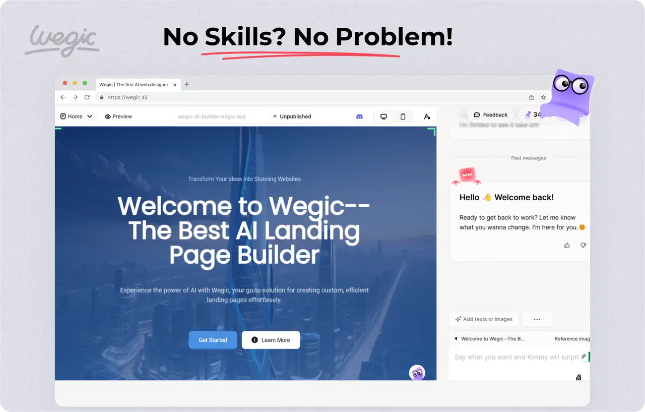
Creating landing pages that truly "convert" visitors often requires a great deal of work. The development of high-quality content, aesthetics, and layout all takes some effort to perfect. To bypass the learning curve and speed up launching a landing page, try the AI landing page builder Wegic, which allows you to build pages without coding. Simply fill out the requirements in the chat interface, and the page will be created using a professional layout and design, saving time and effort for both beginners and small organizations.
Conclusion
Great landing pages are more than just an aesthetically pleasing design. They also help brands talk to users quickly and clearly. Online marketing in 2025 is fiercer than ever before. If a landing page is effective, a campaign will likely succeed. A good landing page can make or break a campaign. It might be used to sell a new product, find new customers, or get people to download an app or sign up.
If you don’t have much time to figure out the technical details of design, testing, and development, you can consider using Wegic, an AI tool that does not require code. With its "conversational website building" capability, you can generate a landing page that meets your goals in just a few minutes. Just speak your mind, and Wegic can help you turn it into a complete page. Sign up for a Wegic account now to create a high-conversion landing page.
Written by
Kimmy
Published on
Mar 17, 2026
Share article
Read more
Our latest blog
Webpages in a minute, powered by Wegic!
With Wegic, transform your needs into stunning, functional websites with advanced AI
Free trial with Wegic, build your site in a click!
What kind of website do you want to build?