Log in
Build Your Site
30 Great Landing Page Examples(Our Top Pick)
Explore 30 top landing page examples that drive conversions. Get inspired by real-world designs to create a high-performing landing page for your business.
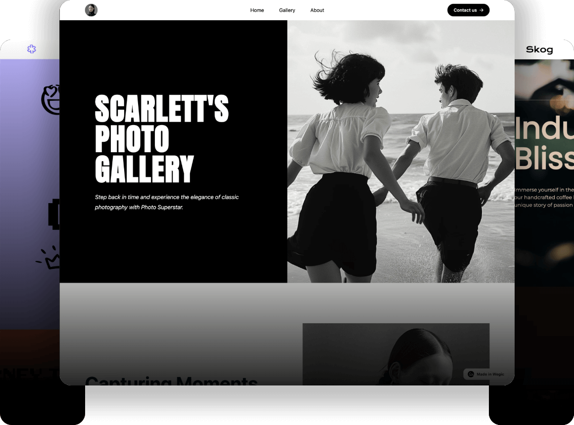
When creating a landing page that draws visitors in and encourages conversions, may be similar to completing a jigsaw without a picture on the box. The secret is to combine strategy, design, and content to create a cohesive experience that encourages users to take action. With so many options available, real-world examples may inspire fresh thinking and highlight the most effective strategies.
In this article, we've handpicked 30 outstanding landing pages that excel in various industries. Each example offers unique insights into how design elements, persuasive copy, and user-focused strategies come together to create high-converting landing pages. Whether you're revamping an existing page or starting from scratch, these examples will inspire you to craft a landing page that looks good and delivers results.
Click here to Build your site
Why a Crafted Landing Page Matters?
Captures Attention Quickly
-
A well-crafted landing page immediately grabs visitors' attention and communicates your value proposition, making them more likely to stay and engage.
Drives Focused Actions
-
By streamlining the visitor experience around a single objective, a crafted landing page effectively guides users toward taking the desired action, whether it's signing up, purchasing, or learning more.
Maximizes Conversions
-
Thoughtfully designed elements like persuasive copy, strong visuals, and clear calls to action work together to increase conversion rates, turning more visitors into leads or customers.
Enhances Brand Perception
-
A polished, user-friendly landing page reflects positively on your brand, building trust and credibility with your audience from the moment they arrive.
30 Selected Landing Page Examples
1.ExpressVPN (Digital Security)
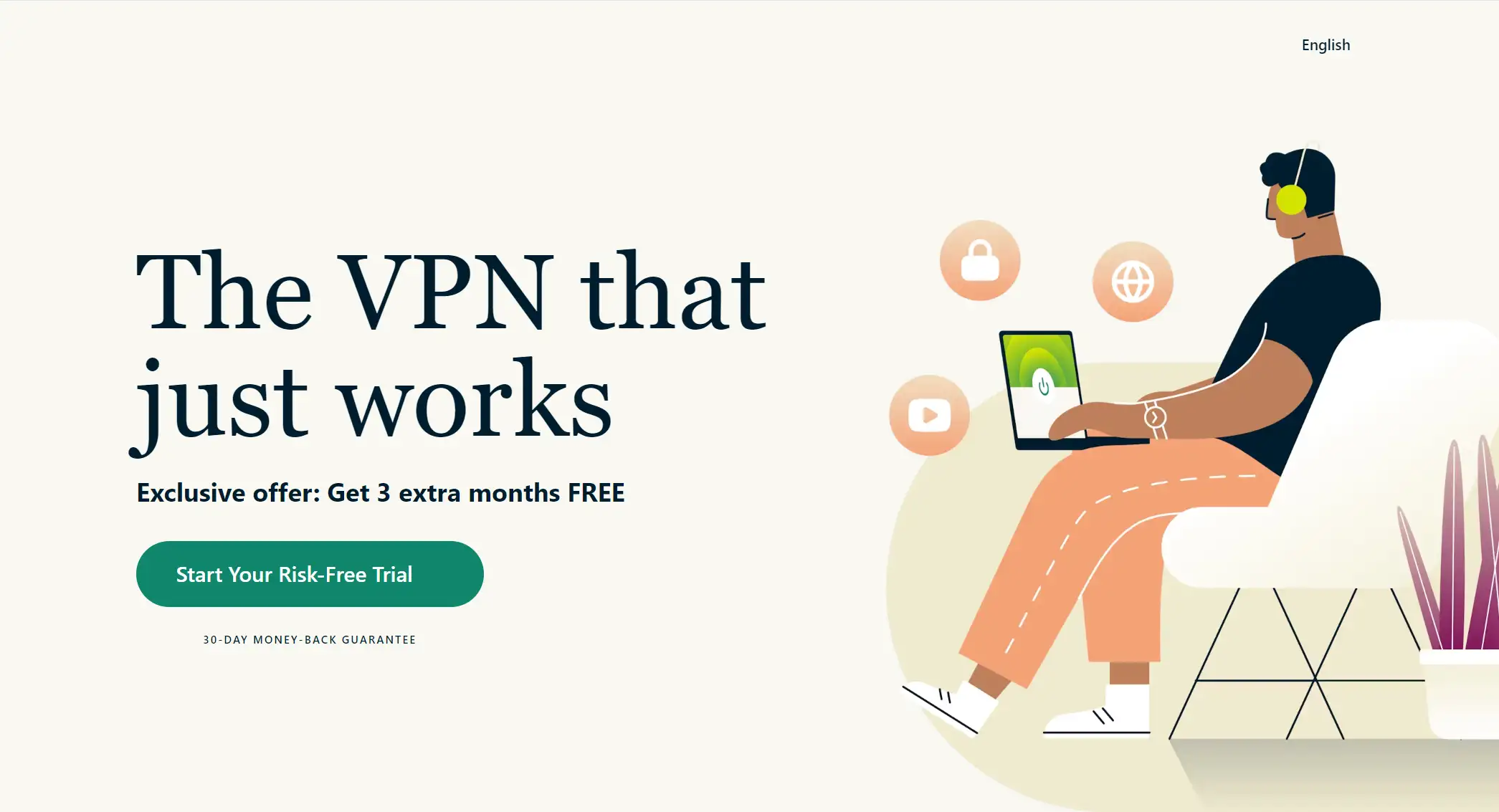
This landing page is notable for the absence of a navigation bar, not for its functionality. ExpressVPN successfully accentuates the main call-to-action (CTA) by removing the navigation bar.
Reducing the number of navigation choices on landing pages makes sense since these components might deflect visitors' attention from the desired activity. A pertinent HubSpot experiment that showed deleting navigation links from landing pages can increase conversion rates lends credence to adhering to this design best practice.
2.Goby (Health and Wellness)

Goby's landing page confidently invites users to click on its CTA assurance, which is prominently displayed at the top. Their affordable pricing and money-back guarantee add to the incredible accolades this award-winning electric toothbrush has won. That is worthy of a grin, surely.
3.Airbnb (Travel and Leisure)
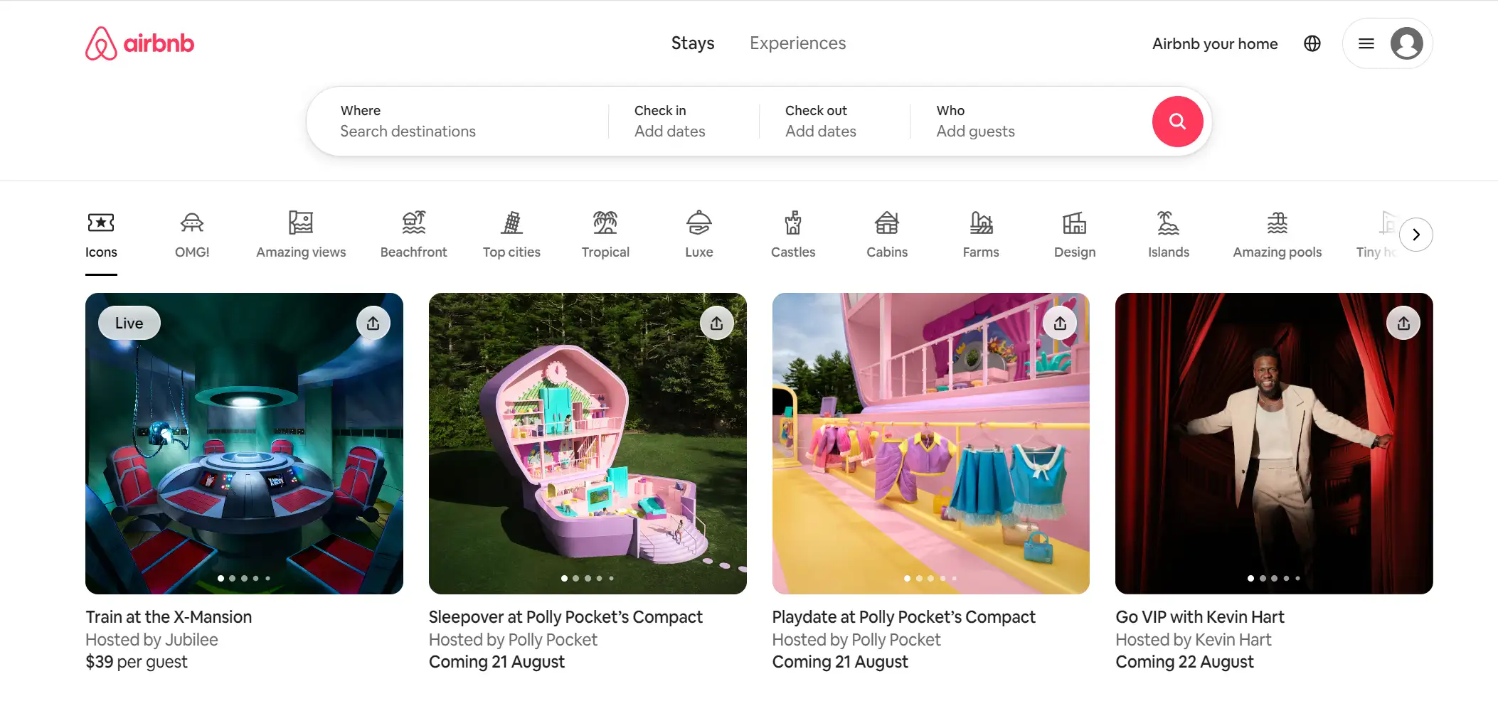
If you're wondering where to find a vacation apartment to rent, this AirBnB landing page is your one-stop shop. There are several alternatives available, including cabins, beachfronts, and breathtaking vistas.
4.DoorDash (Food Delivery)
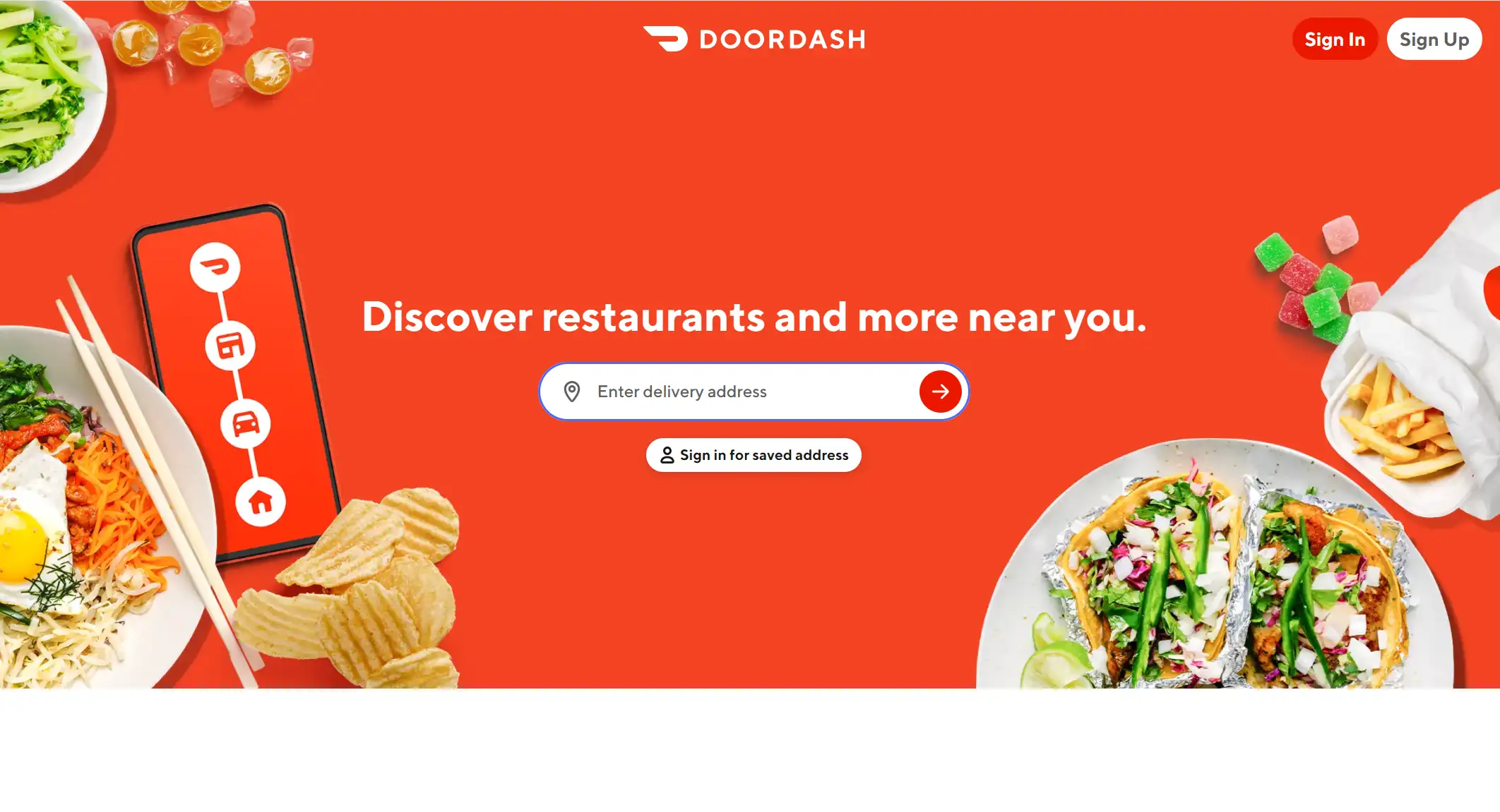
Food delivery is big business, and DoorDash uses landing pages to attract drivers by emphasizing the freedom and earnings potential of the gig. The headline resonates by highlighting the main benefits—flexible hours and being your own boss—while the hero graphic showcases potential weekly earnings, making the opportunity even more appealing. Additionally, the page clearly outlines the qualifications, ensuring that only eligible candidates proceed, streamlining the sign-up process.
5.Moola (Food)
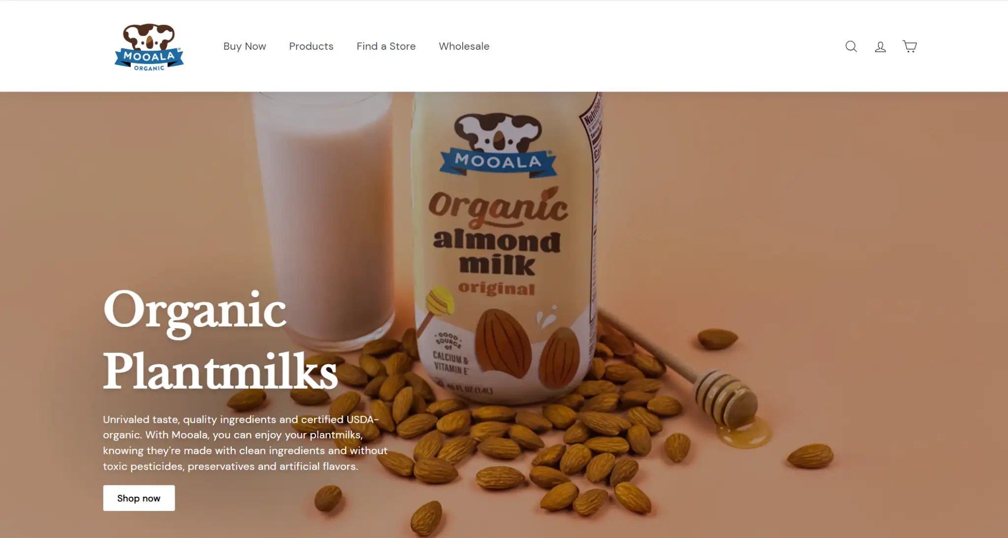
Mooala’s playful landing page uses bold colors like neon green to highlight key elements, while earthy tones enhance trust, reflecting the brand’s organic quality. This simple yet striking design captures attention and reinforces the product's trustworthiness.
6.Calm (Health and Wellness)
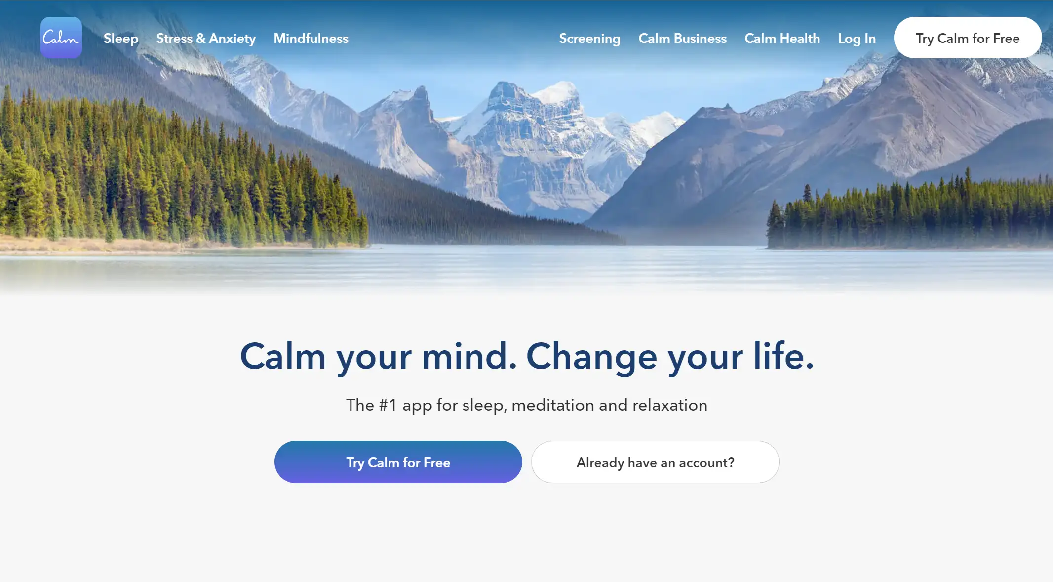
Calm’s landing page perfectly embodies the tranquility it promotes, with clean, straightforward copy and a soothing blue color palette that immediately conveys peace. The clear purpose—better sleep, lower stress, less anxiety—is highlighted, inviting visitors to join millions on their wellness journey.
7.Gong.io (Call Recording)
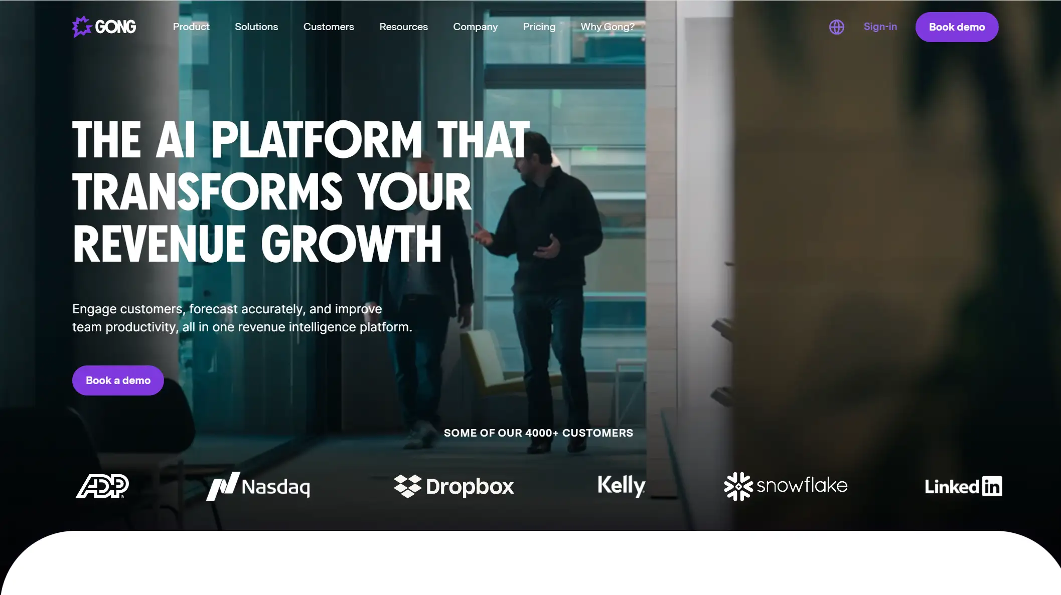
Gong’s landing page stands out by showcasing its AI-driven revenue intelligence platform, backed by customers and strong third-party reviews. It clearly communicates key benefits—enhanced customer engagement, accurate forecasting, and improved productivity—encouraging prospects to demo the software.
8.Netflix (Entertainment)
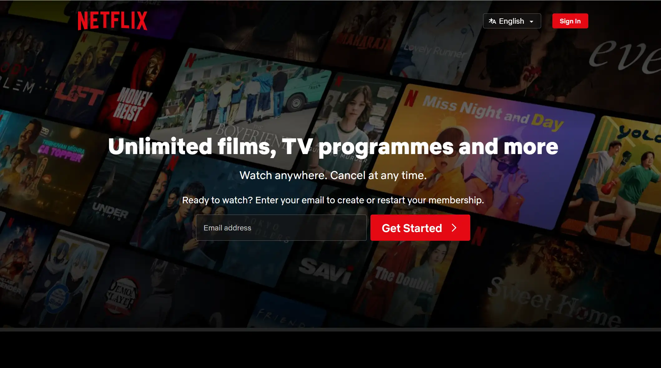
Netflix's landing page excels with its simple email-only sign-up, a discreet FAQ for pricing details, and under 200 words of concise copy. This straightforward approach helps attract a wide audience and maintains engagement, contributing to Netflix's impressive 238 million subscribers worldwide.
9.ConvertCart (Marketing)
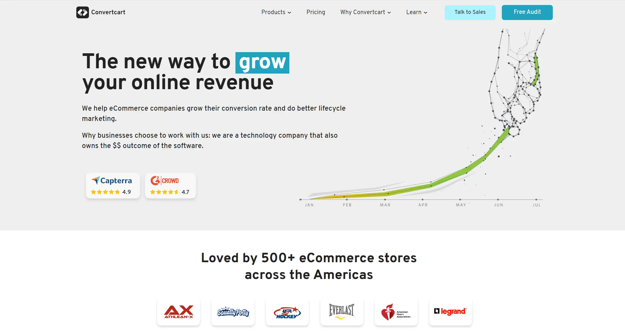
This webinar landing page effectively appeals to eCommerce owners by using a case study format, which offers real-life insights rather than theoretical knowledge. The promise of learning email strategies from successful eCommerce businesses is compelling, suggesting that a less specific headline might not convert as well. To replicate this success, you can audit audience insights, interview top customers, or conduct research studies to uncover valuable information.
10.Uber (Ride-sharing)
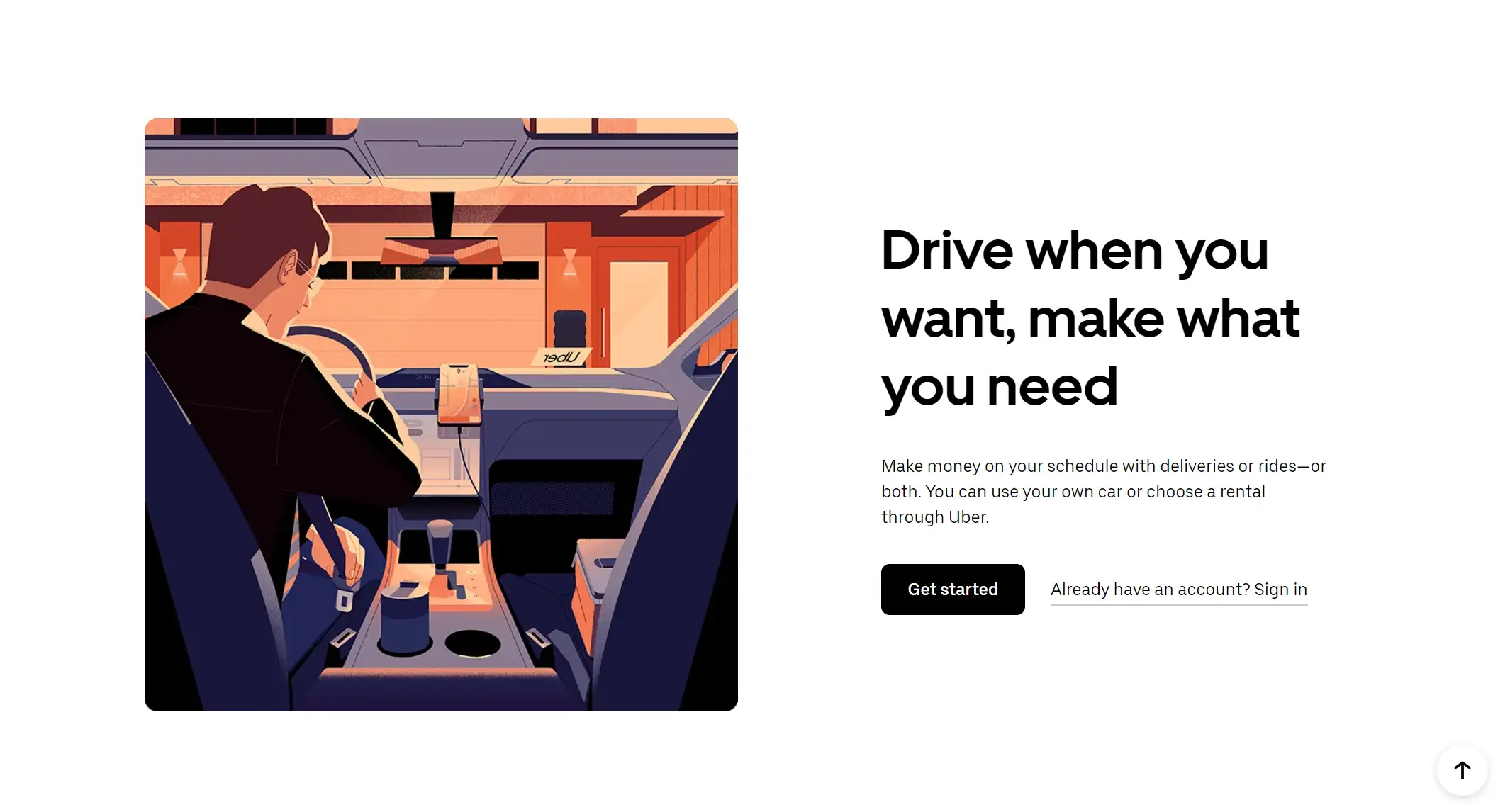
Uber's landing page stands out with its black-and-white color scheme, concise sentences, and straightforward call to action, making it both professional and easy to navigate. To achieve similar effectiveness, design your page with a clear, simple message and avoid overly complex styles, especially if targeting a broad audience.
11.Canva (Design)
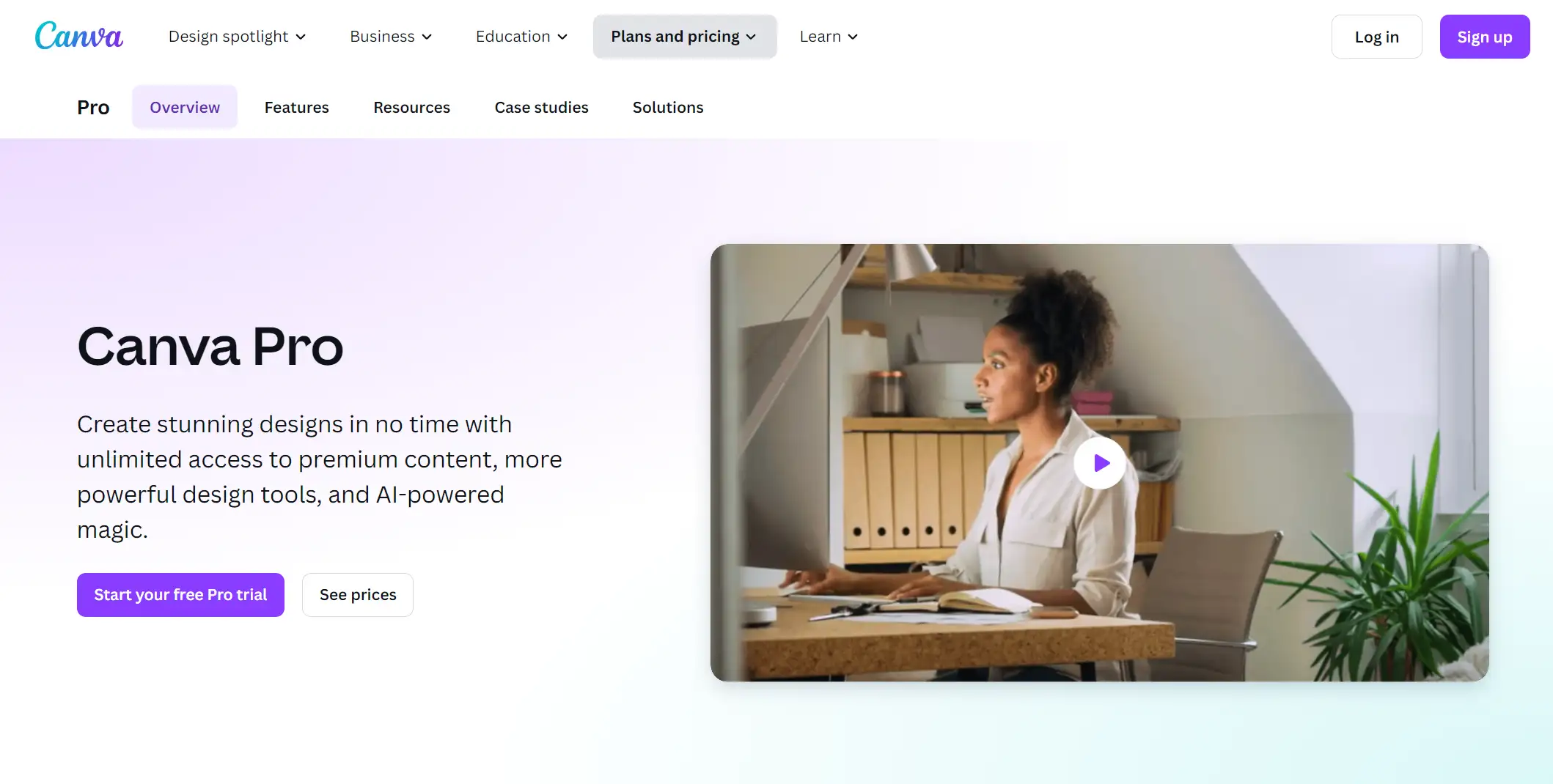
This landing page effectively uses ample white space and bright colors to highlight text and ensure clarity, ending with a FAQ section to address potential questions and demonstrate openness. To implement this, feature your product or service prominently in your design, showcasing its range or capabilities clearly from the start.
12.Nauto (Shipping)
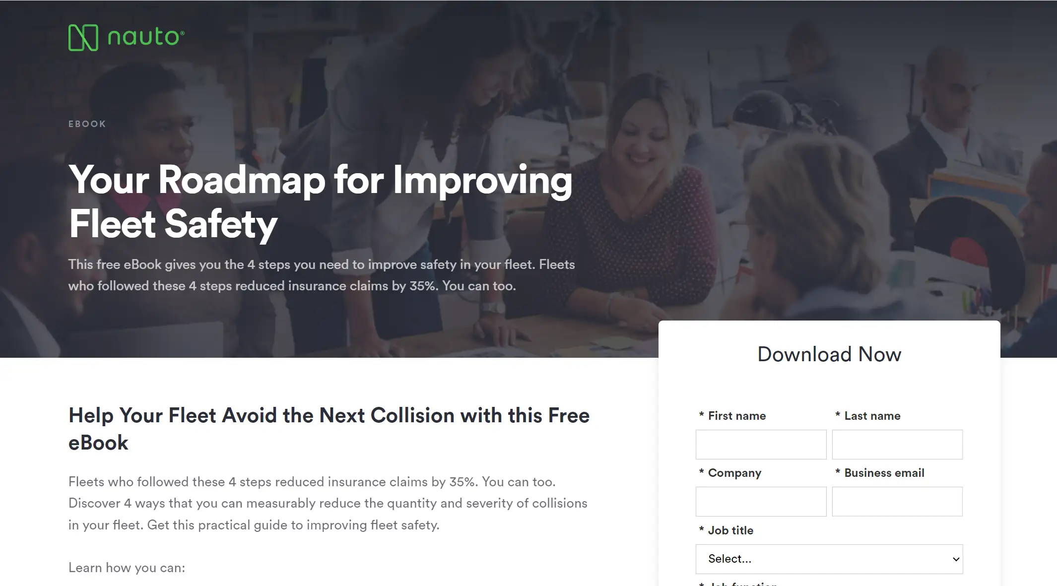
When writing text for landing pages, emphasize the advantages above technical details. For example, Nauto's service is made more desirable by emphasizing, through simple branding, how their fleet safety platform promotes safety. To achieve the same, instead of going into specifics about features, concentrate on how your product or service can enhance consumers' lives or workflows.
13.CD Baby (Entertainment)
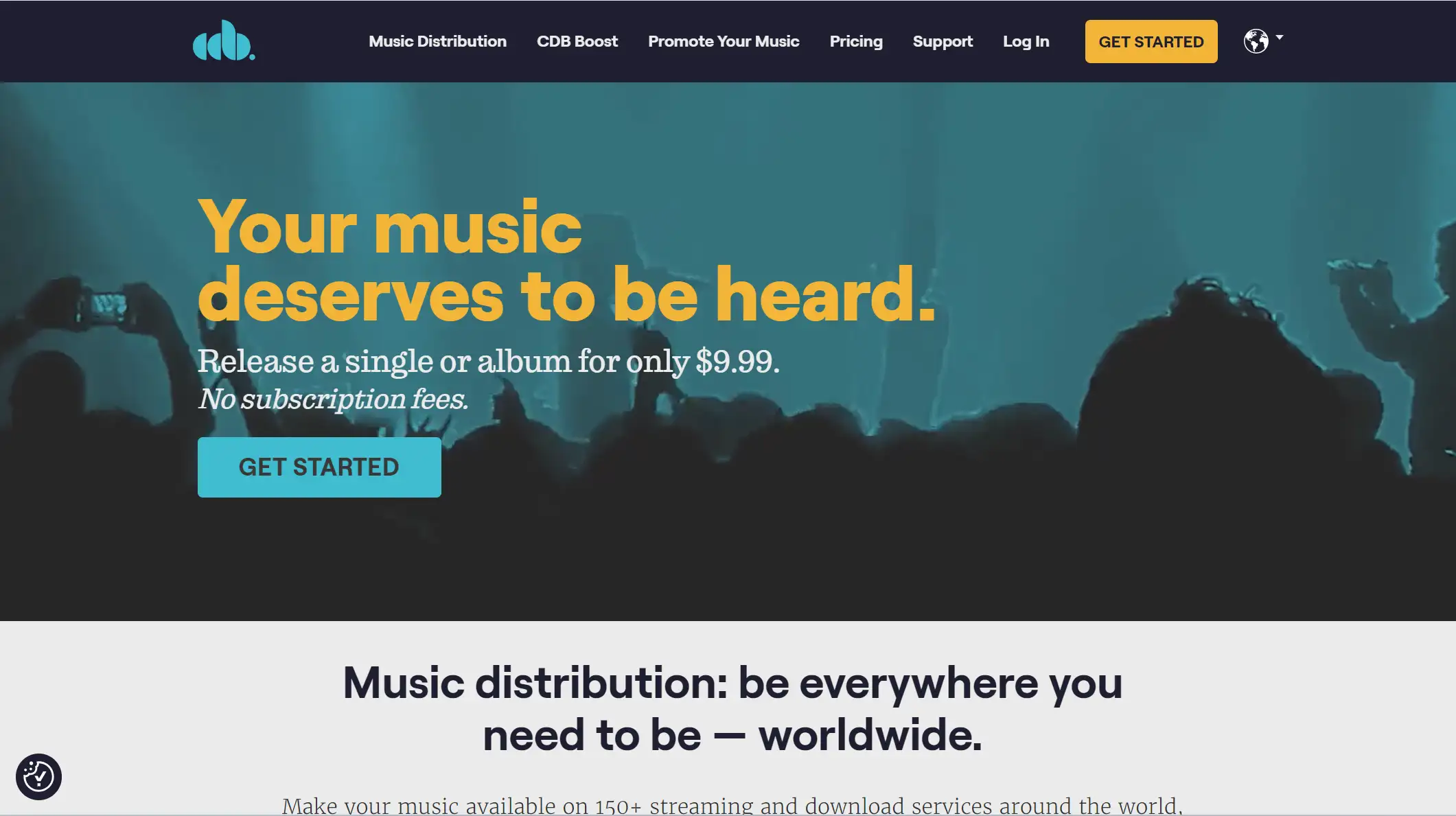
CD Baby's landing page effectively appeals to independent musicians by highlighting key benefits: comprehensive distribution across top streaming platforms like Spotify and Apple Music, transparent pricing, and ensuring they receive deserved royalties. A featured video further emphasizes these advantages, addressing common concerns and showcasing how CD Baby solves them, making it an inspiring example for the SaaS/entertainment industry.
14.Rover (Pets)
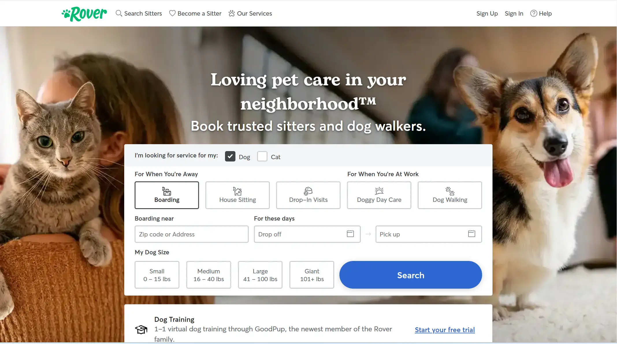
Rover’s landing page builds trust by using testimonials, highlighting its outstanding services, and featuring adorable pet photos. To implement this, focus on addressing your customers' main needs immediately upon landing, offering a clear solution and relevant information right away.
15.Gartner(Consulting)
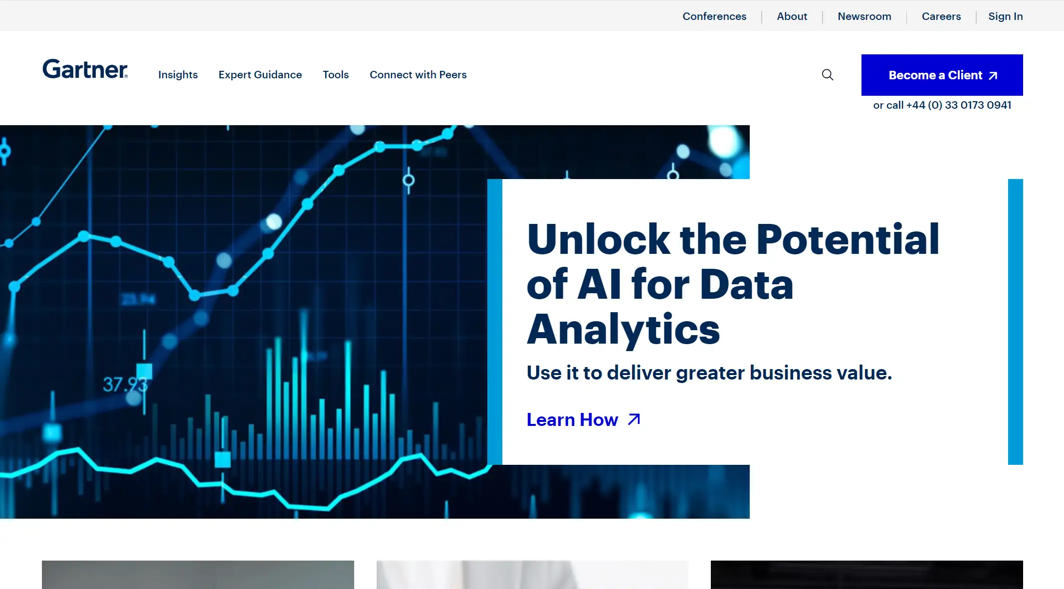
This webinar landing page grabs attention with a contrarian headline about AI as a "human-centric leader," addressing the trending issue of AI in the workplace. By presenting a thought-provoking angle, it effectively engages the audience and boosts interest. Choose relevant, trending topics or contrarian views to attract more attention.
16.Calendly (Scheduling Automation)
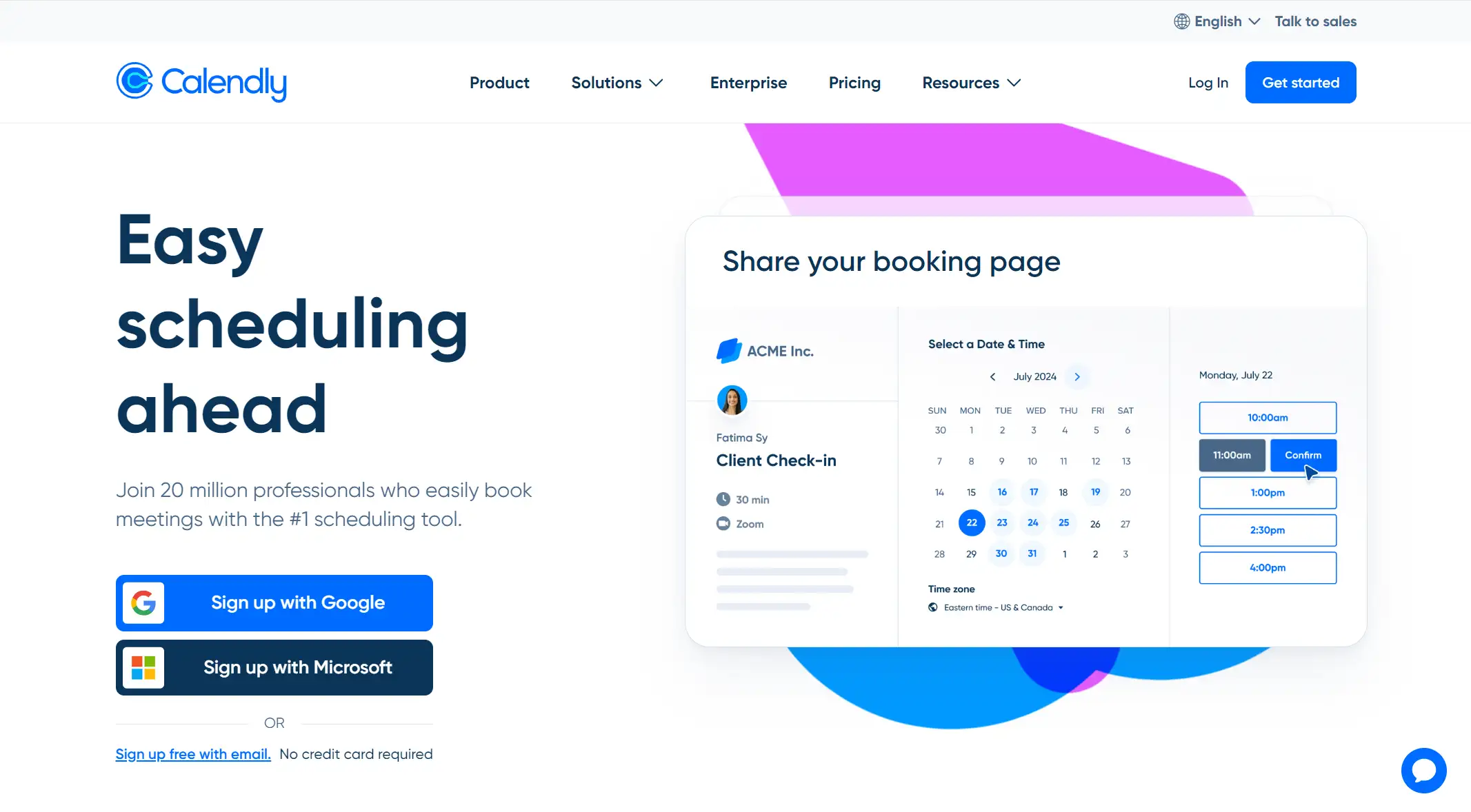
Calendly’s webinar landing page stands out by using a 43-second video, capitalizing on the rising trend of video marketing. Partnering with sales educator Morgan J. Ingram, known for his experience with companies like Salesforce and Google, further enhances credibility and appeals to sales professionals. This strategic approach signals Calendly's commitment to customer needs, likely boosting webinar lead conversions. Featuring a video promo and collaborating with an SME or influencer can significantly enhance your landing page's effectiveness.
17.Good Eggs (Food)
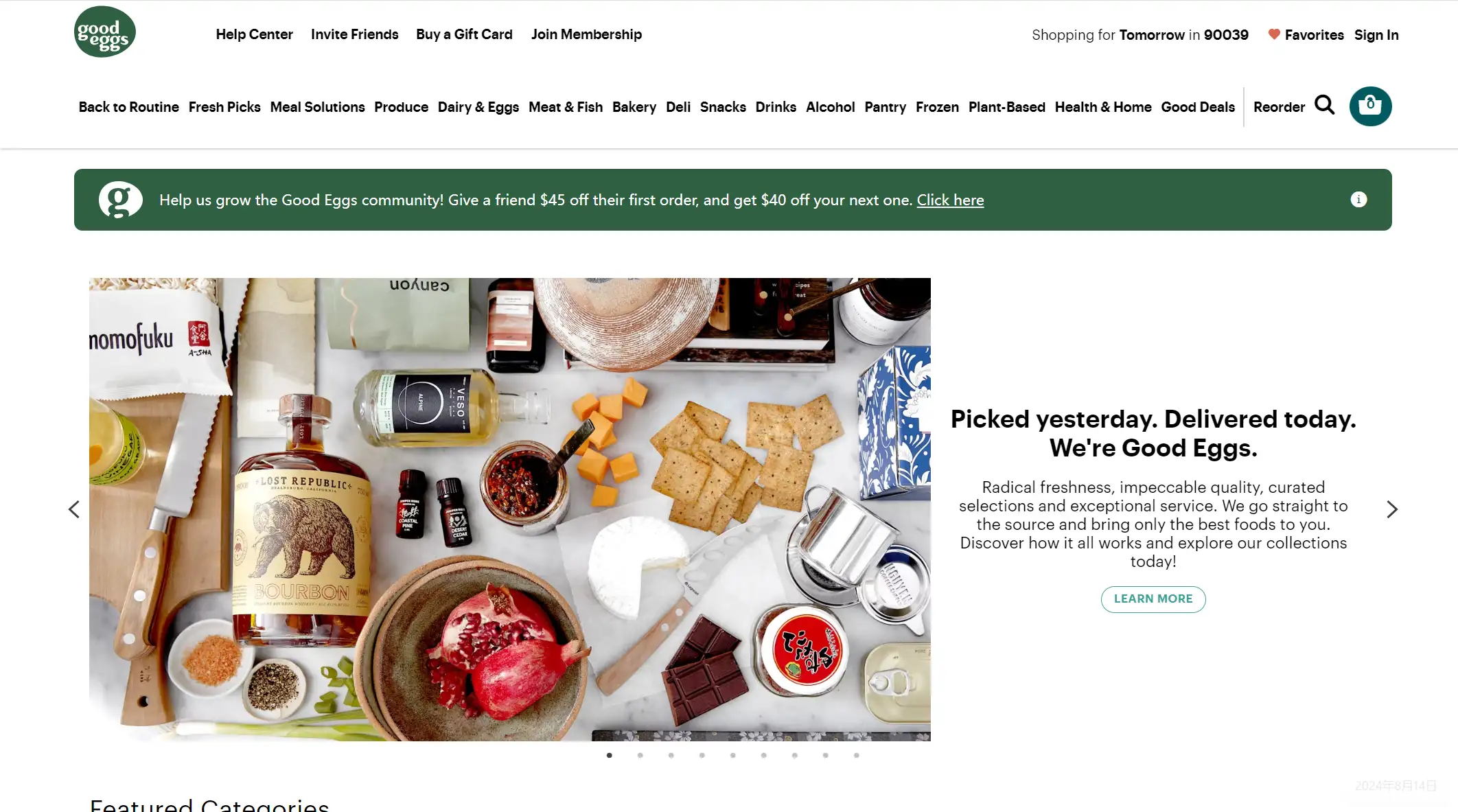
Good Eggs’ landing page effectively promotes free coconut water while showcasing brand values of wellness, sustainability, and ethical labor practices. The promise of a freebie builds goodwill and resonates with visitors who align with the brand's lifestyle. Additionally, carefully selected testimonials reinforce these value propositions, enhancing trust and driving conversions without being overbearing.
18.Hack the Box (Digital Security)
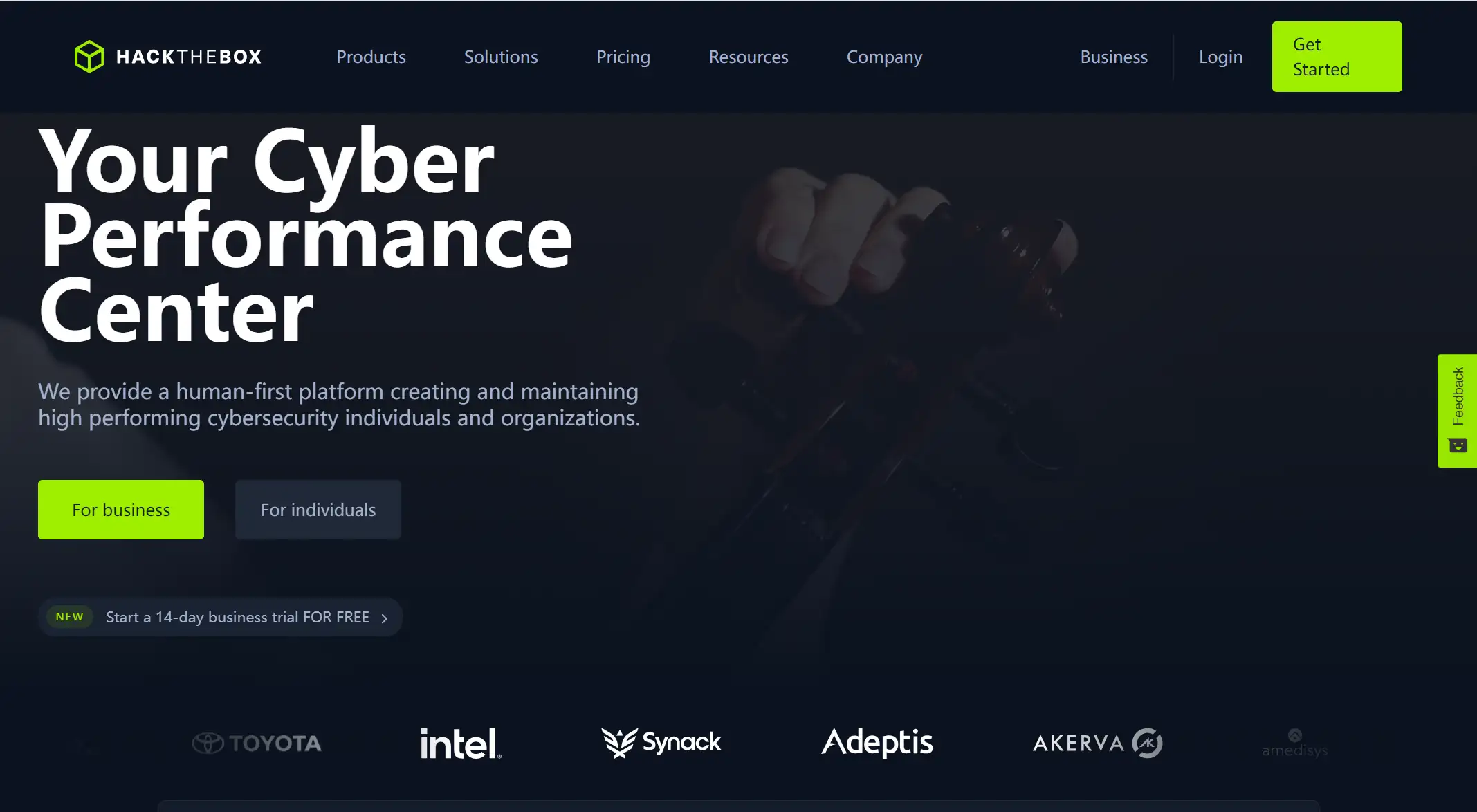
Hack the Box’s landing page quickly establishes its cybersecurity focus, offering training for individuals and organizations. The headline clarifies as you scroll, while a subtle event promotion and a key quote emphasize the service’s importance. Ensure your headline clearly conveys your offering and next steps within seconds.
19.HomeLoanGurus (Finance)
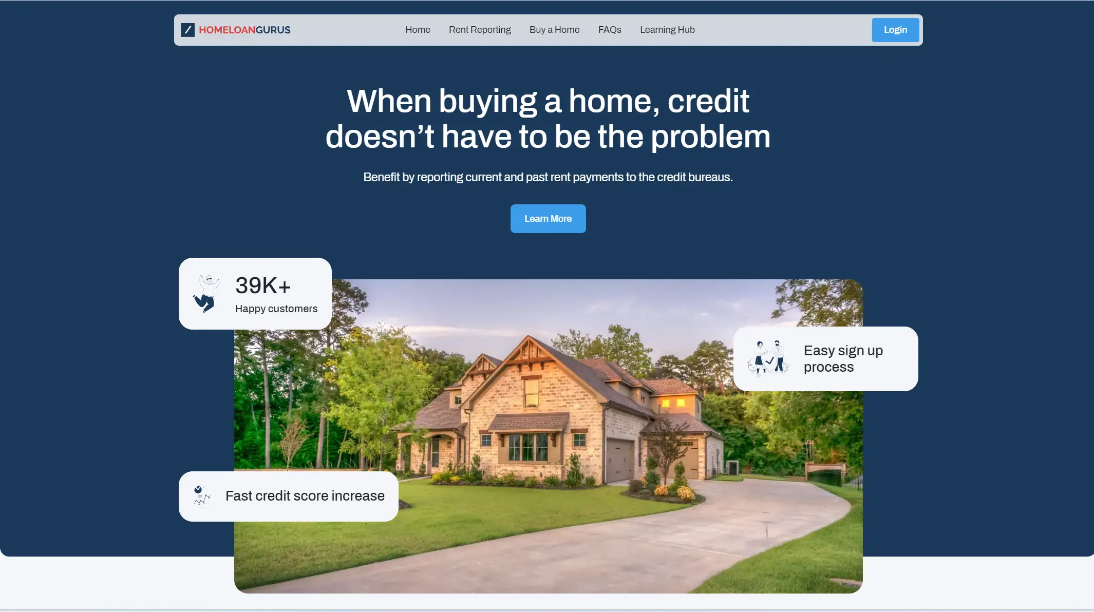
The landing page for HomeLoanGurus successfully reaches out to prospective homeowners with bad credit by emphasizing their issue in the headline and providing a clear solution. It breaks down the home loan application procedure into manageable steps, making it accessible to individuals who are reluctant to get started. The page's condensed information conforms to statistics that suggest shorter financial landing pages have higher conversion rates.
20.Exit Five by Dave Gehardt (Marketing)
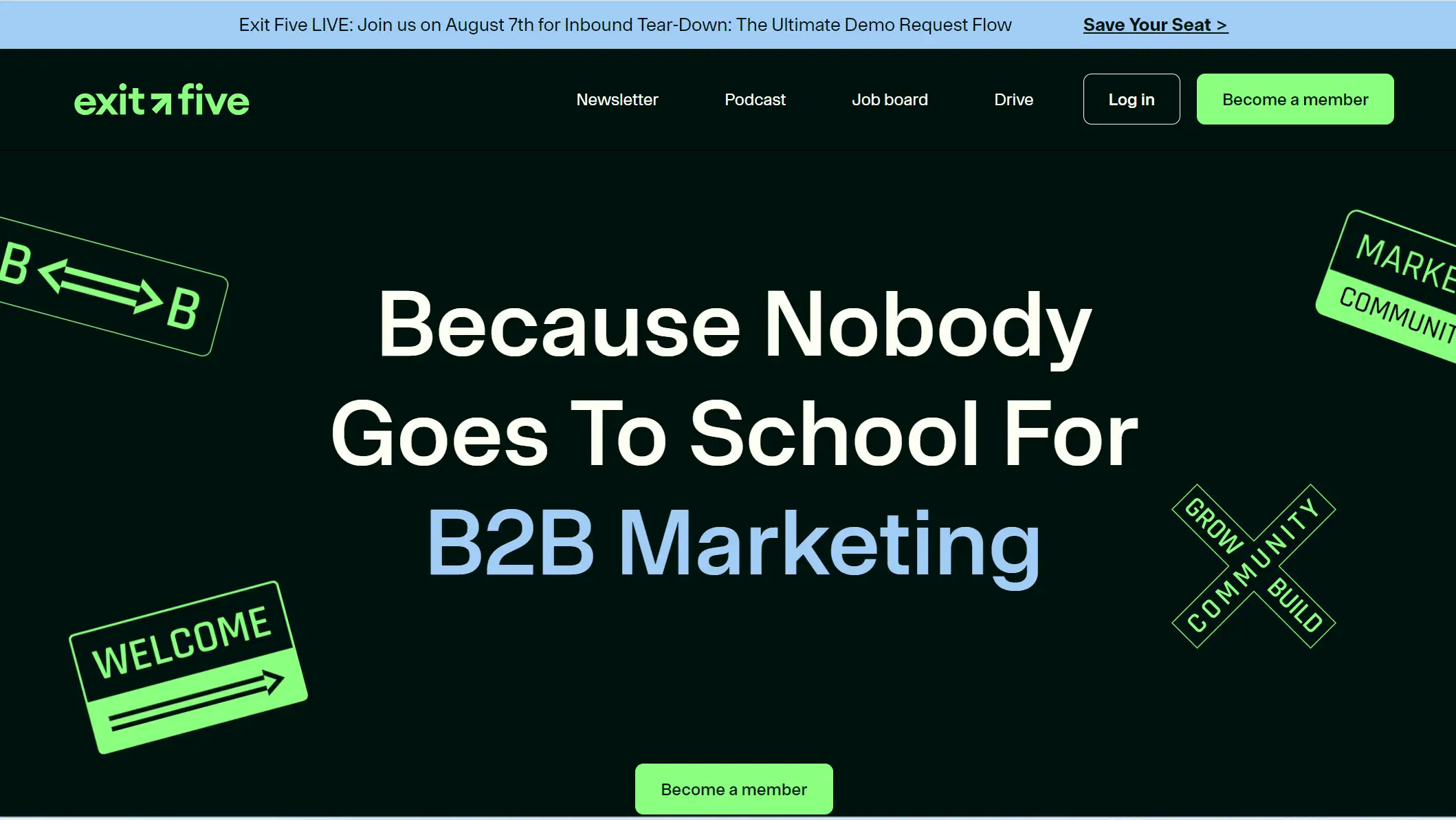
The colorful animations and straightforward text on this Exit Five landing page provide users with an engaging experience while emphasizing the membership advantage of acquiring verified B2B marketing expertise. The website successfully fosters confidence and promotes sign-ups with its reputable creator, Dave Gerhardt, and a risk-free 7-day trial. Investing in a unique landing page such as this may greatly increase the appeal of your business if funds permit.
21.Justin Welsh (Marketing)
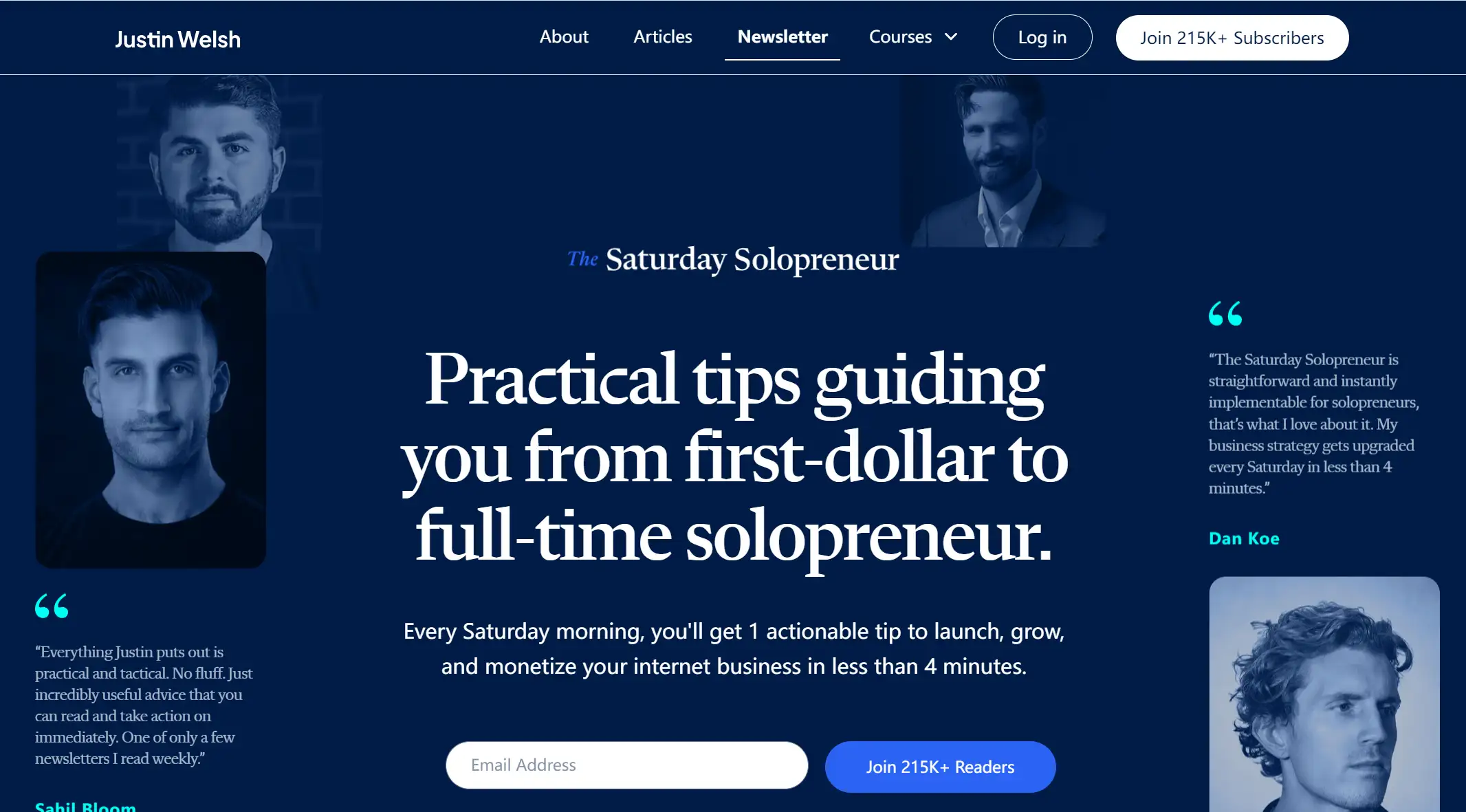
Justin Welsh’s landing page highlights his solopreneurship authority with top endorsements and a 215K+ readership while emphasizing short newsletter reading times and offering sample issues. Featuring notable testimonials and addressing concerns upfront boosts credibility and engagement.
22.The Gist (Sports)
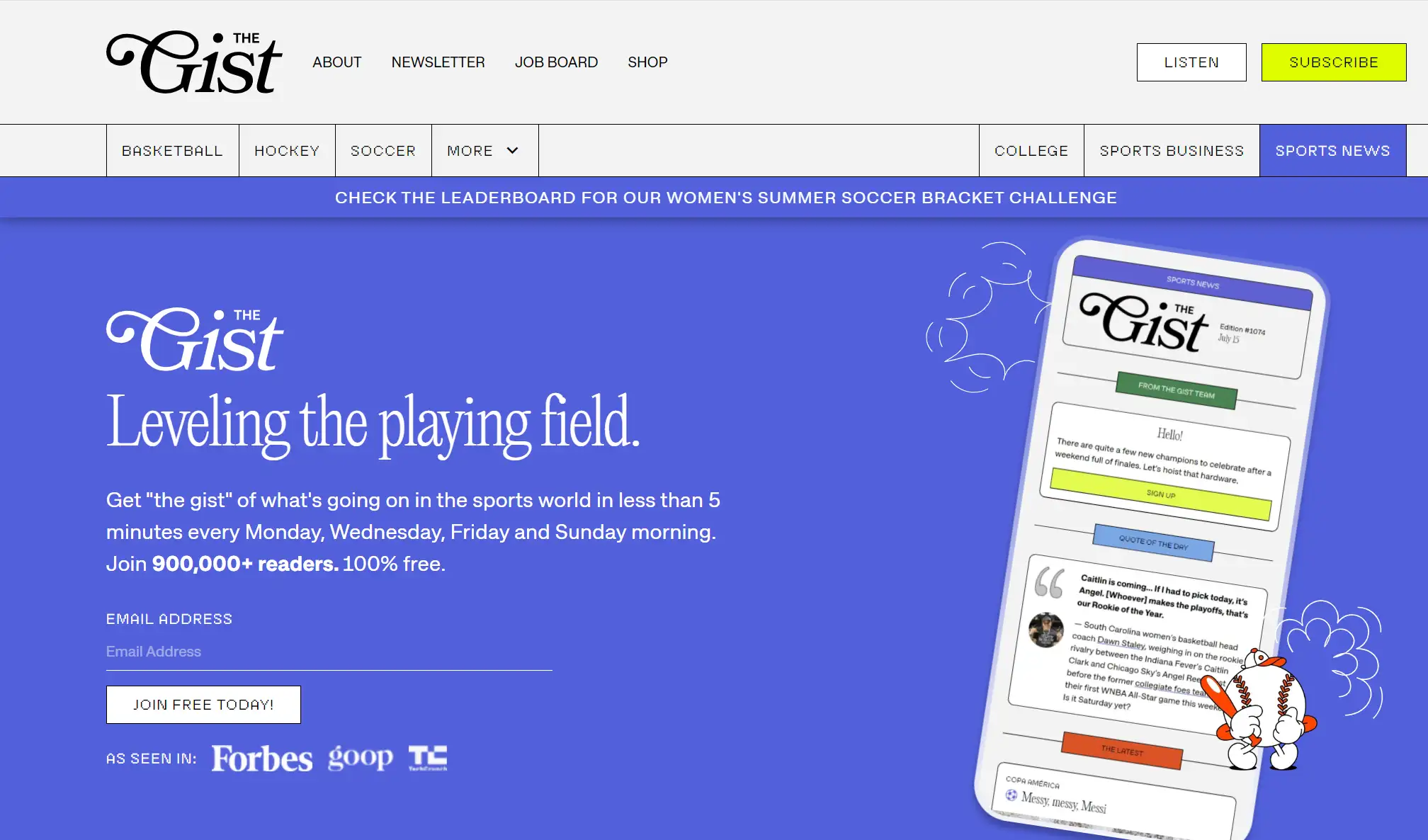
The Gist’s landing page builds credibility with its impressive 900K+ subscriber count and mentions in Forbes and TechCrunch. Its content is concise and easy to digest, fitting entirely on one screen. To implement this, address your target audience’s key objections upfront and keep the information brief and accessible.
23.Jet Pet (Pets)
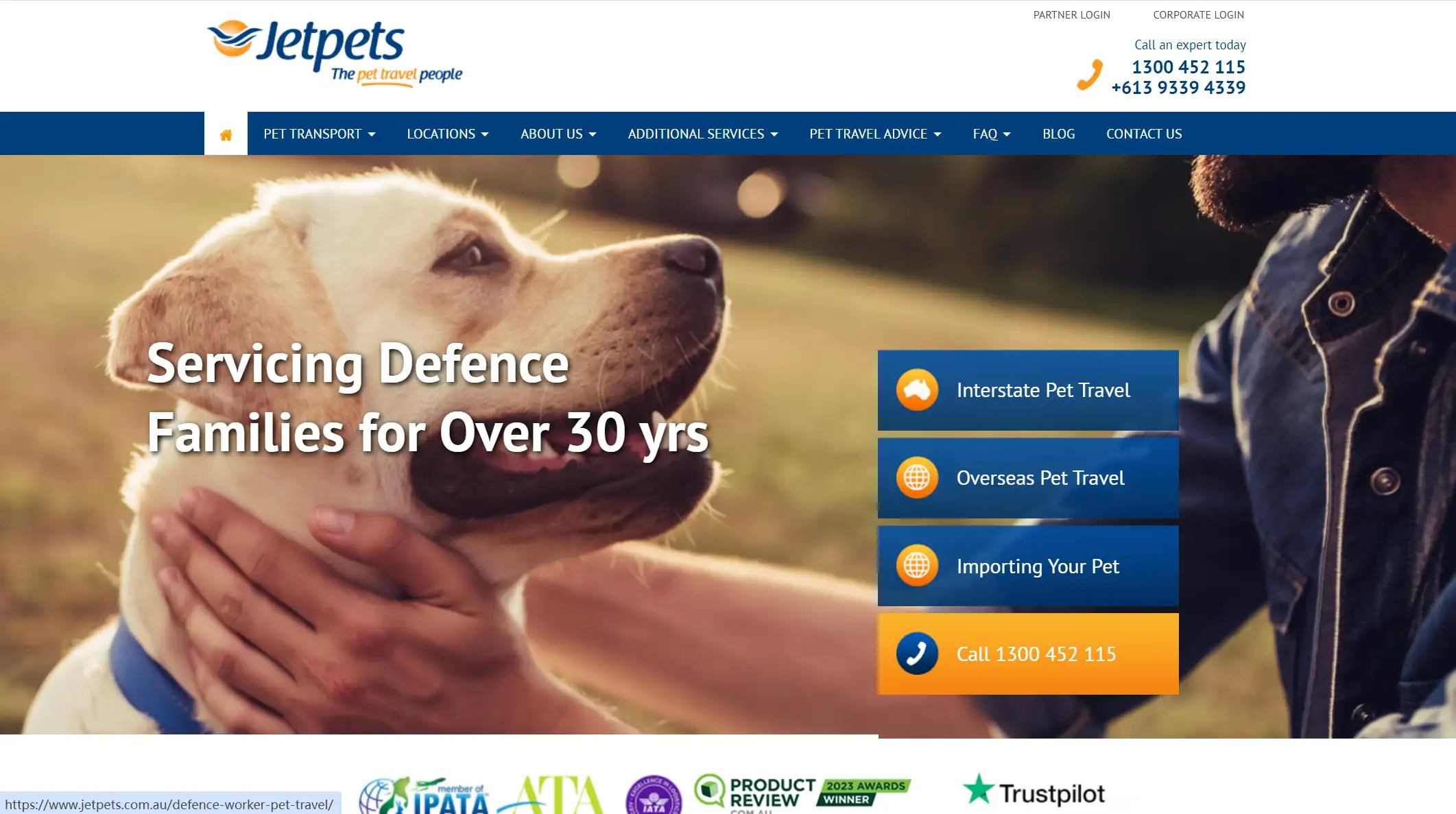
With a clear value statement and the use of Dynamic Keyword Replacement to match search phrases, Jet Pet's landing page performs exceptionally well. In addition to being more amiable and personalized—such as requesting the dog's name—the two-stage form lowers perceived effort. The page's soothing wording and authentic dog owner video testimonials enhance credibility and foster confidence. The components on Jet Pet's page make it an excellent illustration of focusing on particular regions.
24.Breather (Productivity)
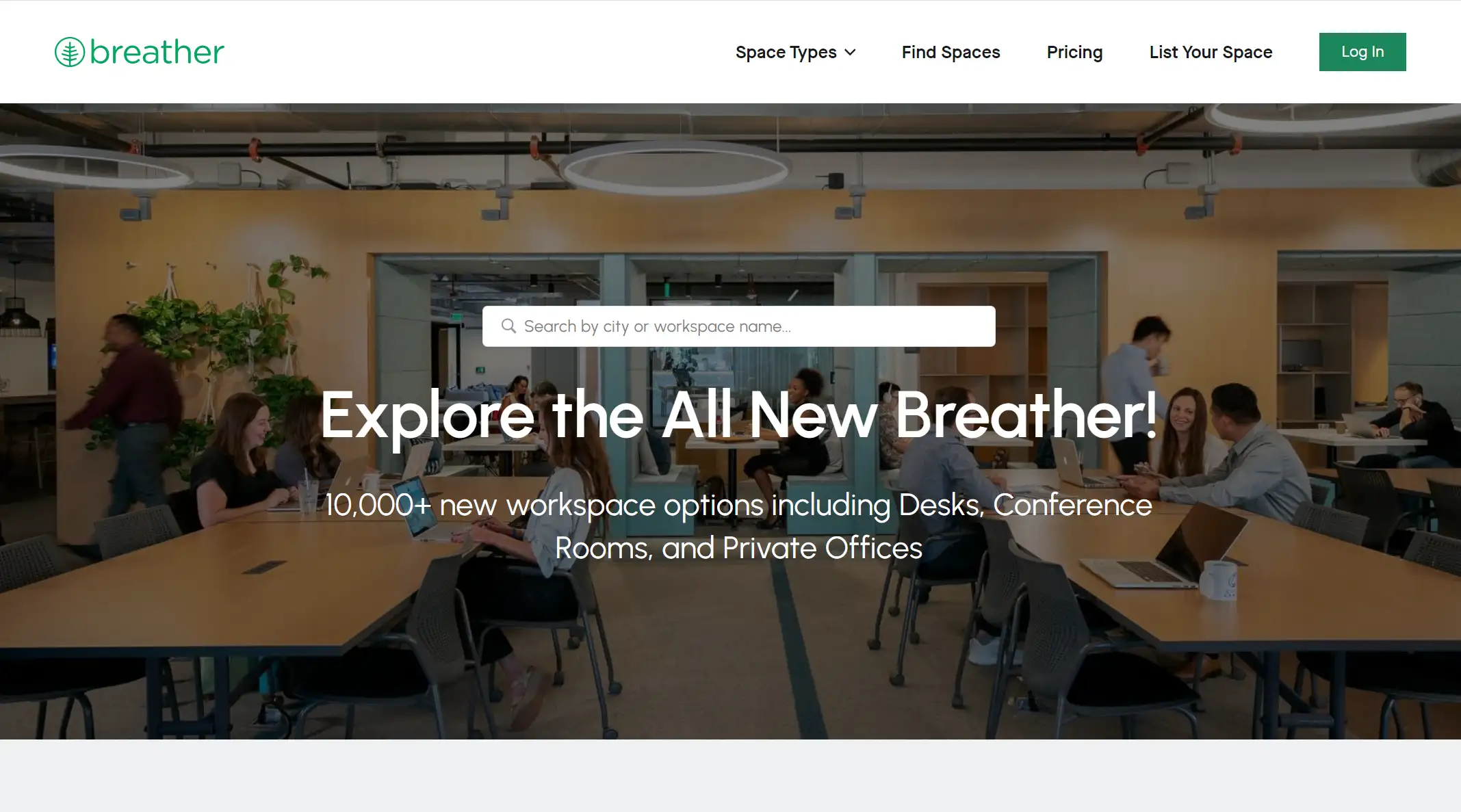
Breather’s landing page effectively uses simple, direct copy and an immediate CTA to find a workspace, enhanced by location services for nearby options. The design, featuring ample negative space and a soothing color scheme, reflects the brand’s focus on creating calm, breathable environments. The strategic placement of the CTA and intuitive design make customer sign-ups easy and user-friendly.
25.Mailchimp (Marketing)
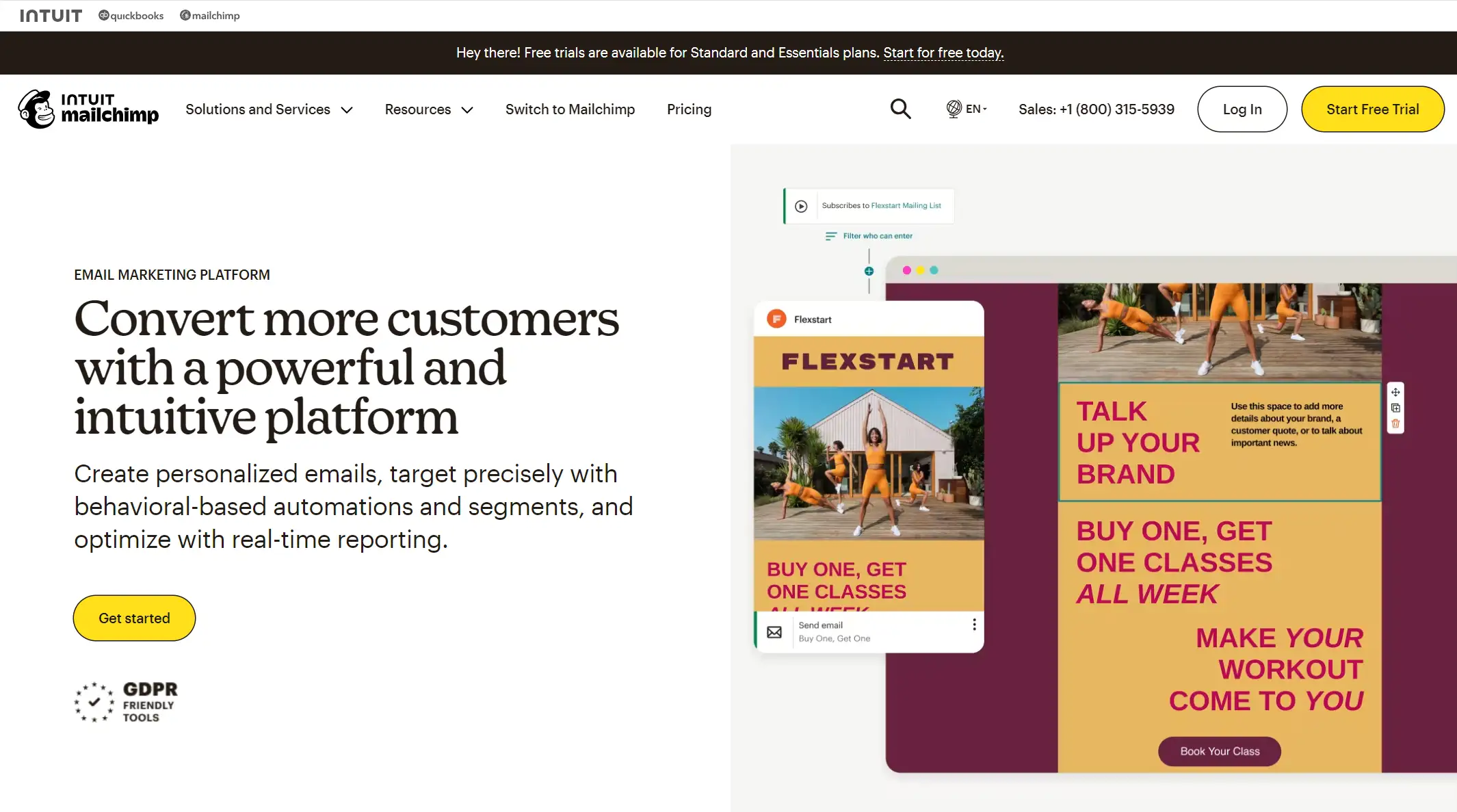
Mailchimp's landing page stands out with bold yellow CTAs that demand attention, diverging from its subdued home page while staying on brand. The consistent placement of CTAs ("Start a free trial" and "Get started") ensures they're always accessible, effectively guiding visitors toward conversion as they navigate the page.
26.NANOR (Health and Wellness)
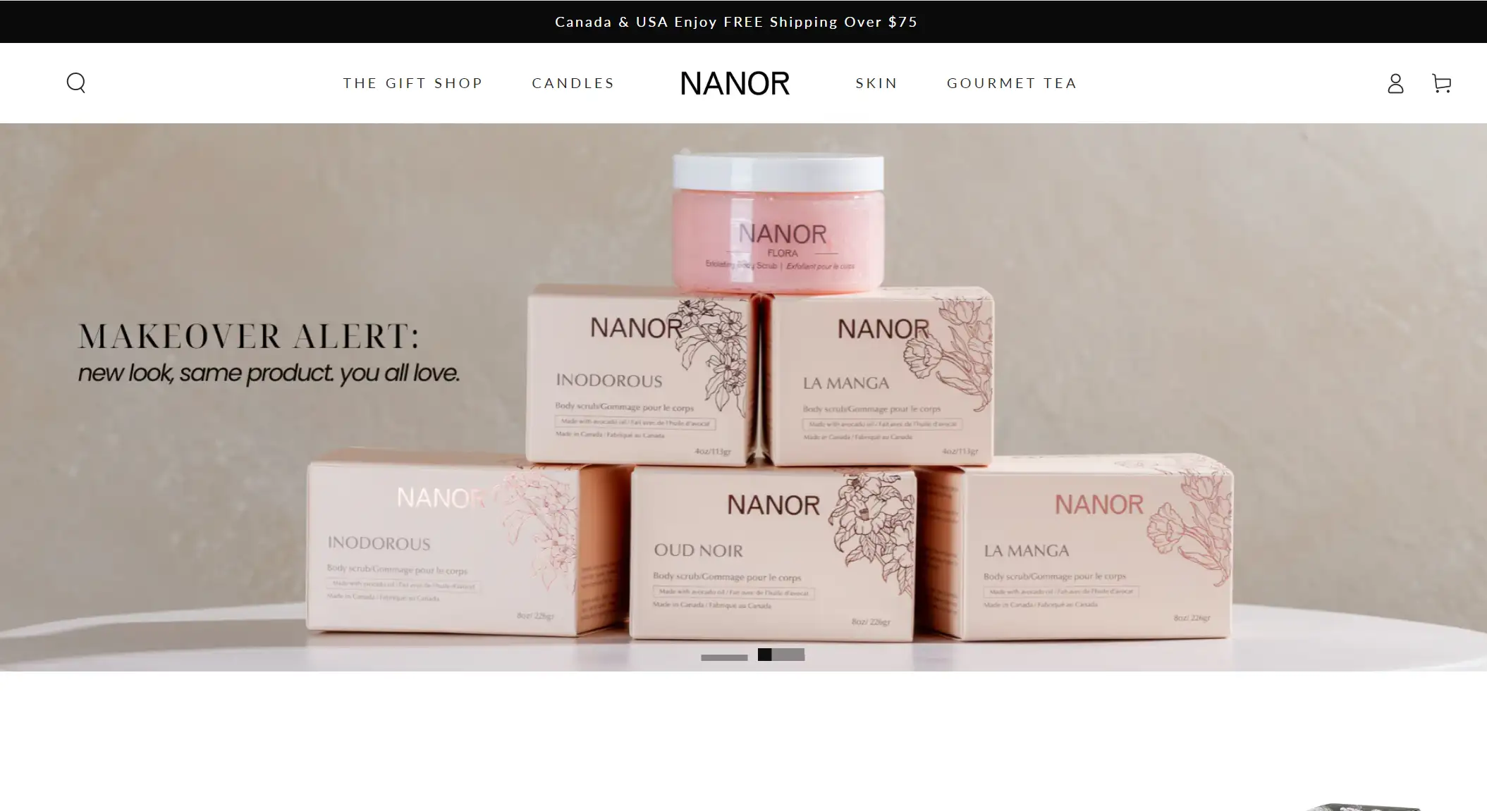
NANOR's landing page exudes luxury with a sleek black background, vivid imagery representing candle fragrances, and custom "Add to Cart" buttons, making it easy for visitors to indulge in a premium sensory experience.
27.Pared (Staffing Solution)
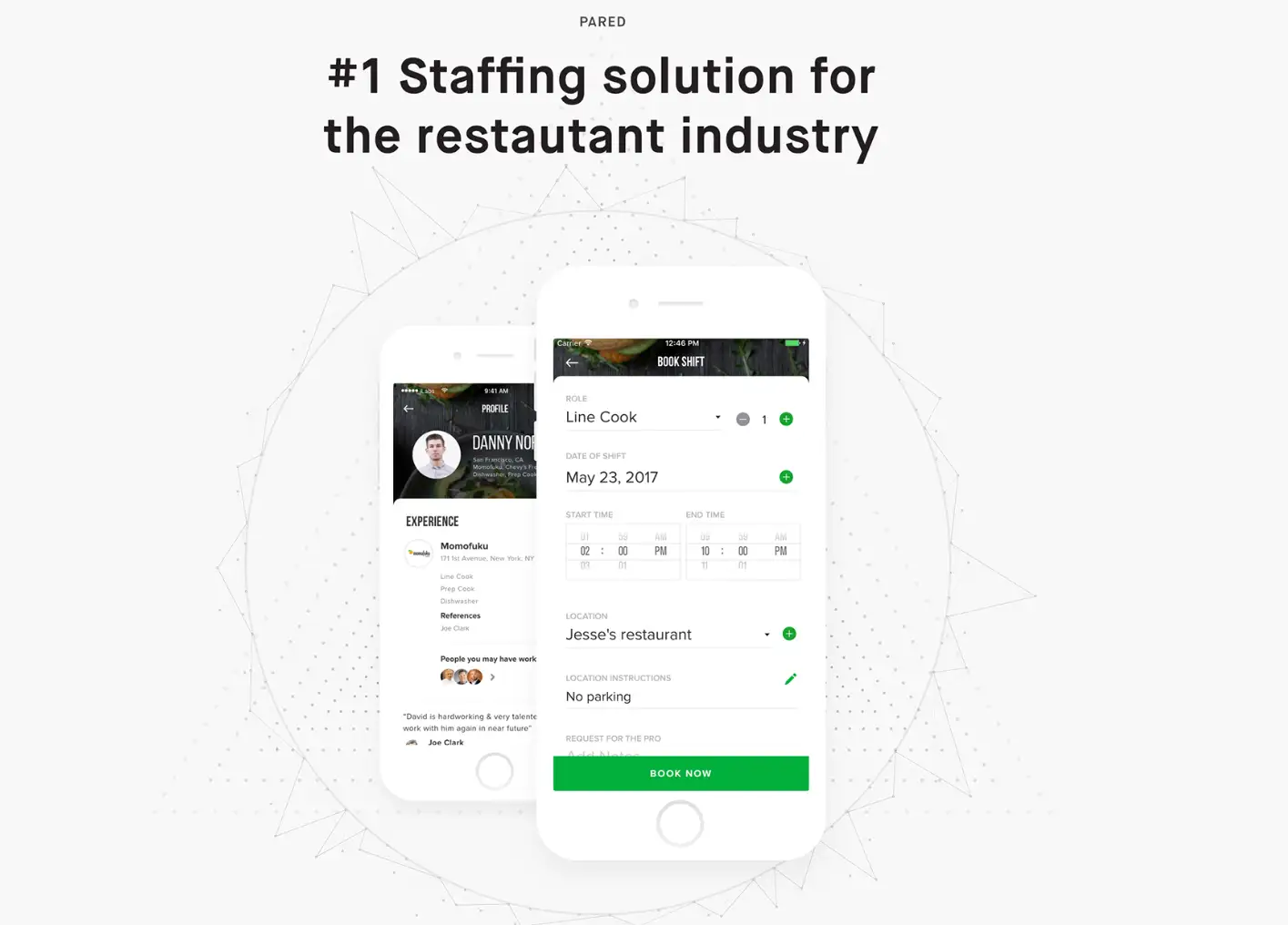
The landing page for Pared successfully targets restaurants by presenting easy-to-use software that links them with skilled culinary personnel. It is accentuated with an explanatory film and endorsements from well-known restaurants.
28.CarMax (Cars)

CarMax's landing page streamlines the car buying and selling process with user-friendly tools like a searchable car database, budget calculator, and instant quote form, emphasizing convenience and a hassle-free experience.
29.Roomezeb (Real Estate)
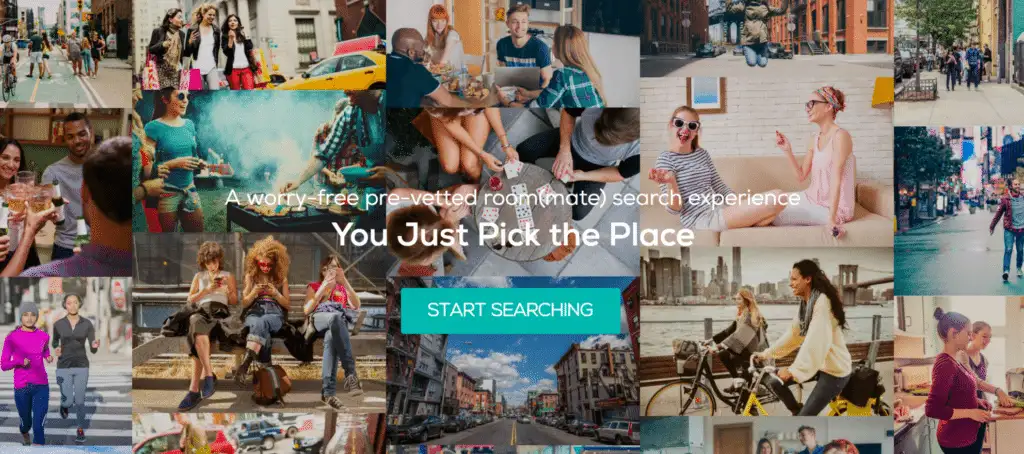
Roomeze's vibrant landing page combines playful illustrations and a compelling CTA, inviting users to explore affordable NYC apartment options with vetted roommates.
30.Woolx (Clothing)
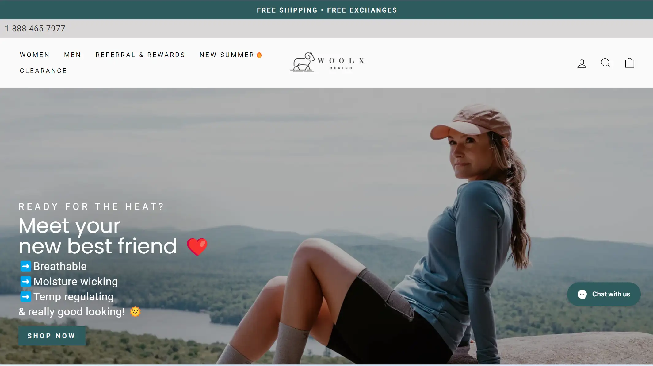
The trendy, breezy Rory Sweater made of 100% Australian Merino wool is highlighted in high-resolution images on Woolx's landing page, along with a lifestyle film and a 10% discount coupon.
Try The Best AI-assisted Tool for Your Next Landing Page Design
Tired of endlessly scrolling through other people's projects for inspiration and then wrestling with clunky website builders? If you're craving a smarter, more fun approach, meet Wegic—the AI-powered chat-and-build website maker that makes web design as easy as chatting with a friend. In just three steps, you can have your landing page up and running in minutes.
Here’s how Wegic works:
First, tell Wegic what you’re dreaming up, from colors to layouts and fonts.
Next, let the AI assistants help you polish those details—like picking the perfect images and tweaking the design.
Finally, buckle up and let Wegic work its magic.
Want to make a few changes? Just chat with the AI or tweak it yourself. It’s like having a web designer in your pocket!
FAQ
What makes a landing page effective?
-
Key elements include a clear headline, strong CTA, engaging design, concise copy, and mobile-friendliness.
How do I track my landing page's success?
-
Monitor metrics like conversion rate, and bounce rate, and use A/B testing. Tools like Google Analytics help analyze performance.
What common landing page mistakes should I avoid?
-
Avoid cluttered designs, unclear CTAs, excessive content, and poor mobile responsiveness. Ensure usability across devices.
Click here to Build your site
Conclusion
A successful landing page balances clear messaging, compelling design, and strategic elements to drive conversions. By examining the 30 great landing page examples provided and trying Wegic, you gain insight into best practices and innovative approaches that can elevate your own page.
Whether it's through eye-catching visuals, persuasive copy, or effective CTAs, applying these lessons can transform your landing page into a powerful tool for achieving your marketing goals.
Written by
Kimmy
Published on
Mar 12, 2026
Share article
Read more
Our latest blog
Webpages in a minute, powered by Wegic!
With Wegic, transform your needs into stunning, functional websites with advanced AI
Free trial with Wegic, build your site in a click!