Log in
Build Your Site
Landing Pages vs Websites: Key Differences Illustration
Discover the key differences between landing pages vs websites, their unique purposes, and how to design them effectively using top tools.
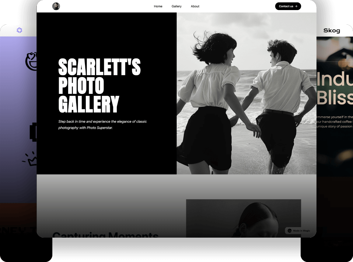
Is there a time that you are quite bewildered specifically on the difference between the landing pages and websites? You're not alone! It becomes quite challenging for many people to comprehend when it’s most appropriate to use each of them if they are new to online marketing or web design. No matter if you are designing the first resume website or trying to improve your current web presence there are some key differences between the landing pages and the standard websites you need to be aware of.

Here in this article, I will take my time and explain the two to you in a basic way. What each does best when they should be used, and critically, perhaps most importantly, we will consider how being aware of those differences makes all the difference to your fortunes online. Finally, the differences in what a landing page consists of as well as what a website contains and how both can be helpful when it comes to reaching your audience will be expounded.
What is a Landing Page?
Landing page is a single web page which is developed especially with the specific objective of gaining customers/clients. It’s normally the first thing that a user is directed to after clicking on an advertisement or a particular call to action link. Unlike a conventional website that consists of several sub-pages and various navigation menus, a landing page focuses on the user’s conversion through a particular call to action, like subscribing to a newsletter or downloading a particular piece of content, among others.
Landing pages are very effective in marketing strategies because they can guide the consumers towards the intended goal without any interference from other links or choices. This increased awareness makes it quite possible for landing pages to act as one of the best tools for conversions.
Typically, a landing page consists of:
-
A catchy headline: This grabs attention and sets the tone for the page.
-
Compelling visuals: Images, videos, or infographics that align with your brand.
-
A clear call to action (CTA): This encourages users to take the desired action (e.g., "Sign Up Now" or "Get Started").
All in all, landing pages help provide an easy-to-use interface for the users as they remove all those extra elements that are not so pertinent at that particular moment and are centred mainly on one action. They are very vital in the process of converting prospects into buyers.
What is a Website?
While a Landing Page is a single web page that a visitor can only bounce to and primarily exit, a website comprises multiple connected web pages each accessible through the other using navigation links. Websites work as a primary platform for businesses or themselves where visitors can find many things or interesting topics services or products. Websites give a holistic picture of what exactly the brand can offer and encompass part of the website such as: ‘About Us,’ ‘Services,’ ‘Blog,’ ‘Contact,’ and ‘Product Pages.’
In particular, websites are easily adaptable for long-term relationships with site visitors. In contrast to other markets where Persuasion is focused on a specific action, these are web locations that are created to have value in content and interactivity. For instance, an e-commerce site has such pages as product pages, frequently asked questions, product reviews, and blog pages which are all in the persuasion-informative paradigm.
Typical components of a website include:
-
Home Page: The main page that provides a summary of the site’s purpose.
-
Multiple Pages: Other pages might be dedicated to products, services, blogs, or contact information.
-
Navigation Menu: Helps visitors move around the site easily.
-
Footer with Links: Usually contains links to social media, legal information, and secondary pages.
Landing pages are self-contained especially if digital marketing provides links directing potential customers to a landing page but websites enable users to browse deeper and get to know about your company and products at their own will.
Landing Pages vs Websites: Key Differences

Okay, now let me be more specific and give you the more interesting information, that is between the terms of landing pages and websites. However, both are active players in the big sphere called digital marketing, but the nature of their work is quite different. Think of it like this: websites are the large houses with the various rooms while landing pages are the little, comfortable, one-bedroom apartments, in which the focus is clear and concise. Now, let’s put it into categories and add some flair to the piece if we may.
Purpose and Focus
The main distinctive feature of landing pages and websites is the presence of goals for these types of pages. Websites can be compared to an ‘online swiss-army knife’ – websites are designed to deliver information on various topics, certain services, or products. What could be more helpful for those who visited your site to stroll through its sections, get to know more about your brand, and perhaps subscribe to your newsletter? Websites are built for long-term relationships with your visitors. You are inviting them in to come live, play around each room in your electronic house, and perhaps stick around.
Landing pages, in turn, are more of the type of ‘speed dating.’ This is your only opportunity to grab the attention of your visitor and make him/her do as you want—whether it’s making a purchase, signing up, or downloading something. They’re focused, single-goal machines. The essence and the focus of the landing page are a single call to action or a goal, which is defined as the purpose of the landing page. You’re not guiding the visitor through the maze of different tabs and menus; you need them to accomplish one action and it should happen right now.
Landing pages vs websites – if you want that person to perform a particular action, like buying something or signing up for something, the landing page is your hero.v
Content Depth
The other main factor that sets a site different from landing pages is the extent of the information provided. Another way to think of websites is as a library in which a vast amount of information, articles, videos, product information and more can be found. They are ideal for those users, who are interested in some in-depth information concerning your company, services or products, and outlook. You have several pages, a header and footer, a toolbar, and so much more, and each of these is a narrative in its own right.
That’s why landing pages, on the other hand, are more similar to a billboard located at a highway intersection. You do not have much time and area to deliver your message, your words are the primary tools you use. The landing page’s content, in general, is not as large and detailed as that of a homepage, but it is more focused and vibrant. It can be seen that it is a matter of filtering out all the congestion and getting to the main issue as soon as possible. There is no time for more unnecessary frills – you’re letting your visitors know just the right message and motivating them to act.

Navigation Style
From the navigational point of view, websites are like those giant malls where one can get lost for hours. It’s full of pages, and drop-down menus, and as far as the eyes can see, there are links to be clicked on. You are taking your guests by different subject matter and providing them with the opportunities to set their course of journey.
However, after a landing page has been established, it resembles a one-way road in that you cannot manipulate its settings or create additional pages from it. You know where you’re going and hell hath no fury like an opinion determined to get there. Thus, a simple method of selecting food through a banner that puts forward no more than two choices would suffice. One of the main goals of a landing page is to reduce the scope of the visitor’s options and make him/her concentrate on a single CTA. You are feeding them with just the right portion of information and don’t leave them in a dilemma nor confuse them with so many other additional information.
SEO Impact
In concerns to SEO, websites are generally more advantaged. A website is supposed to be indexed in search engines and as you have many pages to make changes, there are plenty of chances to place your site for various keywords. Additional content also acts as an added advantage since it provides grounds for the website to appeal to organic traffic.
Landing pages, as subordinated components of a particular campaign, are often far from being great sources of SEO even though landing pages are rather short-term solutions and tools-oriented.
So let me sum it up and say that if we have to choose between landing pages vs websites, it comes to the goals we have. If you are planning to make an empire online which should also have space for expansion then the website is the correct bet. However, if you want a specialized persuasive marketing tool that helps to make conversions, the landing page will do it effectively. Each of them is appropriate for your best practices. However, you need to understand the right time to apply them. So, beginning with the conversation of landing pages vs. website, you are all set with all the necessary information for the selection of the most appropriate option for the company.
4 Best Landing Page Builders in 2024
Unbounce: The Versatile Landing Page Builder
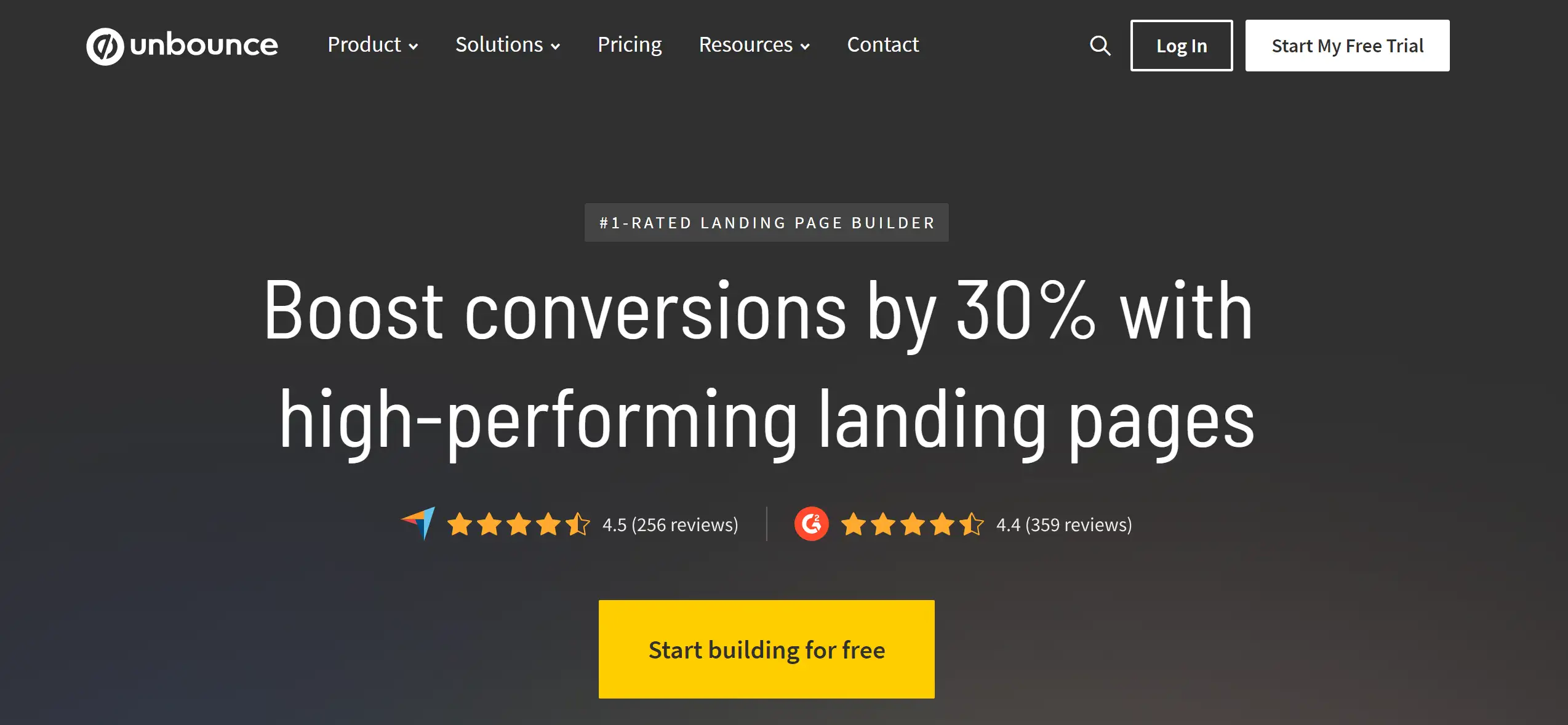
Unbounce is not only a landing page builder tool but a marketing tool of great value for the professional marketer as well as the small business owner who wants to convert clicks into customers. Yes, whether your business is a dental practice, a law firm or a plumbing company, Unbounce has got you sorted. At $99 per month, you have up to 500 conversions and 20,000 unique visitors if you aim at converting leads into sales. The platform offers two ways to craft your landing pages: there’s the more traditional drag-and-drop option, the Classic Builder, and the new-age Smart Builder.
The Smart Builder is there in its beta version right now and it is aimed at using AI to create a layout for you and then you can customize it to your needs. Unbounce has more significant advantages when it comes to A/B testing and targeting allowing us to determine which page is more effective. Also, its Smart Traffic AI leads visitors to the page variant that can help them convert. All in all, Unbounce’s tools are likely to pay off if you are willing to go deeper and employ such options.
Key Features:
-
AI-Powered Smart Builder: Automatically creates and customizes landing pages based on your objectives.
-
A/B Testing Tools: Test multiple page variants to find the most effective one for conversions.
-
Dynamic Text Replacement: Adjusts text on your page based on visitor search queries for better relevance.
Instapage: The Premium Landing Page Builder
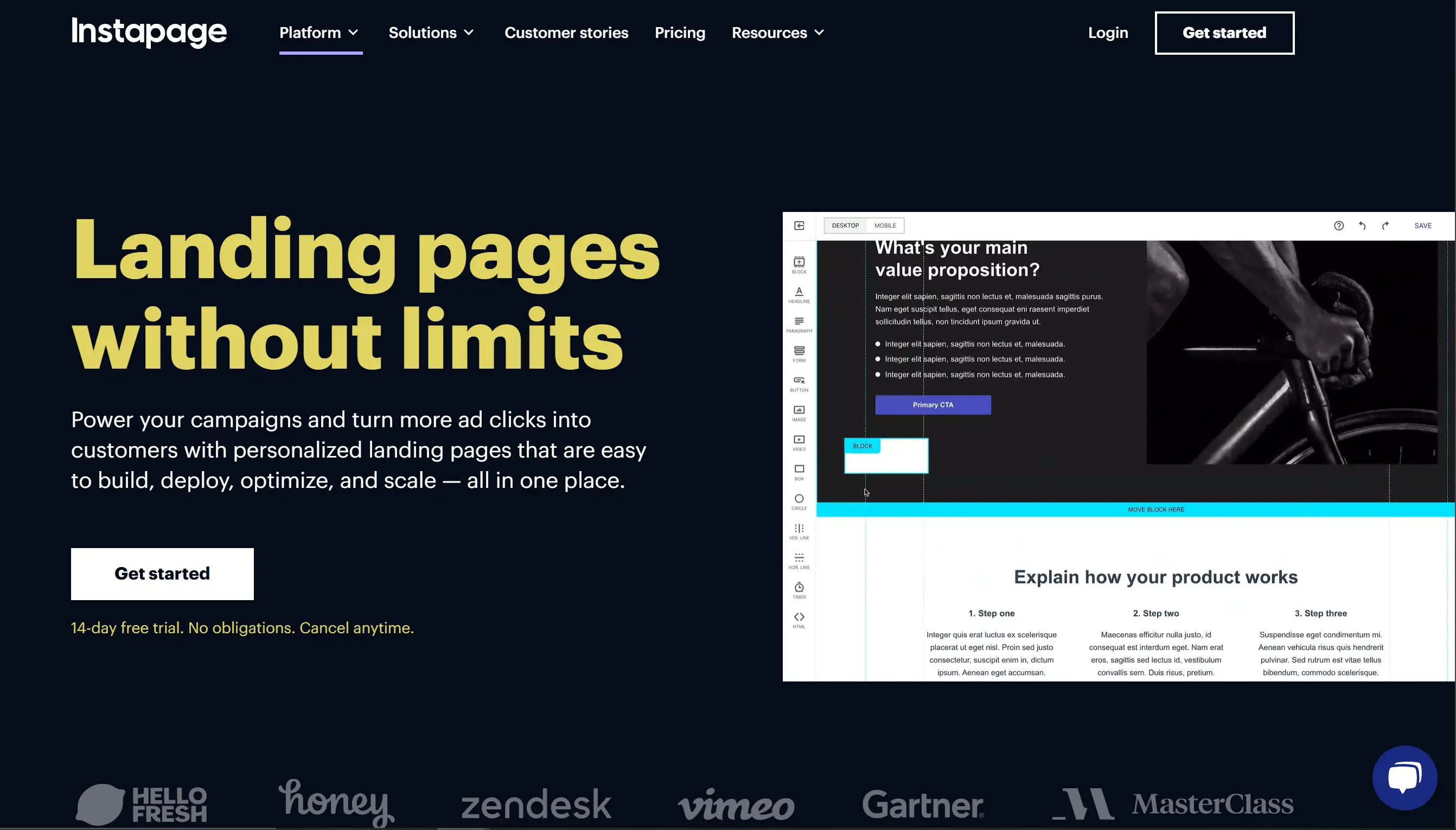
Although Instapage has a rather high price, we can name it one of the best landing page builders. As suited for building post-click conversion-focused landing pages, Instapage comes in two versions – Standard and AMP Landing Pages of which AMP is particularly optimized for mobile users who prefer responsive design. The page maker focuses on the so-called Instablocks—elements of content that you can place on a page and edit within a single click. It brings in an AI content creator to aid in writing juicy copy in a short amount of time. Being designed to be highly personalized with an extra layer of AdMap for ad-targeting and linking the advertisements directly to the landing pages, Instapage is a pinch precise. Its tools such as A/B comparing and heat map offer information on how to tweak the pages to have maximum conversions.
Key Features:
-
Instablocks: Pre-built content blocks for easy drag-and-drop page creation.
-
Advanced Personalization: Tailor landing page content based on visitor demographics and behaviour.
-
AdMap Integration: Link different ads to tailored landing pages for optimized PPC campaigns.
Leadpages: The User-Friendly Landing Page Builder
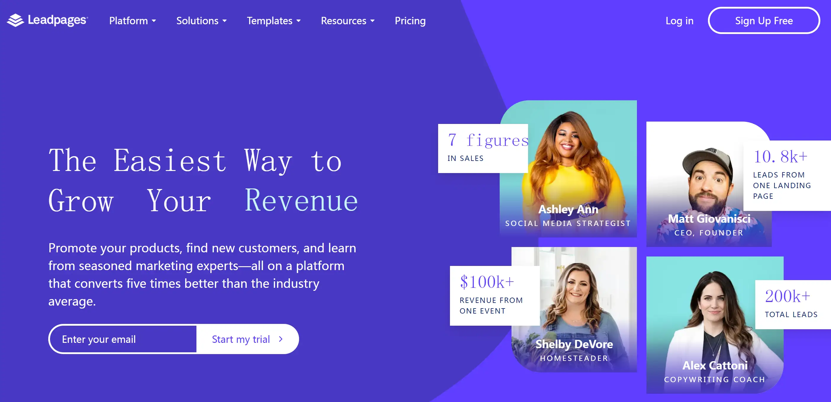
If you’re after a landing page builder that’s as easy to use as it is powerful, Leadpages might be your new best friend. Start with a template, and with a simple click, you can edit individual elements directly—no coding required. Leadpages shines with its straightforward editor and a range of widgets for videos, images, and forms. Its new AI writing assistant (in beta) can help generate and refine copy, though it's best used in conjunction with your existing marketing materials. With a Pro plan, you can even add checkout forms to your pages, making it a breeze to set up a one-product store. Leadpages also integrates with Zapier to automate tasks like form responses and email marketing.
Key Features:
-
Direct Inline Editing: Click on elements to edit them directly with a floating panel for easy adjustments.
-
AI Writing Assistant: Helps generate and tweak landing page copy based on your provided tone and purpose.
-
Checkout Forms Integration: Add payment forms to your landing pages and link them with Stripe for easy transactions.
Carrd: Your Go-To for Effortless Landing Page Creation

Are you Seeking an option to construct a landing page from scratch without spending thousands of dollars? Carrd is your basic, no-nonsense landing page platform that comes with a list of essentials at zero cost. No registration is required even for getting started just select the theme get inside the builder and start designing. Saving and publishing – that’s when you’ll be required to register and create an account with the service. A user interface of Carrd is simple and does not expect a user to invest their time to learn how to use it. The editing process is straightforward: click an image block to show the sidebar for uploading and pasting or linking an image and use markdown for basic text editing.
Some of the features such as the inability to edit the text directly by just highlighting and clicking on the correction as with most word processing programs may seem a little outdated, yet the ease of the interface assures the user that this is only a minor drawback. Next, the builder maintains a strict design paradigm, meaning that once you run your content through it, it will smoothly transition from one block to the next, which makes it perfect for creating simple, yet gorgeously no-nonsense landing pages. However, features such as access to advanced analytical tools, Google Analytics integration, additional widgets or email forms are available only for the Pro Standard account.
Key Features:
-
Simple, Free Start: Begin building without signing up, and only register when you're ready to publish.
-
User-Friendly Design: Easy-to-use editing tools with Markdown support for text formatting.
-
Affordable Pro Plans: Upgrade for advanced features like custom widgets and Google Analytics.
Your Website or Landing Page – Choose Wisely, Young Padawan!
If you are hoping to start from scratch and have the ability to expand your web presence, a website is the way to go. But if you aim to achieve a single, specific objective – let’s say, an event promotion, leads collection, or a new product launch – a landing page is your ace up the sleeve.
They all boil down to what is your target or goal in the online marketing endeavours that you are planning to undertake. And the good news is, with tools like AI assistant available in Wegic, you will not be alone in the entire process.Just 3 steps using an AI-powered design tool can generate your website or landing page :
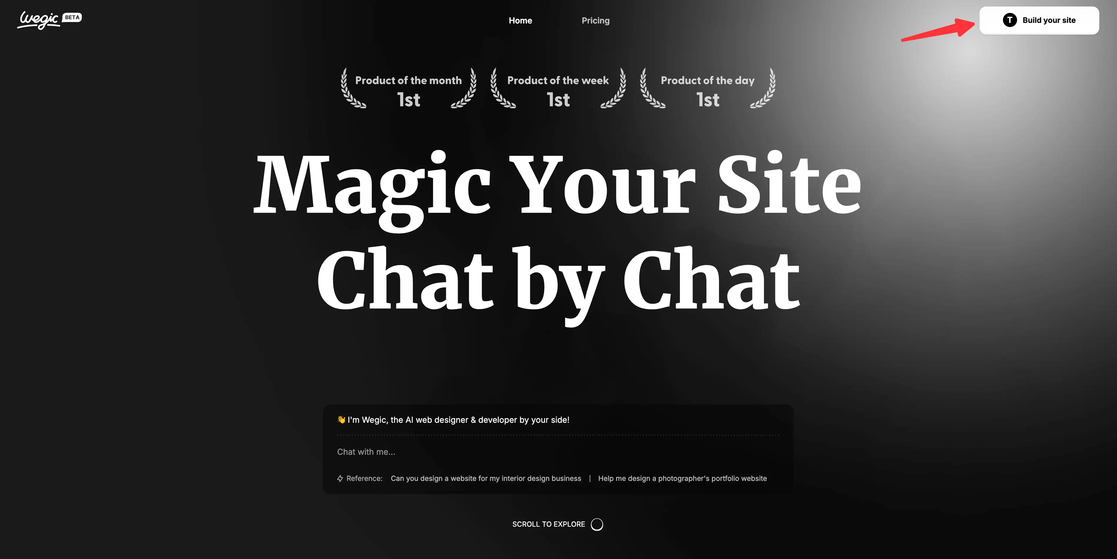
Step 1: Open Wegic
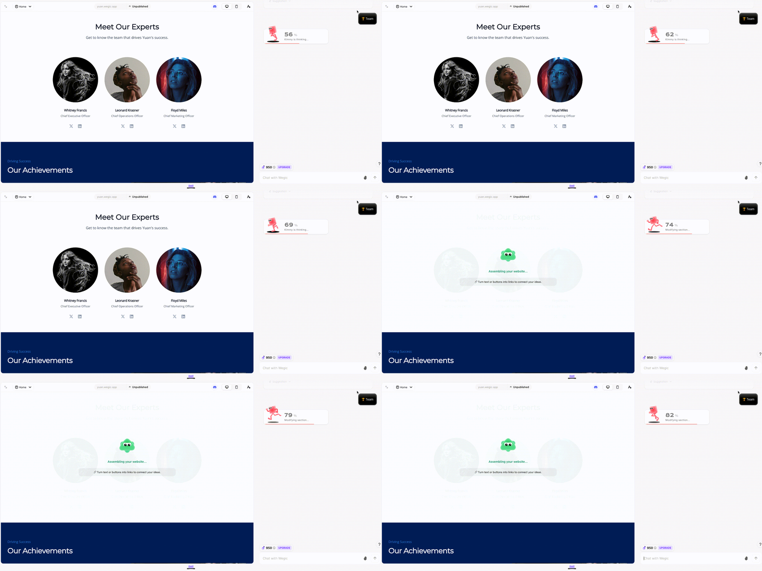
Step 2: Communicate with Wegic —— just like chatting with a designer, describing your website or landing page, or sending a screenshot of the website or landing page you desire.
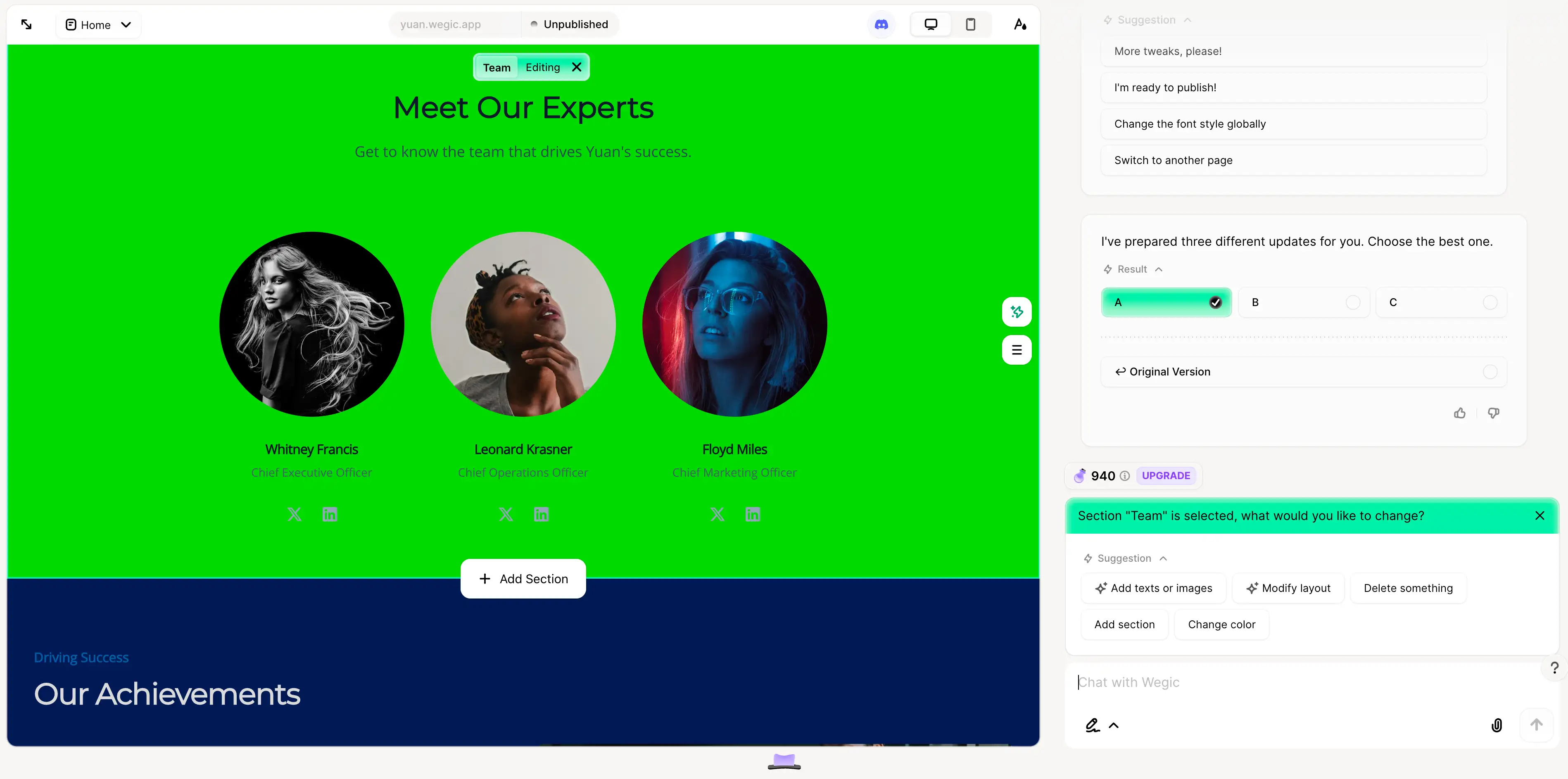
Step 3: Based on the design outcome, you can also have a conversation with Wegic to rework the result.
If you want to create either of these options, Wegic will help you do so quickly, with a step-by-step guide for you to follow so you can make the right decision about what you need.
Written by
Kimmy
Published on
Mar 17, 2026
Share article
Read more
Our latest blog
Webpages in a minute, powered by Wegic!
With Wegic, transform your needs into stunning, functional websites with advanced AI
Free trial with Wegic, build your site in a click!