Log in
Build Your Site
10 Tips to Design an Effective Landing Page
Learn 10 essential tips for designing an effective landing page that converts, plus discover how to easily create one using Wegic’s AI-powered website builder.

Designing an effective landing page is crucial for attracting your audience’s attention and driving conversions. No matter what you do, whether you are promoting a product, offering a service, or building your brand, your landing page needs to be clear, compelling, and user-friendly. Read more about: 15 Inspiring Landing Page Animation Examples for Web Designers
In this guide, we’ll walk you through 10 practical tips that will help you create a landing page that is not only visually great but also performs well. Plus, we’ll show you how to use Wegic, an AI-powered website builder, to make the process even smoother and more efficient. Let’s dive in and turn your ideas into a high-converting landing page.
-
01.Get Clear on Your Goal
-
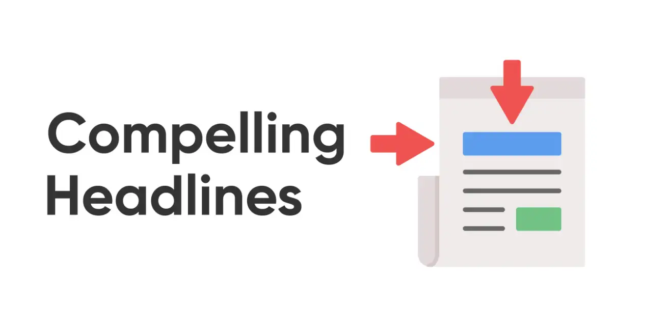
02.Write a Headline That Hooks
-
03.Use a CTA That Gets Clicked
-
04.Keep Things Simple
-
05.Make It Mobile-Friendly
-
06.Show What Others Think
-
07.Only Ask for What You Need
-
08.Use Great Visuals
-
09.Make It Easy to Share
-
10.Keep Testing and Improving
10 Tips to Design an Effective Landing Page
01.Get Clear on Your Goal
It is important to figure out the goal of your landing page because different purposes will affect all aspects of the design. Once you have determined a clear goal, your design can be carried out around this goal.
For example, if you want the audience to buy your product or encourage new users to register and increase the conversion rate, then in this process you need to think about what kinds of design will make it easier for the audience to promote the conversion rate further, such as large and prominent CTA buttons or a persuasive title, because such a design can make it easier to drive users to click.
In this way, you can use concise language and make sure your CTA reflects this goal. Furthermore, you can delete some unnecessary content, allowing your audience to focus on your goal.
02.Write a Headline That Hooks
Your headline is a first impression that encourages your audience to keep reading. If your headline is used effectively, it will arouse the audience's interest and attract them to explore your content more.
You can use straightforward language that conveys the main benefit or solution you're offering. Meanwhile, you can also incorporate some words or phrases to evoke the emotions of your target audience.
For example: "Boost Your Sales by 50% with Our Proven Marketing Strategies." This headline is straightforward, with an appealing promise, which is more likely to attract the audience.
03.Use a CTA That Gets Clicked
An effective CTA plays a leading role in the audience. A clear and strong one can guide users very clearly and directly to complete the desired action and significantly improve the conversion rate. It is a critical component of conversion-focused design.
To create an effective CTA, you can start with verbs that encourage immediate action, such as "Download", "Sign Up", or "Join Now".
Not only that, you can make it stand out visually. You can not only place it in a more prominent position, or increase the size of the button, and use bold font, but also use some contrasting color schemes to highlight its existence. For instance, if your web page background is black, you can use white or conspicuous yellow as the color of the CTA button. This empowers the audience to focus on important content.
For example, "Start Your Free Trial Now" with a bright, contrasting button color. You can add a note underneath saying, "No credit card required."

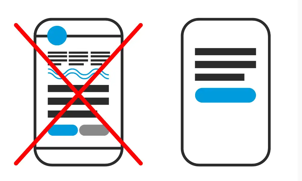
04.Keep the Design Simple
Less is more. A simple and direct design allows the audience to quickly grasp the key points. On the contrary, the overly complex Trial for 15 Days' with an illustration of calendar elements piled up on a web page often makes people feel confused, leaving the audience confused and distrustful. In such cases, they are more likely to leave the website.
There are lots of practices to make your design simple. You can streamline your content and include the most important information. At the same time, reduce the use of multiple colors and fonts, otherwise, people will not be able to grasp the key points. Stick to minimalism and maintain a professional and harmonious appearance of your website.
What’s more, you can use white space around text and images because it will leave your content room to breathe
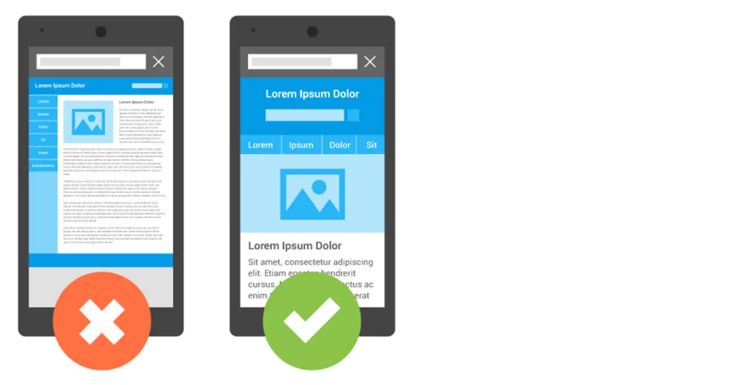
05.Make It Mobile-Friendly
According to statistics, a considerable part of the traffic comes from mobile users, so mobile-friendliness is very important.
Make sure your landing page is mobile responsive so that you can maintain the same good experience when browsing the website, no matter what device you browse on. Otherwise, users are likely to feel frustrated or disappointed.
There are several ways to optimize mobile web pages, such as improving web page loading speed or using flexible layouts and scalable images that adapt to various screen sizes.
And you should also simplify your content and just leave the most important part to your target audience.
Furthermore, you can use some simplified navigation. For example, considering that the mobile screen is relatively small, you can use a hamburger menu, which will not take up too much screen space and can show the content of the entire page to the audience intuitively and clearly.
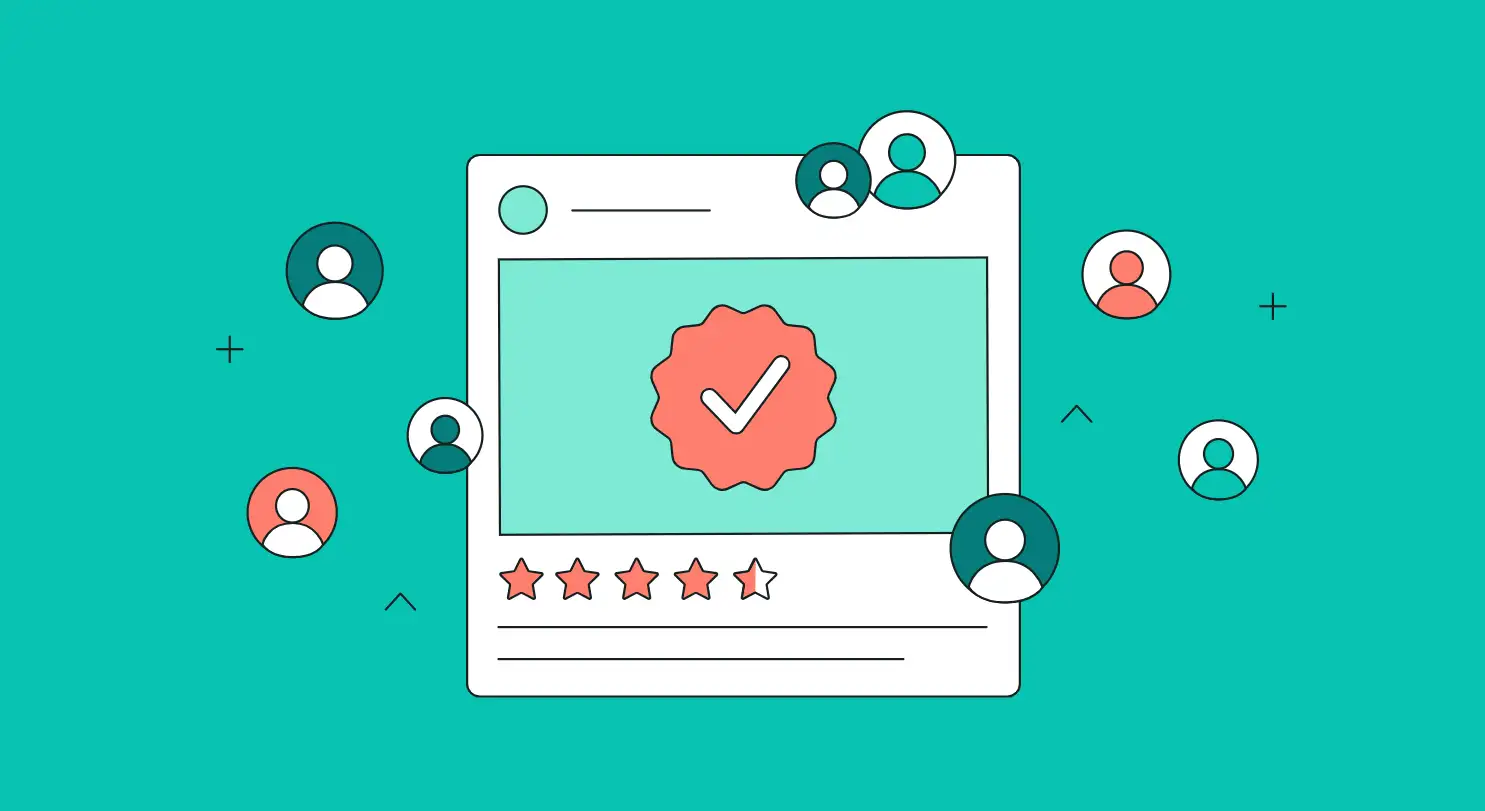
06.Incorporate Social Proof
Social proof leverages the influence of others' experiences to validate your offering. Social proof plays an important role in building trust with your audience. If your audiences see that others have benefited from your products or services, they will automatically be more interested in your brand and reduce skepticism.
There are several effective ways to incorporate your social proof. You can add some customer testimonials, including some quotes from satisfied customers with positive experiences.
In addition, you can also show some case studies. They can present detailed stories showcasing how your product solves real problems for clients. This will increase the confidence of the audience and drive them to purchase.
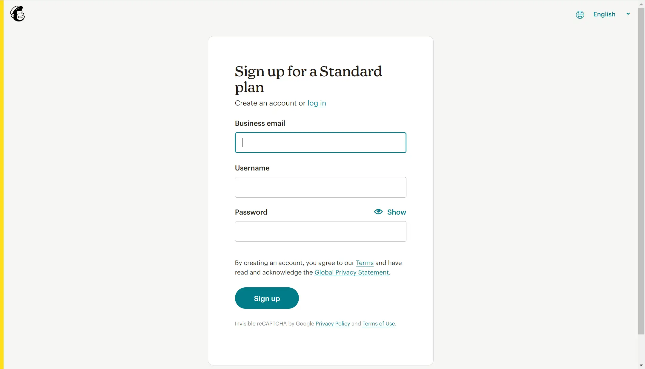
07.Only Ask for What You Need
When designing forms on your landing page, it’s crucial to keep them as simple as possible. Visitors are often put off by lengthy forms that require too much information. To improve your conversion rate, ask only for the information you truly need at that moment. If your goal is to get users to sign up for a newsletter, for instance, requesting just their email address is usually sufficient.
For example, Mailchimp does a great job with its sign-up forms. They only ask for essential information, like an email address and password, to get users started. This reduces friction and makes it easier for potential customers to complete the action.
You can ask yourself if it’s truly necessary. You can always request additional details later in the process, such as during onboarding or in follow-up emails.
08.Use Great Visuals
Visual elements like images and videos can capture attention quickly and convey complex information more effectively than text alone. If used effectively, your landing page will look more professional and appealing. What's more, it enables people to trust your brand and website.
You can use some demonstrative videos or relevant images.
For example, if you are selling products, you can use some videos to show how your products have been produced and highlight the benefits. You can also show your audience the picture of the team behind your brand, which will build a closer connection between your audience and your brand.
Remember, make sure your website maintains a cohesive visual style across all images and graphics to reinforce brand identity.
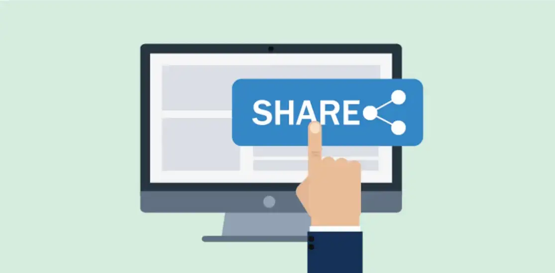
09.Encourage Social Sharing
Encouraging visitors to share your landing page content on social media is a smart way to increase its reach and drive more traffic. By including social sharing buttons, you make it easy for users to spread the word, amplifying your message and potentially attracting more conversions.
We can take a look at BuzzSumo's landing pages, which often include social sharing buttons prominently placed near their CTAs. This allows satisfied users to quickly share the content with their networks, expanding the page's visibility and bringing in new leads.
You can place social sharing buttons in strategic locations, such as near the CTA or at the bottom of the page, where users are most likely to engage with them. Ensure your tons are easy to spot but don't overwhelm the page's design.
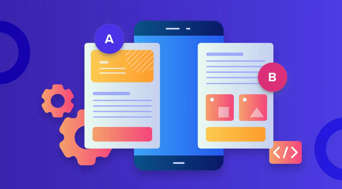
10.Keep Testing and Improving
What works today may not work tomorrow. Audience preferences and industry trends always change. Therefore, it is necessary to conduct repeated testing, which can help you to better understand your audience and current trends, and adjust your marketing strategy in time to keep pace with the changes. It will easily reduce your conversion rate and lose customers.
You can do A/B testing. By comparing two versions of the landing page, you can find out which version will have a better effect, which can also indirectly help you understand the audience Preferences and habits help you adjust your strategy.
Additionally, you can monitor key metrics, including conversion rate, time on page, click-through rate, and so on. From that information, you can better assess effectiveness. Platforms like Google Analytics, and Semrush are powerful analytical tools for you to track user behavior and website performance.
How to Design an Effective Landing Page in Wegic?
After reading the above tips, are you eager to create your website or further polish your existing one? If you still want to use these tips to create an effective landing page, you might want to try Wegic——an AI website builder —— "Webpages in a minute, powered by Wegic"!
In this section, we’ll walk you through the steps to build your landing page using Wegic’s intuitive AI-powered tools, ensuring your design is not only beautiful but also optimized for results.
With built-in GPT 4o, Wegic is an easily used but powerful tool for both newcomers and professionals. It can help you create a stunning landing website within several seconds.
Just tell Wegic what website you want to make, and then select the name and language, and choose the style you prefer. Congratulations! A stunning website was created. It will produce a multiple-page website for you. You can reorganize and configure the page based on your personal needs.
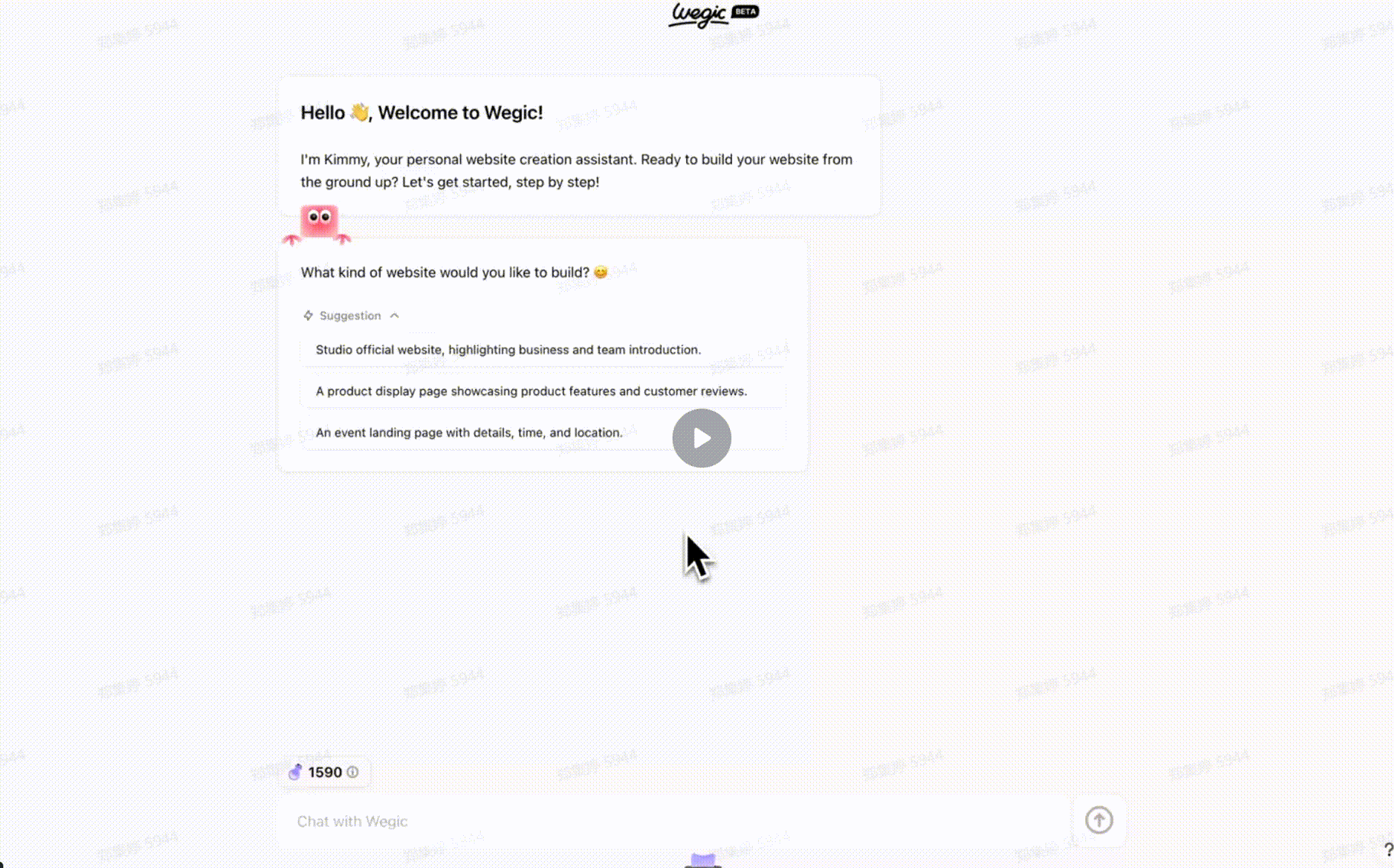
If you are not satisfied with the result it generates, you can try to polish the website. You can change the layout or edit your page. In a word, you are allowed to make any adjustment to Wegic's powerful features.
Here are some websites made by Wegic.
Conclusion
In this blog, we have shared the top 10 tips for an effective landing page. Creating an effective landing page doesn’t have to be complicated. By focusing on clear goals, engaging design, and a strong call to action, you can build a page that resonates with your audience and drives results. With Wegic's intuitive tools, you can adopt these tips and implement them effortlessly. Click to read: How to Create a Landing Page in Wegic – ensuring your landing page is not only attractive but also highly effective.
Remember, the key to success is continuous testing and optimizing, so don’t be afraid to experiment and refine your approach.
Written by
Kimmy
Published on
Mar 17, 2026
Share article
Read more
Our latest blog
Webpages in a minute, powered by Wegic!
With Wegic, transform your needs into stunning, functional websites with advanced AI
Free trial with Wegic, build your site in a click!
What kind of website do you want to build?