Log in
Build Your Site
15 Inspiring Landing Page Animation Examples for Web Designers
Explore 15 stunning website examples for inspiration! Discover innovative designs, user-friendly layouts, and creative ideas to make your next website visually appealing and highly engaging.

The landing page will always determine the first impression your website leaves on your audience. It is critical to make a professional and appealing landing page. More and more attractive landing pages are accompanied by breathtaking animation.
In this article, we will show you 15 landing page animation examples and hope you can find designs to get inspiration from and use the ideas for your next project.
Click here to Build your site
The Benefits of Landing Page Animations
-
Make websites appealing
-
Improve engagement and user experience
-
Increase conversion rate
Landing page animation plays a critical role in website design and brings several benefits.
Animation effects on the page make the whole website visually appealing so that it can capture a larger audience, draw their attention, and create a memorable first impression
It can offer lots of useful information, keep the audience engaged, and guide them to focus on the key information.
A good animation makes a landing page more attractive and informative, ultimately improving the user experience and conversion rate.
5 Common Types of Landing Page Animation
Most landing page animations can be categorized by the following 5 common types. They are micro-interactions, hero animations, scrolling animations, loading animations, and triggered animations.
1. Micro-interactions
Micro-interactions refer to small animations or visual feedback in the user interface that respond to specific user actions. The most common examples include hover effects and button animations. These animations can enhance interactivity, make the interface more intuitive, and improve the user experience. Hover effects and button animation are included in micro-interactions.
-
Hover effect: A hover effect occurs when a change, such as a color shift, happens as you place the cursor over a certain area
-
Button animation: Button animations might involve changes like the button color shifting or enlarging when the cursor moves over it.
2. Hero Animation
Hero animation is used in the main visual area at the top of the web page (usually called the Hero Section). This area is usually the first part that users see when they enter the website. It includes 3D animations, background video, text animation, etc. Hero animation often appears in the prominent part of the screen, which will leave a deep first impression on the audience and convey brand information. It includes 3D animation and background video, interactive elements and so on.
-
3D animation: 3D animation refers to the models or scenes that animate to draw attention. It is often used in tech or product-focused websites.
-
Background video: The background video will play in the hero section, usually a short and looping one. It's often used to convey the company's core values and latest developments and to display brand stories or product information.
3. Loading Animations
Loading animation, such as progress bars or spinners, is displayed when the content or page is loaded. This kind of animation can prevent the audience from feeling too bored or impatient while waiting. Interesting loading animation can increase the audience's retention of the page and improve the conversion rate.
-
Spinner: Spinners, also known as loading spinners or activity indicators, are simple animations that typically take the form of a rotating They often appear when the system is busy or waiting for a process to complete.
-
Process Bars: Process bars are used when the process duration can be estimated or is significant, such as file uploads/downloads, software installations, or lengthy data processing tasks.
4. Triggered Animations
Triggered animation will be displayed when the user performs a specific action or under a certain condition. It includes several types, such as onclick effects and form submissions. Triggered animation is used to enhance interactive experience and visual feedback. On-click and form submission are two typical types of triggered animation.
-
On-click: On-click effects appear when you click an element like a button or link, then the element will make changes, like a color change or a button enlarging.
-
Form submission: Form submission animation occurs when you submit a form, and it will have a checkmark or error message to indicate whether the action is successful.
5. Scrolling Animations
Scrolling Animation will be triggered when the user scrolls the web page. Scrolling animation helps display the content of different chapters separately, making the content more layered. It will increase the interaction between the audience and the website, making the website more attractive and content-layered, and improving the user experience. Reveal animations and horizontal animation are two common types.
-
Real animation: Real animation occurs when you move the mouse, and elements fade in, slide in, or zoom in. It is often used for images or text.
-
Horizontal animation: Horizontal animation refers to the movement or transformation of elements along the horizontal axis (left to right or right to left) on a screen.
15 Inspiring Examples of Landing Page Animations
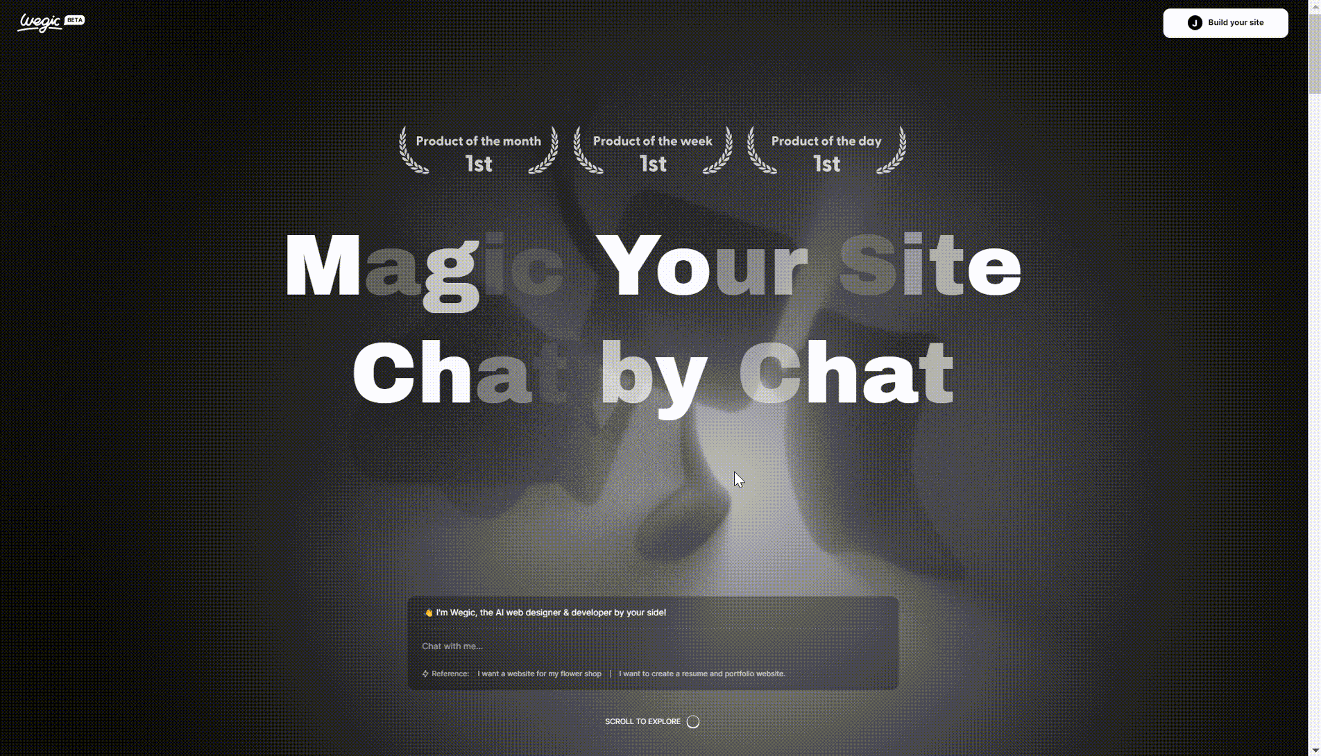
Wegic
Wegic is an AI-powered website builder. It is also a powerful website-building assistant by your side.
The landing page of this website uses a lot of interesting animation, including character animation, hero animation, scrolling animation, trigger, animation, hover effects, background animations, loading Animations, etc.
You can see that there are three IP characters. They have different responsibilities, which can increase interaction with users and shape a unique brand image. If you are trying to generate a website, a cute and interesting character will be always by your side and guide you.
When you move the mouse, you will find that the brightness of the background will change at the same time, which looks creative and innovative.
When you scroll the page, the content will slowly appear or disappear with your movements.
The progress bar also reduces the user's impatience during the waiting process and improves the user experience. Micro animation helps to respond to user requests immediately and guides users to explore more functions.
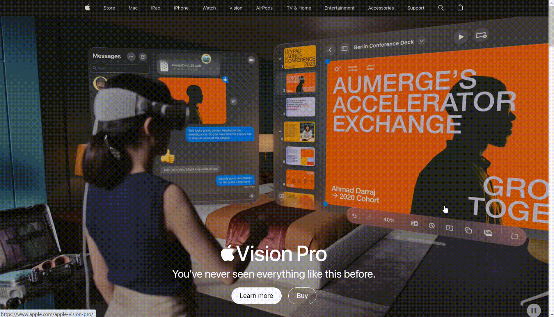
Apple
Apple, as we all know, is a leading technology company known for its innovative products, such as the iPhone and iPad.
Hero animation and scroll animation have been applied to Apple's landing page These smooth animations show the functions and features of its products, which allows users to get to know its products more quickly and direct. Microinteractive elements, such as hover effects, enhance the user experience. Each product page features subtle transitions and animations, highlighting the product's features and capabilities.
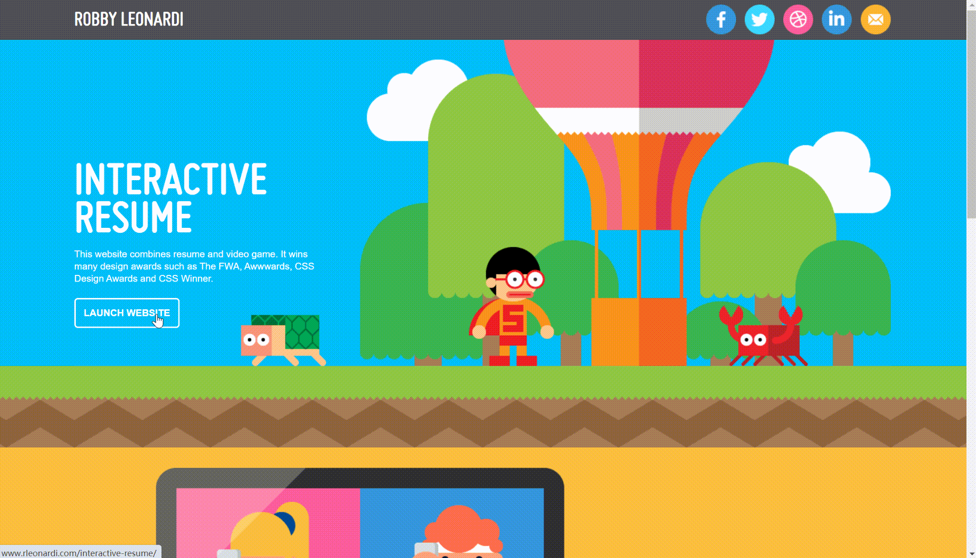
Robby Leonardi
Robby Leonardi is a freelancer. He is an excellent website designer and illustrator. His website is full of brilliant animation, including impressive hero animation, character animation, trigger animation, loading animation like progress bars, and various micro-interaction elements.
These landing page animations are smooth and appealing, and they also convey a wealth of rich and effective information, impressive and memorable. When the audience scrolls the website as guided, they can get to know comprehensive information about Robby. It also reflects the owner's skills and taste, helping to establish a good brand image.
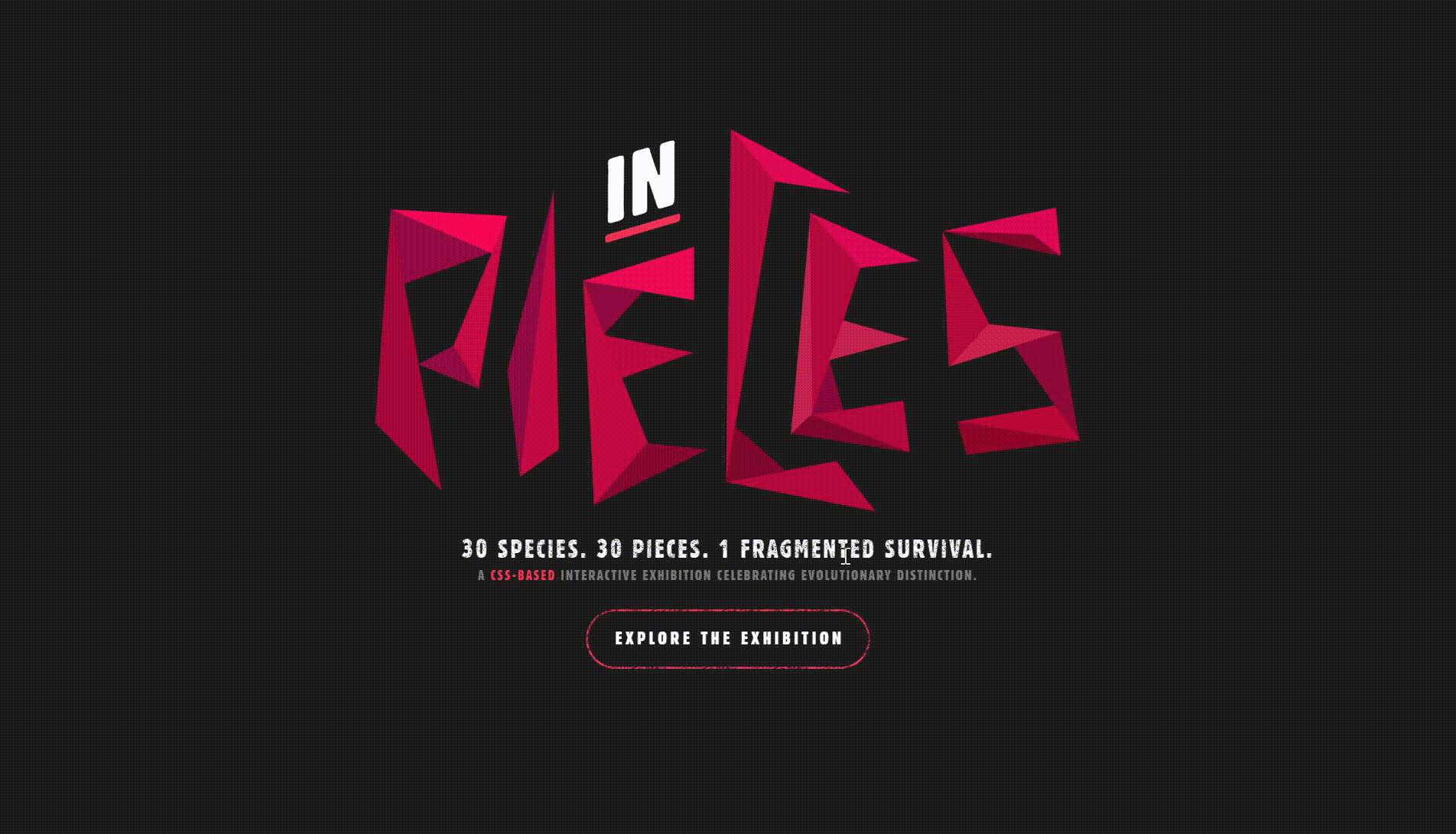
Species in Pieces
Species in Pieces is a website designed for animal protection. This website uses a variety of animation effects such as full-screen animation, trigger animation, progress bar, hover effect, etc.
When you move the mouse to the button, there will be a text message that guides you to the next step. The full-screen animation tells the story of the species, allowing you to learn about these endangered species more quickly. When you click the button to enter the page of the next species, a trigger animation will appear, and the image of the animal made of pieces will appear on the screen, and the background color will change accordingly, which is very fantastic and vivid. It also increases user participation and user experience, encouraging the audience to further explore the website.
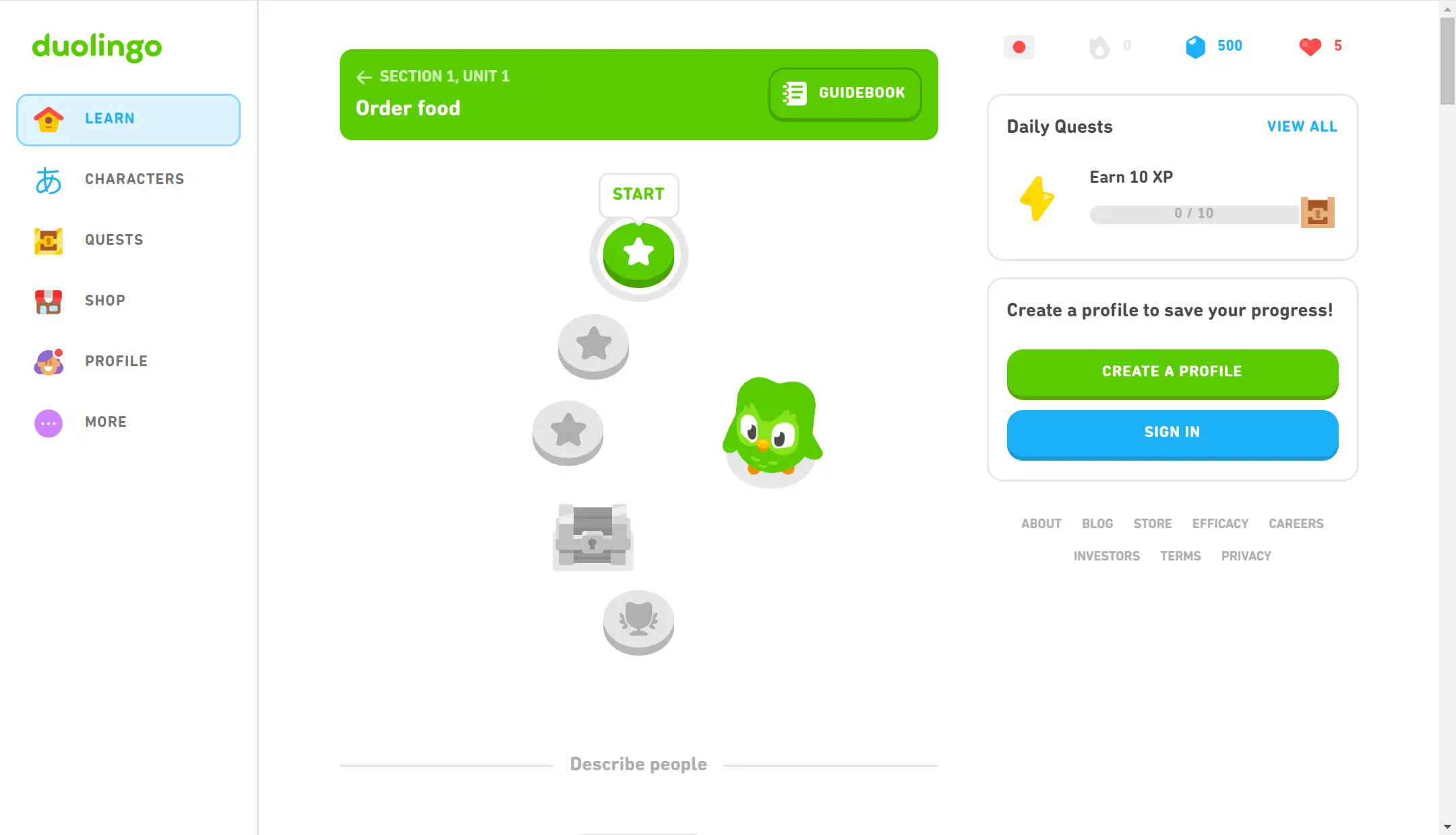
Duolingo
Duolingo is a popular language-learning website. Its landing page animation is also very appealing and fantastic.
It uses character animation, which refers to animated characters on websites or games to create a more attractive and interactive experience. These animated characters can do simple actions such as blinking and waving, walking, or performing tasks. The Owl Duo is a character in Duolingo, which encourages users to learn languages through various animations. This will encourage the audience to stay on the page and enhance interactivity.
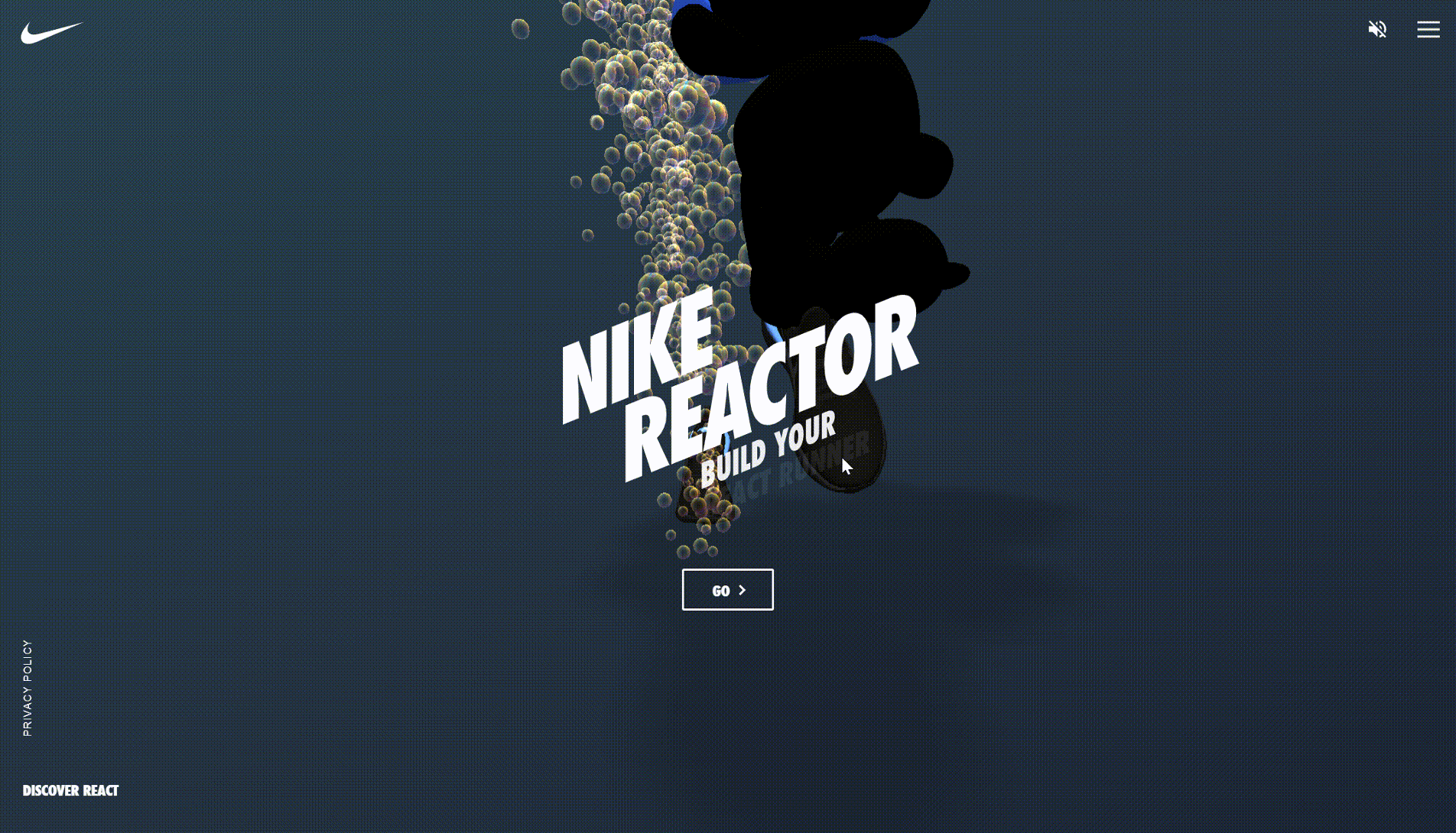
Nike Reactor
Nike React is a foam cushioning technology developed by Nike, offering lightweight, responsive, and durable support in their running shoes.
When you enter its website, you will see the dynamic letters "Nike Reactor". Then, you will be immediately attracted by the animation it shows. The first thing that appears is the full-screen animation. You can see the smooth transition of different background colors. At the same time, each different background color is accompanied by an image of a little character running forward, and the focus of the little character is the shoes they wear.
If you move the cursor to the go at the bottom of the page, a hover effect will appear, simple but interesting, increasing the interaction between the audience and the website, improving the experience, engaging users, and encouraging exploration.
The design not only draws the attention of the audience but also allows them to focus on Nike's products. The whole landing page is very technological and sporty, showing the characteristics of Nike as a sports brand.
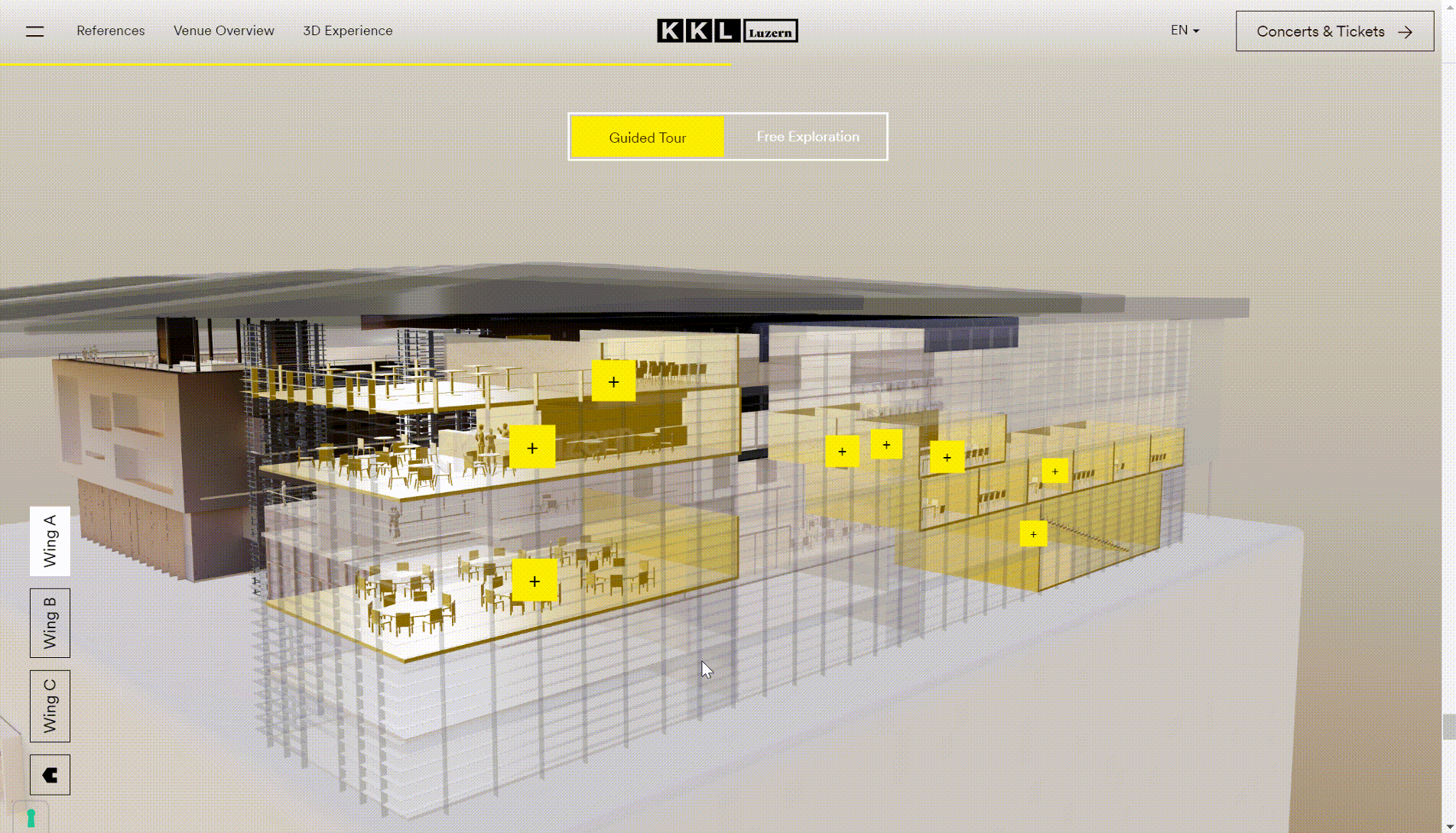
KKL Luzern
Kkl Luzern is a famous cultural and conference center in Switzerland.
Its landing page is very special, showing the audience a 3D stereoscopic image of the conference center. You can observe the structure of the entire building by moving the cursor. The full-screen animation gives the audience a more intuitive and holistic understanding of the whole building.
At the same time, if you move the cursor to the "+", a hover effect will appear, providing you with the name and photo information of the place. If you want to know more information, you can move the cursor to the picture it shows you, and then a hover text "more info" will pop up, and you can click it to enter the next page.
The landing page animation looks elegant, intuitive and very modern, which also increases interactivity and can also guide the audience to get the information they want.
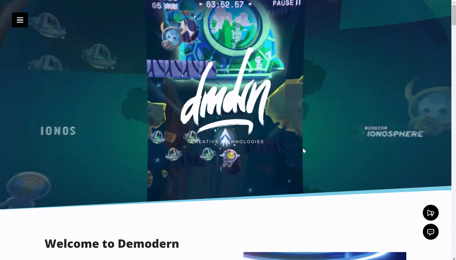
Demodern
Demodern is a digital creative studio headquartered in Germany. Its main business is to provide customers with digital solutions and services, including creating user-friendly interfaces and interactive designs, interactive installation development, web and mobile application development, etc.
When you enter Demodern's website, you will find that it's a modern and innovative style. What catches your eye first is the full-screen animation. This animation introduces the various businesses offered by the company and shows the company's superb technology.
When you scroll down the page, you will see that in addition to the full-screen animation, there are multiple smaller animation clips. These clips are the company's success stories, covering various industries. This shows the company's technology and products, allowing users to have a very intuitive understanding of the company and its products.
Move the cursor to the animation or text, and a finger-shaped hover effect will appear, encouraging you to learn more about the specific information of a certain project. Such an animation helps to enrich the user experience and engagement.
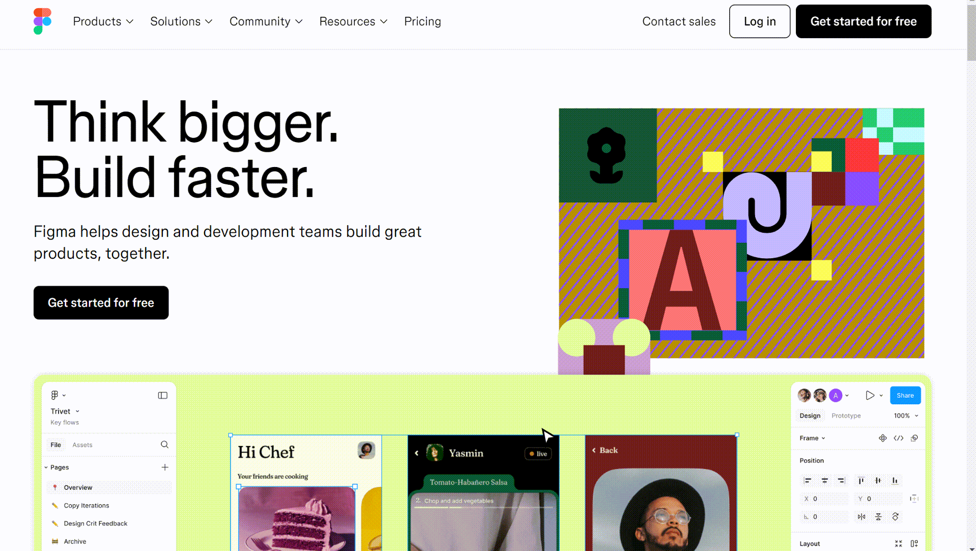
Figma
Figma is a design and prototyping tool which allows users to create and collaborate in real time.
When you enter the Figma website, you will see a full-screen animation. It not only makes it more interesting and vivid visually but also enriches the user's browsing experience. More importantly, the content displayed by the animation is a bit like the user guidance of Figma. This allows the audience to understand the functions and features of Figma more intuitively.
The animation transitions naturally and smoothly. In addition, the entire landing page also uses many triggered animations, such as clicking a button to change color, which increases the interaction and connection between the audience and the website.
In conclusion, the animations are well-integrated into the design, making the site engaging and informative.
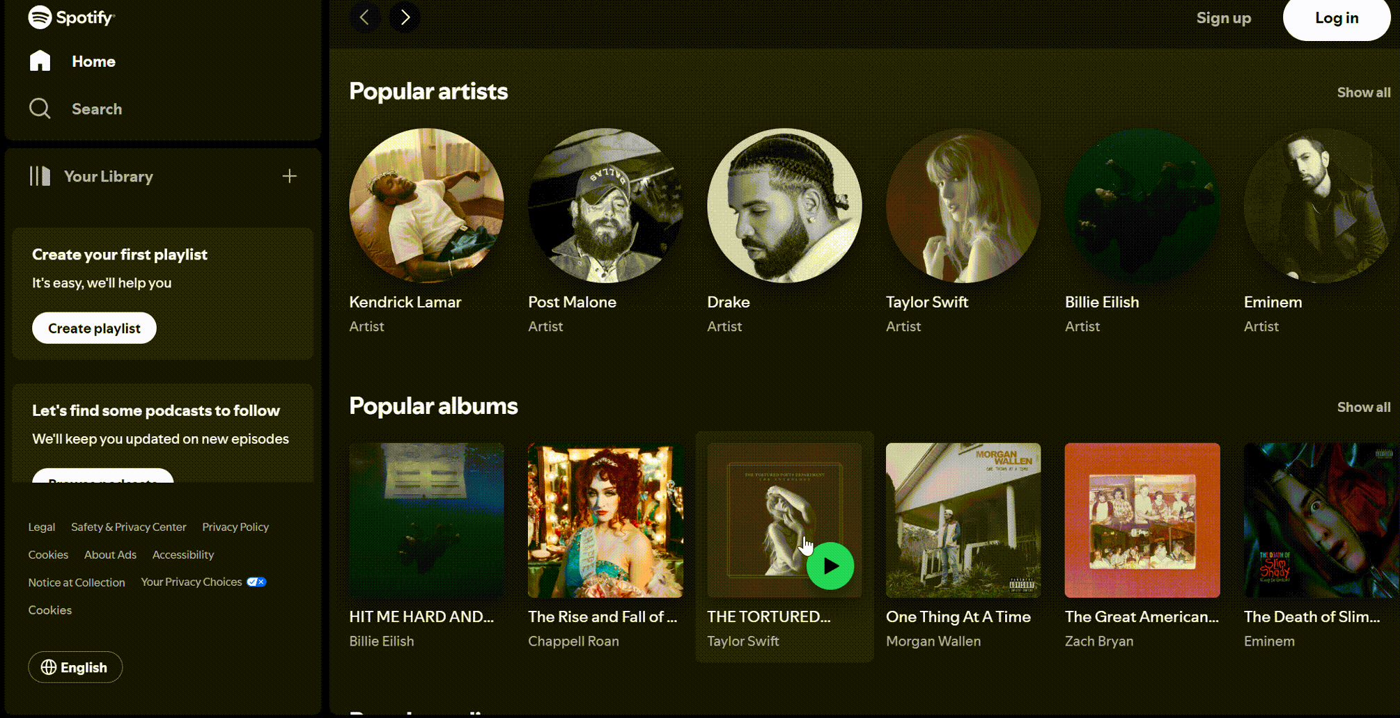
Spotify
Spotify is a popular music streaming service that provides access to a vast library of songs, podcasts, and playlists.
When we enter the landing page of Spotify, we can find that the website shows smooth animations during music playback. There are also many interactive elements like clickable album art and hover effects.
When we move the cursor on the album or the singer's head portrait, a conspicuous play button pops up on the webpage. When we hover the cursor over some more conspicuous buttons, there will be text telling you the corresponding function of the button. These animation effects can better guide users to perform corresponding operations and improve user experience.
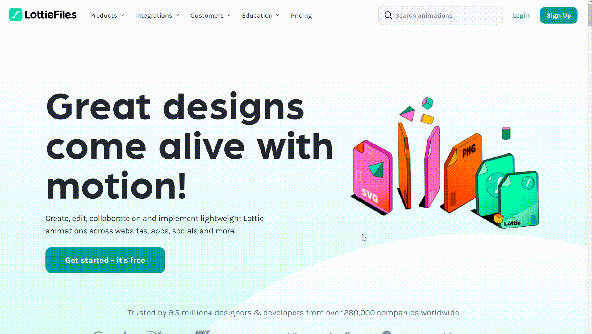
Lottiefiles
LottieFiles is a platform that provides Lottie animation file resources and tools. Its landing page also uses a variety of animation effects, including hover effects, scrolling animation, micro animation, etc.
First of all, many of its icons on the pages are not static, which makes the style of the entire website more lively and interesting and arouses user interest.
When you move the cursor to these interesting animations, a hover effect will appear, showing you the corresponding information and guiding you to operate. The animation effects are very rich and wonderful, which increases users' favorability for the website and improves user experience.
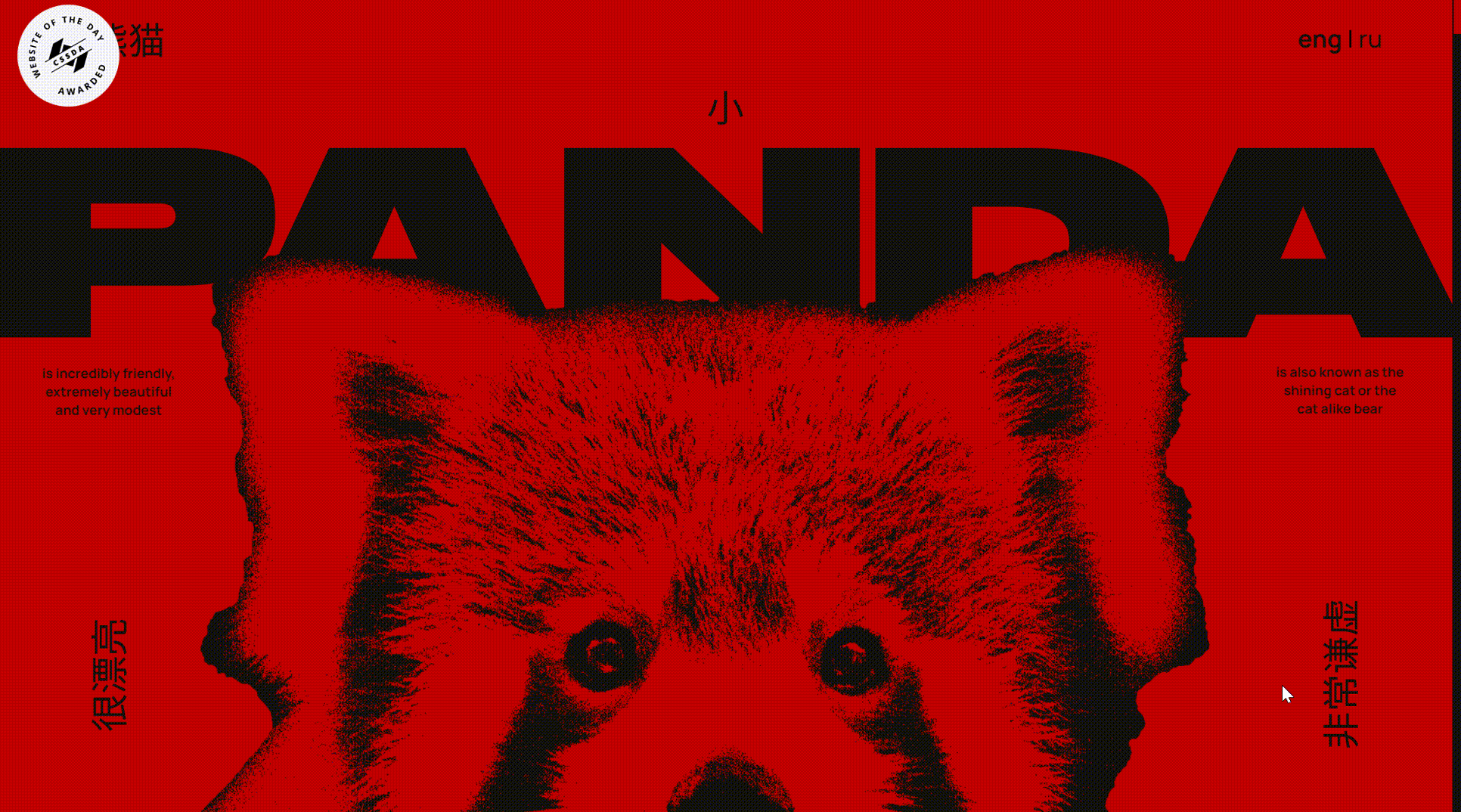
Red Panda
Red Panda is a website dedicated to arousing people's awareness of the protection of red pandas.
The website uses hero animation to show the life scenes of red pandas, which can not only attract people's attention but also convey the importance of protecting red pandas.
In addition, loading animation and scrolling animation are also used. When users scroll down, different contents will gradually appear. This makes the content layered and increases interactivity. Not only that, there are many micro animations on the website, which can provide users with timely feedback and attract users' attention.
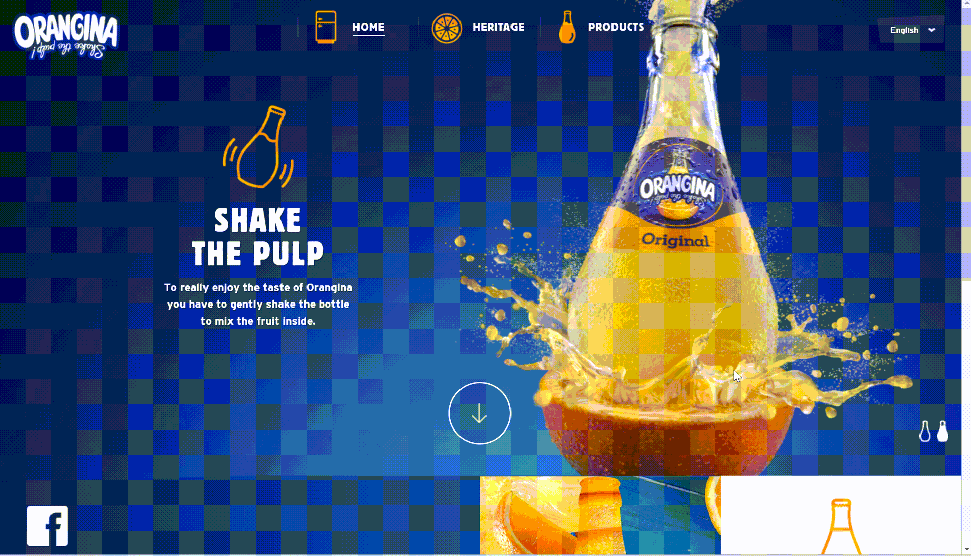
Orangina
Orangina is a beverage brand.
The color scheme of the entire website is mainly blue and orange. The landing page design of the website is very interesting and attractive, with rich and clear content. It uses loading animation, scrolling animation, trigger animation, etc.
When you enter the website, there will be a bottle-shaped progress bar to tell you the loading speed and the picture looks cute, too. This bottle is also the packaging of the company's products. For example, if you want to see the history of product development, click the corresponding icon to enter the next page. Scroll down, and the story of the brand will slowly appear in front of you as you slide your mouse.
The whole webpage is clean and appealing, and the scrolling animation makes the content more layered. Moreover, in the process of sliding, in addition to pictures and text, there are also some funny production videos, which make the audience more memorable.
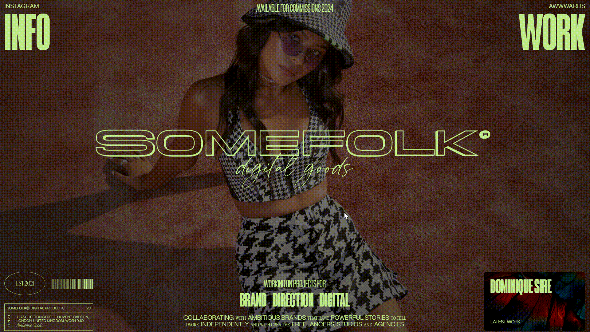
Some folk
Somefolk is a London-based design studio specializing in creating bespoke digital goods and memorable brands.
The biggest highlight of this website landing page is its font and scroll animation. The landing page uses a lot of scroll animation and fade-in and fade-out effects, including horizontal and vertical scrolling. Rich and layered content helps the audience know the website further. The overall animation is very smooth and natural, which increases user experience.
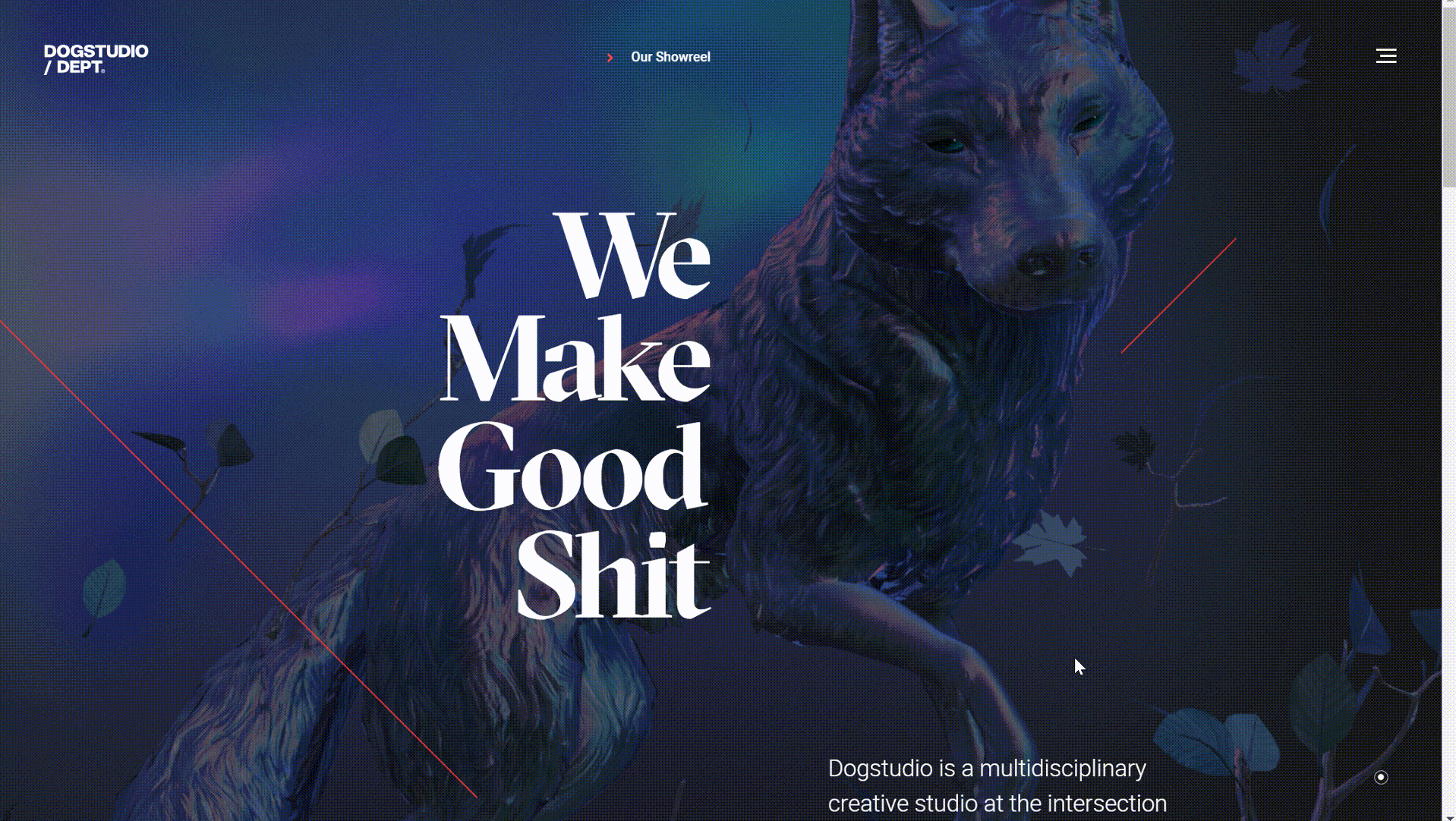
Dog Studio
Dog Studio is a creative digital agency that specializes in delivering high-quality design, branding, and interactive experiences. The main business is to provide digital solutions, such as web design. The landing page of this website is very worth mentioning. It uses many creative animations, including scrolling animation, background animation and hero animation.
A large number of full-screen animations show the company's services and products, which shows its strength and superb technology. Scrolling animation makes the content more layered and helps convey the information of the brand and products to attract users' attention.
What tools can be used?
Have you got some inspiration from the breathtaking animations above? Interesting and beautiful animation can attract more audiences and increase conversion rates.
If you don’t know how to make animation, Wegic can be an optional choice for novices. It is an AI-powered website builder that can help you generate all the websites you like in a few seconds. It can meet your customized needs. And new users have 70 free credits to use. The following are some examples generated by Wegic. Just have a try!
Click here to Build your site
Conclusion
In this article, we introduced different types of animation and showed some excellent examples of landing page animation. Types of animation include hero animation, scroll animation, micro-interaction, loading animation, etc. Choosing what kinds of animation depends on the scenario and the effect you want to achieve.
If these animations are used properly, they can make the website more appealing attract the audience's attention and improve the retention rate. In addition, animations can also convey brand information, guide users to focus on key content and improve conversion rate. If you want to create your own landing page animation, I hope these examples can inspire you as a designer.
Written by
Kimmy
Published on
Mar 17, 2026
Share article
Read more
Our latest blog
Webpages in a minute, powered by Wegic!
With Wegic, transform your needs into stunning, functional websites with advanced AI
Free trial with Wegic, build your site in a click!
What kind of website do you want to build?