How to Create a Landing Page in Wegic
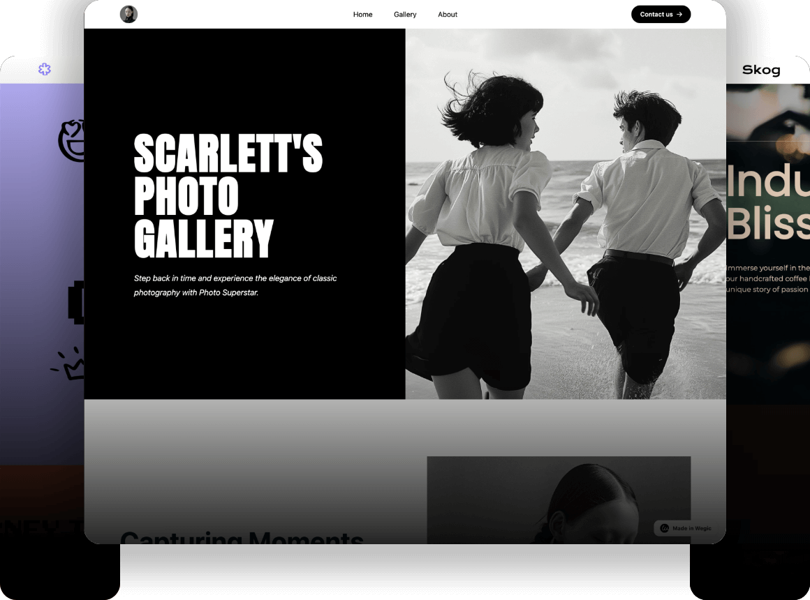
Possessing a landing page help attract visitor's attention, we suggest you use Wegic-your free website maker to design landing pages that showcase your brand.

Possessing a landing page will certainly help you promote your personal or business career. To introduce your products and attract visitor's attention, we suggest you use Wegic-your free website maker to design landing pages that showcase your brand and meet your company's needs.
Wegic is beginner-friendly and easy to use, thanks to its AI-powered design and conversational interface. It allows users to create a fascinating landing page without any code-writing knowledge. Besides, with a free account, you can create up to three landing pages every month through Wegic.
Stages to create a landing page in Wegic
- Establish a landing page outline
- Sign in to Wegic and create a prototype with AI tools
- Personalize your landing page
- Craft your CTA (Call to Action)
- Preview and get feedback
- Publish and optimize your landing page
Establish a landing page blueprint
Before you start creating your own landing page, determine a goal for it. The prototype and the layout of your landing page should particularly be connected with this goal.
It doesn't need to be massive, but it has to be actionable and calculable. Whether you want to gather clients for your upcoming event or you want your visitors to perform as you wish when they click your ad, these are "goals' that need to be established the very first time.
With that goal in mind, it's time for you to design your landing page blueprint. We suggest that your blueprint should contain these key features below:
- An attractive title that represents the message of your brand
- A subheading or brief copy explaining your product or service
- A central message that illustrates the benefits for your visitors
- A compelling CTA (Call to Action)
Sign in to Wegic and create a prototype with AI tools
Creating a landing page prototype with Wegic’s AI tools is a streamlined process that combines user-friendly features with advanced technology.
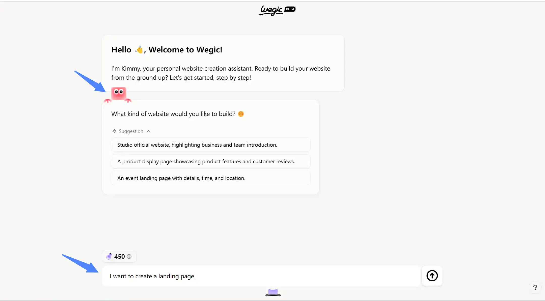
Once you've logged in, a cute assistant called Kimmy will appear in the dialog box. It will help you create a landing page in whatever style you want. Firstly, just type"I want to create a landing page" in the dialog box below to start the conversation with AI.

After giving Kimmy a rough theme, it will constantly ask you questions about the detailed page settings. Meanwhile, it has already prepared some potential choices that you may want to adopt, if that just happens to meet your request, then use it straightforwardly. If not, describe it subtly to Kimmy, it will understand your intention and give you effective feedback.
To guarantee you can fully grasp this step, we'd give you a specific example:
If you choose to build a landing page for business promotion, like in the picture below, then Wegic will generate some related names for your website. If you prefer any of it, then click the text and it will automatically self-copy in the dialog box below. If none of them make you satisfied, don't worry, you can ask Kimmy again to recommend you some new choices or type your personal idea. Just remember there are various ways to work you out.


When you finish the whole preparing process, Kimmy will integrate all the information into one message. This is necessary to ensure every detail is correct and enables you to get your ideal landing page mode.


Personalize your landing page
Personalizing your landing page is the most crucial step in making a strong first impression on your visitors. Your landing page is always the first way of contacting potential customers for your brand. Consequently, engaging, informative and aligned with your overall objectives are indispensable to your landing page.
Here's a guide to approaches to facilitate your landing page's appearance in Wegic:
Use High-Quality Visuals
Wegic possesses a rich gallery, which includes high-quality images of various themes. All of them can be directly applied to your landing page.
When Wegic generates a landing page prototype with both pictures and texts for you, if you are not satisfied with the automatically matched pictures, you can click the “regenerate” button, and it will switch other pictures related to the theme for you. Just keep switching until you are satisfied. Notably, this service is completely free.
In addition, Wegic also supports self-searching images by keywords. When you click the "replace images" button, a search bar will pop up on the right. All you need to do is enter the keywords you want to search for, and Wegic will select the valuable pictures that meet your demands for you. Compared with browsing and selecting on other websites, this embedded function undoubtedly saves your time and cost.


Create Engaging Graphics and Icons
Use graphics and icons to break up text and highlight key points. These elements can make your landing page more visually appealing and easier to navigate.
The assistant Timmy (purple one below the menu) will showcase the logo, title, and description of your landing page. If you've already designed a page logo, just upload it to Wegic. If not, time to ask Wegic to create one for you.
While to make your landing page more attractive, adding some intriguing icons is also available in this website builder. For example, if you ask Kimmy to create some icons for you and apply them to your landing page, it will immediately execute your instructions.


Combine Your Brand
It's crucial to give your landing page the same appearance and feel as your brand. By updating the fonts and designing your brand colors precisely, your page can become a visual extension of your brand.
Wegic provides an extensive selection of fonts to suit various styles and themes. Whether you’re looking for something modern, classic, playful, or formal, you’ll find a font that fits your brand’s personality. Also, curated color palettes are involved in this tool. These palettes are crafted to ensure color harmony and visual appeal, saving you the effort of creating a palette from scratch.
Aside from the preview button, there is a changing option for both color theme and fonts. You can choose from pre-generated hues or try your own from the palette. Once you've adjusted, Wegic will automatically apply them across all pages and elements, ensuring consistency.
For the fonts, there are separate options for head fonts and body texts, which are quite convenient for changing them respectively. For specific sections or components, you can override global settings to create unique visual highlights.


Add Social Proof
In order to build credibility and a sense of trust, we advise you to add testimonials or case reviews section on your landing page. Choose some testimonials that highlight specific benefits and positive outcomes of your products. Moreover, showcase some reviews that provide detailed insights into how your product or service has benefited your customers or clients.
If you don't know how to edit this section, your assistant in Wegic will lend you a hand. In fact, most of the prototypes that Wegic gives you have already contained a comment section. All you need to do is to combine its content with your own brand.

Craft your CTA (Call to Action)
Your CTA (Call to Action) is the most important element on your landing page—essentially, it’s the action you want your visitors to take. Whether it’s completing a form or clicking a button, take a moment to determine the desired action and devise the best way to encourage visitors to take it.
CTA buttons might be small, but they pack a punch. Mastering your call to action is crucial and can be a defining moment for the success of your landing page.
Here are 2 tips to design CTA effectively:
- Make Your CTA-Specific
- Generic CTA buttons like “Learn More” or “Get Started” can work, but they are often too vague (and not in an intriguing way). Visitors may be unsure of what to expect when they click such buttons. Aim to be more specific and descriptive to achieve better results. Phrases like “See Pricing” or “Start Your Free Trial” are more effective as they clearly indicate what happens next.
- Make Your CTA Singular
- A landing page is designed to eliminate the clutter found on regular websites and provide visitors with a single, clear path forward. When creating a landing page, avoid distractions such as unnecessary links, headers, or footers. Keep the design straightforward and focused, guiding visitors directly to the intended action. This streamlined approach ensures that visitors know exactly what to do and increases the likelihood of conversion.

Preview and get feedback
This is the moment you’ve been anticipating. However, before you celebrate and hit publish on your landing page, take one final review to ensure it's ready for its grand unveiling.
Wegic provides two different page preview modes: desktop and mobile, which can help you better confirm the display effect of the page on different devices before publishing.
Copy check: Conduct a quick spot-check to ensure there are no typos or grammar issues on your page. A polished first impression is important.
SEO check: Decide if you want your page to be visible to search engines and optimize it by crafting a keyword-focused page title and meta description.

Publish and optimize your landing page
Once you’re done all the steps above, you landing page is now ready to publish. With your free Wegic account, you can have a free domain name. If you want to customize it, paid plans are suitable for you.
We understand that achieving conversions can be addictive. You can enhance your conversions further by tailoring the perfect landing page for each visitor. Avoid the "set it and forget it" mentality—regularly revisit and refine your landing page to keep it performing at its best.
After launching your initial landing page, increase efficiency by duplicating it and creating new variants. This approach streamlines production, allowing you to optimize each version for peak performance. With the foundational work of building your first landing page complete, you're now ready to scale up.


FAQ
What is the difference between a landing page and a website?
Landing pages are significantly simpler than websites and are typically designed with a singular focus. Unlike websites, which often feature multiple navigation items and serve various purposes, landing pages are built specifically to convert clicks into sales, subscriptions, or traffic. Their streamlined design guides visitors towards a single action, making them highly effective for targeted marketing campaigns.
Compared to other landing page builders, what are the key features of Wegic?
- AI-powered interface: With the AI assistant, users can create a landing page swiftly and smoothly in Wegic.
- Affordable: Currently Wegic's free plan has already contained almost all functions, even though it does have premium plans, its price is far lower than other similar builders.
- Adjust subtly: Wegic allows you to adjust detailedly to every stage and page of your website, which is essential to the final showcase.
Conclusion
The most economical method to create a landing page is to use free website builders like Wegic. These platforms provide basic features for free, enabling you to design a simple landing page with a custom domain. Alternatively, you can code a landing page yourself using HTML and CSS. Hiring a developer to build it is another option if your budget permits.
Written by
Kimmy
Published on
Mar 12, 2026
Share article
Read more
Our latest blog
Webpages in a minute, powered by Wegic!
With Wegic, transform your needs into stunning, functional websites with advanced AI