Log in
Build Your Site
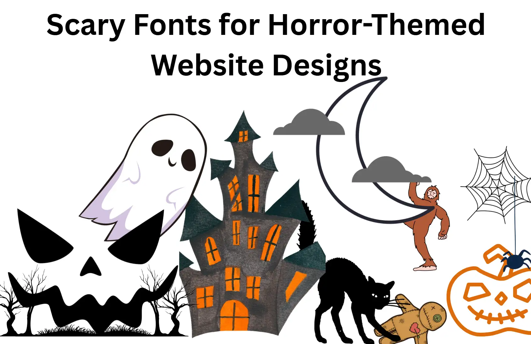
10 Scary Fonts for Horror-Themed Website Designs
Explore 10 scary fonts that bring nightmares to life. Perfect for horror-themed website designs, these fonts deliver fear, drama, and sinister visual impact.

Ever look at a horror-themed web page and think, "Why does that feel more like a 'quirky carnival' than a 'haunted house'?" I've felt that way, too. You’ve created those creepy pictures, scary animations, and blood-red buttons, but it always feels like something’s missing. You must find this font scary.
You’re not alone. Many creators don’t realise that most designers overlook how horror fonts shape a visitor’s fear response. Maybe you’re wondering:
-
"What even makes a font ‘scary’?” (Spoiler: It’s not just blood drips.)
-
“Where can I find free scary fonts that don’t look like cheesy Halloween clipart?”
-
“When should I use scary text fonts without sacrificing readability?”
I used to spend hours picking out normal fonts until I discovered that scary fonts are the secret sauce. The difference between them is that one is a normal web page, while the other can make visitors feel scared - their heart rate speeds up and their mouse hovers over the "X" icon.
In this guide, I’ll explain in detail how horror fonts are designed and introduce 10 super scary font selections, which include several free spooky fonts. I’ll show you how to use them like a pro. No more mismatched moods. It's your weird website that has become a digital terror.
What are Scary Fonts
Horror fonts are font styles that are specifically designed to make people feel scared, nervous, or uneasy. Unlike ordinary fonts, scary fonts use visual tricks, like jagged edges, uneven spacing between characters, or crooked strokes, which make people feel uncomfortable. The words look like they had been scratched by claws, with broken and smeared effects; these damaged appearances reflect a sense of instability, which is also the most typical feature of horror fonts. Others lean toward the Gothic or Medieval styles, using pointed serifs and intricate ornamentation to convey historical associations with mystery and fear. Others use creepy elements like fake blood, cracks, or decay to make their creations more eerie.
Though premium fonts like Graveyard Gothic often showcase intricate details, free horror fonts like Zombie Scratch or Haunted Hollow are more accessible. When choosing a horror font, the main consideration is whether it matches the theme and whether it has enough flavour, rather than whether it is neutral. Therefore, this font is particularly suitable for titles, logos, or Halloween-related materials. Whereas, these eye-catching styles must be used with caution. If used too much, it will easily make the audience feel uncomfortable. Pair these fonts with simple body text fonts to keep things creative and readable.
Elements of Scary Fonts
Horror fonts are designed to make people feel scared or uneasy via careful design decisions. Next, let’s talk about the critical characteristics of these styles, from their structural characteristics to their historical impact.
Unsettling Shapes and Structures
The scariest font ever. It doesn’t play by the rules. The text looks jagged, with varying degrees of spacing and thickness, like the cracks on a tombstone. For example, Psycho Path uses tilted angles to simulate instability, while Zombie Scratch mimics the small imperfections of hand-carving. These deformations will disrupt visual balance and make people feel something is wrong unconsciously. Even free horror fonts like Haunted Hollow have deliberately distorted strokes to create a sense of decay or tension.
Historical Inspirations
Most of those scary fonts come from Gothic calligraphy or medieval manuscripts, and the culture of that era was closely related to mystery and superstition. A font like Graveyard Gothic, which combines sharp serifs with intricate ornamentation, evokes ancient scripts and brings a sense of timeless dread. This connection to the past immediately taps into people's universal fear of the unknown, making these fonts instantly recognisable in terrifying scenes.
Textural Disturbances
Several fonts are just like the real thing, imitating how things would break down over time, like they would be cracked, dirty, or corroded. Cursed Crypt creates fake blood dripping down, while Decay Demise makes it feel like mould is slowly spreading on the character.
These textures add visceral realism, transforming words into artefacts that feel like an ancient or damaged relic. Premium options can usually make these details stand out more, but free weird fonts such as Zombie Scratch can get the effect pretty good.
Controlled Chaos
Strategic imbalance amplifies unease. Several fonts tilt the letters a bit, such as Psycho Path, though others skew the baselines, such as Haunted Hollow, to create a messy nightmare feel. This controlled chaos avoids predictability, confusing the audience but still keeping clarity. Though scary fonts look great in titles and logos, they should be used in moderation. Using them too much can be a bad idea. Pair them with neutral fonts in body copy to keep the reading flow smoother. For example, Raven's Cry is a font that's thin and skeletal, which is great for titles, but it can be eye-tiring when used in paragraphs.
Top 10 Scary Fonts for Horror-Themed Website Designs
| Font Name | Platform | Key Visual Characteristics | Suitability for Horror Theme | Example Website Use Cases |
| Creepster | Google Fonts | Dripping, melting, ghastly, gory | Instantly spooky, reminiscent of classic horror posters | Headers, decorative elements, Halloween promotions |
| Nosifer | Google Fonts | Sharp, aggressive edges, blood-drip embellishments | Sinister, evokes vampire tales and brutality | Titles, logos, impactful statements |
| Butcherman | Google Fonts | Top-heavy, rusted, decayed, jagged edges | Zombified appearance, perfect for post-apocalyptic or zombie-related content | Section titles, call-to-action buttons |
| Eater | Google Fonts | Regal yet decayed, sharp serifs, dripping, corrosive | Elegantly eerie, sophisticated yet disturbing | Headers, stylized body text |
| Metal Mania | Google Fonts | Fine strokes, sharp angles, modern, mental | Dangerous, intense, inspired by heavy metal, suitable for darker horror subgenres | Logos, titles, posters |
| Shlop | Adobe Fonts | Wicked, oozing, irregular forms | Represents dripping blood, toxic waste, or other unsettling fluids | Headers, logos, stylistic elements for gruesome content |
| Halau Spooky Script Rough | Adobe Fonts | Swirling cursive, rough texture, jagged edges | Dark elegance, supernatural horror, sophisticated yet unsettling | Headlines, subheads, invitations, packaging with a spooky theme |
| Monsterific BB | Adobe Fonts | Bold, slightly condensed serif, retro 70s horror magazine | Nostalgic horror vibe, classic monster movie posters, graphic novel inspiration | Headers, titles, retro-themed horror content |
| Eckmannpsych | Adobe Fonts | Psychedelic, distorted, irregular, flowing | Unease, otherworldliness, abstract or psychological horror | Artistic headers, atmospheric text elements |
| P22 Spooky | Adobe Fonts | Heavy blackletter, sharp, angular, thick strokes | Traditional gothic horror, classic literature, haunted castles, ancient mysteries | Titles, section headers for classic horror themes |
1. Creepster
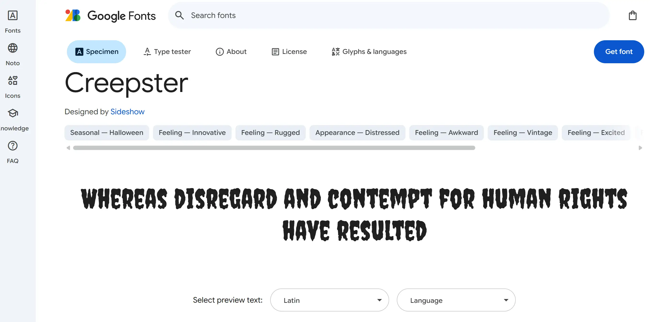
This font, with its dripping, melting look, immediately creates a sense of fear. It reminds me of those old horror movie posters from the middle of the last century. Its hideous and terrifying appearance suddenly made the atmosphere around it tense. This scary design has many options that allow you to tailor the fear to be especially intense. Creepster font works great on Halloween invitations, event posters, web titles, and social media. Its bold and easy-to-read font is perfect for eye-catching headlines and decorations on horror-themed web pages.
2. Nosifer
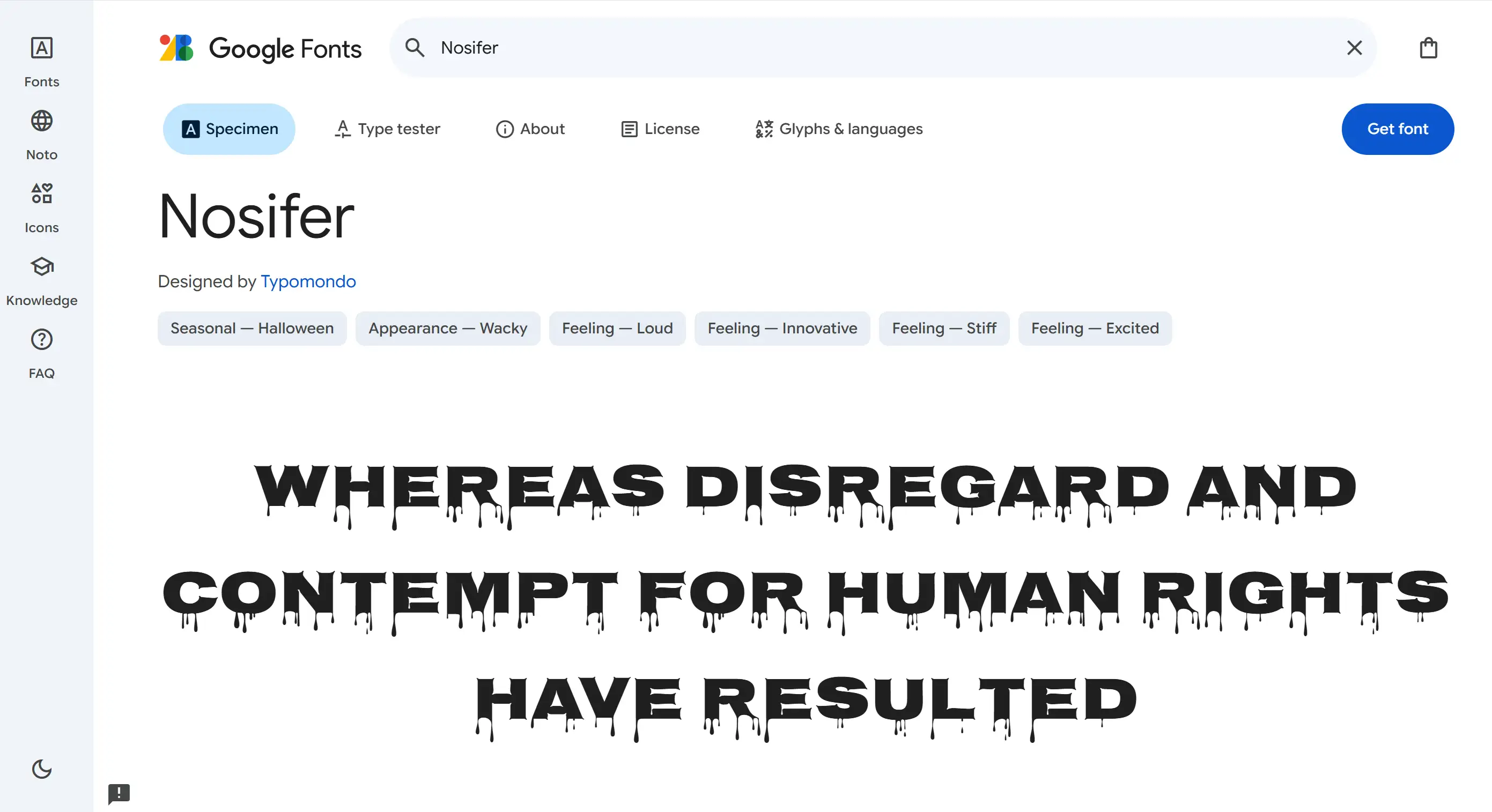
Presenting a particular kind of evil spirit, the font Nosifer is bold and creepy. Its sharp and aggressive angles and the blood-drip-like decoration are all very distinctive. Its sharp edges and jagged shapes, combined with its modern look, make it perfect for projects that want to leave an impressive and spooky feel. The combination of these fixed geometric shapes and blood-stained drips is reminiscent of classic vampire stories and horror narratives, with a sense of solemnity and a touch of brutality. Nosifer is a great font, especially for eye-catching titles and logos. If you want to create a sinister vibe on your web page, this is the right choice.
3. Butcherman
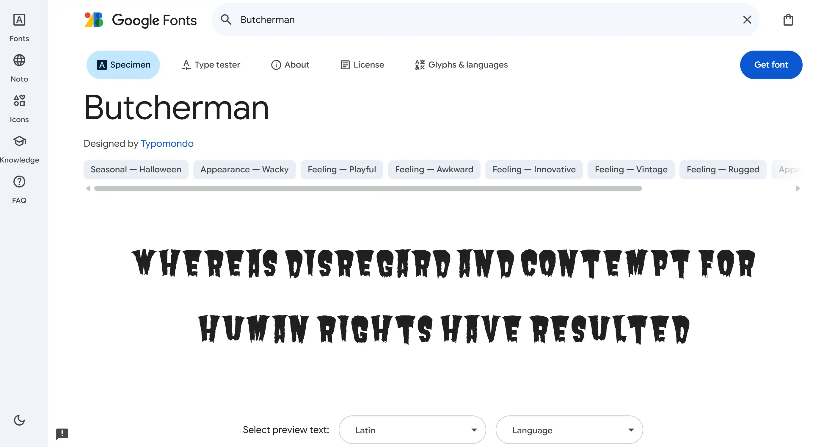
When it comes to zombie or post-apocalyptic designs, Butcherman is a great choice. This horrible font, which is uncomfortable to read, with a higher top and smaller bottom, reveals a shabby and decayed feeling. It is quite different from other fonts. Its hacked-down appearance evokes decay and horror movie scenes. The characters resemble a skull, and the pointy, jagged edges make them look even more bizarre. The Butcherman font is particularly suitable for chapter titles and action buttons. It can also make the text on the web page look depressed and scary, and it has a creepy atmosphere.
4. Eater
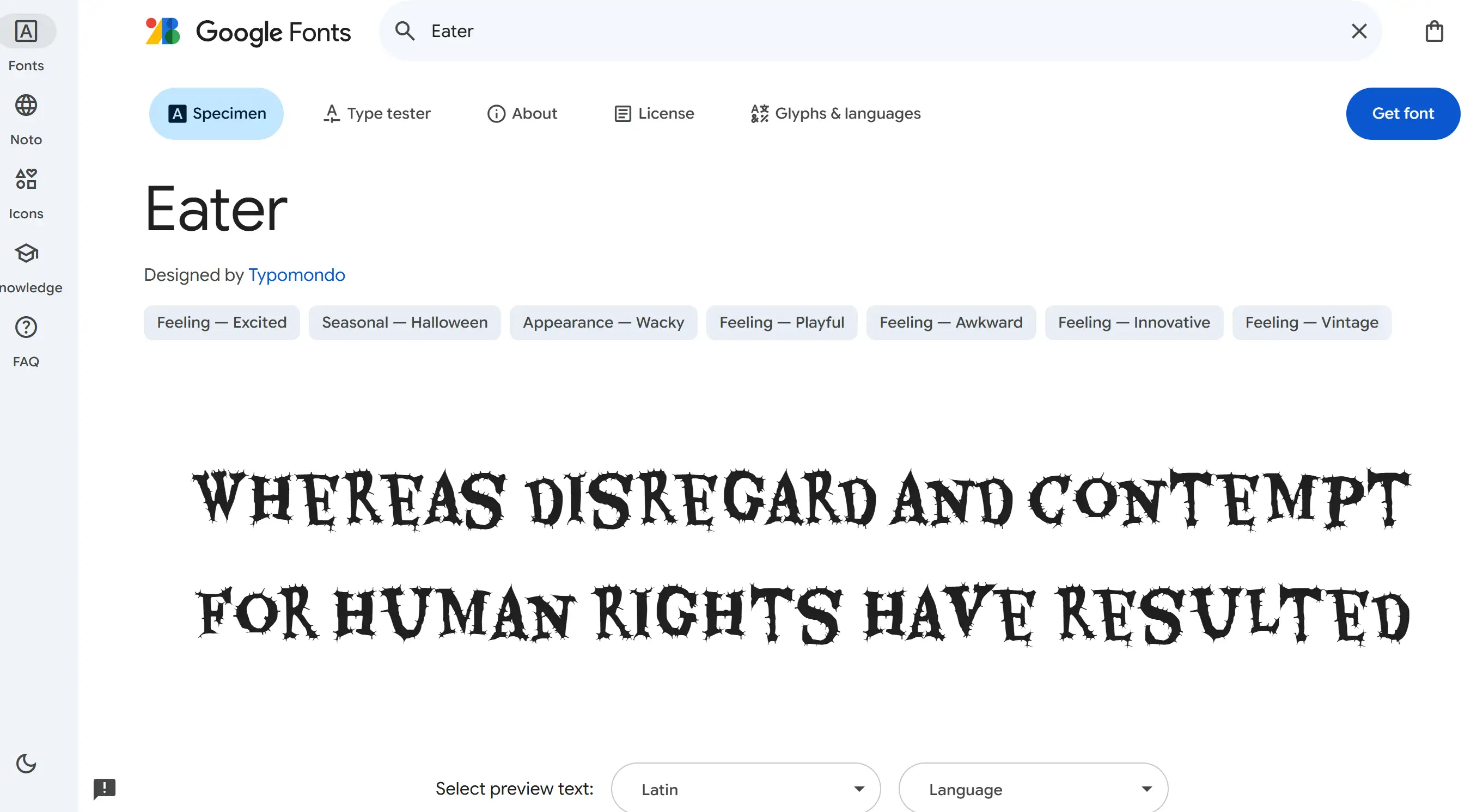
Though it still evokes anxiety, Eater is a more sophisticated take on the horror design style. This gorgeous but decadent font features sharp serifs, drips, and erosions. Its gracefully curved serifs contrast with the jagged hooks, which makes it uncomfortable, making it particularly suitable for elegant and a little weird designs. This demonstration font, named Eater, is like being infected by the saddest rare disease. It is particularly suitable for horror web pages. It exudes a sense of sophistication and can create a creepy and weird atmosphere. It can be used as a title or in body text that requires a particular style.
5. Metal Mania
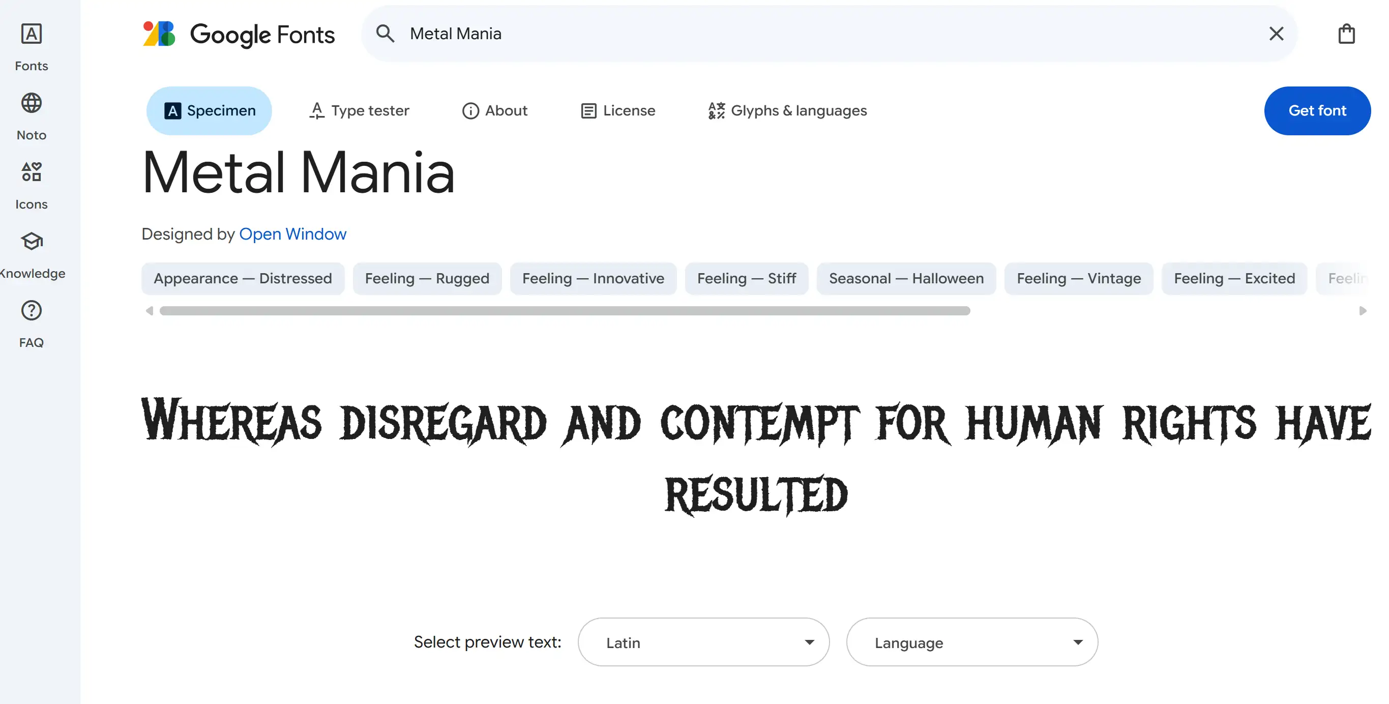
Inspired by heavy metal album covers and posters, the Metal Mania font uses delicate strokes and sharp border lines to create a scary yet stylish visual effect. This font brings a sense of danger and tension, and is very suitable for use in creations related to horror themes. Its sharp, distinct design is particularly well suited for badges, headlines and signage where a vigorous, bold statement is needed. The aggressive aesthetic of Metal Mania, though not the more common "oozing" or "rotting" style, aligns with a specific subgenre of horror, so it's useful for sites that feature dark themes.
6. Shlop
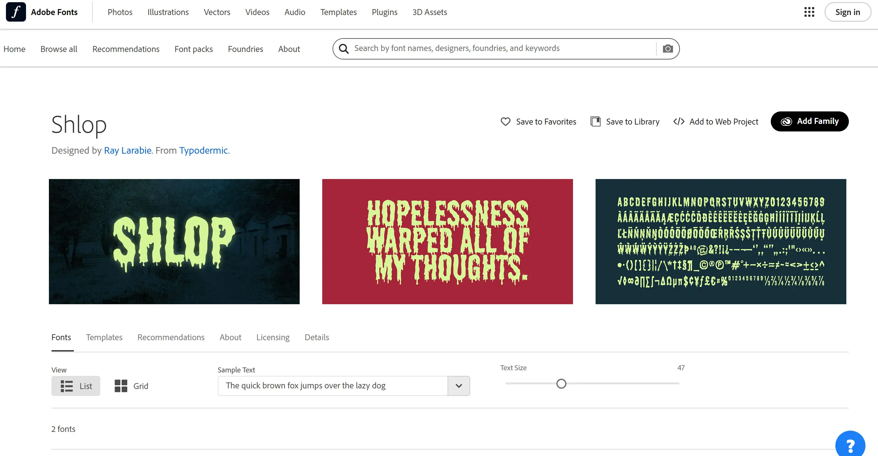
Described as "a scary font that makes people uncomfortable to look at and has things coming out of it", Shlop embodies a sense of visceral dread. Its loose, irregular appearance gives people a sense of threat and fluidity, which is particularly suitable for painting dripping blood, toxic waste, or other things that make people feel uneasy. Shlop's decorative breakdown shows that it is suitable for demonstration because its unique and unsettling appearance can become a visual focal point. This font would be great to use in titles, logos, or as a stylised element to highlight the scary feeling of a horror website.
7. Halau Spooky Script Rough
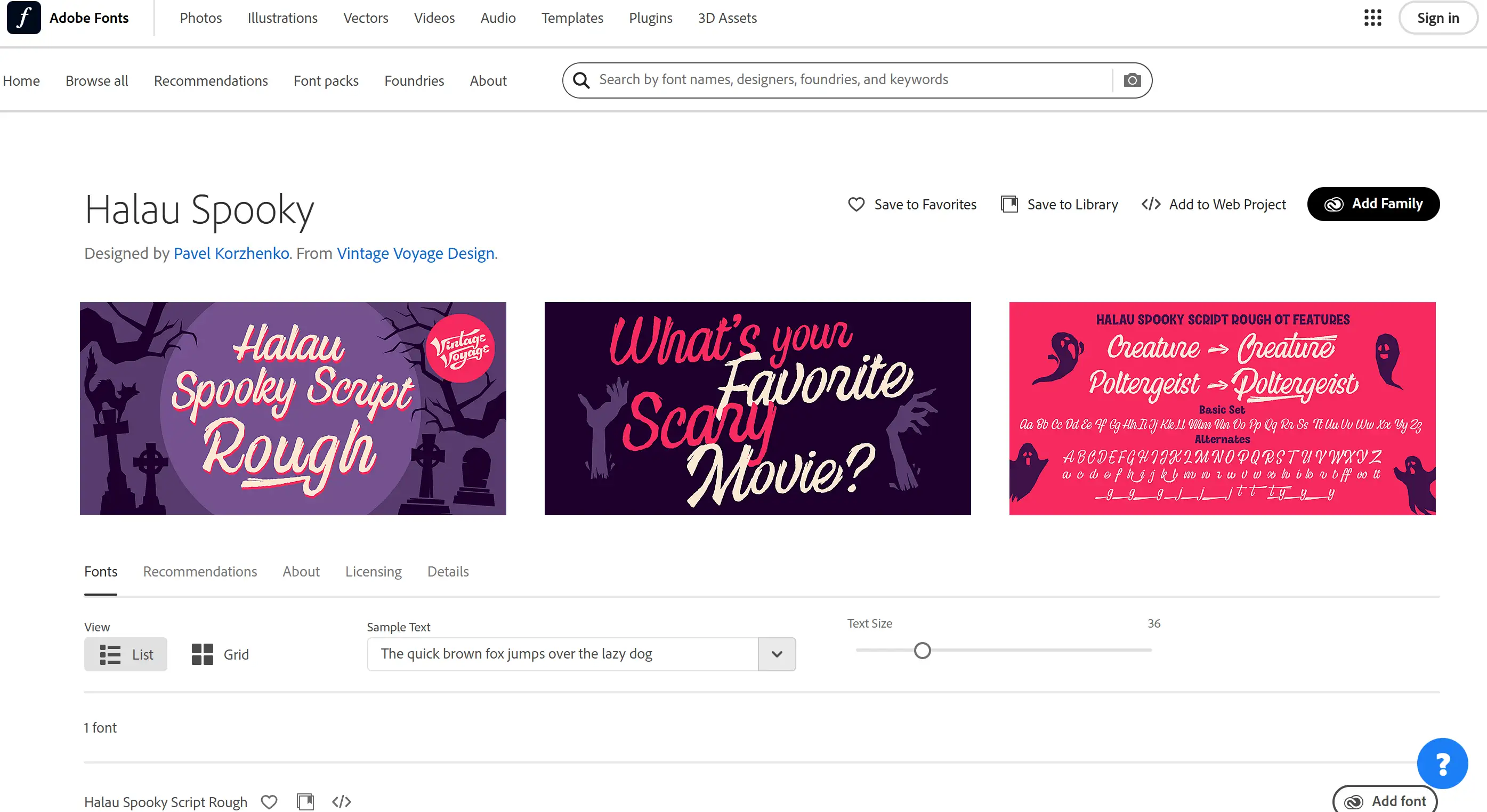
This handwritten font has a mysterious and weird feel, and is particularly suitable for a more complex horror theme. Its swirling, cursive letters look pretty, but the rough surface and slight ridges make it feel a little menacing and uncomfortable. Vintage Voyage Design describes it as “a creepily enchanting typeface for Halloween or other ghoulishly delightful events” and thinks it’s great for headlines, but it also looks great at subheading size. This style alternative can make your personality more prominent, and the whole atmosphere is both exquisite and a bit hazy. It is especially suitable for holiday invitations, food packaging with weirdness, and slogans for horror theatres.
8. Monsterific BB
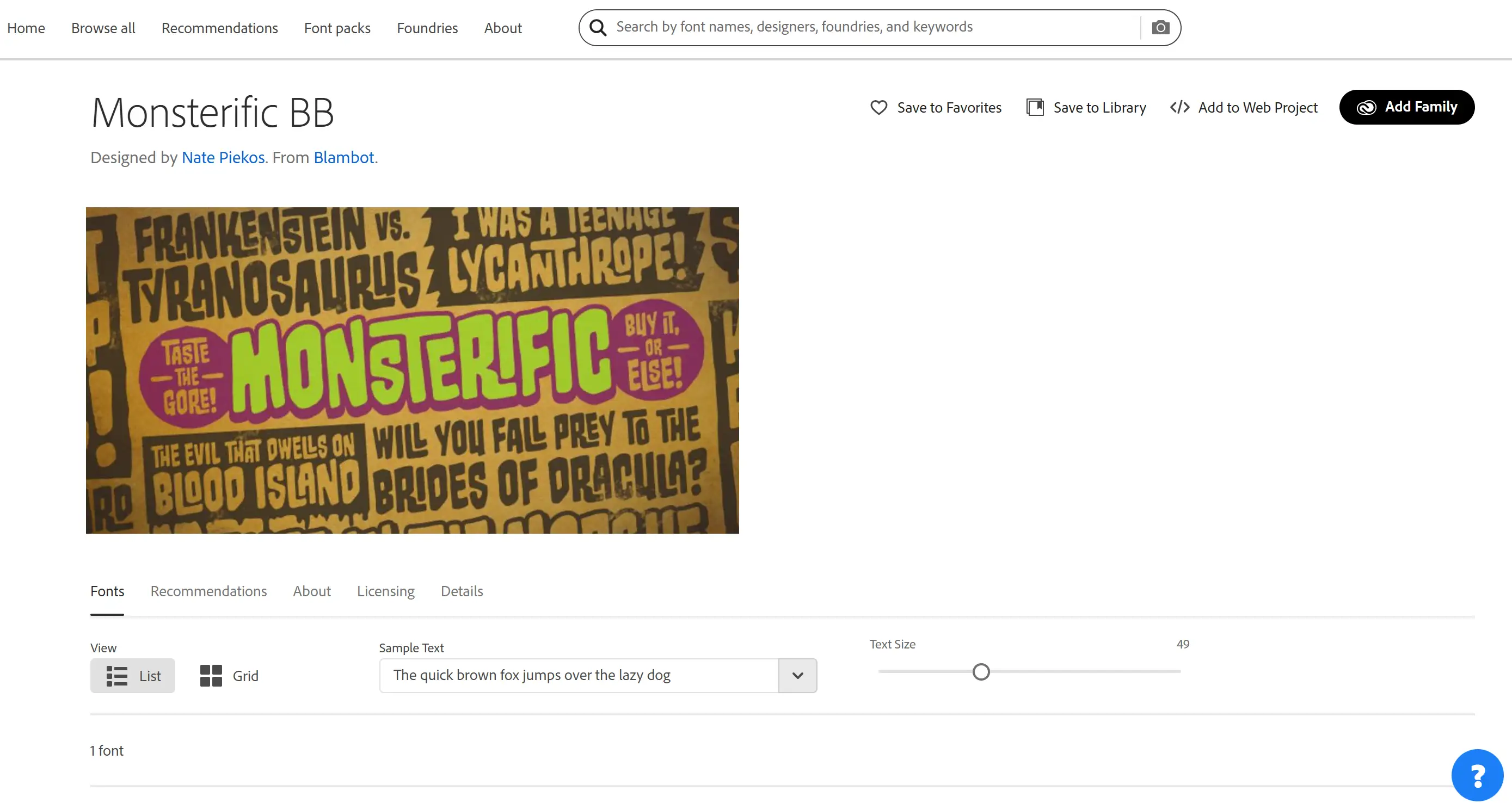
Inspired by the titles of those old horror magazines from the 70s, Monsterific BB is a retro horror vibe transmitter. Its thick, slightly dense serif font has an old-school horror feel, the kind you’d expect from monster movie posters or pulp novel covers. This font showcases a wide series of European characters, and there are a lot of OpenType automatic ligature features, which enhance its adaptability. Monsterific BB from font company Blambot focuses on comic handwriting, which is particularly suitable for horror websites inspired by graphic novels, or those that want to create a nostalgic horror atmosphere.
9. Eckmannpsych
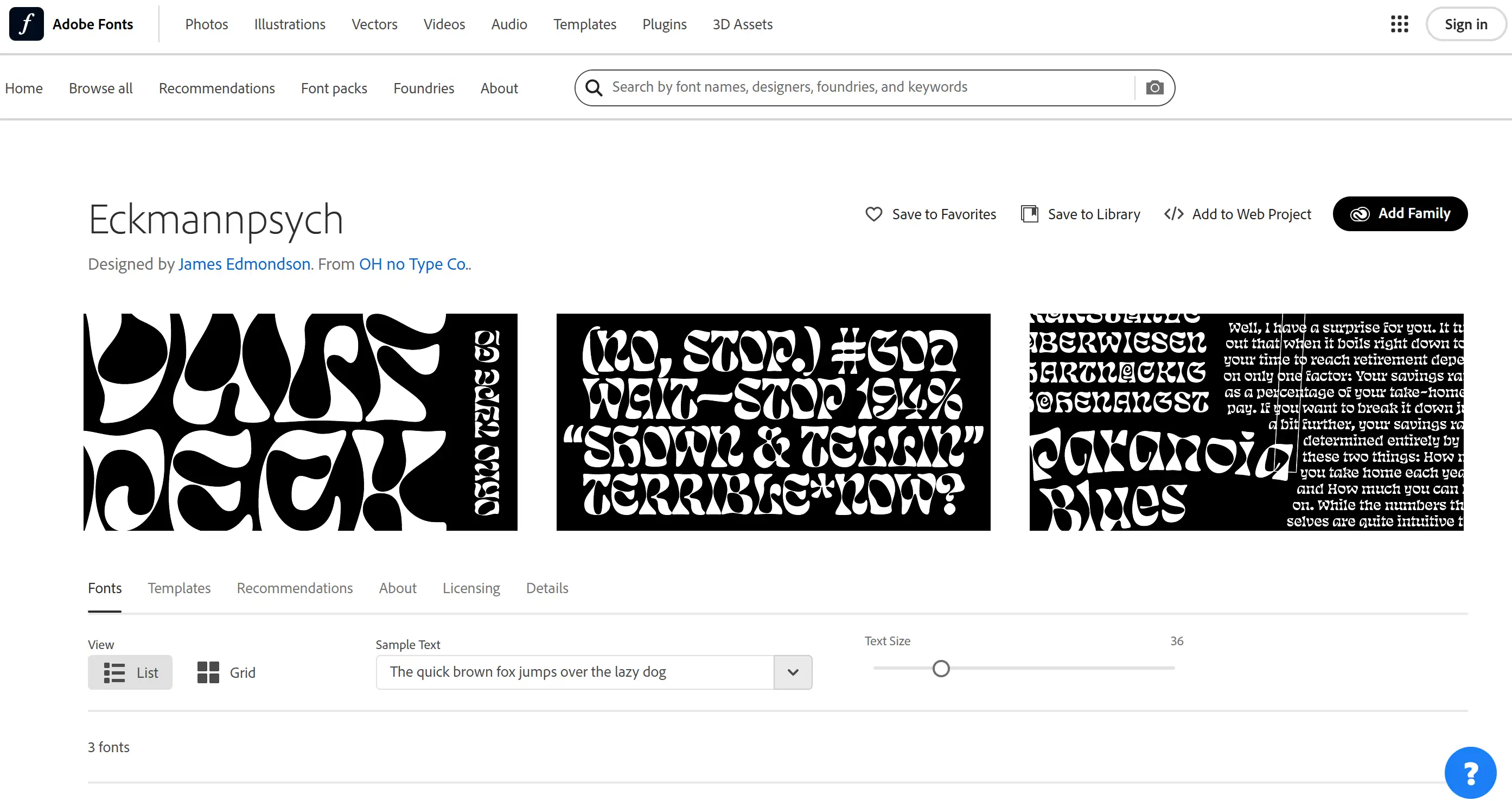
This font brings a distinctly psychedelic and distorted style to horror typography. Inspired by the early 20th-century typeface Eckmannschrift, Eckmannpsych pushes the boundaries of readability to create an unsettling and otherworldly feel. Its unstable, wobbly shape, coupled with its exaggerated twists and turns, makes people feel uneasy and even a little crazy. OH no Type Co. describes it as having roots in late sixties and early seventies aesthetics, and it looks particularly suitable for use in abstract or horror-themed themes. Usability in three optical dimensions can accommodate different text sizes.
10. P22 Spooky
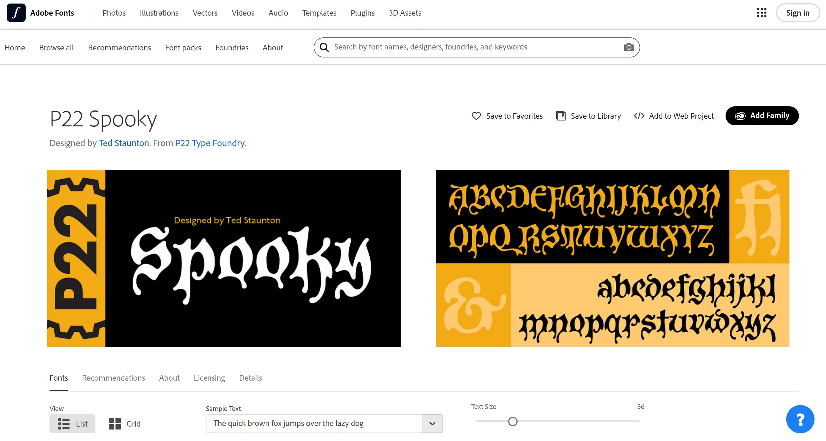
P22 Spooky perfectly creates the atmosphere of traditional Gothic horror with its heavy black font style. This font brings to mind classic horror novels, haunted castles, and ancient mysteries. Those angular shapes and heavy lines are the regulation features of Gothic fonts, making it look full of history and mystery. P22 Type Foundry focuses on researching historical typefaces, striving to authentically recreate the classic horror style. P22 The spooky style is especially suitable for those who want to highlight classic horror themes, or stories with dark historical backgrounds, or those who want to create a scary and mysterious atmosphere for the website.
Factors to Consider When Using Scary Fonts
Choosing horror fonts for your website isn’t just about picking the spookiest option. To put it bluntly, it means finding the right point in terms of appearance, convenience of use, and what the viewer thinks. Next, let’s talk about the critical points of making horror fonts, so that the fonts can look scary enough without affecting normal use.
Audience Intent Vs. Design Intensity
Different terror tactics target different fear points. A page about Halloween celebrations might go for a spooky horror font with an exaggerated dripping effect, such as Cursed Crypt, though a psychological thriller blog might prefer a distorted font to create a more subtle sense of discomfort, such as Psycho Path. Ask:
-
Is your audience seeking fun scares or genuine dread?
-
Does the font’s intensity match their expectations?
Free scary fonts like Zombie Scratch (distressed, hand-carved style) work well for campy themes but risk clashing with minimalist horror styles. Always align the characteristics of your scary fonts with the emotional receptiveness of your target audience.
Hierarchy and Typography Roles
Unconventional fonts are often used in titles, logos, or text that needs emphasis because they create an eye-catching effect in these areas. Whereas, using too many of them in the body of your text may overwhelm your readers. Consider this structure:
-
Main Headers: A horror font, such as Graveyard Gothic, is effective in creating an atmosphere.
-
Supporting Text: Choose a simple sans-serif font such as Arial, which makes the content look clearer.
-
Highlights: This creepy letter style looks great when used on buttons or particularly eye-catching quotes, just like the feeling of a haunted house, which is very exciting.
This structure maintains visual appeal without compromising navigation. Even if you use fancy fonts that don't cost any money, you have to remember: save their power for use in critical places.
Technical Compatibility and Legibility
If the visual effects of a font affect its normal use, then it is of little use. Test how the spooky font looks on a variety of devices and screen sizes. Issues to watch for:
-
Pixelation: Complex details like cracks in Decay Demise will appear unclear and blurry on mobile phones and tablets.
-
Loading Speed: If the font file is too big, it will slow down the page loading speed.
-
Colour contrast: Make sure the text is clearly visible against the background.
For example, the thin, bone-like strokes of a font such as Raven's Cry may be completely invisible against a dark grey background. Use a tool such as Webaim's contrast checker to ensure readability.
Cultural and Genre Nuances
Horror manifests itself differently around the world. That's scary in one culture might be confusing in another. Research regional associations:
-
Gothic Serifs: In a Western context, it is often considered a symbol of traditional horror.
-
East Asian Calligraphy Styles: It may resonate better in Japanese or Korean markets.
Using weird fonts that imitate religious symbols, such as the five-pointed star, may make several people feel uncomfortable. If a product is not sold specifically to a specific niche group, it must consider its acceptance by the mass market.
Pairing with Visual Elements
Those weird font styles never appear alone. Amplify their influence with:
-
Colour Palettes: The deep red and black look impressive, and the green is hard to swallow.
-
Textures: It feels rough, like a layer of mist, or like snowflakes when there is no TV signal.
-
Animations: Effects appear on hover, like a dripping "blood" effect on text.
For example, pairing a font such as Vampire Vault with sharp, extended strokes with the texture of parchment makes it look like an ancient, mysterious, cursed manuscript.
Legal and Ethical Constraints
Those free, weird fonts also have usage rules to follow. Always check licenses:
-
Commercial Use: Several of these free fonts require attribution when used.
-
Modification Rights: Can the font be changed? Can it be adjusted to match the brand tone?
-
Exclusivity: Premium fonts such as Witch's Curse may not be used by many people.
Failure to pay attention to this could lead to legal trouble, and the consequences could be really scary.
Longevity vs. Trendiness
Though those dripping horror-style fonts are popular, they tend to make websites look like they were made in the past. Balance current styles with timeless elements:
-
Trendy: Cursed Crypt has a very aggressive border, and the edge is designed to look like blood dripping down.
-
Timeless: This style is like a Gothic cemetery style, and the serif design is inspired by the Middle Ages.
Final Tip: Whether you’re using premium horror fonts or free spooky fonts, it’s critical to preview how they’ll look in the actual content. A font that terrifies in isolation might clash with your overall design. Tools such as Wegic’s AI Web Page Creator make it especially easy, as it demonstrates various font combinations and ready-made templates in real time.
Launch a Site That Haunts the Internet
Designers have mastered the daunting task of typography. Now you don’t have to struggle with design demons anymore. Let Wegic turn your scary fonts into a no-code website. Really, this is easier than explaining to a spirit why it can't stay in your cellar. Think of Wegic as the friendly AI necromancer of website development. Instead of memorising HTML code or sacrificing your free time to work on CSS, you're just communicating. Simply make your horror-themed page scary by saying “make it look such as a cursed 18th century magic book, but with a ‘Contact Us’ form,” and Wegic’s GPT-4o-powered AI website builder whips it into reality. How about visiting an online store that sells vampire merchandise in multiple languages? Wegic can communicate in more than 20 languages. Do you want to switch the blood dripping action? Forget programmer rules - just state your needs.
What is the most refreshing part? You won’t be limited to a generic layout that just says “My initial WordPress page.” Wegic’s AI can combine weird creativity with professional design, so that the website doesn’t just look scary, it also gives people a sense of vitality.
Written by
Kimmy
Published on
Mar 17, 2026
Share article
Read more
Our latest blog
Webpages in a minute, powered by Wegic!
With Wegic, transform your needs into stunning, functional websites with advanced AI
Free trial with Wegic, build your site in a click!
What kind of website do you want to build?