Log in
Build Your Site
90s Web Design: 20 Classic Examples
Explore the charm of 90s websites with our in-depth look at 20 classic examples. Perfect for nostalgia seekers and those wanting to recreate retro web aesthetics.

Do you recall the time when the Internet was relatively new, and every mouse click seemed like a discovery of something completely novel? If you have thought about what made fresh 90s website designs distinctive and unique, you are not the only one. Returning to the WWW of the mid-90s opened such a colourful, charming and rather unique world of website design.
All of us probably dream about 90s websites because they were more ‘pure’ and came from the time when the world was just going online. These websites were this generation’s artistic representations and the dynamic medium of the internet. Every site of the typical 90s stationery had design features that were characteristic of this generation. Imagine using bright and jarring colours in the background of lots of texts, and the overall look reminiscent of animated GIFs and pixel art from the 90s.
If you are having difficulty as to which aspects of these 90s websites made them unique or have some desire to regain that old feeling from other 90s websites then you are in the right place. These sites adopted such things as embossed buttons, neon backgrounds, and underlined blue links – They all became a kind of hotchpotch of stylistic trends, which, in connection with readymade jokes, gave the sites an unusually looking and looking rather confused appearance.
Having said all that, however, the 20 different 90s websites have been gathered and are below. With the help of a metaphorical time machine, we’ve tracked down these relics – every one of them a snapshot from a time before the Internet represented the dreary, intimidating, and ubiquitous mass of creativity and eccentricity it’s become today. Says the author: It is time to explore web design best practices and principles and find out what real 90s website design is through these treasures.
Click here to Build your site
Tips for Creating a 90s-Looking Website

Developing a website with a 90s style can be a great and entertaining task, not only if it’s related to a specific blog or event, organized within the frame of the requested year. Here are some tailored tips to help achieve that chic trendy look that reminisces out of the 90’s.
Embrace Vibrant and Clashing Colors
Clothes were very bright and often the individual shades conflicted in the 90s. Neon greens, bright pink and electric blue are colours that would sweep across your face. These bright colours could be combined in a rather random manner as far as modern design trends are concerned but such an approach was quite popular in the 90s. To achieve such a style, it is advisable to combine bright colours that contrast with each other but blend well with skin tone. Another is to make your aesthetic website as visually striking as possible, even if that means it might be a tad overwhelming to look at.
Use Flashy Animated GIFs
Animated GIFs were seen almost as the trademark of the 90s websites. These little, frequently looping animations were a spice for otherwise hardly changing pages. The use of a dancing baby, a rotating globe, or a sparkly star will take your site right back to the 90s if you include animated GIFs. There are many of these classic GIFs archived on the Internet, or you can do it yourself with basic animation programmes.
Pixelated Graphics
Web graphics of the initial years were relatively low in resolution and the quality was grainy much like the video games of the early years. Try to use pixel art and bitmap fonts to achieve a similar look to the game. In the following part, we want to present to you some websites which are helpful if you want to find or create pixelated images.
Use Tables for Layouts
HTML tables used to be employed by web designers to implement the layout of their Web pages before the existence of CSS. This method led to layouts that were rigid and blocky-looking in nature. To recreate this, make your content appear in the form of tables using HTML. This will not only give your site that typical 90s look but will also open your eyes to how far web design has evolved.
Add Hit Counters and Guestbooks
Some of the typical elements that could be found on the website of the nineties were hit counters and guestbooks. The existence of this option was evident by the hit counter that is normally found at the bottom of the page giving the number of visitors that had checked the site. Guestbooks enabled guests to express their views or record messages, it was a kind of, today’s comment section, though much briefer. Introducing these elements will make your site more glamorous and will give it that 90’s interactivity.
Incorporate Under Construction Signs
As for the new sites which were developed in the 90s, the “Under Construction” sign was quite typical. Such signs were often accompanied by banners with animated GIFs of construction workers, or roadblocks. It is possible to use an ‘‘Under Construction’’ sign, which will bring some amusing and even childish notes into your Internet project.
Utilize the 216-Color Web-Safe Palette
During the initial days of the internet, colour displays exhibited a lot of problems, and hence, designers restricted their work to around 216 colours that would be displayed on any browser and operating system. By the admitted aesthetics of 90s fashion, use only these shades of colours to get a uniform web-safe look. You can find these specific colours online. There exist tools that can assist you in the task.
Choose Iconic 90s Fonts
Some of the most used fonts for websites in the 90s were Comic Sans, Times New Roman and Courier New. If you want your webpage to have a truly retro look at it, feel free to use these or similar fonts. Additional prominent and contrasting sizes and colours were also important, so do not refuse to make your fonts look big and bright, and headlines should be diverse with rich shades of colours.
Add Background Music or Sound Effects
Background tunes/sound effects were the norm for many websites that were part of the internet of the 90s and they always played once the page was loaded. Although this is not done nowadays, the inclusion of a MIDI music file or some basic 90s sound effects would create an appropriate 90s feel for your site. Only make sure that users can turn off the sounds if they wish to do so.
Design Busy Backgrounds
Loose, filled with active forms, complex geometric patterns anditates were classical patterns for web design of the nineties. These backgrounds sometimes depict reflections or continuation of the image on the shirt with patterns like stars, rainbows, and dotted lines. To replicate this particular layout, organize the page with a background, which should be a high-resolution image with bright and rich visuals, as well as be selected to rehearse all through the web page.
Integrate Scrolling Text and Marquees
Animated gifs and marquees were also common to convey a certain motion on the web pages. Such an effect can be attained using HTML tags that enable the text to scroll from one side of the screen to the other. Use it sparingly and it is best for announcements, and for that 80’s animation feeling that your website has.
Include Web Rings and Banner Ads
Webrings were like link rings. They were a connected web of related sites typically. There would be a banner at the bottom of the page. Another format of ads was banners, which are usually image files; Apart from incorporating web rings and banner ads, it is also recommended to add such components to make your 90s-inspired site look more believable.
By heeding these recommendations, You can also design a website that pretty much harks back to the age of dazzle and squares of the 90s but that is adequate to have the characteristic and amusing flair of the immature worldwide web. Regardless of whether you are designing it just for the sake of entertainment, or to showcase the evolution of the internet, incorporating such relics will certainly help your site to pop.
20 Classic 90s Web Design Examples
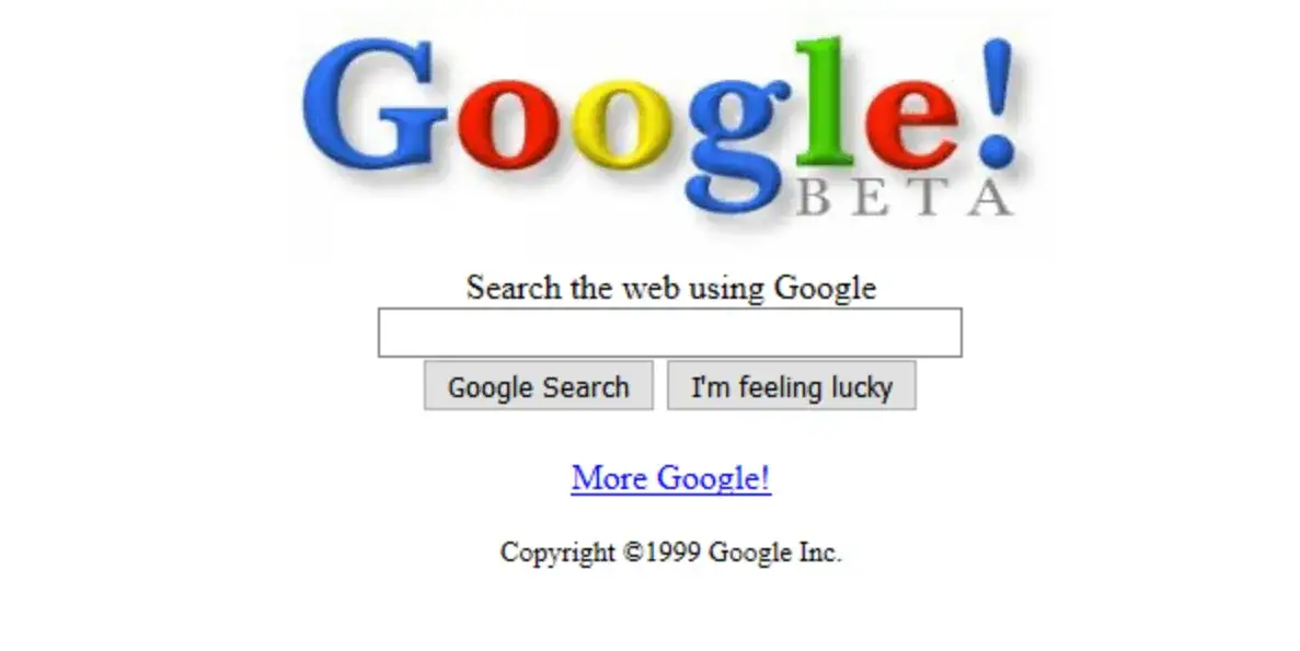
The 1998 design of Google's website remains a fascinating example of the consistency seen in 90s websites. This early version showcases an understated simplicity that has largely persisted into the present day. The logo, featuring subtle 3D shading, stands out as a notable difference, adding a vintage charm. The clean white page, dominated by essential HTML elements like the search input, mirrors the straightforward functionality that Google is known for. Overall, Google's commitment to simplicity and efficiency has been a constant since its inception, making it a quintessential example of the enduring design principles of 90s websites.
Lego
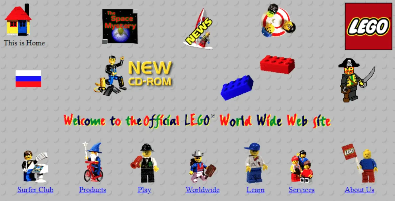
Lego's first website, launched in 1996, perfectly encapsulates the vibrant and playful nature of 90s websites. The Lego-studded background and animated Lego person icons added a dynamic element to the site, reflecting the brand's creativity. The homepage featured low-resolution clip art images that moved and spun, set against a patterned background reminiscent of a Lego base. Despite some clumsy design elements typical of 90s websites, such as large navigation icons, the site offered impressive functionality, including interactive sections like an on-site treasure hunt and a space mystery video game. The playful, chaotic joy of Lego's 90s website has remained a core aspect of its online presence.
eBay
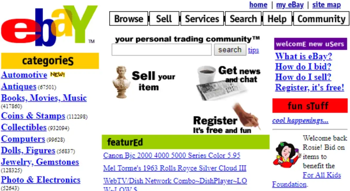
By 1999, eBay's website embraced the colorful and chaotic aesthetic typical of 90s websites. Featuring bright colours, mixed fonts, and grainy clip art, the site was a visual representation of the era's design trends. Despite its design not being the standout feature, eBay's early website had a significant social impact, allowing collectors to connect and trade globally. This foundational aspect of eBay's identity, facilitating connections and transactions across distances, was a revolutionary concept birthed in the era of 90s websites.
The New York Times
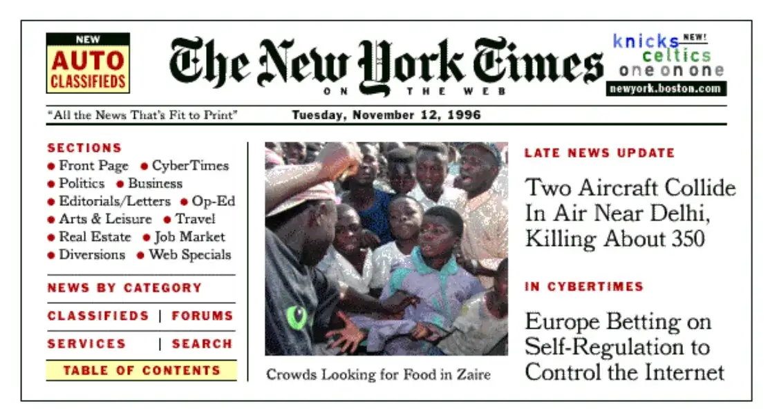
The New York Times website in the 90s is a classic example of early web design. Reflecting the experimental nature of the decade, the site featured hundreds of links and blocky sections, with a vertical and horizontal division of the page. Mismatched fonts and a busy layout were hallmarks of 90s websites, and the NYT site was no exception. This early iteration allowed users to explore a vast array of information, marking a significant step in the evolution of online news platforms
Amazon
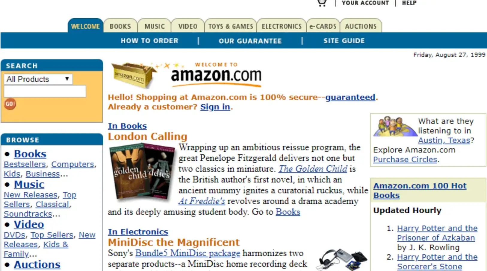
Amazon's 1999 website is a prime example of the bustling layouts typical of 90s websites. Overflowing with images and links, it resembled a digital department store. The main top navigation facilitated access to essential functions like the cart and account, while categories such as books, videos, and electronics were neatly organized in top tabs. The sidebar hosted search options and browsing links, contributing to the site's cluttered yet modern appearance for its time. The old Amazon logo, featuring a river-like path over a stylized "A," added to the vintage charm. This design, while busy, laid the groundwork for the user-friendly e-commerce experiences we expect today.
Sixties Press
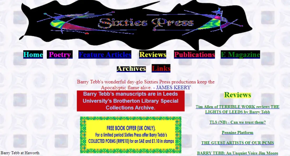
The Sixties Press website, designed by English author Barry Tebb in 1995, is a humorous yet insightful representation of 90s websites. The homepage featured a 90s-themed vector set on a squiggly black shape, with a dated symmetrical pattern background. Brightly coloured navigation buttons with black backgrounds added to the site's chaotic appearance. All content was displayed on the homepage, a characteristic element of early web design. Despite its clunky aesthetics, the site served its purpose of promoting and selling poetry books, embodying the experimental spirit of 90s websites.
The Oatmeal
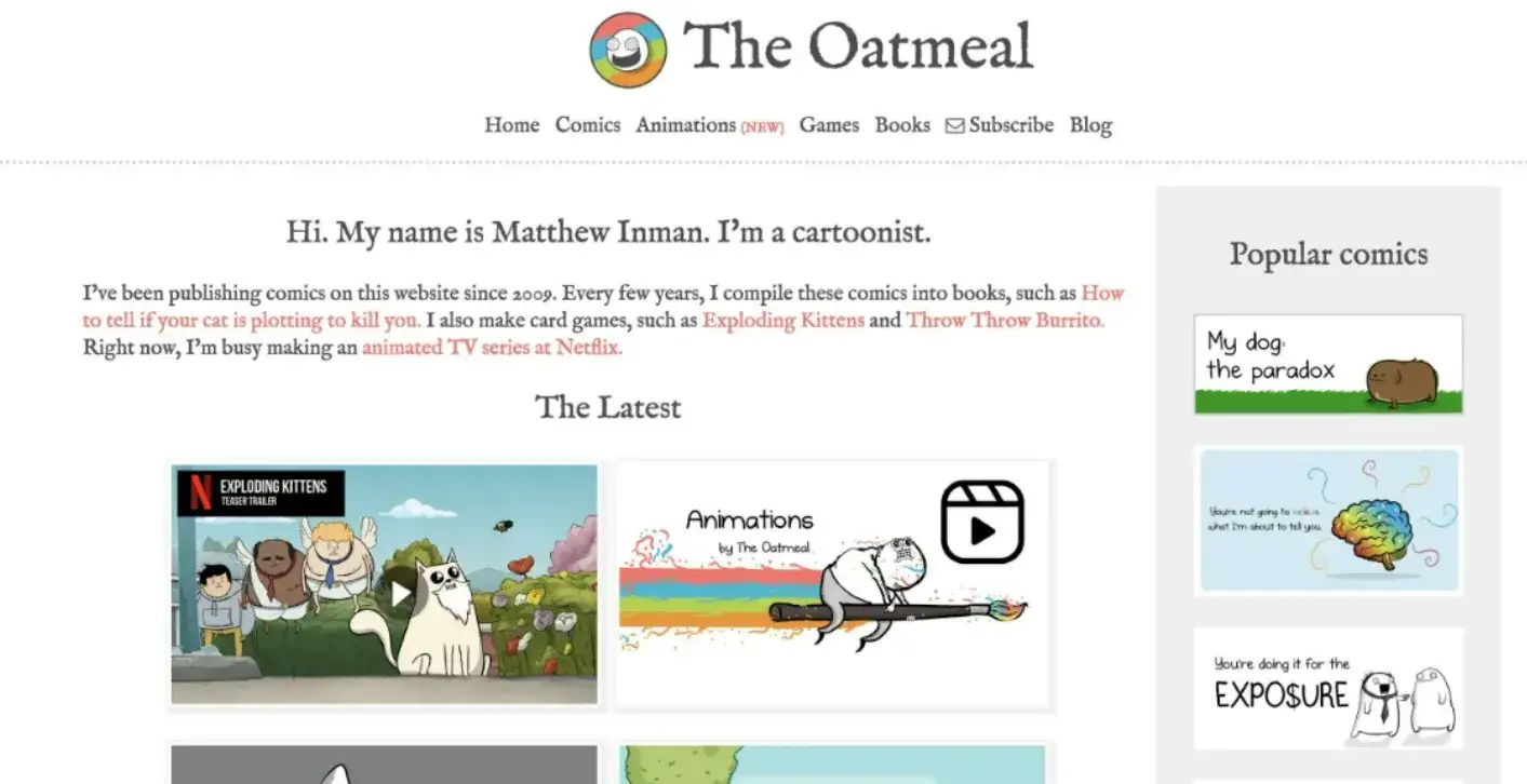
Although The Oatmeal emerged after the 90s, it captures the whimsical and experimental spirit of 90s websites. Known for its witty comics and commentary on various topics, The Oatmeal's design is a blend of humour and simplicity, reminiscent of early web culture. This website serves as a bridge between the raw ethos of the 90s internet and contemporary digital storytelling, highlighting how the playful essence of early web design continues to influence modern websites.
USGS

The USGS website from the 90s exemplifies some of the common pitfalls of early web design. With an overuse of red links, which are typically associated with warnings and errors, the site's navigation was less user-friendly. The layout featured bulleted links and left-aligned, single-column text, making it a challenge to navigate. Despite these usability issues, the site reflects the experimental nature of 90s websites, providing a nostalgic look at the evolution of web design.
Microsoft
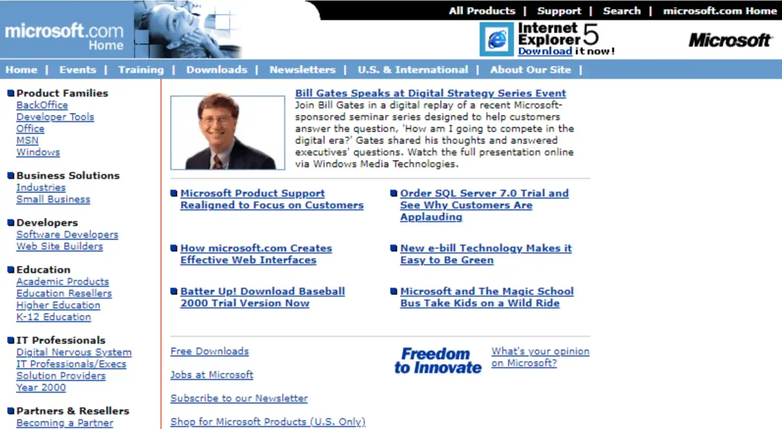
Microsoft's 1994 website, known as "Microsoft's World Wide Web Server," offered a wealth of resources typical of 90s websites. It included databases, knowledge bases, and new product insights. A text menu link catered to users with image-restricted browsers or limited internet access, a common concern of the time. This early version of Microsoft's site was data-rich and technically oriented, reflecting the needs and preferences of users in the early days of the Internet.
Windows 95
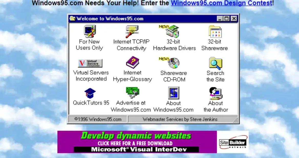
The Windows 95 website, a digital gem from the mid-90s, focused on functionality and ease of use. Its design featured simple navigation and clear information, reflecting the transitional period of the time. The homepage invited users to join a design contest for the operating system, with a background adorned with a pattern of white clouds, adding a whimsical touch. Links were cleverly aligned to resemble system interface icons, making it a nostalgic nod to the visual language of Windows 95. This site embodies the playful yet functional essence of 90s websites.
Dell

Dell provides some of the world's top technology solutions and services. Among their most famous products are their laptops, which have garnered a global fan base. In the 1990s, Dell's website was quite advanced compared to many others, featuring a two-column layout to present products with images and text divided into several sections. Today, Dell's website is more streamlined and uncluttered, with a prominent search box at the top to help customers quickly find their desired products.
Bloomberg
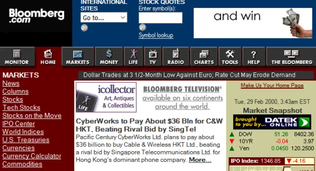
The 1990s were a period of heavy experimentation in web design, which offers many ways to adopt its aesthetic today. For instance, if you run a blog or news website, Bloomberg can serve as inspiration. The site is primarily devoid of colour except for featured images, advertisements, and the strategic use of red to highlight important details. Heavy-weight fonts create a clear visual hierarchy, making it easy for users to navigate through the content.
Yahoo! Games
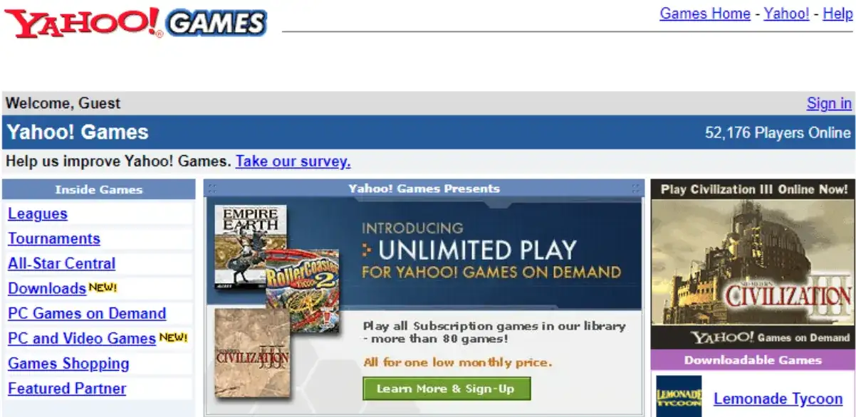
Yahoo! Games, launched in 1998 as a subsection of the main Yahoo! website, hosted a variety of Java applets and Flash games in categories like card games, board games, word games, and sports games. The design was simple, featuring lots of blue hyperlinks in greyscale columns, but the games were addictive and fun. Yahoo! Games offered over 1,000 free-to-play games, although players had to deal with persistent pop-up ads unless they paid for “All-Star” status. Yahoo! Games had a successful run before shutting down in 2016. The website featured a lot of text with inline links.
Hotmail
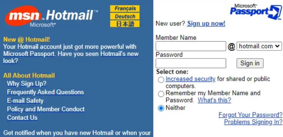
Hotmail's website in the 1990s featured a vertical bar on the left to showcase the logo and main business offerings. The choice of blue for the design was effective since blue is considered the safest colour for web design. Hotmail has since merged with Outlook, a web-based suite of email, contacts, tasks, and calendar services from Microsoft. The current website features a background image that covers the entire screen, bold typography, and a compelling call to action.
The White House
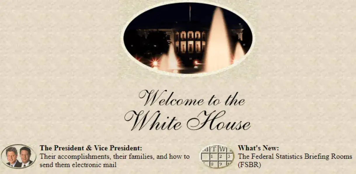
The official White House website in the 1990s was both formal and approachable, providing citizens with access to information and services. The 1995 version offered a virtual tour of the President’s residence and family, featuring galleries, a guest book, and museum-like elements. The design was clean, with minimal text and low-quality small images that often served as icons. Today, the White House website resembles a typical media outlet, focusing more on political news and aligning closely with mainstream media design, moving away from its original museum-like charm.
Space Jam
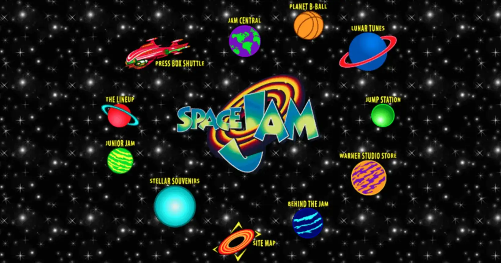
The Space Jam website, launched in 1996, is a quintessential example of 90s web design with its vibrant colours and playful animations. The site was a significant part of the movie's promotional experience, featuring a starry tiled background with clip art planets, spaceships, and basketballs. Interactive landing pages offered trivia games, colouring books, behind-the-scenes content, and downloadable screensavers. The Space Jam site remains live, unchanged since the 90s, serving as a nostalgic reminder of that era's web design.
Apple
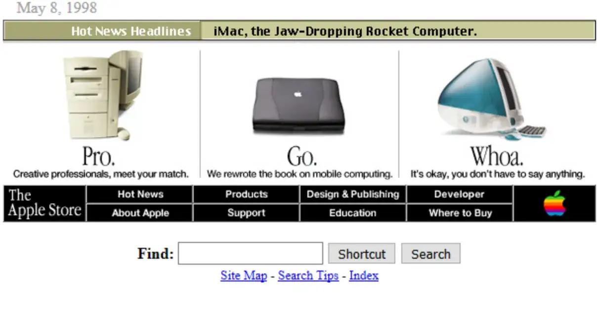
Apple’s website in the 90s was minimalist yet impactful, focusing on sleek design and user-friendly interfaces. In 1998, the site reflected the iconic “Think Different” slogan, with a relatively clean design that embraced white space, concise descriptions, and essential product imagery. Apple’s current website maintains its minimalist allure, featuring a dark top bar for navigation and promoting creativity and innovation through its design.
Pitchfork
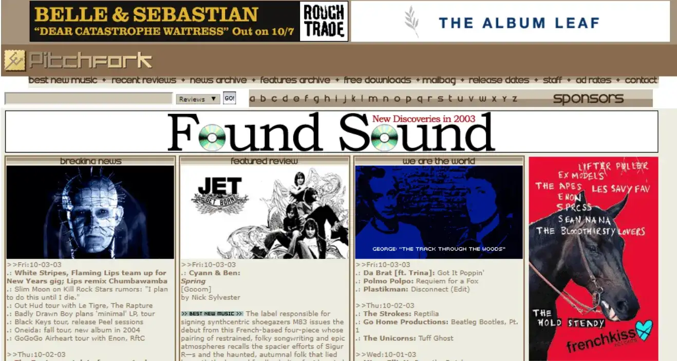
Pitchfork Media, launched in 1995, made a significant impact in music journalism with weekly features, record reviews, and indie music news. The website’s design mirrored other late 90s sites with a newspaper-meets-encyclopedia style of navigation. Columns separated different beats, and sidebars included links to recent items and related reviews. The layout, though inconsistent, encouraged users to stay on the site and consume more content. Pitchfork has since undergone several redesigns but continues to publish music news and reviews.
Disney
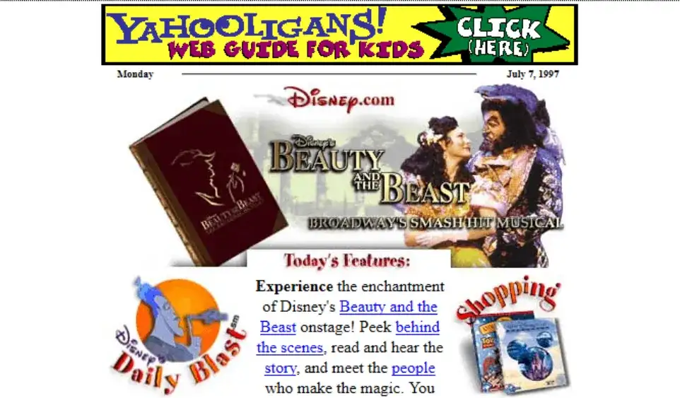
Disney’s website in 1997 was a cluttered HTML-based platform, featuring a mix of text and images, banners, and essential links tucked away in a sidebar. The design embodied the 90s web aesthetic with its cluttered layout and surplus of links. Today, Disney’s website has transitioned to a sleek, clean design with large images of the latest movies, reflecting contemporary web design standards and moving away from its nostalgic clutter.
NASA
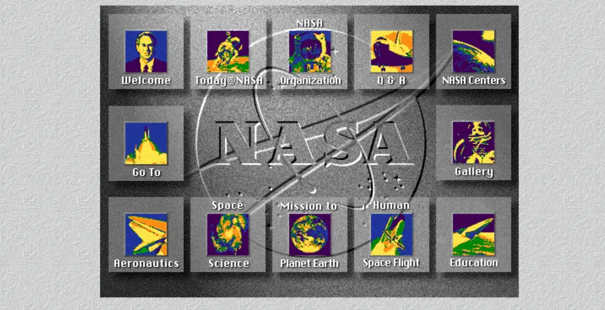
NASA’s first website, launched in 1994, featured a textured grey background and colourful but grainy navigation buttons. It centralized all things NASA, from space images of the day to launch updates. Despite its unintuitive design, it was a significant step in making NASA’s information accessible. Today, NASA’s website has undergone several redesigns, incorporating user feedback to improve navigation and usability, while maintaining its status as a central hub for space enthusiasts.
Click here to Build your site
The 90s Vibe with Futuristic AI Web Design
The old appeal and specific elements of the 90s web design remain relevant and successfully influence the present web creations. The era of web design gave a lot of material to study creativity and experiment, going from bright colours and animated GIFs to navigation menus, to drawing pixel mania. Their existence allows for their inclusion Into current design, which results In modern websites being at once informative, entertaining, and sometimes even reminiscent of the classics.
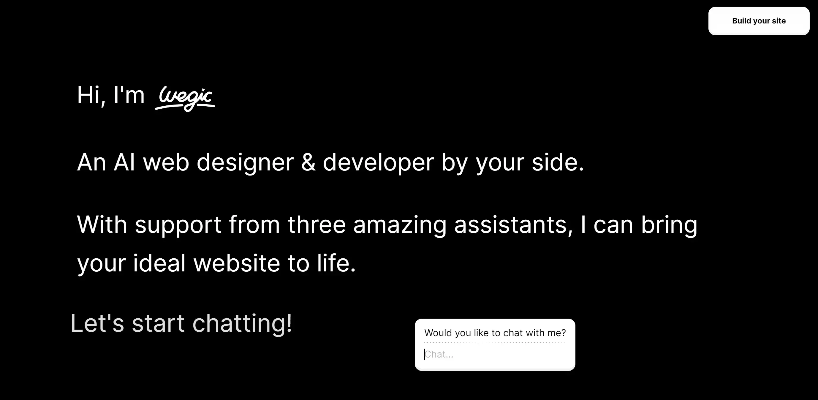
For those who want to have identical 90s websites, Wegic is your DIY website builder in web design, which emulates 90s website creation experience but is empowered with modern technology options. Aimed at students and small companies, Wegic simplifies the process of creating a website by using a chat interface that allows the creation of beautiful websites regardless of the knowledge of program codes.
Key Features:
-
Multimodal Interaction: Guided by natural language and upcoming image inputs, Wegic simplifies the entire website building and hosting process.
-
Zero Barrier, Full Process Support: From concept to deployment, Wegic handles all technical details, requiring no programming or design background.
-
Personalized Customization: Offers a wide range of customization options to suit various styles, ensuring your website reflects your unique personality.
-
One-Click Launch & Custom Domain: Take your website from concept to completion in minutes, with support for custom domains and seamless hosting.
- Affordable price: Wegic offers a free plan, with 70 free credits, you can build your dream website in seconds. Paid plans start from $31.9 per month.
With Wegic, you can relive and apply the style of the 90s website design, which is united with AI assistants. Following current top AI trends makes the process as easy and effective as it can be. Be part of the world’s best web design group and feel the future now!
Written by
Kimmy
Published on
Mar 17, 2026
Share article
Read more
Our latest blog
Webpages in a minute, powered by Wegic!
With Wegic, transform your needs into stunning, functional websites with advanced AI
Free trial with Wegic, build your site in a click!
What kind of website do you want to build?