Log in
Build Your Site
10 Visual Hierarchy Principles Every Design Need to Know
Learn 10 visual hierarchy principles to create user-friendly experiences. Discover tools like Wegic to streamline your process and improve your work’s impact.

Visual hierarchy is a fundamental principle in design. It arranges elements on a page so users can easily identify the most important parts. Designers use simple methods like size, color, contrast, and placement to guide the viewer's attention. In this blog post, we'll explore 10 key principles of visual hierarchy that every designer should master. By understanding and applying these, you can craft designs that not only look great but also communicate effectively.
Why is Visual Hierarchy Important?
Visual hierarchy makes content easier to understand and navigate. When audiences visit your website or look at your design, they don’t want to search for key information. A strong visual hierarchy tells them where to look first. The content that stands out is also the parts the designers would like to share most. It will greatly save time and reduce frustration. You can imagine reading a page where everything is the same size and color. It would be hard to know what’s important or where to start. Hierarchy solves that problem by visually organizing content.
Without it, designs can feel messy and overwhelming. Important actions, like "Buy Now" buttons or key headlines, might get lost in the clutter. Visual hierarchy helps users process information more quickly, making it more likely they'll take the action you want them to, like clicking a button or reading an article.
In essence, visual hierarchy guides users through a design in a logical order. It keeps their attention focused on what matters most and ensures the experience is smooth and enjoyable. By using simple elements like size and contrast, designers make sure users get the message clearly and effortlessly.
What are the 10 Visual Hierarchy Principles?
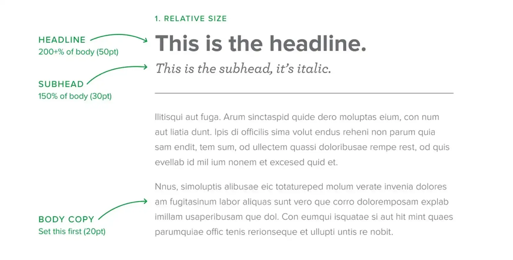
Principle 1: Increase the Size of Key Elements
Size plays a major role in establishing hierarchy because larger elements are perceived as more important. The larger the elements, the more likely they will attract people’s attention.
For example, think of the structure of a newspaper, which usually includes the headline, main title, subtitle, and body. In these different parts, the font sizes used are also various. Normally, the first thing that catches your eye is the largest element----the headline. Sometimes it even determines whether you will pick up the newspaper to read it.
For another example, think of a banner ad. You can easily notice that the main text like "50% OFF TODAY ONLY" is bold and oversized, and the supporting details like terms are much smaller. The first thing you notice is the sale. This is also designed by the business owner. This is the part they want you to pay attention to first.
So, you should make your key elements like headlines, call-to-action buttons, or key images larger than your secondary content, because they are the most important part you want to stress. Bigger size always naturally guides your audience to focus on what matters most.
Principle 2: Align Elements for a Neat Layout
Good alignment is the unsung hero of visual hierarchy. If your design has a well-aligned layout, it will look organized and professional. This will make it easier for users to browse your content.
Consistent alignment between text, images, and buttons gives your design a clean, cohesive look. Remember, small misalignments can be more distracting than you think.
Principle 3: Apply Bold Colors to Guide Attention
Color can evoke emotion, establish brand identity, and signal hierarchy. Bright or bold colors are more likely to grab people’s attention. It is an effective way to guide users toward key information.
You can use bold colors sparingly and strategically. You don’t need to use too bright colors in large areas, because excessive use of bright colors may confuse users. How to maintain a balance in the choice and use of colors is more than critical.
For example, you can imagine that you are designing a clean and grey landing page, and now you change the main CTA buttons to bright orange or yellow colors, your audience can easily notice that because the color contrast makes the button stand out from the rest of the design. This will naturally guide your audience to click. This color choice makes the button highly visible and encourages users to complete their purchase.
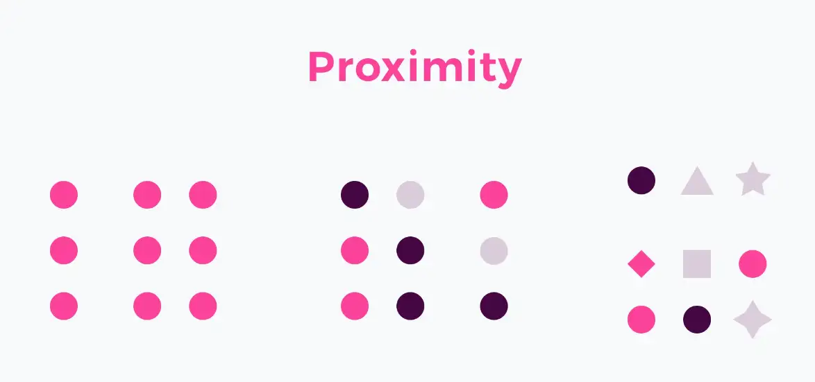
Principle 4: Group Related Elements Together
When related elements are placed closer in your design, your audience will naturally understand their connection. This is a simple yet effective way to make your design more logical and it allows the audience to understand your content more easily.
You can think of an e-commerce product page. The name of a product, the price, the "add to cart" button, and the "purchase" button are often placed together. This is a series of information and elements required to complete the purchase action. If these elements are scattered in various corners of the web page, the audience will be confused and not know what to do next. Or, they take more time to complete the desired action. In short, it hinders the completion of the "purchase" action.
You can organize all related information together, such as product details or navigation links. This allows your audience to find all relevant information very smoothly and avoid confusion.
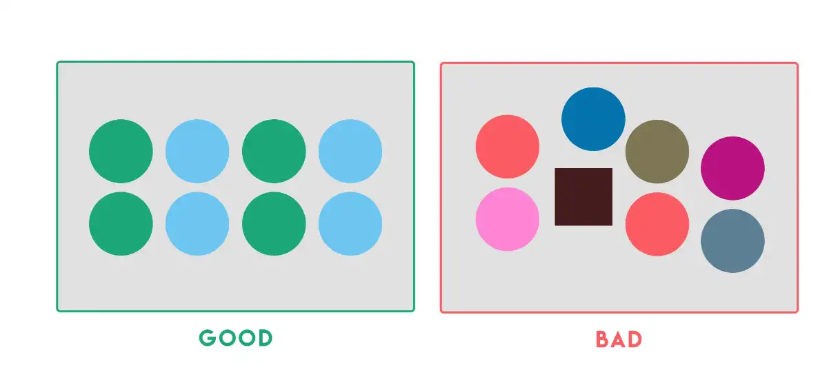
Principle 5: Repeat Design Elements
Repetition builds familiarity and trust. If your audience sees repeated elements, like consistent color, font, or button style, they will feel your design is cohesive and polished. From these elements, your audience can learn how to interact with your design and what to expect more easily.
You should establish design rules and stick to them. Use consistent colors, fonts, and button styles across your entire project. Repetition helps to reinforce your brand image and to create a better user experience.
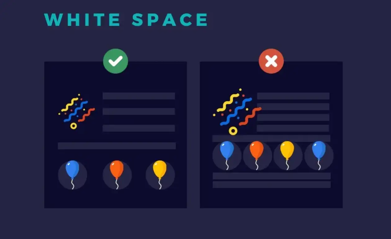
Principle 6: Use Whitespace to Breathe
The use of white space is often underestimated. White space is a very simple but effective design principle. It is like a silent element that lets your design breathe. It offers room for the audience to have a break and digest the content, rather than being overwhelmed by a lot of redundant information and content.
You can consider the Apple product page. Apple's product page is centered on the product image, and a lot of white space is used around it. This allows the audience to focus on the product and highlight its importance. And such a design looks luxurious and intentional.
You can increase the use of white space around some important content to make it stand out in the whole design. Don't worry about whether the use of too much white space will be boring, less is more. By strategically leaving blank spaces around key content, you can reduce clutter and direct attention to the most important components of your design.
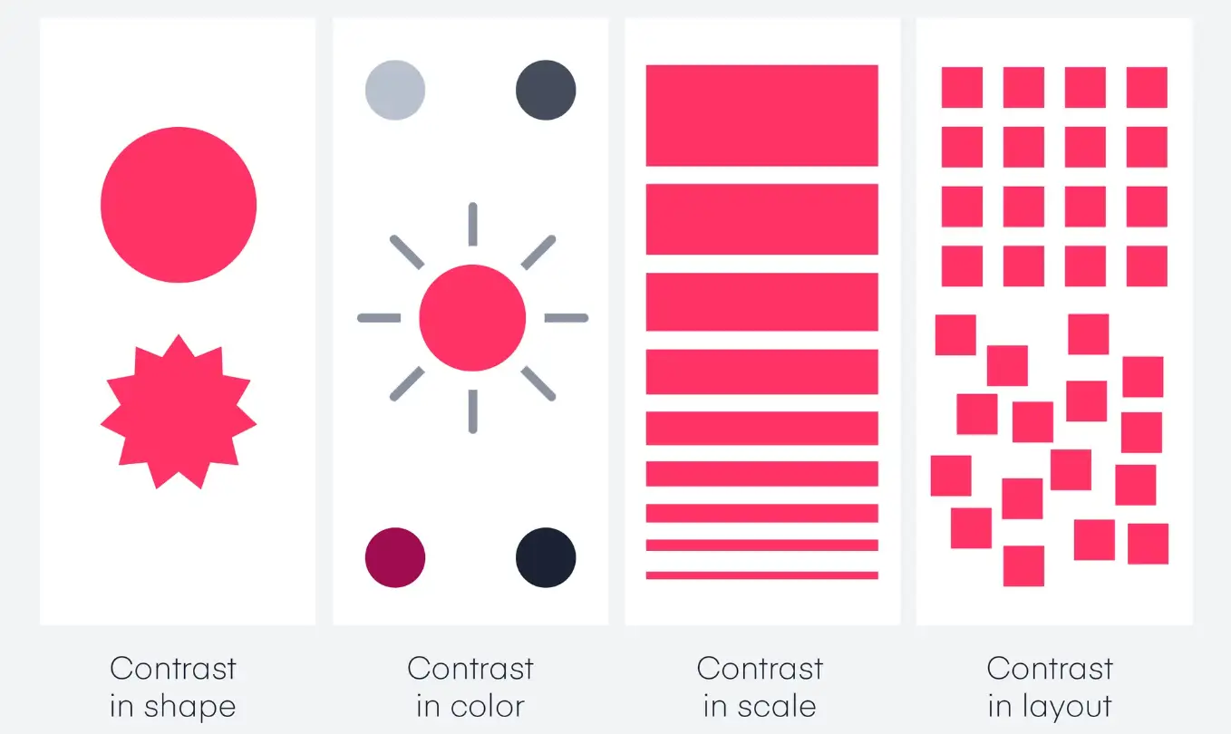
Principle 7: Use Contrast for Emphasis
By using contrast, you can make certain elements shine brighter than others. I have read many articles about visual hierarchy principles, and many of them mention contrast in color. Using good color contrast to highlight a part of the content is a very common and effective way. Contrast is key to creating a visual hierarchy because it helps important elements stand out.
But I would like to add that contrast isn’t just about colors—it’s about creating a distinction between elements. There are many ways to make the design contrast. Color contrast, font weight, or even texture contrast can help differentiate between elements and establish their significance.
For example, on a service page, the main headline is in large, bold text, while the body content is smaller and lighter. This contrast in size and weight directs attention to the headline first. You can use contrast for elements that need to be emphasized, like using rounded buttons in a layout full of straight-edged elements. But you need to be careful, using too much contrast can easily lose its original effect because it can also distract the audience.
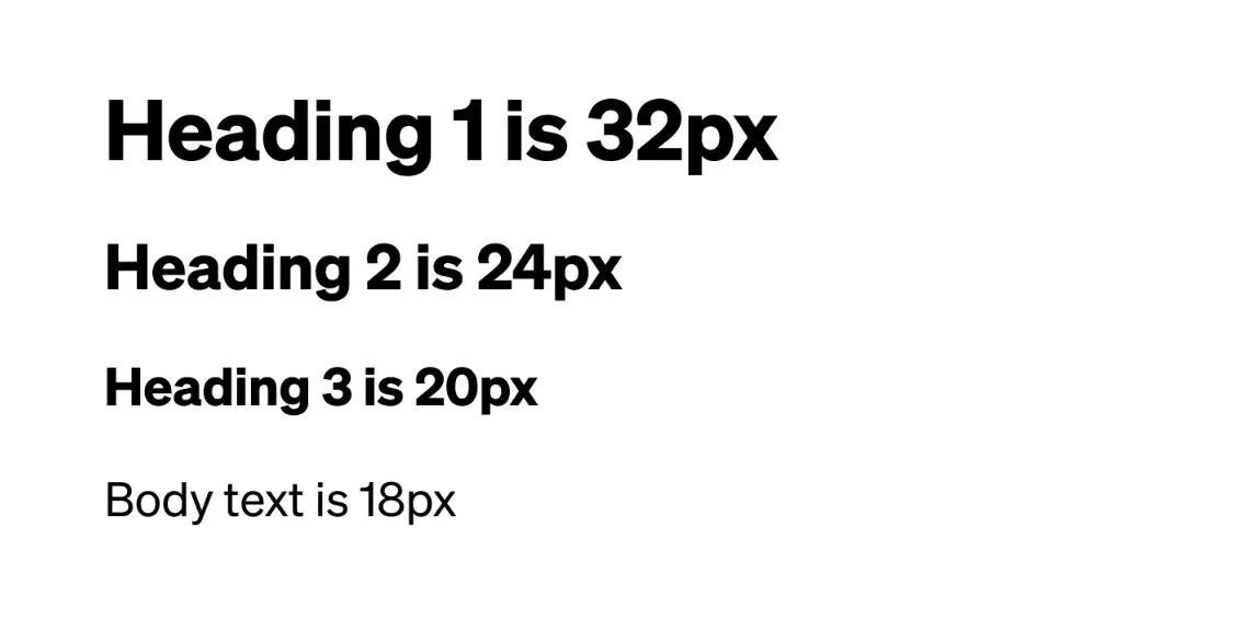
Principle 8: Use Typography Hierarchy to Organize Text
Typography hierarchy plays an important role in organizing your content. When you use bold and large fonts, it conveys a message to your audience: this is something you need to read. The smaller fonts are used as supplementary information to support the headline in the body of the text.
For instance, you can imagine a newspaper layout----the headline is in large, bold type at the top of the page, followed by a smaller subheading and then body text in a standard size. This has demonstrated the typography hierarchy. It makes the overall design look more logical and well-organized. Also, pay attention to line height and letter spacing to improve readability.
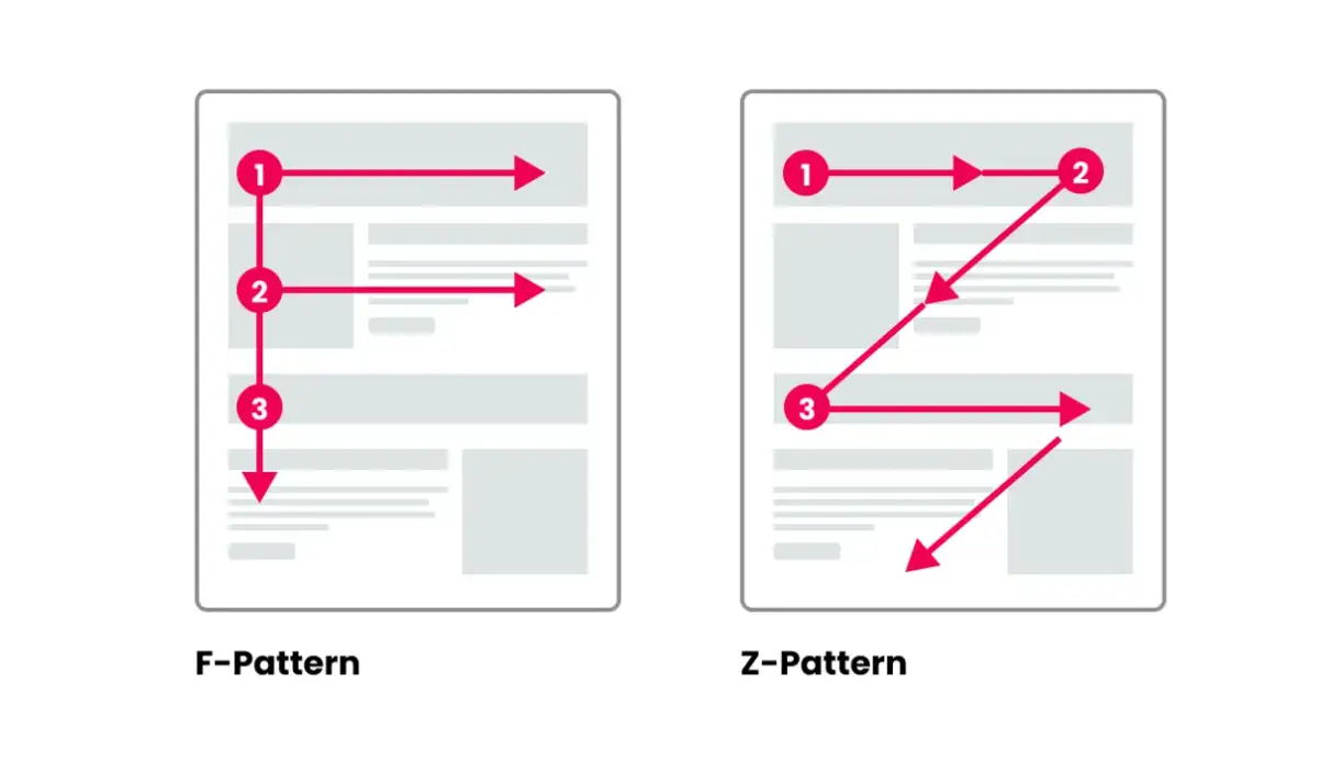
Principle 9: Leverage Viewing Patterns
People are more inclined to follow viewing predictable patterns when scanning content, especially on screen.
Z-pattern and F-pattern are two of the most common patterns. Making good use of these patterns can help you place key elements properly.
Z-pattern: It follows the natural movement of the eye from top-left to top-right, then down to the bottom-left, and finally to the bottom-right. It is often used in designs with minimal text and heavy visuals.
F-pattern: It is more used for text-heavy content, such as blogs or articles. The audience will first look at the top (reading the headline), then move down the left side. It’s useful for structuring
You can use the Z-pattern for designing clear, and concise content, especially when your goal is to guide the audience to finish the desired actions. If your page is text-heavy, it would be better to choose an F-pattern because it ensures important information like headings and CTAs can be easily noticed.
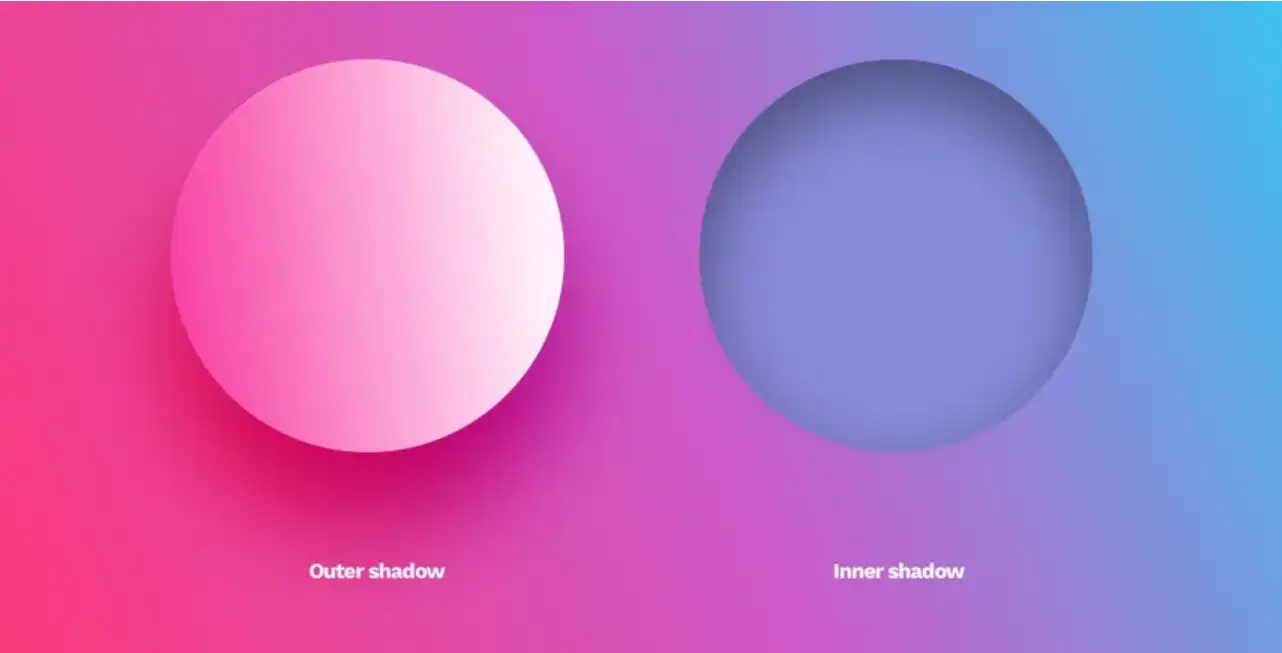
Principle 10: Create Depth with Texture or Shadows
Depth makes designs feel more dynamic and engaging. You can separate key elements by using shadows or textures and make your design more layered to create a visual hierarchy. Use shadows and textures sparingly to highlight certain areas, like buttons or cards. A little depth goes a long way in making interactive elements stand out, but overdoing it can make your design look cluttered or dated.
Things to Watch regarding Visual Hierarchy
Now you already know 10 principles to improve your visual hierarchy. If you can’t wait to apply it in practical projects? Great. But wait, it's worth noting that some common pitfalls can still occur, even when these principles are applied. Although some of the pitfalls I have mentioned above, I still want to stress again. Here are some key things you need to watch for visual hierarchy.
01.Too Many Focal Points
If everything stands out, nothing stands out. So, you should avoid using too many bold elements, bright colors, or large fonts. Keep the focus on one or two primary elements.
02.Poor Contrast
Low contrast between text and background can make important information hard to read. Ensure there's enough contrast to make key elements pop, but not so much that it becomes harsh or overwhelming.
03.Overusing Bold Colors
Using bold colors will certainly draw attention easily, but if you use too much, it might overwhelm you. So you need to make color choices carefully and use them sparingly for the most important elements, like call-to-action buttons or key headings.
04.Misusing Fonts
Using too many fonts or inconsistent font sizes and styles can disrupt the flow. It might confuse your audience. So make sure you stick to a couple of fonts with a clear hierarchy to maintain a clean, readable design.
A Tool to Help You Implement Visual Hierarchy: Wegic
While understanding and mastering visual hierarchy is essential, implementing these principles in real-world projects can sometimes be challenging. This is where tools like Wegic come in handy.
Wegic offers an intuitive platform designed specifically to help designers apply key visual hierarchy principles, from adjusting the contrast to aligning elements perfectly. Even if you are a newcomer without any design background or code foundation, tools like Wegic can save you time and help you achieve a polished final product.
You can build a website at zero cost on Wegic and implement all your creative schemes to improve your visual hierarchy. Wegic will send 70 credits to every new user while publishing a new website just costs 40 credits. What's more, if you invite new users to register on Wegic, you will receive more than 100 credits as rewards.
As we all know, Wegic offers a lot of powerful features, especially its AI features. It can assist in creating depth, leveraging typography, and managing whitespace effectively. What you need to do is just enter your prompts.
For instance, if you want to make some adjustments, just enter the prompts, like "Increase the font size of headings", "change the background color to bright yellow", "Move the title upwards by 40px" and so on.
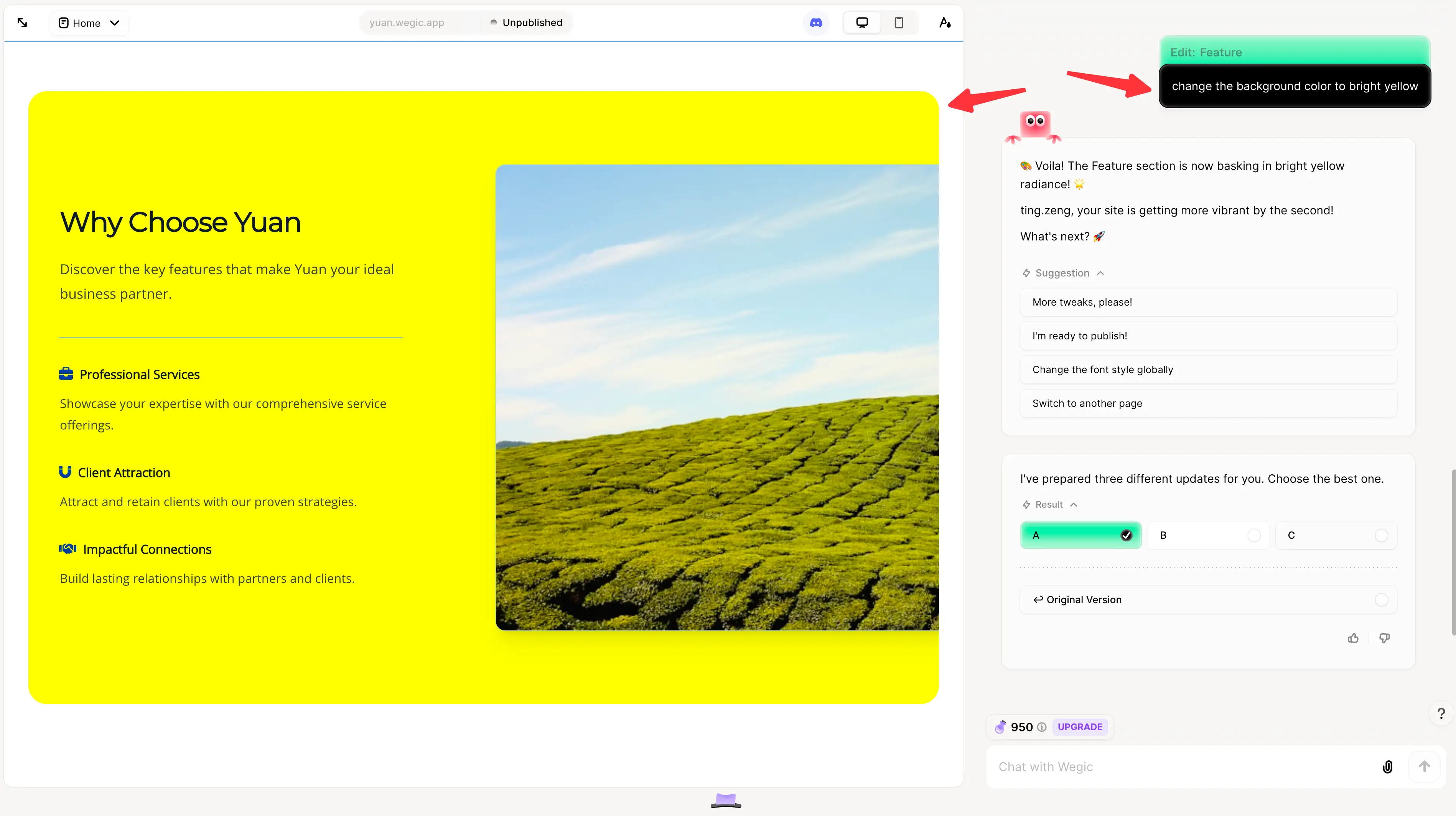
With Wegic, you can freely implement visual hierarchy principles for your project, and polish your design until you are satisfied with it. Wegic streamlines the design process, ensuring your work stays clear, focused, and engaging.
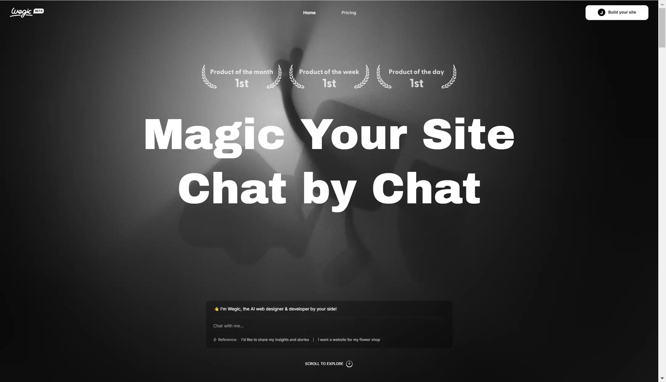
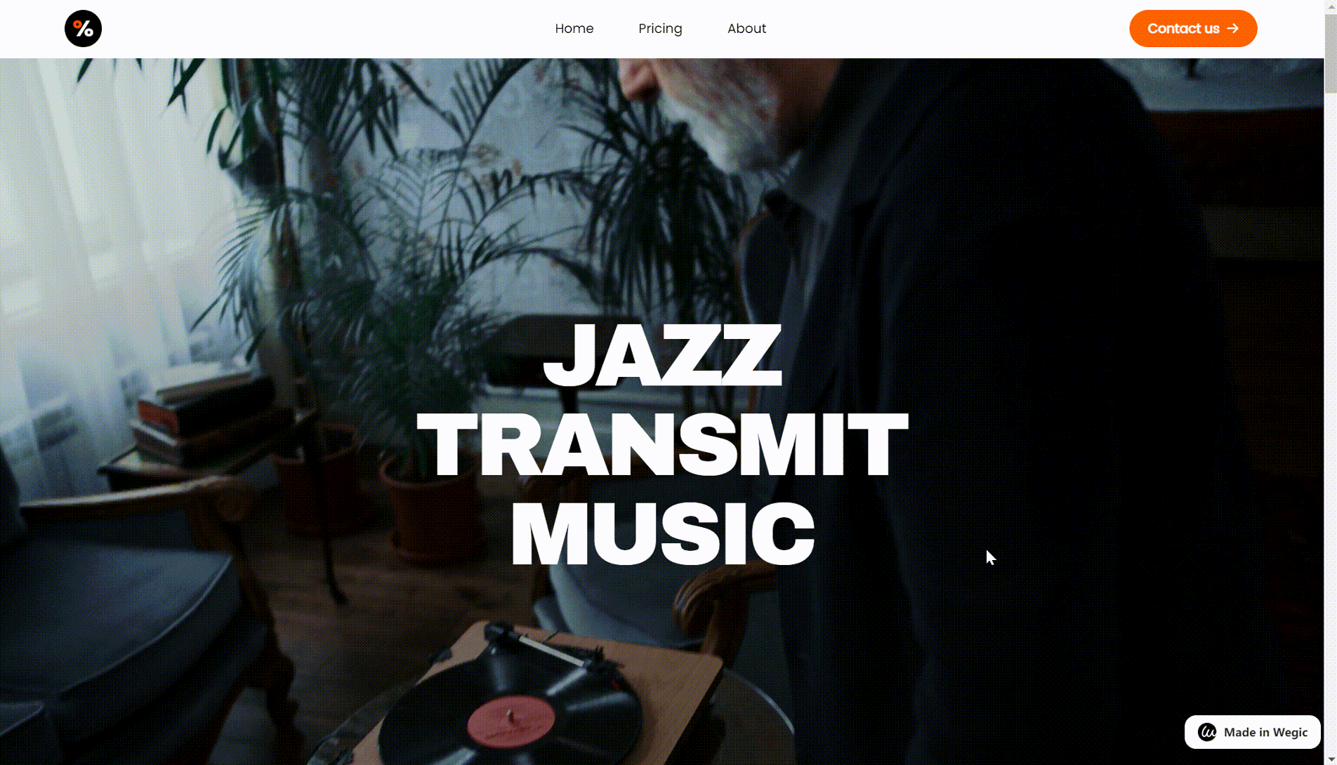
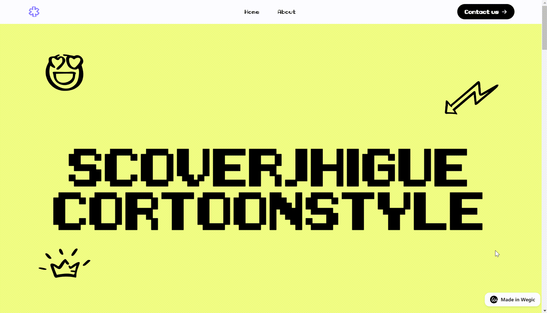
Below are some websites made by Wegic. If you like it, just have a try.
Conclusion
In this blog, we have shared 10 principles to increase visual hierarchy and recommend Wegic as a helpful tool to implement these principles. Understanding and applying visual hierarchy is essential because it helps designers communicate clearly and engage users effectively.
By mastering principles such as size, contrast, alignment, and whitespace, you can control how viewers interact with your design. As we’ve discussed, these techniques not only make content more digestible but also help guide users toward the actions you want them to take.
FAQ
How can I create a strong visual hierarchy in my designs?
You can create a strong visual hierarchy by using techniques like increasing the size of key elements, applying bold colors for emphasis, aligning elements neatly, and using whitespace to avoid clutter.
Does hierarchy mean order of importance?
Yes, visual hierarchy refers to the order of importance in a design. It’s a technique that helps guide viewers’ attention so they know where to look first and what to focus on next. Designers use visual hierarchy to emphasize the most important elements, such as headlines, buttons, or images, and to de-emphasize less critical content. This is achieved through tools like size (larger elements tend to draw more attention), color (bold or contrasting colors stand out), and placement (elements at the top or center are often noticed first). By organizing content in this way, visual hierarchy ensures that users engage with the most crucial information in the right sequence, making the design clearer and more effective.
How can Wegic help with visual hierarchy?
Wegic is a website builder that makes it easy to apply visual hierarchy principles. It offers features like text alignment, contrast adjustment, and spacing tools to help you create clean, well-structured designs. All can be easily achieved by just a few prompts in the chatbox.
Read More
Written by
Kimmy
Published on
Mar 17, 2026
Share article
Read more
Our latest blog
Webpages in a minute, powered by Wegic!
With Wegic, transform your needs into stunning, functional websites with advanced AI
Free trial with Wegic, build your site in a click!
What kind of website do you want to build?