Log in
Build Your Site
10 Intriguing Corporate Website Examples to Inspire Your Own
Looking for the top corporate website examples to inspire your own? You are in the right place! Check the list we have prepared for you.
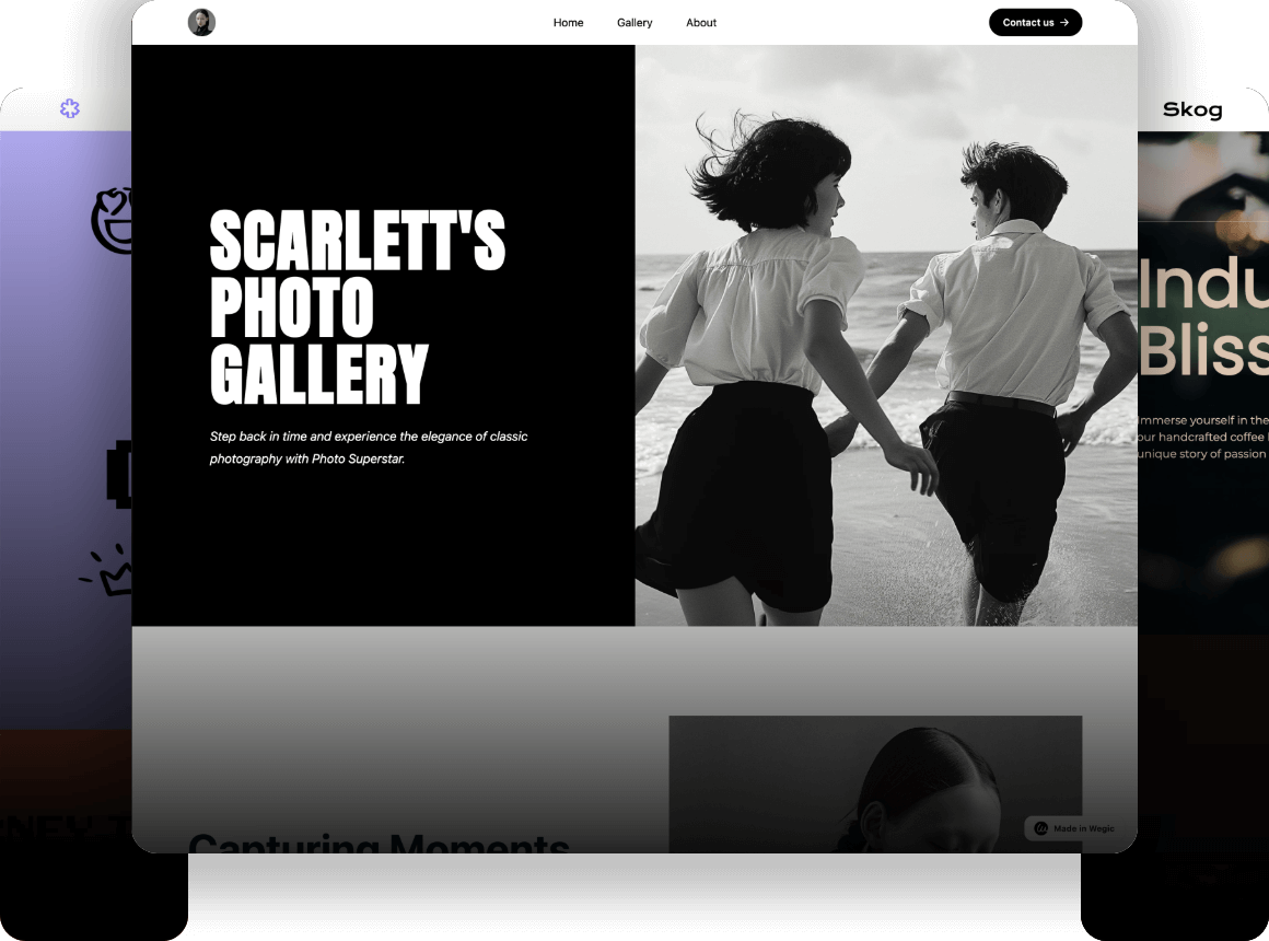
Are you looking to create a standout corporate website? Here are 10 intriguing corporate website examples to inspire you. These sites exemplify excellence in design, branding, user experience, and more—each demonstrating how a well-crafted company website can leave a lasting impression.
10 Intriguing Corporate Website Examples to Inspire Your Own
Are you confused about what a good corporate website looks like? If you’re searching for inspiration, here’s the good news: you’ve come to the right place! I’ve curated 10 intriguing company website examples that showcase cutting-edge designs and impactful user experiences.
1.Adobe
-
Intuitive Navigation
-
Personalized User Experience
-
Products Showcasing
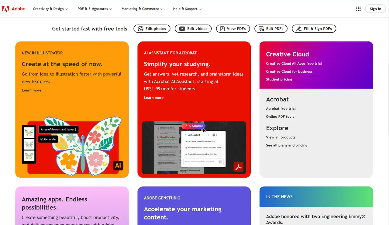
Founded in December 1982, Adobe Inc. (formerly Adobe Systems Incorporated) is a leading American software company based in San Jose, California, known for its diverse suite of tools catering to web design, photo and video editing, animation, and more.
Intuitive navigation matters in an informative business website. Adobe is one of the best website examples. Its company website represents an intuitive navigation system that allows users to effortlessly explore its featured products, online tools, resources and support options.
Adobe’s website offers a unified yet personalized user experience. The homepage prominently showcases its products, complemented by engaging texts such as "Get started fast with free tools," encouraging visitors to explore. Each product page is tailored to its respective tool, while maintaining a cohesive design across the site.
Adobe's website also effectively showcases its products, reinforcing its brand identity. Regular updates about Adobe and its product developments are also featured, keeping users informed of the latest news.
2.Asset Class
-
User-friendly Design
-
Visual Achievements
-
Seamless Integration
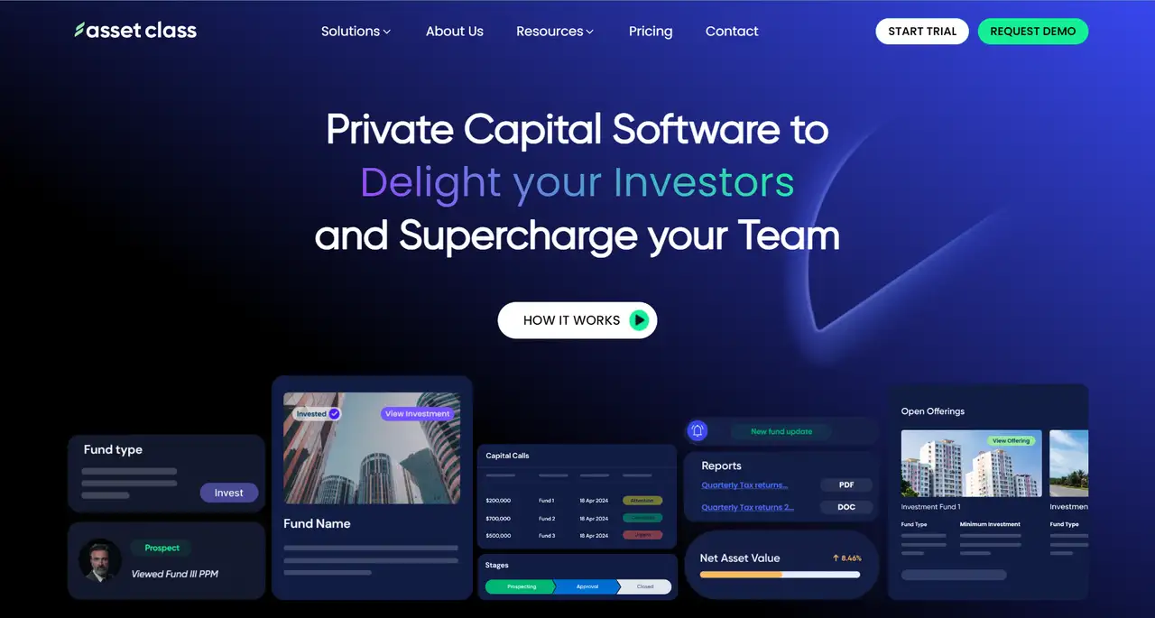
Established in 2019, Asset Class is a leading platform for the private capital industry, aiming to be the global leader in powering private capital through top-tier solutions for fundraising, investor relations, investor portals, deal flow management, portfolio management, and fund administration.
Asset Class’s corporate website features a clean and professional design with a color scheme of white, black, green, and blue. The site offers a modern, modular design tailored to private capital firms, emphasizing user-centered navigation for easy access to tools such as digital onboarding, capital calls, and portfolio tracking. A branded investor portal provides 24/7 access to documents and performance data, enhancing transparency.
The company website of Asset Class visualizes its achievements through photos, numbers, and pie graphs. For example, a potential customer can learn from the one of the top website designs that the business has powered 650+ private capital funds globally.
Seamless integration with platforms like Salesforce and DocuSign facilitates efficient workflows, while a strong focus on security and compliance (SOC II, encryption) fosters trust.
3.Blavity Inc.
-
Striking Color Scheme
-
Creative Homepage Layout
-
Overlaid Call-to-action (CTA)
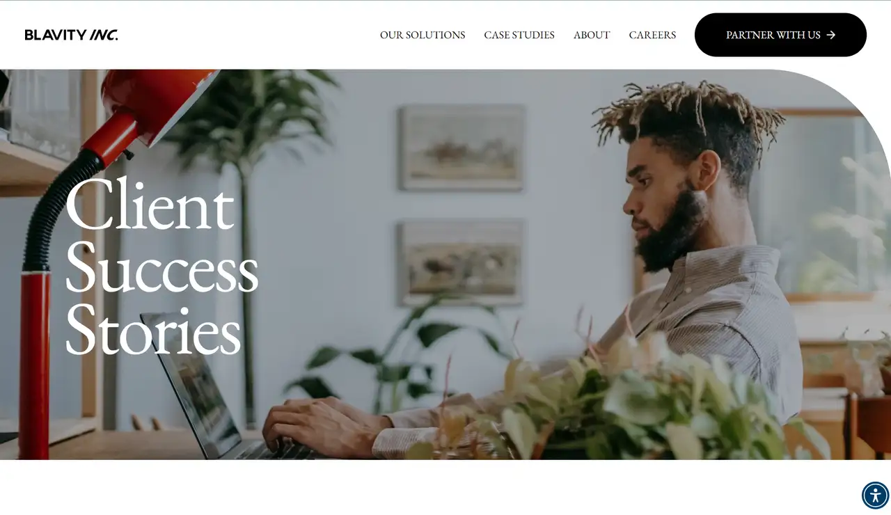
Founded in 2014 by Morgan DeBaun (CEO) and co-founders Jonathan Jackson, Jeff Nelson (COO), and Aaron Samuels, Blavity Inc. develops products and brands for multicultural consumers. Through strategic launches and acquisitions, it has positioned itself as a leading enterprise for premium content and a network focused on youth, Black culture, and technology.
Its corporate website features a striking color scheme of white, black, and orange, effectively capturing customer attention.
Its homepage layout is a strong example for corporate businesses, utilizing bold text alongside large images and videos to enhance content engagement. The balanced use of white space contributes to its status as one of the best company websites reviewed.
An overlaid call-to-action (CTA) enables users to engage without scrolling. Emphasizing community-focused initiatives, the site offers advertisers and partners opportunities to connect with diverse audiences, effectively balancing aesthetics and functionality to create an engaging user experience.
4.Calendly
-
Custom Design
-
Intuitive User Interface
-
Dynamic Content Loading
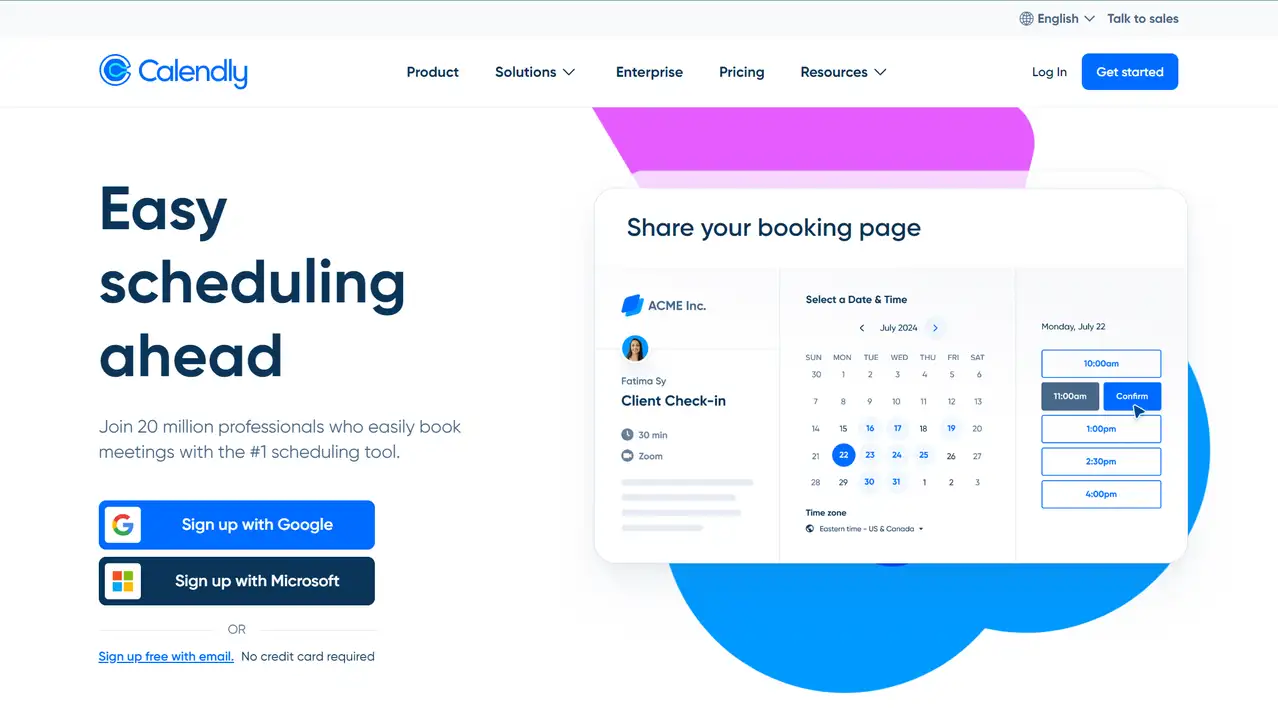
Founded in Atlanta in 2013 by Tope Awotona, Calendly was born out of frustration with the difficulties of scheduling sales calls. The company provides a SaaS platform that automates the scheduling process, facilitating external meetings and boosting productivity. Users can share their availability through a scheduling link or embed it in emails and texts, allowing recipients to select a suitable time, which is automatically synced with their Google or Microsoft Outlook calendars.
Calendly’s website exemplifies corporate web design with its custom design and strategic use of white space, creating a clean and professional aesthetic.
The intuitive user interface ensures a smooth browsing experience, with clear navigation and a logical flow of information, adhering to strong digital marketing principles.
The site incorporates dynamic content loading technology, showcasing Calendly’s customizable, automated features in real-time, providing an engaging experience for individual users and enterprise clients alike.
5.Cherche Susan
-
Clean, Professional Layout
-
Live Load Technology
-
Simplicity in Design
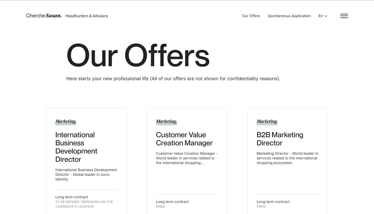
Founded in 2003, Cherche Susan is a recruitment and HR agency based in Paris. The website embodies a corporate tone through its thoughtful typography, ample white space, and professional imagery.
Its corporate website features a clean, professional layout that reflects its specialization in headhunting and recruitment for executives and senior managers in sectors such as data, digital, marketing, and communication. Additionally, the site highlights its personalized recruitment approach, employing a methodology that aims to ensure long-term satisfaction for both clients and candidates.
Utilizing live load technology, the site adjusts content in real-time based on user behavior and preferences, enhancing interactivity and personalization. Each page effectively encourages user engagement without feeling disruptive or intrusive—a well-executed design choice.
Emphasizing simplicity, the site offers clear navigation and organized sections, including "Our Offers," "Expertise," and "Profession," making it easy for users to explore job opportunities and recruitment services. Minimal yet impactful visuals support its focus on professional headhunting.
6.Deity
-
Accessible Design
-
Tailored Solutions
-
AI Assistant Service
In today’s fast-paced digital landscape, commerce is more dynamic than ever. Rapid shifts in consumer behavior, vast amounts of data, and the constant emergence of new sales channels and SaaS technologies challenge businesses like never before. Relying on outdated, static technology poses a significant risk to survival in this evolving environment. To thrive in this marketplace, your business needs more than flexibility—it requires a robust, adaptable foundation that promotes growth and gives you control over your future.
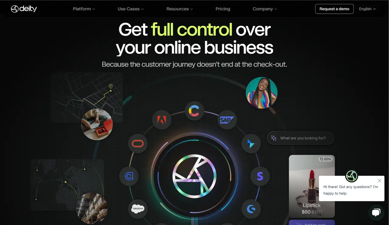
The corporate website exemplifies this approach, offering an accessible design that allows users to easily navigate and select the platform and use case that best suits their needs. Pricing information is transparent, with customizable Deity environments starting at €60k per year, granting access to all products, tools, and services.
Interactive elements, such as the central hub, visually showcase the service ecosystem in an appealing way, while client testimonials and prominent brand logos enhance credibility and trust. The site also provides targeted solution for different users with extensive resources, including documentation for the Deity Commerce Platform, blogs with the latest product news, podcasts, and brand assets.
Additionally, the AI assistant offers real-time support, providing users with responsive and helpful answers to any inquiries, further enhancing the user experience.
7.Enter Island
-
Minimalist Design
-
Interactive Animations
-
Consistent Logo Display
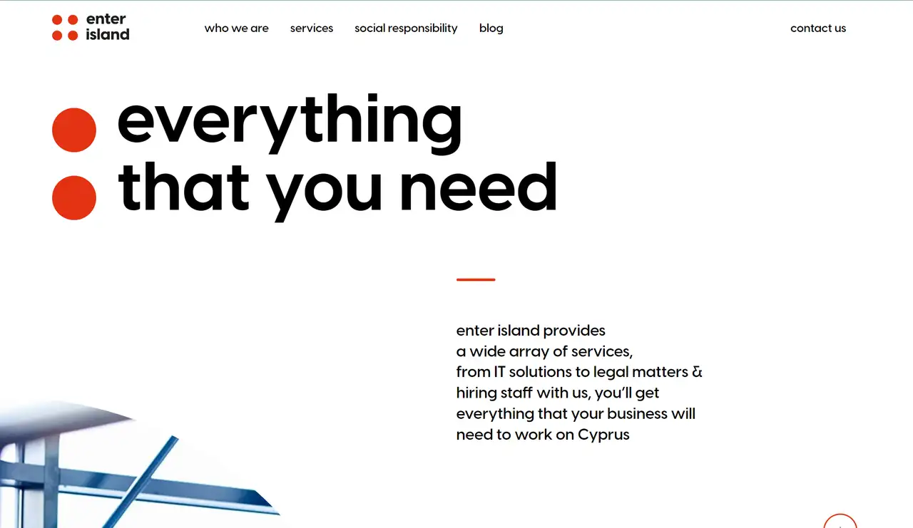
Enter Island is a company dedicated to helping businesses adapt in Cyprus and overseas. Their corporate website showcases a strong brand identity, effectively highlighting their expertise in IT services.
Enter Island’s website makes a bold impression through its minimalist design. The striking color combinations create a powerful visual impact that instantly grabs user attention. Interactive features such as micro-animations, scroll-triggered effects, and smooth transitions make the browsing experience engaging and dynamic.
The site prominently uses red circles, including the brand’s four-red-circle logo, as a recurring visual element. The frequent appearance of these circles, in different sizes and placements, reinforces the brand identity and leaves a lasting impression on visitors, creating a sense of connection and unity that aligns with Enter Island’s mission to simplify and streamline business processes.
8.Garden Eight
-
3D Design
-
Creative Interaction
-
Intuitive Navigation
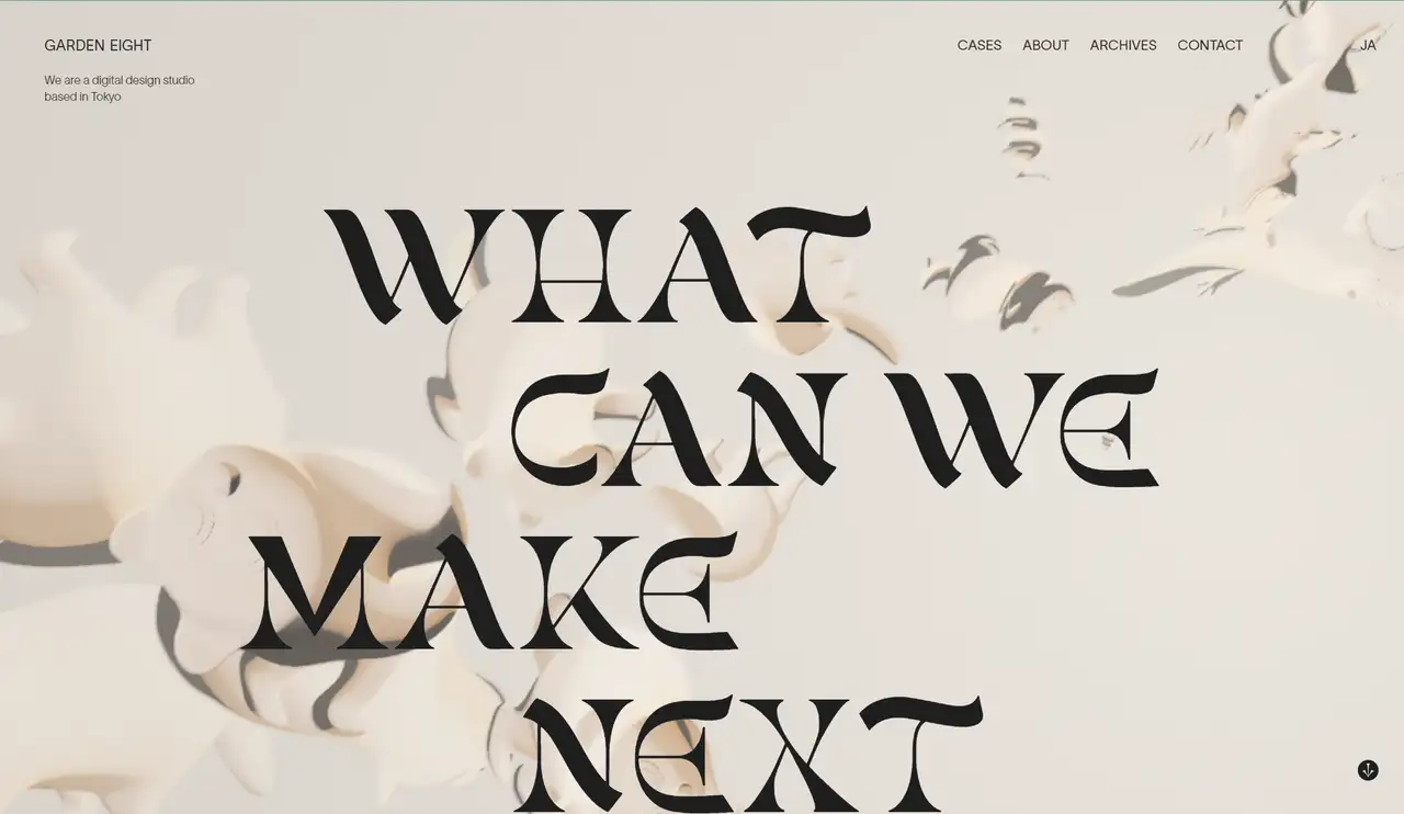
The team at Garden Eight, a digital design studio based in Tokyo and Copenhagen, has been independently crafting digital designs for over a decade, earning a reputation for their vibrant and artistic craftsmanship.
Their website can be seen as the one of the top website examples you can learn from. It is a creative and charming space that utilizes 3D design and virtual reality technology to provide an immersive brand experience. The grid layout, inspired by the logo's shape, features floating 3D objects, while bold, personalized typography and unique layouts highlight key information and enhance visual hierarchy.
Describing their site as “simple and playful,” Garden Eight showcases an interactive canvas filled with dynamic, animal-like shapes. The minimalistic yet highly inventive design incorporates a limited color palette and extensive animations, creating a lively user experience. Utilizing advanced technologies like Three.js and Nuxt.js, the website delivers smooth, immersive visuals, including scrolling animations.
Although navigation is unconventional, it remains intuitive, encouraging exploration and effectively showcasing their portfolio and design philosophy.
9.Happly AI
-
Simple Layout
-
Fullscreen Video Background
-
Interactive Multimedia Content
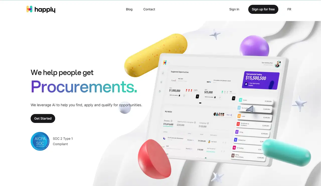
Happly Ai is an award-winning platform that democratizes funding opportunities by assisting users in finding, applying for, and qualifying for grants, procurements, tax credits, and programs tailored to their unique profiles.
Its corporate site design is playful and fresh. It is well-suited for a financial services site, featuring a clean white background complemented by gentle pastel colors that create a calming and welcoming atmosphere. Fun graphics and a friendly font make users feel right at home.
Moreover, at the beginning of the homepage, visitors can see the site's high-quality video backgrounds, fullscreen videos, further enhancing the immersive experience.
Interactive elements like counters and dynamic graphics draw users in, while a thoughtful balance between spacing and content ensures that information is easy to digest. The GrantMatch tool is prominently displayed, highlighting its usefulness and innovation without unnecessary complexity.
10.Plex
-
Interactive Usability
-
Chill Layout
-
High-quality images
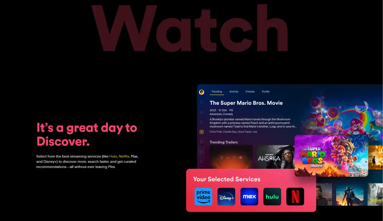
Plex is a comprehensive entertainment platform that serves as a one-stop destination for streaming movies, TV shows, and music. Accessible on nearly any device, Plex is the first and only platform to offer free ad-supported movies, shows, and live TV while allowing users to easily search and add any title—regardless of its streaming service—to their Watchlist. With 17 million and growing monthly active users, Plex acts as an entertainment concierge, providing new discoveries and recommendations from various streaming apps and personal media libraries.
The website design features high-quality resource covers paired with a chill layout that makes navigation easy and engaging. Its dark mode adds a sleek, modern touch, while interactive usability allows users to quickly select and start watching their preferred content. Plex’s design emphasizes social proof, showcasing impressive statistics and reinforcing its trustworthiness.
Different fonts, sizes, and colors of words highlight key sections such as "Save," "Watch," and "Explore," enhancing the browsing experience. The use of three primary colors—red, yellow, and blue—against a dark background makes the interface visually striking and memorable. Additionally, the site features high-quality, vivid images, and the copy is engaging, creating an inviting space for users to easily discover and interact with their favorite content.
Conclusion
These examples illustrate how a corporate website can achieve excellence. You may be clear that no matter whether your business is, a restaurant, gaming company, or a therapist company, a company's website is often the first point of contact for visitors, and it plays a crucial role in shaping their impression. The most effective websites not only attract attention but also inform visitors about the business, convey the brand's message, and deliver an aesthetically pleasing experience. If you’re looking to revamp your own site or seeking inspiration, these websites are sure to spark your creativity and guide you in crafting a standout online presence.
Submit these inspirations to the AI to generate a high-quality corporate website in 3 simple steps.
In addition to referring to these websites, we can also leverage the power of AI to assist us in analyzing and even generating similar high-quality corporate websites. This secret weapon is Wegic - your AI web design and development companion.
Step 1:
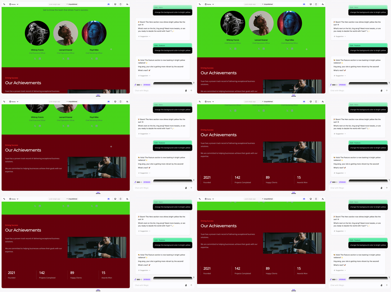
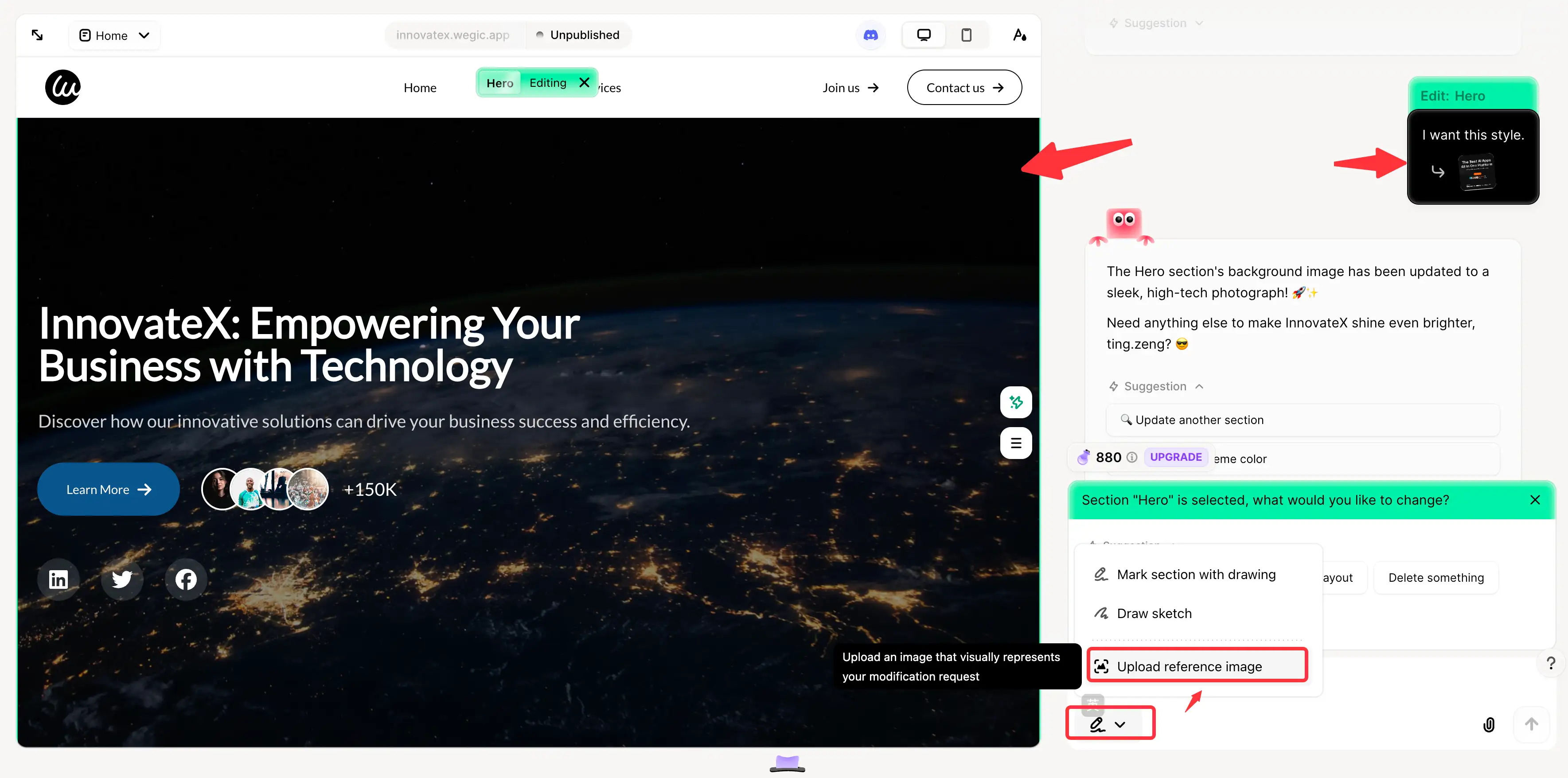
Start a conversation with Wegic by expressing your website preferences and requirements. Wegic will guide you through the design process, offering suggestions and adjustments based on your inputs.
Step 2:
Click "Upload reference image", Upload an image that visually represents your modification request, and Wegic will be able to help you generate the corporate website style in the reference style.
Step 3:
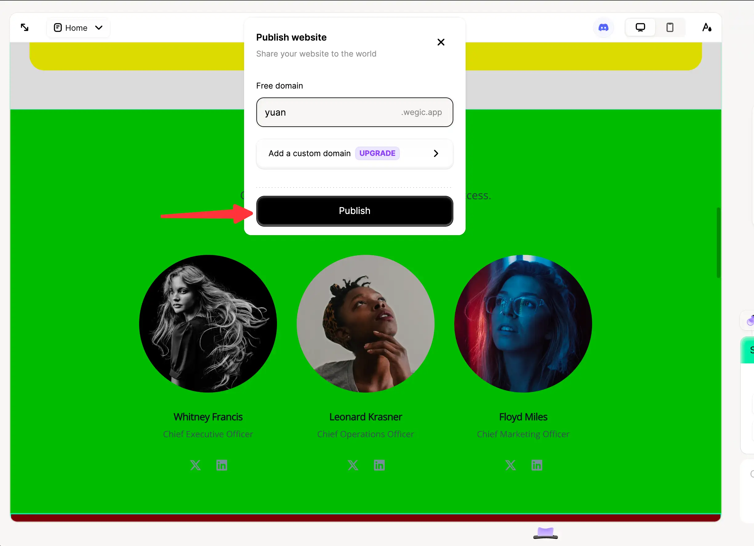
If you're happy with your website design, then Wegic makes it a breeze for you to publish your site, guaranteeing that it's within reach of your audience!
FAQs
Does a corporate need a website?
Yes. A corporate website serves as a symbol of trust, as consumers tend to purchase from businesses they are familiar with, like, and trust. This also includes customers who prefer shopping in physical stores but use online resources to inform their purchases. If your business isn’t visible in their searches, you risk going unnoticed. For corporations looking to create an effective website to sell products or services, impress clients, and enhance their online presence, developing a quality site is crucial.
Should I build my website or pay someone else to do it?
If you have a substantial budget and prefer not to manage the design or technical details on your own, hiring a designer could be a wise choice. Alternatively, you can create your own website using platforms like Wegic, WordPress, or Wix. For example, Wegic allows you to build a website through straightforward conversations with an AI assistant.
Is a website usable for an e-commerce store?
Absolutely. E-commerce sites encompass all the features of presentation sites, with the added benefit of an online store that enables you to sell products directly from your site. Establishing and managing an e-commerce store can significantly enhance a small business's growth.
What elements should a corporate website have?
After reading the examples above, you may have found your answers. Key elements can include user-friendly interactions, high-quality images, an impressive or clear layout, visual achievements, and anything that showcases your corporation's uniqueness and brand identity.
Tip: If you want more information on how to build a corporate website, you can click the following links. I hope they can help you.
Written by
Kimmy
Published on
Mar 17, 2026
Share article
Read more
Our latest blog
Webpages in a minute, powered by Wegic!
With Wegic, transform your needs into stunning, functional websites with advanced AI
Free trial with Wegic, build your site in a click!
What kind of website do you want to build?