ログイン
サイトを作成
2024年のポッドキャストウェブサイトの16の良い例
2024年のポッドキャストウェブサイトの16の良い例を発見してください。イノベーティブなデザインと効果的なコンテンツ戦略を紹介しています。これらの良い例から学びましょう!

2024年6月現在、世界中で登録されているポッドキャストは4億を超え、その数は増加し続けており、年々ポッドキャストを聴くリスナーの割合も増加しています。テキストは徐々に音声形式で人々の耳に届けられるようになっています。
Appleでは現在、アプリにポッドキャストがプリインストールされており、魅力的なコンテンツを提供する番組を制作するだけで、自分のポッドキャストコンテンツを公開できます。しかし、ポッドキャストウェブサイトを設定することにより、より広範なオーディエンスを引きつけ、より多くの人々にポッドキャストコンテンツを届けるための価値あるツールになることを理解しておく必要があります。
このブログでは、学びやデザインのインスピレーションを得たり、プロの有益なアドバイスを聞くために利用できる16のポッドキャストウェブサイトの例を紹介します。
1. WTF with Marc Maron
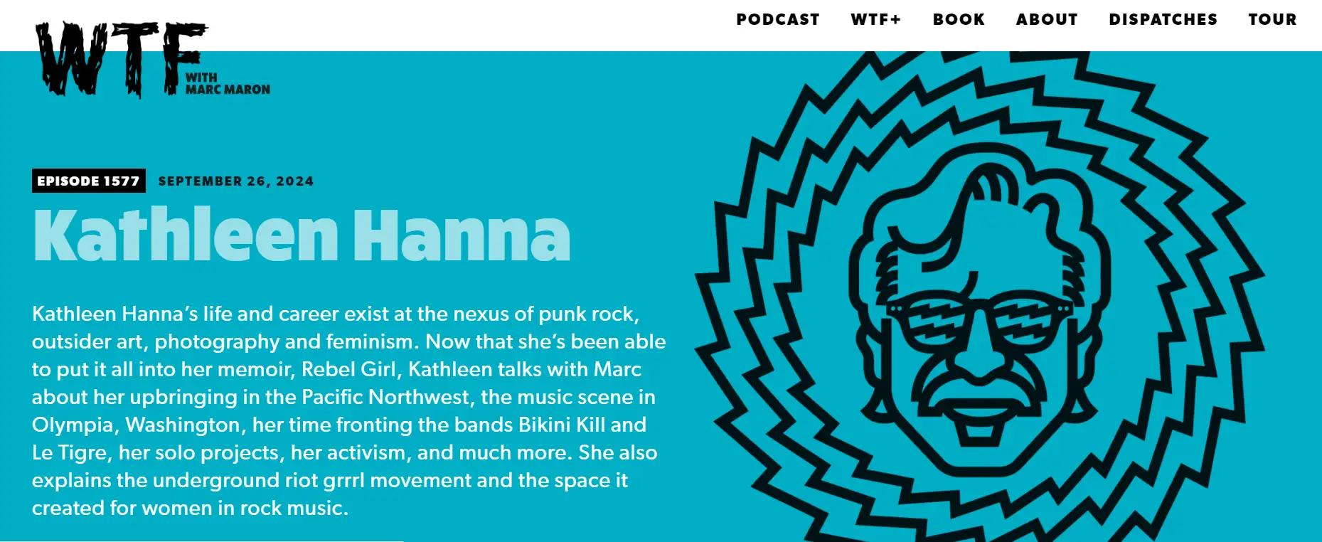
WTF with Marc Maronは、コメディアンのMarc Maronがホストを務める週刊ポッドキャストおよびラジオ番組で、彼が社会現象や人間の本質について話す、さまざまな分野の人々とのインタビューを特徴としています。
Marc Maronは、ウェブサイトで彼のエピソードを掲載し、トップページでは最新エピソードのインタビューのゲストやキャラクターの背景を紹介しています。これにより、リスナーはその情報を学び、直接聞くことができます。サイトの画像も彼の個人的な性格を示しており、ブログのブランド化に役立っています。
もちろん、エピソードを聞くだけでなく、彼の投稿を読んだり、本を購入したりできるウェブサイトもあります。ポッドキャストウェブサイトの例は、多くのビジネスを拡大することができるのです。
2. Alie Ward
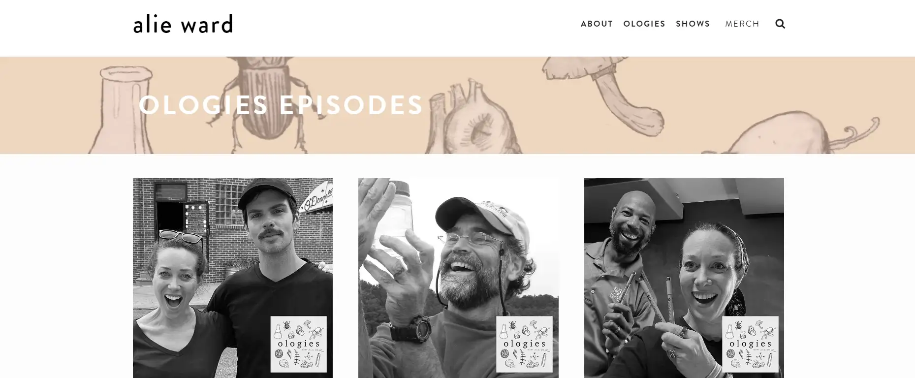
Alie Wardは、タイム雑誌によってトップ50のポッドキャストに選ばれたコメディ科学ポッドキャストOlogiesをホストする科学ジャーナリストです。彼女の個人サイトは、彼女のポッドキャストサイトとしても知られており、彼女の個人的なイメージに焦点を当てています。彼女のユニークな写真を通じて、彼女が独創的な人物であることがわかり、彼女はウェブサイトの「About」セクションを通じて自分自身を紹介し、個性を表現しています。
3. Twenty Thousand Hertz
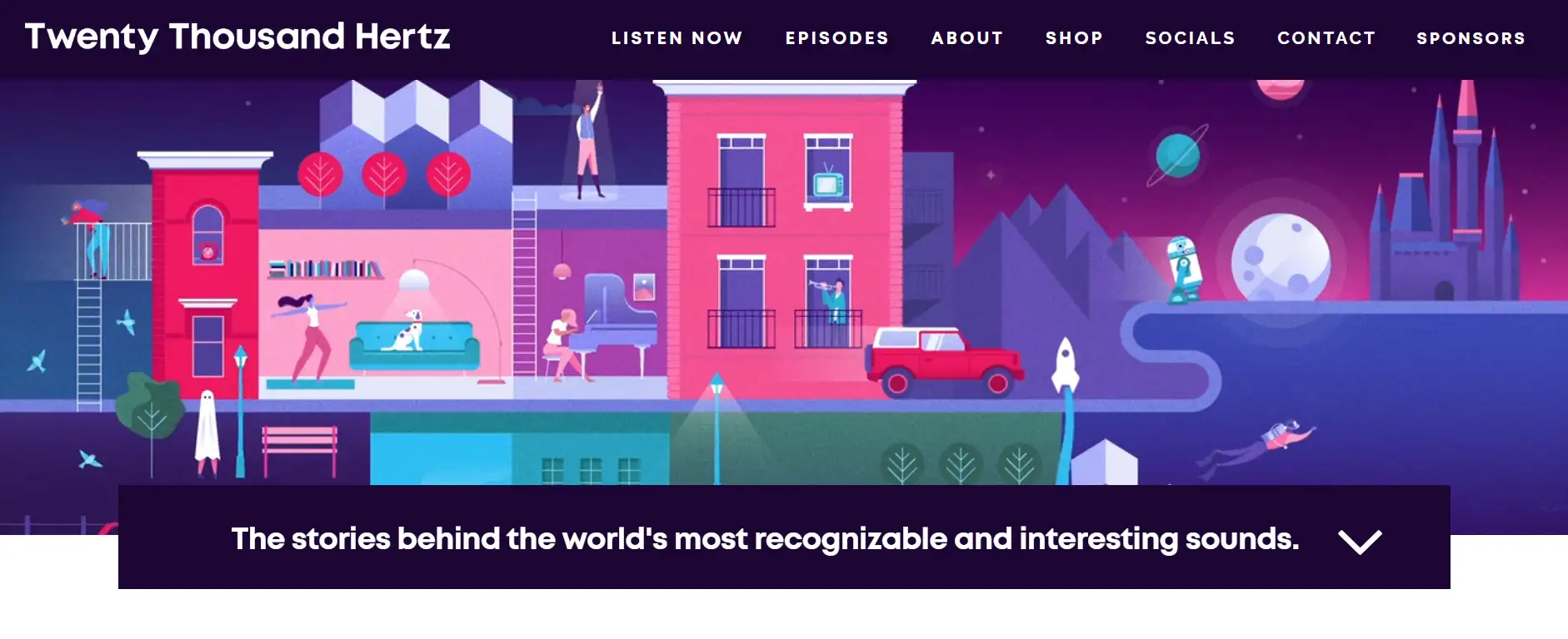
Twenty Thousand Hertzは、"世界で最も認識され、興味深い音"についてのポッドキャストです。Dallas Taylorが情熱を込めて行うプロジェクトで、聞かなければならない声の物語を共有するものです。
このポッドキャストウェブサイトの例では、青と紫の主な色を使用した明確なカラーコントラストが使われており、これによりブランドの認識が高まります。このカラーコントラストに加え、コメディックなキャラクターの創造的なデザインは、サイトの興味を引き、キャラクターの表情や行動を通じてポッドキャストのテーマや雰囲気を伝えます。
サイトの下部には、ユーザーがポッドキャストチームと連絡を取り、フィードバックを提供できるようにしたデザインが施された「お問い合わせ」エリアがあります。このインタラクティブなメカニズムは、ユーザーとポッドキャストチームの強い絆を築き、ユーザー満足度を高めます。
4. Suzy Welch
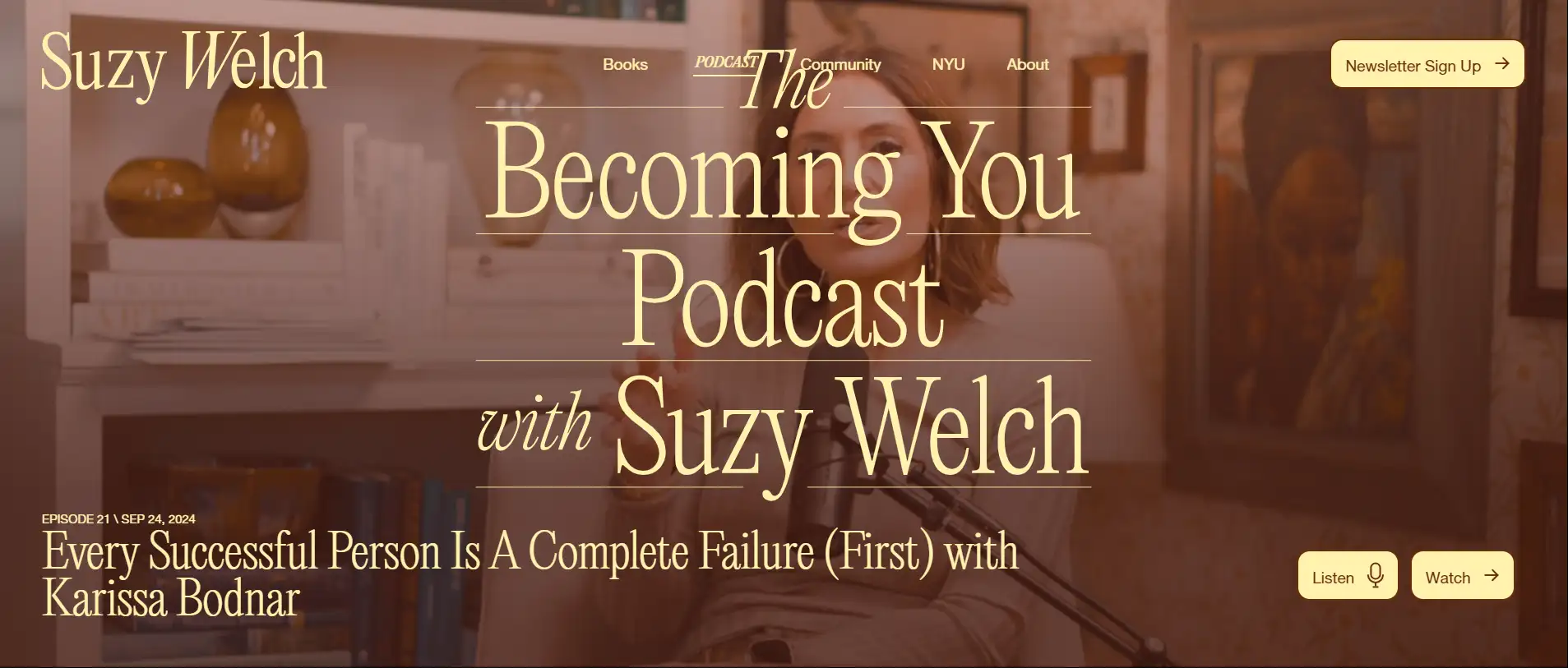
Suzy Welchは、ニューヨーク大学ターナー・ビジネス・スクールの受賞歴のある教授であり、テクノロジー企業家です。彼女は幅広いオーディエンスを惹きつけており、ジャーナリストとしての経験と出版した本は、彼女のストーリーテリングや生徒への指導にとって価値あるリソースとなっています。
Suzy Welchのポッドキャストウェブサイトは、聴くだけでなく、読んだり、見たりすることもできます。各ポッドキャストのトピックは、広範なオーディエンスに関心のあるトピック、例えば「成功と失敗」や「自己成長」を中心に据えています。感情的な共鳴や個人的なストーリーを伝え、ユーザーとの感情的なつながりを作り出しています。
また、ポッドキャストウェブサイトのデザインについても言及する価値があります。全体のカラースキームはビンテージブラウントーンで、これはSuzy Welchのブランドイメージと非常に一致しており、安定感と洗練された印象を与えます。一方で、フォントはシンプルでエレガントで、ブランドの一貫性を強化しています。背景にはSuzy Welchの写真を使用し、マイクロフォンと人物に焦点を当て、ポッドキャストのテーマと雰囲気を伝えています。
5. Jean Rottner
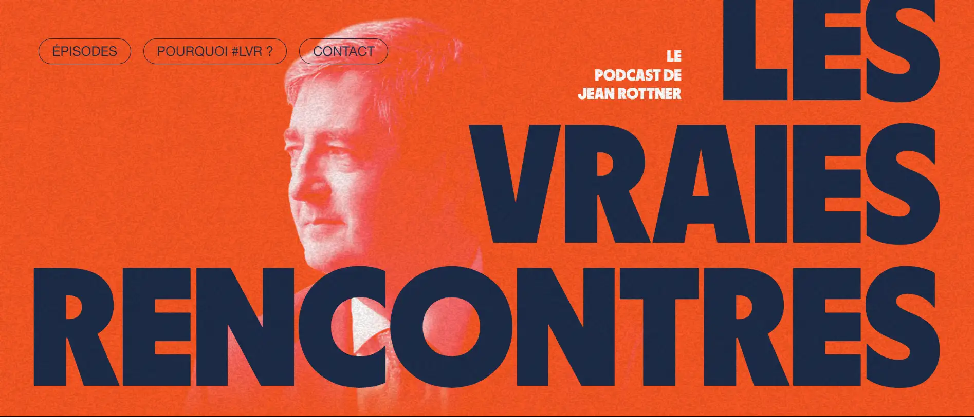
Jean Rottnerは、さまざまな分野の人々、創業者、CEO、宇宙飛行士などから、彼らのインスピレーションに満ちた情熱的で注目すべきキャリアの物語を語る彼のチャンネルで人々をインスピレーションするフランスの政治家です。
彼のウェブサイトにアクセスすると、通常のブラックアンドホワイトではなく、大胆なオレンジ色のカラースキームが使われており、ホストのJean Rottnerの写真を中心にした大きなフォントデザインにより、ポッドキャストはユーザーにとってすぐに記憶に残り、認識されやすくなります。
「POURQUOI #LVR?」(Why #LVR)は、ポッドキャストの背景について学ぶことをユーザーに誘います。また、「EPISODES」と「CONTACT」は、ユーザーがコンテンツやインタラクションへの直接的なパスを提供します。
6. The Women in Tech Show
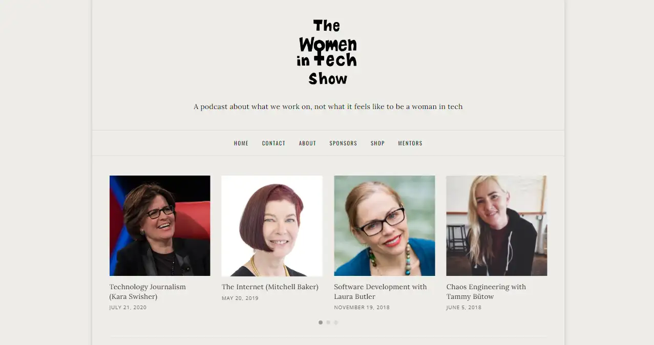
The Women in Tech Showのウェブサイトは、テクノロジー業界の主に著名な女性ホストが特徴のターゲットニッチ市場を成功裏に構築し、女性のテクノロジー業界でのキャリアに関心を持つオーディエンスを惹きつけています。
リスナーはアバターでスピーカーを素早く認識でき、各ポッドキャストには短い説明がついており、リスナーがトピックが自分の興味に合っているかどうかをよりよく理解するのに役立ちます。このデザインはリスナーの識別とコンテンツへの関心を高めます。
リスナーが以前にそのポッドキャストを聞いたことがない場合、ページ上部の4つのエピソードはリスナーにとって聞き始めのポイントになります。このポッドキャストサイトの例では、2カラムレイアウトを使用しており、左側にポッドキャストのメインコンテンツを、右側にカテゴリーやタグなどのサブナビゲーションを配置しています。クリーンなレイアウトにより、ユーザーは視覚的な疲れを感じることなく大量の情報を簡単にナビゲートできます。
7. CRTL SHIFT
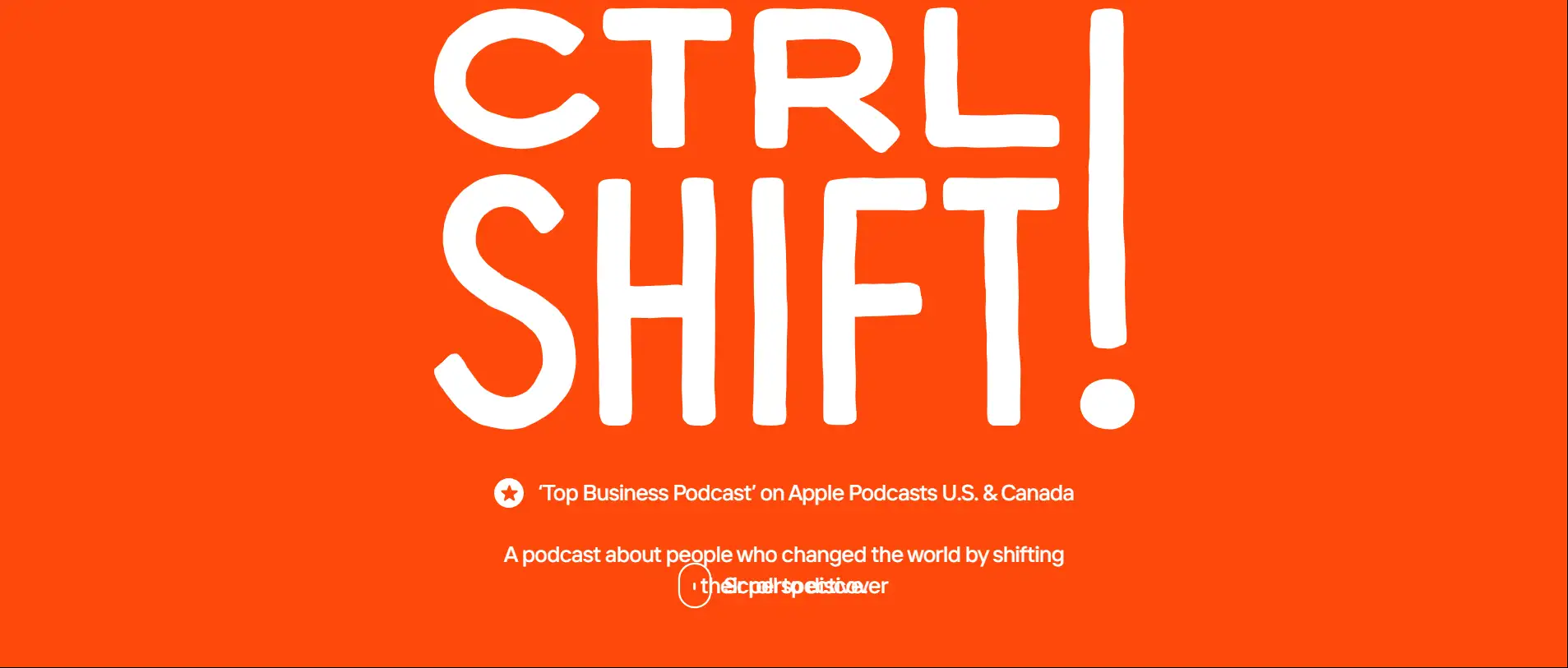
CTRL SHIFTは、米国とカナダで最大のビジネスパッドキャストであり、意見を述べる出力によって人々の認識を変えており、各エピソードで変化の良い例を語っています。
そのウェブサイトのデザインは、私たちがチェックした中で最も興味深く魅力的なものです。CTRLとSHIFTのハイライトは、ウェブページの引き出しアニメーションGIFやスクロールキーボードアニメーションを通じて紹介されています。他のポッドキャストのリスニングプラットフォームは、ウェブサイトページのApple PodcastsとSpotifyに配置されています。
8. Swindled

Swindledは、匿名の男性によって書かれてホストされているアメリカの真実の犯罪パッドキャストであり、この脚本付きエピソードは白-collar犯罪、詐欺師、企業の貪欲さの世界を探ります。
このポッドキャストウェブサイトの例には、「私たちの満足した顧客から」というソーシャルプローフセクションがあり、リスナーの証言やレビューを紹介し、プログラムの信頼性を高めます。「不要なものを買う」は、ユーザーの注意を引くための舌打ちの文です。
全体的に、アイコン、カラーパレット、ページのスタイルはブランドの一貫性が非常に高いです。ユーモラスな鉛筆の絵画を用いた黒い背景は、ブランドイメージを構築し、ユーザーの記憶を強化するのに役立ち、学ぶ価値のあるデザインアイデアです。
9. The Friday Habit
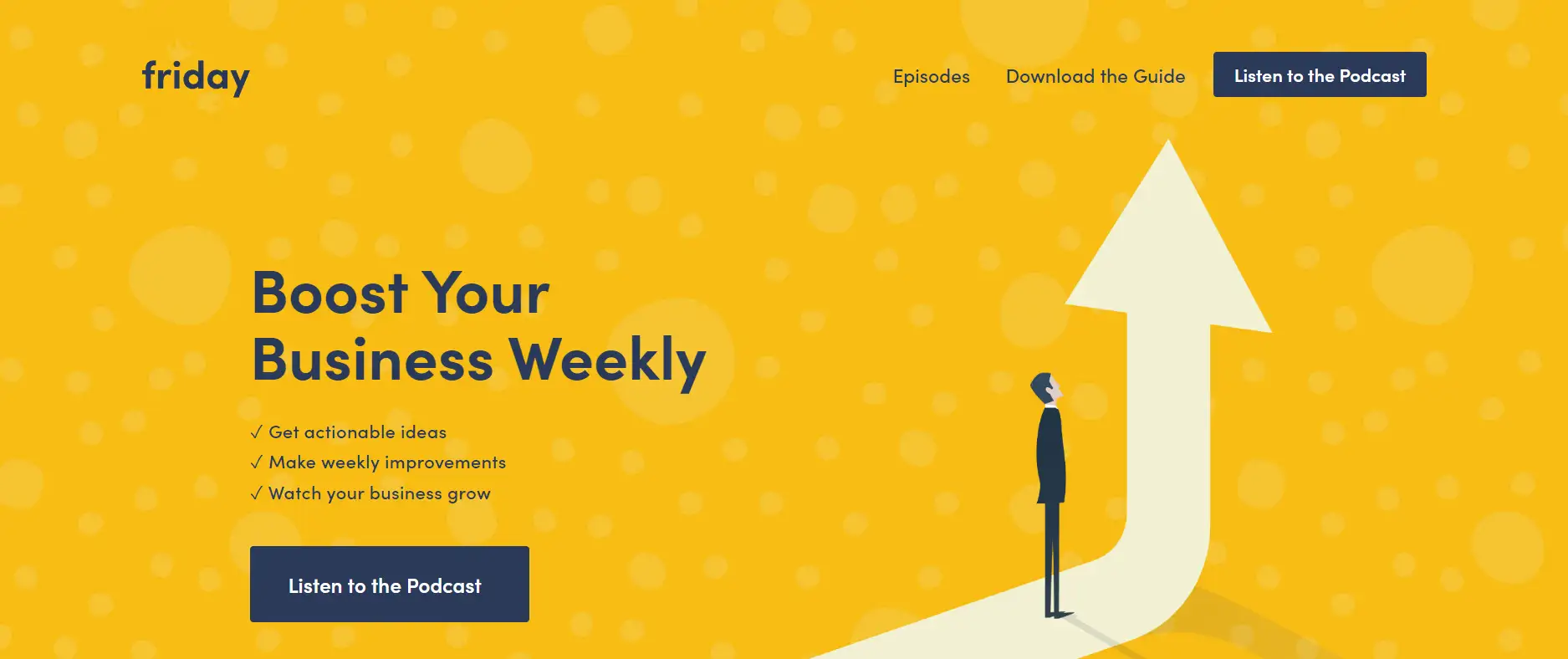
このサイトはビジネス開発に焦点を当てたポッドキャストであり、黄色と青を主な色として使用しており、どちらもユーザーの注意を引くほど明るく鮮やかです。全体的なデザインはミニマリストで、不要な装飾要素を排除し、コンテンツを焦点にしています。色からフォント、レイアウト、要素の使用に至るまで、高い一貫性が維持され、ブランド全体の雰囲気を向上させます。
The Friday Habitは、訪問者がエピソードを聞くための明確なCTAボタンを強調し、ポッドキャストリスニングプラットフォームであるApple Podcasts、Google Podcasts、Spotify、YouTubeも追加しました。これにより、ユーザーはサイトと相互作用し、ユーザーの定着率が向上します。
10. The Construction Disruption Podcast
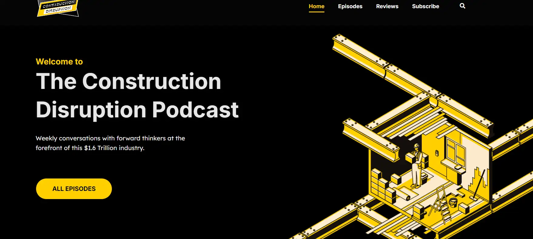
建設業界における建設の破壊についての最終的なポッドキャストで、建設と技術の動向に関するニュースを紹介しています。
サイトはクリーンなデザインで情報の明確なレイヤー化を行い、明るい黄色と黒の対比色を使って現代的でプロフェッショナルな見た目を作り出しています。ポッドキャストは最新の技術を紹介し、ユーザーを惹きつけるために「今すぐ聞いて」や「もっと見る」オプションを追加しています。リスナーのフィードバックセクションはソーシャルプローフを提供し、新しいリスナーがプログラムの質を理解し、リスニングへの信頼を高めるのに役立ちます。
11. Freakonomics Radio
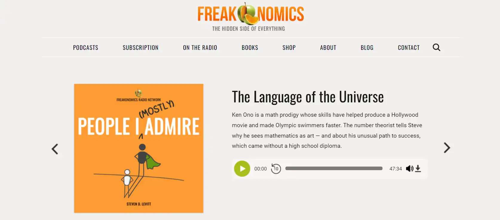
Freakonomicsのポッドキャストサイトは、経済学と日常の交差点にあるタイプのポッドキャストです。経済学の原則を用いて、日常のさまざまな現象や問題を議論しています。青を主色として使用することで、専門性と信頼感を伝え、経済的な内容の厳粛さと一致しています。
下部の本の広告エリアは、オレンジと黄色を背景色として使用し、視覚的な対比を作り、過度に急な印象を与えずに注意を引きます。全体のページは美しく保たれています。
ポッドキャストウェブサイトの例は音声コンテンツに限らず、ビデオなどさまざまな形式のプレゼンテーションも提供し、異なるユーザーのニーズに対応しています。サイトはブログインタラクティブ記事リスナーに、ポッドキャストでのホストやゲストの意見だけでなく、ブログでより詳細で包括的な説明も聞かせます。
12. Design Matters
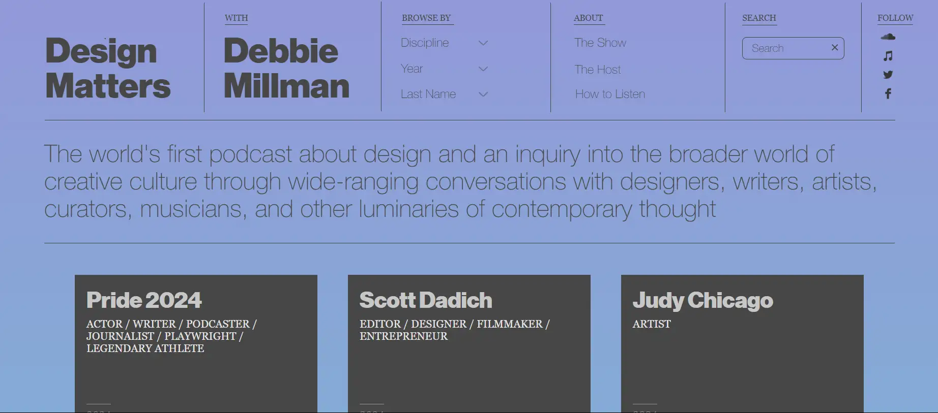
Design Mattersは、デザインに焦点を当てた世界初のポッドキャストであり、デザイナー、アーティスト、ライターなど、さまざまな人々を招いて、デザインが社会に与える役割について深く議論しています。
このポッドキャストウェブサイトの例は、デザイン分野の視聴者にとって親しみやすく、プログラムエピソードを「専門分野」「年」「姓」に分類する明確なナビゲーションメニューを使用しており、ユーザーが異なるプログラムやトピックを簡単に見つけることができ、ユーザー体験を向上させます。各招待されたゲストのパネルは、その専門的背景と実績を紹介しているため、プログラムの信頼性が高まります。
13. Book Fight Podcast
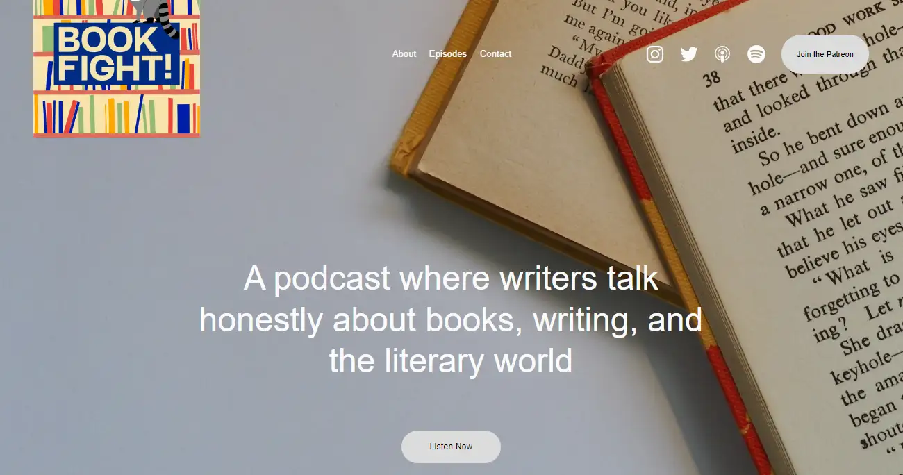
Book Fightは、本と執筆に焦点を当てたポッドキャストサイトで、文学作品、著者、およびその創造プロセスについて、文学に興味を持つリスナーに話します。会話形式を通じて、文学愛好家や著者に魅力的な本の詳細な分析と批評を提供しています。
Book Fightは、内容の重要さにもかかわらずユーモラスなトーンを使用しています。各エピソードは特定のトピックや本に焦点を当て、リスナーがコンテンツの深い理解を得られるようにし、議論をより魅力的で聴きやすくしています。
ポッドキャストウェブサイトは、忠実なリスナーの支援を引きつけるためにPatreonを通じた追加コンテンツも提供しており、収益源を増やし、ユーザーの定着率を高めています。
14. Logo Geek Podcast
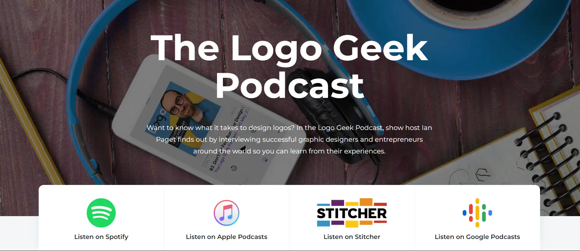
Logo Greekは、ロゴデザインに特化したポッドキャストウェブサイトで、さまざまな視点でのロゴデザインについて、さまざまな業界の実践者を招いてインタビューを行い、意見交換するためのデザイナー向けに最適です。
ポッドキャストウェブサイトは、ホームページの一番上に4つのロゴアイコンを設置し、視聴者をこれらのプラットフォームで聴き、購読するように導いています。各エピソードの下には、ポッドキャストのインタビューを聴くだけでなく、インタビューアーのバックグラウンドを学ぶことができ、オーディオコンテンツのインタビューをテキストに変換して訪問者が読むこともできます。最も重要なのは、ロゴデザイナーの無料の電子書籍を視聴者に提供し、ユーザーに次のステップを直接案内して、コンバージョンの可能性を高めています。
15. Copper & Heat
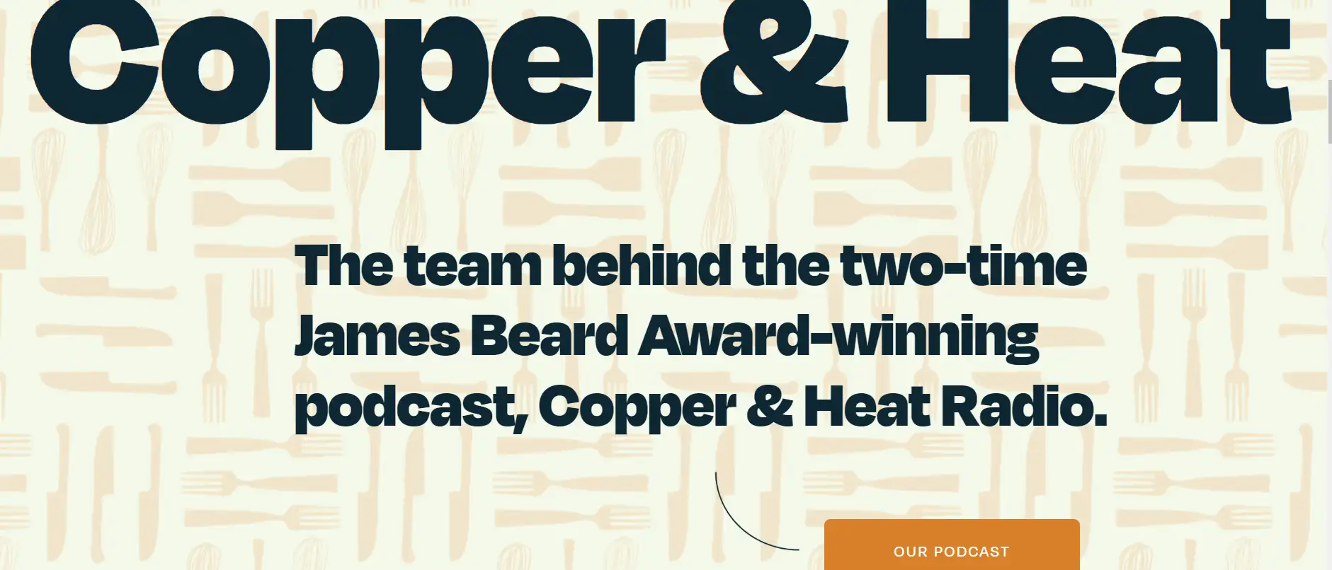
Copper & Heatは、複数の賞を受賞したポッドキャストウェブサイトで、食に興味のある視聴者向けにユニークで洞察力のある考えを提供しています。
このサイトは「丁寧に提供されたストーリー」と強調しており、サイトの見出しやコピーはブランドのストーリーを語り、ターゲットオーディエンスを引きつけ、ブランドアイデンティティを強化しています。
ポッドキャストウェブサイトは、コンテンツの配信だけでなく、リスナーが信頼感を持てるようにする必要があります。このウェブサイトの事例では、受賞歴(例えば、James Beard Award)を示し、ブランドの権威と信頼性を高め、潜在顧客を引きつけます。また、提携している有名ブランドをリストアップし、ブランドイメージを向上させ、潜在顧客の信頼を高めています。
16. The Moth

小説家であるGeorge Dawes Greenによって設立されたThe Mothは、彼の故郷ジョージアの暑い夏の夜の雰囲気をニューヨークで再現したいという願いから名付けられました。家のポーチの明かりがミツバチを引き寄せ、彼と友人が魅力的な物語を語る夜でした。
The Mothは、物語のポッドキャストとラジオシリーズのユニークなブレンドで、リスナーに親密なバックステージパスを提供します。魅力的な物語に加え、ストーリーテラーの写真や洞察力のあるインタビューを紹介し、音声以上の体験を豊かにします。物語の魔法だけでなく、個人的な旅の深さも明らかにし、すべてのエピソードが人間関係の宝庫となるようにしています。
結論
上述の16のポッドキャストウェブサイトの例を理性的に検討した結果、注目を集めるポッドキャストを作ることは、単なるコンテンツの作成を越えて、常に広いオーディエンスにアクセス可能であることを保証する必要があることがわかります。
ポッドキャストウェブサイトはブランドのビーコンであり、一貫したビジュアルアイデンティティを通じて独自の特徴を示します。このデジタルアイデンティティはウェブサイトデザインに影響を与え、シームレスなユーザー体験を促進します。リスナーにとって聴くことが簡単になり、利便性が向上し、多様な接点を通じてエンゲージメントを拡大し、より深いつながりを育みます。
ポッドキャストウェブサイトを構築したい場合は、今すぐAIウェブビルダーを使用して最初のウェブサイトを構築できます - Wegic!
ポッドキャストウェブサイトのFAQ
ポッドキャストウェブサイトに何を含めるべきですか?
ブログサイトに配置すべきコンテンツには、ポッドキャストエピソード、ショーの説明、ホストの情報、購読リンク、リスナーのフィードバックとインタラクションが含まれます。
ポッドキャストウェブサイトを作成する方法は?
ポッドキャストウェブサイトを作成する方法はいくつかあります。ウェブデザイナーを選び、専門のウェブデザインチームを選ぶこともできますし、もちろん、AIウェブビルダーを使用してDIYでブログサイトを作成することもできます。これにより、時間と費用を節約できます。
ポッドキャストコンテンツの最適な長さはどれくらいですか?
最適な長さはトピックやオーディエンスの好みに応じて調整され、通常は20〜60分程度が推奨されます。これにより、スピーカーがコンテンツをカバーし、リスナーが全体を聴くことを求める興味を保つことができます。
ポッドキャストを公開する最適な頻度はどれくらいですか?
公開頻度は、コンテンツの種類、ターゲットオーディエンス、制作能力などの多くの要因に依存します。
-
週次:これは最も一般的な頻度であり、ほとんどのポッドキャストのリスナーの関心や期待を維持します。
-
2週間に一度:より深く、複雑な制作が必要なポッドキャストに適しています。品質の高いコンテンツを確保するためです。
-
月次:より専門的なトピックや、多くの準備を必要とするポッドキャストに適しています。高品質なコンテンツの制作に集中するためです。
どうすれば私のポッドキャストのリスナー数を増やすことができますか?
SNSを活用して、短い動画やオーディオクリップを投稿することで、潜在的なリスナーの注意を引くことができます。
ウェブサイトをお持ちの場合、ユーザーが検索エンジンでポッドキャストをより簡単に見つけるために関連するキーワードを使用してください。また、リスナーからメールアドレスを収集して、定期的なポッドキャストのアップデートや関連するコンテンツを配信することもできます。
著者
Kimmy
投稿日
2026年4月14日
記事を共有
続きを読む
最新のブログ
Wegicで一分でウェブページを!
Wegicを使用して、先進的なAIであなたのニーズを見事で機能的なウェブサイトに変えましょう。
Wegicで無料トライアル、一クリックでサイトを構築!
どのようなウェブサイトを作りたいですか?