Log in
Build Your Site
14 Stunning E-commerce Website Design Examples for Inspiration
Get inspired by these 14 examples, featuring eye-catching styles from leading e-commerce stores. Using Wegic create your first winning website!
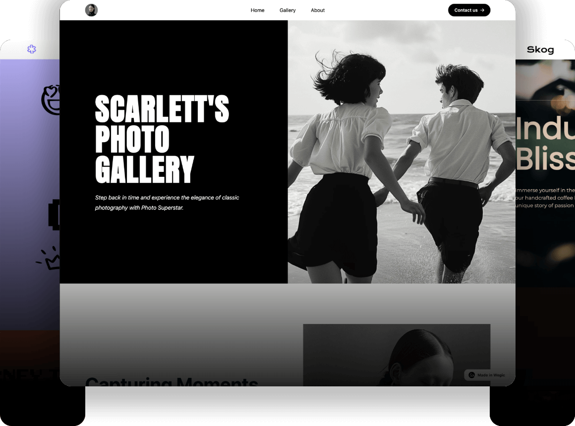
Website design is all about creating an atmosphere for your "digital store" that makes people want to walk in, stay, and ultimately buy.
A stunning e-commerce website design plays a crucial role in sales, directly affecting user experience, brand image, conversion rates and many other aspects. In order to help you build stunning e-commerce websites, this article lists 14 e-commerce websites with great design and functionality for inspiration!
Table of Contents
-
14 E-commerce Website Examples
-
What makes for a stunning e-commerce website design?
-
Tips for designing an e-commerce website
-
E-commerce website design FAQs
-
Conclusion
14 E-Commerce Website Examples
Here are some examples of e-commerce websites with flawless functionality and standout designs that demonstrate both effective online retailing and their smart digital commerce strategies. To make it easier for you to refer to the unique features of different industries, websites are categorized:
-
Fashion e-commerce websites
-
Self-care and beauty e-commerce websites
-
Jewelry & accessories e-commerce websites
-
Food & Drink e-commerce websites
-
Kids and Babies e-commerce websites
-
Home e-commerce websites
-
Sports and outdoor e-commerce websites
Fashion e-commerce websites
1. Rothy's
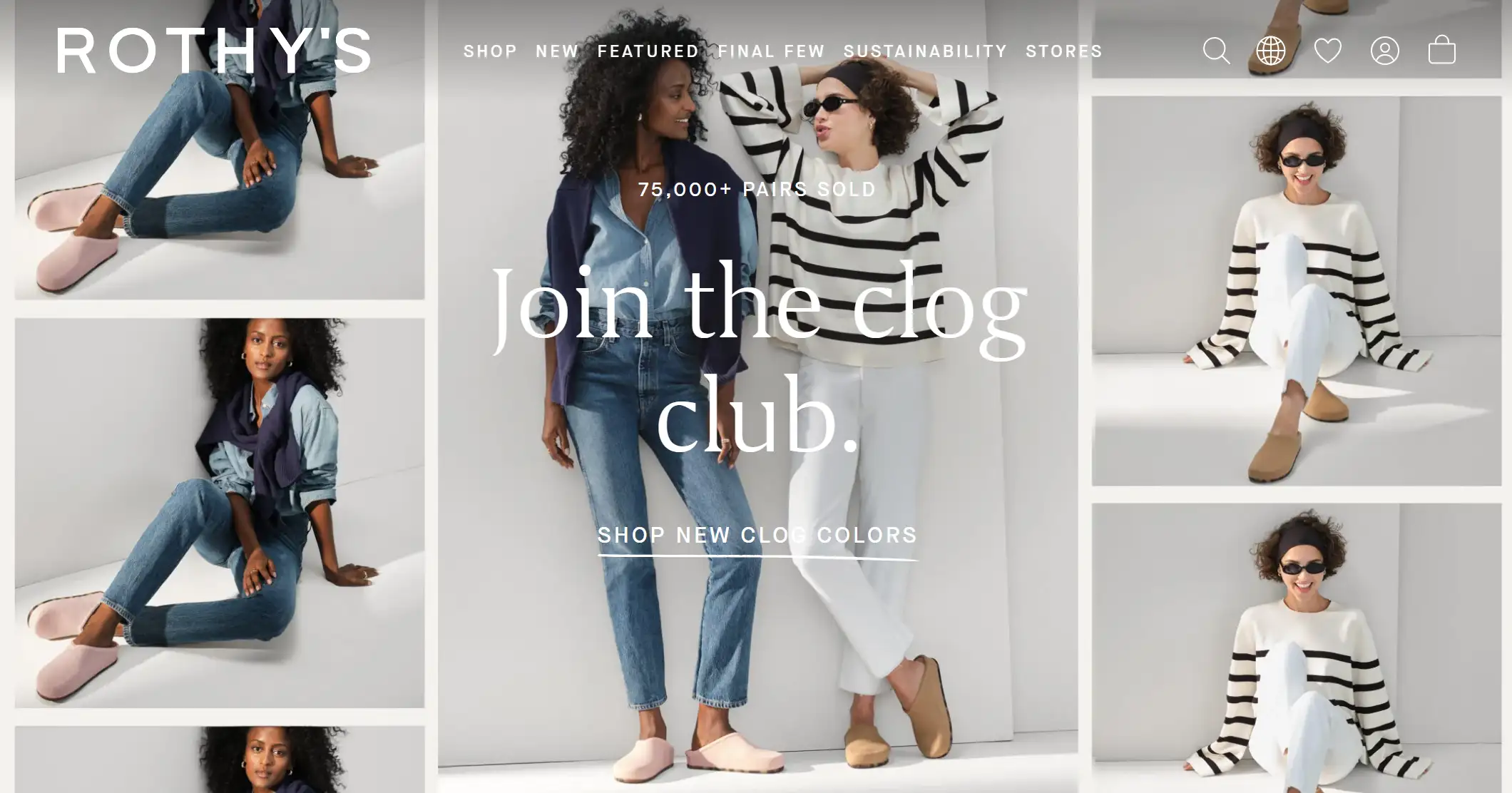
Rothys is a sustainable fashion e-commerce website that emphasizes comfort, washability, and style. On its homepage, it primarily showcases the comfort and sustainable fabrication concepts of its products.
Website Design Highlights:
-
Clean and Minimalistic Layout: The layout is very clean with plenty of white space, allowing the products to stand out. The minimalist design reflects the brand's commitment to quality and sustainability,
-
Text and Image Integration: This e-commerce website design uses sans-serif white text placed on top of images such as "Join the Clog Club". The text is elegantly typed and complements the overall aesthetic, making the website visually cohesive.
-
User-Generated Content: The "Rothy's in the wild" section features images of real customers wearing the brand's products, adding authenticity and building a community around the brand. This UGC helps potential customers see how the products would look in real-life scenarios, which increases trust and encourages the site's customers to experience their products for real.
-
Drop-down Menu Bars: Rothy's uses drop-down menus on their website categorized by product, which allows users to quickly find the products they need and enhances the user experience.
2. Allbirds
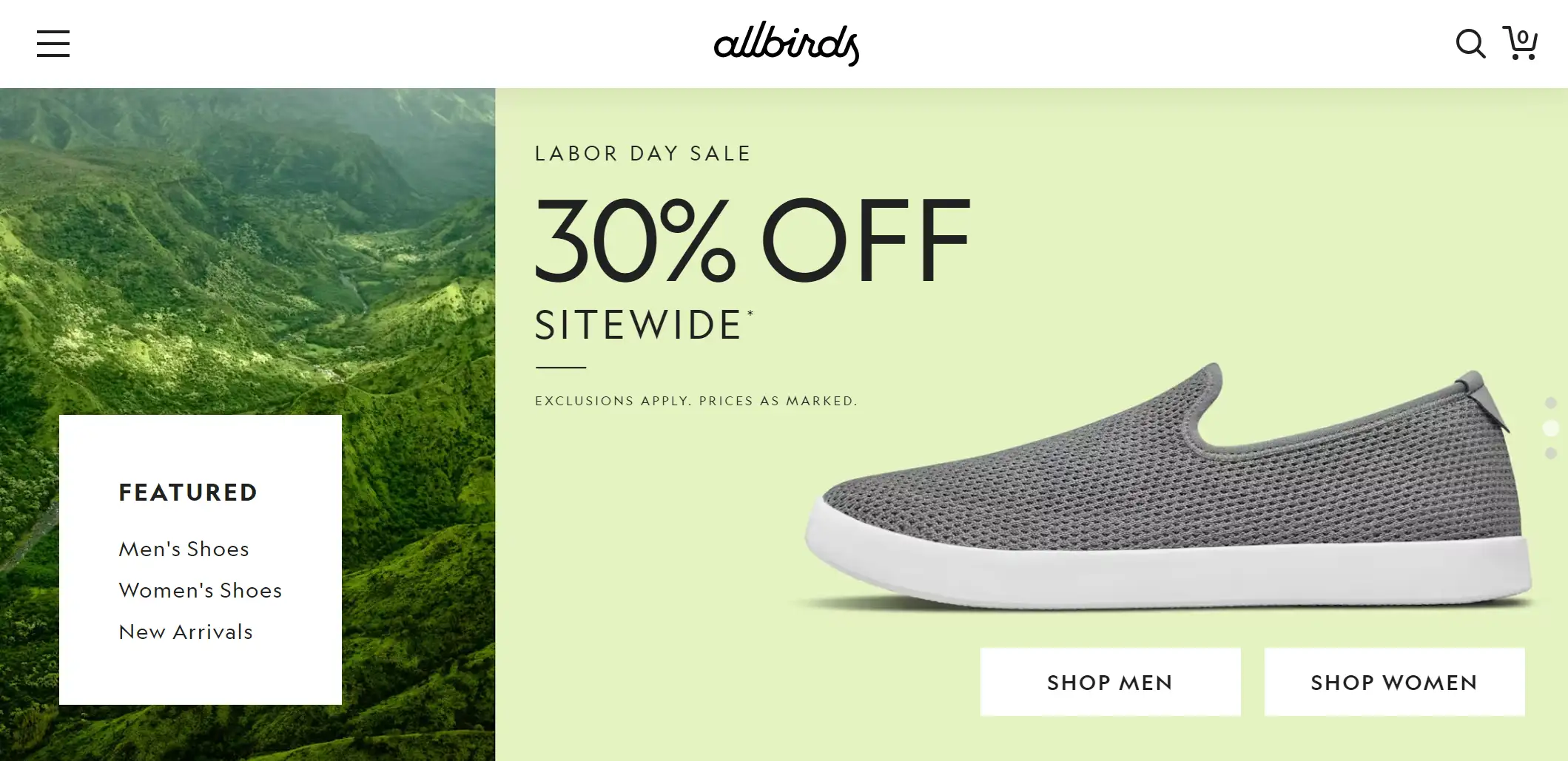
Allbirds is an e-commerce website for shoes and clothing. Allbirds' slogan makes the world's most comfortable shoes and flats, emphasizing the naturalness of the product's materials and practical design.
Website Design Highlights:
-
Consistent Color Palette: The use of green hues throughout the site reinforces the brand's focus on natural materials and sustainability. All of the images take elements of nature's trees, flowers and some plants. This consistency in color palette not only makes the site visually cohesive but also helps communicate the brand's core values.
-
Picture to GIF: Dynamic images are more appealing than static ones and make bland e-commerce website pages move. It likewise conveys the qualities of the product.
-
Interactive Product Displays: Allbirds utilizes a micro-interactive design approach for all of its product images, with a slight zoom-in to respond to the user as they navigate through the various products.
Self-care and beauty e-commerce websites
3. Skinome
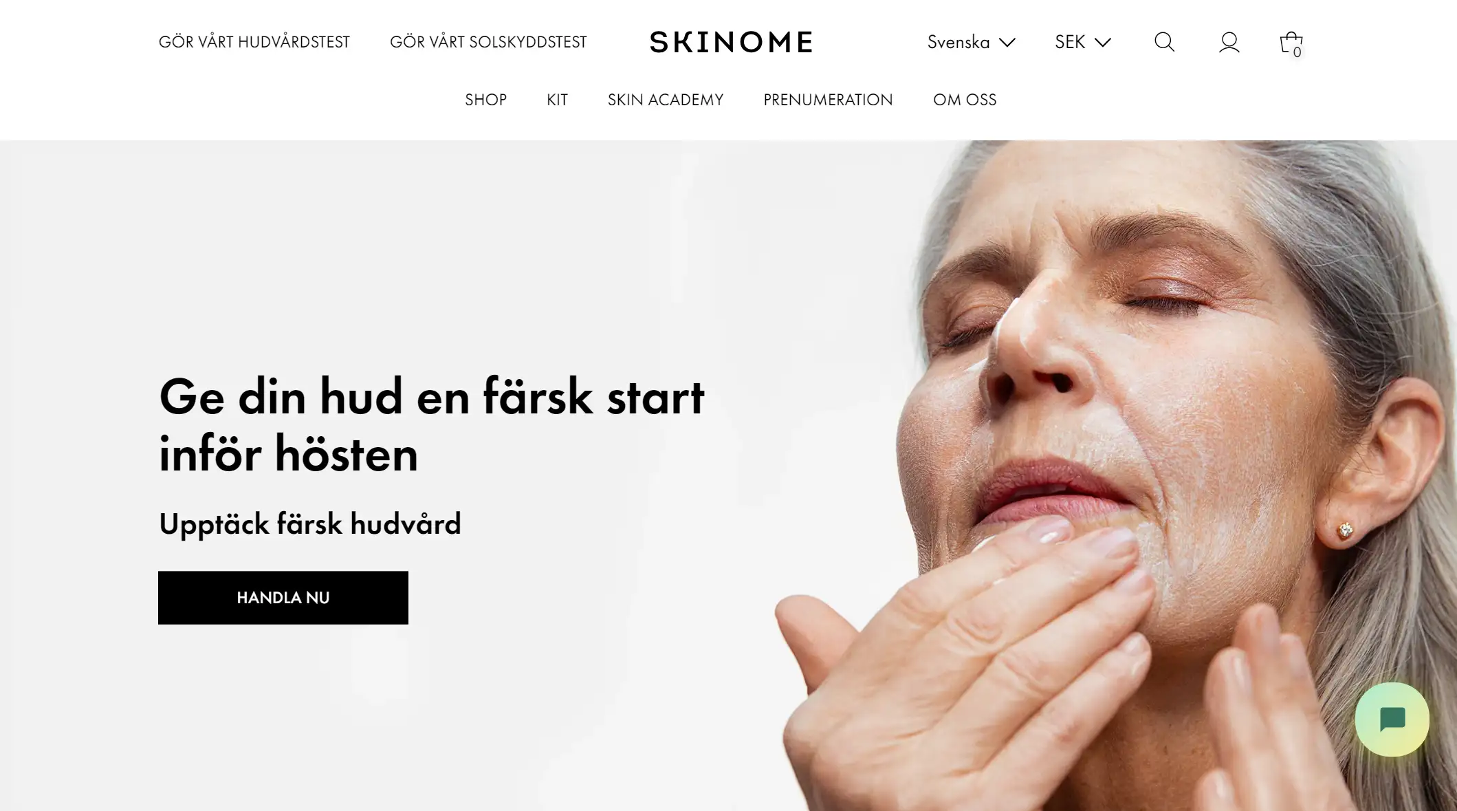
Skinome is a Swedish e-commerce site for the skin care industry. Their goal is to empower the selection of the right products for optimal skin health through knowledge and science. Its website's language, design style, and ample white space create a sense of clarity and calm that aligns with the brand's focus on skincare.
Website Design Highlights:
-
Hero Imagery: The use of large, high-quality images, especially close-ups of older women using skincare products, immediately communicates the target audience and effectiveness of the product. These visuals have an impact and create a strong emotional connection with users.
-
Before-and-After Slider: The before and after image sliders included under the "Användarresultat" section are a powerful tool to demonstrate the product's effectiveness. Showing users before and after using Skinome products, this interactive element allows potential customers to see the tangible benefits of using skin care products.
-
Expert & Authority Endorsements: Recognized by prestigious publications such as BAZAAR, ELLE, VOGUE and The Times, the inclusion of these scrolling logos in the e-commerce platform enhanced the credibility of the brand. This design choice associates the product with a recognizable brand in the industry and helps build trust with potential customers.
4. Addendum Hair
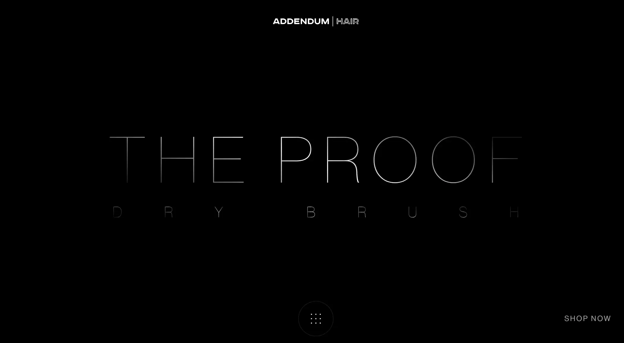
Addendum Hair is an e-commerce site specializing in hair care, and this page features The proof comb product line.
Website Design Highlights:
-
Scroll-Triggered Interactions: As users scroll, they are presented with new content and product details that keep them engaged and encourage further site exploration. This scrolling interaction creates a more immersive and visually appealing experience that makes a brand's product stand out.
-
Burger Menu: burger menu icons keep the interface clean and tidy by hiding navigation options until they are needed. This is especially important for mobile or small screen devices with limited space. Clicking on the hamburger icon displays the full menu, allowing users to access different parts of the site and enjoy a seamless website experience.
-
3D Product Display: 3D product displays allow users to interact with products, such as rotating, zooming in, and viewing products from multiple angles. Customers can see the product in a more realistic form as if they were holding it in their hands. This helps to better understand the product's features, textures, and dimensions. This interaction in e-commerce website design increases user engagement and makes the shopping experience more immersive.
Jewelry & accessories e-commerce websites
5. Cartier
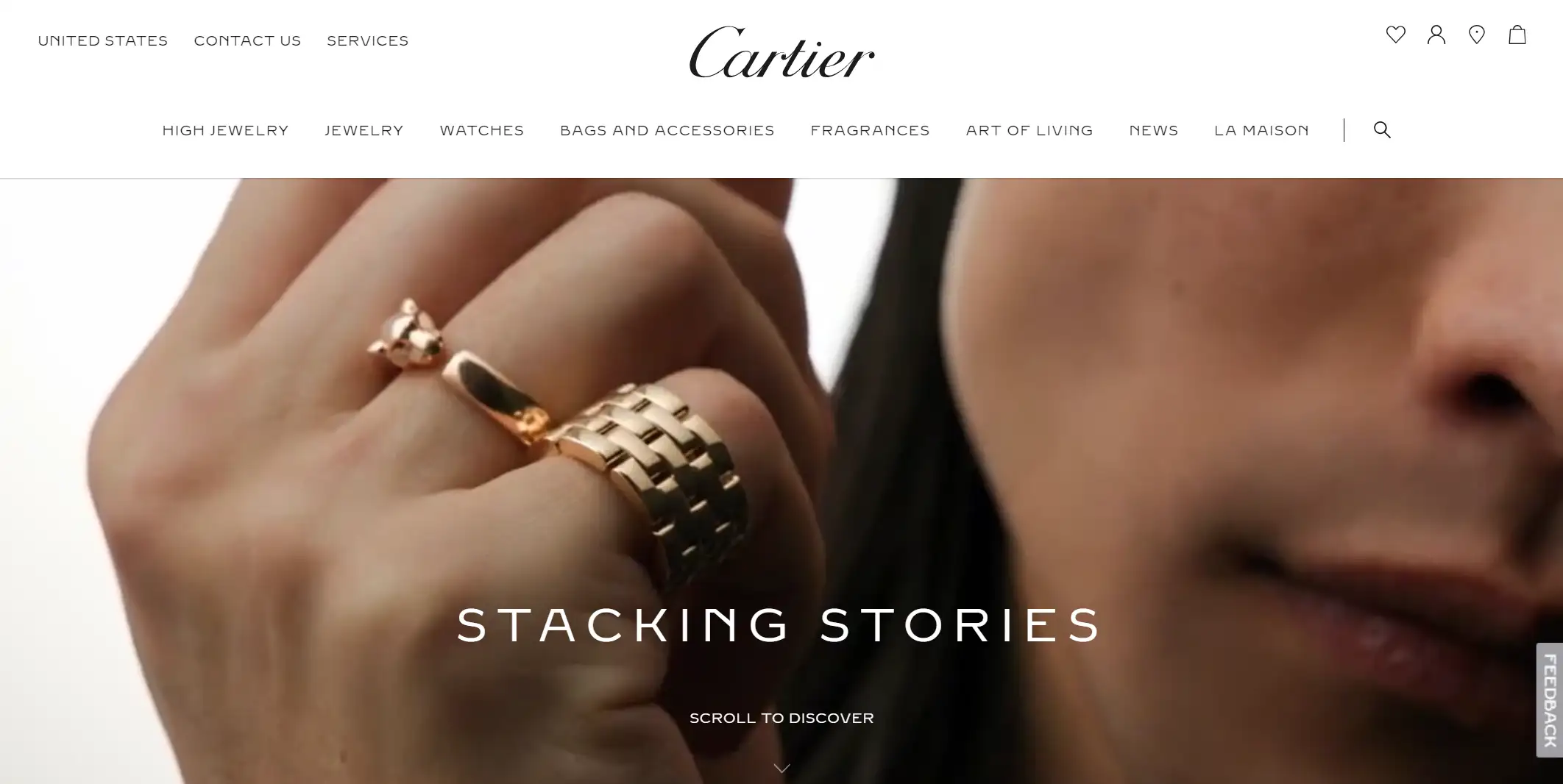
This is the e-commerce site for Cartier's luxury jewelry and watches, and it has a website design that highlights the luxury jewelry brand's sense of class and style.
Website Design Highlights:
-
High-quality Photos: A unique showcase of high quality images of their luxury jewelry and watches with an emphasis on craftsmanship. At the same time, users are able to see the products displayed on the photos and interact with the photos, clicking on different locations to see the specific product content of earrings, necklaces, and bracelets.
-
Mega Menu Navigation: Mega menu provides a centralized point of navigation that allows users to jump directly to the page they want without having to go through multiple levels of sub-menus. With a variety of products and images available in the menu, the site can capture the customer's attention, boosting the exposure of those products.
6. Swarovski
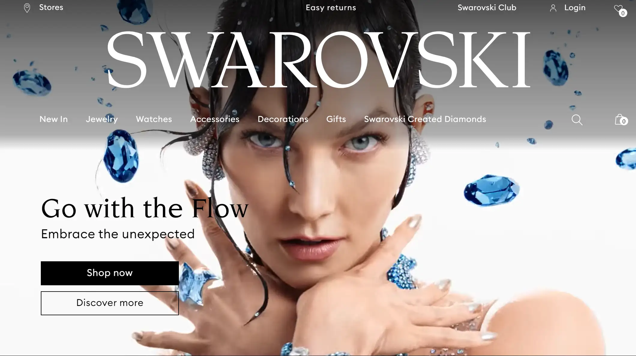
Swarovski is a renowned brand of crystal jewelry and accessories. Founder Daniel Swarovski's passion for innovation and design and his mastery of crystal cutting have made Swarovski a leading jewelry and accessories brand. Their e-commerce website can reach tens of millions of visits per month.
Website Design Highlights:
-
Hero Video: A video of a woman dancing in a blue jewel plays at the top of the homepage. This e-commerce website design is very eye-catching and leaves a lasting memory for the website user's visitors.
-
Consistent Theme: Swarovski's website adopts beige as a consistent background color, both for the main page and product detail pages. Both exude elegance and sophistication through modern serif fonts and sleek page layouts.
-
Virtual Art Showcase: The Crystal E-commerce website displays its products as if they were art collections, allowing users to explore the products engagingly as they browse the site.
Food & Drink e-Commerce websites
7. Queen Garnet
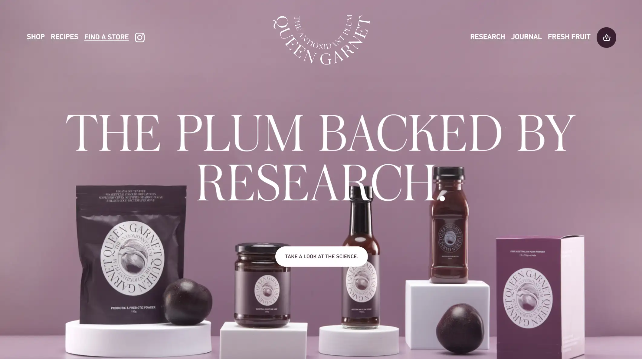
Queen Garnet is a garnet queen health food website from Australia. The theme color throughout the site is the Garnet Queen fruit color - deep purple.
Website Design Highlights:
-
Parallax Effect: This online business website utilizes parallax scrolling technology to make the user experience (UX) more engaging. Such a website design tells a story to the website user, with an ever-present background and information about the product, allowing the user to gradually learn more about their product.
-
Large Headline Text Typesetting: The text on the site's pages reflects Queen's Garnet's value proposition, such as "A nectar a day keeps the doctor away!" The large, bold font conveys Queen's Garnet's goal of bringing health to its users.
-
Product Recipe Sharing: The site also features a "Recipes Ideas" page that allows brand users to learn to make a range of related food products, which not only provides customers with knowledge and experience, but also improves retention throughout the site and attracts potential users to purchase products.
8. Civil Pours
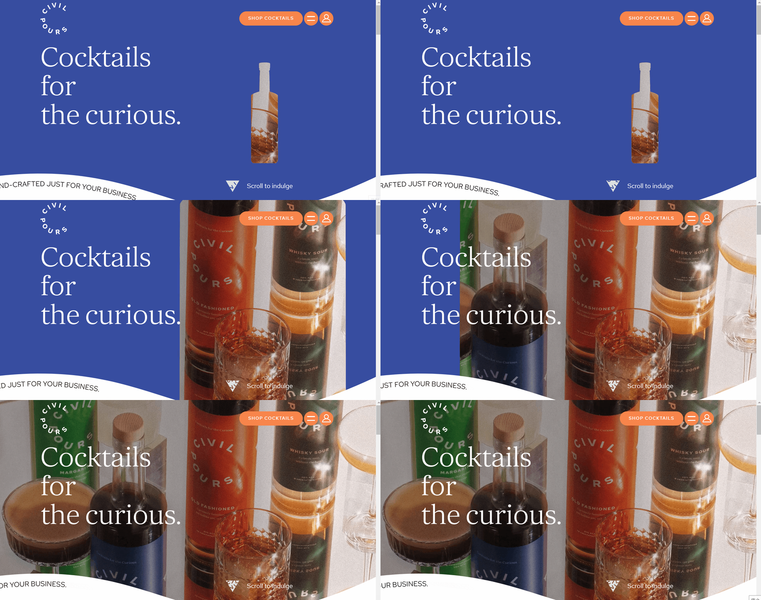
Civil Pour is the e-commerce site for specialty cocktails, it e-commerce website design is half exploratory, half e-commerce, offering an immersive experience to indulge in ready-to-drink cocktails crafted by Canada's top bars.
Website Design Highlights:
-
Wave Typography: This design enhances the motion and visual appeal of the page, mimics the fluidity of liquids, and echoes the theme of the cocktail. This design provides an "immersive experience" that draws users in and gives them a sense of the brand's unique style and product appeal.
-
Silhouette design: On the homepage, with dynamic images of wine bottles and containers with stylized silhouettes, this design conveys the essence of the product through simplified shapes, while retaining a certain artistic sense and visual identity.
-
Color Contrast Levels: The pages all use the yellow, blue, and orange background colors of their product packaging to create a strong color contrast, conveying an energetic and innovative brand personality.
-
Strategic CTA Buttons: This e-commerce website design employs a very large number of CTA buttons to encourage users to take action. For example, "ADD TO BAG", "VIEW COCKTAILS".
Kids and babies e-commerce websites
9. Kotok
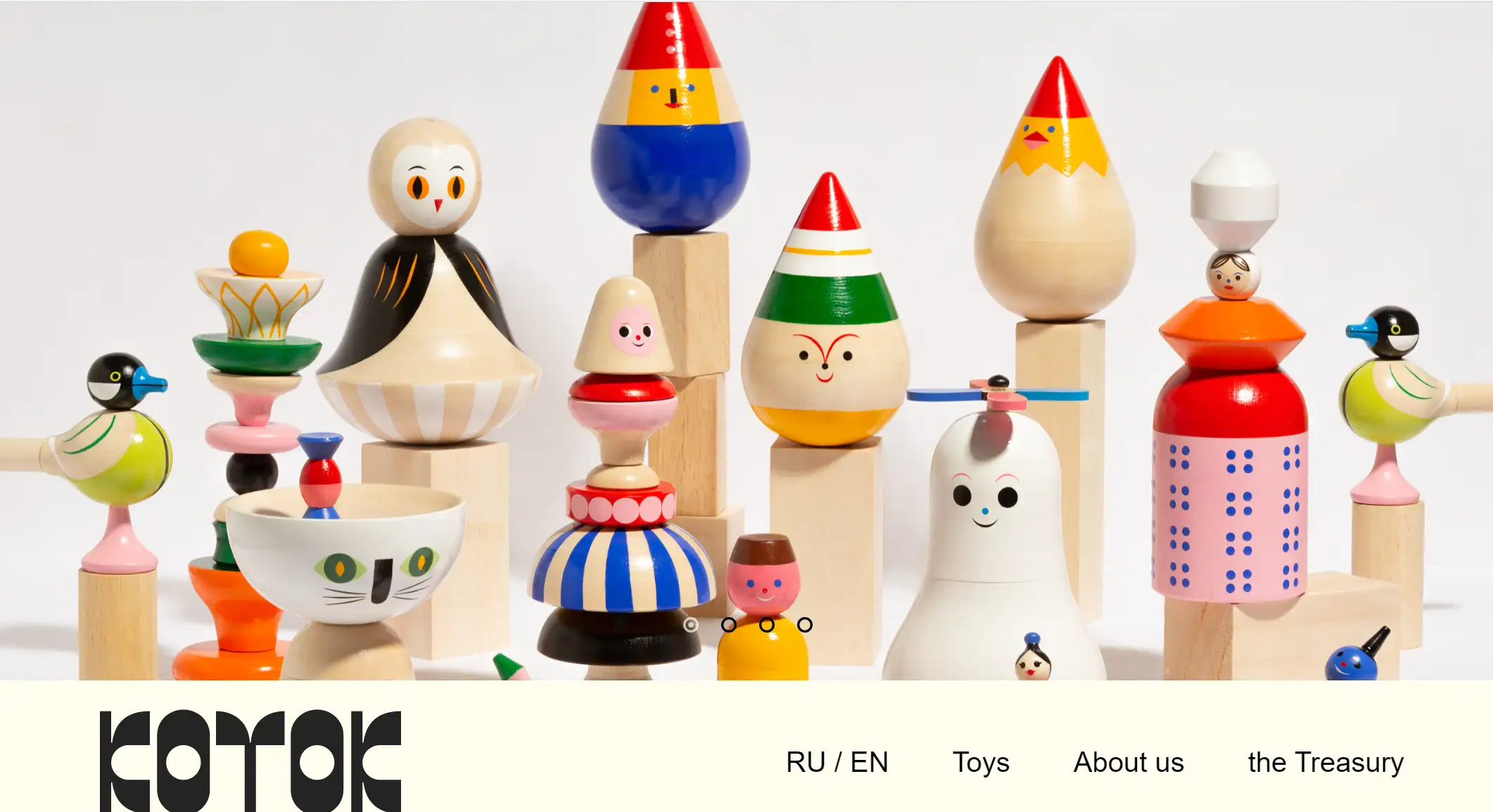
KOTOK is a Russian e-commerce website for children's wooden toys. On their website they sell a wide range of high-quality toys produced traditionally by Russian craftsmen, and their toys have received coverage and awards from major Russian media and publishing houses.
Website Design Highlights:
-
Dynamic & Graphic Design: Toy products according to the type of clear presentation on the main page, the plane design of various toys moves the unique design to attract the attention of users, and enhance the overall page aesthetics.
-
Neat Layout: On the product description page, there is a catalog on the left and neat product images on the right. So that users can find their favorite toys clearly and unambiguously.
10. Holiday HospiTales

This is the e-commerce site for the Holiday HospiTales book series. They are designed to help pediatric patients who are in the hospital during the holidays get through that time by reading.
Website Design Highlights:
-
Lovely Color: The use of warm and festive tones, such as the dark blue background used for the scene of a snowy night in winter combined with bright illustrations, creates a cozy atmosphere and attracts the user's attention.
-
Illustration Style: The illustrations are in a cartoon style with vivid images that will interest children and their parents. This style is suitable for children's books and conveys a sense of joy and fantasy.
-
Strong Emotional Connection: This website design doesn't focus on sales. Instead, the content emphasizes the warmth of the holiday season and caring for children, enhancing emotional resonance and enabling users to better connect with the brand. It also conveys the idea that stories were created with care and purpose.
Home e-commerce websites
11. Boll & Branch
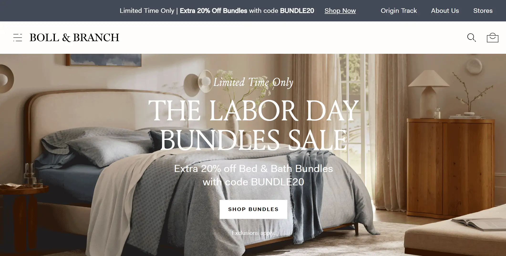
Boll & Branch is an e-commerce site for bedding, and this e-commerce site is styled to follow environmental and sustainability commitments. All of their products are ethical, sustainably sourced, and of the highest quality. The site's brand values are impressive.
Website Design Highlights:
-
Customer Review: Boll & Branch takes their human-centered value proposition seriously, showcasing reviews from real users on their website, a design that not only reflects the quality of their products but also increases trust for potential users.
-
Feedback Sheet: The e-commerce website example also reflects the company's focus on the customer experience by including a form on the webpage to collect customer feedback. For example, the user is asked some questions: "Do you sleep hot or cool? " and several answers are listed for the customer to choose from. This also improves user engagement on the site.
-
Full Screen Overlay Menu: Full-screen overlay menus are usually triggered by a hamburger menu icon. When the menu is clicked, it takes up the entire screen, providing users with clear and direct navigation options. This full-screen approach reduces distractions and ensures that users can easily find what they are looking for without being overwhelmed by other page elements.
12. CODE Furniture
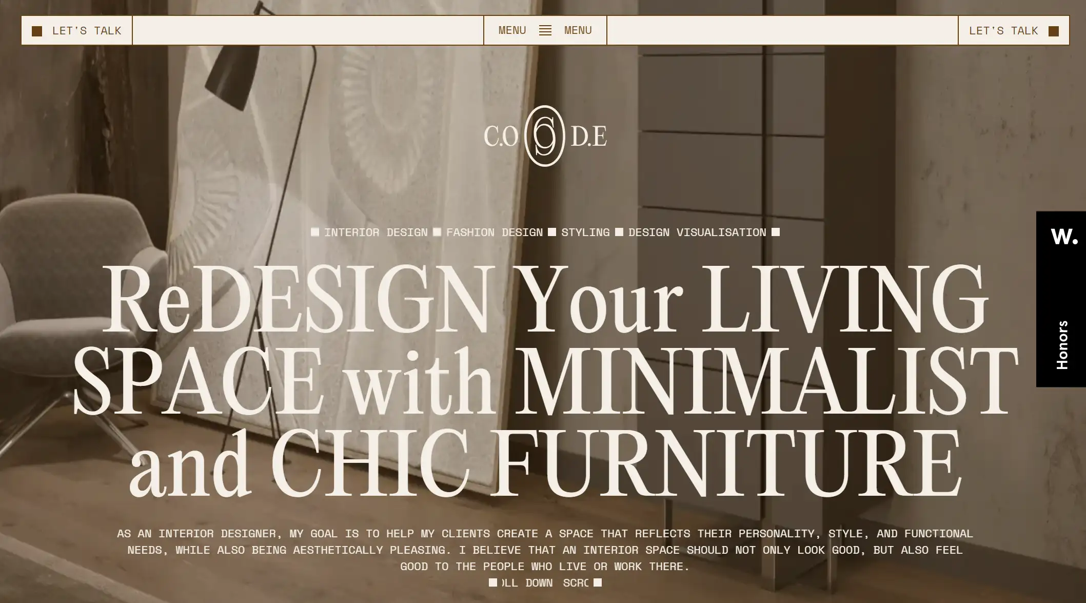
A furniture design company website developed by a collaboration between Advanced Team and V&M Developers and has received an Awwwards accolade.
Website Design Highlights:
-
Virtual Realistic Furniture Models: This e-commerce website example is well worth studying. This is because they have utilized modern front-end technology to create realistic furniture models. This innovative design approach allows users to scrutinize furniture products in a virtual environment, providing a near-realistic shopping experience.
-
Product Adaptive Design: The site features a product adaptive interface that responds to user interactions such as continuous scrolling. As the user scrolls, the product visuals and accompanying information dynamically change to create an engaging and fluid browsing experience.
-
User Engagement: Adding interactive elements to the product images of each piece of furniture, the dynamic and interactive elements set a new standard for how online furniture stores can engage customers and make the shopping experience more personalized and enjoyable.
Sports and outdoors e-commerce websites
13. Moon Bikes
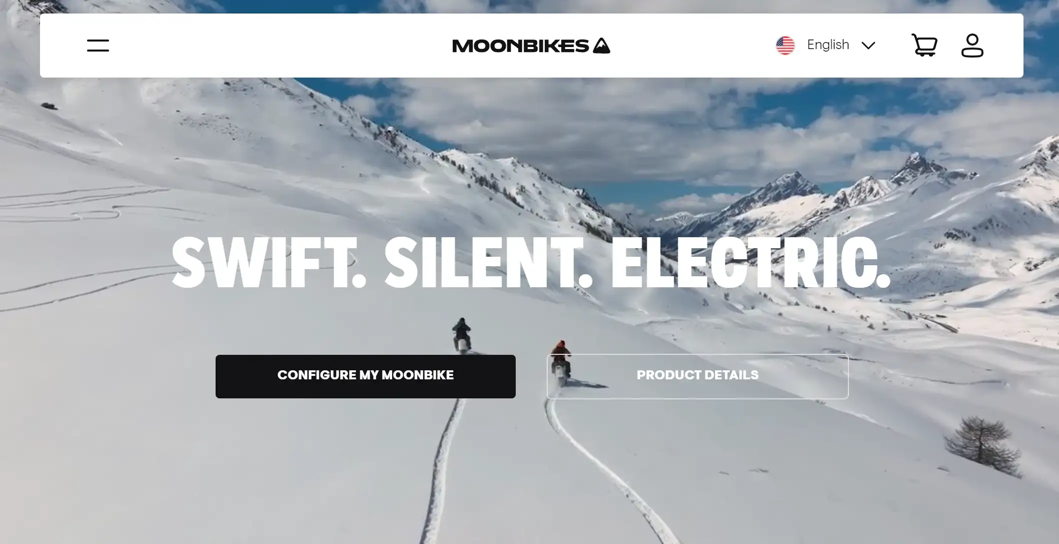
Moonbikes is the worlds first electric Snow Bike. Their e-commerce site showcases their product as an advanced feature that can ride in snow up to a foot deep. This is an e-commerce site example that stands out in a crowd of common sales items.
Website Design Highlights:
-
Full-Screen Video: In its e-commerce website design, well-produced videos can grab visitors' attention from the start, lowering bounce rates and encouraging them to explore further. Integrating clear and compelling CTAs can lead to higher conversion rates. For example, strategically placed "CONFIGURE MY MOONBIKE" "PRODUCT DETAILS" buttons guide the user journey.
-
Featured Press: Citing reviews from reputable media outlets (e.g. Forbes, Wired, TechCrunch, etc.) enhances the credibility and authority of the brand, and potential customers are more likely to trust these products. By showcasing positive user reviews and media reviews, you can incentivize potential customers to make a purchase decision and increase conversions.
-
Multimedia Dispaly: The video demonstrates different usage scenarios (e.g., skiing, night riding, etc.) and also provides different activity options to emphasize the versatility of MoonBike in winter activities to appeal to users with different interests. MoonBike's versatility in winter activities should be emphasized to attract users with different interests.
14. CALEY
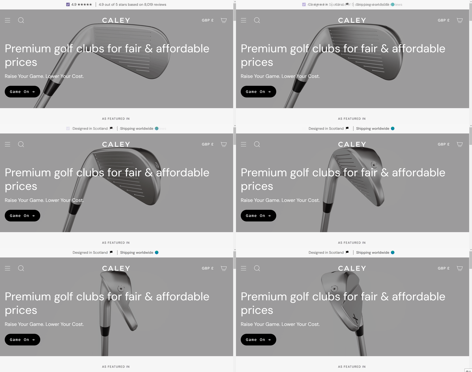
Caley provides high quality golf clubs for new golfers entering the game and supporting seasoned pros around the world. Their e-commerce website has a clean design that simplifies the process of purchasing products for their customers.
Website Design Highlights:
-
Professional Experts: Caley focuses on bringing professional advice and reviews to its customers, and its website is designed to provide reviews from industry experts for potential users to refer to, which also increases customers' confidence in making a purchase.
-
Search Bar: Caley also provides a search bar that allows site visitors to quickly find the products they need, facilitating the user's site experience.
How to design a stunning e-commerce website?
With these 14 examples of stunning e-commerce website design we can analyze them deeply and then realize that a stunning e-commerce website design needs to consider the following factors:
1. Captivating Visuals
High-definition, crisp product images on your homepage are crucial for instantly capturing consumer attention. Our brains process visuals much faster than text, so hero images effectively communicate your value proposition and excite new visitors about your offerings.
A carousel showcases various product categories or seasonal offerings. Regularly update it to keep returning customers intrigued and excited about new arrivals.
2. User-Friendly Navigation
The design needs to ensure that your website's navigation is simple and intuitive, allowing users to easily find what they need. And avoid the use of shallow parent categories that don't direct users to specific subpages. A deeper structure not only saves navigation space, but also effectively guides users to explore deeper. Clear categorization encourages users to explore more products. When users can easily find relevant categories.
E-commerce websites can incorporate elements such as hover effects, product displays with animation and interactive effects to engage users. People are always attracted to dynamics. So these can enhance the shopping experience and make visitors stay longer on your website.
4. Real Customer Review
Social recognition plays a key role in creating high-converting product pages. According to research, nearly half of consumers consider online reviews to be as credible as recommendations from friends and family. Therefore, it's especially important to make it easy for customers to find these reviews. This sense of trust and richness of information can better attract the attention of potential buyers and promote the purchase decision.
5. Responsive and Fast-Loading Design
Given that a large portion of e-commerce traffic comes from mobile devices, it's critical to ensure that your website is fully responsive and provides a superior user experience on smartphones and tablets. If your e-commerce site is not performing well on mobile devices, you could be missing out on a significant amount of potential revenue.
Conclusion
In this article, we've looked at e-commerce website design examples from a variety of industries, dissecting the highlights of their design elements, which use extraordinary design highlights to embellish creativity while being mindful of usability.
If you are just starting your e-commerce journey and want to launch your own online platform, feel free to use our AI website builder - Wegic to try out the website design inspirations you've learned and use them in your own website!
E-commerce website design FAQs
Can I build an e-commerce website on my own?
If you want to build an e-commerce website but don't have coding or design experience, you can use an AI website builder platform like Wegic, which has all the features you need to build a beautiful, user-friendly website, including features such as custom domain names, multi-page setup, and search engine optimization.
How much does it cost to build an e-commerce website?
On Wegic, you can use 70 points to build one e-commerce website for free. You can design the pages of your e-commerce website for free by inviting new users and also sharing your website to other platforms to earn points.
How long does it take to build an e-commerce platform?
The development time of an e-commerce website depends on several factors, i.e., the size of the store, the chosen technology stack, the size of the development team, and experience.
If you are a small business owner who wants to build a website quickly you can try Wegic, which can quickly generate a well-designed e-commerce website in less than 90 seconds by entering your business requirements.
However, building an e-commerce website for domestic or cross-border business may take longer.
Written by
Kimmy
Published on
Mar 17, 2026
Share article
Read more
Our latest blog
Webpages in a minute, powered by Wegic!
With Wegic, transform your needs into stunning, functional websites with advanced AI
Free trial with Wegic, build your site in a click!
What kind of website do you want to build?