Log in
Build Your Site
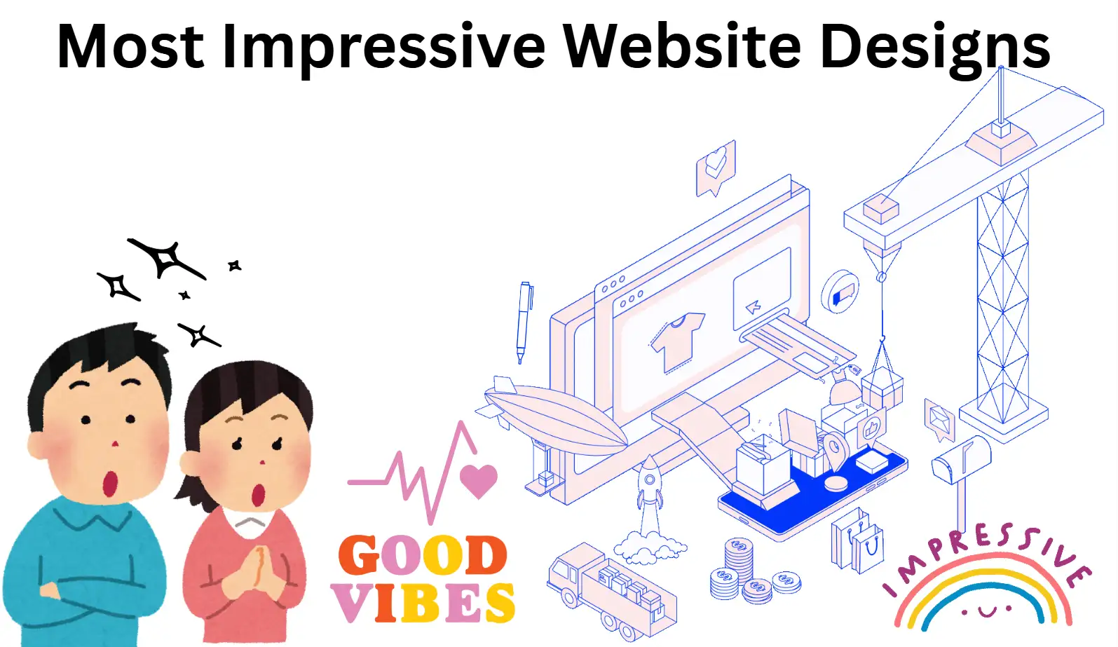
10 Most Impressive Website Designs You Can't Miss in 2025
Looking for inspiration? Dive into the most impressive website design highlights of 2025. These 10 sites redefine digital aesthetics and modern web design.

I get it - feeling stuck on what really makes the most impressive website design can be maddening. You’ve probably scrolled through countless portfolios, looking for examples of awesome website layouts. Nevertheless, you may still be wondering, “What’s the catch?” Maybe you’ve seen several unique website layouts that struck a chord with you, but you haven’t figured out why they work so well.
I went there too. Back when I first started making websites, I realised that no matter how slick the visuals are, if visitors can’t find what they’re looking for or if there’s no emotional connection to it, it’s useless. That’s why in this article, I’m going to break down what makes the best website layouts unique. You’ll learn how to spot these features, how to emulate them, and how to make your own website shine.
By the end of our exploration, you’ll not only recognise the most impressive website design when you see it, but also have a clear strategy to turn those cutting-edge site layout examples into your own forte. Maybe you will also figure out several unique site layouts in the process of learning.
The Most Impressive Website Designs: Top 10 Picks
In this part, I will talk to you about the ten most popular website layouts in 2025, which will definitely make you shine. These website layout examples are really notable. They not only have super creative interactive approaches, but also use particularly eye-catching designs, coupled with storytelling layout formats. They represent a group of unique website designs that have created new standards in the industry.
1.Jeton
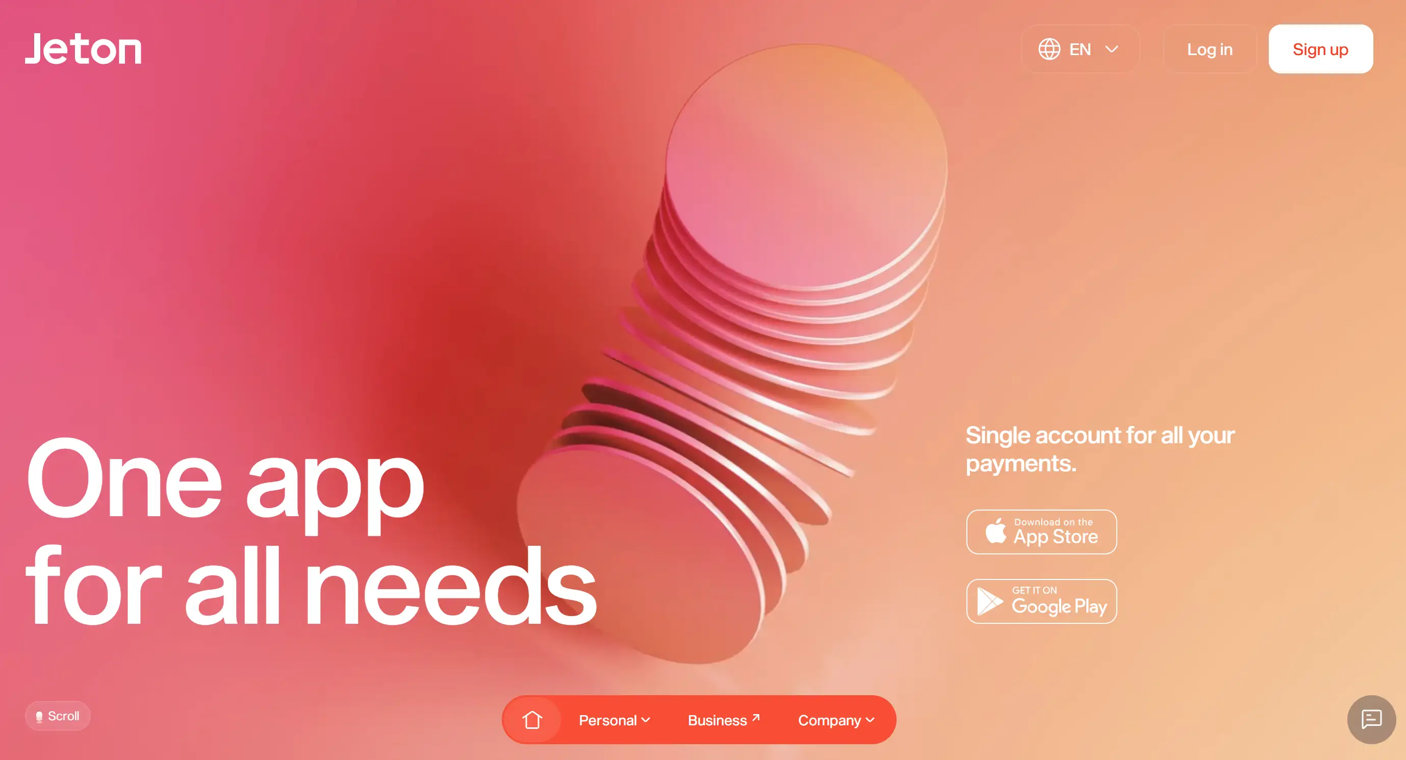
Jeton has carefully designed hierarchical interaction details highlighting critical functions without making users feel complicated or annoyed. The platform’s adaptive grid allows content to flexibly adjust on desktop, tablet, and mobile, showcasing the best website layouts in responsive design. A well-designed colour scheme will use a softer background colour to highlight the more popping, accent colours, which can subtly draw attention to the "call to action." Its high-definition illustrations, coupled with smooth demonstration animations, look particularly eye-catching, impress visitors, and enhance the brand image. Jeton’s blend of visual flair and seamless performance establishes a benchmark for cutting-edge website layouts in the fintech space.
2.Phamily
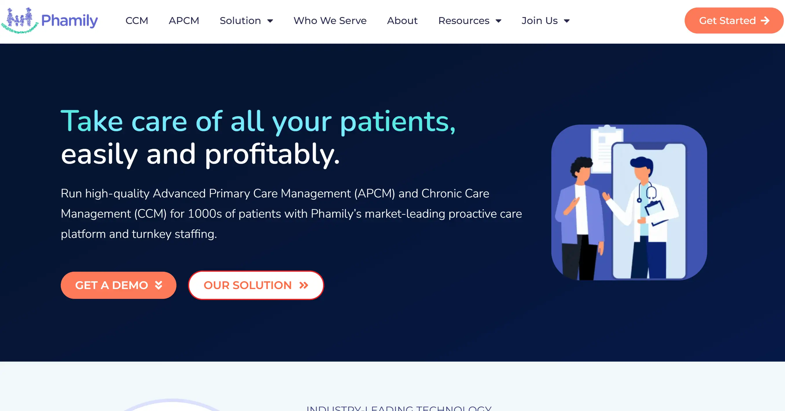
Phamily’s storytelling is coherent, and the navigation is that immersive scrolling kind of thing. Its homepage uses a full-screen video as the background, and these videos transition smoothly into product demonstrations, making the entire website layout feel as if it’s telling a story and is particularly attractive. This parallax effect cleverly gives the picture a sense of layering. It does not affect the speed of opening the web page, but also makes users more willing to interact. The prominent CTA is placed on the contrasting typography, guiding visitors to understand Phamily’s brand story. As a great example of a website layout, Phamily finds a balance between cinematic visuals and usability, and can attract everyone's attention in a very short time.
3.Osmo
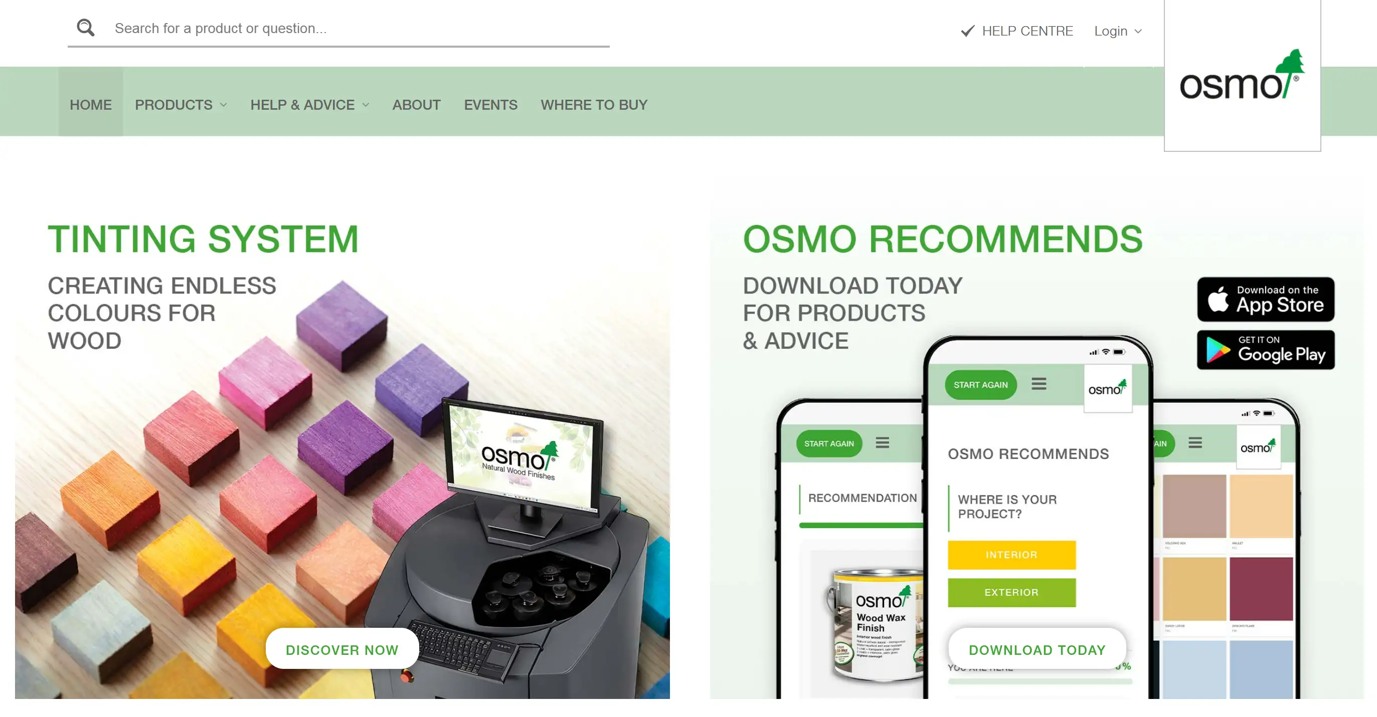
Osmo has a split-screen demonstration function, and its layout can be adjusted by yourself, which can demonstrate pictures and text side by side. The small animation effect when it hovers is particularly sensitive, and it responds immediately when the mouse is touched, perfectly showing the delicate interactive effects in top website designs. Strategic whitespace makes each section legible and avoids visual clutter. Mobile adaptation means stacking things vertically. Though it becomes one column, you can still see how the original two columns are arranged, and the importance of the content has not changed. Osmo’s design concept is a good example of how a unique website layout perfectly combines beauty and usability.
4.Gufram
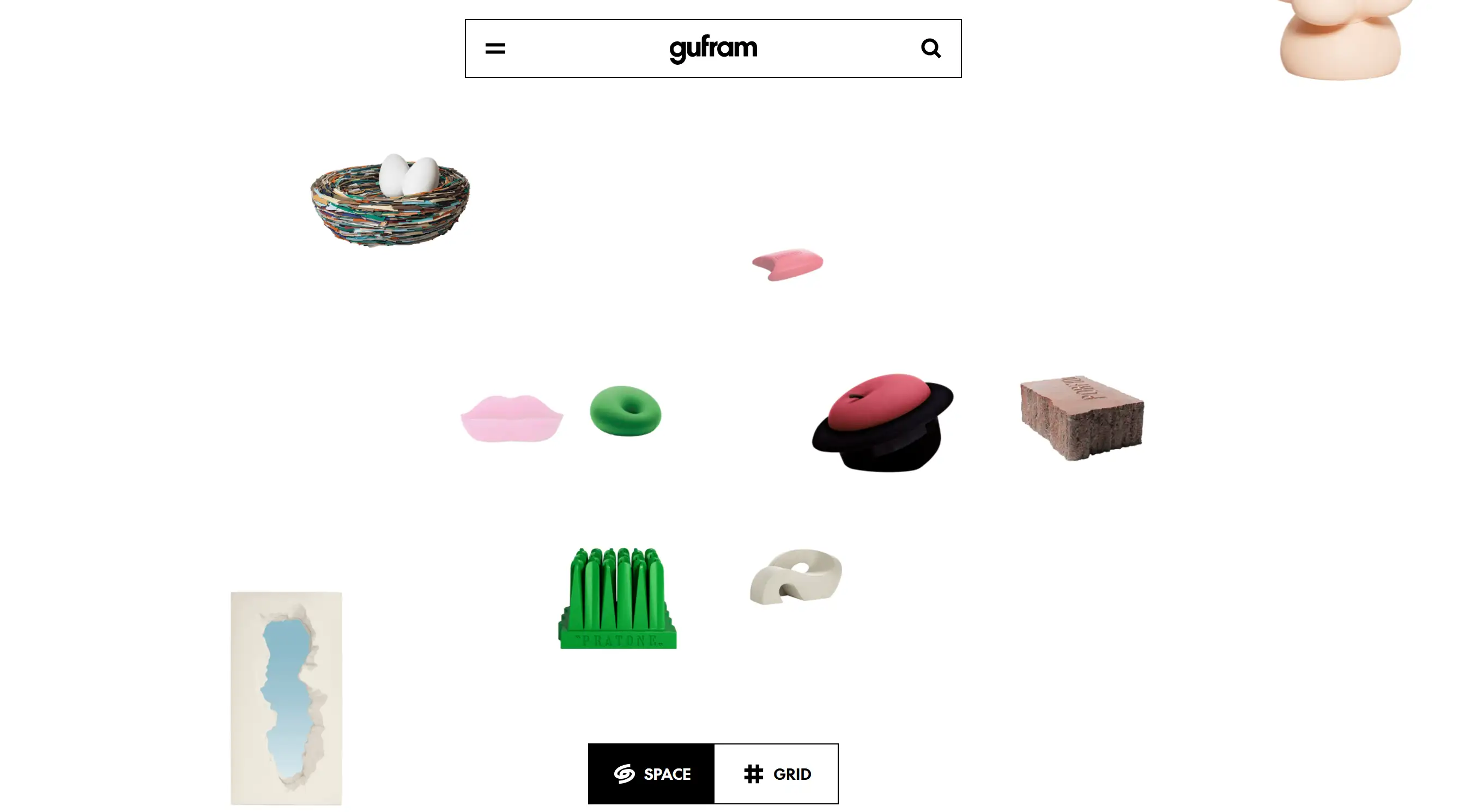
Gufram‘s online platform features a bold and exaggerated photography style and uses asymmetrical designs to highlight the outlines of iconic furniture, perfectly showcasing Gufram's avant-garde style. Gufram’s website uses full-screen visuals and segmented navigation to further solidify its position as a top website layout for creative brands.
Hover-triggered product demos allow people to view different variations immediately, which increases engagement and clarity. This menu is simple and clear, and the layout is also exquisite, so people can understand it at a glance. They placed each piece equally prominently, and this layout fully reflects Gufram's unconventional design concept.
5.DavidLangarica
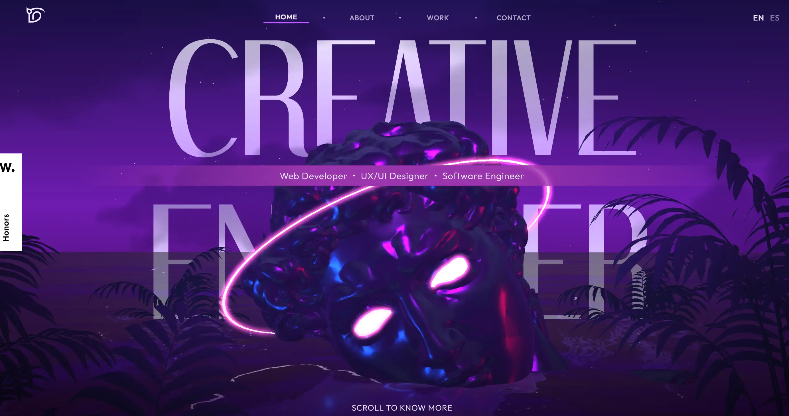
The site’s navigation bar remains hidden until you scroll, preserving immersion and allocating screen space to key visuals. When you hover over the item thumbnails, they expand and demonstrate a brief description, which exemplifies microinteractions at their best. The simple colour scheme draws more attention to the work results, although the concise text description guides users to look at each case study. This portfolio will instantly stand out among many website designs and is perfect for creative people who want a simple and exquisite style.
6.Formless
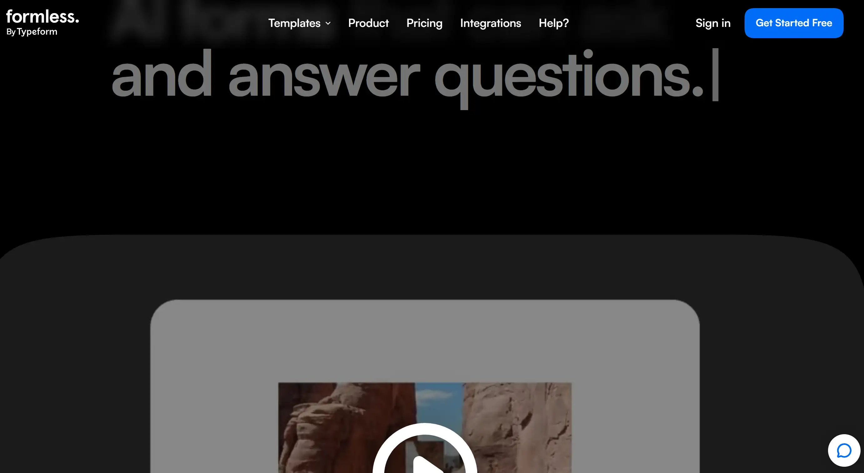
Formless draws on good website design examples to craft a minimalist interface that still stands out among unique website designs. Its homepage uses a unique full-screen canvas with a call to action in the middle, which looks simple and eye-catching. With a gentle scroll, the content fades in, and with another swipe, the content slowly reveals itself, which is eye-catching without looking too garish. Using a bright colour with a monochrome palette can make brand characteristics more prominent and make people understand the content at a glance. Formless illustrates how the most memorable website designs emerge by using deliberate restraint and user-centric layouts.
7.SPINX Digital
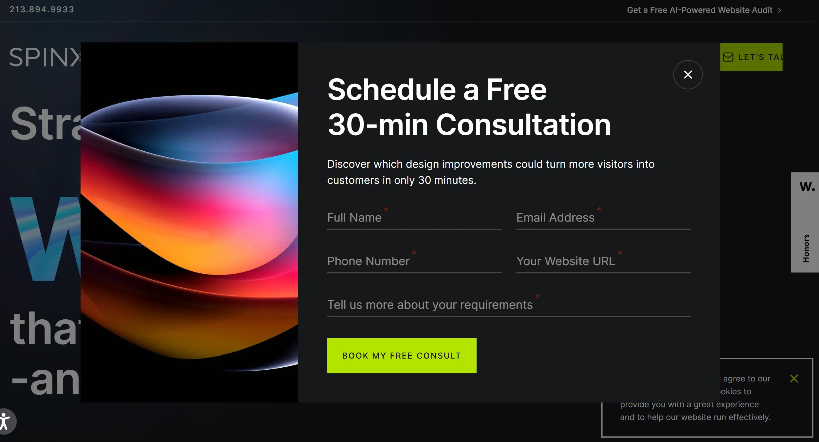
SPINX Digital’s portfolio site uses a modular component system and asynchronous content loading to showcase a great website design and make interactions super fast. Interactive graphs update in real time as users scroll, showcasing SPINX Digital’s data expertise without page reloads. The sections are switched using effects like sliding and gradient, allowing them to transition naturally between different case studies. Simple icons and simple text descriptions demonstrate complex services. This website is a very practical and unique website design example, especially suitable for those organisations that want to show off their technical strength.
8.Baseborn
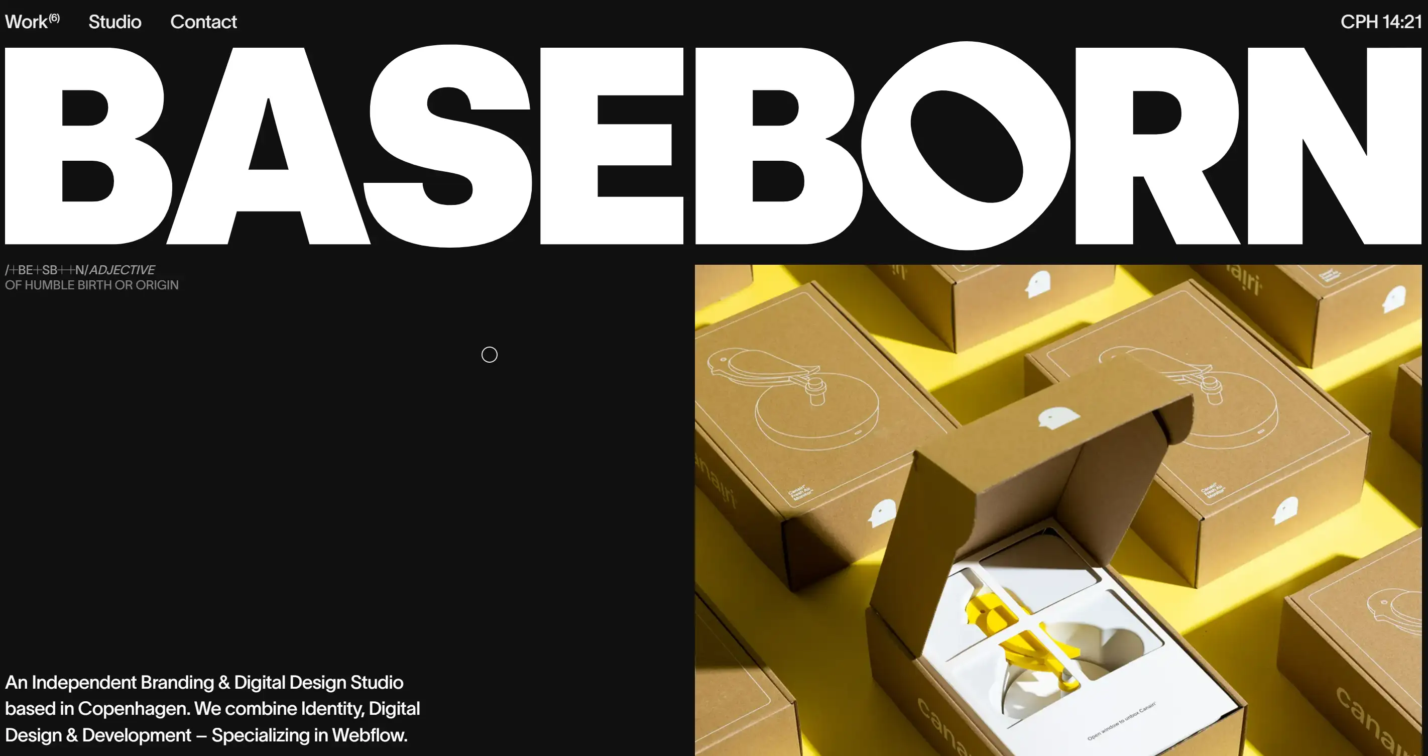
Baseborn illustrates the most impressive website design by pairing a monochromatic framework with dynamic scroll-based animations. The content is slowly revealed, and the effect is amazing. The hero image is naturally integrated into the text, making the narrative smoother and without abrupt transitions. The header remains in the same position, but its transparency adjusts with the scroll depth, making it visible without blocking critical content. Interactive map embeds and live chat widgets make customer assistance more powerful without cluttering the page. Look at what Baseborn has to say - it's the perfect combination of simplicity and high-end functionality in good website design examples.
9.Grab & Go

Grab & Go showcases the most impressive website design in e-commerce through its lightning-fast search and filter system that updates product grids in real time. Its sticky sidebar demonstrates categories with clear icons and labels, making it easier for everyone to find things on desktop and mobile. The product cards use dynamic price tags, which animate the price updates, drawing attention to the promotion without looking too gimmicky. The text instructions on the button tell everyone what to do, making it easier for customers to place orders and reducing the shopping cart loss rate. Grab & Go shows how unique website design can transform the online retail experience.
10.Tore S. Bentsen
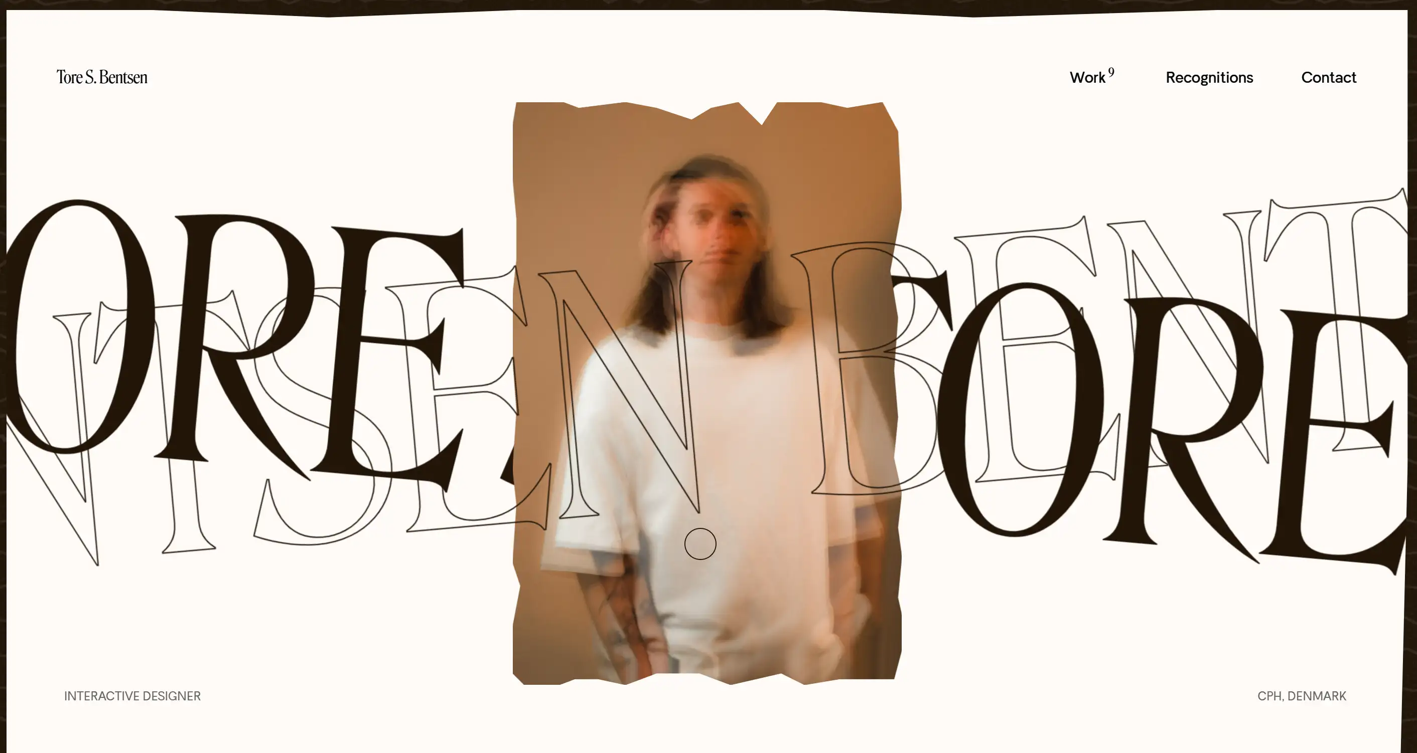
Tore S. Bentsen’s portfolio rounds out the list with an architecture-inspired layout that uses grid overlays to align content precisely. The small picture of each project will be enlarged to become a case study of the entire page, coupled with a smooth fade-in and fade-out effect, which can particularly indicate the most powerful aspect of the good website design examples in narrative coherence. Contextual tooltips allow users to see detailed information about an item while maintaining the main view clean. A persistent advancement bar tracks scroll depth, orienting visitors within long-form presentations. Bentsen’s site illustrates how meticulous layout and micro-interactions can deliver a cohesive, high-impact browsing experience.
Key Elements of the Most Impressive Website Design
When evaluating the most impressive website designs, five crucial elements are particularly critical: quality imagery, easy-to-understand navigation, responsive interactions, coherent storytelling, and innovative structure. Putting these things together in good places in various fields can bring tourists a particularly great user experience. These attributes address common pain points, like uncertainty over what makes an impressive website design and questions like “Which layout will best feature my offerings?”
Compelling Visuals
Quality imagery, like high-resolution photos or vector graphics, combined with carefully matched colours, can make content easier to read and highlight critical parts. Colours should be chosen not only to identify the brand but also to evoke the desired emotion. The layout must be particularly careful, and the icon design must be unified to keep it neat and draw attention to where it should be. Layered elements add dimension without clutter, while accessible contrast ratios ensure clarity on any screen. These rules are reflected in many cutting-edge website design illustrations, showing that beauty and functionality can be achieved at the same time.
Streamlined User Flows
Clear navigation optimises engagement. The sliding menu and fixed header can help people find what they want quickly. Breadcrumb links and integrated search streamline exploration on content-rich sites. Use loading indicators and lazy loading of media to prevent sudden interruptions. A well-placed call to action can guide users to complete the main operation smoothly, especially on mobile phones, where the area that is convenient for thumb operation is particularly critical. It reduces bounce rates by making the site trajectory simpler and reducing user confusion, although also allowing users to drill down and browse more content.
Responsive Interactions
Make elements appear with a small animation when the mouse hovers over them, see the gradient effect when the page scrolls, and pop-up prompt boxes in time, all of which give users quick feedback. Advancement markers and subtle audio cues make the action more powerful. Interactive forms with real-time validation minimise user errors. Embedded videos and dynamic graphics can make those text-heavy passages less boring and make people more willing to explore. Developers who create top-notch website designs have mastered the art of finding the sweet spot between motion and performance, always maintaining site speed at the top of their priority list.
Coherent Narratives
By dividing the content into chapters, readers can follow the ideas more easily. Simple text, clear headings, and visual anchors highlight each benefit. Testimonials, case studies, and data snapshots can all help build a compelling sense of credibility. Arranging the components in a progressive order makes it easier for readers to understand, and they can listen to it by following this line of thought. A comprehensive style that is consistent with the brand’s tone of voice transforms functionality into attractive guidelines that set a unique website design style and resonate with your audience.
Inventive Frameworks
Custom grids, dynamic layouts, and modular components make pages no longer monotonous. Adaptive highlight modules and contextual prompts can offer guidance without making people feel that the interface is cluttered. This unconventional way of writing paragraphs makes it more interesting, and the content is still easy to understand. Subtle scroll transitions and custom cursors give it more personality. Taken together, these strategies can transform a website into a top-notch design that sets new standards for originality and user experience.
How to Create The Most Impressive Website Design
Follow a clear, eight-step process to make top-notch website design a reality. Designers can find inspiration from remarkable website design illustrations and use Wegic’s AI-driven auxiliary tools to speed up creation and optimise completeness, ultimately creating eye-catching and unique website designs.
Step 1: Register Your Wegic Profile
You need to open an account on Wegic first. You can register with your email address (you can also log in with your Google account), and then simply create your personal information. Check the Terms and Privacy Policy so you understand how Wegic handles your data. If you're already a member, just log in and start creating.
Step 2: Consult Kimmy, the AI Guide
As soon as you enter, you will meet Kimmy, Wegic’s built-in AI aide. How a website can present its ideal appearance - Whether it is a website to showcase personal portfolio, a page for running a store, or a platform for writing a blog, Kimmy is willing to help everyone recommend the most suitable layout and function combination.
Not certain what type you need? You can come up with several new ideas based on the current popular and awesome website design trends and combine them with its goals.
Step 3: Tailor Structural Elements
Once you understand Kimmy's plan, adjust the parts to suit your needs. Add or remove galleries, contact forms, or testimonial blocks with a click. You can arrange the pages in any order you like. Kimmy can do it automatically for you, or let you decide the order yourself. Adjust colour schemes, fonts, and spacing until the look reflects your branded voice.
Step 4: Populate with Engaging Content
High-quality copy and visuals distinguish standout sites. Upload your headlines, product descriptions, and blog posts using Wegic’s content modules. Then enrich the page with images, movies, or embedded slideshows. Kimmy refines layouts so each element displays cleanly, ensuring accessibility and consistency across devices.
Step 5: Configure Essential Pages
Every site needs core destinations:
-
Home: Welcome everyone with a particularly attractive opening statement.
-
About: Tell its story or goal.
-
Offerings: People can tell at a glance what the service or product is.
-
Blog: A place to post new updates, articles or announcements.
-
Contact: It is easy to contact them by using forms, emails or maps.
Kimmy uses the best method so that each page achieves the desired effect.
Step 6: Fine-Tune for Search Engines
Wegic can automatically handle SEO features, but you still need to work on metadata such as titles, meta descriptions, and keyword targeting. They should incorporate related terms, which not only assist the sample presentation of the website design, but also make the content more discoverable and searchable. Ensure that mobile phones and other mobile devices can be used normally and load quickly. These are two basic points that search engines value very much.
Step 7: Select and Personalise Your Domain
It is still critical to get a conspicuous network address. Wegic provides subdomains for free, or users can upgrade to use their own custom URLs without Wegic’s branding. Make sure your domain name reflects your brand, and it is easy for people to spell and remember.
Step 8: Preview, Test, and Publish
Before going online, you should preview it on your computer and mobile phone to see if there are any problems with the layout. Check all your links, forms, and interactive widgets to ensure they function correctly. If you think everything is OK, click the "Publish" button to start. Making changes later is super easy. Kimmy automatically saves every adjustment you make, so you can easily keep your site looking fresh and unique without starting over.
From "Wow" to "Wow, I Built It"
Now that we’ve explored what makes the most impressive website designs so memorable, it’s time to shift gears and get started building an eye-catching website with Wegic, a chat-based AI tool that turns ideas into aesthetic, multi-page websites, no code required.
Written by
Kimmy
Published on
Mar 17, 2026
Share article
Read more
Our latest blog
Webpages in a minute, powered by Wegic!
With Wegic, transform your needs into stunning, functional websites with advanced AI
Free trial with Wegic, build your site in a click!
What kind of website do you want to build?