Log in
Build Your Site
12 Best One Page Website Examples for Inspiration
Discover 12 stunning one-page website examples with this guide, perfect for students, designers, and businesses. Click to find your ideal design inspiration!

Are you confused when finding the views on your website is disappointing? Do you want to build a website but give up due to a lack of domain knowledge? Do you prefer using a one page website to a multi-page website? Or are you searching for some examples on one page sites? If your answers are yes, or good, this passage is totally designed for you.
Nowadays, more and more individuals and companies are willing to use a website to introduce themselves and some products or services. There is no doubt that the demand for website building is increasing. However, what kind of website is simple yet effective that will attract your target audience? The answer is obvious: a one page site.
In other words, though there are various websites you can choose from, yet a one page site may be your best option. Before I give my reasons, I hope you, my friend who is reading this passage, know more about a one page site.
What is a One Page Website?

A one page website is designed as a single, continuous web page, eliminating the need for multiple linked pages. Instead of navigating through a traditional menu with several pages, users can access all the information by scrolling down or interacting directly with the page.
Less is more. Monique Danao, a contributing journalist at Forbes Advisor, wrote recently, "More isn’t always better when it comes to web design." I agree with that. A well-designed one-page website can effectively showcase the products or services offered by small businesses and individual professionals. That is to say, you are expected to put your user experience in an important place. If the layout is simpler, and more information you can gain from the scrolling of the page within a few seconds, that will be more attractive for your visitors, and leave a good impression on them.
One Page Website Trends
One page website design is evolving at a fast pace. You may find that single page websites are more frequently used for personal portfolios, start-ups, or product providers.
Current design trends for single page websites may involve:
Bold Typography: Use of large, eye-catching fonts to convey key messages and grab attention.
Single-Column Layouts: Simplified layout with a single column to improve readability and focus user attention on key content.
Smooth Scrolling: Enhanced user experience with smooth transitions as users scroll through different sections of the page.
Creative Fonts: Massive fonts are available to convey your thoughts or attitudes.
Interesting Micro-interactions: Some micro-interactions can attract the visitor's eyeballs, and provide them with better experience.
High-Quality Pictures or Videos: High-quality visual elements represent how superb your products are or how excellent your team is.
Dynamic Color Schemes: Vivid, gradient color schemes that add energy and a modern feel to your design.
Minimal Styleguide: A clean and simple style ensures consistency while maintaining a minimalist aesthetic.
Dark Mode: Offering a dark mode option can enhance the user experience by reducing eye strain and adding a sleek, modern look.
Benefits of a One Page Website
Actually, you need to choose the design that fits your website's content. A one page site and its counterpart, a multi-page website, have different use senerios. So you will find it hard to decide which one to use.
A multi-page website is made up of multiple interconnected pages, linked through menus and navigation. Each page serves a specific function, providing detailed and organized information. This format is traditional for websites, especially those that require greater complexity and more in-depth content compared to a single-page site. You may see this kind of design is used in E-commerce websites or companies websites. For example, online stores with product categories, checkout, support pages, etc.
However, what can you do if you want to build a simple yet effective website at little expense?
Don't worry. One page websites are the best choice for you! The advantages of one page sites are as follows:
Simplified Navigation
By placing all content on a single page, users avoid navigating through multiple menus or links. Instead, they can simply scroll to locate the information they need with ease.
Clear and Focused Messaging
A one-page website is ideal for presenting a concise, direct message, ensuring visitors aren’t overloaded with excessive details. It’s especially effective for portfolios, product showcases, and event promotions.
Effortless Maintenance
With only one page to manage, updating content becomes straightforward and less time-consuming, allowing for quick adjustments when needed.
Optimized Mobile Experience
One-page websites are inherently more mobile-friendly, as scrolling is intuitive on smartphones and tablets. Users can easily swipe down rather than having to navigate through multiple links.
Emphasis on Call-to-Action (CTA)
Having all content on a single page makes it easier to highlight key CTAs like “Sign Up” or “Buy Now.” With fewer distractions from multiple pages, users are more likely to take action, leading to increased conversion rates.
Consolidated SEO Power
Instead of spreading SEO efforts across several pages, a one-page website focuses them on a single URL. This makes it more efficient to optimize for specific keywords and improve search engine rankings.
12 Best One Page Website Examples
Now you may get more familiar with a one page website and its advantages. You may want to know which is a good example of such website design. Okay, I will provide you with 12 best single page websites in 2024. I hope it's useful for you.
1. Apple Vision Pro
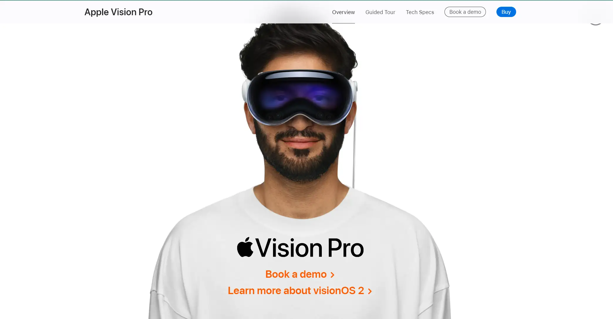
The Apple Vision Pro marks Apple's entry into spatial computing, blending digital content with the physical world using cutting-edge technology. By labeling the headset as a "Pro" product, Apple is positioning it for professionals and high-end consumers with this initial release.
The one page site design of Apple Vision Pro is excellent with its abundant content, high-quality videos and detailed descriptions.
On the official website, pricing varies based on customization options. If you choose to pay in installments, the cost starts at $3499 or $291.58 per month for 12 months.
Major Design Elements
High-quality: VideosVideos cover my scenarios that Apple Vision Pro can be worn. They directly showcase its advantages.
Bold Fonts: The bold fonts are suitable for the introduction of the product, which leaves a great impression on the audience of the website.
Interaction Buttons: A lot of interaction buttons make those who are interested in the product or one feature of it know more details. In this way, visitors become willing to order it.
Engage with Visuals: Use high-quality images, videos, and animated transitions to grab attention and communicate your brand message.
2. Banyak Surf Adventure
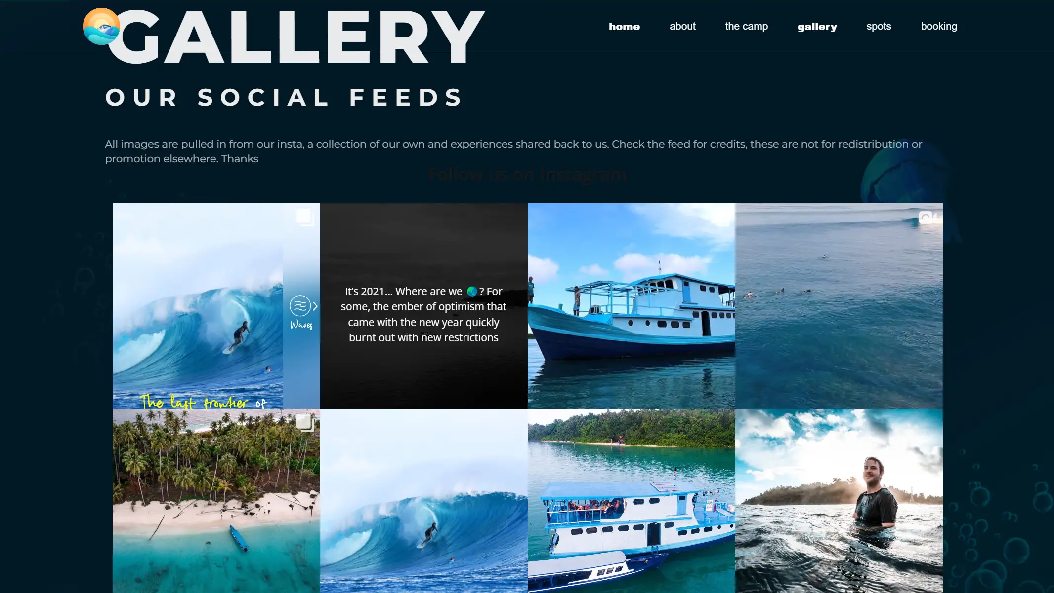
You may like travelling or not, but the one page site of Banyak Surf Adventure may attract your eyeballs and leave you great impression on the tourist destination. The website features intuitive menu items like "the camp," "gallery", and "booking" options, making navigation effortless for new visitors. The gallery links directly to their Instagram photos, while the overall copy evokes a sense of travel and adventure, enhancing the fun and engaging experience.
Major Design Elements
High-Resolution Images: The breathtaking images in the gallery showcase the scenic surf spots and the remote beauty of the Banyak Islands. These visuals immerse users in the tropical paradise that awaits them.
Proper Copy: The website's copy is concise and inviting, perfectly tailored to adventurous travelers. It effectively highlights the exclusivity of the surf breaks and the unspoiled nature of the destination, compelling visitors to explore more.
Seamless Navigation: Anchored links and smooth scrolling ensure users can access all the essential information without leaving the page, providing a clean and efficient browsing experience. Additionally, social media integration adds a dynamic element, keeping the site fresh and up-to-date.
3. Gopuff
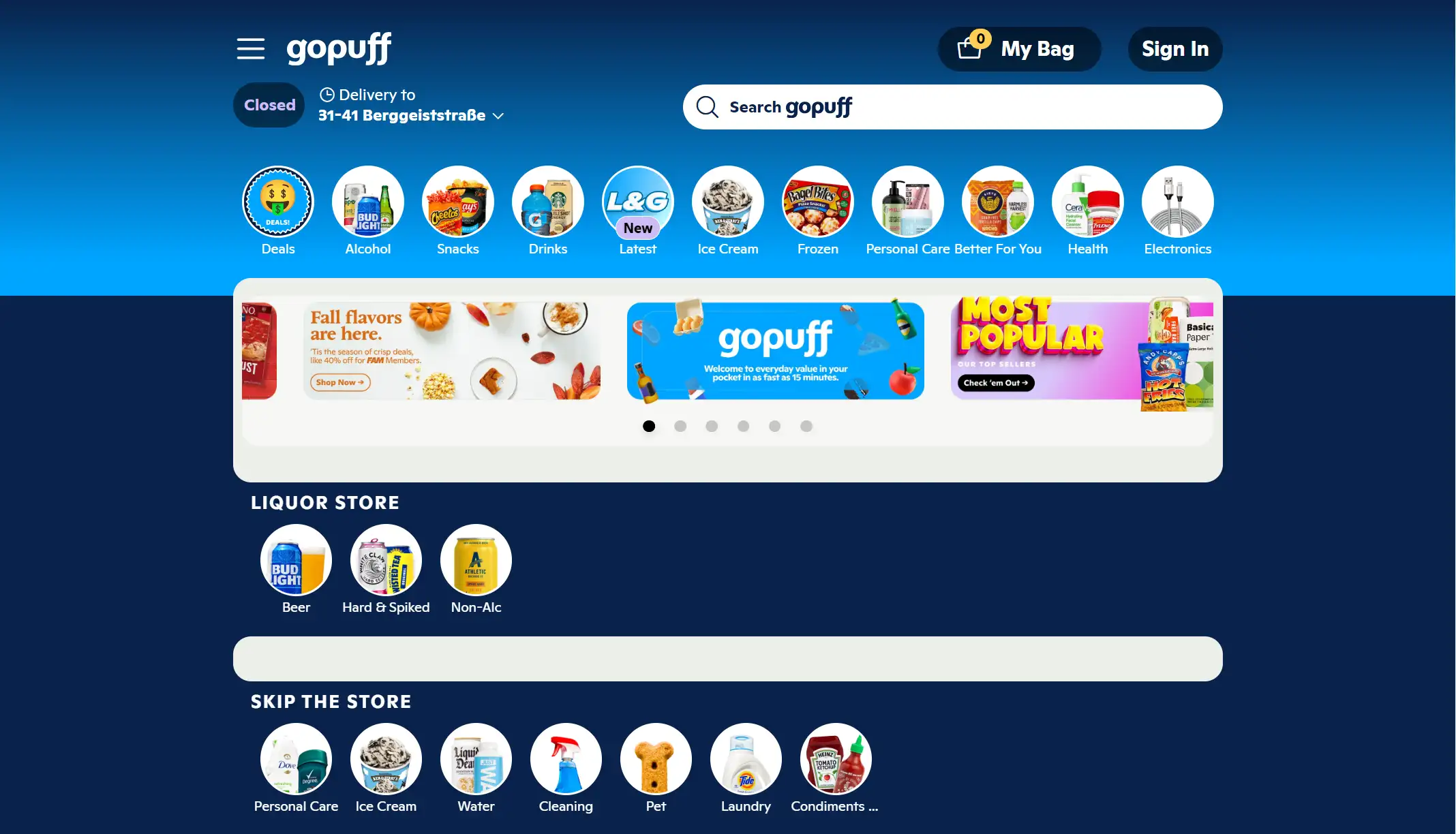
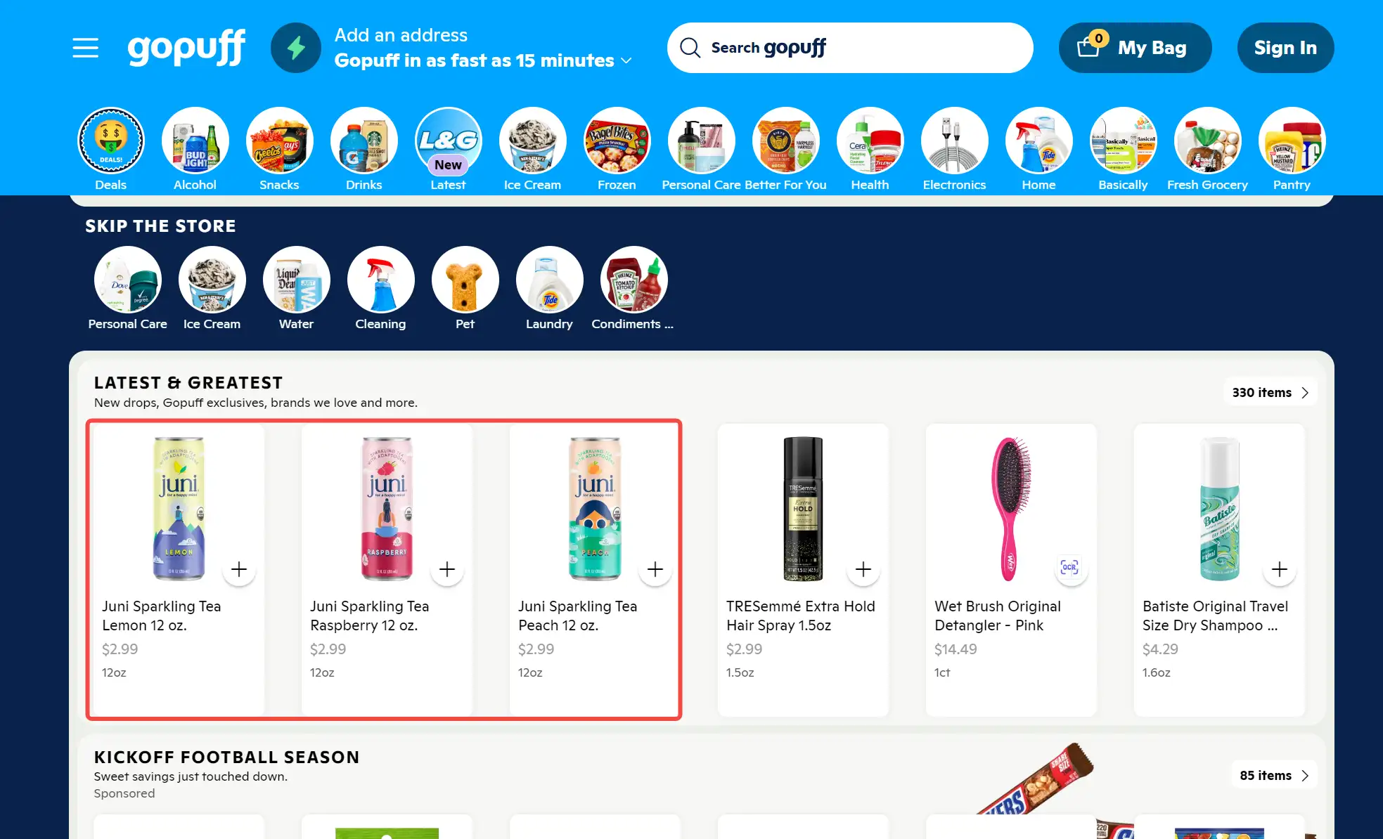
GoPuff, headquartered in Philadelphia, is an American company specializing in consumer goods and food delivery. Customers can use Gopuff to order snacks, essentials, alcohol, and more via its app or website. After entering your delivery address, you can view all available items from the nearest Gopuff facility. It is a great one page website example for groceries or other e-commerce.
According to statistics, GoPuff generated approximately $1.2 billion in revenue in 2023, a decline of around $300 million in the previous year. Besides, over 20 million people have downloaded the app, with 1.8 million active users.
Major Design Elements
Easy Navigation: You can browse the page by either scrolling or using the top menu.
Clear Layout: Each product is displayed with a photo, and its price is listed beneath, making it easy to spot items of interest.
Accurate Classification: Although the products fall under the same category, they are individually labeled by name. For instance, three different beverages are available, allowing you to select one based on your preference.
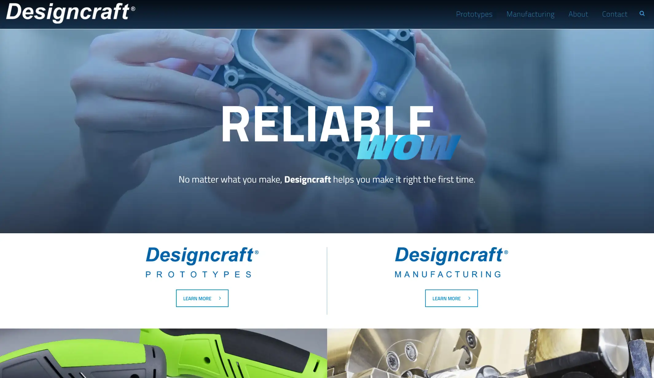
4. DesignCraft
Since 1980, Designcraft has created quality prototypes and visual models at our main location in Lake Zurich, Illinois. Streamlined, simplified, and cost-effective – that’s the service Designcraft set out to create by adding manufacturing to our broad range of capabilities. Designcraft's core services include CNC machining, molding, casting, additive manufacturing, finishing, design and engineering, and rapid manufacturing.
Major Design Elements
Portfolio Focused: By showing their work via photos, which is key in the manufacturing industry.
Simple Design: Clean design with no nonsense copy, but you can get the value of the company, its team, and its service.
On-Brand Imagery: All visuals reflect the brand's capabilities in manufacturing, ensuring a consistent and immersive experience for visitors.
5. Juan Mora
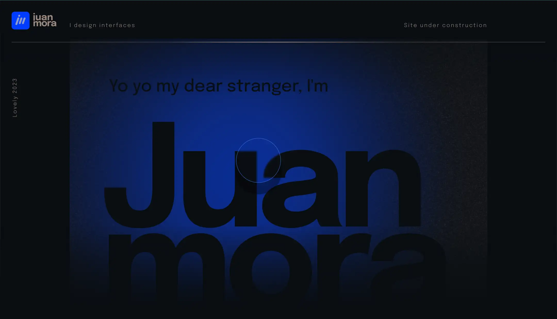
Juan Morar is a Design Director working on apps and websites that create a strong digital presence for brands. The interaction of this one page site is extraordinary. The one page website design is creative. For example, the cursor shown on this website is a circle but a lighter. It will highlight anywhere it shines.
Major Design Elements
Creative Interaction: The designer changes the common arrow cursor into a circle one as a lighter to light up somewhere dark. Besides, the sphere will shine to different angles with cursor moving. Meanwhile, you will notice the shadow of the cursor. And you can easily think of solar space.
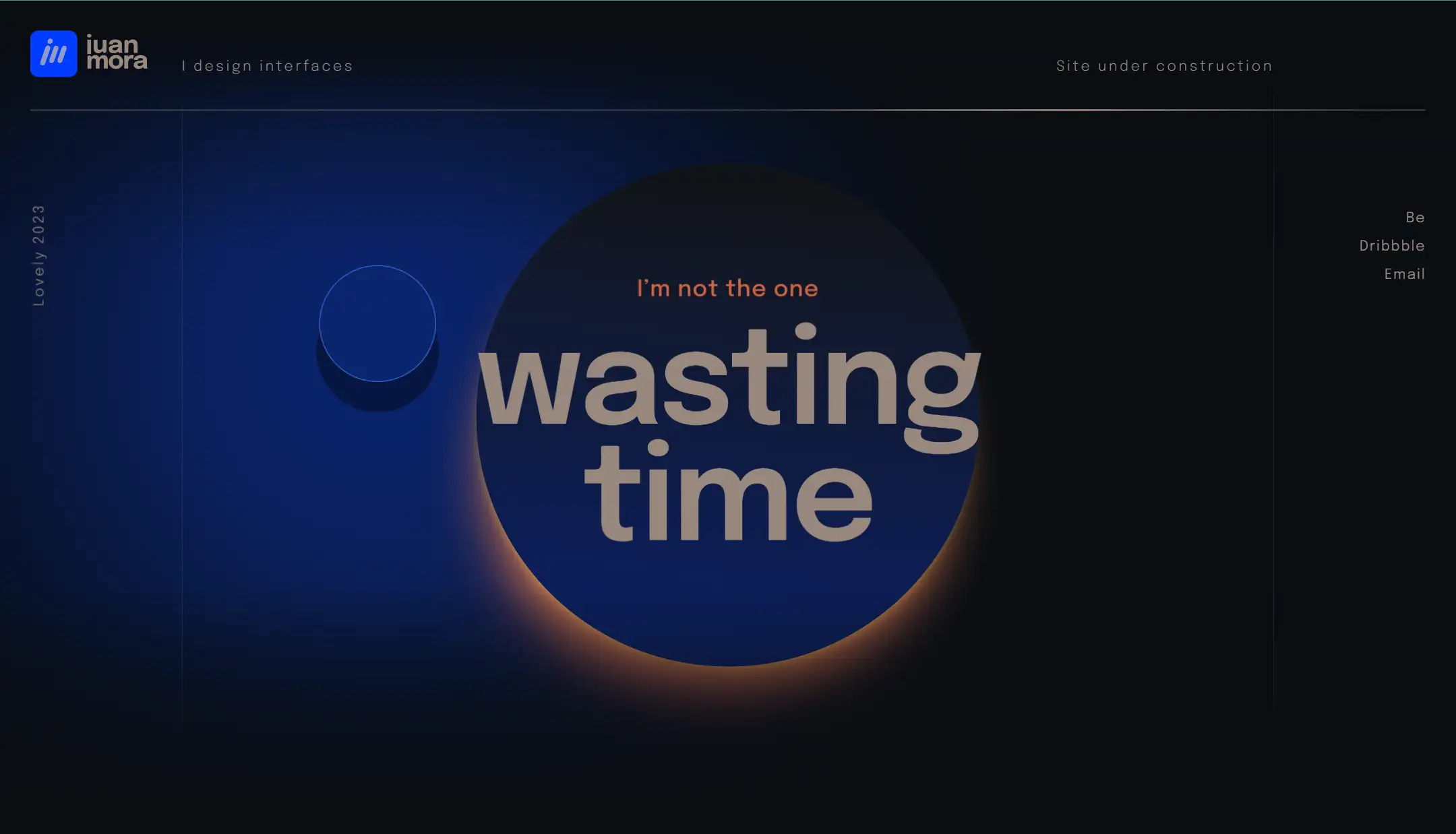
Humorous Words: When you want to scroll down, you will find a so-called note, read "This site is under construction." Then, if you keep scrolling the web page, you can have a feeling that the cute author is talking to you. Next, you become more curious about what's on the next page. (I'm also addicted to scrolling down XD)
Appealing Fonts and Formats: You can notice that keywords on the page are big, bold, and with an apparent color. The rest of the information is written in small, orange words. The formats are also attractive to the visitor. For example, "there was a loser user that kept scrolling down".
6. Get Structure
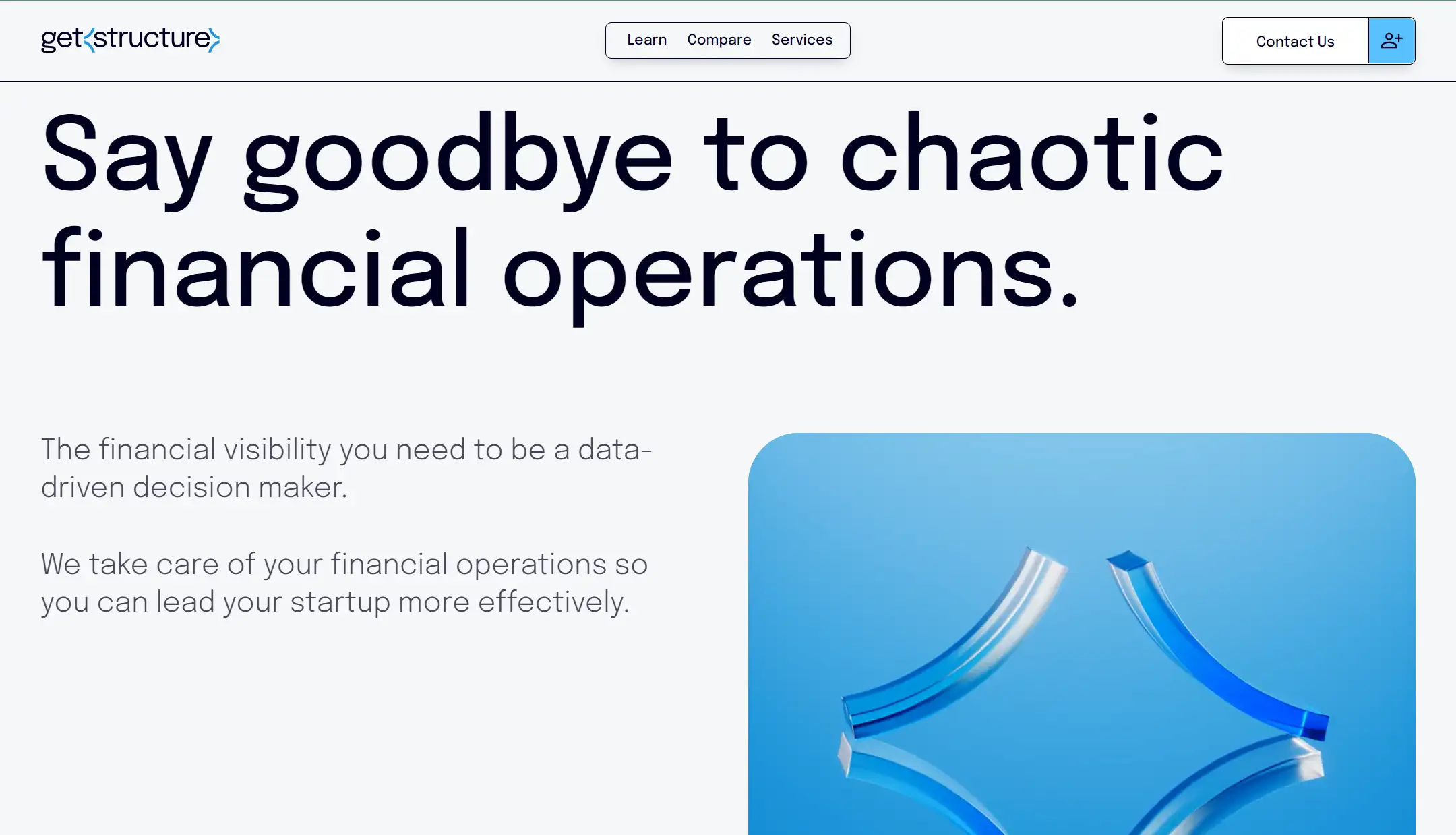
With Get Structure, you gain a clear overview of your business's health through a single dashboard that consolidates all key metrics and data. Get Structure provides financial operations as a service, ensuring our client's finances, tech stack, and processes are organized and taken care of.
Using the one page website, the one page website designer shows the capabilities and achievements well of the company, helping to win the trust of users.
Major Design Elements
Engaging Imagery:A dynamic gift immediately captures attention and sets the tone for the rest of the site.
Portfolio-Centric:Robot Genius highlights their work through embedded videos, allowing the content to take center stage, which is crucial in the film industry.
Keep it Simple: Prioritize clarity. Every element should serve a purpose.
7. Sanstete
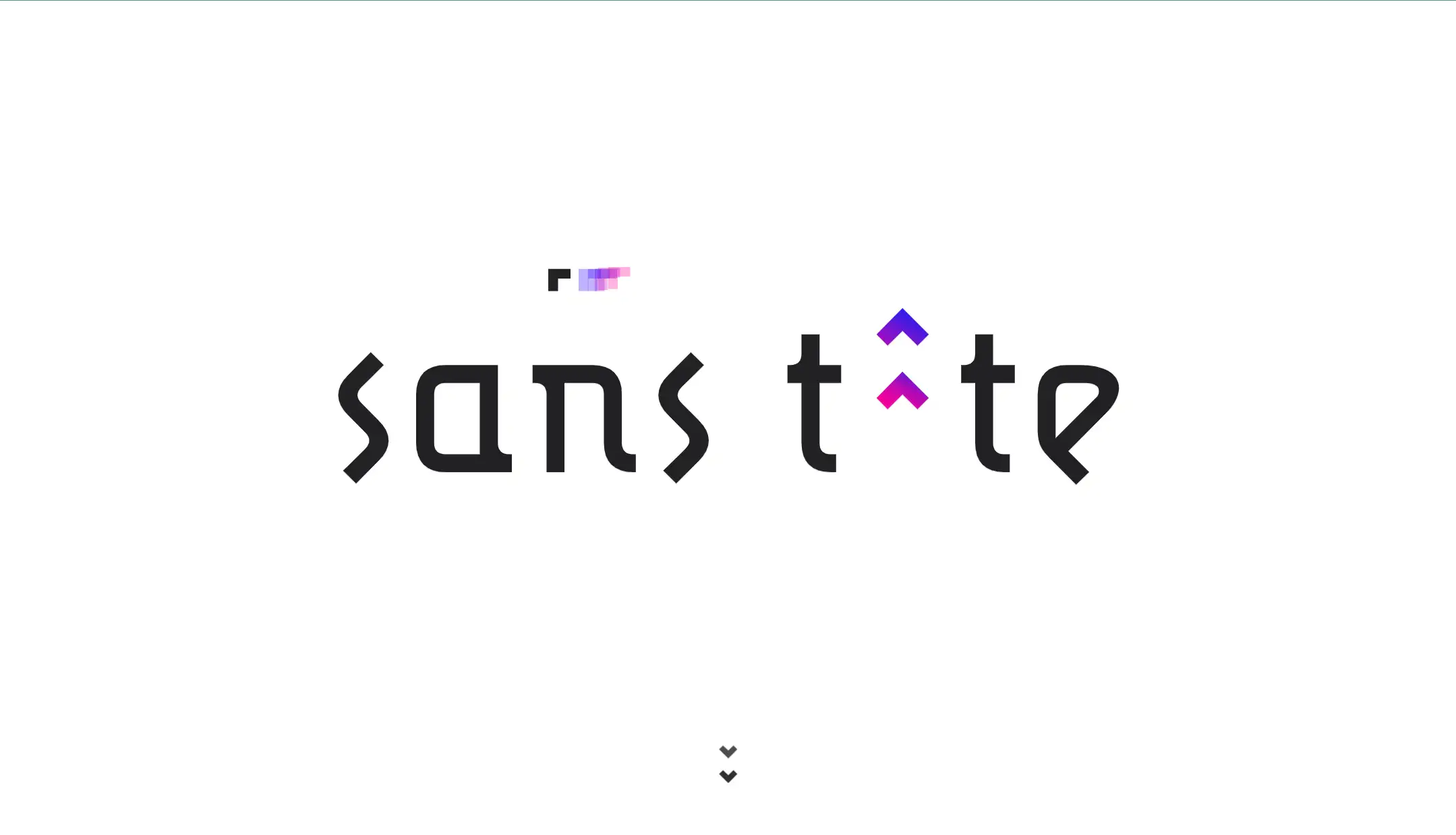
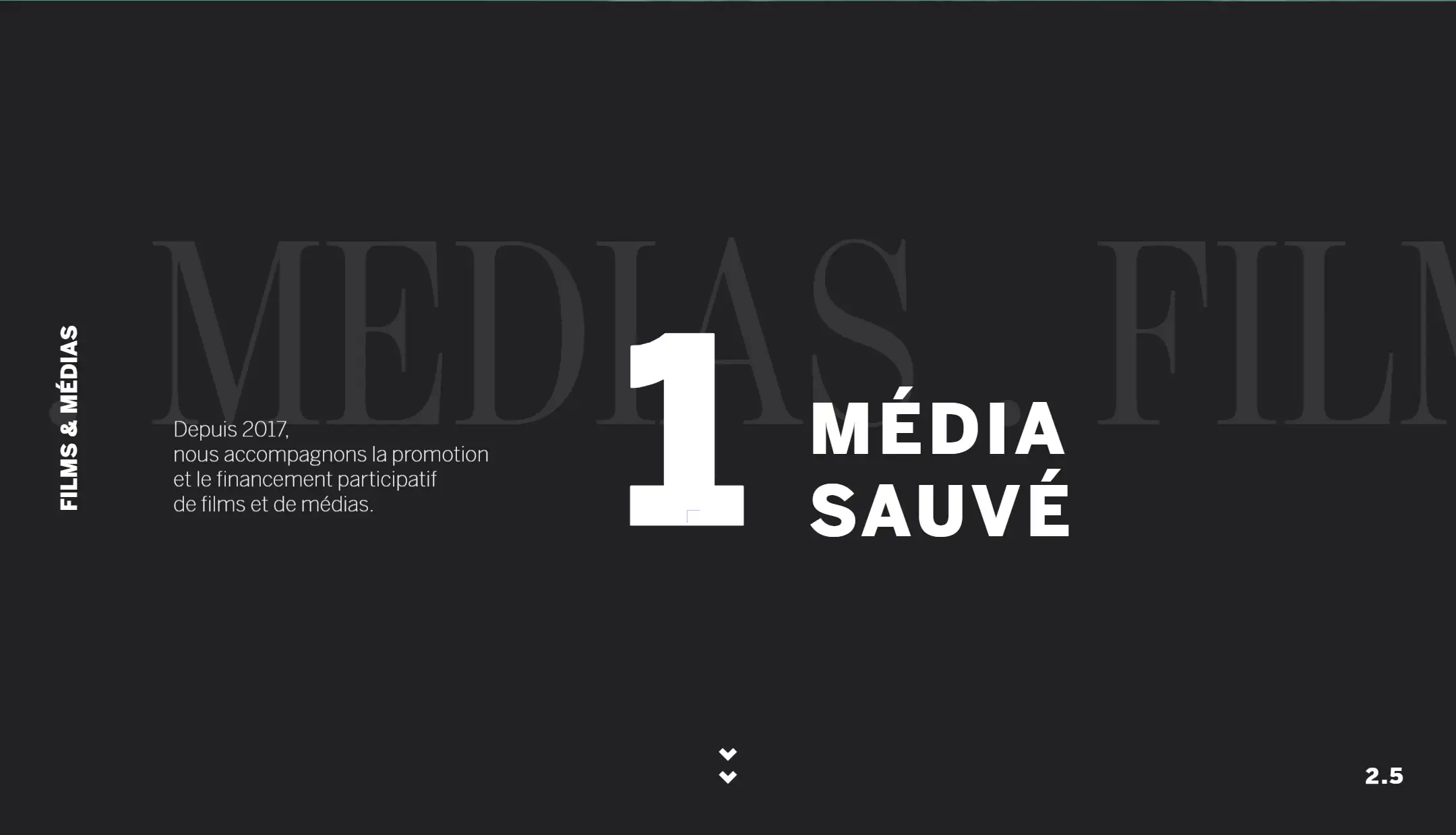
Since 2017, Sanstete has been dedicated to supporting the promotion and crowdfunding of films and media. The website provides targeted advice on crowdfunding strategies for both film financing and other media projects. Its intuitive design features sections that address key topics, including content strategy and community engagement. Although the one page site is simple, it covers all important information.
Major Design Elements
Dark Mode: A sleek, dark theme enhances visual appeal and reduces eye strain, providing a modern and comfortable browsing experience
Interesting Cursor Design: A cute cursor design adds a unique touch to the browsing experience, making navigation more engaging and visually appealing.
Achievements Showcase: Highlighting key accomplishments and milestones adds credibility and emphasizes the designer’s expertise, enhancing their profile and engaging visitors with their success stories.
8. Pixel Lab
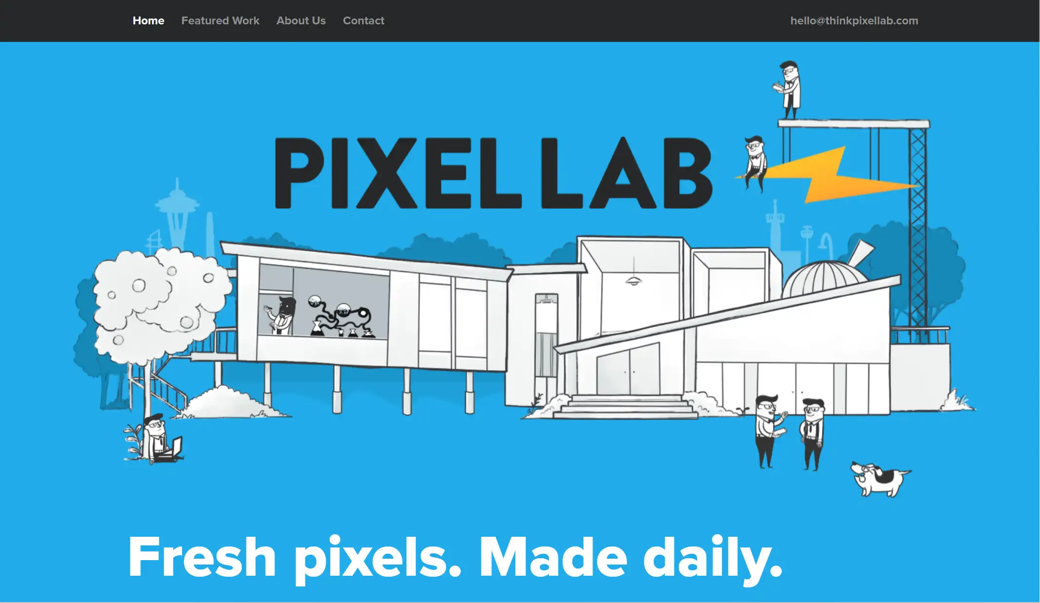
Pixel Lab is an award-winning design and development studio in Seattle. It was founded in 2008. So far, it has done 68 successful projects. Their works have received over 90 million views.
From the one page website of Pixel Lab, we are clear that the areas of expertise of the team involve Web, app development, mobile and unique form factor, marketing analytics and all things related to user experience and design. It specializes in creating simple, fun and intuitive experiences for the web and devices.
Major Design Elements
Simple Layout: The website features a clean and minimalistic design that enhances usability. The focus on simplicity allows users to navigate effortlessly, while the intuitive structure highlights key content without overwhelming visitors with unnecessary elements.
Clear Emphasis: The website places a clear emphasis on the company’s expertise in web, app, and mobile development, as well as user experience and design.
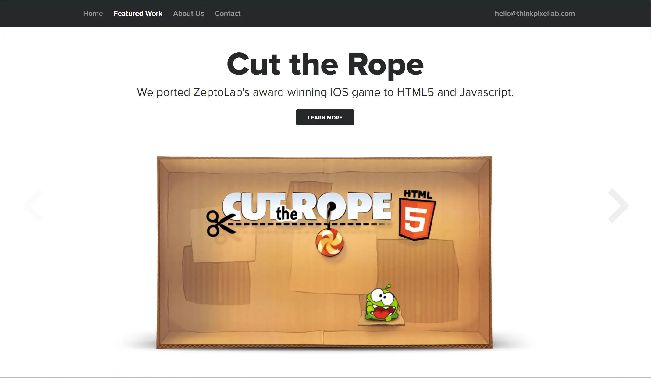
Visual Achievements: Pixel Lab showcases its portfolio visually, highlighting major accomplishments like helping Red Bull share the world's most ambitious bike race in real-time 3D, reimagining Flight Simulator for the modern web, etc. These visual achievements help reinforce the team's technical capabilities and design excellence. As in the photo below, it shows that Pixel Lab ported ZeptoLab's award-winning iOS game to HTML5 and Javascript.
9. Dolox
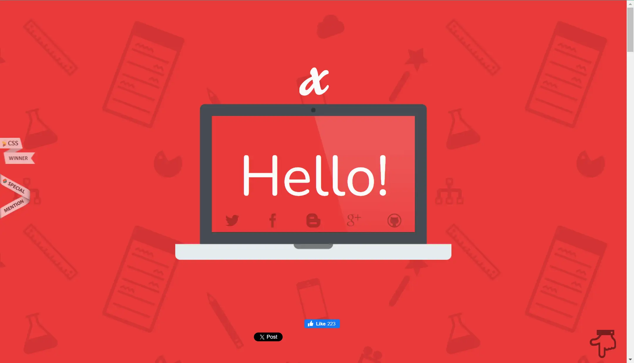
Founded in 2004, Dolox, Inc. is a software design and development company. Originally based in Philadelphia, the company relocated to New York City in 2013. Its one page website design is worth everyone learning.
Major Design Elements
Vivid Introduction: At the beginning of the page, there is a laptop with "Hello". Following that, more words come to your eyes, and then you will realize that it's a dynamic introduction of Dolox. It's very interesting.
Clear List of Services: The website outlines the company's offerings in 8 fields, each designed to communicate its specialties concisely, highlighting its technical capabilities, credibility, and communication skills.
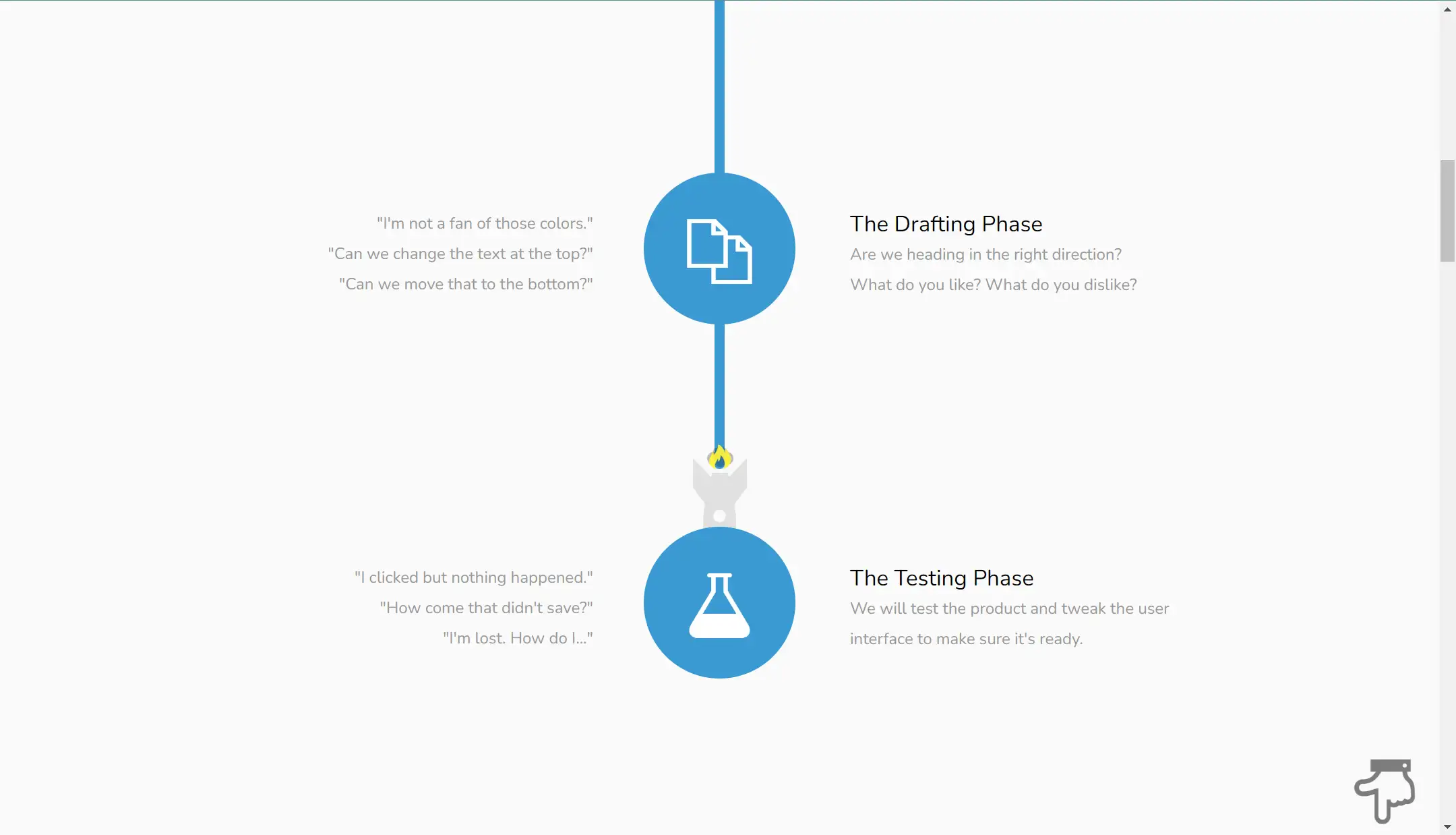
Strong Interaction: When scrolling down, you make it clear about the workflow of the company, including the specifition, the drafting phase, the testing phase, and the shipping of the product. Many quotations are listed on the left, showing the problems of users when using some electronic products. The suggestions are on the right, which can win the trust of the users.
10. Oovra
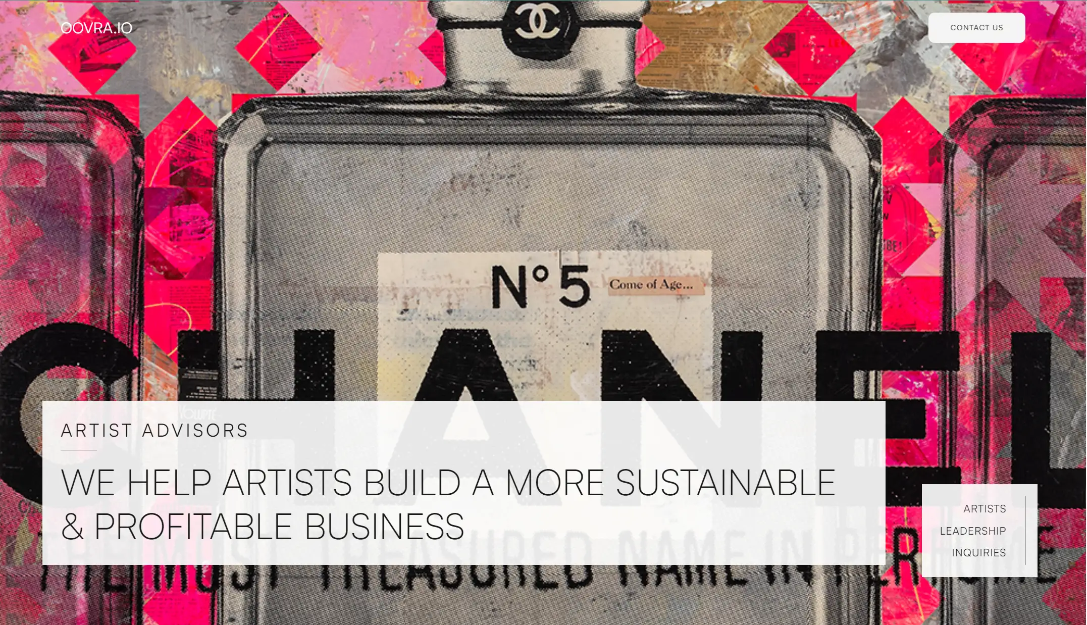
Oovra, an Arizona company, is a provider of professional services that provides dedicated sales and support for artists. Oovra represents artist studios, turning fans and followers into collectors. The one page site also represents that it transforms social media engagement into tangible sales and deeper audience connections, freeing you from constraints.
Major Design Elements
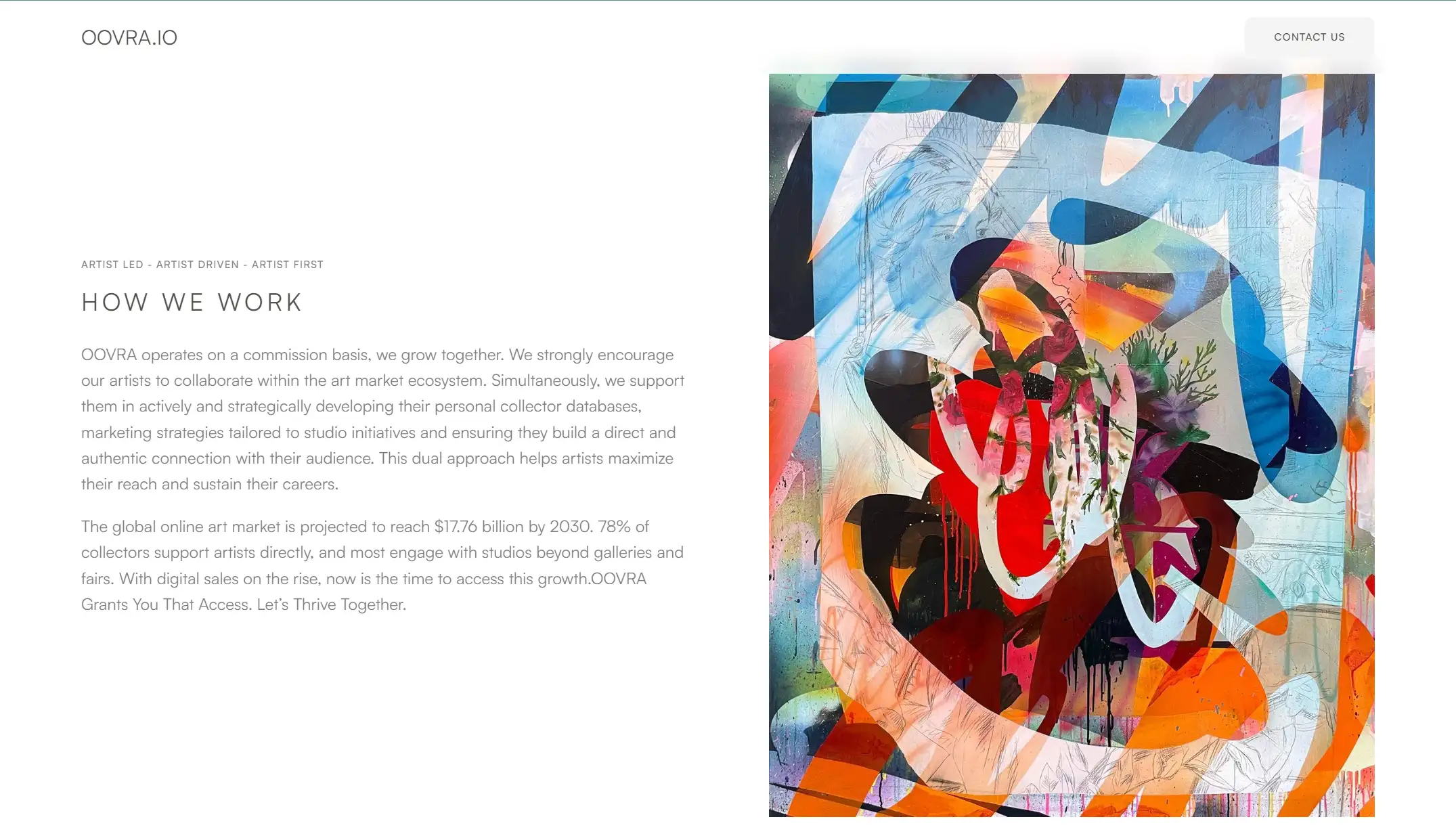
Strong Artistry: Upon entering the one page website, visitors are immersed in an art museum-like experience. The visuals are carefully curated, with images and accompanying text seamlessly blending together to create a harmonious and artistic atmosphere.
Delicate Layout: The site layout resembles a high-end magazine, presenting content with elegance and sophistication. Each section is meticulously designed to highlight the artists' work in a visually appealing way.
Creative Pictures: The images showcase the artists' talents and their ability to anticipate and respond to global trends. These creative works not only demonstrate their skill but also foster strong connections with clients and consumers, turning engagement into meaningful relationships.
11. Café Frida
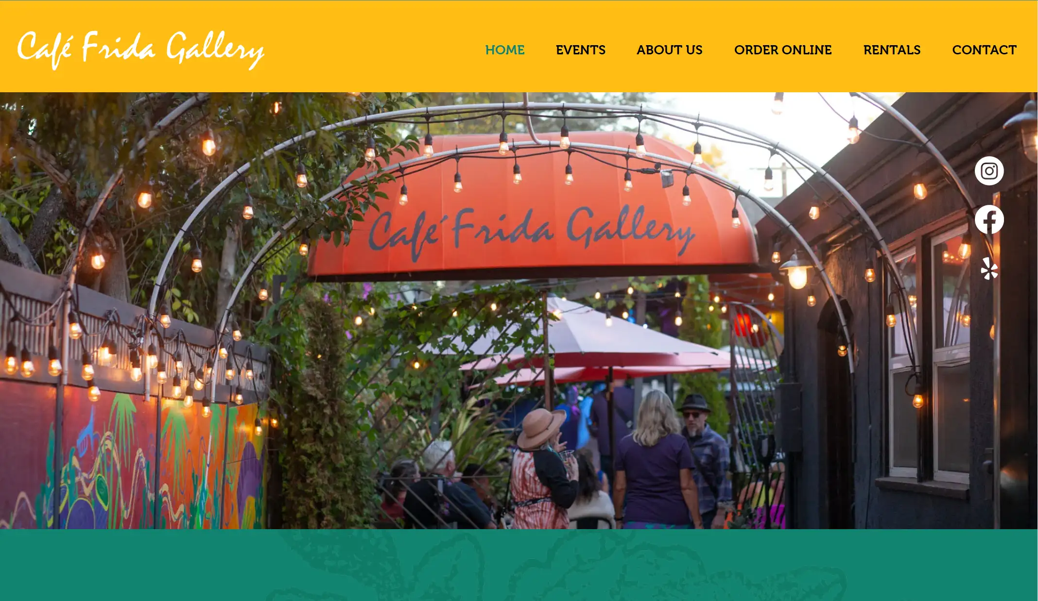
Café Frida Gallery was created by Mamadou Diouf and Mario Uribe to provide a much-needed artist hangout in Sonoma County.
Café Frida Gallery, located in the heart of the SOFA Arts District in downtown Santa Rosa, serves as both a gallery and café. Its mission is to support Sonoma County artists while offering a diverse selection of healthy foods. This one page site also shows it acts as a lively hub for community events and gatherings.
Major Design Elements
Immersive Design: Full-screen visuals and interactive elements create an engaging experience.
Colorful Mode: Instead of Dard mode, like many other single page websites, this website adopts colorful style, which is in line with its services and production.
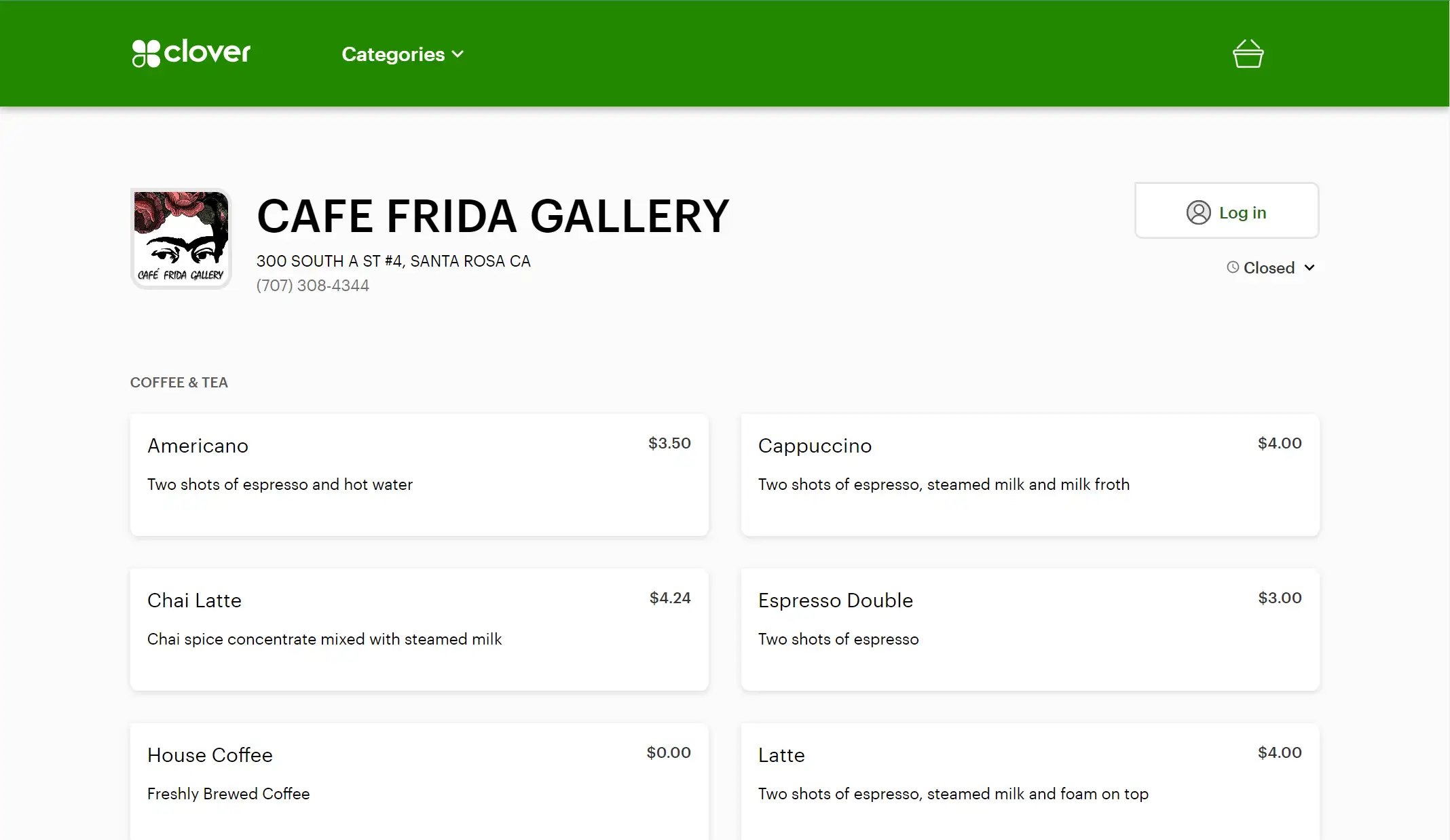
Simple Layout: As a whole, the website is short and simple, giving the main introduction ranges from who they are, and what they do to how to rent their place. But if you are eager to know more details about certain part, you can click the relevant button. For example, if you want to order a meal, you can click "ORDER NOW". Then you can see the page below.
12. We Ain’t Plastic
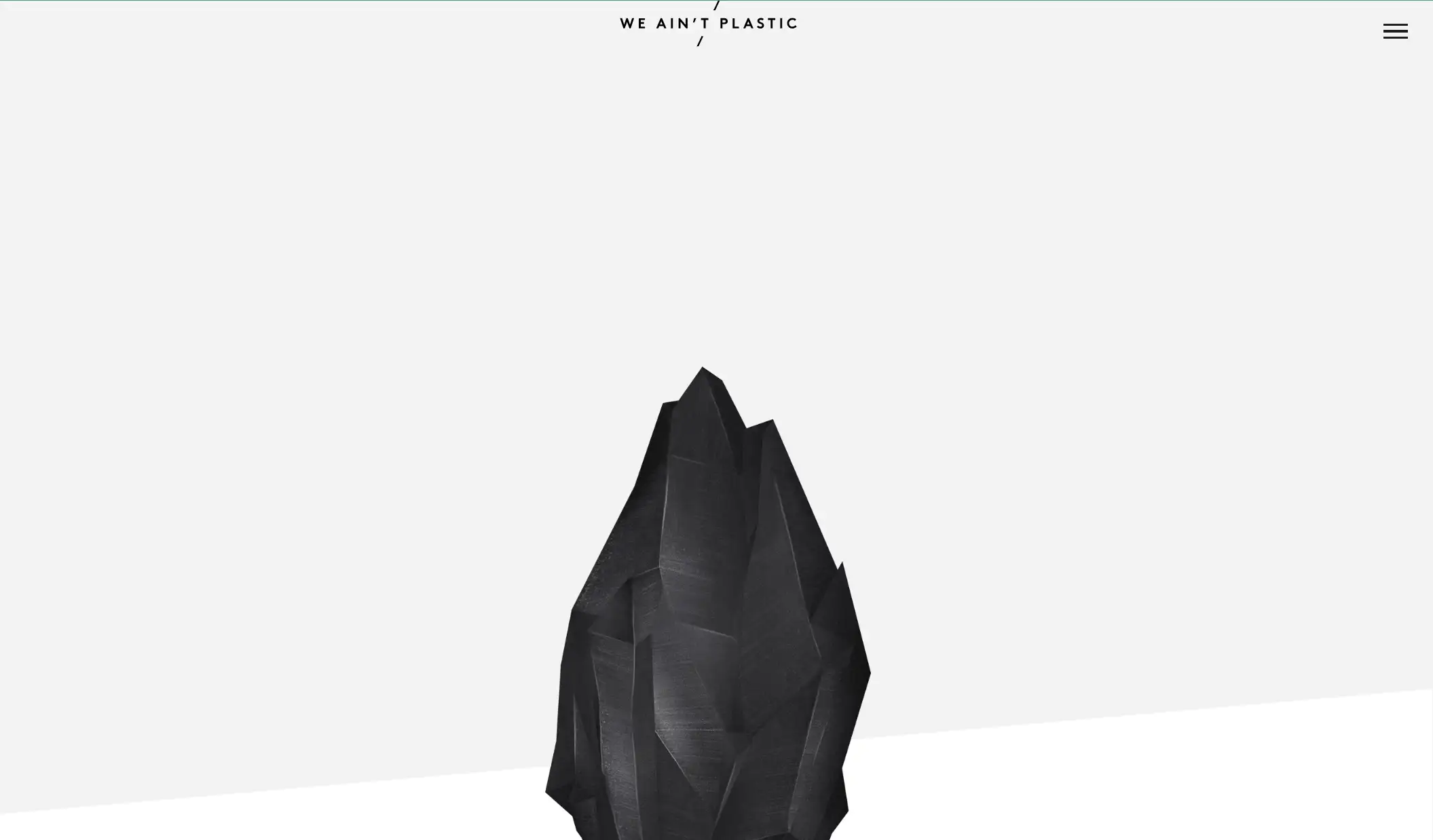
We Ain’t Plastic is the digital portfolio of Roland Lösslein, a Creative Technologist and User Experience Engineer based in Berlin. This one-page site displays his extensive background in developing digital products, encompassing product design, user experience innovation, and implementation.
Major Design Elements
Engaging Visual Design: Full-screen visuals and interactive features immerse visitors in the portfolio, creating an engaging experience that encourages further exploration.
Icon-Based Communication: Strategically placed icons highlight the artist’s strengths and services, offering a clear and concise representation of their offerings.
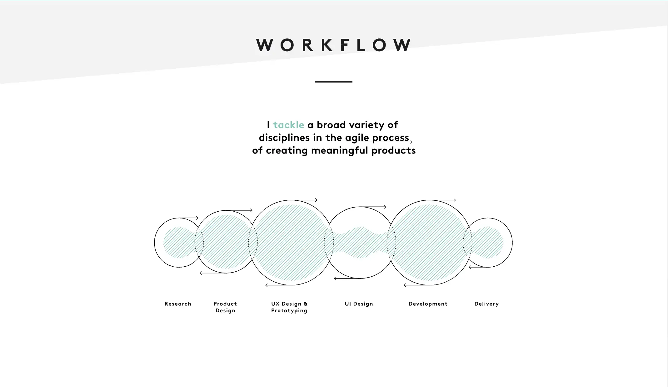
Visual Workflow: The designer also makes the workflow visible, involving research, product design, UX DEsign&Prototyping, UI Design, Development, and Delivery. This reflects the professional skills and capabilities of the team.
How to Build a One Page Website?
Building a website isn't difficult, and one-page websites are no exception.
Modern web design favors minimalism, focusing on clean layouts, easy navigation, and mobile-first functionality. Simplicity often delivers a stronger impact.
Unlike multi-page websites, which emphasize structure, single-page sites focus on clarity. They present key information on a single scrollable page, making it ideal for guiding visitors to a specific action without overwhelming them.
Understand the Purpose of Your One-Page Site
Before you begin, it's important to define the purpose of your site. Browse examples of other one-page websites to see how they convey their messages. Identify your goals, target audience, and desired features to choose the right template. Knowing these elements will help you create a focused, engaging site.
Your website is one of the most powerful marketing tools at your disposal. The key to success lies in understanding your objectives and shaping the direction of your one-page site to meet those goals.
Build Your Website
If you want to use your AI assistant to help you build a website, the following guides may help you. Let me take Wegic as an example.
Step 1: Log in.
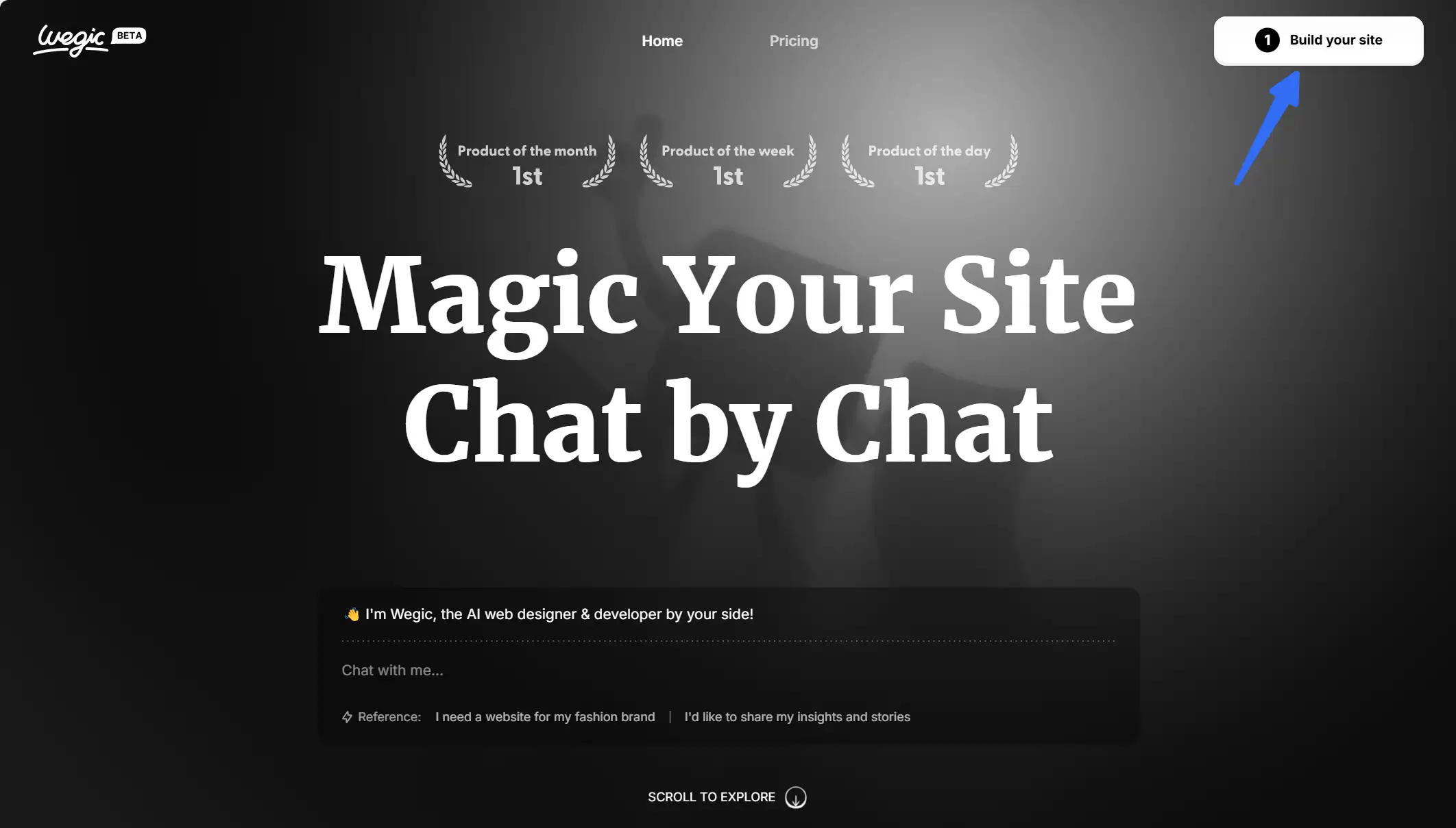
Step 2: Create a New Website
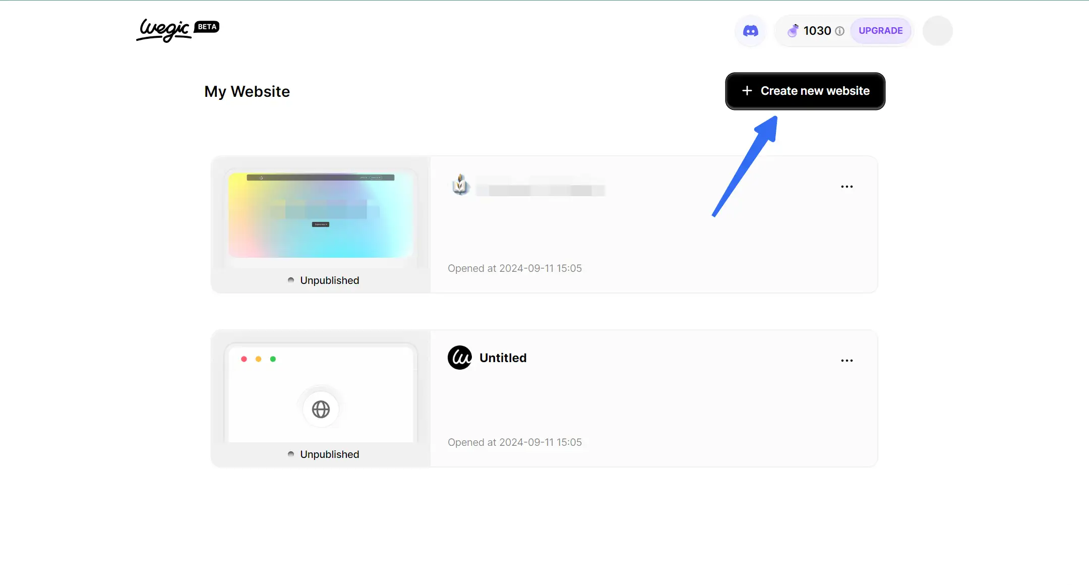
Step 3: Define Your Website Concept
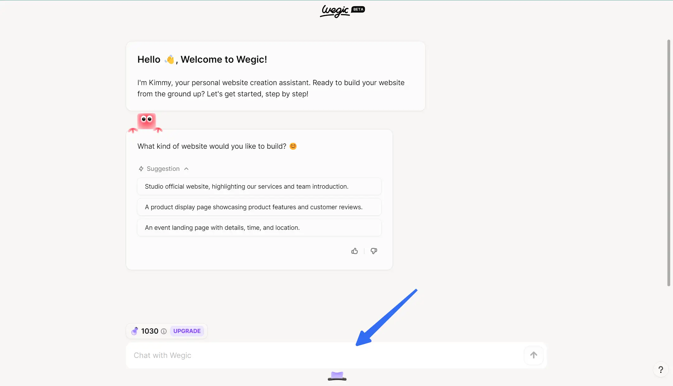
In this step, you can tell the AI assistant want to build a one page website, and you want to name it as XXX. Through conversation, your expected website can be built within seconds.
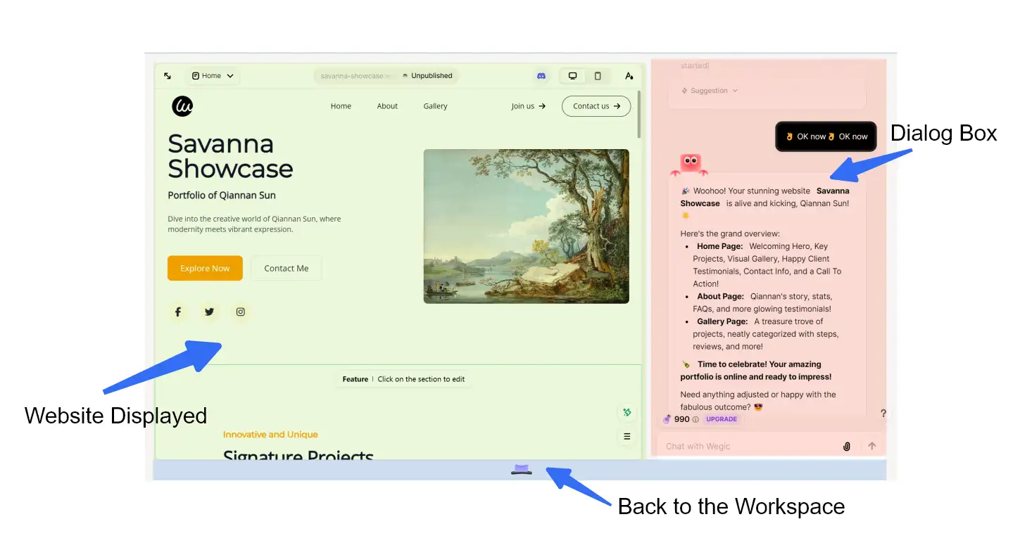
Step 4: Wegic Interface Overview
According to our preferences, Wegic will present the page.
Register a New Domain
Start by choosing a suitable name for your website. A domain, also known as a web address or URL, is your site’s online home. A strong domain name can improve your search engine rankings, increasing the chances of attracting visitors. Once you’ve chosen a name, register it with a domain registrar.
Keep in mind that you’ll also need a hosting provider to house your website. If coding isn’t your strength, consider an all-in-one solution like Wegic, which simplifies the process of building and hosting your site.
Customize Your One-Page Website
When organizing your website’s content, you have plenty of flexibility. Consider sharing your story through blog posts, or arrange your content using customizable drag-and-drop sections. Using the Design panel, you can adjust fonts, colors, spacing, and more to create a custom look that reflects your style. Essential elements to consider include a homepage, an "About Us" section, a contact page, and an FAQ page. Remember, the goal is to create a seamless and cohesive user experience throughout the site.
Optimize Your Website for Search Engines
Search engine optimization (SEO) is crucial for making your website visible in search engine results, particularly on Google. By following basic SEO practices, you can drive more traffic to your site. Use relevant keywords in your content to boost your rankings, but ensure they fit naturally and serve a purpose. But avoid overusing keywords.
Additionally, keep your visitors in mind when optimizing your site. Ensure the navigation is simple, and that pages load quickly for a better user experience.
Test Your Website
Before launching your website, thoroughly test it to ensure everything works as expected.
Proofread your content for accuracy and errors. Ensure all links are working properly and remove any placeholder text from your theme. Test the site across multiple browsers like Chrome, Firefox, and Safari. Next, connect to Google Analytics to monitor performance after launch. Finally, get feedback from users to identify any areas for improvement.
FAQ

What is a One-Page Website?
A one-page website, also known as a one-pager or landing page, consists of a single HTML page. Unlike multi-page websites where navigation menus link to separate pages, a one-page site’s menu connects to different sections of the same page. This format offers a simple and efficient way to present information, much like a digital business card or flyer, making it ideal for individuals or small businesses seeking a straightforward online presence.
How Do I Build a One-Page Website?
Building a one-page website is easy with platforms like Wegic and Wix. These services provide user-friendly tools and pre-designed templates, allowing you to create a functional and visually appealing one-page site without much hassle.
Can I Create a One-Page Website for Free?
Yes, platforms like Wegic offer a variety of free templates specifically designed for one-page websites. You can get started at no cost while still having access to essential design features.
Is Wegic a One-Page Website Builder?
Wegic is a flexible platform capable of building both multi-page and one-page websites. Its range of templates, including those specifically created for one-page designs, makes it an excellent choice for creating a streamlined online presence.
Is a One-Page Website Good for SEO?
When designed with SEO best practices in mind, a one-page website can perform well in search engine rankings. In some cases, it can even outperform traditional multi-page websites, particularly if the content is optimized correctly.
When Should You Use a One-Page Website?
A one-page website is ideal when the content can be easily organized into distinct sections on a single page. Users scroll down to access information instead of clicking through multiple pages, simplifying the navigation experience.
Ease of Use: One-page websites are favored for their simplicity. Users enjoy easy navigation with more scrolling and less clicking, which makes it quick and intuitive to find information.
User Engagement: Single-page designs can boost engagement by keeping users focused on a single, coherent message. However, the content must remain digestible and well-organized to maintain attention.
Improved Communication: One-page sites eliminate distractions by presenting information in a linear flow. Instead of spreading content over multiple pages, this format allows for a seamless, story-like experience, which can enhance user satisfaction and drive higher conversions.
Conclusion
One-page websites offer a cost-effective solution by condensing all essential information into a single, scrollable page. They are easy to set up, maintain, and navigate, making them ideal for small businesses, personal portfolios, or event promotions. With a clean, focused layout, one-page websites allow you to deliver your message quickly and clearly, without overwhelming visitors with multiple pages.
The 12 best one page site examples here will help you gain more useful information you need, and you can also create your website based on your specific demand.
If you’re looking for more guides on building a website, I’d recommend checking out these articles:
Written by
Kimmy
Published on
Mar 17, 2026
Share article
Read more
Our latest blog
Webpages in a minute, powered by Wegic!
With Wegic, transform your needs into stunning, functional websites with advanced AI
Free trial with Wegic, build your site in a click!
What kind of website do you want to build?