Log in
Build Your Site
Best Fonts for Websites in 2025: Readability Meets Style
Discover the best fonts for websites in 2025. Our expert guide covers top choices for readability, style, and performance to elevate your site's design and user experience.
In the digital world, your font is your voice. In the first 50 milliseconds a user spends on your site, they form a subconscious opinion—and your typography is doing most of the talking. It’s a silent ambassador for your brand, capable of building immediate trust or creating instant friction. The choice of font is far more than a minor design detail; it's a critical business decision that directly impacts user trust, brand perception, and ultimately, your bottom line. Yet, with thousands of options available, the process of selecting the perfect typeface can be overwhelming. A wrong choice can lead to poor readability, high bounce rates, and a diluted brand message.
This article is your definitive guide to navigating the world of web typography in 2025. We will not only present a curated list of the best fonts for websites but also provide a strategic framework for choosing them. This comprehensive guide delves into the nuances of readability, aesthetics, web font performance, and font readability and accessibility, ensuring your website not only looks stunning but also delivers a flawless user experience. By understanding these principles, you can transform your site's typography from a mere stylistic choice into a powerful asset.
The Critical Role of Typography in 2025
The importance of typography has grown exponentially as digital landscapes become more competitive. It's no longer enough for a website to be functional; it must be experiential. The right font choice is at the heart of creating a positive and memorable user experience.
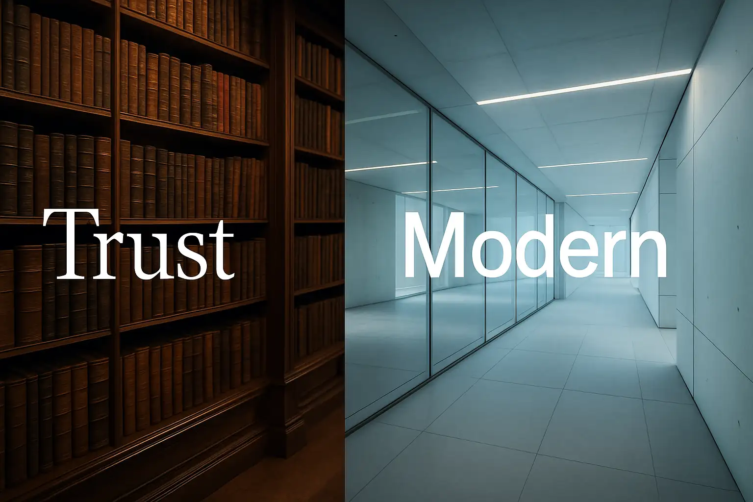
The psychology of fonts is a powerful tool in branding. Different styles evoke distinct emotions and associations, shaping how a user perceives your business. The classic sans-serif vs serif fonts debate is the most prominent example.
- Serif Fonts: With their small decorative strokes, serif fonts convey tradition, authority, trust, and elegance. They are often used by institutions that want to appear established and respectable, such as financial firms, universities, and distinguished publications.
- Sans-Serif Fonts: Lacking these strokes, sans-serif fonts present a clean, modern, and approachable feel. They are the go-to choice for tech startups, minimalist brands, and any business wanting to project an image of clarity and innovation.
Beyond psychology, font readability and accessibility has become a non-negotiable cornerstone of modern web design. A beautiful font that cannot be easily read is fundamentally a failed font. Web Content Accessibility Guidelines (WCAG) now play a crucial role, and font choice is a major component. This includes using typefaces with clear, distinct letterforms, ensuring sufficient color contrast, and providing scalable text that remains legible for users with visual impairments. Prioritizing accessibility isn't just an ethical choice; it expands your audience and improves the user experience for everyone.
Finally, the technical aspect of fonts has a direct impact on your search engine ranking. Web font performance is a key factor in Google's Core Web Vitals, a set of metrics that measure user experience. Fonts are render-blocking resources, meaning the browser must load the font file before it can display the text. Using too many fonts or relying on large, unoptimized font files can significantly slow down your site's loading time, negatively affecting metrics like Largest Contentful Paint (LCP) and Cumulative Layout Shift (CLS). A fast-loading, high-performing website is favored by search engines, making font optimization a crucial part of any effective SEO strategy.
How to Choose the Perfect Website Font: An Expert's Framework
With a clear understanding of why fonts are so important, the next step is learning how to choose a website font. This expert framework breaks the process down into logical, actionable steps, empowering you to make an informed decision that aligns with your brand and audience.
Define Your Brand Personality
Before you even look at a single font, look at your brand. What is its core personality? Is it modern and minimalist, classic and elegant, bold and quirky, or friendly and approachable? Your font is a key visual element that must align perfectly with this identity. A law firm would not use a playful, rounded font, just as a children's toy store would avoid a rigid, traditional serif. Make a list of adjectives that describe your brand and use it as a reference point throughout the selection process.
Understand Font Classifications
Every font falls into a broader category, each with its own distinct characteristics and ideal use cases.
- Sans-Serif: As the digital default, these fonts are prized for their clarity and readability on screens of all sizes. Their clean, simple letterforms create a modern and uncluttered look, making them ideal for body text, user interfaces, and corporate branding.
- Serif: Once seen as primarily for print, serifs are experiencing a digital renaissance. They add a touch of elegance, authority, and class. They work exceptionally well for headlines, luxury fonts for websites, and brands that want to convey tradition and trustworthiness.
- Display: These are the personality fonts. Often bold, artistic, or highly stylized, display fonts are designed to grab attention. They should be used sparingly, exclusively for headlines, logos, and short, impactful statements. Using a display font for body text is a critical design mistake that severely compromises readability.
- Monospace: In these fonts, every character occupies the same amount of horizontal space. This creates a technical, retro, or typewriter-like feel, making them a niche choice for developer portfolios, tech blogs, or brands with a quirky, intellectual identity.
Embrace the Future: The Power of Variable Fonts
The single most important trend in web typography for 2025 is the adoption of variable fonts. A variable font is a single, highly efficient file that contains multiple stylistic variations—including weight, width, and slant. Instead of loading separate files for light, regular, bold, and italic versions of a font, you load just one. This has two revolutionary benefits. First, it provides unparalleled creative control, allowing you to fine-tune the exact weight and style of your text for perfect visual hierarchy. Second, it delivers superior web font performance. Fewer files mean fewer HTTP requests, resulting in faster loading times and a better score on Core Web Vitals.
Scrutinize Readability Factors
When evaluating a font, look beyond its overall style and examine its technical details. Key factors that determine on-screen readability include:
- X-height: This is the height of a lowercase 'x' in a font. A larger x-height generally makes a font easier to read, especially at smaller sizes, as it makes the main body of the letters more prominent.
- Aperture: This refers to the opening in letters like 'c', 's', and 'e'. Fonts with open apertures are more legible at small sizes because the letterforms are less likely to blur together.
- Character Differentiation: Ensure that similar characters are easily distinguishable. A good web font will have clear differences between a capital 'I', a lowercase 'l', and the number '1', as well as between 'O' and '0'. This small detail significantly reduces reading friction.
Verify Licensing
Finally, a crucial but often overlooked step is to check the font's license. Not all fonts are free for commercial use. Using a font without the proper license can lead to legal issues. To avoid this, stick to reputable sources that offer clear licensing terms. Google Fonts for websites is the most popular and reliable resource, offering a vast library of high-quality, open-source fonts that are completely free for commercial use.
The Ultimate List: 20 Best Fonts for Websites in 2025
Here is the definitive, curated list of the best website fonts 2025 has to offer. Each font has been selected based on its superior readability, stylistic versatility, and performance.
The Unbeatable Sans-Serifs (The Workhorses)
These fonts are modern, versatile, and highly legible, making them the perfect foundation for almost any website.
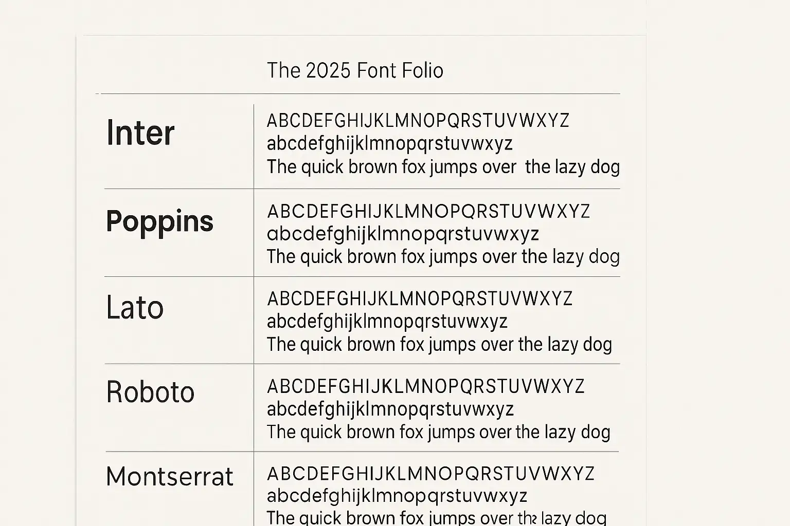
Inter
Inter is arguably the king of UI fonts. Designed by Rasmus Andersson specifically for computer screens, it boasts an exceptionally tall x-height, making it incredibly clear at any size. Its neutral yet friendly character ensures it never distracts from the content. As one of the most versatile variable fonts, Inter offers superior performance and design flexibility, making it a top choice for SaaS platforms, corporate sites, and any project where clarity is paramount. It pairs beautifully with almost any serif headline font, such as Lora.
Poppins
Poppins is a stunning geometric sans-serif that strikes a perfect balance between professionalism and friendliness. Based on pure geometric shapes, its circular letterforms give it a warm and inviting feel. It's an incredibly versatile font that works equally well for bold headlines and readable body text. This makes Poppins a favorite among tech startups, creative agencies, and brands wanting a clean, modern website fonts look. It pairs wonderfully with a workhorse serif like Merriweather.
Lato
Created by designer Łukasz Dziedzic, Lato was conceived as a corporate font that felt warm and stable, not cold and authoritarian. Its semi-rounded details give it a feeling of warmth, while its strong structure provides stability and seriousness. It's a fantastic choice for body text due to its excellent readability and is one of the most popular Google Fonts for websites for a reason. Lato works harmoniously with an elegant serif headline like Playfair Display.
Roboto
Developed by Google as the system font for Android, Roboto is a true master of versatility. It features a dual nature, with a mechanical skeleton and largely geometric forms, but with friendly and open curves. This allows for a natural reading rhythm that feels familiar and comfortable. As one of the most widely used best web fonts, it offers extensive language support and is a foolproof choice for any application. It pairs seamlessly with its serif companion, Roboto Slab.
Montserrat
Inspired by old posters and signs from the traditional Montserrat neighborhood of Buenos Aires, this font has a unique urban and stylish character. Its geometric simplicity makes it a favorite for designers looking to create impactful headlines and branding. While excellent for titles, its readability in long paragraphs can be less optimal than fonts like Inter, so it's best used for short-form text. It creates a powerful font pairing for websites with a classic serif like Lora.
Nunito Sans
Nunito Sans is a well-balanced sans-serif with rounded terminals, giving it a soft, friendly, and approachable appearance. It's less formal than Lato or Roboto, making it an excellent choice for blogs, non-profits, educational platforms, and brands that want to connect with their audience on a more personal level. Its clean and open letterforms ensure high legibility. It pairs nicely with a clear serif like Source Serif Pro.
Manrope
Manrope is a modern, semi-rounded geometric sans-serif. It is highly versatile, combining aspects of different font types for a unique and clean look. As a variable font, it's highly performant and adaptable. It’s an excellent choice for tech websites, dashboards, and any UI design where clarity and a touch of personality are needed. Manrope’s clean lines pair well with a characterful serif like DM Serif Display.
Figtree
Designed by Google specifically for its own Google Fonts branding, Figtree is a clean, simple, and robust geometric sans-serif. It was created with simplicity and legibility in mind, making it an excellent general-purpose font. Its friendly yet professional character makes it suitable for a wide range of applications, from UI text to corporate documents. It can be paired effectively with a classic serif like Merriweather.
Instrument Sans
Instrument Sans is a sharp, professional, and highly legible neo-grotesque font. It has a distinctive character with unique details, such as its angled terminals, that make it stand out while remaining highly functional for both UI and long-form text. It’s an excellent choice for design agencies, modern corporate sites, and applications that need a font with a bit more personality than Inter. It pairs well with a modern serif like Lora.
Satoshi
Satoshi is a minimalist and clean open-source sans-serif with a modern, geometric foundation. It’s highly legible and has a neutral yet sophisticated feel, making it a fantastic choice for digital platforms, branding, and editorial design. It’s one of the rising stars in the world of modern website fonts. It creates a stylish pairing with an elegant serif like Migra.
The Elegant Serifs (Authority and Style)
These fonts bring a sense of tradition, sophistication, and trust, making them ideal for brands that want to project an image of authority and class.
Lora
Lora is a well-balanced contemporary serif with roots in calligraphy. It's a text-face with moderate contrast that is well-suited for body text, providing a comfortable reading experience. Its elegant curves and driving serifs make it a beautiful choice for long-form articles, storytelling, and any brand wanting an artistic yet highly readable feel. It's a perfect companion to a clean sans-serif like Montserrat.
Playfair Display
With its high-contrast letterforms and delicate hairlines, Playfair Display is the epitome of elegance. Inspired by the work of John Baskerville from the late 18th century, this font is strictly for display use. It’s perfect for creating impactful, stylish headlines for luxury fonts for websites, fashion blogs, and portfolios. It should always be paired with a simple, readable sans-serif for body text, such as Lato or Roboto.
Merriweather
Merriweather was designed by Sorkin Type specifically to be a highly readable text face for on-screen reading. It features large x-height, slightly condensed letterforms, and sturdy serifs, all of which contribute to its excellent legibility even in small sizes. This makes it one of the absolute best web fonts for the body text of news sites, blogs, and academic articles. It pairs well with a strong sans-serif headline like Oswald or Montserrat.
Source Serif Pro
Created by Adobe as a companion to the popular Source Sans Pro, this serif typeface has a strong, clear, and traditional voice. It was designed to provide an exceptional reading experience in long-form digital text. Its clarity and professional tone make it a fantastic choice for academic journals, professional documents, and corporate websites that require a trustworthy feel.
DM Serif Display
This is a high-contrast, transitional display serif designed for large sizes. It's the perfect companion to its sans-serif counterpart, DM Sans. Its strong, sharp serifs and elegant curves give it a powerful presence, making it ideal for magazine-style headlines, branding, and any design that needs to make a bold, sophisticated statement. Pair it with DM Sans for the body text for a guaranteed harmonious look.
Arvo
Arvo is a geometric slab serif, meaning its serifs are thick, block-like strokes. This gives the font a confident, clear, and strong appearance. It's highly readable and works well for both headlines and body text, though it truly shines in headings, calls to action, and navigation menus. Its unique character makes it a great choice for brands that want to appear both modern and reliable.
The Personality Picks (Display & Niche)
These fonts are for brands that want to make a unique statement and stand out from the crowd.
Space Grotesk
This is a quirky, fixed-width (monospace) font that has been proportionally spaced. Based on Space Mono, it retains a technical, retro feel while being more versatile for headlines and short text. It's a perfect choice for developer portfolios, tech-forward brands, and creative agencies looking for a unique typographic voice.
Right Grotesk
Right Grotesk combines technical precision with a stylish and unique look. It has a large character set and a wide range of weights, making it surprisingly versatile. Its distinctive letterforms are perfect for brands that want to establish a strong, memorable visual identity without sacrificing clarity.
Sora
Sora is a geometric sans-serif with a distinctly techy but exceptionally clear feel. Its unique letterforms, particularly the lowercase 'g' and 'a', give it a futuristic character while its generous spacing ensures it remains highly functional and readable. It’s a great choice for tech companies, software applications, and forward-thinking brands.
Migra
Migra is a confident and expressive contemporary serif. It's inspired by the migration of birds, which is reflected in its sharp, beak-like serifs. It's an excellent choice for stylish brand stories, editorial layouts, and fashion websites, bringing a dose of high-class personality to any design. It’s one of the top choices for luxury fonts for websites.
Streamlining Font Selection with AI: The Wegic.AI Advantage
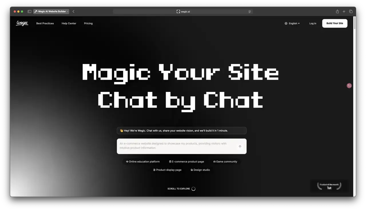
While understanding the principles of typography is essential, the implementation process can still be daunting, often requiring manual adjustments to code and style sheets. This is where modern AI-powered platforms like Wegic.AI transform the experience. Wegic.AI is an AI website builder that simplifies the entire process of font selection and implementation, making expert-level design accessible to everyone.
Instead of manually searching through libraries and then coding the changes, Wegic.AI leverages artificial intelligence to provide intelligent recommendations. The platform can analyze your brand's industry and desired tone to suggest a curated list of the best fonts for websites that are already optimized for readability and performance. This eliminates guesswork and ensures you start with a professional foundation.
The true power of Wegic.AI lies in its conversational interface. You can simply tell the AI what you want in plain language. For instance, you could type, "Make my headlines use Poppins and my body text use Inter," and the platform will instantly apply the changes across your entire site. This allows for rapid experimentation with different font pairing for websites, enabling you to see how different combinations look in real-time without touching a single line of code. The platform automatically handles the technical backend, ensuring that your chosen Google Fonts for websites are loaded efficiently to maintain optimal web font performance and protect your Core Web Vitals. By integrating these advanced features, Wegic.AI acts as your personal design assistant, ensuring your website's typography is not only beautiful and on-brand but also technically sound and highly accessible.
The Art of Font Pairing: 5 Combinations That Work
Creating a strong visual hierarchy is the key to guiding your reader's eye through your content. The most effective way to do this is through a well-executed font pairing for websites. Here are the fundamental rules and five combinations that are guaranteed to work.
Rule 1: Contrast is Key
The most classic and effective rule is to create contrast. Don't pair two fonts that are too similar. A bold, decorative headline font needs a simple, neutral body font to ground it. The classic strategy of pairing a strong serif headline with a clean sans-serif body is a timeless technique because it creates a clear distinction between heading and text, making the content easy to scan and digest.
Rule 2: Use Superfamilies
A superfamily is a font family that includes both serif and sans-serif versions designed to work together (e.g., Source Serif Pro and Source Sans Pro). Using a superfamily is a foolproof strategy for creating harmony. Because the fonts share the same underlying skeletal structure, they are guaranteed to complement each other perfectly, creating a cohesive and professional look.
Pairing Examples
- Montserrat (Headline) + Lora (Body): This pairing is the perfect blend of modern and classic. The strong, geometric, and modern strength of Montserrat creates a powerful headline that contrasts beautifully with the elegant, classic readability of Lora for a comfortable long-form reading experience.
- Playfair Display (Headline) + Lato (Body): This is a high-impact pairing for brands that want to exude class. The flamboyant, sophisticated serif headline is the star of the show, while the stable, friendly, and highly legible sans-serif Lato provides a solid, unobtrusive foundation for the body content.
- Poppins (Headline) + Inter (Body): This is the ultimate modern, clean UI pairing. Both are exceptionally legible and share a geometric foundation, creating a harmonious and professional look perfect for tech companies, SaaS platforms, and modern corporate sites.
- Arvo (Headline) + Roboto (Body): The strong, confident slab serif Arvo grabs attention and is perfect for a bold call to action. It is balanced by the neutral, familiar, and highly comfortable reading rhythm of Roboto, ensuring the main content is effortless to consume.
- Source Serif Pro (Headline) + Source Sans Pro (Body): This is the perfect example of using a superfamily for guaranteed success. Created by the same foundry to work in tandem, this pairing offers perfect visual harmony and a highly professional, cohesive aesthetic suitable for any corporate or editorial project.
FAQ: Your Font Questions Answered
Here are concise, authoritative answers to some of the most common questions about website typography.
What is the single most readable font for a website?
While readability can be subjective, the font most consistently praised for on-screen legibility is Inter. It was designed from the ground up specifically for user interfaces, with a tall x-height and open apertures that ensure it remains crystal clear even at very small sizes.
How many fonts are too many for one website?
It is a firm best practice to use a maximum of two font families, or three at the absolute most. One font for headlines and another for body text is ideal. Using more than this can make your site look cluttered and unprofessional, and it will negatively impact your web font performance by increasing loading times.
Are Google Fonts really free for commercial use?
Yes. All fonts available on the Google Fonts platform are published under open-source licenses, which means they are completely free for commercial use on any project, whether it's a personal blog or a large corporate website.
What is the best font for a professional or corporate website?
For a professional and trustworthy look, you should opt for clean, highly legible sans-serifs like Inter, Lato, or Instrument Sans. These fonts convey clarity, efficiency, and modernity. They can be paired with a traditional serif headline like Source Serif Pro to add a touch of authority.
Should I host fonts myself or use a service like Google Fonts?
For the vast majority of website owners, using a service like Google Fonts for websites is the superior choice. Google uses a powerful, global Content Delivery Network (CDN) that ensures the fonts are delivered to your users quickly, regardless of their location. It also handles browser caching effectively. Self-hosting gives you more control but requires technical setup and maintenance.
Your Next Steps
Choosing the best fonts for websites in 2025 is a strategic decision that goes far beyond simple aesthetics. As we've explored, the optimal choice is one that masterfully balances three critical elements: your unique brand personality, the user's need for effortless readability, and the technical demands of web font performance. Your typography is a fundamental component of your user experience, a silent tool that can build trust, communicate your brand's values, and guide your users seamlessly through their journey.
You are now equipped with an expert framework and a curated list of the top website fonts 2025 has to offer. You understand the power of variable fonts, the importance of accessibility, and the art of creating a harmonious font pairing for websites. Armed with this knowledge, you can move beyond guesswork and make an informed, strategic choice that will elevate your website's design and effectiveness.
Now that you have the ultimate guide to web fonts, which combination are you most excited to try on your site? Share your favorite pairings in the comments below!
Choosing the right font is a crucial first step, but implementing it perfectly across your entire website can be complex. Wegic.AI removes the technical barriers, allowing you to focus on what matters most: creating a beautiful and effective online presence.
Our AI-powered platform lets you build a stunning, high-performance website where you can apply and test the beautiful fonts mentioned in this guide with a single click—no code required. Stop wrestling with style sheets and performance optimization, and start creating a website that truly represents your brand.
Written by
Kimmy
Published on
Mar 12, 2026
Share article
Read more
Our latest blog
Webpages in a minute, powered by Wegic!
With Wegic, transform your needs into stunning, functional websites with advanced AI
Free trial with Wegic, build your site in a click!