Log in
Build Your Site
Elegant Typefaces That Elevate Any Web Design
Are you still looking for an elegant and well-designed web font? Explore elegant web fonts to enhance the visual design of your website.

A font that looks elegant and beautiful can affect how people feel about your website. A good font can make your website easier to read, while a font that is not legible can confuse visitors and cause them to leave. That's why choosing the right font is essential to creating a great user experience and a strong brand image. If you want your website to look elegant, sleek, and modern, then look no further than elegant fonts. Elegant fonts can make your website look more professional and stylish, and they can also show your visitors your attention to design details.
In this article, we'll show you different types of elegant fonts. You'll learn where they're used and how they fit into a variety of styles—from classic retro to modern futuristic. Whether you're designing a blog, portfolio, or business website, we can provide you with inspiration and help you choose a font that really stands out.
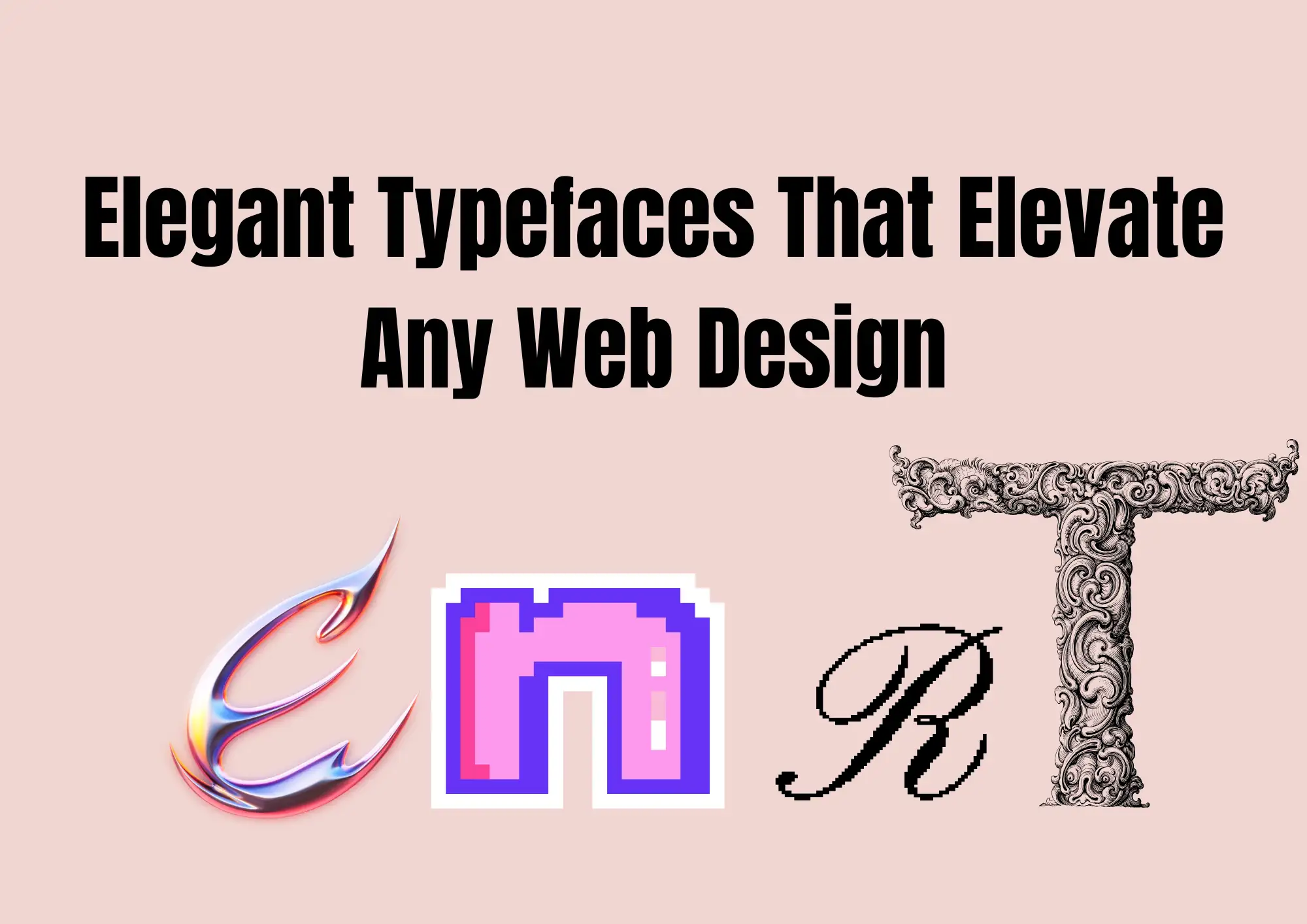
#01 What Makes a Typeface Truly Elegant?
Not all fonts are the same. Some fonts are bold and fun. Some are strong and serious. But elegant typefaces are special. They are clean, stylish, and full of beauty. This font will help your website look fancy, smart, and professional.
So, what makes a font truly elegant?
1. It has high contrast lines. This means that some parts of the letter are thick, and other parts are thin. This makes the font look rich and classic.
2.It has smooth and balanced shapes. The letters flow together in a soft and beautiful way.
3. An Elegant font is easy to read. It may look stylish, but it never forgets that people need to read the words clearly.
These typefaces are great for luxury brands, fashion stores, design studios, and modern business websites. When someone visits a website with an elegant font, they feel trust and comfort. It shows that the brand cares about good style and details.
Elegant fonts are not loud or messy. They don't try to grab attention with big, heavy letters. Instead, they use small touches—like thin lines, soft curves, or extra space—to show quiet strength. They look strong without being loud. That's what makes them different from bold or "crazy" fonts.
You can find elegant typefaces in many styles. Some are more classic, like what you see in old books. Others are more modern, perfect for websites or online stores. But no matter the style, a good elegant font always feels smooth, balanced, and clean.
In the next parts of this article, we will show you some great examples of elegant fonts you can try. These will help your website stand out and look amazing!
#02 Timeless Beauty: The Charm of Vintage Fonts
Some fonts make us feel like we are going back in time. These are called Vintage fonts. They are full of old charm and classic beauty. A Vintage font often looks like it came from the 1920s, 1950s, or even earlier. It reminds us of posters, signs, and books from many years ago. This kind of style makes people feel warm, curious, and even a little bit nostalgic.
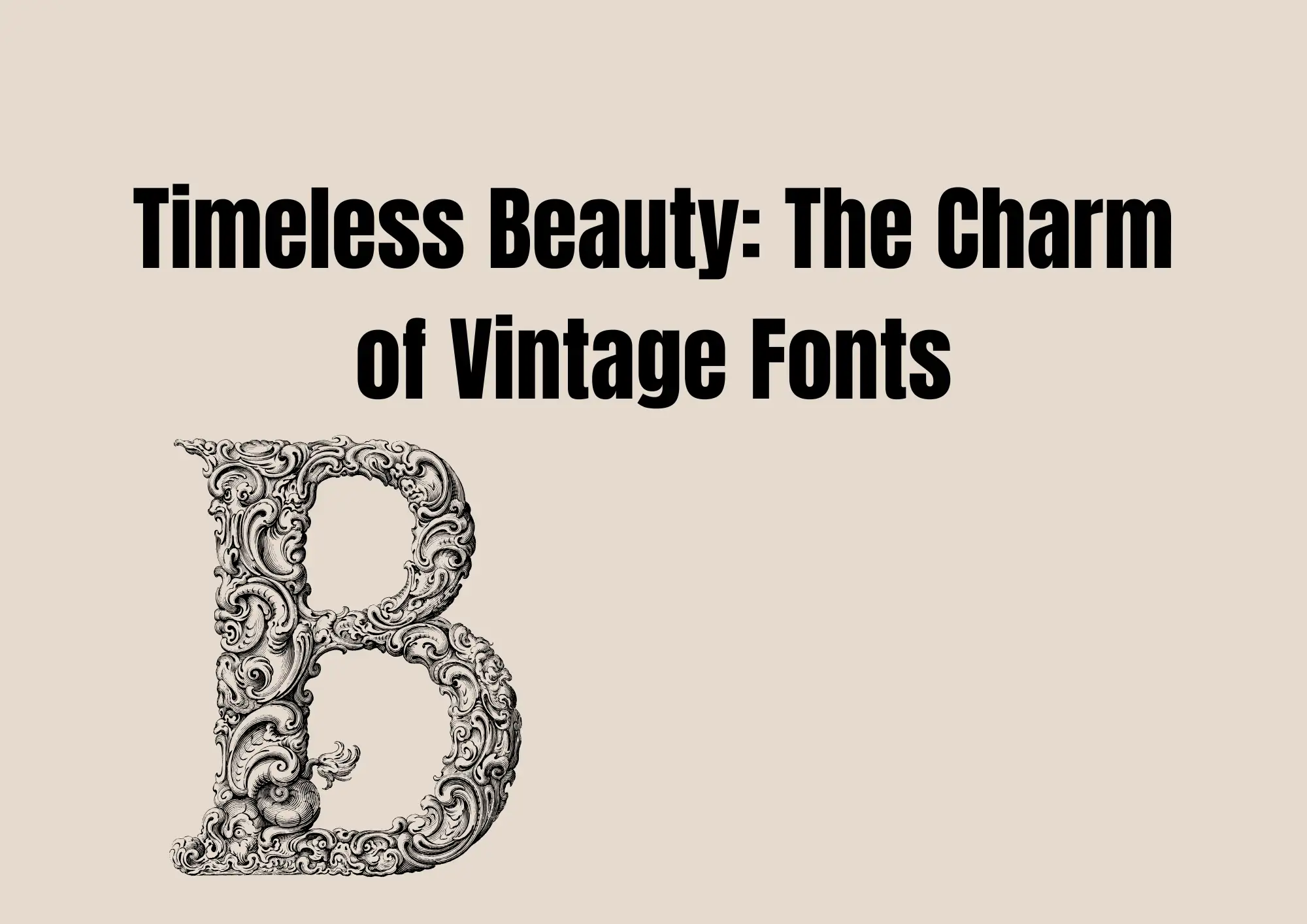
A Vintage font usually has strong lines, unique curves, and a lot of detail. The letters often have extra touches like shadows, curls, or sharp edges. These small things make the font look special and full of character. It feels different from simple or modern styles. That's why it's perfect for websites that tell stories or want to feel artistic.
Where can you use a Vintage font? It works well on brand story pages, creative blogs, vintage-style shops, or websites that sell handmade goods. If your brand wants to feel cozy, old-school, or rich in history, a vintage typeface is a great choice. When people see it, they quickly understand your brand's style and feeling.
You can pair a Vintage font with a soft Elegant font for a balanced look. Use the vintage style for titles, and a simple elegant one for the body text. This keeps the site easy to read but full of personality.
Some great Vintage fonts you can try are:
- Playfair Display – free on Google Fonts
- Bodoni Moda – stylish and old-school
- Great Vibes – for fancy headlines
- Sail – a retro script font for creative brands
You can find more on websites like Google Fonts, Fontshare, and DaFont, where many fonts are free for commercial use. Try a vintage font today to give your site timeless beauty and style!
#03 The Medieval Touch: Fonts That Add Historic Flair
Do you like retro-feeling websites? Then you might love using a Medieval typeface. These fonts are full of old-world charm. They look like the letters in ancient books or old stone carvings.
A Medieval typeface often has fancy, sharp lines. Some styles are based on Gothic letters, with tall and narrow shapes. Others look like hand-drawn script used by monks in the Middle Ages. These fonts bring a feeling of history and tradition. They are not just letters—they are art.
When should you use a Medieval typeface? These fonts work best on websites about history or culture. If your website like retro style, this font style helps visitors feel that right away.
Here are some popular Medieval-style fonts you can try:
- UnifrakturCook – a Gothic-style font that is free on Google Fonts
- MedievalSharp – has fun, old-style letters and is easy to read
- Blackletter – bold and powerful, perfect for logos
- Old English Text – great for historical drama or art projects
You can find Medieval typeface on font websites like Google Fonts, DaFont, or Font Library. Many are free to use, but always check if they are okay for commercial projects.
#04 Sleek and Stylish: The Rise of Grotesque Fonts
Not all fonts are old or fancy. Some are clean, modern, and straight to the point. These are called Grotesque fonts. Even though the name may sound strange, a Grotesque font is one of the most popular styles used in websites today. It has become a big part of modern design.
A Grotesque font is a type of sans-serif font. This means it has no little "feet" or lines at the end of the letters. The shapes are simple, even, and easy to read. These fonts started in the 19th century but have changed over time. Now, they are used by tech companies, design blogs, and modern brands to look clean, smart, and fresh.
One reason people love Grotesque fonts is that they feel both simple and strong. They look professional without being too serious. They're perfect for websites that want a minimal look but still want style. Even though they are very clean, many Grotesque fonts can also feel like elegant typefaces—especially when used with good spacing and soft colors.
You'll often see them used in tech websites, fashion brands, or apps. They work well in UI (user interface) design because they are easy to read on screens of all sizes.
Here are some great Grotesque fonts:
- Neue Haas Grotesk – clean and strong; used by many global brands
- Söhne – modern and elegant; great for minimal websites
- IBM Plex Sans – free and professional
- Work Sans – free on Google Fonts and easy to read
You can pair a Grotesque font with an Elegant font for a nice balance of sharpness and grace. If you want your website to look modern and stylish, this is a smart font style to try!
#05 Forward-Looking: Elegant Fonts with a Futuristic Vibe
Some websites need to feel fresh, bold, and ahead of their time. That's where Future fonts come in. These fonts look modern and high-tech. They often have smooth round shapes, clean lines, and simple, geometric letters. These styles are great for showing that your brand is about new ideas and the future.
Future fonts are perfect for websites in tech, startups, or anything related to innovation—like Web3, NFTs, and digital products. These fonts help your website feel smart, cool, and full of energy. Some also feel like elegant fonts, because they are clean and balanced, not too crazy or hard to read.
For example, the font used by the Wegic website is full of technology style fonts, which perfectly fits the website image. As an AI technology website, when you enter the homepage of the website, you will see this font - Future Font.
Here are some popular Future fonts to try:
- Orbitron – a tech-style font great for science, space, or Web3
- Exo 2 – modern and round, good for apps and smart tech
- Titillium Web – geometric and clean, works for UI and dashboards
- Audiowide – bold and fun for crypto or NFT pages
- Rajdhani – smooth and square, easy to read on screens
Many of these fonts are New fonts and free to use on platforms like Google Fonts or Fontshare.
Tips for using Future fonts:
- Use them for titles or short headlines
- Don't mix too many styles—pair with a simple body font like Open Sans
- Test how they look on phones and tablets
- Keep colors modern—black, white, neon, or gradients work well
By using Future fonts, your website can feel cutting-edge and elegant at the same time. It tells people your brand is modern and ready for what's next.
#06 How to Choose and Pair Elegant Typefaces
Picking the right elegant typefaces for your website is to look smart, clean, and easy to understand. You want your fonts to match your style and feel just right together.
Step 1: Use Different Fonts for Titles and Text
Your title font should be bold and special. It should grab attention. This is where you can use a more stylish Elegant font. For the body text, choose a font that is simple and easy to read. Avoid some fancy curls or super thin lines that read hard for some old people.
Example:
- Title: Playfair Display (Elegant and classic)
- Text: Lato (Simple and clean)
Step 2: Match Bold and Thin Styles
Using bold fonts for headlines and light fonts for body text helps guide the reader. It also creates a nice balance. But be careful: don't mix too many weights (bold, thin, medium) unless they belong to the same font family. Keeping things neat helps your website look more professional.
Step 3: Keep the Look Consistent
Your fonts should work together. If your title looks modern, your text should too. Don't mix a fun cartoon font with a serious business font. Matching styles help your brand look strong and clear.
Step 4: Test on All Devices
A font might look great on a big computer screen but not on a phone. Always test your elegant typefaces on phones, tablets, and different browsers.
Step 5: Try Free and New Fonts
There are many great New fonts you can find on Google Fonts or Fontshare. They're free and easy to use. Look for ones labeled as an Elegant font, with good spacing and high readability.
By following these steps, your fonts will look beautiful and easy to read. This makes your website feel stylish, smart, and friendly.
#07 Try before you choose: Wegic makes it easy
Choosing an elegant font is nice, but seeing its actual effect is even more important. This is where Wegic comes in. Wegic is an AI-driven website builder that allows you to quickly design a beautiful website even if you are not a designer.
Start trying Wegic AI to generate an elegant font website👇
You can talk to the AI assistant and put forward your requirements, including the elegant fonts you want to try. After testing the generation to see if it is suitable for your brand website, you can really start the layout. Start trying now. Wegic is a great starting point for you to start trying.
Conclusion
Fonts do more than show words—they show your style. Using elegant typefaces helps your website look clean, smart, and beautiful. An Elegant font can make your brand feel high-end and professional. If you love the old-school look, a Vintage font can add charm and tell a story. Want something bold and modern? Try Future fonts with clean shapes and new ideas. There are so many great fonts out there, free and easy to use. Try different styles and pair them well. The right fonts can help your website stand out and give visitors a great experience. Take a look at the style of Wegic.com as a reference for website font design!
Written by
Kimmy
Published on
Mar 17, 2026
Share article
Read more
Our latest blog
Webpages in a minute, powered by Wegic!
With Wegic, transform your needs into stunning, functional websites with advanced AI
Free trial with Wegic, build your site in a click!
What kind of website do you want to build?
