Log in
Build Your Site
Reactive Web Design Explained: Why It Matters for Modern Sites
Reactive Web Design is transforming modern websites. Learn its definition, key principles, and how it differs from traditional responsive web design.

In the Internet age, more and more people browse the web through various devices. Mobile phones, tablets, computers, and other devices are now key tools people use to go online. Web designers use a reactive design to guarantee websites operate properly across all devices. The ability to modify web content based on different screen sizes is accomplished through this approach. The website functions both quickly and provides users with an improved experience.

The article describes the fundamentals of reactive web design together with its essential principles. It also compares reactive design with responsive design. This will help you choose the best option for your website.
What is Reactive Web Design?
Web design traditions feature websites built with permanent width dimensions. This approach means the site cannot adjust well to different screen sizes. For example, users can view the website normally on a computer. A phone or tablet display may create disorganized or nonfunctional interfaces. To fix this, developers used to make two separate versions of the site—one for mobile and one for PC. This took more time and effort.
Reactive web design works differently. A website adjusts its presentation elements and content through different screen dimensions and resolution levels while responding to user interface methods like touching or using a mouse. The "reactive" method enables the system to perform intelligent modifications. This improves the user experience.
Importance of Reactive Web Design for Modern Websites
Faster Page Loading
The time needed for pages to load creates direct consequences for user satisfaction. The hardware capabilities of mobile devices typically have slower internet speeds and less processing power. A page that requires too much time to open will cause users to abandon the site. Therefore, Fast webpage loading has become an essential factor for designing effective websites.
The implementation of reactive design techniques results in faster website speed. The system implements various speed enhancement methods, which include lazy loading, together with async loading and image optimization techniques. The design system modifies image dimensions according to both screen dimensions and the current internet speed. The system prevents unnecessary file loading. The method reduces the number of HTTP requests while making the code more straightforward. The modifications implemented in the pages lead to enhanced loading speed. Videos will also affect the loading speed of the website. Check video optimization to make your site load faster.
Unify Design and Content
Web design approaches from the past require separate versions for each device platform. The process of designing websites, along with website construction and maintenance, becomes more challenging due to this practice. When the best reactive websites needs changes, developers must update each version separately. The process requires a significant time investment, which may result in version mismatch errors. Reactivity in web fixes this problem by using a flexible design. Now, when a website needs updates, developers only change one version. This automatically updates the website on all devices at the same time.

Image by Istock
A website transforms its layout and content automatically to adapt to various devices through responsive design. The system operates across mobile phones and tablets together with computers. The text alongside images automatically adjusts its dimensions to match the phone display. The content becomes both readable and usable to users. The computer display features expanded and easy-to-read elements. The design provides users with complete viewing comfort.
Adapt to Future Technologies
5G, together with IoT and AI technologies, creates diverse user requirements. The market receives continuous releases of foldable phones in addition to smartwatches and VR devices. New technologies change how people use digital content. Old web design methods no longer work well on today’s devices. This leads to a poor user experience.
A reactive system adapts to various devices and upcoming technical developments to provide support for new technological requirements. The design system works across multiple screen dimensions and display specifications alongside changing device functionality. The website operates effectively through new devices and interaction methods.

Image by Istock
Reduce Maintenance Costs
The traditional web development process needs different versions to work across various platforms. Website maintenance and updating is a tedious task that takes a lot of time and cost. When a function needs to be updated or a bug needs to be fixed, developers have to make changes in each version separately.
Reactivity in web solves this problem. The system operates with a single code base and identical layout instructions that adapt to every device type. Developers need to perform updates to content and styles and feature improvements only through a single modification process. The modifications affect every device through automatic implementation. The maintenance expenses decrease significantly while development efficiency increases substantially.
Additionally, the need to create device-specific versions has disappeared for developers. The website development team can concentrate on creating better and faster web pages. The team's efficiency will increase through this approach while they make better use of their available resources.
Reactive Web Design vs Responsive Web Design
Today, websites need to work well on all devices. There are two main ways to build them. These are called reactive web design and responsive web design. The design solutions optimize user experiences across different requirements and usage situations.
| Comparison Aspect | Reactive Web Design | Responsive Web Design |
| Core Objective | Dynamically responds to user interactions & data changes | Adapts layout to different screen sizes/devices |
| Technology | JavaScript frameworks (React/Vue/Angular), data-driven UI updates | CSS-based (Media Queries, Flexbox/Grid) |
| Best For | Highly interactive apps (SPAs, dashboards, real-time systems) | Content-focused sites (blogs, news, corporate websites) |
| Performance | Initial load may be slower, but smoother subsequent interactions | Faster rendering (CSS-driven), but may have redundant code |
| SEO Friendliness | Requires optimization (SSR/pre-rendering) | Naturally SEO-friendly (crawlable content) |
| Development Complexity | Higher (state management, framework dependencies) | Lower (primarily HTML/CSS) |
| User Experience | Seamless updates (no page reloads) | Consistent across devices, but relies on page refreshes |
| Maintenance | Higher (framework updates, complex logic) | Lower (mostly styling adjustments) |
| Examples | Single-Page Apps (SPAs), dynamic web apps | Multi-page websites (MPAs), static sites |
Web applications with interactive features need reactive web design rather than responsive web design. Websites that focus on content sharing alongside universal device support should choose responsive web design. Your project can use both design approaches to achieve wider audience reach.
To build a responsive website, click the article: ⬇️
Key Principles of Reactive Web Design
-
Data-driven interface
Data-driven interfaces will transform their display based on alterations in the available data. The interface operates independently from defined structural patterns. The interface automatically transforms after the data updates to display the most recent data. It also makes the user experience better by making interactions smoother. The reactivity in web enables users to update sections of the page rather than forcing a complete page reload when they click or type.
-
Componentized architecture
Componentized architecture divides websites and applications into independent, separate components that operate independently. Each part handles a specific task or shows a certain section. The codebase becomes simpler to keep updated because of this approach. Designers and developers can work on their own. They focus on small, individual parts without changing the whole website.

Image by Istock
-
Unidirectional data flow
The framework sends data from the top parts to the bottom parts in one direction. This means data changes only move from parent parts to child parts, not the other way. This makes the data easier to control. It also helps avoid mistakes. The development team gains better capabilities to track down and resolve problems easily.
-
Efficient rendering of virtual DOM
Virtual DOM is a technology that makes pages render faster. It works by creating a copy of the webpage in memory. Data changes do not affect the actual webpage at the time of alteration. Instead, it first updates the copy in memory. Then it compares the copy with the real webpage and only updates the parts that are different. The smooth functioning and quick response of the page to users becomes feasible through this method.
-
Centralized state management
An application with centralized state management stores its complete data collection at a single location. The app's data source connects every component, thus making information flow straightforward and simple to maintain. Using this approach, the application ensures data consistency while maintaining proper functionality.
To learn website management, click the article: ⬇️
Implementing Reactive Design in Websites
By implementing the following steps, you will be able to build the best reactive websites that meets the needs of users on various devices.
Step 1: Determine website requirements and goals
You must fully define both the website requirements as well as its intended goals before beginning the design process. The best reactive websites will receive their functional specifications and content structure, and interaction patterns through discussions between team members, along with customers or stakeholders.
Step 2: Design a Flexible Layout Structure
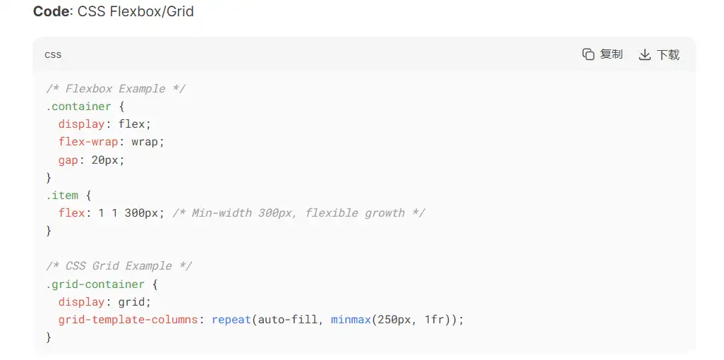
The design process should include the implementation of a flexible grid system. The page elements must adapt their layout based on the screen dimensions. Element widths should be expressed through percentages instead of using static figures. The page design functions properly across screens of all sizes. Users should be able to read the page content naturally. You can use CSS Flexbox/Grid to achieve a reactive layout.
Are these programs too troublesome for you? Click the code-free builder to build a website.
Step 3: Choose a Suitable Front-end Framework or Library

The selection of appropriate front-end tools determines the success of a website that functions across all platforms. Popular tools like Bootstrap and Foundation offer ready-made layouts and responsive features. Such tools enable developers to build adaptable designs more quickly. The interactive elements in your website require JavaScript tools like React or Vue to achieve them. The tools contain intelligent systems to manage page updates and data handling.
Step 4: Use Responsive Images and Media
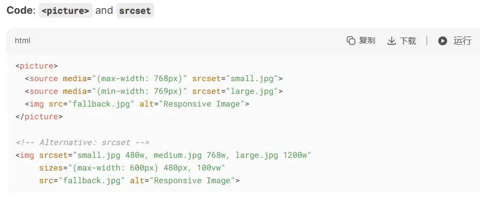
The loading speed of mobile devices slows down when large images are used. The solution to this issue requires developers to provide images in multiple sizes that match each device's screen size. Smaller screens need smaller images. WEBP stands as one of the better image formats that modern browsers support to enhance page loading speed. The
<picture> tag, together with CSS's srcset allows automatic image resizing according to device specifications. Check interactive websites to learn about some interactive elements.Step 5: Implement Dynamic and Interactive Elements

Websites often need dynamic and interactive features to make them easier to use. Web apps improve usability by checking form inputs for errors. They also load new content without refreshing the page and update what’s shown on the screen. The development of dynamic features uses JavaScript frameworks, including React and Vue. The framework implements basic design concepts that involve data flow in one direction while enabling developers to create reusable parts. The code organization, together with website speed improvement, is possible through this approach.
Step 6: Optimize Performance and Loading Speed
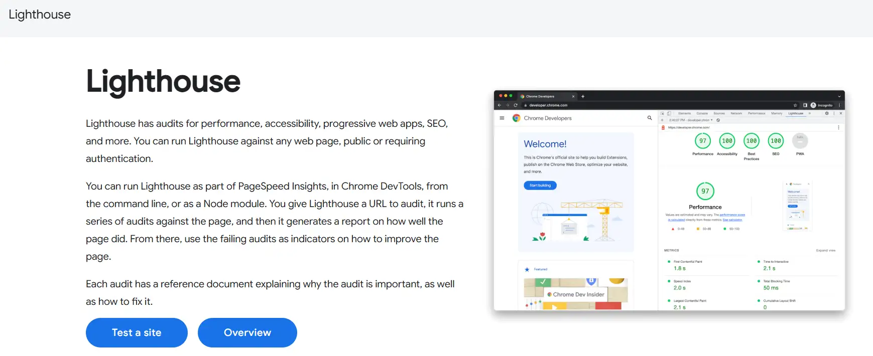
You should unite your CSS and JavaScript files into a single condensed version. A CDN should be used to expedite the loading of static files. The website should defer the loading of less critical content until a later stage. Cut down on HTTP requests. Static files benefit from caching because this prevents them from reloading each time. Google Lighthouse serves as an instrument to check website speed while providing assistance for optimization.
Step 7: Testing and Debugging
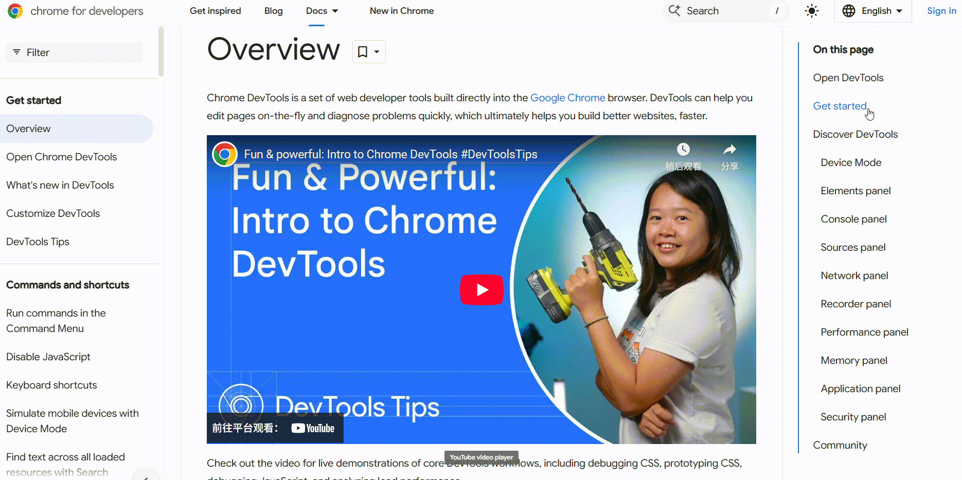
Testing remains fundamental for creating websites that function across all devices. The site must be tested across multiple phones and computers, and all major browsers and operating systems. Fix any problems you find. Chrome DevTools serves as a helpful tool for such tasks. Address all detected issues through proper repair procedures. The best reactive websites will operate effectively on every platform through this approach.
Step 8: Regular Updates and Maintenance
Technology evolves while user requirements also transform. The website requires ongoing updates for its content alongside enhancements to features and design elements. Perform periodic tests that evaluate both speed and operational performance of the website. A consistent good user experience remains available to all users through this approach.
Conclusion
The website functionality increases when using a reactive web design across multiple devices. The system can change its display to fit different screen sizes. It also reacts when users interact with it. But implementing reactivity in web requires expertise along with an investment of time. If you want a simple website for your blog, portfolio, or business details, you can try an easier way to build it. The AI tool Wegic uses GPT-4o to let users build websites simply through chat functions. No coding is needed. Create a website quickly by signing up for a free Wegic account.
Written by
Kimmy
Published on
Mar 17, 2026
Share article
Read more
Our latest blog
Webpages in a minute, powered by Wegic!
With Wegic, transform your needs into stunning, functional websites with advanced AI
Free trial with Wegic, build your site in a click!
What kind of website do you want to build?