Log in
Build Your Site
The 90s Cup Design Is Back: Retro in Web & Product Design
The iconic '90s cup design is making a bold comeback. Discover how this retro style is influencing modern web and product design trends with nostalgic flair.
Do you still remember that paper cup with blue-green waves and purple lines? Yes, the one with the “Jazz” style that was common in the 90s. It used to be everywhere in fast food shops, schools, and offices. You could see it on trays, vending machines, and breakroom tables. For many people, it became part of everyday life without even thinking about it. Later, people slowly forgot about it as new styles took over. But now, it is back!
This design is showing up in many places again. Not just on cups, but also on website backgrounds, phone cases, T-shirts, and even brand logos. You can also find it on posters, bags, and home decorations. 90s cups have become a cool retro symbol. It looks both familiar and fun. It brings a feeling of the past, but also fits in with today’s love for vintage style.
Why is it popular? Maybe people miss how they felt when they were young. Or maybe they are tired of modern design that looks “too clean.” Some say it brings back a warm, fun feeling that is hard to find in simple, serious designs. No matter the reason, it is back in our lives. And it is not just decoration. It is also changing how we design websites and products. Designers now mix this retro look with modern tools to create something new.
Next, we will talk about where this 90s cup pattern came from, why it is popular again, and how it is changing design style today. Get ready for a fun trip full of memories!
Click on the image to get more inspiration 👇
What Is the 90s Cup Design?
When people talk about the most classic pattern from the 90s, many first think of that cup design with blue-green and purple wave lines. Its real name is “Jazz,” and some people call it the “Solo” cup pattern. The colors are simple, but when you see it, it feels very 90s and full of memories. It has a kind of energy and style that makes people think of that time right away. The pattern may look basic, but it brings a strong feeling of nostalgia.
This pattern first came out on a disposable paper cup made by the Dixie company. The designer was Gina Ekiss. She made this design for a contest inside the company. It was just one of many entries, and she didn’t know it would become so popular. But it won the contest and was chosen to be printed on products. Later, it was used on many cups, trays, and even vending machines. It quickly became part of everyday life in the U.S., showing up in school cafeterias, office breakrooms, hospital waiting areas, and fast food restaurants.
Why did it become so loved? Maybe because it is simple, easy to see, and has a kind of “cool” feeling that is hard to explain. The wave shapes feel free and relaxed, and the color mix is bright but not too strong. In that time, when there was no social media, this pattern was already everywhere. You could see it in schools, hospitals, and fast food places. People didn’t think about it much back then, but now, when they see it again, it brings back many memories from their childhood or teen years.
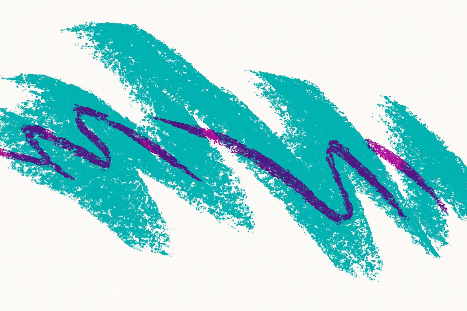
Now, it has become a symbol of the past. On the internet, many people wear T-shirts with this pattern, like those 90s cup design shirts. They look pretty stylish. Not only older people, but young people also like this style. It feels like a memory from the past, but now it is popular again.
Why Is It Trending Again?
So why did this '90s cup pattern become popular again? To be honest, it’s a bit surprising. But it also makes sense. Now, many people like old things. They watch old movies, play retro games, or wear old-style sneakers. 90s stuff is cool again. People enjoy going back to the styles and feelings from that time. It gives them comfort, and it’s fun to mix the old with the new.
This pattern is very special. That 90s cups blue and purple color mix makes people think of the 90s right away. It feels a bit wild, a bit free, not too perfect. It gives a feeling of “freedom.” It doesn’t try to be too clean or serious. For many people, it’s a memory from childhood — maybe from school lunches or birthday parties. For young people, it’s a new and special style. It looks different from today’s designs, so it feels fresh and interesting.
Social media helped, too. On TikTok and Instagram, many people show clothes, home stuff, and even website designs with this pattern. Some post photos of T-shirts or phone cases with it, while others use it in digital art or backgrounds. Slowly, it became a trend. More and more people saw it, liked it, and wanted to try it. Brands also saw this and started to put it on their product packages or ads again. It became a way to stand out while also making people smile with something they remember.
There is one more reason: we feel a bit tired of today’s simple style. Clean, white, and neat design looks nice, but after a while, it feels boring. Everything starts to look the same. But this pattern is the opposite. It’s loud, bright, and full of character. It has a playful energy that grabs attention. So now it’s back, and more and more people like it. It’s not just about looks — it’s about feeling something real and fun again.
Retro Meets Digital: 90s Cups in Web Design
Now, more and more website designs are using retro style. And the 90s cup pattern has quietly come onto the screen. Yes, that blue-green wave with purple lines is not just on 90s cups and plates anymore. It is now showing up as website backgrounds, button styles, and even part of logos. Some designers even use it in loading screens or as part of animated elements, giving websites a lively, playful look that feels fresh and different from today’s usual clean layouts.
Many designers think this pattern is easy to remember. It is not a modern, simple style. It feels more “human.” It brings out a sense of warmth and personality that modern styles sometimes lack. Adding this retro style to a website can quickly catch people’s eyes. It also feels fun, silly, and free. It brings a light, creative mood that works well in digital spaces. It’s great for creative brands, music artist pages, or small online shops. It helps set a relaxed, friendly tone that makes people feel more connected.
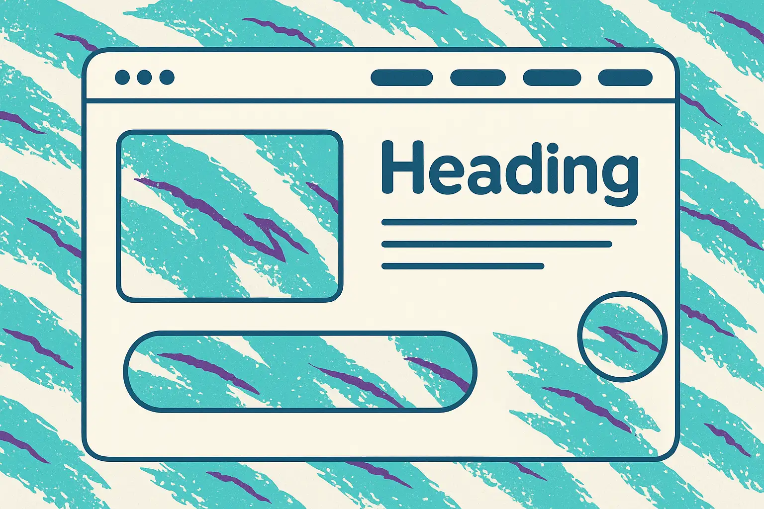
Some people use a full background with the “Jazz” style. Others just use a little, like under the menu bar or around buttons. Some add it in footers, banners, or even as a hover effect. That way, it doesn’t look too messy, but still has the feeling. You can show personality without taking away from the content.
Of course, you should not use too much. If the colors are too strong or the pattern is too full, it can be hard to look at. It may distract users or make the page feel too loud. The key is to find a balance between retro and modern. It should look fun, but not too much. Used the right way, this pattern can turn a plain page into something that makes people smile — and want to come back.
90s Cups in Product Design & Branding
Besides web design, the 90s cup pattern is also showing up again on many products. You can see it on water bottles, T-shirts, phone cases, notebooks, and canvas bags. It feels like “old look, new use,” but it still looks very fun. The mix of bright blue and purple lines adds a playful touch, and when used in the right way, it makes everyday items feel more creative and full of personality.
Many brands are starting to use it for packaging design, especially for drinks, snacks, or lifestyle products. They find that this style can catch people’s eyes quickly. In stores or online, products with this pattern often stand out on the shelf or feed. People want to look at it more. For many, this pattern is a childhood memory — it reminds them of school lunches, fast food, or fun times from the past. For young people, it’s a “cool and fresh” retro style. It feels different from the clean, simple designs they see every day.
Designers also like to use ready-made images. Online, you can find many free 90s cup design PNG files. They have clear backgrounds, so they are easy to use. You can quickly put them into posters, labels, or social media pictures. Some people use them for stickers, digital mood boards, or even clothing mockups. This makes the design process faster and more flexible, especially for small teams or individual creators.
Some small personal brands even make this pattern the main part of their style. For example, shops that sell eco cups or streetwear use this 90s style for their whole product line. It looks super special. It gives their brand a bold, fun voice that helps them stand out in a crowded market. Sometimes, just one unique pattern like this can create a whole vibe that people remember.
Retro is not going backward. It’s using old things to tell new stories. This pattern is the best example of that. It takes something simple and turns it into something full of feeling, color, and fun — perfect for today’s creative world.
Design It Like the 90s, Build It Like Today
Now, everyone loves the 90s retro style, but we live in a digital time that cares about speed and ease. People want their design to “look like childhood,” but “work like now.” This has become a goal for many, especially in website and brand design. More and more people like to use old things to tell new stories.
For example, many people choose the classic 90s cups pattern and mix it with simple layouts and fonts. It looks retro but not old. This feeling is warm and special. But just having an idea is not enough — you also need to make it real. At this time, a good and easy tool becomes very important.
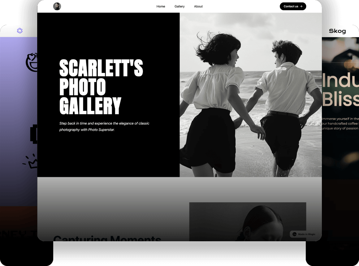
Now, some AI tools can really save you a lot of time. Wegic is an interesting platform. You just talk to it and type the kind of style, function, or feeling you want. It can help you build the whole website. It’s easy to use, and you don’t need to write code. For people who like the 90s style but want to go online fast, it’s a good fit.
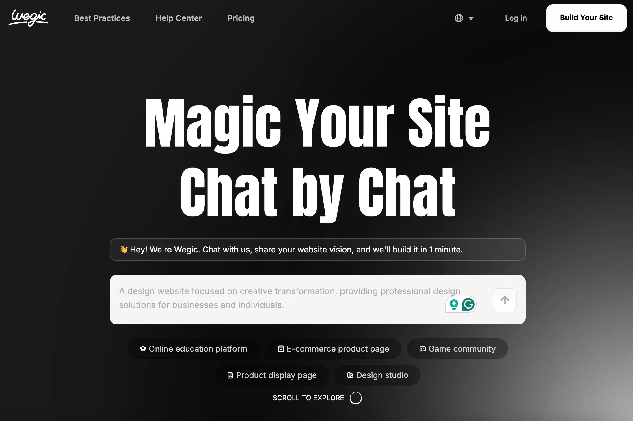
In the end, design is not just about looks. It’s also a way to show who we are. And tools — as long as they help us express ourselves more easily — are good tools. No matter if you are making a website, product package, or just showing your work, being able to do retro style fast and well is one of the best things in today’s world. Here is a comprehensive beginner's guide and Wegic web examples for your reference.
Conclusion
The 90s cup pattern may seem like just a small visual element, but it carries the memories of a whole generation. From fast food paper cups to today’s website backgrounds, product packaging, and even fashion patterns, 90s cups are no longer just about cups. They have become a cultural symbol and a kind of design language.
In today’s world that values “efficiency” and a “modern look,” the return of retro style shows that people actually care more about emotion and personality. We start to like things that feel “from the past” because they are more real and warm. And this familiar blue and purple wave line fits that feeling perfectly.
If you are doing design and want something special, you can look at these small patterns from the 90s. They are simple, but they have stories, feelings, and fun. If you use them well, they can touch people and make your work more unique.
No matter if you are making a website, packaging, or social media content, elements like 90s cups will never go out of style. They just “log off” for a while. When the time is right, they come back — just like this time, they’re back, and even cooler.
Written by
Kimmy
Published on
Mar 12, 2026
Share article
Read more
Our latest blog
Webpages in a minute, powered by Wegic!
With Wegic, transform your needs into stunning, functional websites with advanced AI
Free trial with Wegic, build your site in a click!
