Log in
Build Your Site
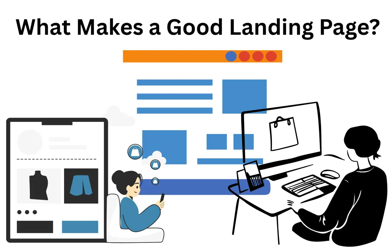
What Makes a Good Landing Page? 10 Must-Have Elements
Wondering what makes a good landing page? This guide breaks down 10 proven elements every high-converting landing page needs to succeed in today’s market.

In the dynamic landscape of digital marketing, if a company wants to achieve its business objectives, it must have a robust presence on the Internet. Among various promotional approaches, landing pages are particularly critical. They can turn visitors into valuable leads or loyal customers.
This article discusses questions like "what is a landing page", the various landing page types in detail, providing a comprehensive understanding of their definition, offers several practical operation approaches and suggestions, and also provides a set of specific plans to optimise conversion rates. It also showcases several examples of successful landing pages for businesses.
What is a Landing Page
What is a landing page? A landing page is a stand-alone webpage designed specifically for a specific promotion. It is the place where visitors end up after clicking on various online links, like search results, ads, emails, or links on social media. The main purpose of what makes a good landing page is to direct visitors to do a specific thing or respond to a call to action (CTA) to transform these visitors into tangible business outcomes, such as leads or sales. Unlike a homepage, which gives a broad view of a business and encourages exploration, a landing page focuses on a specific action. It minimises navigation options, which allows guests to focus more on information and conversion goals. Landing pages play a vital role from the very beginning for promotional activities that hope to achieve traffic goals. This background highlights an essential principle: What makes a good landing page work best is when it has a clear purpose and a direct call to action.
Types of Landing Pages
A Quick Overview
| Landing Page Type | Primary Purpose | Typical Use Cases |
| Lead Generation Page | Capture user information | E-book downloads, webinar registrations, free trials, newsletter sign-ups |
| Click-Through Page | Drive users to a purchase or next step | E-commerce product pages, checkout processes |
| Sales Landing Page | Encourage direct sales | Promoting specific products or services with a clear purchase CTA |
| Event Landing Page | Promote and collect registrations for events | Webinars, conferences, workshops |
| Squeeze Landing Page | Collect email addresses | Offering a valuable resource in exchange for an email address |
| Product Landing Page | Highlight a specific product | Showcasing features, benefits, and encouraging purchase |
| Webinar Registration Page | Collect sign-ups for webinars | Promoting and gathering attendees for online events |
-
Lead collection pages collect data from users by having them fill out forms. This usually happens when a guest gets something good, such as an e-book, webinar ticket, or particular offer.
-
Click-through pages are mainly designed to guide users to buy things or take the next step. These things are used when doing business online. They can lead people directly to product pages or checkout areas, and generally, there is no need to fill out those forms first. The goal of transactional sites is to get visitors to complete transactions, and they often use forms to collect detailed information that can be used for future email promotions.
-
Transactional pages aim to persuade visitors to complete a transaction, frequently involving a form to gather visitor details for future engagement through email marketing campaigns.
-
Reference pages present visitors with focused information, reducing the possibility of distraction, although showing detailed introductions to products and services, prompting them to take direct action.
-
Single-Offer landing pages are initially designed to sell one thing or get people to take a certain action.
-
Sales landing pages drive sales by sharing persuasive information about your product or service with a clear call to action to purchase.
-
Event landing pages are mainly used to promote online seminars or conference activities, allowing participants to complete registration more conveniently.
-
Squeeze landing pages focus on a simple way to obtain a valuable asset or reward from a participant by “compressing” critical details, like an email contact.
-
Coming Soon landing pages are a useful tool for people who want to generate anticipation and inspire participation in new projects or facilities before they are officially unveiled.
-
Long-form landing pages provide particularly comprehensive information, explain the details of the plan clearly, and also integrate relevant pictures, which can make the search engine optimisation effect superior and the content richer.
-
Unsubscribe landing pages provide options like adjusting the frequency of emails or highlighting the benefits of continuing your subscription.
-
Infomercial landing pages use storytelling to illustrate the core value of a product or facility, which is particularly useful for products that need to be explained in detail.
-
Viral landing pages use particularly eye-catching pictures, funny jokes or ideas that make people shine, so that people will find it interesting and want to share it.
-
Splash landing pages are typically used to make announcements or allow guests to select their preferences, like choosing a language. They usually make a brief appearance, such as a little interlude, and then take the guest to another table.
-
Signup landing pages are designed to encourage participants to begin their journey by using the facility by signing up for a free trial or membership.
-
Product landing pages highlight a product. Its purpose is to make participants want to learn more information or want to buy the product.
-
Webinar Registration landing pages are a great tool for collecting registration information for online events. It is very critical!
-
Organic Campaign landing pages are specifically optimised for enhanced visibility in search engine results to attract visitors from search engines.
-
Paid Campaign landing pages are strategically tailored to maximise the return on investment from online advertising platforms.
-
Email Campaign landing pages match the content of the email sent, and they must often demonstrate customised solutions based on previous interactions.
-
SEO landing pages are optimised for superior demonstration on search engines.
-
Video landing pages mainly use videos, relying on videos to bring out the attractiveness of multimedia.
-
Text landing pages convey information initially by using written content.
-
Affiliate landing pages can help increase the effectiveness of advertising.
-
Mobile landing pages are well-designed, ensuring a smooth experience for guests on mobile phones or tablets.
The tables for different types of destinations highlight the importance of aligning the goals of the table with your marketing objectives and audience needs. To be honest, if you want to improve your conversion rate and make your marketing more successful, you need to be strategic and arrange different target orders at different stages of the customer journey.
10 Landing Page Best Practices for Business
The target page can have such a high conversion rate because it uses a proven good approach. These cornerstone businesses are superior at turning website visitors into valuable sales leads and customers.
1. Craft a Benefit-Focused Headline
The headline of a landing page is like a first greeting to guests, effectively catching their attention. Visitors must immediately understand the value proposition of the page and what they can gain from it when they arrive at the page. An effective headline should be clear, concise, and engaging, directly addressing the primary benefit when you're considering what a good landing page can bring. For instance, instead of a generic headline such as "Free E-book Download," a benefit-focused alternative could be "Unlock the Secrets to Increased Sales with Our Free E-book." Research shows that using emotional headlines is one of the most effective landing page best practices in grabbing attention and connecting with your audience. To put it bluntly, if the title always focuses on the word "benefits", it is telling everyone that customers want to know what benefits they can get, rather than just listening to your introduction of your products or services. The content of marketing promotion should start from the current situation of customers and directly address their most pressing issues and worries.
2. Include a Compelling Visualisation of the Offer
When brainstorming what makes a good landing page, the image component plays a vital role and can greatly increase the overall efficiency. Using several high-quality pictures, videos or graphics that resonate with your audience can greatly enhance engagement and visually communicate the value of what you provide. Not only do these visuals make the form more eye-catching, but they also help communicate and highlight the benefits to the customer. When creating visual effects, it is best to use images that can show the customer's ideal "desired state", so that it can resonate more strongly with their wishes. The importance is that people process information more effectively via images and videos than by using text alone. The landing page must first use a graphic to highlight the value and benefits of the product, and it must be simple so that visitors can understand it and resonate with it emotionally.
3. Feature a Clear and Prominent Call to Action (CTA)
The call to action serves as the pivotal point on a landing page, guiding visitors towards the desired conversion. To be effective, a CTA must stand out and have a unique design that explains what makes a good landing page and is easy to notice. Using contrasting colours for CTA buttons is effective in grabbing visitors’ attention. Besides, the content must use very practical language to clearly tell the guests what to do next. When the web page content is relatively long, visitors scroll down the page, repeat the CTA button is repeated in different positions so that they can see the entrance to conversion at any time. A clear and compelling CTA tells customers directly what they need to do to gain the benefits of the value provided. The emphasis on visual prominence and action-centeredness illustrates how critical it is to understand the situation and what you want people to do in order to maximise conversion rates.
4. Keep Forms Simple and Above the Fold
To answer the question "What makes a good landing page?", you can consider a form. It needs to simplify the form content and retain only the most basic required information, which can make the entire conversion process smoother. Asking too many questions may frustrate guests and lead to more abandonment. It is best to place the lead collection form in a place that can be seen as soon as the web page is opened, so that people can see it as soon as they come in without having to scroll down.
If more detailed information is required, try using a multi-step form. This breaks the data request into smaller chunks that are easier to handle and less intimidating for the user. The recommendation to keep forms short and place them above the fold directly addresses the principle of minimising obstacles in the conversion process. A lot of complicated filling in content or a form that is hidden too deeply will make visitors give up directly. Therefore, ease of use and a clear pathway to conversion are of paramount importance.
5. Ensure Consistency in Messaging and Design
Keeping a consistent experience across all marketing touchpoints is critical to building trust and ensuring a smooth user journey. When it comes to communication, everything from the title and text to the visual design of what makes a good landing page must be perfectly aligned with the ads, emails, or links that attracted the visitor in the first place. This total consistency can reassure visitors that they have arrived where they wanted to go. Also, it’s especially critical to maintain brand consistency by using the same colours, fonts, and in conclusion style associated with your brand. If there is a misalignment in communication or design, it will easily confuse people and affect trust, which may lead to greater bounce rates. This shows how critical it is to develop a unified marketing plan. All links need to work well together to allow consumers to feel a clear and consistent brand image.
6. Build Trust with Social Proof and Trust Signals
In the online circle, because it is difficult to communicate face-to-face, they need to build trust with each other to optimise conversion rates. Incorporating social proof elements, like testimonials from satisfied customers, positive reviews, compelling case studies, and displaying logos of well-known customers, can greatly enhance the credibility of your landing page. Furthermore, symbols of trust, like a security logo that indicates a secure connection or a link to a privacy policy, can help visitors feel more confident that the provide they are viewing is safe and reliable. The reason why video recommendations are so influential is that they can give people a more vivid and convincing sense of social proof. Content that includes social proof effectively leverages the principle of social impact, where individuals are more likely to believe and act on the positive experiences of others. Trust indicators directly address everyone's concerns about security issues and make everyone more confident in the brand and its products. In this way, it can help dispel the concerns of visitors.
7. Keep the Landing Page Focused and Free of Distractions
The primary objective of what makes a good landing page is to drive a specific conversion. Therefore, those distractions should be reduced or removed as much as possible. This means removing navigation menus and unnecessary links that would take visitors to other parts of your site. To keep the page clear and not confuse your visitors, the best method is to focus on just one provide and one call to action on each landing page. White space is used in design to make the page look cleaner and easier to read. It can avoid visual clutter and make critical things more visible. By making the entire process simpler and not adding too many distractions, businesses can keep visitors focused on their desired conversion goals.
If the page is too messy and has too many options, it will easily make people feel confused and at a loss, which may eventually lead to more people exiting. Prioritising a clean and streamlined user experience is paramount for maximising the effectiveness of landing pages.
8. Optimise for Mobile Devices
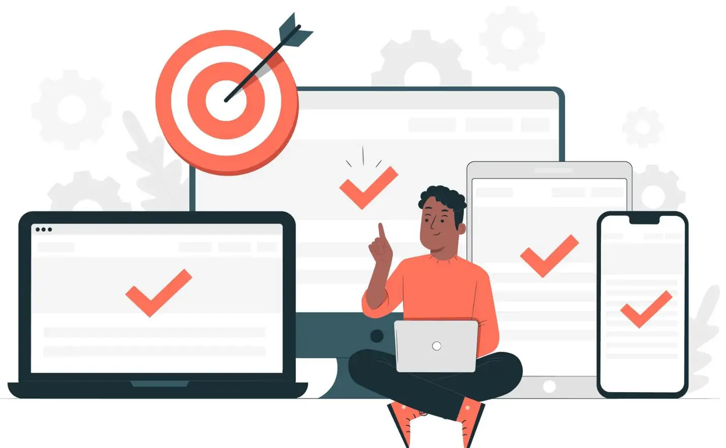
Nowadays, a lot of network traffic comes from mobile phones and tablets. If you don’t pay attention to the experience on these devices, your conversion rate may be greatly impacted. Optimising for mobile devices ensures that all visitors, regardless of the device they are using, have a positive and fully functional experience, thereby maximising the potential for conversions.
9. Test and Optimise Your Landing Pages
Achieving optimal performance from what makes a good landing page is an iterative process that requires continuous testing and optimisation. A/B testing involves making different versions of what makes a good landing page to compare and see which version can best impress the target audience. This step is very important. To put it simply, this means you need to take a good look at the title, images, call to action, and the fields in the form, and try different approaches to see which combination works best. It’s also very critical to continually monitor critical metrics such as conversion rates, exit rates, and form completion rates so they indicate how your landing pages are actually performing and help identify areas for optimisation and enhancement. Improvement is not a single task, but an ongoing effort to continually optimise and improve the efficiency of your landing pages over time. This cycle of constant inspection and enhancement is extremely critical because just because something works for several people, or a certain proposal doesn’t mean it will work for others. If you want to achieve the best conversion rate, you cannot do without a data-based experimental approach.
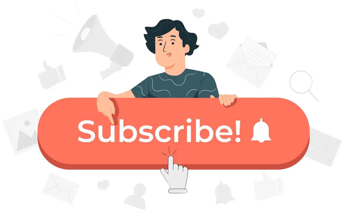
10. Use a Thank You Page
After visitors comprehend what they are supposed to do on the landing page (like filling out a form), it is a good idea to direct them to a dedicated thank-you page. This step is simple and has some clear benefits. The thank you page will immediately confirm with the guest that their operation has been completed. Plus, it provides a great opportunity to deliver on a promise, such as giving someone access to download several materials or the ability to watch a webinar. In addition to completing the initial proposal, a thank you page can also involve a secondary proposal or related proposal materials that may spark the new client's interest, thereby keeping interaction and nurturing them further in the marketing process. By giving guests clear instructions on what to do next, or sending them something useful, thank you pages can better maintain relationships with guests and encourage them to engage more with your brand.
Tips for What Makes A Good Landing Page
Still wondering what makes a good landing page? Here are effective tips. Creating a high-converting landing page requires a strategic method that includes detailed preparation, persuasive content, effective design, and ongoing optimisation.
Pre-Creation Considerations
Before you dive into the layout and content of your landing page, consider a few crucial factors. The most critical thing is to define your goal clearly. What specific actions do you expect your visitors to take? This may include signing up for announcements, accessing resources, requesting a product demonstration, or making a simple purchase. If you have a clear idea of your goal in mind, the choices you make later will not lead you astray. It’s about understanding your audience intimately. Investigate their motivations, pain points, and possible hesitations so you can tailor communications and provide solutions that truly align with them. The third point is to determine your offer. In return for their efforts, it gives the visitor several valuable resources or motivation to help the visitor achieve their desired goals. This could be an e-book, access to a webcast, a particular discount, or a free trial. Fourth, you have to pick the right tool for the task. Choose a landing page creation tool that matches your skill level, financial resources, and desired features. Several of the more famous platforms include HubSpot, Unbounce, Instapage, and Wix. Finally, mobile device usability should be considered from the very beginning of your design. Because a gigantic amount of Internet traffic comes from mobile devices, to truly reach the target user group, the website must have a responsive design.
Content Creation Tips
Writing content that people find particularly persuasive is really critical for what makes a good landing page. First of all, you have to think of an eye-catching title. The title should be direct, concise, and clear, highlighting the advantages and grabbing the customer's attention at once. Next, use convincing and concise words to focus on the benefits of your proposal and directly address the pain points of your target audience. Use short paragraphs and bullet points to organise your content so it’s easy to read and your information is clear. Include top-notch and relevant images and clips that are visual elements that directly assist the message and effectively highlight the product’s value proposition. Use a particularly catchy call to action, be clear and direct, and let customers know what they should do. Its goal is to put the most crucial information above the fold, like the title, main discount, and call to action buttons, so that visitors can see it as soon as they open the web page without even moving the mouse wheel.
Design and Layout Tips
The visuals of your landing page will directly determine how well it performs. Try to keep the design clean and simple, make use of white space, and avoid overwhelming your visitors with too much information. By cleverly using font size, colour depth, and panel placement, you can ensure that the image has a clear visual focus, so that the visitor's eyes can be directed to the most critical information. It must always adhere to the established brand colours, fonts, and other things so that the entire web page looks consistent with the brand image. Make your pages load faster so visitors don’t leave because they load too slowly.
Finally, don't hesitate to test different layouts for your landing page to see which arrangement of components leads to the highest conversion rates.
Form Optimisation Tips
It is very critical to improve your documents by creating a landing form for your potential customers. Ask only for the information you need. The fewer fields you require, the higher your conversion rates are likely to be. Place the file in a prominent place on the page so it is easy to find and process. Use clear labels and blank spaces for each document so that visitors can understand what information is required. Smart fields are flexible, they can distinguish whether it is a new customer or an old customer and choose the appropriate filling approach. This way, old customers can save a lot of trouble when filling out the form.
Post-Creation Tips
After completing the landing page, the task is not yet over. Test your landing page thoroughly across various devices and web browsers to ensure it functions properly, is adaptable, and is visible. Keep an eye on efficiency metrics such as conversion rates, exit rate, and time spent on the check-in form to understand how guests are using your "what makes a good landing page" takeaways. By analysing the collected data and A/B test results, we continuously improve the landing page to make it more and more effective. Finally, if your target group includes people from different industries with different needs and preferences, consider segmenting your campaign. Create a dedicated landing page for each specific industry.
Optimising Your Conversion Journey
In short, understanding what makes a good landing page and increasing the number of landing pages is extremely critical for any small business that wants to maximise the effectiveness of online promotion. An efficient landing page is such an important conversion station that can turn interested guests into valuable potential customers and finally into loyal customers. These core principles discussed in depth — creating a headline that highlights your benefits, choosing eye-catching images, emphasizing a clear call to action, maintaining your copy short, maintaining it consistent, building confidence, reducing distractions, being mobile-friendly, testing and improving, and making good use of a thank you list — together form the crucial building blocks for creating a successful landing page.

It is very critical to do things with the user at the centre. Deeply understand the needs, pain points, and motivations of your target group so that you can understand what makes a good landing page that truly impresses them and is of practical help to them. Remember, the digital landscape is always developing, and what works today may not work tomorrow. So, constant checking and enhancement are extremely critical to stay ahead of the curve and keep your conversion rates as high as possible. By following the landing page best practices and organisational advice in this article, you can significantly increase your landing page strategies. You can make the conversion process more effective and ultimately achieve the results they desire.
Written by
Kimmy
Published on
Mar 17, 2026
Share article
Read more
Our latest blog
Webpages in a minute, powered by Wegic!
With Wegic, transform your needs into stunning, functional websites with advanced AI
Free trial with Wegic, build your site in a click!
What kind of website do you want to build?