Log in
Build Your Site
Mobile Website Design: 14 Best Practices
Learn how to create a seamless, responsive site with our comprehensive guide to mobile website design. Discover key elements, best practices, and future trends to ensure your site shines on any screen.

Do you find yourself dealing with a website, which just doesn’t size properly on a mobile phone screen? Let me assure you, dear reader, that you are not the only one with such thoughts. Trying to work on a site that was not optimized for the small screen is not a fun experience—tiny letters, touch-unfriendly buttons, and page after page with no clear way to get to where you want to go. And this is where mobile website design comes into the picture and is more important than it has ever been.

Today, those who do not have a fully responsive website are ‘out of it’ or more appropriately ‘out of business.’ Think about it: mobile devices are known to contribute to the bigger part of internet traffic. Whether you are planning to design a site for your business or a blog or just for sharing your interest with the world, you must pay attention to the mobile website design another thriving column of a successful site is that the site should be responsive enough to open any page easily in any device.
So, without further ado, happy deep-diving into the topic of mobile website design. Let me break down those basics for you and by the time you finish this guide, you’ll be aware of the things that can make or mar the mobile experience and ensure the flow is seamless, visitor-friendly and encourages repeat visits.
Why Mobile Website Design Matters More Than Ever

As we all know, today our phones are as much a part of us as our arms and legs. Today, if we’re getting food delivered to our doorstep, shopping online, or just surfing the net, most of us do not look up from our screens. And so it stands to reason that the mobile audience has surpassed the desktop one in recent years. In this new paradigm, having a website that is at the very least mobile responsive is no longer an ad hoc, it is a necessity. How about struggling to work on a phone site where the buttons, texts, and even hyperlinks are so small that tapping is impossible, the text is too long to fit the screen, or the site requires constant zooming in and out just to read a line or two? That’s the kind of experience that makes users go elsewhere in no time, or rather in the time it takes to press the back button.
Responsive design is not only about merely scaling the objects of the website for use on a mobile device. It is all about redesigning the journey that a user goes through when he or she interacts with a given product.

Picture this: your potential customers are busy with their daily lives, they are busy working, probably chasing after their children, and they do not have the time or the patience to search for the answers they seek. If your site is not easy to use, fast to load, and easy to navigate, they are gone – possibly to a competitor who has. Hand on heart, no one wants to compromise on the mobile experience in the world of instant reactions. And if you cannot offer that you might as well not exist at all, people will ignore your existence.
However, mobile website design is not only important concerning the site's usability: it also impacts the site’s SEO. Mobile-friendliness Google has reaffirmed many times that it is among its ranking signals. Therefore, if your site is not yet optimized for mobile, then you are not only losing visitors, but you are losing visibility too. Exactly – the Google bots are visiting your site with the mobile-only perspective, and if your mobile version is not great, then you are toast. It is as good as going for an interview with a company dressed in pajamas – it’s not well received.

You might ask, “Wait a minute, quite often I create a cool-looking desktop website, do I need to spend time on mobile website design.” The answer is absolutely yes. It’s crucial to regard your website as the brand that it is — a virtual store of your business. Potential customers will not spend their time searching for a way in or struggling with a door that is too stuck to get into your store. The same can be said for mobile design. If your site is not easily accessible, one will not waste time bumping around on it and leaving.
Mobile website design is all about the future of your online business and company presence. It gives assurance that regardless of the likelihood by which or where a person is approaching your site they get the optimum view. And let’s face it; in the current, fast-moving, mobile-first world, that’s the kind of edge businesses need to sustain.
Key Elements of Effective Mobile Website Design
It means that in the case of designing a mobile site, it does not translate to just minimizing the home PC website design and fitting it to the pocket-sized screen.
Oh, if only it was that simple to undertake a critical reading and stand ashamed of rote learning and reiteration! Of course, a good and properly optimized mobile site requires solid and detailed work on the customer and usability, simplicity of navigation and fast loading. Therefore, here are the components that can turn into strengths or weaknesses of the mobile website design.
Responsive Layouts: Not Just a Buzzword
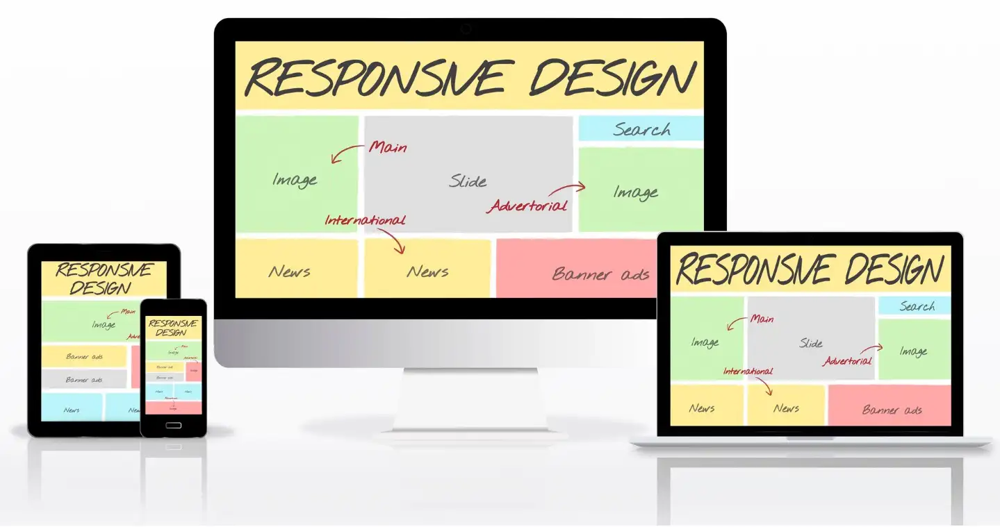
Loose coupling is the basis of mobile website design, and there is a good reason for it. When it comes to internet browsing, everything has to fit onto a screen and the size may vary: it is the smartphone, tablet, or, do not forget, a phablet. It’s dreadful to open a website on a phone and the only thing you can read is one line at a time while having to scroll and swipe left or right. Frustrating, right? Responsive web design ensures that your content changes easily and follows the browser layout, thus enabling easy navigation of the site.
But don’t think of responsive design as just resizing the object here – it is much more complicated than that. It is about doing what is essential most of the time, not all of the time. Larger screens can have more content in them on a mobile layout, it’s less is more. Focus on the essentials. It is also important to know ‘what else’ about your audience, and what it is that they need to see first of all. This intentional whittling down of the content or the information you want to present to the user benefits in not inundating the user with plenty of information while at the same time delivering just what they need.
Speed: The Need for Speed (No, Really)
I think it is about time that people confront this fact: nobody likes to wait and this is particularly true when it comes to loading a website. Mobile web design: the quicker the better – all you need to know about loading time. The more quickly the necessary page is loaded in the client’s browser, the better it is. Last but not least, a website’s loading speed is one of the criteria by which search engines such as Google consider a particular website. Therefore, if you desire your site to be more effective than your competitor’s, be sure that it is as fast as it is colourful.
How do you achieve this? Begin with minimizing images—Though you may certainly like to use clear images, these take a long time to load. It is advised that you acquire a Content Delivery Network (CDN) to host your content on different servers to minimize the distance between your site and your clients. Every millisecond counts! And here’s a quick tip: do not use large, cumbersome scripts that will take a long time to load. Making your code cleaner is like tidying your pile of bicycles, it all just works better and moves faster. Also, your users will be grateful to you for it!

Touch-Friendly Navigation: Ditch the Tiny Buttons
Now, let’s discuss taps – or, more precisely, taps you make on your phone’s buttons. It’s like when you fail to click a button that is so small you end up missing it three times before lodging the click. And that, ladies and gentlemen, is yet another example of a terrible design of mobile website. As you will see, this is as true in the world of mobile phones as it is anywhere else: your thumb is the measure. Ensure all the buttons and links on the website or application are large enough to enable easy use without one having to use a magnifying glass.
Designing for touch is not, however, a matter of scale alone. It’s also about placement. Consider the way you usually take your mobile in hand, that is with one hand only. Buttons and menus should also respect the thumb zone so that usability can be perfect. If it's irritating to let thumbs do acrobatics on your website and your users have to do just that, then it's high time you redesign your site.
And, if I may be so bold as to make one final request, do not use hover menus on mobile site designs. It may be manageable with a mouse on a desktop, or laptop computer, but on a touch screen, it is only frustrating. Rather, such actions as tapping or swiping should be used because they are easy to understand and thus make the interface easy to use.
Content Prioritization: Less Is More
Who among us has not come across those websites that attempt to provide as much information as can fit in a single page? That might be fine for the desktop, but oh boy it is hell on mobile. Essentially, if there’s one aspect that defines convenient mobile internet usage, it’s the curation of what is needed to be right on the surface and what can be out of sight.
When it comes to designing user information, the starting point should be the fundamental information your users require. Is all of this your contact information? A product list? Whatever it is, make sure that it is on the mobile site; ideally, it should be the first thing that visitors see. More minor elements or changes can be placed in the expandable menus or accordions that do not distract the design.
Just bear in mind that the users of the mobile web are generally always on the go. What they desire is a fast understanding of the content, not to sit, unfolded, turning the pages of a book with non-stop text. Therefore, make your content as brief as possible. Users should find their way around your site easily; this can be achieved by using bullet point forming, small paragraphs and clear headings.

Readability: Size (and Contrast) Matters
Mobile website design’s worst friend is the use of very tiny text. Let me rephrase the statement: if to read your content your users require a magnifying glass, you have an issue. Make sure your text is legible on the small screen as it’s not cool when users are forced to zoom in on the text.
But it’s not just about size—although contrary to common sense, contrast plays a huge role when it comes to improving the readability of text. Running a light grey font on a white background might seem very stylish and professional, but it is very bad in terms of readability. For this, ensure that you use stark shades of colours to make your text ‘pop’ and be easily read regardless of the external light conditions.
Also, there is the font, which must also be chosen carefully. People are fond of stylish and beautiful fonts for printing them, but most of them are barely readable on a screen. Use clear non-italicised fonts that are easy on the reader’s eyes and also suitable to be used on both; mobile devices and computers.
Visual Hierarchy: Guide the User’s Eye
A combination of principles is the visual hierarchy and is used to lead the viewers’ attention to the points that are relevant on the given page. In the context of m-website design, it is about the manipulation of size, colour and position which fashion out noticeable content.
In this case, what is also important is the differentiation. For example, the headings should be bigger and bolder than the rest of the body content. Call to action such as a ‘Buy Now’ or ‘Sign Up Here’ button should be coloured differently and located in easily recognizable places.
Here again, it is best to have white spaces. This may be a hack, but there’s no reason why some frameworks should not be left blank to create emphasis and presence for the content.
Designing your site with a good layout and following the principles of visual communication, makes it possible for every user, after visiting your site, can’t get lost and overwhelmed by the information provided.
Mobile-Friendly Forms: Keep It Simple
That is why, the idea of filling long or complex forms for example through a mobile device is very uncomfortable. At least, this seems to be the rule when it comes to mobile website design and development. Make all your forms brief, including only such data that is necessary.
It may be faster for a user to use one of the autofill options and if the form is more extensive, it should be divided into parts with the subsequent steps. And to always use the correct kinds of input – such as the number pad for telephone number inputs – so users do not have to go back and forth between keying.
In this case, the goal is to enable forms to be quick and simple to complete, something that users are not likely to stop in the middle of doing.

Testing: The Unsung Hero
Last but not least, do not underestimate the power of testing in mobile website design. People often think their site is responsive, meaning it looks perfect on every device it is viewed on, but the reality is, that until you test, you will not know.
There are tools, which allow you to preview the site as it would look on different screen sizes and different devices; it is also recommended to try loading the site on a real smartphone or a tablet. It’s always disappointing to see what looks beautiful on a desktop monitor a total disaster on a phone; that is why a test is essential to find out before the users do so. Well, just one thing to remind you: the field of mobile technologies is in constant progress. It’s also important to update your site frequently and test it frequently for compatibility with the current devices and trends in the market. It is the most effective way to keep our mobile website design young and, therefore, relevant to the public.
Because Who Doesn’t Love a Good Mobile Makeover?
Eventually, we have discussed a lot about mobile website design, now if you are here and your business, wants to make your mobile website design look great on small screens. But come on – is creating mobile-friendly websites just a luxury or necessity in today’s technological world? Anyway, there it is. Fresh into the job, the thought of plunging into all these aspects can be compared to standing and attempting to thread a needle with two hands while on a unicycle with two torches in each hand.
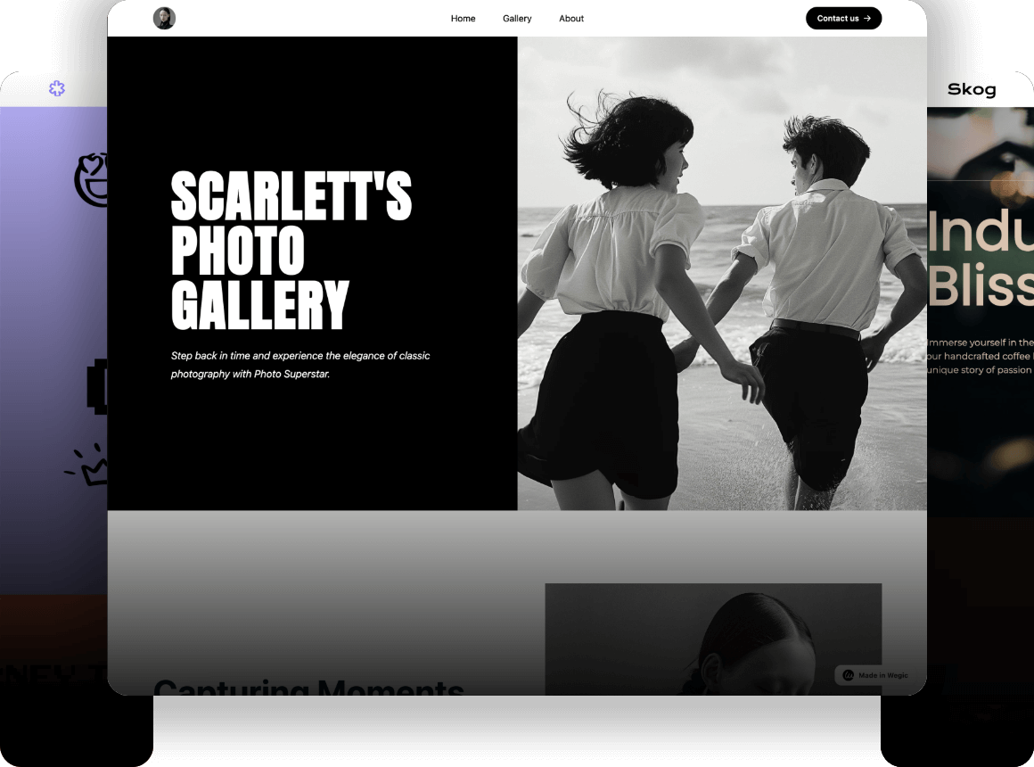
If you find yourself wondering, But where do I get started with all this? welcome to the club. The good news? You are not left to your own devices. Indeed, the process of designing mobile websites looks complicated, especially, if one has no idea about technology. But that’s where tools such as Wegic come into light. It’s your guide through the bewildering web, making sure your website looks as good on the small screen of a mobile device as on the big screen of a computer.

Wegic is like a cool friend who knows how to do everything and makes it look effortless. Need a website? Wegic’s got you covered, no sweat. This AI web designer and developer doesn’t just build your mobile website design—it chats with you about it, like you're discussing weekend plans. Whether you're setting up shop online, creating a killer resume, or launching a photo gallery, Wegic is here to make it happen with a wink and a smile.
Wegic’s Bag of Tricks:
-
AI-Powered Design & Development: Wegic uses advanced algorithms that turn your vague ideas into a polished website. Think of it as your brain but with HTML skills.
-
Chat-Based Interface: Just talk to Wegic. Seriously, that’s all it takes. It's like texting a friend who also happens to be a web design genius.
-
Versatile Project Scope: Whether you’re building a blog about your portfolio or an online store for your homemade jam, Wegic can handle it all. No project is too quirky.
-
Supportive Sidekicks: Wegic comes with three extra assistant tools that jump in to help, making sure your website is as smooth as a buttered biscuit.
Why You’ll Love Hanging Out with Wegic?
-
Ridiculously Easy: If you can chat, you can create a website. No coding. No headaches. Just smooth sailing from idea to launch.
-
Customizable: Want to add a personal touch? Wegic lets you tweak and tailor your site until it’s just right. It’s your site, after all.
-
Time-Saving: Let the AI do the hard stuff. You get a shiny new website faster than you can say "I hate coding."
-
Extra Help on Hand: Those assistants? They’re like having a tech-savvy bestie who’s always there to offer advice and fix stuff when you need it.
As has been said, it does not have to be perfect right from the start, but it has to be started. This comes as a high time to raise the question of organizing it in a manner that will be beneficial for the audience. There is not a tiny angle that doesn’t need fine-tuning, whether you are fooling with your navigation, or image, making sure your content appears great even on scaled down to a mobile screen.
So, what’s next? Breathe and explore cellular site design being aware of the fact that it is doable to make your mobile website design a masterpiece. But if you require a bit of a nudge in the right direction, do not eschew the assistance of advanced features such as Wegic and others. The next time your mobile site visitor comes by, he will be thanking his lucky stars – while your business’s profitability does the same.
Written by
Kimmy
Published on
Mar 17, 2026
Share article
Read more
Our latest blog
Webpages in a minute, powered by Wegic!
With Wegic, transform your needs into stunning, functional websites with advanced AI
Free trial with Wegic, build your site in a click!
What kind of website do you want to build?