Log in
Build Your Site
What Makes a Nice Looking Website: Tips & Best Practices
Check out these 4 must-see tips and best practices for designing nice-looking websites that wow visitors, deliver a seamless experience, and boost conversions.

Let’s be honest—these days, everyone has a website. The internet is packed with millions of sites, so if you want yours to stand out, it has to look sharp and professional. But what is a nice-looking website?
It's more than just good aesthetics; it's about functionality, clarity, and the ability to keep visitors interested. A good website design example is one that leaves a strong first impression. When someone visits your site, they form an opinion almost instantly—within 8 seconds, to be exact. That’s all the time you have to grab their attention before they move on to something else, like a trending video or an adorable cat meme. In fact, studies show that human attention spans have dropped to just 8 seconds, which means your website needs to make an impact quickly.
But don’t worry, it’s not as overwhelming as it sounds. With some thoughtful design choices, you can create a website that looks amazing and keeps visitors engaged. From selecting the right fonts and colors to balancing layout and spacing, small changes can make a huge difference in how users perceive your site and interact with it.
Click on the picture to make your appealing website online for free! ⬇️
Today, I’ll walk you through 4 simple, practical tips and some of the best website designs to make your site look professional and inviting.
1. Craft a Clear Visual Path
Ever wonder how people actually look at your website? Spoiler alert: they don’t read everything. They scan, and they do it fast. That’s why smart web design isn’t just about looking pretty; it’s about guiding your visitors’ eyes to the good stuff. Two tried-and-true methods for this are the Z-pattern and F-pattern, and trust me, they’re game-changers.
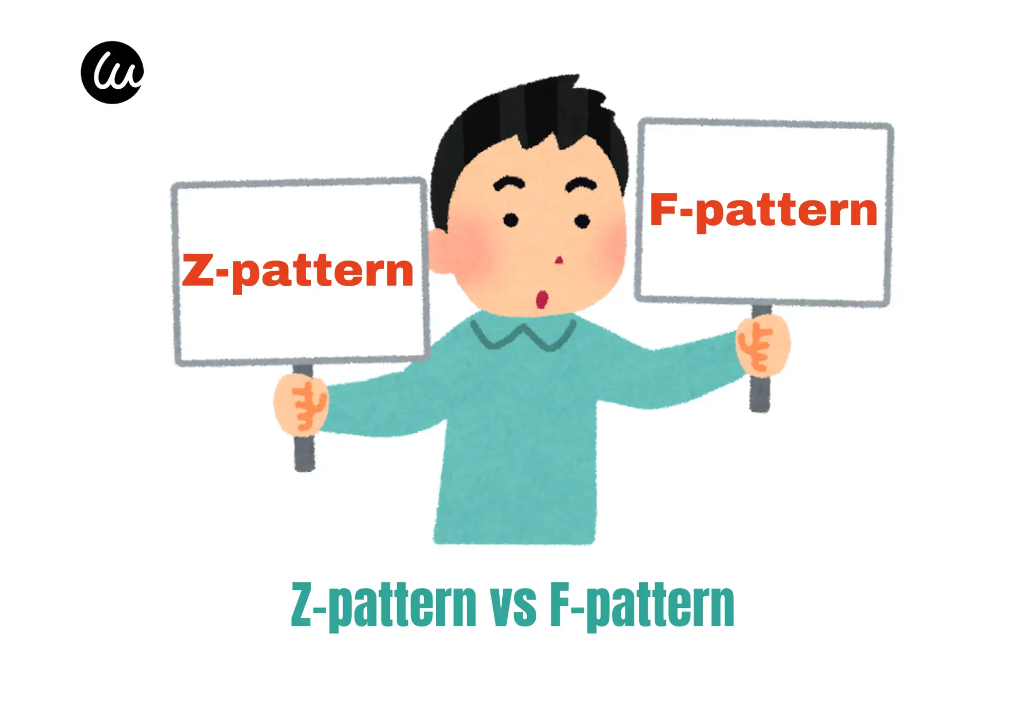
The Z-Pattern: The Zigzag That Gets to the Point
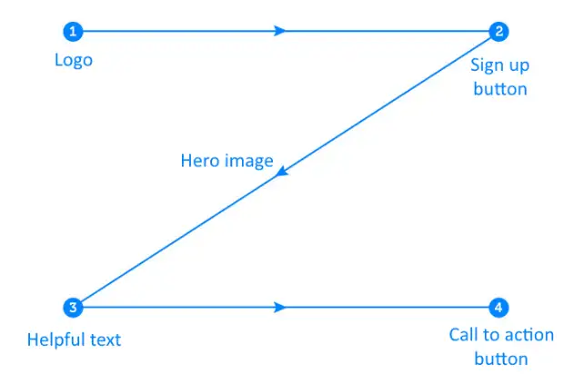
For websites with minimal text—think landing pages, promo sites, or anything that doesn’t drown people in paragraphs, the Z-pattern is your best friend. It’s how our eyes naturally move across a clean, text-light page:
-
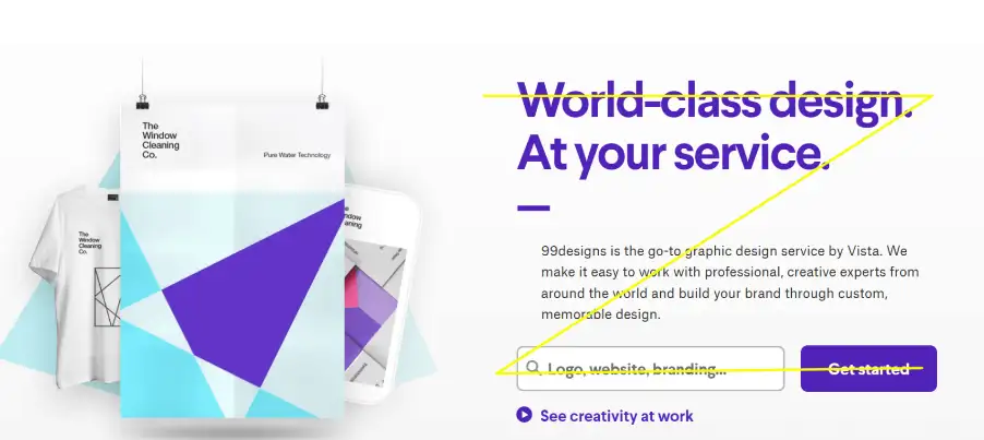
Start top left (usually the logo).
-
Glide top right (navigation or a headline).
-
Zigzag down diagonally to the bottom left (maybe an image or tagline).
-
Land bottom right (the “Sign Up” or “Buy Now” button).
How to Use It:
-
Top left: Your logo. Easy win.
-
Top right: Navigation or your snazzy headline.
-
Middle diagonal: A bold image or your catchy tagline.
-
Bottom right: That CTA button that screams, “Click me!”
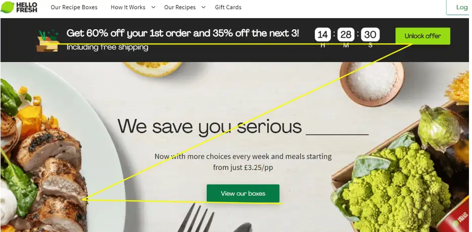
Here are some examples of the Z-pattern:
The F-Pattern: For the Readers (and Skimmers)
If your site leans heavier on content—blogs, service details, or even feature-packed product pages—the F-pattern comes to the rescue. It’s how people naturally read the text:
-
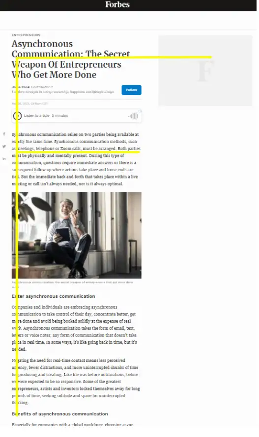
Start at the top left (headline).
-
Skim horizontally, then drop down the left side.
-
Spot something interesting? Their eyes dart to the right.
-
Repeat until they hit the bottom.
How to Use It:
-
Bold headlines at the top.
-
Key info (features, pricing, etc.) aligned on the left.
-
Throw in visuals or links to pull their attention across.
Here’re some examples of the F-pattern:
The Magic of Combining Both
Think of your website as a journey. The Z-pattern acts as the friendly greeter, welcoming visitors with a clean, focused introduction to your brand or product. As they explore further, the F-pattern takes over, helping them navigate through deeper layers of content with ease.
Homepage: Use the Z-pattern to make a powerful first impression and guide visitors toward a key action.
Inner Pages: Switch to the F-pattern to deliver detailed information in a structured, user-friendly way.
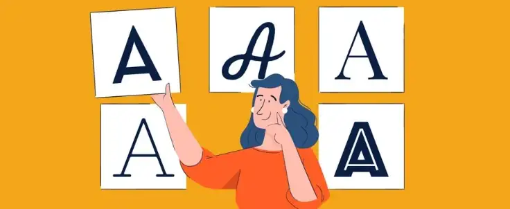
2. Choose the Right Font
Why Fonts Matter
Font choice is a crucial detail that can make or break your web design. Fonts are the silent heroes of web design. They might not scream for attention like images or animations, but they quietly set the tone, guide your visitors, and convey your brand’s personality. Choosing the right fonts is like dressing your website—it needs to fit, flatter, and make an impression.
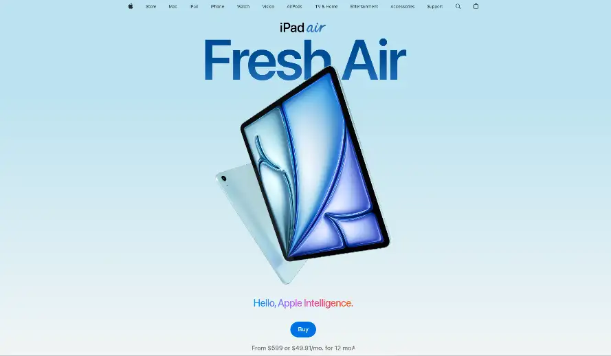
As an example, below is a screenshot of one of the most famous websites in the world:

Apple’s design stands out due to its font. Don’t believe me? Here’s the same page with another font instead:
Not Apple anymore, right?
The Main Types of Fonts
-
Serif Fonts: Think of these as the elegant “formal wear” of typography. With their distinct “feet” at the ends of letters, fonts like Times New Roman or Georgia exude professionalism and sophistication. They’re ideal for brands with a classic or traditional vibe, adding a touch of timeless elegance to your site.
-
Sans-Serif Fonts: If serif fonts are formal, sans-serif fonts are the modern jeans and t-shirt—casual, versatile, and perfect for contemporary designs. With their clean, no-frills appearance, fonts like Open Sans or Helvetica are especially suited for digital screens, ensuring your site looks fresh and approachable.
-
Script and Display Fonts: These are the statement jewelry of web design—bold, creative, and full of personality. Fonts like Lobster or Yellowtail mimic handwriting, adding flair and uniqueness. But be careful: they’re best used sparingly for headlines or accents, as they can overwhelm when used for large blocks of text.
How to Choose the Right Font
-
Stick to Two or Three Fonts
When it comes to font selection, less is more. Use one font for headings to grab attention and another for body text to keep things readable. Too many fonts can make your site look chaotic and unprofessional.
-
Match Your Brand’s Personality
Your fonts should reflect your brand’s vibe:
-
Formal and sophisticated? Opt for a serif font.
-
Modern and casual? A sans-serif font will feel right at home.
-
Creative and bold? Add a script or display font for accents, but don’t overdo it.
-
Prioritize Readability
Your website’s primary job is to communicate, so readability is key. Choose fonts that are easy to read across all devices and avoid overly decorative options for body text. Save the fancy fonts for headings or special elements.
-
Test It Out
Preview your fonts on desktops, tablets, and smartphones to ensure they look sharp everywhere. Also, check for loading speeds—some fancy fonts can slow down your site, which might drive users away.
Fonts are more than just letters, they’re your brand’s voice. Stick to a couple of well-chosen styles, match them to your brand’s vibe, and make sure they’re easy to read. With the right fonts, your website won’t just look great—it’ll feel inviting and keep visitors around. Let your typography speak for you!
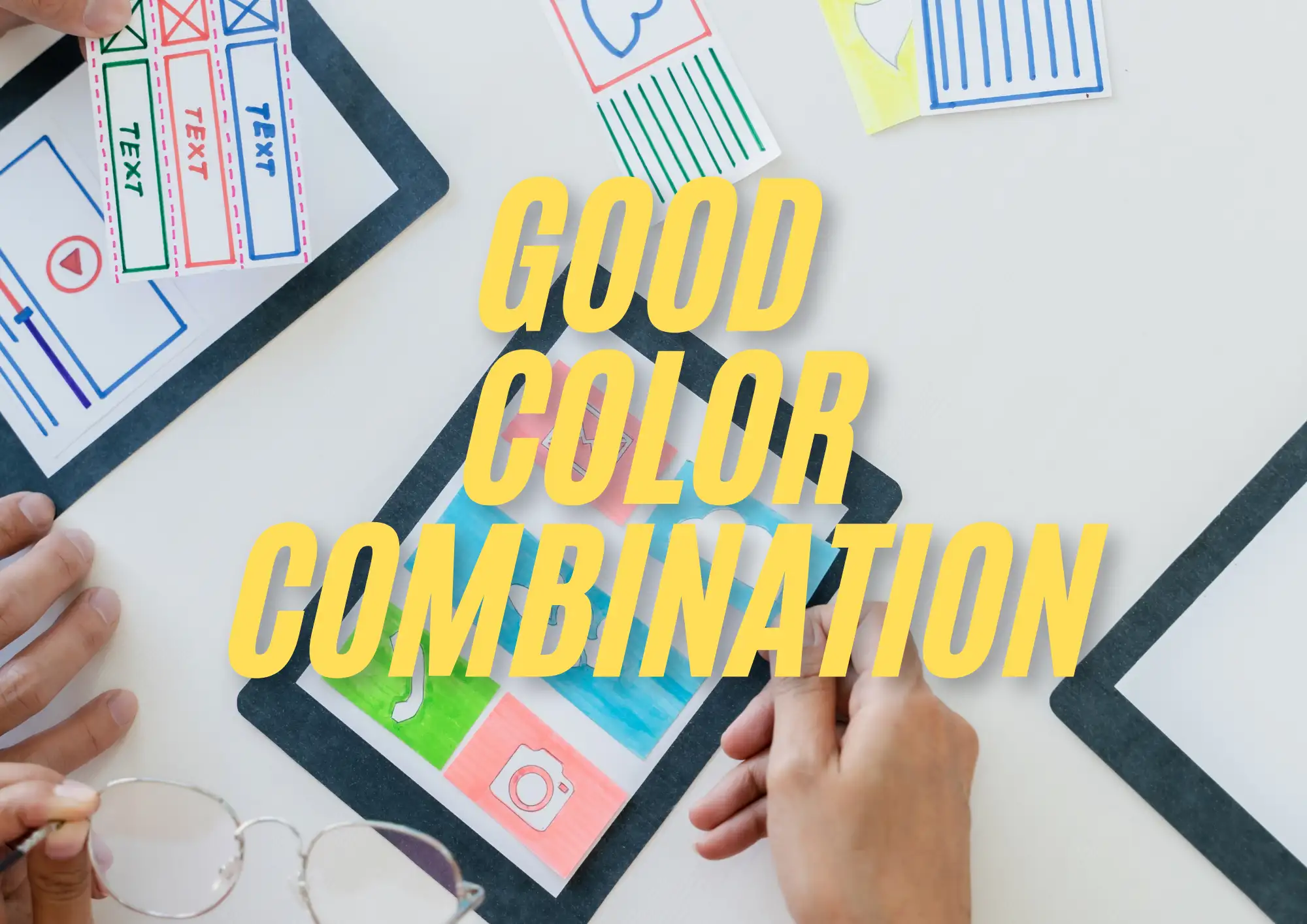
3. Choose a Color Scheme That Fits Your Brand
What is a website color scheme?
A website color scheme is a set of colors used consistently across your site to create a harmonious design. These colors enhance readability, highlight key elements, and evoke the right emotions in your audience. Think of your color scheme as the personality of your site—it tells visitors what to expect and helps them connect with your brand.
For most designs, stick to two or three base colors to keep things clean and professional. To expand your palette, use tints (lighter versions of your base colors) and shades (darker versions).
Why Color Schemes Matter
Your website’s color scheme isn’t just for looks—it’s a powerhouse tool that can build your brand and boost conversions. Think of it as your website’s personality in living color, shaping how visitors feel and what they do next.
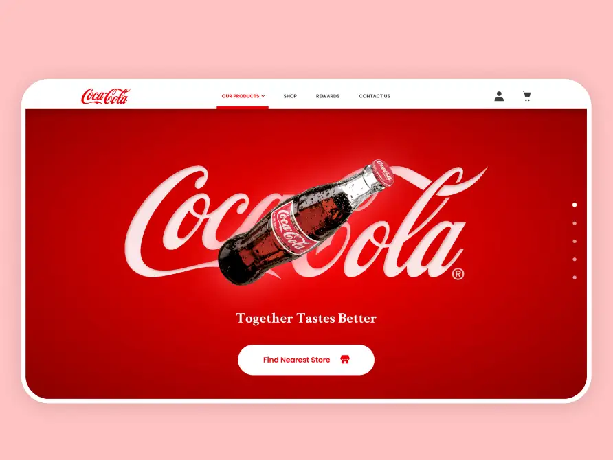
1. Build Brand Identity
Colors are like your brand’s voice, quietly telling visitors who you are and what you stand for. From the bold red of Coca-Cola to the calming blue of Facebook, research shows that color can increase brand recognition by up to 80%.
2. Drives Conversions
Colors don’t just tell a story—they drive action. Data from 2024 reveals that 85% of consumers say color influences their buying decisions.
Here’s the trick: accent colors. These are bold, contrasting hues that make buttons, CTAs, or key products pop. Think of a vibrant orange “Buy Now” button against a neutral gray background—it’s like a flashing arrow pointing users in the right direction.
Want to find the perfect accent? Turn to the trusty color wheel. The complementary color directly opposite your primary hue will stand out and draw attention. For example, if your site leans blue, an orange accent color can guide users’ eyes to what matters most.
With the right color scheme, your website isn’t just visually appealing—it’s memorable, persuasive, and totally on-brand. Let your colors do the work for you!
4. Let Your Website Breathe with White Space
What Is White Space?
White space—also called “negative space”—is one of the most underrated elements in web design. While some website owners may see it as wasted space, designers know better. White space is essential for creating balance, improving readability, and guiding your visitors’ focus. It’s like the silence in music or the glue in a mosaic—it holds everything together.
White space refers to the unmarked areas surrounding visual elements like text, images, and logos. It can take many forms:
-
Wide margins on a page
-
Spaces between paragraphs or letters (known as kerning in typography)
-
The open areas within or around images
Despite the name, white space doesn’t have to be white. It can include soft colors, subtle textures, or even background patterns. As long as it separates elements and enhances readability, it’s doing its job.
Why White Space Matters
1. Boosts Readability
Good use of white space can increase text readability by up to 20%. It provides a visual break, making your content more digestible and enjoyable to read. Platforms like Medium demonstrate this perfectly with wide margins, generous paragraph spacing, and clear line spacing that create a clean, distraction-free reading experience.
2. Organizes Content
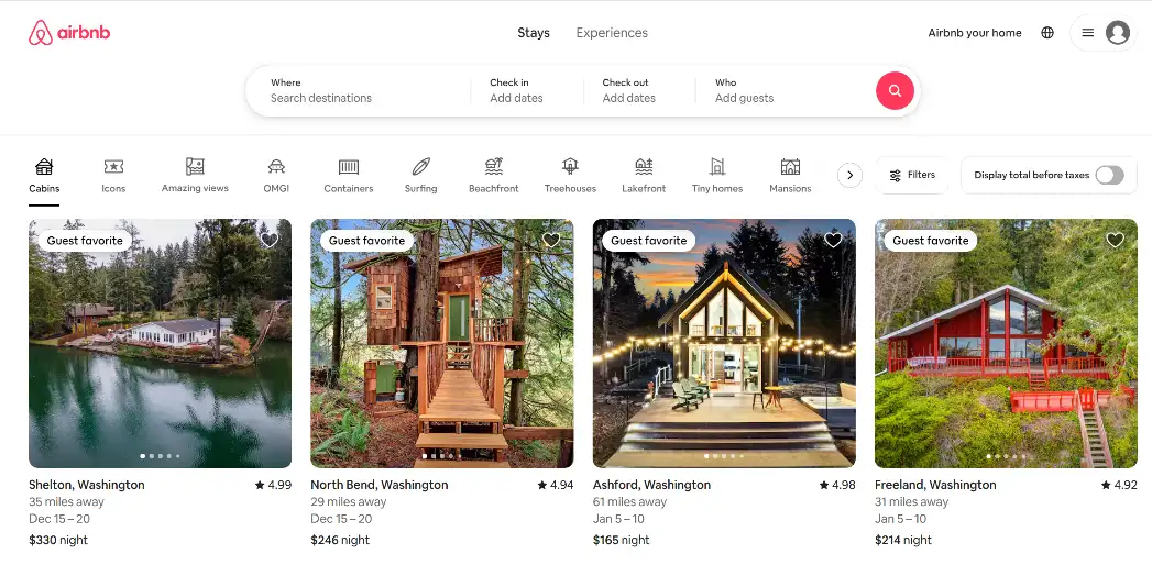
White space helps structure your page, grouping related elements and separating unrelated ones. This is rooted in the law of proximity, which tells us that elements placed closer together appear related. For instance, Airbnb uses white space to create clarity and simplicity, spacing out search results to make it easy for users to scan and compare options.
3. Draws Focus
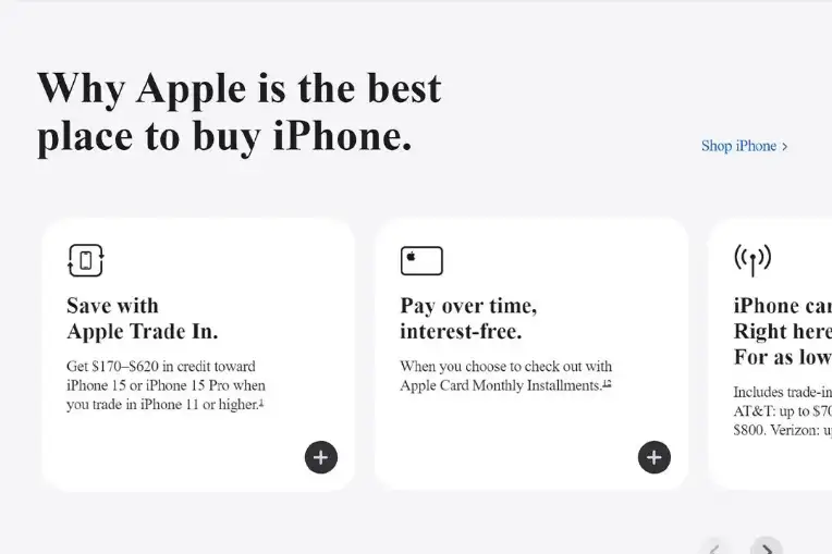
The more white space around an element, the more attention it commands. This is why minimalist designs often use ample space to emphasize key elements, like call-to-action buttons or product images. A good website design example is Apple, whose website features generous white space to spotlight its products, ensuring a sleek and focused user experience.
4. Adds Elegance
White space exudes sophistication. High-end brands like Vogue use it liberally to create a luxurious, polished feel. Incorporating white space into your design gives your website a sense of refinement and professionalism, elevating its overall aesthetic.
Remember: let your content breathe, and your visitors will stick around longer.
Final Thoughts
Creating a nice-looking website isn’t just about aesthetics—it’s about combining thoughtful design with functionality to deliver an exceptional user experience. If you’re wondering what is a nice-looking website, it’s one that balances form and function to leave a lasting impression. From crafting a clear visual path to choosing the right fonts, colors, and spacing, these tips and best practices will help you build a site that’s visually stunning, easy to navigate, and tailored to your audience’s needs.
Remember, a well-designed website does more than just look good. It communicates your brand, engages your visitors, and guides them toward taking action. By implementing these strategies, you’ll not only create a professional, cohesive design but also leave a lasting impression that keeps people coming back. Best website design practices show that thoughtful layouts and user-focused design are key to success.
Your website is your digital handshake—make it nice-looking and memorable!
If you’re looking for an easy way to beautify your website, consider using Wegic. This AI-powered tool simplifies the design process, allowing you to create a functional and visually appealing website without the hassle.
Click on the picture to try Wegic for free! ⬇️

Written by
Kimmy
Published on
Mar 17, 2026
Share article
Read more
Our latest blog
Webpages in a minute, powered by Wegic!
With Wegic, transform your needs into stunning, functional websites with advanced AI
Free trial with Wegic, build your site in a click!
What kind of website do you want to build?