Log in
Build Your Site
Mastering Website Aesthetics: Elevating Your Site's Look
This blog will take you to discover everything you need to know about website aesthetics, giving you some inspiration to make your website even more amazing.
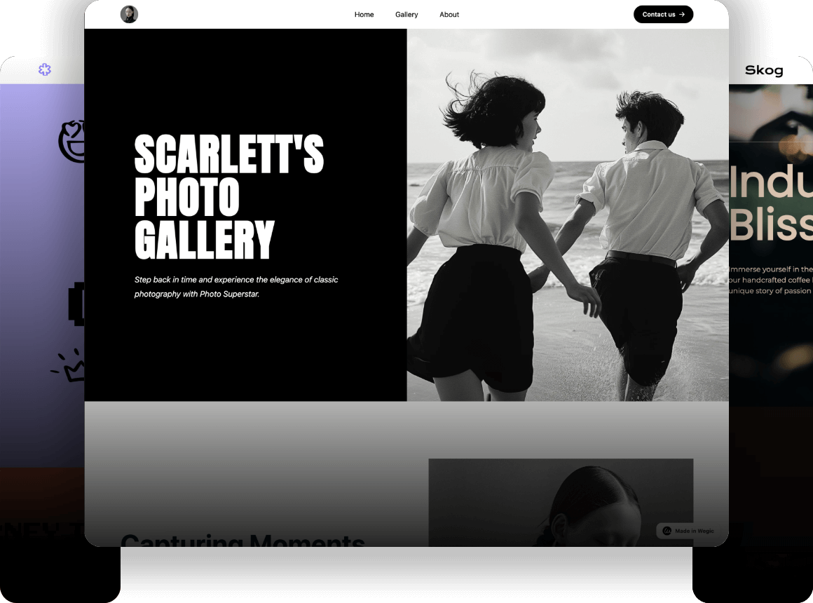
In this digital age, people are increasingly aware of the importance of a website, as it not only displays information but more importantly conveys a brand image. A beautiful eye-catching website can attract users' attention, enhance user experience and increase their interest and love for the brand. In this article, we are exploring how to enhance the overall visual effect of a website by mastering the principles and techniques of website aesthetics to elevate your website. It also helps improve user experience and create better publicity for your brand. By picking the right color scheme, adjusting font size, optimizing typographic layout and content, and applying animation effects, among other techniques, we design a valuable and informative website that is both aesthetically pleasing and functional.
Click here to Build your site
What is Website Aesthetics?
In web design, web aesthetics we mean refers to the front-end of a website, i.e. how the page looks like when presented to the audience. Web aesthetics encompasses many elements, including the overall color scheme of the web page, fonts, navigation, menus and user interaction, among others. Aesthetics focuses on providing a pleasing visual experience for the user by designing a beautiful website appearance through different color schemes, font design, typography, layout and so on.
In addition to aesthetics, the importance of functionality should never be overlooked in the website design process. Functionality focuses on focusing on the user's needs, by optimizing the layout, choosing the right elements and other methods to meet the user's needs. How to balance aesthetics and functionality is something that web designers have all been exploring. They have been thinking about what kind of design can make a website look more attractive, bring users a wonderful and pleasant visual enjoyment, and meet the user's needs and enhance their user experience.
Website aesthetics can greatly influence the first impression and brand image of the user, as the website is often a very important channel through which the user learns about the brand. When they open the website, the first impression will greatly influence their view and judgment of the company and brand, and will also directly determine whether they want to continue to stay on the site. Mastering the principles of website aesthetics to elevate the website is therefore very important.
Basic Principles of Website Design
The following are some of the more common principles and theories in website design that designers can learn from. By mastering these principles and incorporating them into real design practice, you will create a satisfactory web design.
Symmetry and Balance
The principle of symmetry has been widely used in the field of design. This principle helps to ensure that the web page is visually stable and comfortable and avoids confusion or discomfort for the user.
The use of symmetrical shapes and figures creates a harmonious and aesthetically pleasing visual effect, which helps to make a web page more attractive and aesthetically pleasing. Not only that, but symmetry also makes it more intuitive and easier for users to understand and use. Studies have shown that people tend to look for symmetry in everything. For example, facial symmetry improves people's evaluation of the attractiveness of a face.
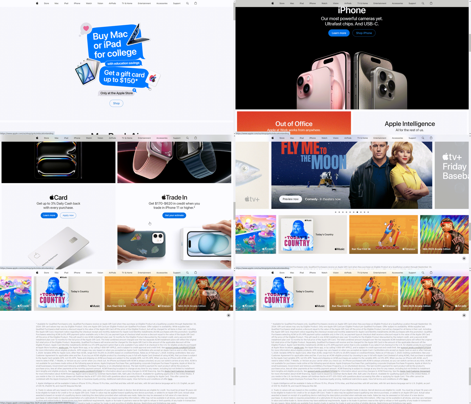
In addition to symmetrical designs, there are also asymmetrical designs. Asymmetrical Design (Asymmetrical Design) directs the user's attention and maintains a sense of harmony on the page by creating visual balance. The overall visual balance of the website is achieved not just through a symmetrical arrangement of elements, but via a combination of visual techniques and design elements.
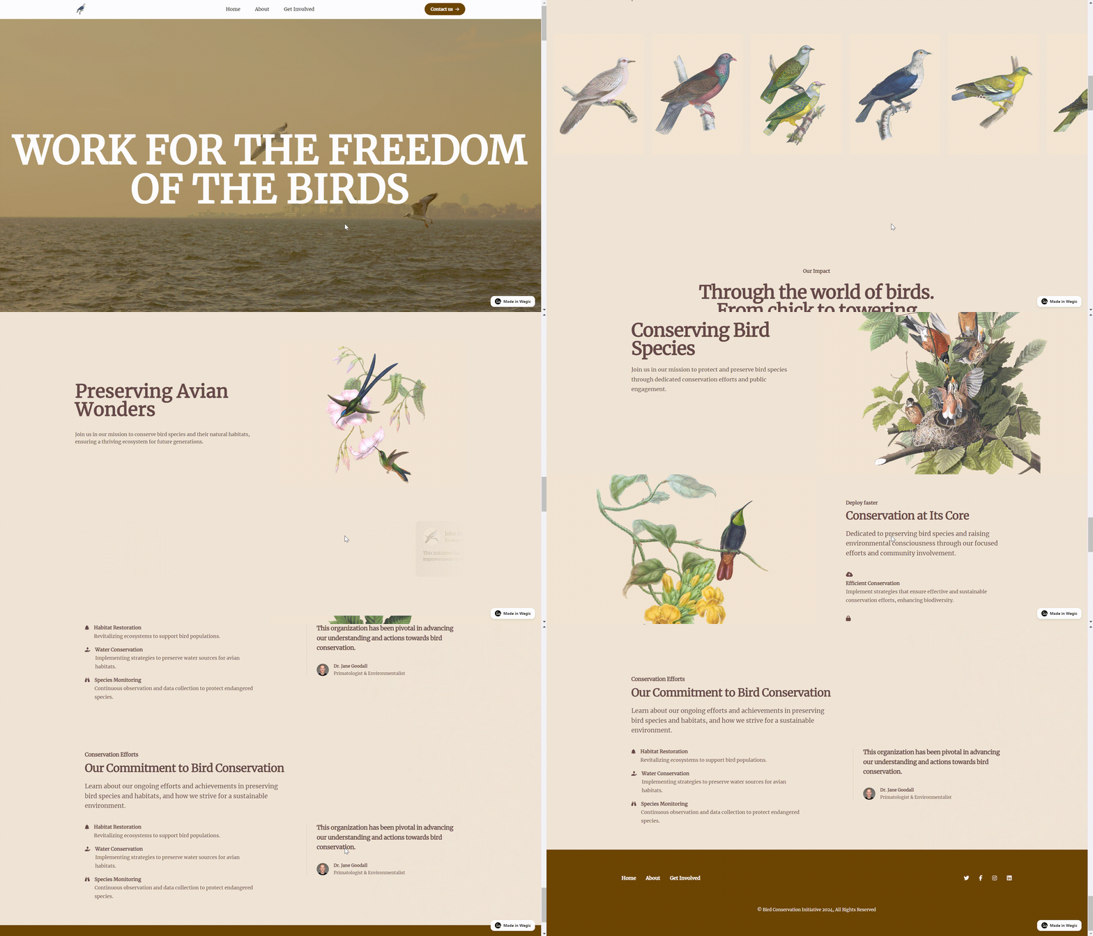
Contrast and Consistency
Contrast and consistency also plays an important role in design. Contrast makes it easier to differentiate between different elements in a design. Here we are talking about the contrast of colors. A strong contrast can emphasize an area in the design, which can attract the attention of the user.
Consistency refers to the process of combining the various design elements in a harmonious way, including the consistency of fonts and typography, images and icons. Each element has its own function, but they all share a common theme and are put together in a very hierarchical and logical way. Using a uniform color scheme, principles like repetition, balance and symmetry will help create a sense of harmony in the design and form a complete whole. Your website will look more professional and organized if you have consistency in your design.
What's more, it helps maintain consistent branding elements throughout the visual layout. Ensure that colors, fonts, and imagery align with your brand identity, creating a cohesive and recognizable visual language that reinforces your brand image.
Space Utilization and Visual Layout
The use of space and typography helps to optimize page layout, ensuring that important information is highlighted and easily accessible, and plays a vital role in attracting and retaining users. When users click into a website, the first thing they focus on is the overall effect and feeling. It is important to organize the many design elements and functional buttons to create an aesthetically pleasing, creative and functional website. This requires designers to start from the user's point of view, consider their needs, thoughtful, it will directly affect the user experience.
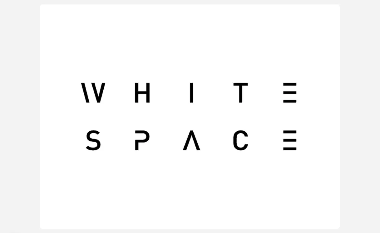
In addition, the utilization of white space should not be ignored. According to research, adding a certain amount of white space to a web page will increase readership, and it can direct users to focus directly on key content, especially what the brand wants them to know.
Color Theory and Emotion
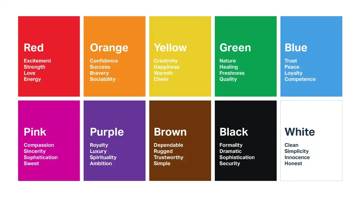
Color theory is also a very important aspect of web design, it conveys brand messages and triggers emotional resonance in users. Different color schemes will make users feel different emotions, so which color to choose needs to be considered in conjunction with factors such as brand image and main business. For example, cool colors are those that lean towards blue and green in the twelve hue ring, and will leave a calm, relaxing, natural, and professional impression on the audience. Choosing the proper color scheme can help enhance the user experience. Designing a website with a uniform color palette can enhance brand recognition and strengthen the user's impression of the brand. Choosing some color schemes with strong color contrasts can guide user behavior, such as matching certain buttons with bright and vibrant colors, which can increase user engagement and interaction. Utilizing good color theory can help designers create a more user-friendly website, improve user experience and create a positive brand image.
Visual Hierarchy
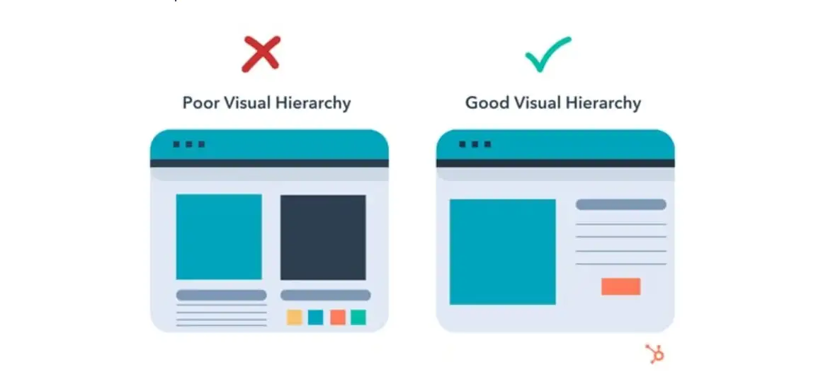
Visual hierarchy is the structure and prioritization of information in a design. It presents a holistic picture to the user, which can directly influence whether the user wants to delve deeper into the site or leave immediately.
Through the visual hierarchy, designers highlight the most important points, which are also the most important information they want to convey to the user. The rest of the design then unfolds slowly. With a clear hierarchy, audience can acquire the information and key points they need more faster. Directing the user's attention provides a smoother experience for the user. There are many ways to achieve this effect, such as the clever use of color, shape, size, spacing, proportion and orientation. Visual elements that determine hierarchy can also be used to convey the meaning, concept and mood of the composition. For example, adjusting the size, thickness and thickness of headline fonts can guide users to shift their eyes first to the main headline and then to the subheadings. In short, it's always the same rule to make a proper layout of your website and think about the needs of your users. Utilizing a good visual hierarchy can better help the site to guide the user's line of sight, highlighting the key content and enhance the user experience.
Let's look at this example. A good visual hierarchy should be like the one in the right side. Users can focus their attention on the blue box, and seize the key point at the first sight of the web page.
Design Tips for Elevating Your Website
Choosing the right color scheme
Web color schemes will directly affect the overall style of web design and user experience. A good web color scheme must be in line with the brand's style, attract users' eyes, and bring them a good visual experience and user experience. If the color scheme is inappropriate, it will lead to the overall style of the webpage is confusing, the key information and content can not be highlighted, the user can not quickly access to the information, it is not easy to read, and there is no pleasant visual experience. Such a color scheme is not conducive to brand image building.
Many factors need to be considered when choosing a color scheme, including one's main business, the overall style of the brand, how to choose the theme, etc. First, the designer needs to figure out the style positioning of the website. Drawing up the theme of the website in advance can ensure that the subsequent color matching will not deviate from the theme, and improve the website quality and user experience. At the same time, designers need to consider what kind of brand image they want to create and show in front of users. These questions need to be considered by the designers before the overall matching.
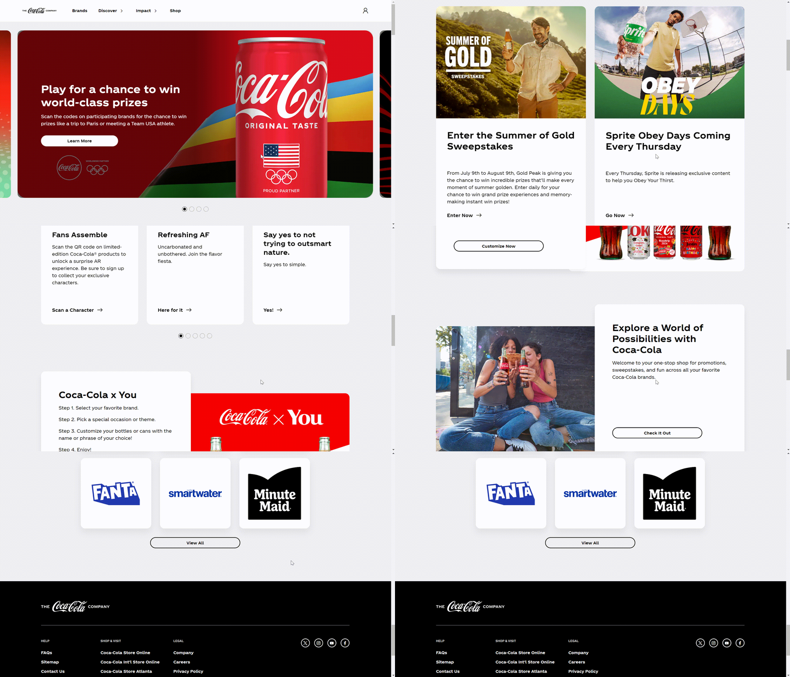
Different color schemes will bring different effects. For example, cool colors are those that lean towards blue and green in the twelve hue ring, and have properties such as calm, relaxing, natural, and professional. The scope of application is very wide and can be used in business finance, health food, tourism and other types of web page color schemes. Warm tones favoring red and orange are warm colors that can convey feelings of warmth, enthusiasm, vitality, etc., and are used to emphasize the focus on the webpage, suitable for use in food website color schemes that can stimulate consumers' appetites, such as the official website of Coca-Cola. The color scheme of red and white is the same as that of the brand's logo, which demonstrates a consistent brand image. Moreover, the use of red in a large area highlights a kind of enthusiasm and desire, which is more capable of attracting the users' eyes and stimulating their desire. It attracts users' eyes and stimulates their desire to buy.
Increasing the Readability of Your Content
Content readability is a key aspect of web design and directly affects how users use your information. Increasing the readability of content offers users a positive experience and creates long-lasting interaction.
Designers should present the same easy-to-read fonts on the web page to form a coherent reading experience and visual experience, reducing distractions and ensuring that users can read the information with ease and pleasure. Then, they should choose appropriate font sizes to accommodate different reading preferences. Font size as well as line spacing should be large enough for comfortable reading without overwhelming the audience.
Effective use of headings and subheadings can help designers create a clear hierarchy of content. Dividing content into different sections helps users find relevant information at a faster pace. This hierarchy improves comprehension and overall content organization.
In a word, improving the readability of content is a crucial aspect of web design. Designers can realize this goal by choosing easy-to-read fonts, appropriate font size and white space, and setting appropriate line spacing. These play a vital role in improving user satisfaction and also enhance the effectiveness of the information and establish a connection between the user and the website.
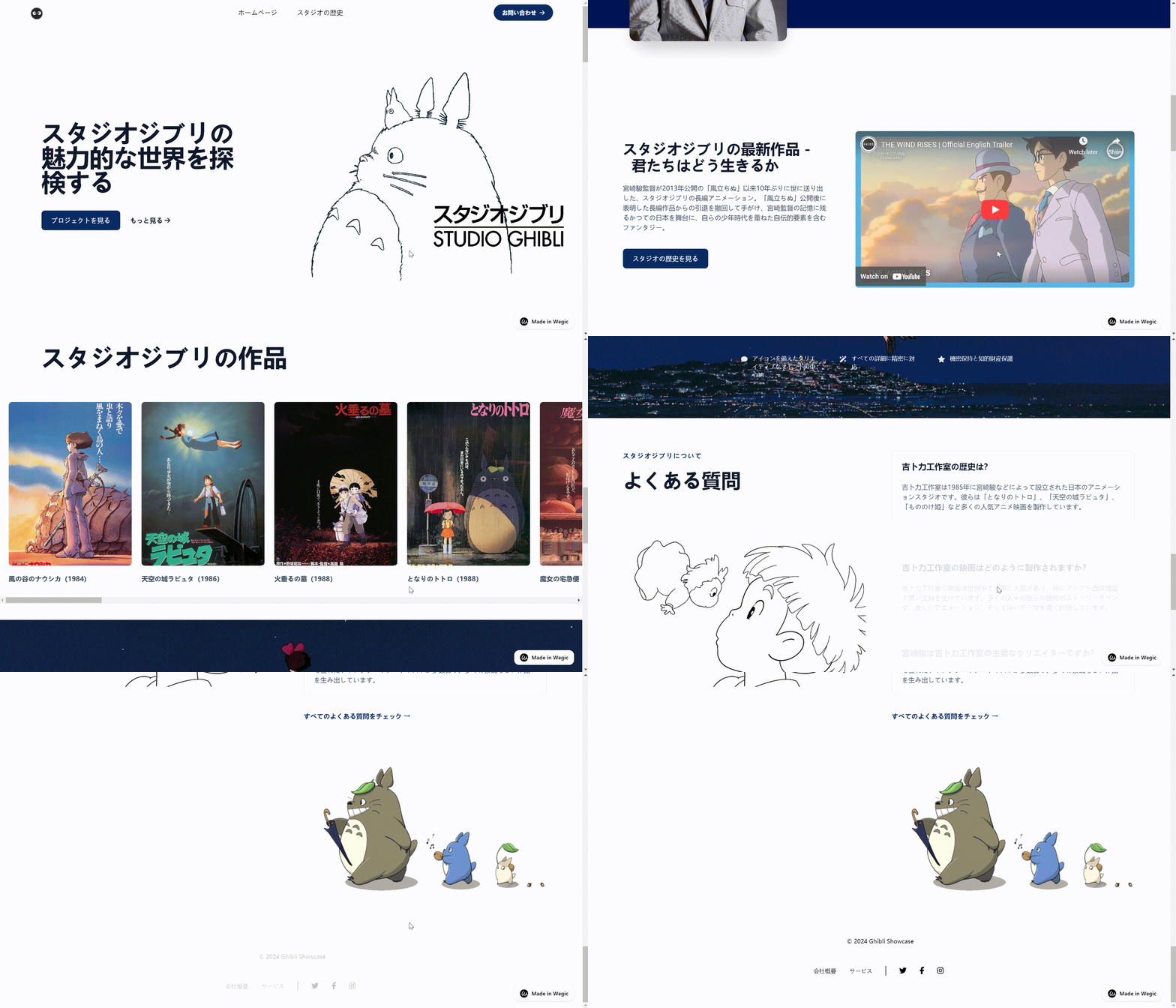
Here is an example made by Wegic.
Creating Easy and User-Friendly Navigation
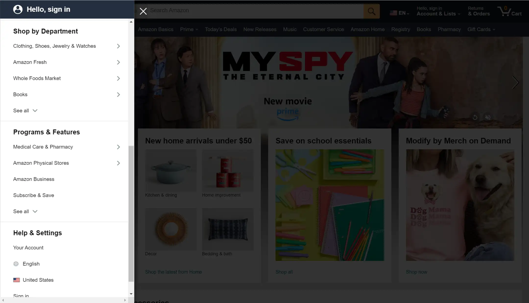
The most important concern in web design is user experience. A good web design must have a navigation bar that is simple and easy to understand and very user-friendly. If not, it means the audience have to spend long time looking for the buttons and information they need, which will greatly make a negative effect on user experience. A good design will put the navigation bar in a more prominent position so that users can quickly browse and understand the relevant information to fulfill the needs of customers. Designers should consider the user's needs, including what content they would like to know most, how can let the audience find information more easily. With these questions and keeping users in mind, they can design better and user-friendly navigation
It can be said that all of the web designer's design, including the choice of colors, fonts, typography, visual effects of the presentation, the layout of the menu and navigation, and so on these issues are centered on how to improve the user experience and how to better serve the user to carry out the development. Designers in the web design process to consider the main questions are: what is the user's needs? How to design to meet the needs of users? What kind of design can make users find the information they want faster and better? Only when the user experience is improved will the web page be known and used by more people and serve more users. Below is an example from Amazon.
Responsive Design: A Key to User-Friendly Websites
Responsive design is essential in web design, which can greatly improve the user's ease of browsing and navigating the web. Some newcomers may not be too clear about this concept. Responsive design is a web design technique that refers to changing the page size and overall layout according to the different browsing devices of the user in order to provide a pleasant and comfortable visual experience for the user. For example, nowadays many people use mobile browsers for searching, so web designers should make sure that the interface users see on their cell phones and computers is consistent. Responsive design makes the user's browsing behavior smoother, which further enhances the user experience, keeps the brand image consistent and increases the user's goodwill towards the brand. In addition to this, it also improves SEO performance as search engines also prefer to rank user-friendly businesses at the top.
Proper Application of Dynamic Elements and Animation
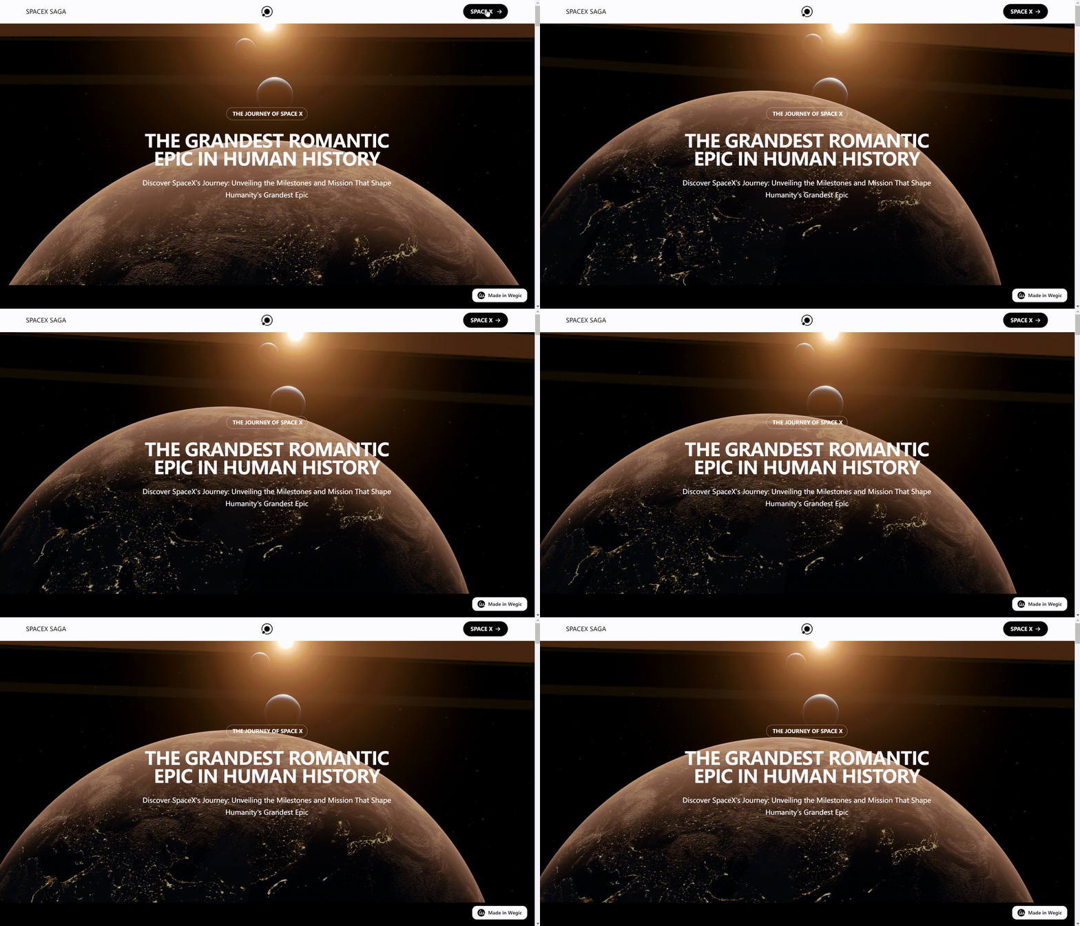
Animation has many benefits in web design. Good use of animation can make the whole web design look more lively, creative and design-oriented. Animation is functional, it can help convey information and guide users to do the right thing, what's more, animation can be used as a good decoration. What's more, animation can be used as a great decoration. Decorative animation can help create an emotional connection between users and the interface and inspire visual appeal, increasing user engagement and retention on your site. Moreover, animations also make a deeper impression on the user, increasing the recognition of the used website and brand. For example, in a marketing website, utilizing animation to create interesting interactive effects will allow users to better understand products and services.
Animation and special effects should pay attention to maintain the unity of the style with the website, otherwise, it will look very abrupt and dazzling. At the same time, the design of animation and special effects should highlight the main content and functions of the website to help users better understand and use the website. Secondly, if the animation file is too large or complex, it will increase the loading time of the website, reduce the responsiveness of the page, and affect the smoothness and experience of the users. Therefore, when designing animations and special effects, users' feelings and habits need to be considered. Animation and special effects should provide users with clear and concise operation tips and feedback, help users find the information they need faster, provide a good and pleasant visual experience, and stimulate user interest.
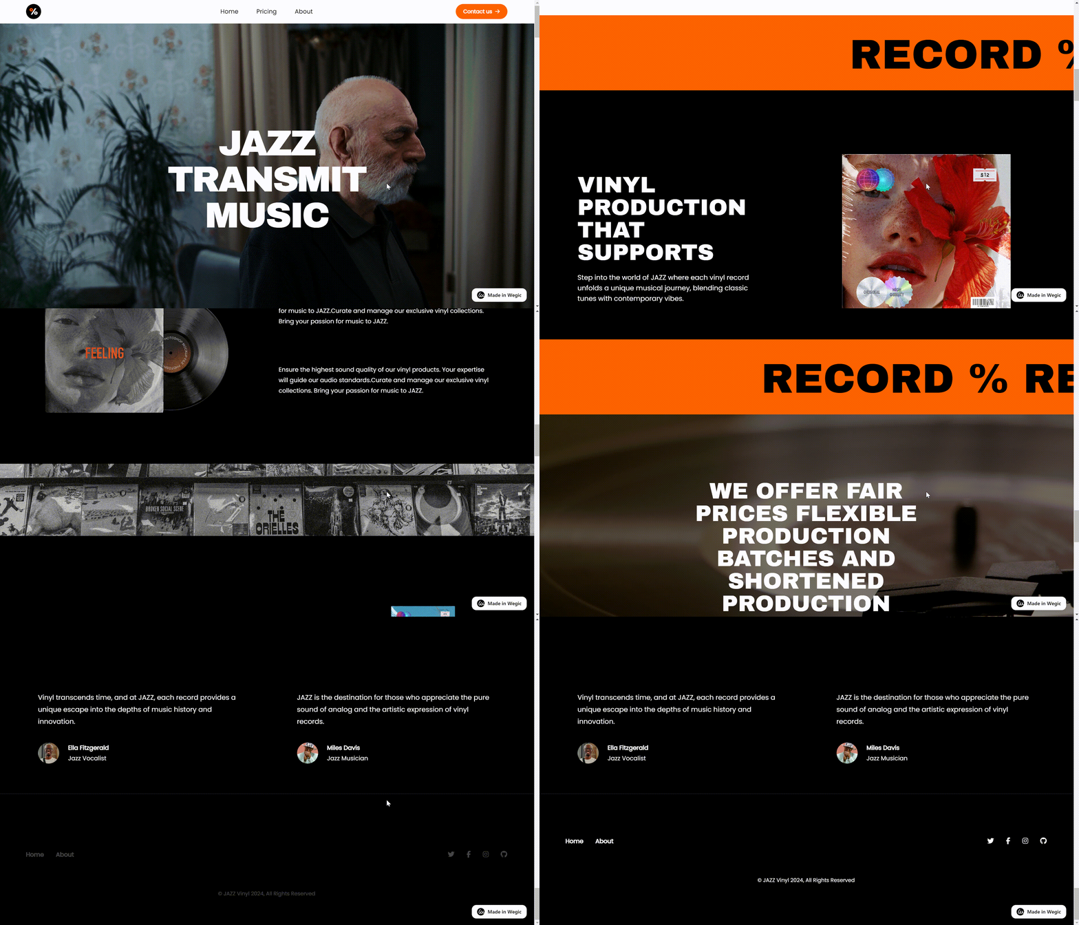
Here are some examples made by Wegic.
Click here to Build your site
Conclusion
In this article, we delve into how to improve the overall visual appeal and user experience of your website by mastering the basic principles and techniques of website aesthetics. Different brands and websites have their own styles and positioning, determine their own positioning and brand image, based on this integration of different design principles, choose the right color scheme, fonts, layout, etc. to create a visually appealing website. Then, from the user's point of view, serve their needs and helps them get a good experience.
Website aesthetics is an area that needs to be constantly explored by designers. With the constant updating of technology and changing aesthetic trends, designers need to keep learning and exploring new design methods and concepts. In the actual design process, designers should flexibly utilize what they have learned to create unique and attractive website designs. If you wish to learn more professional advice and examples about website design, you can try to use Wegic. With AI assistance, you will get a lot of helpful advice and create a perfect website to meet your personal needs.
Written by
Kimmy
Published on
Mar 12, 2026
Share article
Read more
Our latest blog
Webpages in a minute, powered by Wegic!
With Wegic, transform your needs into stunning, functional websites with advanced AI
Free trial with Wegic, build your site in a click!