Log in
Build Your Site
How to Create a Good Color Combination? The Ultimate Guide
In this article, we will delve deep into the fundamentals of color theory, and examples to help you make good color combinations in your design.

Colors are an effective tool that can evoke feelings, shape perceptions, and drive behavior rather than a simple visual component. The colors you use will determine the tone and create a lasting impression whether you're creating a smooth website, an engaging app, or a memorable brand.
However, do you know how to choose colors? How to make a good color combination? If you have no idea about that, you are at the right place. In this article, we will explain what color theory is, talk about different color options, delve deep into the fundamentals of color theory, and offer helpful advice and examples to help you make good color combinations in your design.
Ready? Let's jump in.
What is Good Color Combination?
A color combination refers to the mix of two or more colors that work together in a design or artwork. It's about choosing colors that look good together and supporting the message, mood, or style you're aiming for. Different combinations can evoke different emotions—like calmness, excitement, or professionalism—and guide how people perceive your work.
A good color combination will bring about a lot of advantages. If colors are used and combined effectively in your design, they will attract more attention, improve user experience, and strengthen your brand identity.
Color combination is not just picking two colors and running with them. There’s actually quite a bit of science and design color theory behind it. If you want to make a good color combination, you need to understand some basic principles of color theory and design. Knowing some theories and principles, making good color combinations will be much easier.
What is Color Theory
Color theory is the study of color relationships, color combinations' visual effects, and the messages colors convey. It's a set of guidelines that colorists, artists, and designers use to choose, mix, and use color. Now I will explain some important concepts in color theory. You will have a better understanding of color theory by figuring out the following concepts.
Key Concepts
-
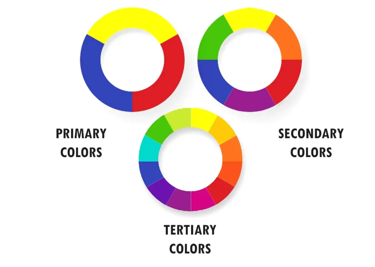
Primary colors: Primary colors are the three colors that cannot be created by mixing other colors. In the traditional color theory for painting, they are red, blue, and yellow.
-
Secondary colors: Secondary colors are the ones combined with two primary colors. For instance, purple is a secondary color mixing red and blue; green is created by mixing blue and yellow.
-
Tertiary colors: Tertiary colors are created by a primary color and a secondary color. These are more nuanced colors, like red-orange or blue-green. Colors like violet, amber, or Magenta are all tertiary colors.
-
Warm colors: Warm colors are those that evoke warmth and energy, such as red, orange, and yellow. Red represents love and passion, and orange represents creativity and enthusiasm. These colors are associated with passion and excitement, creating a sense of intensity.
-
Cool colors: Cool colors are those that evoke a sense of calm and relaxation, such as blue, green, and purple. Blue represents trust and calmness, and green represents growth and harmony. These colors create a feeling of serenity and stability.
-
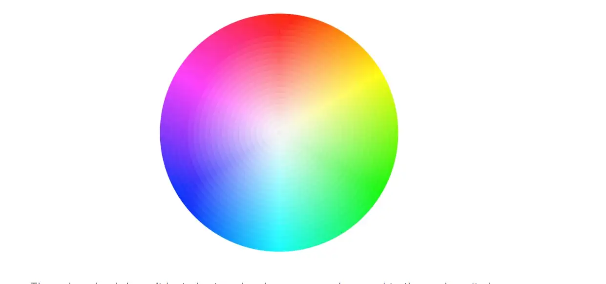
Color wheel: Color wheels are visual representations of colors grouped in a circle. It depicts the relationships between primary colors, secondary colors, and tertiary colors. The color wheel is an important tool in color theory and design because it assists designers and artists in understanding color relationships, harmonies, and contrasts.
6 Common Types of Color Palettes
-
Complementary colors
-
Analogous colors
-
Triadic colors
-
Monochromatic colors
-
Split-complementary colors
Complementary Colors
Complementary color combinations are on the opposite of the color wheel, for example, red and green, blue and yellow. Such a contrast combination will create a memorable and obvious impression.
Analogous Colors
Analogous color combinations are pairs of colors next to each other on the color wheel, which will create a sense of harmony and a pleasant look, such as yellow-green and red-orange.
Triadic Colors
Triadic colors are three colors that are evenly spaced around the color wheel, for example, red, yellow, and blue, or green, purple, and orange. This combination will not only offer a strong visual contrast but also keep a balance as well as color richness.
Monochromatic Colors
A monochromatic color scheme consists of many colors combined with different degrees of brightness and saturation. Put simply, it is choosing a hue, adjusting its brightness and purity, and creating a number of various colors that when combined create a monochromatic color scheme.
This scheme is easy to manage and creates a cohesive look.
Split-Complementary Colors
Split-complementary colors is choosing a pair of complementary colors, plus another color next to its complementary color.
For example, if you start with blue, and the complementary color of blue is orange, then the split complementary colors of blue are red and yellow next to orange. In this way, you get a split complementary color scheme consisting of red, yellow, and blue.
This scheme provides high contrast without the tension of the complementary color scheme, creating a sense of harmony and hierarchy.
Tetradic (Double-Complementary) Colors
The double complementary color scheme involves the use of two sets of complementary colors. Simply put, it is to choose two pairs of complementary colors on the color wheel.
For example, you can choose blue and orange as one pair of complementary colors, and choose purple next to blue and yellow next to orange as another pair of complementary colors.
This color scheme provides more color changes and contrast effects, looks rich in color and strong in contrast, but also requires higher matching skills to maintain overall harmony.
How to Make a Good Color Combination
Now you probably have grasped some principles and theories of colors, and now you can try to make a good color combination for your design. Here I have listed 4 steps to a good color combination for your reference. Please read on.
-
Define Your Purpose and Audience
-
Start with a Base Color
-
Use the Color Wheel for Inspiration
-
Make Use of Color Phychology
First step: Define Your Purpose and Audience
To start with, you should define the purpose of your design and your targeted audience.
You need to think about what emotions you want to evoke, calmness or excitement, and what feeling you want to create when they first view the website, professional or relaxing. This will help you determine the overall tone and style of your website.
For instance, if you are creating a healthcare website, you might probably create a feeling of calmness and professionalism in your design. In a word, a basic style depends on your personal needs.
Second step: Start with a Base Color
Then, choose a base color that matches the purpose and mood of your design.
This color will be the most important and prominent. When selecting a base color, you have to consider a lot, including color theory, brand identity, audience preference, industry trends, cultural differences, and so on. It is a very complex topic.
For instance, imagine you are designing an organic food brand, combined with what we mentioned above, the green color will be an optional choice for your design as a base color.
Because in color psychology, green is always associated with nature, growth, and health, it conveys a message of natural ingredients and environmentally friendly practices.
Also, in many food or beverage industries, especially organic food brands whose targeted audiences stress food safety and health, designers are more inclined to use green colors to create a sense of health, sustainability, and eco-friendliness. This will strengthen brand identity.
Third Step: Use the Color Wheel for Inspiration
After you choose the base color, you can use the color wheel for inspiration and select other colors for your color scheme. You should try to find complementary or analogous colors that work well with your base color.
This will be a very complex process because you need to consider a lot, and the choices of colors are multiple. You have to keep adjusting till you are satisfied with that.
However, if the color combination you choose works effectively, it will enhance the base color and provide contrast or harmony. You can take several types (e.g. complementary colors, analogous colors, monochromatic colors) for your reference.
Fourth Step: Make Use of Color Psychology
Color psychology studies how different colors influence people’s feelings and actions. This is a complex and broad topic that involves multiple fields such as psychology and neuroscience.
For instance, warm colors like red and yellow always evoke energy and enthusiasm, while cool colors like blue or purple make people feel calm and serene.

Practical Applications and Examples in Design
With so many theories and principles in this blog, I believe you have a further understanding of color. Next, I would like to show you some excellent cases of good color combinations. Hope you can get inspiration from them, and apply them to your next projects.
6 Practical Examples to Get Your Inspiration
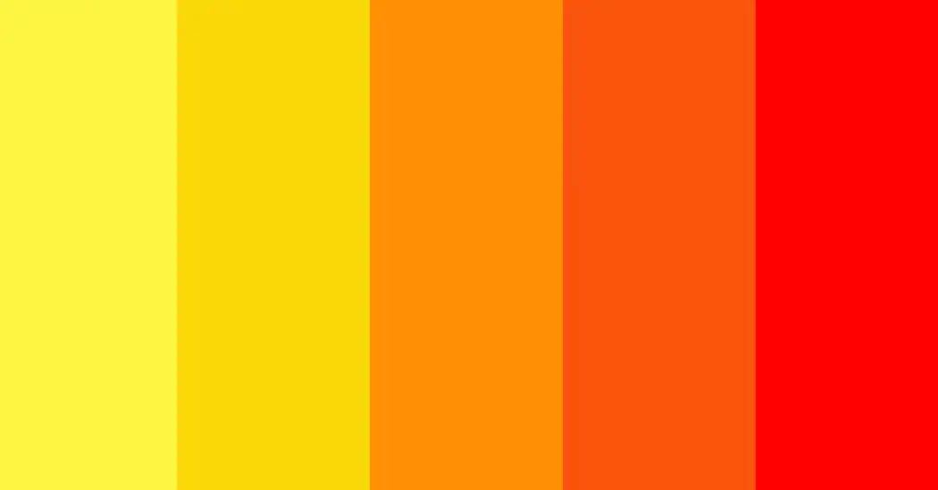
Red, Orange, and Yellow
-
Types: ananougous color
-
Examples: McDonald's
-
Effects: Red represents energy, passion, and excitement. Orange is always associated with warmth while yellow provides a feeling of happiness and joy. These warm colors evoke feelings of warmth, energy, and desire, which work effectively in fast-food marketing.
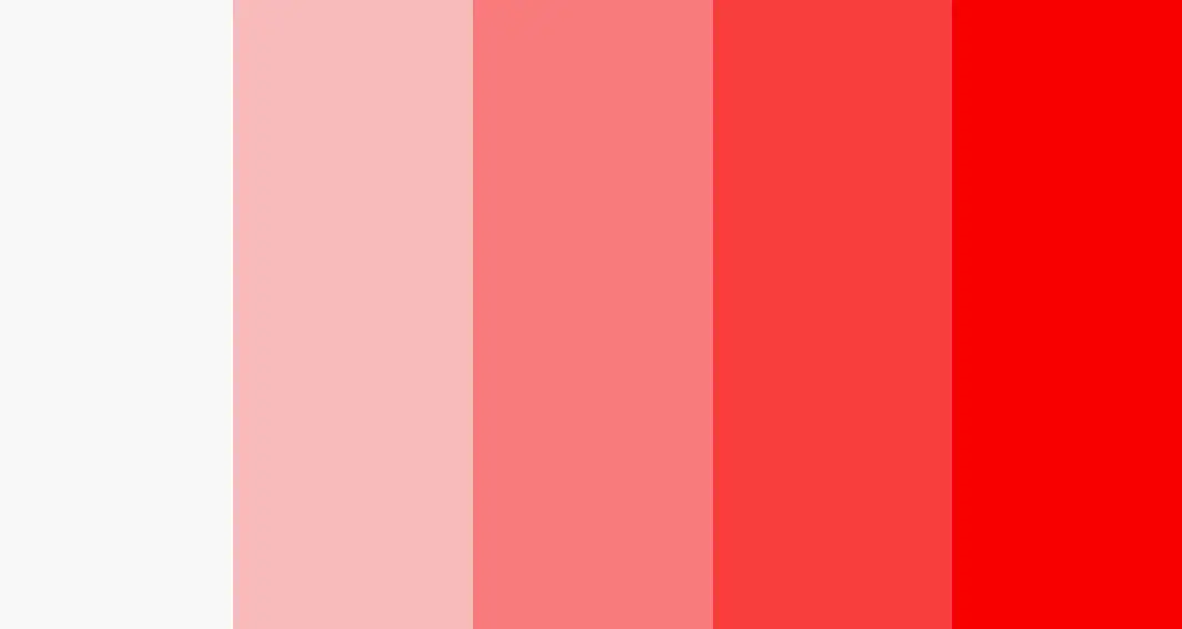
Red and White
-
Type: complementary colors
-
Example: Coca-Cola, YouTube
-
Effects: Coca-Cola is known for its iconic red and white branding. The red and white combination shows a high and fresh contrast. Red is often associated with passion and energy and is often used to evoke excitement. A blending of white balances the intensity of red, creating a clean and approachable look.
Teal and Orange
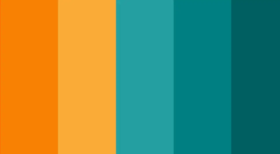
-
Types: complementary colors
-
Example: Tiffany & Co.
-
Effects: Teal is a greenish-blue color, representing a feeling of calmness. Orange is associated with energy, warmth, vigor, and creativity. The combination looks vibrant and visually attractive. A mix of warm and cool tones can create a balanced and engaging visual experience, appealing to a wide range of audiences.
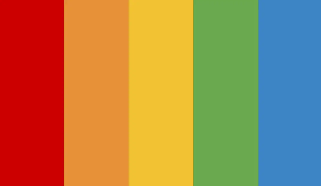
Red, Blue, and Yellow
-
Type: Triadic color
-
Example: Google
-
Effects: The combination of primary colors----red, blue, and yellow, plus green creates a sense of balance. It is vibrant and dynamic without overwhelming. This combination makes the brand friendly and approachable. Multiple colors also show a kind of diversity and inclusiveness, reflecting the wide range of services Google offers.
Green, Red, and Orange
-
Type: Split-Complementary Colors
-
Example: 7-Eleven
-
Effects: Red and green are complementary colors, plus purple creating a high contrast. It also avoids the intensity of a direct complementary color scheme.
Such a color combination looks diverse and harmonious.
Blue, Orange, Red, and Green
-
Type: Tetradic (Double-Complementary) Colors
-
Example: Microsoft
-
Effects: Blue and orange, red and green are two pairs of complementary colors. Diverse colors provide more opportunities to make different designs. Two pairs of complementary colors also create a strong contrast, making the design more eye-catching and energetic. It should be noted that you should carefully determine the proportion of these colors, creating a harmonious look.
Consider Color Trends in Different Industries
The use of color in design may have an important effect on how users perceive and interact with it. Various color schemes will be preferred and used in industries. There are some common color trends in different industries. When you make color combinations, you should also consider color trends in your industries. A brief overview of popular color trends and the industries they correspond with is shown below.
Red
Red is the most emotional color, making the heart beat faster and creating a sense of urgency, so it's often used in promotional pages for big sales, clearance, and other events.
Research shows that industries like restaurants, technology, transportation, and agriculture are inclined to use red colors, but home furnishings and healthcare have to be cautious about using red colors.
homepage
Blue
Blue is a very popular color, creating a sense of calmness and peace. It has the highest adoption rate of any color in today's web and logo design. Banks and merchants often use blue to provide a sense of security for their customers.
Research studies show that industries such as healthcare, energy, finance, aviation, and technology favor the use of blue. However, the home industry needs to be cautious about using blue.

Green
Green is the color closest to nature, and people often feel more relaxed, which is why many businesses and websites use green to relax and calm users.
The energy, finance, food and beverage, home, and technology industries like to use green color.

Yellow
Yellow is mostly adopted by companies that can provide a happy feeling. It also imprints us with a warning emotional color that can be used to attract the user's attention.
Yellow is often used in the home, energy, and restaurant industries, but is not suitable for agriculture and healthcare.
Orange
Orange is not usually used as the main color of a web page because of its strong visual stimulus, but because of its strong presence and the positive emotions it stimulates, it is most often used on CTA buttons, such as Buy Now, Submit, Sign Up, and other buttons that are linked to user conversion.
Conclusion
In this article, we have discussed color theory and color combinations. It has played a significant role in our design. Whether you're creating a logo, an app, or a website, the right color combination can make a lasting impression and resonate deeply with your audience. Color combination is a difficult and complex science in our design process. But don't worry. Probably you have already had some general understanding of them. If you are now preparing for your new project, try to apply the above tips and principles to your design.
FAQs
What Tools Can Be Used for Selecting Color Combinations?
-
Adobe Color: Adobe Color allows you to create and explore color schemes. It offers a range of preset color rules and the ability to extract colors from images
-
Coolors: Coolors is a user-friendly color palette generator that helps you quickly create harmonious color schemes. You can easily adjust and tweak colors until you find the perfect combination
-
Color Mind: Color Mind is an AI-powered tool. It helps you to generate color palettes based on user preferences. It can help you find the best color combinations.
-
Khroma: Khroma uses machine learning to help you find color combinations that align with your style. You can train the tool on your favorite colors and it will help to generate your personalized palettes
-
ColorSpace: ColorSpace is a simple yet powerful tool. You can create stunning color palettes with ColorSpace. It’s a perfect tool for designers who want to explore different color combinations and see how they interact visually.
-
Colormind: As an AI-powered color palette generator, Colormind can adapt to the style of the project. It can generate palettes from scratch or based on an image.
What Common Mistakes to Avoid When Choosing Color Combination?
1.Overusing vibrant colors
If you use many bright colors, the design might look overwhelming and make the content difficult to read or focus on.
2.Too many colors
Choosing 3-5 colors will create a harmonious and cohesive design.
3.Following trends blindly
It is important to stay current with design trends, but you should consider the context of your brand and your audience. Don't follow trends blindly
4.Ignoring accessibility
Accessibility is an important part of modern design. Make sure your color choices have enough contrast to be read by everyone
5.Lack of consistency across platforms
Inconsistent use of colors might make your audience confused and dilute your brand identity. Maintaining a consistent color scheme helps reinforce brand recognition and trust.
Written by
Kimmy
Published on
Mar 12, 2026
Share article
Read more
Our latest blog
Webpages in a minute, powered by Wegic!
With Wegic, transform your needs into stunning, functional websites with advanced AI
Free trial with Wegic, build your site in a click!
What kind of website do you want to build?