Log in
Build Your Site
Website Layout Design 101: Ket Features & Best Practices
Looking to improve your website's layout? Explore key features and best practices to create an appealing design that enhances user interaction and satisfaction.

Have you ever landed on a website feeling lost and not knowing what to do next because you didn’t know where to click? If you’ve been there, then you’re not alone. The truth is, it’s not easy to craft a website that feels intuitive and inviting unless you know exactly where to start. Understanding the key features of website layout comes in handy in that area. It’s a kind of a blueprint for your online presence. Even the most compelling content or eye-catching visuals will fall short without it.
In this guide, we’ll explore the essential features of website design that keep users engaged, the components of a website homepage that set the tone, and best practices to help your layout truly shine. If you’re a complete see or need to hone your skills further, this roadmap will help you get your dot on with great sites that'll keep visitors visiting.
Key Features a Website Should Include
To create a website that will stand out, you have to begin with the basics. These very basic elements guarantee your site is one you can set to work without hassle while appearing sentimentally appealing. Let’s dive into the key website features that no successful site should be without:
Clear Navigation
The backbone of your website is navigation. Users should be made to effortlessly find what they need. A navigation bar doesn't have to be fancy. But it must be straightforward, whether you prefer a horizontal menu, a vertical sidebar, or a minimalist hamburger icon. Otherwise, people will think that every link is at the same level of importance. This clarity increased user experience and reduced bounce rates.
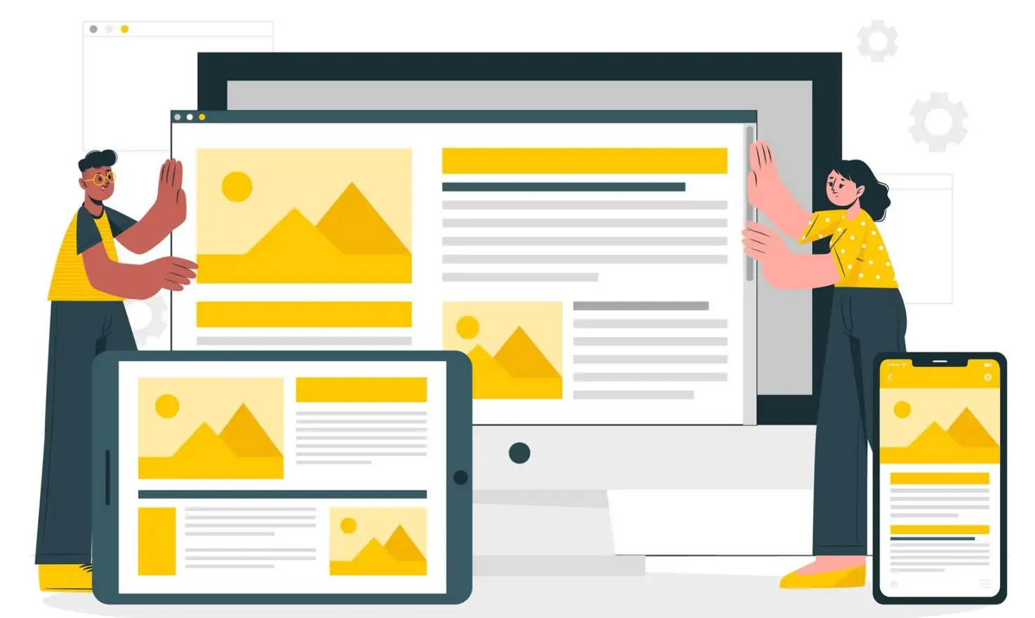
Responsive Design
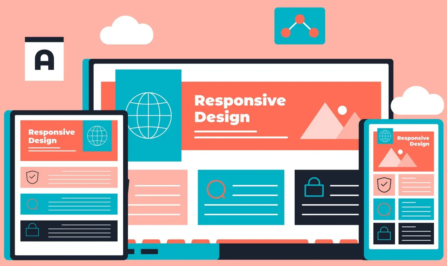
Today’s multi-device world demands that your website will flow smoothly from screen to screen. Responsive design not only improves usability but also boosts your SEO performance. Every element should resize from images to reflowing text, and adjust perfectly to any phone, any tablet, and any desktop.
Engaging Call-to-Actions (CTAs)
CTAs, strategically placed to encourage visitors to other goals, include things such as “Sign Up” or “Discover More.” These prompts should look different, but be merged with your website’s design’s overall tone. The idea is to get users to a level of meaningful interactions, not too much.
Optimized Load Times
Nobody wants to wait for a page to load. Compress large files, minimize code bloat, and choose reliable web page hosting services to keep load times under three seconds. Not only does a fast site retain visitors, but search engines see that your site is fast too.
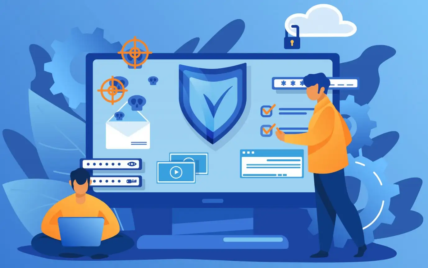
Web Security Measures
Security is non-negotiable. Add SSL certificates, secure payment gateways, and two-factor authentication to protect your user’s data. Investing in web security builds trust and keeps cyber threats at bay. Visitors know they are at a safe site where their information is in safe hands.
Social Media Integration
Place social media buttons strongly. Users can share your content and connect with your brand on Instagram, Twitter or LinkedIn. Integrating seamlessly allows you to reach and fuels the feeling of community.
Search Functionality
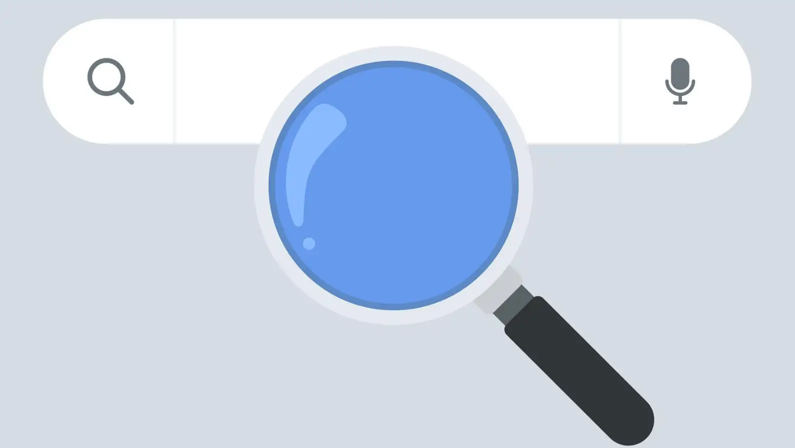
A search bar is a must if your site will host a lot of content. Be sure to make it prominent and show accurate and relevant results. Further, you can enhance the usability of your website when you use advanced search options, such as filters.
Consistent Branding
Mixed messages after a visit to your site: there's even the potential for conflicting brand identities. Ensure every part of your logo and color scheme, and your tone of voice in content matches your brand. It confers a certain cohesion to your site which is itself becoming memorable and which makes your site look professional.
Content That Speaks to the User
Any website's beat should be great content. Make sure that your text, images, and videos complement your words and are interesting, informative and relevant to your audience. An intuitive layout with this would make your messaging shine second to none.
Accessibility for All Users
Make design inclusive. Include things like image alt text, accessible keyboard navigation, and a day's readable fonts. Usability and ethical standards, both improve accessibility.
By prioritizing these key website features, you lay the groundwork for a website that’s not only functional but also engaging and user-friendly. The right balance between technical efficiency and thoughtful design means visitors walk away with that right feeling that they’ll want to come back for more.
Website Layout Design That Shines
Creating a platform which is visually engaging is an art as much as a science. The perfect key feature website layout doesn’t just look good—it works effortlessly for every visitor. Here’s how to design a layout that turns heads and keeps users engaged:
Embrace Simplicity
In some cases less is more for web design. Don’t over-clutter pages with tons of stuff. This is a clean, minimalist approach that highlights your content, directing the focus to the most essential elements. It is simple and is the best user experience.
Highlight Key Areas
Some parts and pieces of a website's homepage matter more than others. Find out which real estate, header, hero section or firstfold, is most valuable and take it seriously. Such feature high-interacting content is a powerful headline, call to action, and crazy big image that connects with your audience.
Use Whitespace Like a Pro
Your secret weapon is whitespace or negative space. This lets your design breathe, and your content is more digestible. Whitespace skillfully used can keep your layout balanced, lessen visual strain, and imbue your layout with a little elegance.
Leverage Visual Hierarchy
Focus your visitors’ eyes on the most important stuff. Apply size, colour, and placement to strategically. Say a bold headline with fewer italics gives a natural flow. Also, CTAs use opposite colours to stand out without being forced.
Include Thoughtful Navigation
Quality navigation can or breaks a website. Put clear labels, and short menus with simple links to lead visitors. Whether they’re exploring components of a website homepage or diving into detailed blog posts, seamless navigation keeps users happy and engaged.
Consistency Creates Comfort
Trust is gained through visual and functional consistency. Follow the same type of consistency in page elements, like using the same type of font, and using the same colored buttons on the pages. Ultimately, consistency helps you eliminate many distractions and gain a polished-looking service.
Integrate Interactive Features
Personality and fun are added by interactive elements. If you keep users curious about hover effects, animated transitions or collapsible sections. That said, moderation is the key—too much can get away from performance and make you forget the central point of your message.
Consider Web Security and Hosting
If your site is not secure and hosted on good servers, then your layout’s brilliance means nothing. A strong focus on web security and dependable web page hosting keeps your visitors’ trust intact and ensures smooth performance.
Best Practices for Website Layout
A well-designed layout is needed to create a successful website, both for its visual appeal and functionality. A great website layout not only adds a sparkle to your web page it also promotes easy usability of your site and this means increased engagement, conversions, and happiness. To help you elevate your site’s design, here are some essential best practices to follow:
User-Centric Design
Every website design is a UX project. A user-centric layout is about your target audience’s needs, preferences and behaviour. User testing and receiving feedback about your layout is how you make sure your design is effective. You can learn from how users use your website and identify points of pain, navigation that can be streamlined and overall usability issues. The quicker visitors can find what they are looking for, the greater the probability they will stay on your site, engaging with your content, and converting.
The design elements such as clear calls to action, logical menu structure, and visually appealing hierarchy make the user easily navigate their website increasing the possibility of return.
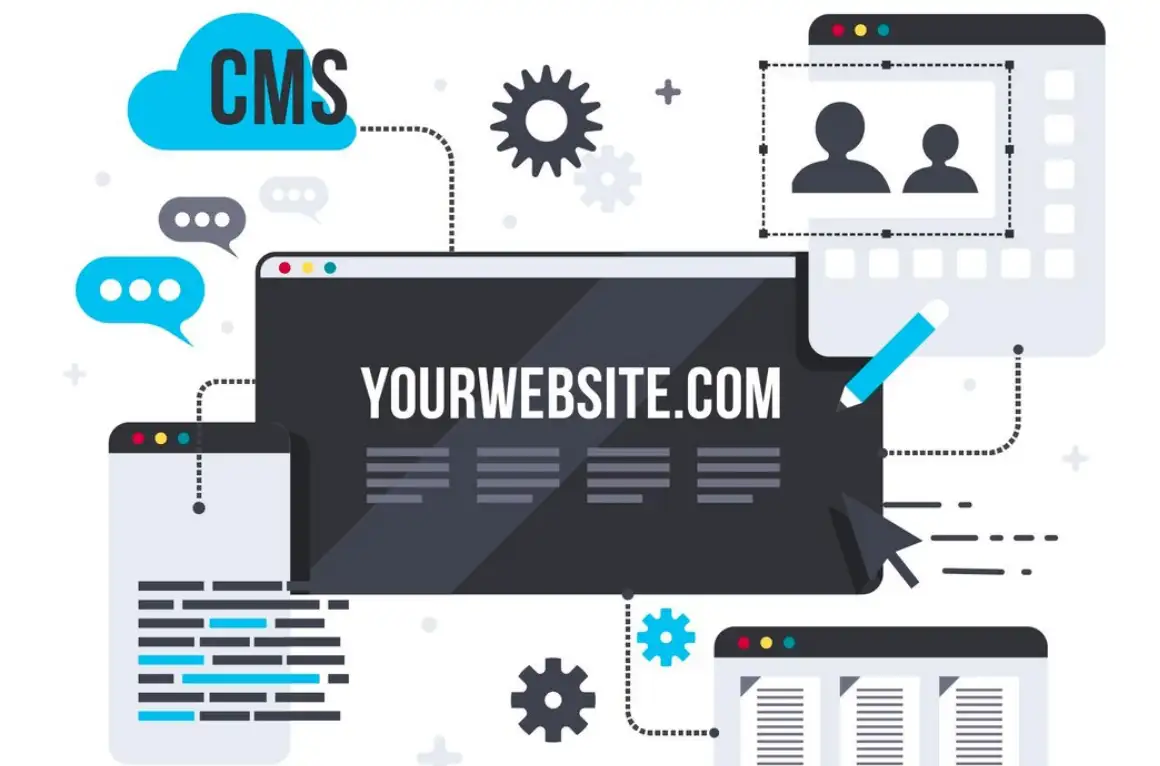
SEO Optimization
Only if users can find it, is a beautiful website layout effective. That’s why search engine optimization (SEO) is important because it optimizes your website layout for SEO, so search engines can easily crawl and index your site and your rankings and visibility are improved. To enhance SEO, incorporate relevant keywords like “key feature website layout,” “responsive design,” and “web security” naturally throughout your content, headers, and image alt tags. In addition, make sure your metadata (title tags and meta descriptions) is to draw both search engines and potential visitors. To achieve this, you can make SEO the main weapon in your arsenal for your website layout strategy and drive organic traffic to your site and your content to get to the right people.
Fast Loading Pages
User experience and SEO are dependent on page speed. If your website loads too slowly your users will likely get frustrated and simply leave your site before the page is even fully loaded. In addition, Google also uses page speed as a ranking signal – faster websites get higher positions on search results. Optimizing your images will help to ensure your site loads quickly and will not leave your users with low-quality images. Let users load pages previously visited faster and think about using a content delivery network (CDN) to distribute your content across several servers around the world. A fast website layout not only makes users happy but in turn, reduces bounce rates and keeps visitors engaged for longer.
Mobile-First Approach
No matter how high you rank on mobile search, if your site isn’t optimised for mobile, you’re losing money. The mobile-first approach applies to the design of a site where you create your site for small screens and scale up to large screens such as desktops. It also makes sure that the browsing experience on smartphones and tablets is just as seamless as it is on the desktop, by eliminating the need to pinch and zoom. Responsive design is crucial here, as it ensures that your website layout adapts to different screen sizes, maintaining readability and functionality. More people are now accessing websites from within mobile devices than ever before, so adopting a mobile-first mindset is vital to deliver a consistent optimal user experience, whatever the platform.
Regular Updates
When updating your layout is so easy, it’s important to stay current in the digital world. Using fresh and real data allows the searcher exactly what they need. Secondly, plugins, themes, and back-end systems should always be kept up to date to stay secure and keep out of vulnerabilities. Up to date means not only performing excellent and protected on your site but also notifying the search engine that your site is dynamic and maintained. Fresh content can help as it can improve your rankings, drive traffic, and keep people coming back for more.
With that said, you can implement these best practices into your website layout, turning that into a site that’s visually appealing, user friendly, and also with high chance of being successful. By concentrating on user experience, SEO, speed, mobile compatibility and regular updates, you’re doing yourself irrespective of the competition they will be ahead of the competition and your site will give visitors top-notch. And no matter if you’re running an e-commerce store, a personal portfolio, or a business site, by following these practices you can get a design that not only looks great but also performs well.
Plausible Web Design Ideas for Layouts
Inspiration fuels creativity. Here are some innovative website design ideas to spark your imagination:
Minimalist Layouts
Simplicity is timeless. The work of removing distractions, reorganizing, consolidating, and simplifying, frees attention from many other things, facilitating focus on navigation, core content, and space for momentary thoughts. Largely because it works so well for showing off products and portfolios, where the work is the marketer and the design is by default more sterile, it’s a method you can use.
Storytelling Formats
Use your website to make a dynamic story. Storytelling layouts tell your story through scrolling animations or sequential visual elements. Immersive is great for brands that have deep histories, or strong messages.
Grid-Based Designs
With grids, your layout is measurably more orderly, and visually pleasing and functions more easily. Grids can be used to bring order without losing the creative edge whether it’s a gallery of photos or a product showcase.
Dark Mode Options
Dark mode isn’t just cool, it’s helpful. Choosing to have light or dark themes available to the users makes the experience more accessible and also personalizes that experience. One of the most popular features of this is with tech-focused or creative industries.
Interactive Elements
Make them interactive and playful to add just that. Hover effects sliders, and collapsible menus. The elements encourage users to explore and keep users engaged. Just make sure it works on all devices and doesn’t have usability hiccups.
Ready to Turn Your Ideas into a Website Masterpiece?
Now you’ve seen the magic of an ideal website layout, it’s time to put those ideas into action, and guess what – you don’t have to be a coding wizard to achieve it!
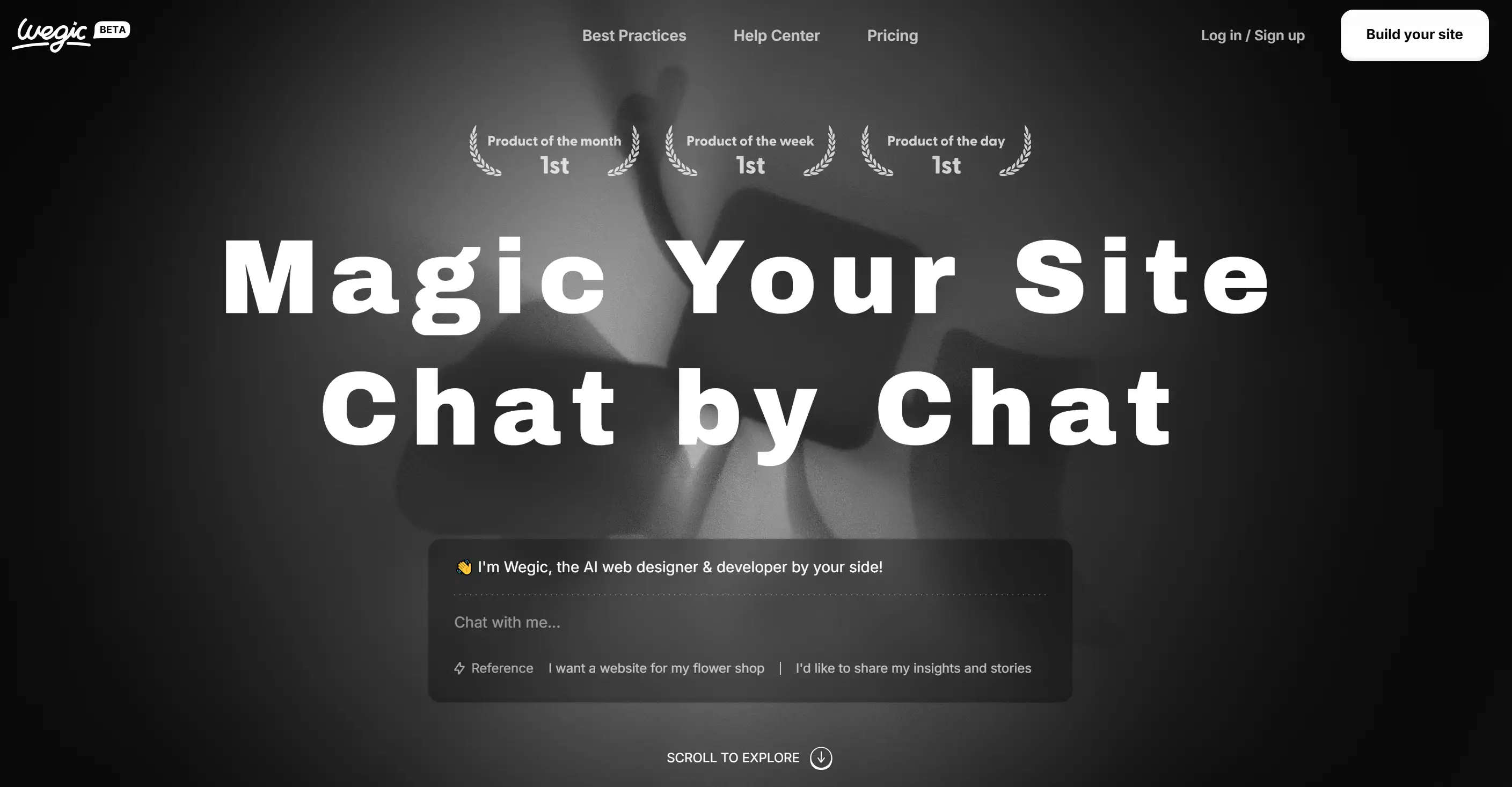
Where Wegic comes in, though, is your web-building BFF, guiding you through an unruffled, chat-based process where your thoughts diverge and your creativity begins to flow. All the heavy lifting is done by Wegic’s AI-powered website builder, to give you a fully functional, stylish website, with just a couple of casual chats. Wegic makes it so easy to craft a personal portfolio, or to launch an e-commerce site, or any site for that matter, it’s as if you were having a conversation with a friend. Want to create a professional online presence that doesn’t require a headache?
In Wegic, it’s just: ‘Let’s get started!’
Written by
Kimmy
Published on
Mar 17, 2026
Share article
Read more
Our latest blog
Webpages in a minute, powered by Wegic!
With Wegic, transform your needs into stunning, functional websites with advanced AI
Free trial with Wegic, build your site in a click!
What kind of website do you want to build?