Log in
Build Your Site
20+ Simple & Modern Ecommerce Website Design to Inspire You
Discover 20+ modern e-commerce website design ideas that blend style and functionality. Get inspired to create a user-friendly, high-converting online store today!
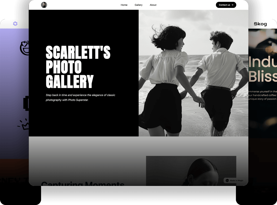
A clean, sleek online store where every product stands out on its own, without being drowned by clutter--this is exactly where more purchases are likely to happen. The colors are calming, the navigation is smooth, and the checkout process is quick—no distractions, just a perfect shopping experience-- this is what a modern ecommerce website design should feel like.
In today’s digital world, where first impressions matter, having a clean, user-friendly design is no longer just a plus—it's essential. Studies show that 94% of users’ first impressions are related to your website's design, and 38% of visitors will leave if the layout is unattractive. For an ecommerce site, these statistics mean one thing: A modern ecommerce website design can be the difference between gaining a loyal customer and losing a sale.
Having a modern web design for your online shop is key to standing out from the competition. Simple, straightforward designs not only enhance the user experience but also boost performance, and a good online shop design ensures your customers can easily find what they’re looking for and check out quickly, without frustration or delays. Whether you’re using a modern ecommerce website design template or customizing your layout, the goal is to make every visitor feel like their experience is enjoyable.
Therefore, let Wegic guide you to explore 20+ modern & simple ecommerce website design examples that could just be your ideal inspiration!
Why Modernist Simplicity Works in Ecommerce Design
Ease of Navigation
- A clean, simple layout makes it easy for users to find what they’re looking for.
- 76% of users say that ease of navigation is the most important factor in a website's usability.
- A well-organized website helps customers move quickly between pages, leading to more time spent shopping and less frustration.
Focus on User Experience
- Minimalist designs guide users smoothly from browsing to buying, with clear product displays and an easy checkout process.
- 67% of users are more likely to return to a website with a positive user experience.
- A clutter-free design enhances trust by creating a comfortable, familiar environment that encourages repeat visits.
Quick Load Times
- Speed is critical in keeping visitors engaged: 53% of mobile users abandon a website if it takes more than three seconds to load.
- By reducing unnecessary elements, minimalist designs ensure faster loading times, keeping customers happy and reducing bounce rates.
Clutter-Free Design Improves Business Metrics
- Modern ecommerce website design that is clean and simple leads to higher conversion rates and lower bounce rates.
- A straightforward design helps customers focus on the products, not the distractions.
- Zara's ecommerce site is a great example of this approach, using a minimalist design to keep the shopping experience smooth and easy, contributing to its high conversion rates.
How Wegic Makes It Easy to Implement Modern Simplicity
Now, how can you bring these principles to life for your own online store?
The process doesn’t have to be complicated with Wegic, a conversational, AI-powered design assistant, with whom you can chat your way to the perfect layout, color palette, and even product placement—without needing any coding skills.
Wegic guides you through every step, making the process of building a shop web design both intuitive and fun and ensuring your site is clean, fast, and user-friendly!
20+ Simple & Modern Ecommerce Website Design Ideas
Creating a modern ecommerce website design is key to attracting customers and providing a smooth shopping experience. Here are 20+ fresh and effective ideas to inspire your online shop design, complete with examples from real brands that use these concepts to stand out.
1. Everlane: Minimalist Product Pages
Description
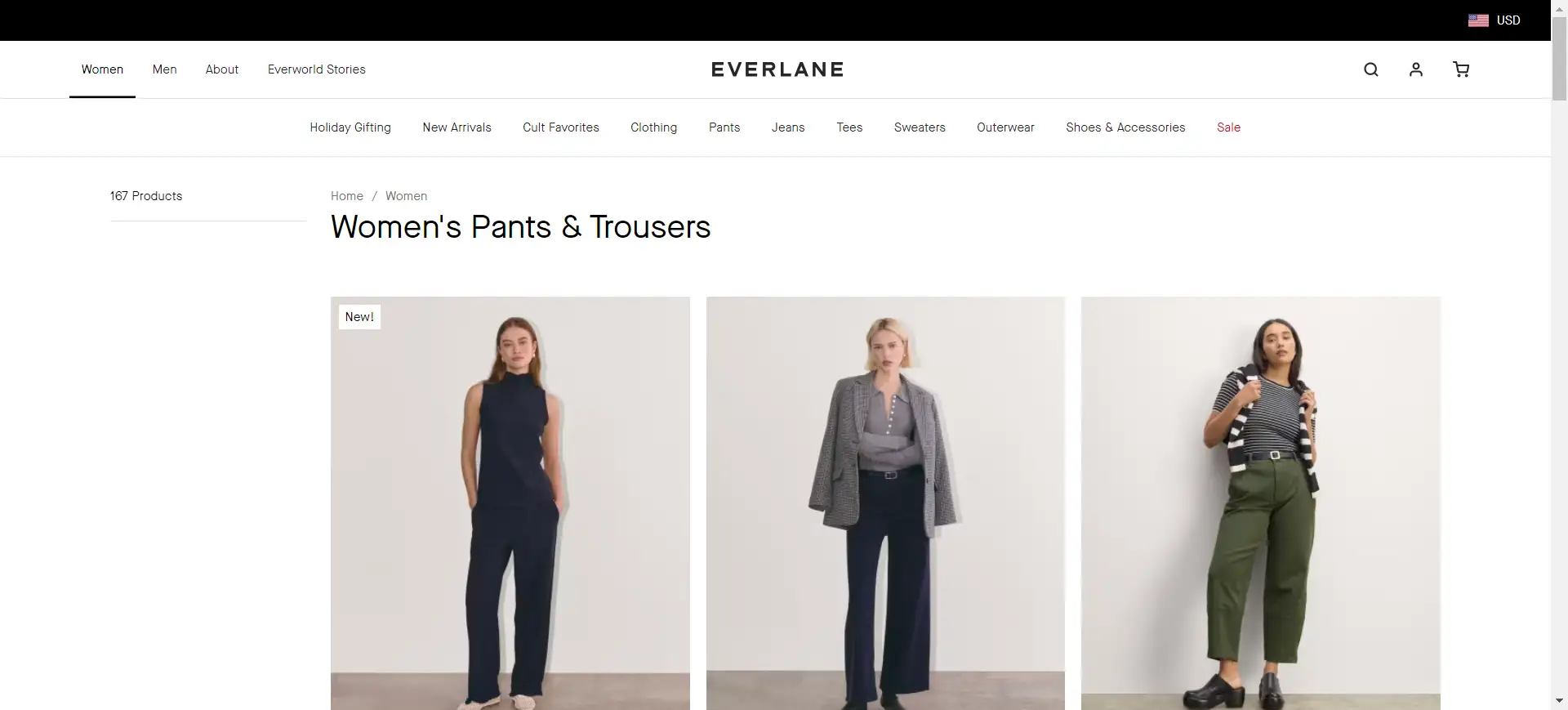
- Clean and simple product pages with minimal distractions, allowing users to focus on the essentials.
Example
- Everlane uses large, high-quality product images and short descriptions, letting the products speak for themselves. The generous use of white space makes it easier for customers to focus on what matters, creating a straightforward and pleasant shopping experience.
2. Aesop: Bold Typography & Spacious Layouts
Description
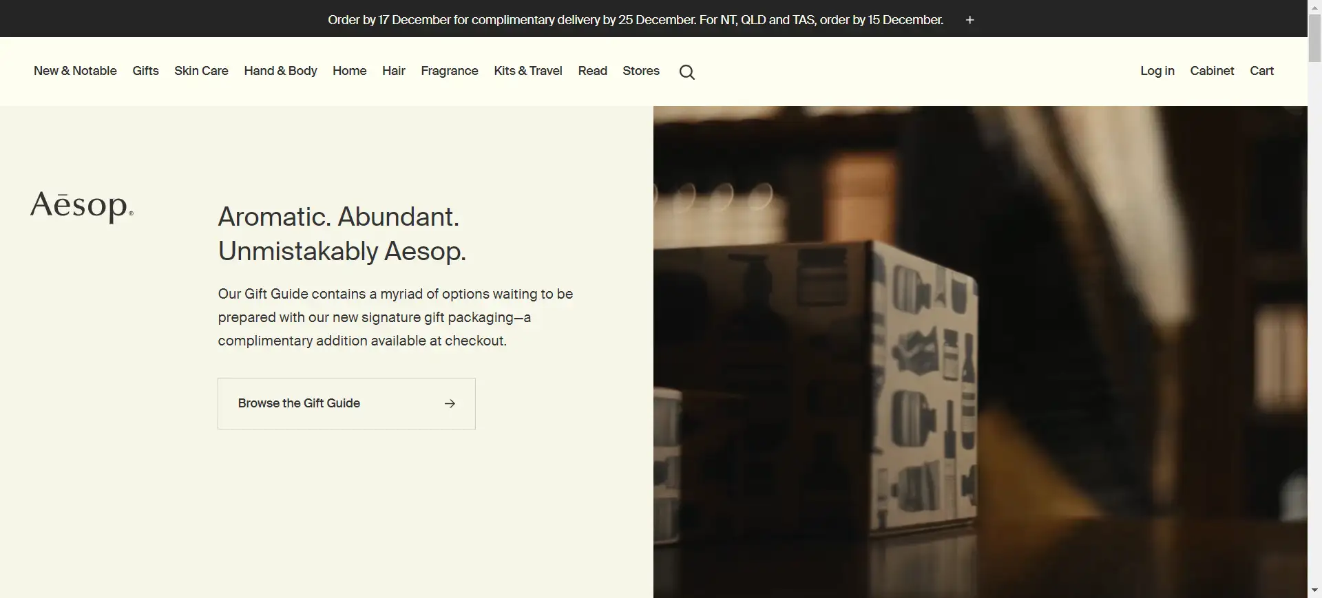
- Big, bold fonts and wide spaces help grab attention and make reading easier.
Example
- Aesop’s website uses large fonts that make product names pop. The spacious design gives the text room to breathe, making it easy for users to navigate and read, while also reflecting the brand’s premium feel.
3. Pitch Tents: One-Page Ecommerce Sites
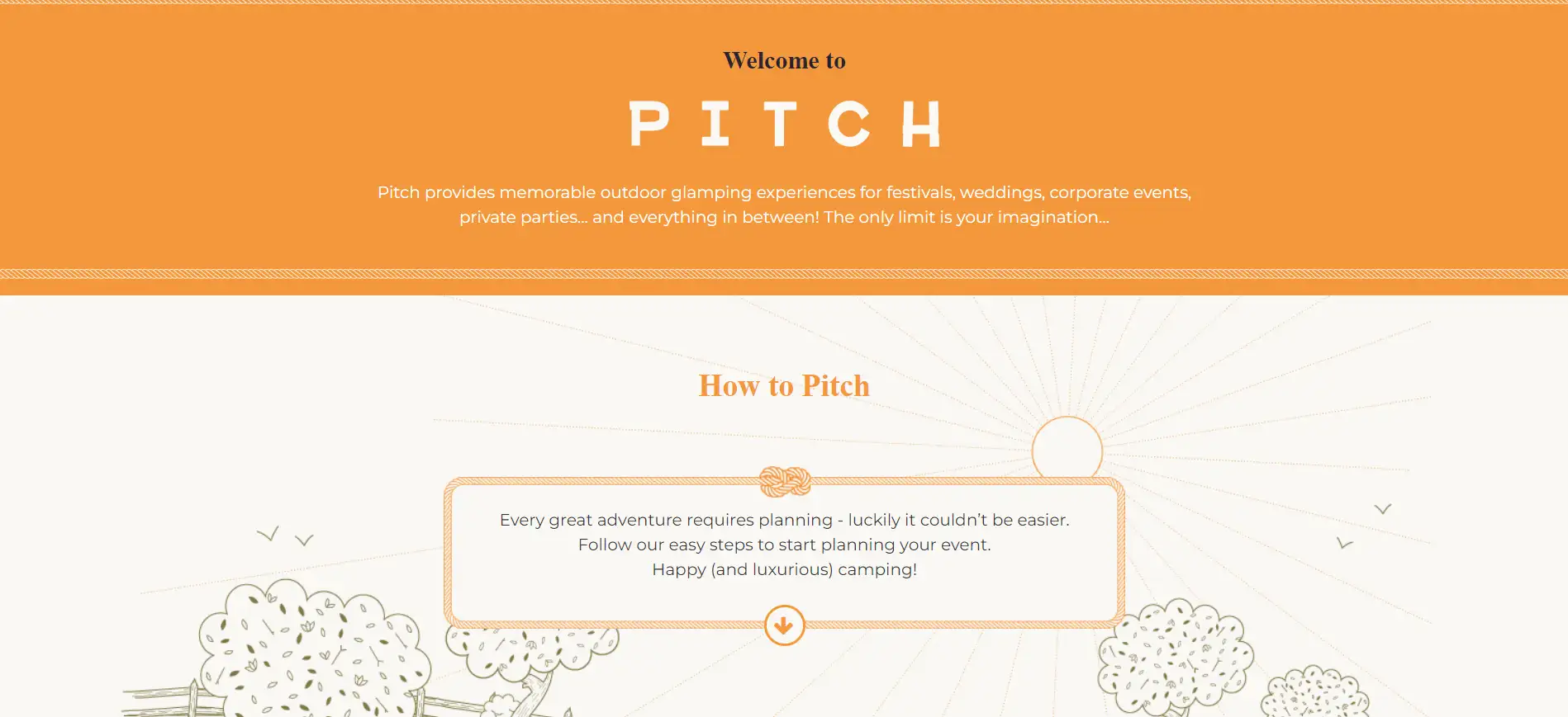
Description
- A single-page design that brings everything together, reducing clicks and making it quicker for users to shop
Example
- Pitch Tents uses a one-page design for easy browsing and a fast checkout process. By keeping everything on one page, it helps users make decisions quickly and reduces cart abandonment.
4. Ocelot Chocolate: Grid Layouts with Focused CTAs
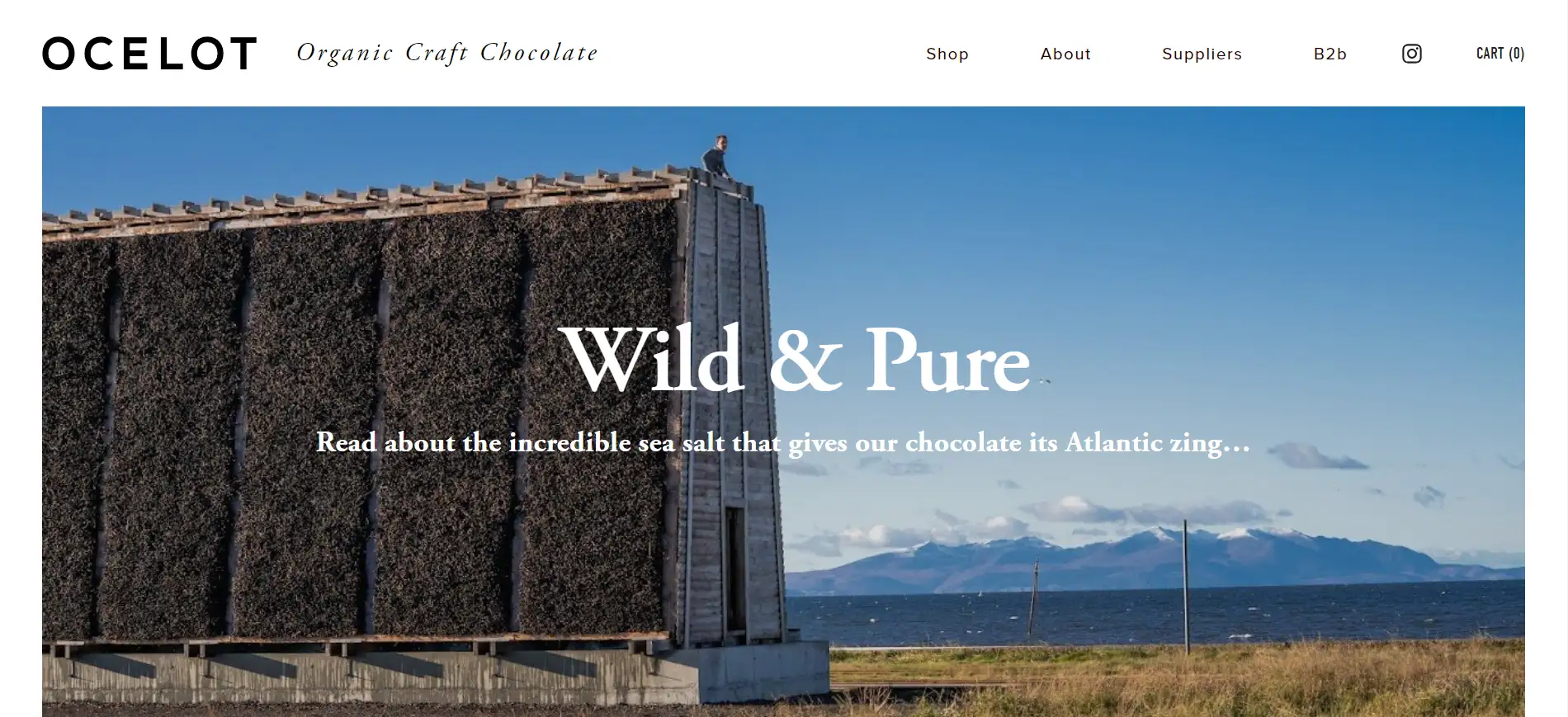
Description
- A well-organized grid layout that displays products clearly, paired with bold CTAs to guide users to take action.
Example
- Ocelot Chocolate’s site uses a grid layout with clear “Shop Now” buttons next to each product, making it easy for visitors to browse and click through to purchase.
5. Allbirds: Simple Navigation, Clean Menus
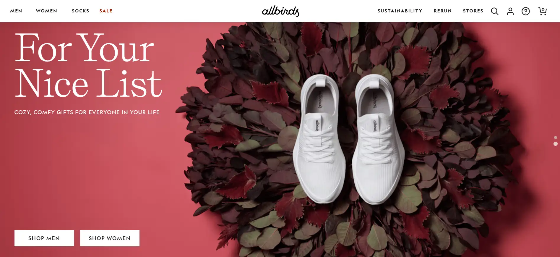
Description
- Easy-to-use navigation that helps customers find what they need without feeling lost.
Example
- The Allbirds website features a horizontal navigation bar at the top, clearly labeled with categories like "Men," "Women," "Kids," and "Our Story." Each category is easily accessible, enabling customers to quickly locate the products they are interested in. The design also includes dropdown menus with subcategories and featured products for effortless exploration, all while maintaining a minimalist and clean layout.
6. BBC Shop: Mobile-First Design
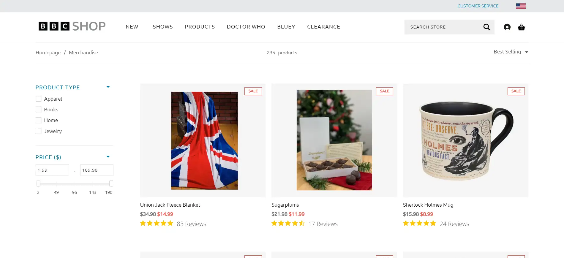
Description
- A design strategy that focuses on mobile devices first, ensuring the site works perfectly on small screens.
Example
- BBC Shop optimized their site for mobile, boosting traffic and engagement. The layout loads quickly and looks great on any device, offering a seamless experience for mobile shoppers.
7. AYO: Neutral Color Palettes with Accent Colors
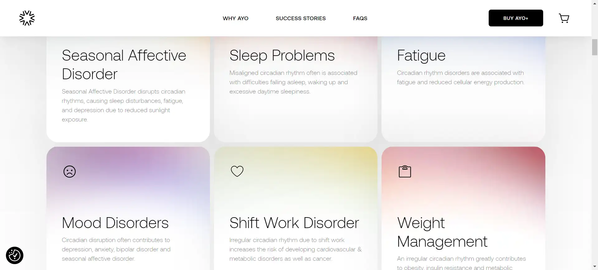
Description
- A neutral background with pops of color draws attention to key areas, such as promotions or product details.
Example
- AYO uses soft color gradients to guide attention to important sections, like special deals or new arrivals, while maintaining a stylish and balanced look.
8. Warby Parker: Custom Illustrations and Unique Branding
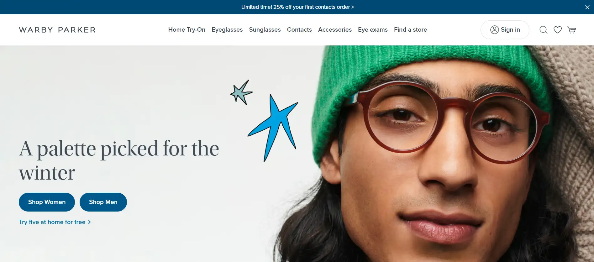
Description
- Custom illustrations help tell a brand’s story and create a memorable identity.
Example
- Warby Parker adds fun, quirky illustrations throughout their site. These images build a personal connection with customers, enhancing the brand's friendly and approachable vibe.
9. Nike: Subtle Animations & Hover Effects
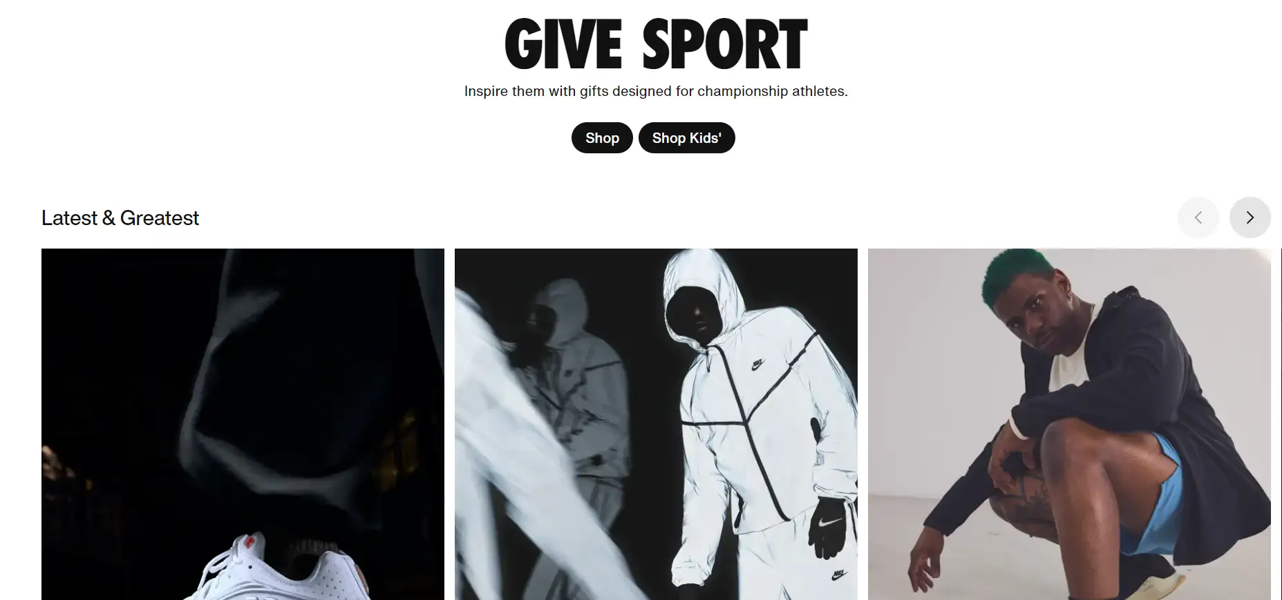
Description
- Smooth animations or hover effects that provide feedback without overwhelming the user.
Example
- Nike’s website uses hover effects to show more product details when users hover over an image. This interaction keeps things interesting without distracting the shopper.
10. Amazon: Product Filtering and Sorting Features
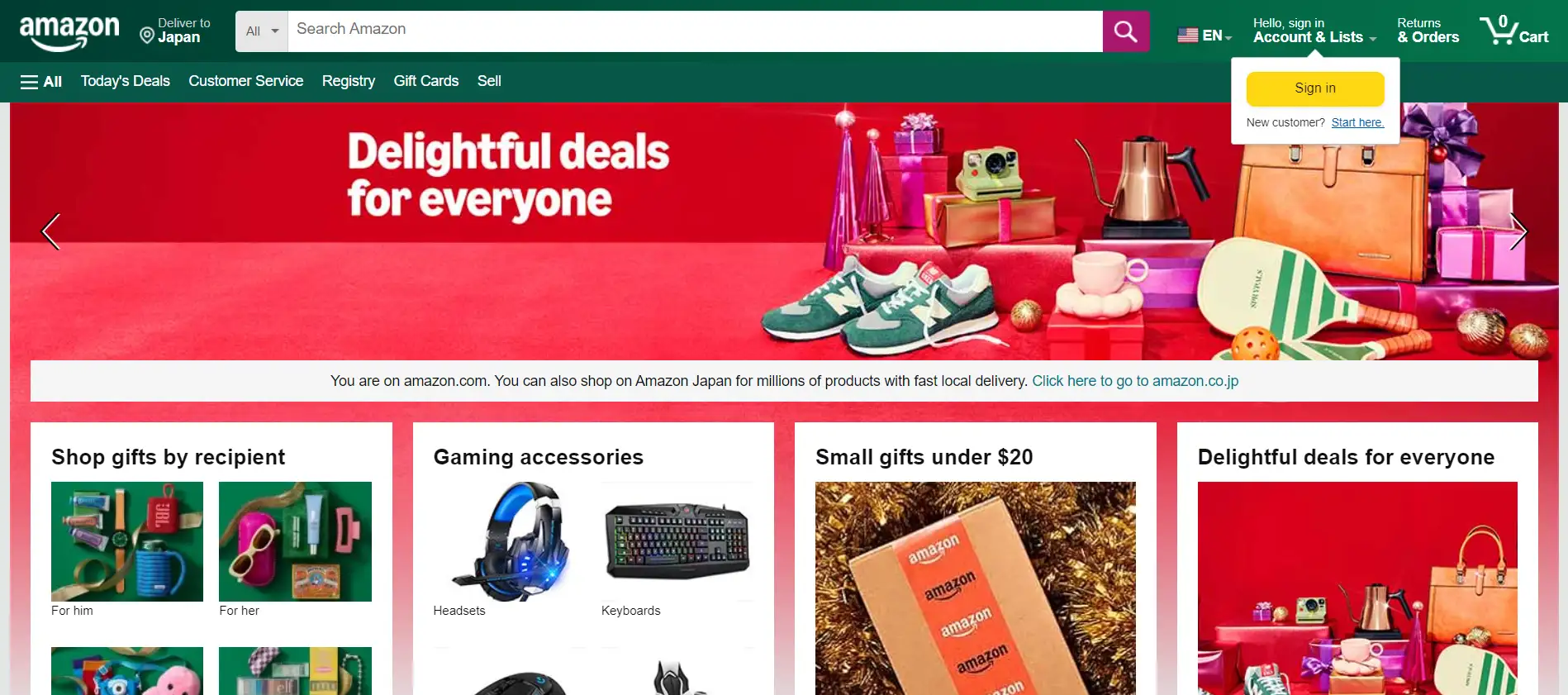
Description
- Simple filters that help customers quickly find exactly what they want.
Example
- Amazon’s powerful filters allow shoppers to sort by price, rating, and other preferences, making it easier to browse thousands of items without feeling overwhelmed.
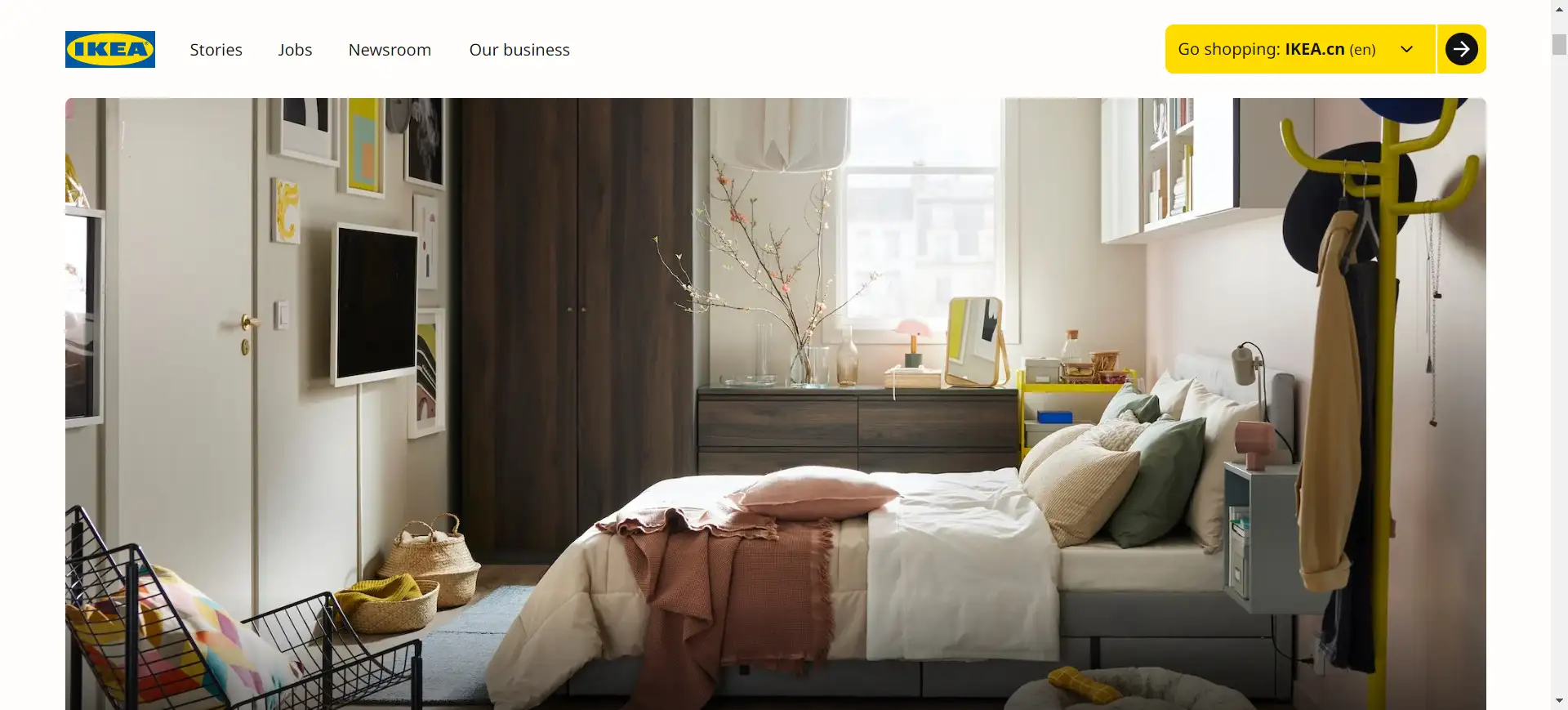
11. IKEA: Interactive 3D Product Views
Description
- Let customers view product examples from all angles to make informed buying decisions.
Example
- IKEA provides 3D product views that many brands use, allowing customers to see how furniture looks from different perspectives.
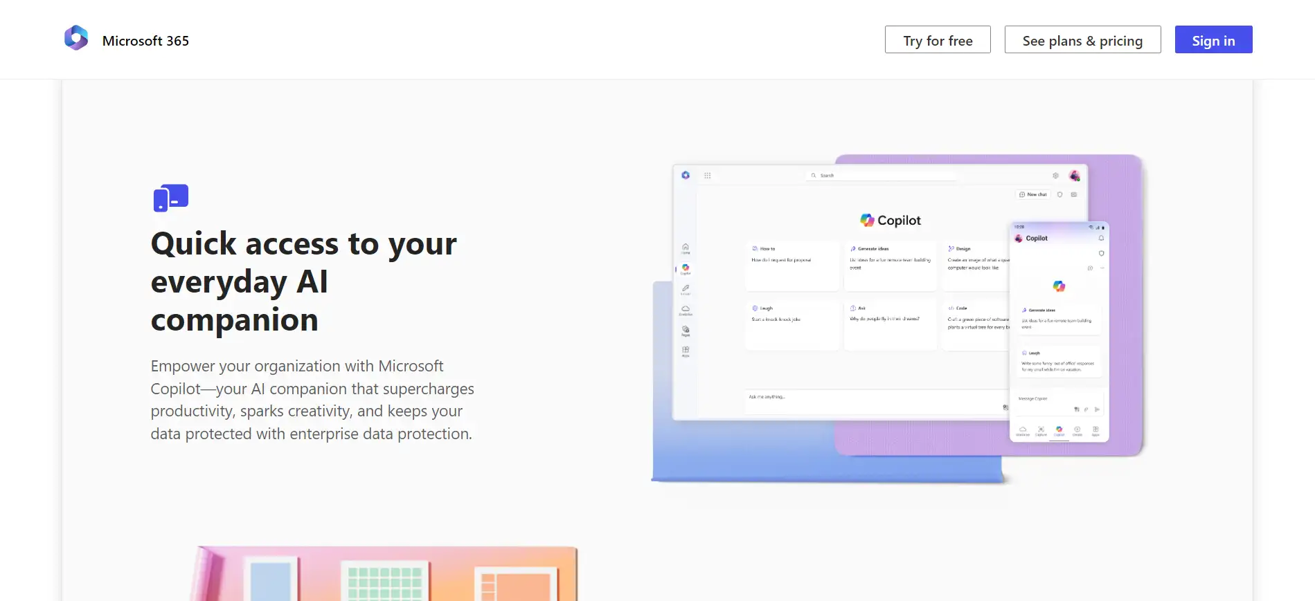
12. Microsoft Office: Flat Design
Description
- A minimalist approach that removes unnecessary details, making the interface clean and functional
Example
- Microsoft Office’s site uses flat design to create a simple, easy-to-navigate layout that emphasizes functionality over decoration.
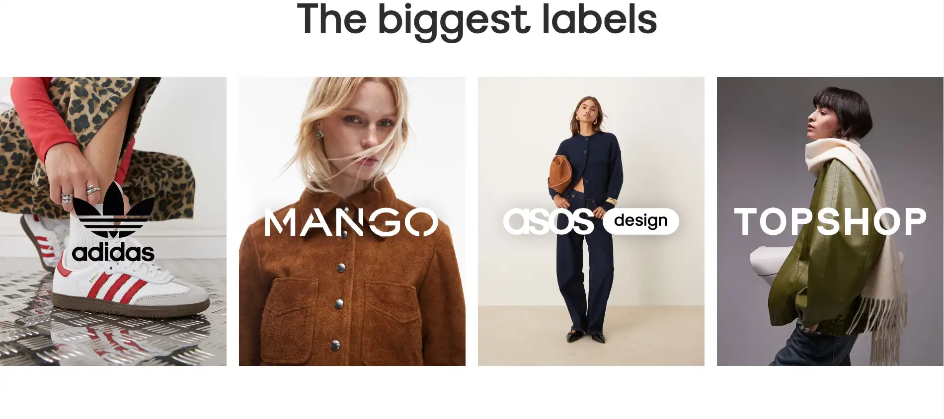
13. ASOS: Personalized Homepage Layouts
Description
- Tailoring the homepage to each visitor’s past behavior makes the experience feel personal and increases engagement.
Example
- ASOS customizes its homepage based on users' browsing history, showing products related to their previous interests. For example, if a user often shops for women’s clothing, the homepage will feature women’s fashion items, making it easier for users to find what they want and encouraging more purchases. Also, personalized promotions and recommendations based on browsing habits further enhance the shopping experience.
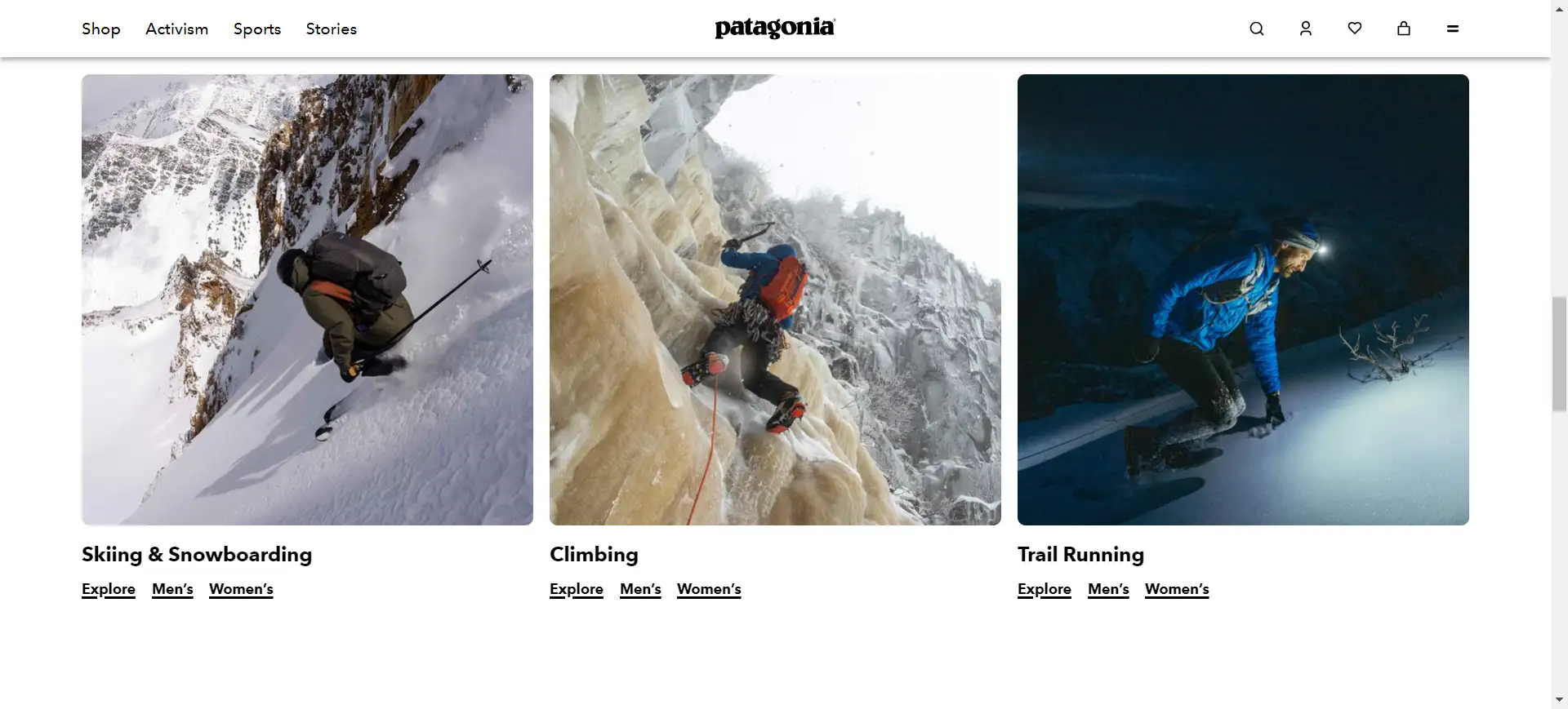
14. Patagonia: Storytelling with Visuals
Description
- Using images and videos to tell your brand’s story and create emotional connections with customers.
Example
- Patagonia’s site features videos about their commitment to sustainability, which connect with eco-conscious shoppers.
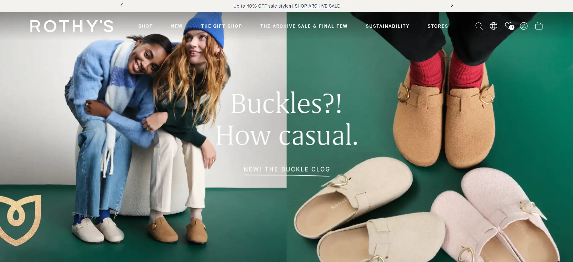
15. Rothy’s: Asymmetrical Layouts
Description
- Breaking traditional grid patterns for a more modern, dynamic look.
Example
- Rothy’s uses asymmetrical layouts to show off their eco-friendly shoes in a visually engaging way, while still maintaining a balanced feel.
16. Apple: White Space as a Key Feature

Description
- Giving important elements enough breathing room to avoid a cluttered look.
Example
- Apple’s website uses plenty of white space around products, giving it a premium, clean feel that lets the tech shine.
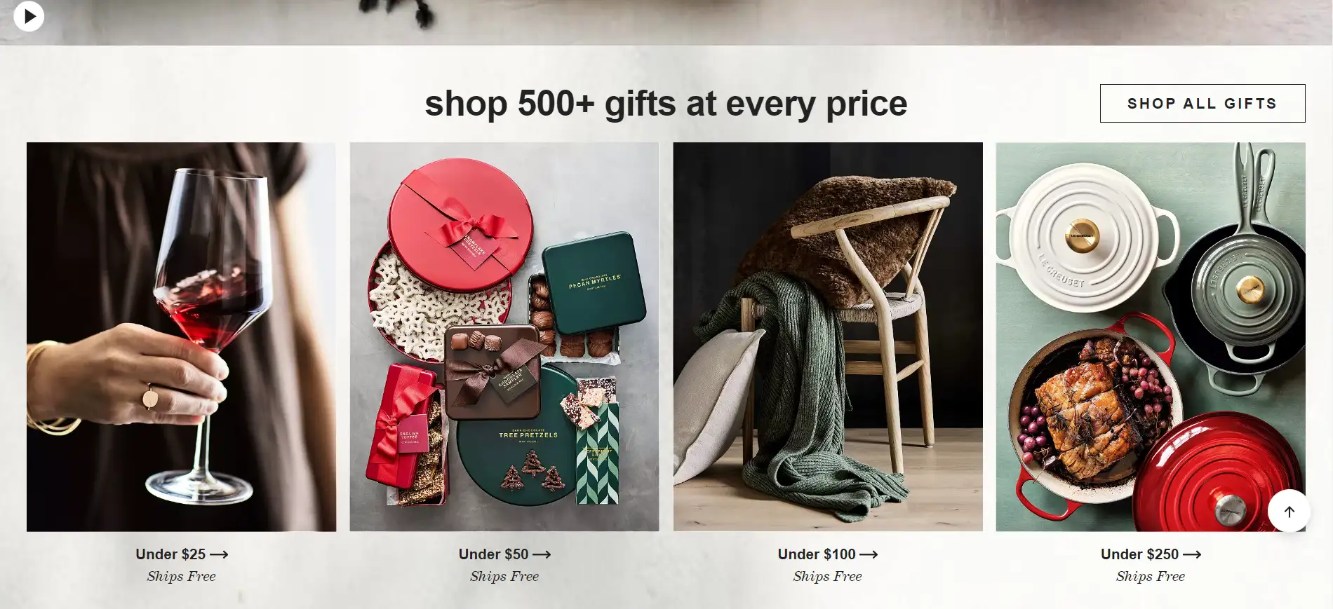
17. Crate & Barrel: Simple Checkout Process
Description
- A streamlined checkout process reduces cart abandonment and improves the overall shopping experience.
Example
- Crate & Barrel simplifies its checkout page, helping users complete their purchases without unnecessary steps.
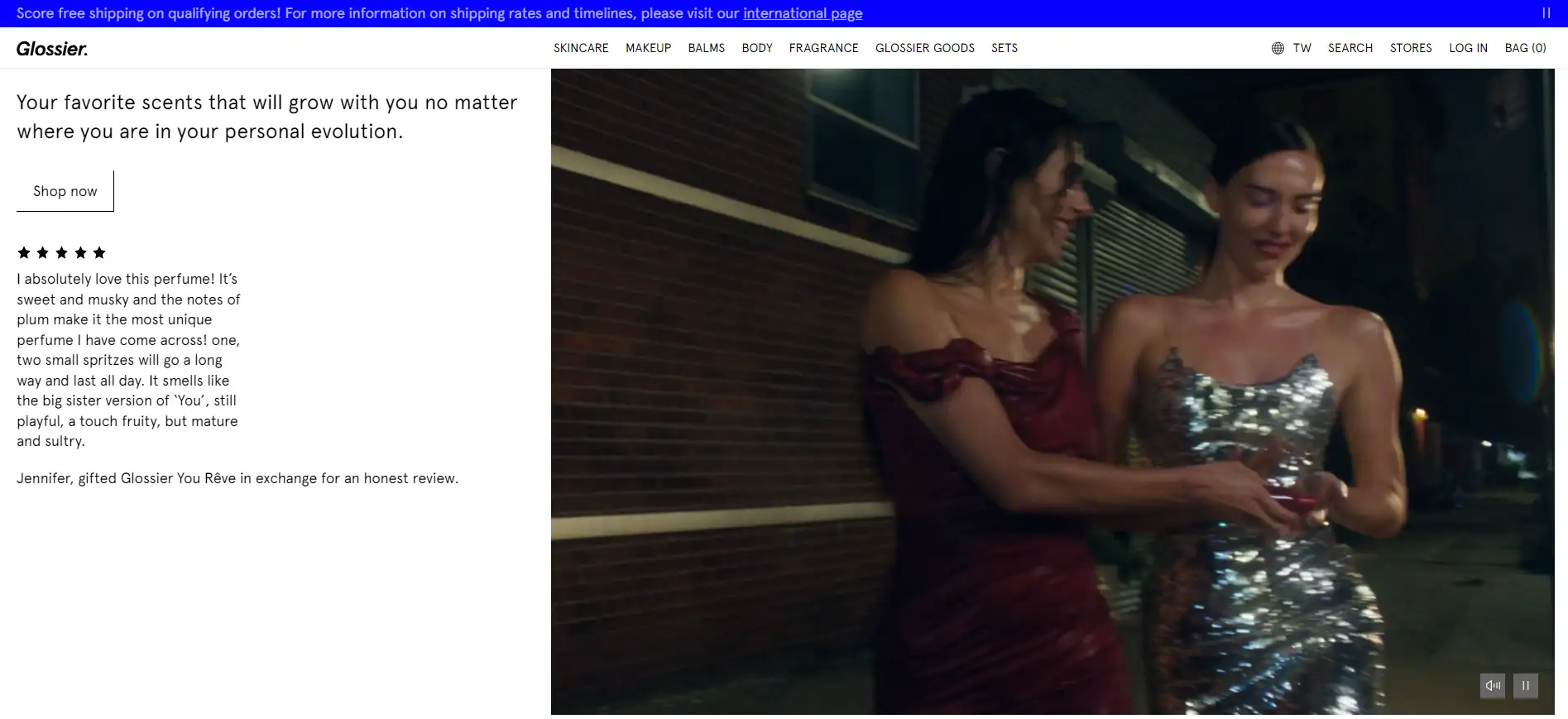
18. Glossier: User Reviews & Testimonials in a Clean Layout
Description
- Displaying customer reviews without overcrowding the design.
Example
- Glossier shows customer reviews in a neat, easy-to-read format on product pages, building trust with potential buyers.
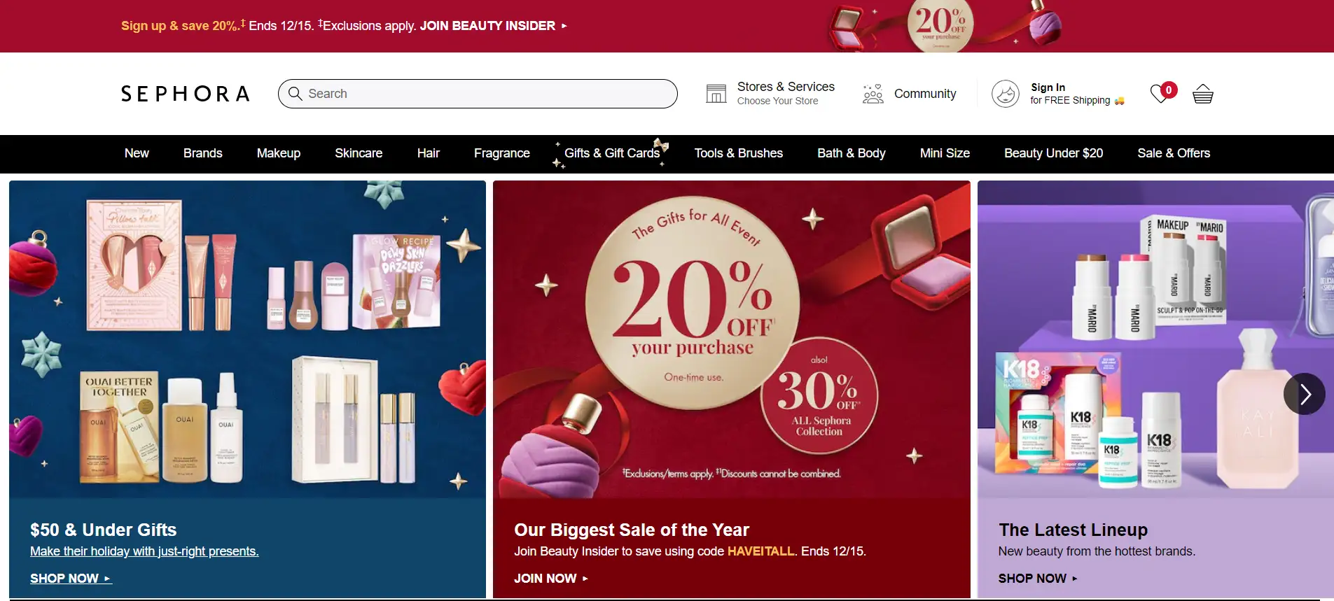
19. Sephora: Video Integration
Description
- Including product videos to show how the items work or offer tutorials directly on the product page.
Example
- Sephora integrates tutorial videos for their beauty products, helping customers see how the products are used and boosting confidence in their purchase.
20. Zara: Quick View for Products
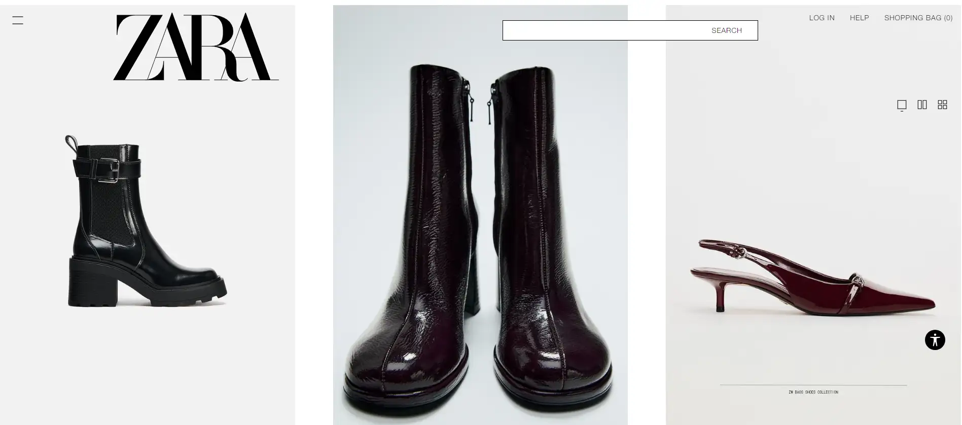
Description
- Allowing users to see product details without leaving the page, making it easier to browse.
Example
- Zara’s quick view feature lets users check out product details in a pop-up window, which makes browsing faster and more convenient.
How to Bring These Designs to Life: Try Wegic for Modern Website Design
Want to create websites like below? Click the image and try Wegic to get the best design now!👇
Wegic makes creating modern ecommerce website designs simple and enjoyable. By leveraging conversational AI and intuitive tools, users can transform design ideas into stunning shop web designs with ease. Here's how:
Start with a Conversation

Tell Wegic what you need in your online shop design through a chat. For example, say, “I want a minimalist homepage with personalized sections” or “Add a quick-view feature for my products.” Wegic understands your requests and guides you step-by-step to build the perfect site.
Customize Your Website
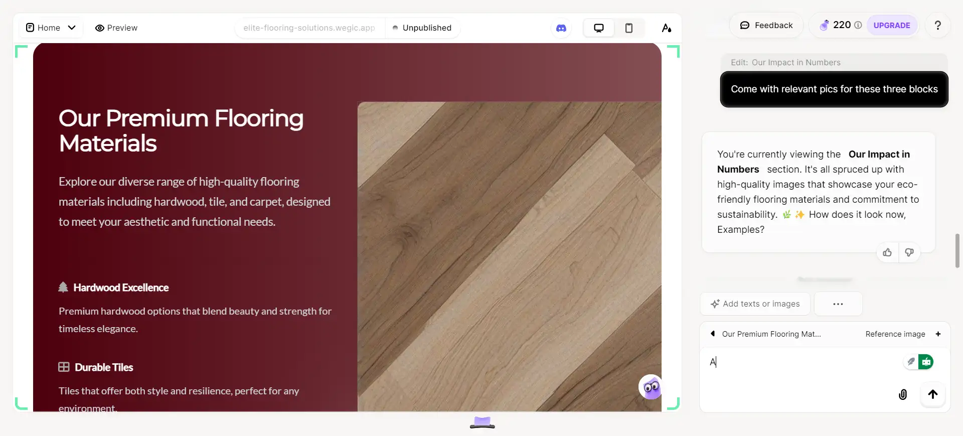
Wegic gives users full control to tailor their modern ecommerce website design to perfection with simple, intuitive features, all by chatting:
1. Navigation Styles: Easily switch between horizontal or vertical menus, add dropdown options, or reorganize categories in chats. Wegic adapts the navigation to match your branding and usability needs.
2. Typography Customization: Adjust fonts for headlines, body text, and product descriptions. You can specify font styles, sizes, and weights to highlight key elements like product names or promotional banners.
3. Color Scheme Personalization: Experiment with color palettes by providing a specific shade or describing the mood you want. For example, input proompts like “Use pastel tones for a calm feel” or “Add bold reds for urgency.”
4. Layout Adjustments: Wegic supports section modifications, such as resizing product grids, repositioning banners, or creating space for featured content. Use tools like ‘Draw Reference Sketch’ to sketch ideas directly onto the layout.
5. Visual Enhancements: Upload your images or select free copyright-protected visuals and illustrations through Wegic. Add hover animations for product photos or adjust scrolling effects to make your pages interactive and engaging.
6. Mobile Responsiveness: Ensure your shop web design looks flawless on all devices. Wegic automatically optimizes layouts for smartphones and tablets, so your customers enjoy a seamless browsing experience.
7. Dynamic Content Integration: Add videos (via URL), embed YouTube clips, or integrate Google Maps to showcase store locations. Wegic supports third-party tools to enhance user engagement.
Explore Multi-Page and Mobile-Friendly Options
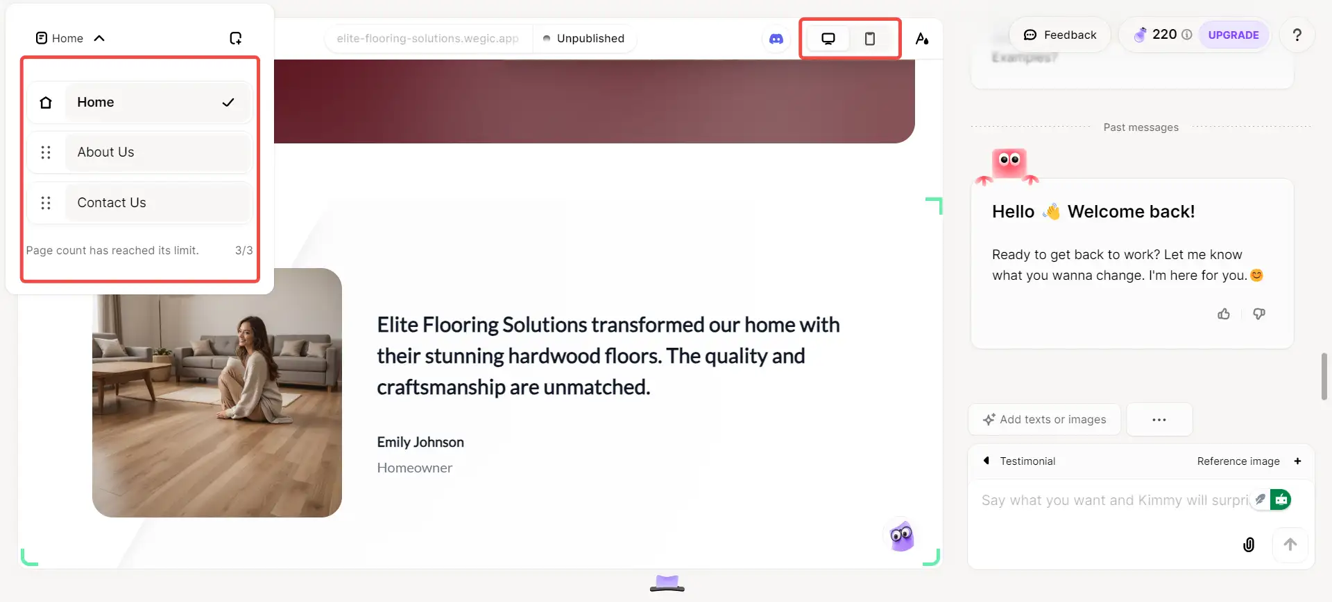
For flexibility, Wegic supports multi-page designs and ensures your site looks fantastic on any device. Whether it’s a modern ecommerce website design template or a unique layout, Wegic guarantees a smooth experience for desktop and mobile users.
Enhance with Pro Feature
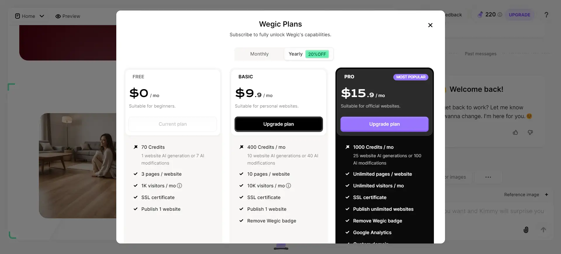
Upgrade to Wegic’s Pro Plan to unlock premium features like custom domains, Google Analytics integration, and advanced customization. These tools are perfect for creating polished and professional modern web designs tailored to your needs.
Wegic empowers anyone, from beginners to experts, to craft visually stunning and functional ecommerce websites through natural conversation and AI-driven design tools.
Simplifying Ecommerce Design with Modern Trends
Modern and simple design is crucial to capturing customers’ attention and offering them a seamless shopping experience, which means, a clean, user-friendly website with easy navigation and attractive visuals not only makes browsing easier but also builds trust and boosts sales.
With Wegic’s AI-driven platform, anyone—regardless of technical experience—can create their own ecommerce website effortlessly. The power of conversational design makes it simple to personalize every detail, from layout to colors, and bring your vision to life.
Start creating your dream ecommerce site with Wegic today—no coding skills needed, just your ideas and creativity!
Written by
Kimmy
Published on
Mar 17, 2026
Share article
Read more
Our latest blog
Webpages in a minute, powered by Wegic!
With Wegic, transform your needs into stunning, functional websites with advanced AI
Free trial with Wegic, build your site in a click!
